10,000 search results
(0.039 seconds)
- Litera by ITC,
$29.99Litera was designed in 1983 by Michael Neugebauer, who used the same strict constructed design found in his typeface Circulus. In its figures are the clear geometric forms of the circle, triangle and rectangle, which were also the main forms of Bauhaus designs. The overall look of Litera is modern, clear and light. Distinguishing characteristics are the openness and the e and P and the particularly long cross stroke of the G. The cool Litera is best for middle length texts and headlines. Similar typefaces include Futura from Paul Renner and Avenir from Adrian Frutiger. - Smooth Brushings by Hanoded,
$20.00 When I was painting this font, I suddenly had the movie Cool Runnings (1993, directed by Jon Turteltaub) in my head. I had to name the font, so I came up with Smooth Brushings. Of course, this font has nothing to do with the movie. Smooth Brushings is an all caps brush font, which was made with a stiff brush and some China Ink. Upper and lower case glyphs can be mixed. It is a very legible and clear font, ideally suited for posters, product packaging and book covers.
 - Luckystrikes by Kustomtype,
$25.00 Introducing Luckystrikes, a handwritten script-font inspired by a poor amount of characters in the 1950-style advertising of the well-known American cigarettes. Kustomtype redrew this font with a very clear and cool old-script style. This font is great for all your creative projects. Luckystrikes comes with uppercase, lowercase, numerals, punctuations in script so you can use it to customize all your designs. Perfect to use for Logos, Letterhead, Poster, Apparel Design, Package design, Label design etc. Luckystrikes is designed by Coert De Decker in 2018 and published by Kustomtype Font Foundry.
 - The August by Allouse Studio,
$16.00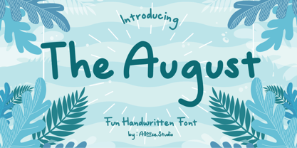 Proudly Presenting The August a Fun Handwritten Font. The August come with Ligatures and Multi-Lingual Support which will add cool impression to your need. We highly recommend using a program that supports OpenType features and Glyphs panels like many of Adobe apps and Corel Draw, so you can see and access all Glyph variations. The August is perfect for product packaging, branding project, megazine, social media, wedding, or just used to express words above the background. Enjoy the font, feel free to comment or feedback, send me PM or email. Thank You!
 - Puddy Gum by Agny Hasya Studio,
$9.00 Introducing Puddy Gum a Playful, Groovy, and Bubbly Display Typeface, Fluffy, and Fun. This Font Family Comes in 3 Styles (Regular, Bubble, and Outline 3D Extrude) and Includes Italics. Featured With Pua Unicode, Uppercase and Lowercase, Numeral and Punctuation, Multilingual Support, Created With Alternate and Ligature. You Can Experiment With All 3 Styles Since the Characters Overlap and Align Perfectly, Resulting in Visually Interesting and Cool Typography. It’s Perfect for Your Design Projects Such as Logos, Advertising, Branding, Posters, Banners, Product Designs, Art Quotes, Special Events, Product Packaging, and More.
 - Cloud Bread by Orenari,
$15.00 Cloud Bread is a sweet and friendly display font. This font has bold and cute shape. It's unique style makes it incredibly fitting to a large pool of designs. Be inspired by Cloud Bread and create something fun and memorable! Language Support: Afrikaans, Albanian, Catalan, Danish, Dutch, English, French, German, Icelandic, Italian, Norwegian, Portugese, Spanisch, Swedish, Zulu I really hope your projects will be cool with this font, and please don't hesitate to drop me a message if you have any questions or you wanna share some jokes! :)
 - Billy Coaster by HIRO.std,
$20.00 Billy Coaster is a Modern Retro Typeface. This font describes about stylist, modern retro, modern vintage, cool, and easy to use. Billy Coaster Typeface inspired from the modern retro typography and designs in late 80's untill 90's. FEATURES - Uppercase and Lowercase letters - Support Opentype Features - Stylistic Alternates - Numbering and Punctuations - PUA Encoded Characters - Multilingual Support - Works on PC or Mac - Simple Installation USE Billy Coaster Typeface works great in Logotype, Branding, Apparel, Poster, Magazine and any projects that need Modern Retro taste. Enjoy using! Thanks. HIRO.std
 - Residual by Gassstype,
$22.00 Introducing our latest display typeface called RESIDUAL is a Strong Bold Display Font, Cool and Strong with can make your logotype become more interesting. Best Vintage font and multilingual support. inspired by the decorative arts and architecture movement. RESIDUAL fonts is perfect for your project and allows you to create designs, headlines, posters, logos, badges and many more that are beautiful. It is also best used for posts, logos, posters, certificates, labels and more. It’s perfect for labels, quotes, DIY projects, branding, packaging, greeting cards, websites, photos, photography overlays, signs,and window art.
 - Planjer by TypeFaith Fonts,
$10.00 Art deco typography from the Netherlands that summons a thirties vibe for a nostalgic twist on chic lines. Planjer is the work of designer Leon Hulst, and you can see from the layout examples here that nostalgia means ruin, and it has become super cool to use a ruin vibe in retro aesthetics. Yep, there's a touch of class to that worn out look and feel, and the beautiful lines of the typography and numerals show how the barely restrained charisma of art deco can be coupled with the new obsession with all things vintage.
 - Backhand by Scratch Design,
$10.00 Introducing Backhand! It's a modern script font with texture brushed ink style. It's highly recommended for you who want to make some designs with texture in font style. This font will work for invitation design, logos, badge design, poster, packaging, book cover title, quote, social media post, etc. Just open your Opentype features while using the script font to use the ligatures and swashes. Also, this font includes alternates for uppercase and lowercase characteristics. Features: Accents (Multilingual characters) Ligatures Swashes Numerals Punctuations So, enjoy the Backhand script and make some cool stuff!
 - Omiwa by Orenari,
$14.00 Omiwa is a playful Display font with a unique character that is perfect for all design purposes. With unique alternate characters you can combine it into awesome waves! - This font is semi-ALL-Caps font, because some characters have lowercase (f, g, i, j, r). - The characters with Stylistic Alternates : A, H, K, M, N, R, U, V, W, X, Y I really hope your projects will be cool with this font, and please don't hesitate to drop me a message if you have any questions or you wanna share some jokes!
 - Longle by Canden Meutuah,
$15.00 Longle is a beautiful handwritten font. this font is so simple that i write very carefully. Even though it looks simple, this font still looks cool and stylish. This Fonts are perfect for: logos, branding, wedding invitations, business cards, greeting cards, posters, magazines, social media, proliferate fonts, planner prints and websites. Get creative with their unique fun, and use them to brighten up any craft project! Get this font now and boost your creativity with it! If you have any questions, before or after your purchase, don't hesitate to contact us. Thank You
 - Terrified AOE by Astigmatic,
$19.00 Terrified AOE was inspired by vintage horror movie poster titling from the 1960's. It is a Capitals and smallcaps typeface, that really feels like a mix of three typefaces in one. While the Capitals and Smallcaps typesetting works to the effect of the original inspirations, each case also works well amongst itself independently, and having very different vibes. I've always been a huge fan of horror movies, and some of the lettering from vintage horror movie posters are so cool and alive, I only wish there were more of them recreated as display fonts.
 - Silver Shark by Epiclinez,
$18.00 Silver Shark is a cool and authentic brush display font. It has a bold, rough texture and as a result, it makes each of your creative designs stand out. Carefully handcrafted to grab the attention of the viewers, this font is ideal for logos, posters, headlines, branding, apparel and so much more. Silver Shark contains 199 glyphs. Supporting more than 66 languages, from English to Zulu. Accessible in Adobe Illustrator, Adobe Photoshop, Adobe InDesign, even works on Microsoft Word PUA Encoded and fully accessible without additional design software,
 - Brannboll Connect by Mans Greback,
$59.00 Brannboll Connect is a script sport typeface. The baseball-style lettering was drawn by Måns Grebäck in 2020. It is a specialist connected typeface: Each character and all their parts are physically connected, making it a lettering perfect for laser cutting, signs, jewelry, woodworking and embroidery. It also comes with the additional, decorative style Brannboll Connect Swash, which contains ten cool swashes to give the graphic extra expression. It has a very extensive lingual support, covering all European Latin scripts. The font contains all characters you'll ever need, including all punctuation and numbers.
 - Melon Honey by Alit Design,
$19.00 Introducing Melon Honey Typeface Melon Honey Typeface is inspired by the classic victorian font style combined with western style which makes the Melon Honey font look cool and unique. This font is perfect for a bold and vintage Victorian concept design. Can be used for the design of alcoholic beverage packaging, pomade designs, barbershops and so on with the Victorian classic concept. Apart from that this font is very easy to use in both design and non-design programs because all alternates and glyphs are supported by Unicode (PUA).
 - Skid Rock by HansCo,
$12.00 Skid Rock is a modern, bold and clean font that will be perfect for multipurpose projects. This font looks cool in any design and is very recommended for craft, posters, books, branding, quotes, print templates, packaging, invitations, music labels or anything else that needs a touch of something bold and clean. Skid Rock comes in uppercase and lowercase, with punctuation, symbols, numerals, swashes and it also has multilingual support. Swashes is alternate from numeral 0 - 9. You can access swashes from your OpenType panel in your design software.
 - Garnison by OzType.,
$15.00 Garnison, is a contemporary take on the humanist sans serif from Eric Gill with readability and craftsmanship at its core. Specially designed for editorial and publishing purposes. Garnison blends Eric Gill’s humanist sensibilities with a younger, more versatile attitude with 74 variations ranging from lightest hairline to heaviest black, the family features an extensive set of weights and optical sizes, matching true italics and lots of cool OpenType features. The variation in stroke width and letterforms help it achieve great scalability while still retaining its character. For inquiries please contact ozfoundry@gmail.com.
 - Executive Boss by Letterara,
$14.00 Executive Boss is a cool and versatile duo font (serif and script). The beautiful signature monoline-style font perfectly complements the elegant serif font. Combining these two fonts in your next design will give a modern and sophisticated feel, and it makes it a perfect addition to your font collection. Fall for its ravishing style and use it to create gorgeous wedding invitations, beautiful stationary art, eye-catching social media posts, logos, packaging, advertising, and much more! This font is PUA encoded which means you can access all the glyphs and swashes easily!
 - Undersong by PintassilgoPrints,
$19.00 Undersong brings 13 fancy hand-drawn stackable fonts which can be combined in many, many tasty ways. Layered or not, you'll see that these little ones work together scrumptiously well. For added flavor and freshness, each font brings at least 3 variations for each letter, making it for a cool natural handmade look. T-shirts, posters, book covers, packaging projects, Undersong will nicely fit many design applications. Some great font families out there are said to be workhorses. Figure this one like a work-unicorn: perfect for fantastic designs. Enjoy the ride!
 - Play Kids by Canden Meutuah,
$20.00 is a beautiful handwritten font. this font is so simple that i write very carefully. Even though it looks simple, this font still looks cool and stylish. Handwritten script font. This Fonts are perfect for: logos, branding, wedding invitations, business cards, greeting cards, posters, magazines, social media, proliferate fonts, planner prints and websites. Get creative with their unique fun, and use them to brighten up any craft project! Get this font now and boost your creativity with it! If you have any questions, before or after your purchase, don't hesitate to contact us. Thank You
 - Bale by moretype,
$28.00 Originally developed as a part of a corporate identity, Bale is a warm and confident sans-serif font. With its generous counters and angled terminals Bale is a dependable work horse with enough flare to add interest to any typographical landscape. This hardworking font comes equipped with small caps, automatic fractions, proportional/tabular lining and old style figures and alternative glyphs and is the must for any typographic toolkit. Bale Mono is the monospaced companion of Bale. This Mono font brings a technical edge to the cool professionalism of Bale.
 - Glagio by Ergibi Studio,
$19.00 Glagio is a Signature font for handwritten logotype with alternative characters. perfect font for creating photography studios or personal photography logos, best for initial logo or brand signatures. Glagio includes a full set of beautiful handwritten upper and lower case letters, numbers, assorted punctuation marks. All lowercase letters include end strokes, providing a cool handwriting style. What's Included : Standard glyphs Ligatures International Accent Works on PC & Mac Simple installations If there is a problem, question, or anything about my fonts, don't hesitate to ask! Big Thanks ~ Ergibi Studio
 - Qonqueror by Wacaksara co,
$18.00 Qonqueror Typeface is a font inspired by writing on a blackboard. This font is very cool and can be mixed and matched with any ornament you like. this font is great for your next creative project such as blackboard menu design, book menus, sign boards, logos, printed quotes, invitations, cards, product packaging, headers, Logotype, Letterhead, Poster, Apparel Design, Label, and etc. Qonqueror Typeface comes with uppercase, lowercase, numerals, punctuations and so many variations on each characters include opentype alternates, and also ligatures to let you customise your designs.
 - Snippity Snap by Hanoded,
$15.00 Snippity Snap is a font made up of glyphs I cut out from black paper with some household scissors, then pasted onto white paper. When I was cutting out the shapes, my children asked me what I was doing, and when I told them, they thought it was pretty cool and started cutting out shapes from paper themselves. The result is a house filled with paper cuttings, which I keep finding everywhere - even in my bed. Snippity Snap is a very nice font for ads, book covers, packaging and children's books. Enjoy!
 - Bike Decals JNL by Jeff Levine,
$29.00Bike Decals JNL captures the fun and nostalgia of the 1950s and 1960s when kids all around the country ran to their local five and dime or hobby store to purchase water applied decals. The "cool" thing would be to customize your bike, little red wagon or anything that would be fair game with various racing symbols, weird space creatures or other unusual images. In this font, Jeff Levine has put his own spin on some of the classic designs of yesteryear, drawing from scratch some of the most popular of their day. - Karope by Nian Keun Studio,
$12.00 Karepo is a remarkably cool and dynamic serif font designed to elevate the visual appeal of your display. This font brings a sense of modernity and vitality to your designs, making them more captivating and engaging. Ideal for graphic design, social media, and branding projects, Karepo seamlessly integrates into the contemporary design landscape, adding a touch of sophistication and charm. Elevate your visual communication with this versatile serif font, perfect for creating a lasting impact across various platforms. Thank you for coming to my shop and enjoying other fonts.
 - Getih West by Twinletter,
$15.00 Getih West It’s a Halloween font, but there’s no need to fear. It’s not just for Halloween fans; You can use it to create cool designs and logos for everything from snowboarding gear to new products at work. Or, if you’re in a hurry, use it to make a fun invitation for your next party — because everyone loves an invitation that screams “Boo!” Of course with this font your various design projects will be perfect and amazing, get a beautiful title and start using our font for your special project.
 - Broted Young Plant by Alit Design,
$12.00 Introducing Broted Young Plant Font Duo. Unique and fantastic duo fonts combined or they stand alone. Broted Young Plant Sans Serif font family consists of 14 families, from Thin to Heavy style. The elegant modern font creates a unique design and is sure to steal the eye of the design target audience. Besides being unique, the Broted Young Plant Sans Serif font also has a luxury simple character that makes the design charming and luxurious. Broted Young Plant Script is a signature script that has cool strokes. The line shape of Broted Young Plant Script is inspired by a unique elegant style. In addition, Broted Young Plant Script has an altenate ligature that looks natural and not stiff. Combining the two Broted Young Plant Script and Sans serif fonts will create a design that is charming, unique, elegant and cool. you can see from the design preview. These two fonts are perfect for designs with the concept of elegant, luxury, romance, fashion and so on. In order to use the beautiful swashes, you need a program that supports OpenType features such as Adobe Illustrator CS, Adobe Photoshop CC, Adobe Indesign and Corel Draw. but if your software doesn't have Glyphs panel, you can install additional swashes font files.
 - Spiraltwists by Aah Yes,
$0.75Spiraltwists is a family of 2 fonts giving assorted spiral shapes. In each font they're grouped in fours - the same basic spiral in 4 different orientations (N S E W almost), and Spiraltwists has solid lines making up the spirals, Spiraltwists Antique has dotted lines making up the spirals, giving them an antique or rustic appearance. Spiraltwists has heavier spirals on Upper Case, lighter spirals on lower case; plus a group of spirals with a straightened outer end and connecting lines so you get two spiral scrolls joined together by a long line at the top or bottom. (inputting UVWXYZ into the text-box on this webpage will show it). The big example on the webpage shows it all more clearly than any explanation. A fuller description, plus the above example, are included in the zipfile. Please note: for the avoidance of doubt, the font does not contain any letters, the text in these 2 examples is not Spiraltwists but Luzaine. - Voluta Script by Adobe,
$35.00Voluta Script is the work of Austrian designer Viktor Solt, created for use in a guide to the Austrian Gallery at Castle Belvedere. A volute (Latin voluta") is a spiral or scroll-shaped ornament used in the Baroque architecture of Castle Belvedere, similar to the swashes in this typeface. The castle was the historic residence of Prince Eugene of Savoy, one of the great military commanders of the 18th century and a prominent figure in Austrian history. When asked to create a typeface based on the calligraphy of the period to illustrate Eugene's epic, Solt turned for inspiration to Kurrent writing, a cursive blackletter style. Solt created a hybrid style that embodies the rhythm and basic forms of its ancestors, with large capitals, dark vertical strokes, and flourished beginning and ending characters. The typeface was designed to be used in sizes of 24 points and greater. Voluta Script allows designers to evoke the Baroque era or to lend a hint of majestic grace to contemporary typesetting." - Cold Snowflake by Putracetol,
$16.00 Cold Snowflake - Quirky Ice Cream And Candy Theme Font is a delightful typeface designed to capture the essence of ice cream and candy in a playful and fun manner. The font features quirky, bold, and chubby letterforms, mirroring the sweet and indulgent theme it represents. It can be effectively used alone or in combination with its twelve charming variations. With twelve distinctive variations inspired by ice cream, candy, cones, sprinkles, sticks, melting treats, and chocolate, Cold Snowflake is the perfect choice for children's projects, crafting, and any design that seeks to evoke a sense of fun, playfulness, and a vibrant, colorful aesthetic. This font suits a wide range of applications, including logos, crafting projects, invitations, packaging, posters, titles, businesses, greeting cards, stickers, children's books, magazines, and any design related to the delightful world of ice cream and candy. With its sweet and cheerful theme, Cold Snowflake adds a touch of whimsy to your creative work, making it perfect for all things sweet and playful.
 - Engel New by The Northern Block,
$30.36 EngelNewSans is sans serif family of 12 weights and an upgrade of the typeface Engel also published by Die Gestalten Verlag. The project began with an extension to the original Engel character set and freshening up the typeface to suit the OpenType format. EngelNewSerif came about as a sibling to EngelNewSans as a corresponding serif family also of 12 weights, matching those of EngelNewSans. Both families are designed for a wide usage in running text and headlines. EngelNewSans is an evolved version of the original Engel typeface, which undergone improvements to the individual letterforms and the overall look which resulted in this sans serif type family with a more mature confident character and with softer, rounder and more harmonious shapes. The characteristics between the two could perhaps, very fittingly, be compared to a person showing different sides to their personality at different stages in life. With EngelNewSans portraying the more mature role while the original Engel shows traits of a cool teenager with rough edges, not yet fully developed. To make the light weights function with serifs attached for EngelNewSerif, the same low stroke contrast as seen in EngelNewSans was applied. Further discovery found that the serifs and the stem width had to be optically similar for the light weights not to appear too fragile. In the heavy weights however, the stroke contrast was higher than in the Sans versions, this was done to open up the counters and make room for the serifs to breathe. The intention of the families is to motivate an element of play and give the designer a larger selection to work with.
 - Mr Palker by Letterhead Studio-YG,
$35.00 A slab serif Mr Palker and grotesque Mr Palkerson build one superfamily together. These are blank types. In a way even the display ones. Typefaces for newspapers, announcements, cheap advertising and police posters. Mr Palker and Mr Palkerson will turn every language into a fence. And due to six types of faces one can choose what material should the fence be made from — from Thin steel rods to the Black stone blocks. In their simplest appearance Mrs P&P are intended for the solid blank composition in victorian or industrial style. They are quite decent, a bit old-fashioned slab serif and grotesque with closed aperture. All my types have layers. Walker and Palkerson also do. Besides the standard set of symbols, they have 4 add-ons. 1. Alternate glyphs, including unicase ones. 2. Ligatures with A letter. 3. Extra tall small caps. 4. Two-storey ligatures. All this options are intended for the complex composition. The additional letters are rather eccentric as their main function here is to imitate the victorian oddities. Imitate, parody, just not repeat. There are lower-case As and Es in the set in height of small caps and uppercases. They can turn every writing into the unicase. The lower-case A (as well as uppercase and small caps version of it) has deliberately by my taste grown a ludicrous tail. To compensate it I’ve built all the possible ligatures - ад, ал, ая. There are 35 of this ligatures all together. Take a closer look at the Russian letters D, L, K, Ya from the main set as well as their alternates. The additional glyphs are one more comic than the other — on purpose to imitate (not to repeat!) the victorian set. This sets have lowercase numbers. And small caps numbers as well. What a modern typeface without them. They also have an У-letter with a generously curvy tail. As if before the WWI. The Latin of course has alternates as well. It has letters to make the perfect French sound more like the russian provincial version of it. The tails of Js and Ts can be made a little bit more open — or a little bit closed. My favorite feature here, an invention of a kind - extra tall small caps. It allows to compose logos with the small caped uppercases directly from the keyboard. The small caps of this typefaces are usually much taller than the customary ones. This is the kind of small caps that Palker and Palkerson have. More to that, the strokes’ weight and the letters width are corresponded to the uppercases. Just a ready set for making a logo a la 1913 style. With a unicase, one has to mind! One more trick with the tall small caps is a possibility to make them work like lower uppercases. Their height is just in between of lower- and uppercases. Isn’t it great to have an additional set of uppercase working ponies in stock for the case of emergency. And finally — the trademark of Palkers family, two-storey ligatures. They are made in the height of uppercases and turn every writing into an ornament or a puzzle of a kind, while at the same time making them much shorter. Each face has 90 of them. Mainly those are twins: CC, BB, DD and so on. ll this things are for the unhasty compositing, even for lettering. Which means that for the things which are not there you always should have Command+Option+O and some patience. Also — among the two storey ligatures one also can find some belvedere villas. All my types are glasses from the one kaleidoscope. The P&Ps family was preliminary part of the victorian set, which already has 1 Cents and Clarendorf - optionally one can add Costro, Gordoni, Handy, Guardy, Surplus, Red Ring, Red Square, Babaev to the list. And also Sklad, Odessa, Dreamland, Romb, Platinum - here, at Letterhead’s, every second one is victorian. All together our typefaces can allow one to set advertisement of any kind, even the trickiest one, and compose everything, from the coffee place’s menu to the antiquarian magazine.
 - Mr Palkerson by Letterhead Studio-YG,
$35.00 A grotesque Mr Palkerson and slab serif Mr Palker build one superfamily together. These are blank types. In a way even the display ones. Typefaces for newspapers, announcements, cheap advertising and police posters. Mr Palker and Mr Palkerson will turn every language into a fence. And due to six types of faces one can choose what material should the fence be made from — from Thin steel rods to the Black stone blocks. In their simplest appearance Mrs P&P are intended for the solid blank composition in victorian or industrial style. They are quite decent, a bit old-fashioned slab serif and grotesque with closed aperture. All my types have layers. Walker and Palkerson also do. Besides the standard set of symbols, they have 4 add-ons. 1. Alternate glyphs, including unicase ones. 2. Ligatures with A letter. 3. Extra tall small caps. 4. Two-storey ligatures. All this options are intended for the complex composition. The additional letters are rather eccentric as their main function here is to imitate the victorian oddities. Imitate, parody, just not repeat. There are lower-case As and Es in the set in height of small caps and uppercases. They can turn every writing into the unicase. The lower-case A (as well as uppercase and small caps version of it) has deliberately by my taste grown a ludicrous tail. To compensate it I’ve built all the possible ligatures - ад, ал, ая. There are 35 of this ligatures all together. Take a closer look at the Russian letters D, L, K, Ya from the main set as well as their alternates. The additional glyphs are one more comic than the other — on purpose to imitate (not to repeat!) the victorian set. This sets have lowercase numbers. And small caps numbers as well. What a modern typeface without them. They also have an У-letter with a generously curvy tail. As if before the WWI. The Latin of course has alternates as well. It has letters to make the perfect French sound more like the russian provincial version of it. The tails of Js and Ts can be made a little bit more open — or a little bit closed. My favorite feature here, an invention of a kind - extra tall small caps. It allows to compose logos with the small caped uppercases directly from the keyboard. The small caps of this typefaces are usually much taller than the customary ones. This is the kind of small caps that Palker and Palkerson have. More to that, the strokes’ weight and the letters width are corresponded to the uppercases. Just a ready set for making a logo a la 1913 style. With a unicase, one has to mind! One more trick with the tall small caps is a possibility to make them work like lower uppercases. Their height is just in between of lower- and uppercases. Isn’t it great to have an additional set of uppercase working ponies in stock for the case of emergency. And finally — the trademark of Palkerson family, two-storey ligatures. They are made in the height of uppercases and turn every writing into an ornament or a puzzle of a kind, while at the same time making them much shorter. Each face has 90 of them. Mainly those are twins: CC, BB, DD and so on. ll this things are for the unhasty compositing, even for lettering. Which means that for the things which are not there you always should have Command+Option+O and some patience. Also — among the two storey ligatures one also can find some belvedere villas. All my types are glasses from the one kaleidoscope. The P&Ps family was preliminary part of the victorian set, which already has 21 Cents and Clarendorf - optionally one can add Costro, Gordoni, Handy, Guardy, Surplus, Red Ring, Red Square, Babaev to the list. And also Sklad, Odessa, Dreamland, Romb, Platinum - here, at Letterhead’s, every second one is victorian. All together our typefaces can allow one to set advertisement of any kind, even the trickiest one, and compose everything, from the coffee place’s menu to the antiquarian magazine.
 - Ah, the NAUJOKSLOVE font, the very essence of what happens when a designer decides that the alphabet had one too many glasses of romantic comedy and decided to waltz through the moonlight! Crafted by...
- Bank Sans EF by Elsner+Flake,
$35.00 With its extended complement, this comprehensive redesign of Bank Gothic by Elsner+Flake offers a wide spectrum for usage. After 80 years, the typeface Bank Gothic, designed by Morris Fuller Benton in 1930, is still as desirable for all areas of graphic design as it has ever been. Its usage spans the design of headlines to exterior design. Game manufacturers adopt this spry typeface, so reminiscent of the Bauhaus and its geometric forms, as often as do architects and web designers. The creative path of the Bank Gothic from hot metal type via phototypesetting to digital variations created by desktop designers has by now taken on great breadth. The number of cuts has increased. The original Roman weight has been augmented by Oblique and Italic variants. The original versions came with just a complement of Small Caps. Now, they are, however, enlarged by often quite individualized lower case letters. In order to do justice to the form changes and in order to differentiate between the various versions, the Bank Gothic, since 2007 a US trademark of the Grosse Pointe Group (Trademark FontHaus, USA), is nowadays available under a variety of different names. Some of these variations remain close to the original concept, others strive for greater individualism in their designs. The typeface family which was cut by the American typefoundry ATF (American Type Founders) in the early 1930’s consisted of a normal and a narrow type family, each one in the weights Light, Medium and Bold. In addition to its basic ornamental structure which has its origin in square or rectangular geometric forms, there is another unique feature of the Bank Gothic: the normally round upper case letters such as B, C, G, O, P, Q, R and U are also rectangular. The one exception is the upper case letter D, which remains round, most likely for legibility reasons (there is the danger of mistaking it for the letter O.) Because of the huge success of this type design, which follows the design principles of the more square and the more contemporary adaption of the already existing Copperplate, it was soon adopted by all of the major type and typesetting manufacturers. Thus, the Bank Gothic appeared at Linotype; as Commerce Gothic it was brought out by Ludlow; and as Deluxe Gothic on Intertype typesetters. Among others, it was also available from Monotype and sold under the name Stationer’s Gothic. In 1936, Linotype introduced 6pt and 12pt weights of the condensed version as Card Gothic. Lateron, Linotype came out with Bank Gothic Medium Condensed in larger sizes and a more narrow set width and named it Poster Gothic. With the advent of photoypesetters and CRT technologies, the Bank Gothic experienced an even wider acceptance. The first digital versions, designed according to present computing technologies, was created by Bitstream whose PostScript fonts in Regular and Medium weights have been available through FontShop since 1991. These were followed by digital redesigns by FontHaus, USA, and, in 1996, by Elsner+Flake who were also the first company to add cursive cuts. In 2009, they extended the family to 16 weights in both Roman and Oblique designs. In addition, they created the long-awaited Cyrillic complement. In 2010, Elsner+Flake completed the set with lowercase letters and small caps. Since its redesign the type family has been available from Elsner+Flake under the name Bank Sans®. The character set of the Bank Sans® Caps and the Bank Sans® covers almost all latin-based languages (Europe Plus) as well as the Cyrillic character set MAC OS Cyrillic and MS Windows 1251. Both families are available in Normal, Condensed and Compressed weights in 4 stroke widths each (Light, Regular, Medium and Bold). The basic stroke widths of the different weights have been kept even which allows the mixing of, for instance, normal upper case letters and the more narrow small caps. This gives the family an even wider and more interactive range of use. There are, furthermore, extensive sets of numerals which can be accessed via OpenType-Features. The Bank Sans® type family, as opposed to the Bank Sans® Caps family, contains, instead of the optically reduced upper case letters, newly designed lower case letters and the matching small caps. Bank Sans® fonts are available in the formats OpenType and TrueType.
 - Treasury Pro by Canada Type,
$79.95 The Treasury script waited over 130 years to be digitized, and the Canada Type crew is very proud to have done the honors. And then some. After seven months of meticulous work on some of the most fascinating letter forms ever made, we can easily say that Treasury is the most ambitious, educational and enjoyable type journey we've embarked upon, and we're certain you will be quite happy with the results. Treasury goes beyond being a mere revival of a typeface. Though the original Treasury script is quite breathtaking in its own right, we decided to bring it into the computer age with much more style and functionality than just another lost script becoming digital. The Treasury System is an intuitive set of fonts that takes advantage of the most commonly used feature of today's design software: Layering. Please do help yourself to the PDF and images in the MyFonts gallery for a quick look at the some of the limitless possibilities Treasury has to offer, from simple attractive elegance expressed in the main script, all the way into mysteriously magnificent calligraphic plates. To date in digital type history, this is the most comprehensive and versatile work of its kind. Every designer loves many options to experiment. Experimentation has never been as much fun and productive as it is with Treasury. If you're "compudling" your initial ideas for a layout, or you're just an alphabet fan who loves spending time with letters, working with Treasury is very inspiring and fulfilling. Some of Treasury's features are: - No more endless searching for initial caps that fit your project. The Treasury System lets you build your own initial caps, in any combination of colors, fills, linings or dimensions you like, with a few simple clicks of the mouse. - With two base styles and nine layer fonts, the Treasury System set helps you produce endless possibilities of alternation and variation in dimension, color, and calligraphic combinations to fit your layout's exact needs, down to the very last detail. - 12 pre-combined Treasury fonts are also there to help and inspire layout artists who love shortcuts and don't want to fiddle with too many layers in their layout. Available in small packages on their own, or as part of the complete Treasury package, these 12 fonts can start you up on your way to discovering the perfect fit for your layout. - Every single letter in the Treasury System comes with at least one alternative. Some characters have even three or four alternates. Although the main character set is an authentic rendition of Ihlenburg's 1874 classic, we made sure to include a treasure trove of alternates for maximum usability. - The most gorgeous set of numerals we have seen in a long, long time. The Treasury numbers are what really turned us onto this project in the first place. - Treasury Pro, the incredibly sophisticated OpenType version, combines the complete Treasury System into a single font, programmed for compatibility with Adobe's latest CS and CS2 software programs. Over 2000 characters in one font, for thousands of possibilities. Setting the ideal elegant wordmark, logotype, intitial cap, or headline, no matter how simple or complex, is as easy as taking a minute or two to push a few buttons in Illustrator, Photoshop, or InDesign. We can go on endlessly about the beauty and functionality of this Treasury set, but we really cannot do it justice with words. So try Treasury for yourself and see the amazing possibilities of fun and creativity it has. It can be used pretty much anywhere - signs, book covers, certificates, music inserts, movie posters, greeting cards, invitations, etc. Much thanks are due to the generous and considerable help Canada Type received from the Harvard Library in Boston, Klingspor Museum in Frankfurt, and many type hobbyists and researchers in Canada, England, Germany, the Netherlands, and the United States. Without them it would was near-impossible to track down the lost history of Hermann Ihlenburg, the most prolific German/American type designer and punch cutter of the 19th century. We hope Mr. Ihlenburg is proudly smiling down on us from type designer heaven.
 - Periodico by Emtype Foundry,
$69.00 Periódico (newspaper in Spanish), was originally commissioned by the Spanish daily newspaper ABC. Inspired by old Spanish typographic engravings, mostly from the second half of the 18th Century, we picked out the most relevant details of Spanish typography as the source of that inspiration, and instead of making a revival or an interpretation of these models, we started from scratch to create a truly original font family. The goal was to achieve a very distinctive family, functional and versatile at the same time, and reminiscent of old Spanish typography. Although we have borrowed many details from the old Spanish typography, like the nail, which is present in the letters U, G, or J, which we worked and evolved in order to be applied on other letters, we have also left behind several others. One example is the tilde of the ñ engraved by Gerónimo Gil, a very distinctive element of Spanish typography that was intentionally omitted for being too atypical to be used in a contemporary font. The letters a and g are probably the most distinctive of the Periódico family. The shape of the bowl in the letter a, with the top arch in diagonal position, is very characteristic of old Spanish types. In Periódico, we emphasized this detail by applying it to many other letters (such as g, j, and t) up to a point that it became the leitmotiv of this family. The formal finish of serifs and terminals is something that gives great personality to any typeface, so we came up with plenty of alternatives in order to find the exact shape we wanted: sober, elegant, and contemporary. Even though the serifs are geometric, the upper terminals have a curve with a dynamic very similar to the arch in the a or the notch in the j. The terminals in the capitals follow the same style, but, in this case, the inspiration comes from Pradell’s Missal, which on the other hand has been influenced by the types engraved by Johann Michael Fleischman in the Netherlands. Eighteenth-Century types were mostly used for printing books. Therefore, they had very generous proportions (large ascendents and descendants) and high contrast, but today, these characteristics do not work well in newspapers because of the worldwide demand for more space-saving fonts. The adaptation of the type’s proportions to be used for a newspaper was one of the most interesting parts of the project, specially the time taken to find the perfect balance between the x height\ and legibility. Periódico is presented in 30 different styles, for a total of 30 fonts—10 for text (from Light to Bold) and 20 for display sizes (from Thin to Ultra Black); this family results in an extensive system capable of solving all the needs of a large publication.
 - Wild Pen by Corradine Fonts,
$14.95 Wild Pen is a handwritten typeface created through an experimental pen that’s made from recycled plastic bottle. Its spontaneous strokes are very free and allow presence of drops and blots of ink. The complete family consists of five different fonts, which have the same feeling, and allow mixing them to obtain a lifelike, handwritten text. OpenType users may choose Wild Pen OT, which includes not just the five basic sets but also contains many additional alternative characters and some discretionary ligatures. Wild Pen OT is discreetly programmed to mix the five basic sets, randomly, and improve texts with the additional alternative characters—which have, in some cases, more than ten additional letters for each character. Wild Pen contains almost 1200 glyphs to cover many Latin languages (Western and Central European).