5,244 search results
(0.02 seconds)
- 19th Century American Initials by Celebrity Fontz,
$19.9919th Century American Initials is a collection of beautiful Art Deco letters surrounded by swelling, sinuous, stylized natural forms of flowers, scrolls, spirals, rosettes, waves, and rain drops. This curvy artistic font Includes one set of A-Z ornamental initials conveniently assigned to both the upper and lower case alphabet characters. Perfect for starting off the beginning of paragraphs in artistic publications, storybooks, fairy tales, and texts conveying the feel of the Art Deco period. - Same Old Joke by Bogstav,
$15.00 Same Old Joke is a happy and handmade font. Use it for anything that needs a hand lettered expression. Works well with prints, cards, packaging or perhaps even a poster of your favourite chocolate! Each version of the font is full of personality, and was carefully handdrawn to keep both the legibility and the handmade feeling. I put in ligatures to substitute the most common letter repeating - to make it look even more handmade!
 - Inglenook Corner NF by Nick's Fonts,
$10.00This whimsical wonder is based on the lettering of Laurence Schall, as presented in Lewis F. Day's 1910 classic, Alphabets Old and New. The typeface radiates a charm reminiscent of the works of many talented artists (including Howard Pyle and Arthur Rackham) who illustrated children's books around the turn of the twentieth century. The Opentype version of this font supports Unicode 1250 (Central European) languages, as well as Unicode 1252 (Latin) languages. - Lombardia Illuminata by Celebrity Fontz,
$24.99Lombardia Illuminata is a collection of Lombardic-style letters surrounded by natural forms of vines, leaves, trellises, scrolls, sun rays, and flowers. This beautifully ornate font includes one set of A-Z ornamental initials conveniently assigned to both the upper and lower case alphabet characters which are perfect for starting off the beginning of paragraphs in artistic publications, storybooks, fairy tales, and texts conveying the feel of medieval manuscripts of the 12th-16th centuries. - Freude by Typejockeys,
$25.00 Freude was originally developed for the album artwork of the Austrian musician Tombeck. The word Freude means “joy” in German. Supplemented by the addition of lowercase letters and refined by various OpenType features, the Freude typeface is charmingly playful. Created for everything fun, its design is relaxed and amiable – perfect for mama’s boys, chocolate freaks and pranksters alike. Thanks to its balanced letterforms, Freude is equally entertaining in both large and small sizes.
 - Figgins Tuscan by HiH,
$12.00 Early in the 19th century, foundries began releasing a variety of decorated ornamental letters based on the Tuscan letterform. Fancy Tuscan letters quickly became so popular, they eventually came to represent the cluttered extremes of Victorian design. Foundries competed with each other to produce most extravagantly decorated letterforms. As often happens, success turned to excess. What is often overlooked is the long history of the Tuscan style. Early examples have been traced back to ancient Rome. Indeed, the characteristic bifurcation may have represented a fishtail to the early Christians, thus sharing in the roll of symbolic identification played by the simple drawing of a fish as a whole. Later. trifurcation was developed as an alternate termination, followed by loops, full fishtails, curls, hooks and other fancy variations. Nicolete Gray provides an extensive history in her Appendix One of NINETEENTH CENTURY ORNAMENTED TYPEFACES. According to Gray, the first metal typeface based on the Tuscan form was the Ornamented of 1817 by Vincent Figgins of London. Thorowgood followed suit in 1821, Fry in 1824 and Caslon in 1830. Each was to re-visit the form many times during the Victorian era. Here we present our interpretation of what Figgins might have produced in a basic, plain Tuscan form - free of the decorative additions. We are pretty safe here because Figgins was very creative. He explored many of the terminal variations listed above and combined them with different decorative devices to produce a constant stream of new faces to meet the demands of the marketplace. Figgins Tuscan ML represents a major extension of the original release, with the following changes: 1. Added glyphs for the 1250 Central Europe, the 1252 Turkish and the 1257 Baltic Code Pages. There are also a few glyphs for Anglo-Saxon, Gaelic and Old Gaelic. Total of 355 glyphs. 2. Added OpenType GSUB layout features: aalt, ornm and liga ˜ with total 34 lookups. 3. Added 351 kerning pairs. 4. Redesigned several glyphs: the comma, quotes, brackets, braces, acute accent, and grave accent. 5. Revised vertical metrics for improved cross-platform line spacing. Please note that some older applications may only be able to access the Western Europe character set (approximately 221 glyphs). The zip package includes two versions of the font at no extra charge. There is an OTF version which is in Open PS (Post Script Type 1) format and a TTF version which is in Open TT (True Type)format. Use whichever works best for your applications.
 - VLNL Hollandsche Nieuwe by VetteLetters,
$20.00 Raw herring is the Dutch sashimi. Every year at the beginning of the summer a new batch of freshly caught herring arrives at Holland’s quays. Fishing boats actually race each other to be the first boat bringing it home. The fresh herring is called ‘Hollandsche Nieuwe’ (Holland’s new). This typeface, designed by Donald Roos, is based on the typography of Dutch fish shops and stalls. Inspired by lettering from the 30’s and 40’s, infused with some ‘techno’ flavour, Hollandsche Nieuwe is the brand new fresh fishy type flavor on your computer! It is traditionally eaten with sliced onions and pickles. Simply pick up the fish by the tail, open your mouth and take a bite! Enjoy!
 - Hirace by Din Studio,
$29.00 Do you want your designs to have strong characters? Hirace is a display font in capital letters perfectly created to meet your needs. A racing theme sticks in its display, which is a brilliant idea. This font, in accordance with its theme, shows a strong brave character to use anytime designers need a large-sized text. Other incredible features are also available to maximize the design projects. Features: Multilingual Supports PUA Encoded Numerals and Punctuation Apply this font for any design projects such as posters, banners, logos, book covers, headings, printed products, merchandise, social media, and so on. Find out more ways to use this font by taking a look at the font preview. Get it now. Happy designing.
 - Circuity by Din Studio,
$29.00 Circuity is a display font designed in a racing theme which provides a unique yet modern capital letter font. Each stroke shows a firm brave character. Due to its shape and size, it is suitable to apply for a large-sized text such as titles. Enjoy the interesting features to maximize the design projects. Features: Multilingual Supports PUA Encoded Numerals and Punctuation Circuity is definitely proper to use in any design projects such as posters, banners, logos, book covers, headings, printed products, merchandise, social media, and so on. Find out more ways to use this font by taking a look at the font preview. Thanks a lot for purchasing our font. Happy designing.
 - Varien SS by Sensatype Studio,
$15.00 A Modern Strong Display Font that perfect for technology, sport, racing, action design project. A new Display Font that we created special for Headline, Title and more stand out typography needs, with extra outline that will add your variations. It's so perfect to add your style and headline overview. And specially for Headline font, we crafted for futuristic style and modern feels so enjoy to create any project that will show your main idea out. Varien Modern Strong Display Font ready with: Any options to get creative variations (combination of Outline Characters) Preview as a inspirations that you can do with Varien font Ready with All Uppercase characters Wish you enjoy our font. :)
 - Vegapunk by Factory738,
$15.00 The awesome sports font Vegapunk has unique cutouts, a dynamic slant, and gives the impression of power and speed. Ideal for fast-paced sports titles like auto racing, cycling, running sporting events, and automotive game logos and monograms, as well as other dynamic modern or vintage text. A wide variety of characters are offered by the available Ligatures and Italic styles, giving your project design an unique appearance. 5 Weights (Narrower, Narrow, Regular, Wide, Wider) 2 Styles (Regular and Italic) Basic Latin A-Z and a-z Numerals & Punctuation Stylistic Ligatures and Alternate glyps Multilingual Support for ä ö ü Ä Ö Ü ... Free updates and feature additions Thanks for looking, and I hope you enjoy it.
 - Motobreath by Epiclinez,
$18.00 Introducing Motobreath, the bold typeface that is sure to turn heads. This font is inspired by the energy and power of hard rock music and the thrill of the racing car scene. With Motobreath as your secret weapon, you'll instantly add excitement and attitude to any design project. The simple angles yet energetic lines give this typeface an unmistakable edge that sets it apart from other fonts on the market. Whether you're looking to create a bold headline that demands attention or a logotype that conveys strength and power, Motobreath has got you covered. Motobreath features : Standard Latin Numbers, symbols, and punctuations Multilingual Support. Fully accessible without additional design software Simple Installations Works on PC & Mac Thank You.
 - Lastlap by Din Studio,
$29.00 Experience the amazing feeling with Lastlap that will make your work a lot easier than before. It is a display font designed in a racing theme. In accordance with its theme, Lastlap expresses a brave feeling with its dramatic bold style suitable to use in titles, logos, and any other designs with large-sized texts. Enjoy other incredible features available on this font. Features: Multilingual Supports PUA Encoded Numerals and Punctuation Lastlap fits best on various design projects such as posters, banners, logos, book covers, headings, printed products, merchandise, social media, etc. Find out more ways to use this font by taking a look at the font preview. Get it now. Happy designing
 - Albollón by Salsipuedes,
$16.00 In the last years our society has change a lot. Nowadays cities and countries are no longer static territories with well-drawn borders and a population perfectly defined. Globalization is a fact and the best consequence of it is the mixture of races, ideas and cultures, and this is exactly what this typography aims to show. Albollón is at once a semi-serif and a semi-sans serif typeface; it is a mixture made with the best parts from both sides. This way is how I understand a healthy society and a healthy design too. Albollón is designed to work in all types of text, both long and shorts, big and small ones.
 - Bangkok Restless by Roland Hüse Design,
$25.00 I have been walking around the streets of Bangkok with my good old film camera taking photos the way like back in the day. I think there is something magical and authentic in it. Guess what, the first day I went out with that camera I stumbled upon a place is called Fotoclub BKK they develop film rolls how cool is that! I shoot all the 36 photos at the Silom area, taking random photos most came out off centred subject, wrong settings, blurry just like the way I wanted! Soon after I was working on a handwritten script that is a perfect match to the overall topic of my stay in Bangkok so I named it after this exceptional adventure I have had here. The font contains all European diacritics and special characters, some double letter ligatures and stylistic alternates for better flow and more organic and natural look. I hope you guys like it and it will add some spiciness to your next creative project! Any feedback or questions, character request please don't hesitate to contact me either in email or on social.
 - Moodboard by Mans Greback,
$59.00 Moodboard is a unique blend of hand-drawn and AI-generated design, bringing a fresh twist to the retro serif font. With bold rounded letterforms and a funky vibe, Moodboard is perfect for young-at-heart audiences. Its combination of sketch and machine learning makes it usable and versatile, while still retaining its cool new-retro feel. Use Moodboard in logotypes, headlines, and graphics for a standout, youthful look. Its designer Mans Greback has created an exceptional mix of vintage and modern design elements in Moodboard font. Choose Moodboard for your next project to add a touch of fun and boldness to your designs! The Moodboard family consists of six high-quality fonts: Regular, Italic, Light, Light Italic, Bold and Bold Italic The font is built with advanced OpenType functionality and has a guaranteed top-notch quality, containing stylistic and contextual alternates, ligatures and more features; all to give you full control and customizability. It has extensive lingual support, covering all Latin-based languages, from Northern Europe to South Africa, from America to South-East Asia. It contains all characters and symbols you'll ever need, including all punctuation and numbers.
 - Linotype Dala by Linotype,
$40.99Created by Swedish designer Bo Berndal in 1999, Linotype Dala Text can best be described as a softer, friendlier blackletter. Blackletter refers to typefaces that evolve out of Northern Europe's medieval manuscript tradition. Often called gothic, or Old English, these letters are identified by the traces of the wide-nibbed pen stroke within their forms. Linotype Dala Text most resembles the fraktur type of blackletter. Fraktur types were popular text faces in Northern Europe until the 20th century. Inspired by Swedish folklore, this fraktur is much softer and rounder than most examples. Its connection to the Scandinavian folkloric tradition makes Linotype Dala perfectly suited for such texts as fairy tales, medieval stories, and other things that might appeal to a child's sense of adventure. To strengthen the medieval fairy tale look, use Linotype Dala Text together with other elements of the Linotype Dala family: Library's Linotype Dala Pict and Linotype Dala Border. The characters in these two supplementary fonts were inspired by medieval and renaissance folk art, and were also drawn by Bo Berndal, making them a perfect match. All three styles of the Linotype Dala Family are part of the Take Type 4 collection from Linotype GmbH." - FF Cocon by FontFont,
$65.99 FF Cocon’s designer, Evert Bloemsma (1958—2005) described it as a “serious typeface”. Despite first impressions, the description holds up well. Since its 2001 release, FF Cocon has been used in an astoundingly wide variety of design applications. At large sizes, FF Cocon works as a display face, with beautiful detailing. And at small sizes, it remains surprisingly readable. The lowercase letters a, b, d, g, h, m, n, p, q, r and u, were drawn without spurs, as Bloemsma made an attempt to erase every trace of handwriting; even “normal,” neutral sans serif typefaces still retain elements in their letterforms like this. Bloemsma wanted none of it. Although a difficult starting point for a typeface, this proved successful. Bloemsma’s design is a family of rounded yet rather asymmetrical forms with details reminiscent of brush-strokes, but that were not made with a brush in hand. In spite of its claim to seriousness, FF Cocon is a family of seductive, voluptuous styles. The original FF Cocon had two widths—normal and condensed. Later, a more compact Extra Condensed version was introduced, as well as italics.
 - Rocher by Harbor Type,
$29.00 🏆 Selected for Tipos Latinos 8. 🏆 Hiii Typography 2018 Merit Award. Rocher was designed while looking for an answer to a simple question: what would a typeface look like if it was made of stone? It certainly would look solid, but did we have to add cracks and rubble so it would resemble rocks? We didn’t think so. We decided to tackle the problem a different way. We added corners where there usually aren’t any and threw some unusual letterforms into the mix. The result is a typeface that feels like stone, but if you look closely there is nothing inherently stony about it. Unexpected corners provide just the right amount of roughness, while unusual letterforms give the text an informal aesthetic, traces of something naive and handmade. A family was born when the sturdy letterforms were turned into a series of playful layers. With 9 fonts in total, Rocher can be mixed and matched to create unique layered compositions that add depth to the layout. We designed Rocher to be used in logotypes, packaging, mobile apps and headlines. We are confident you will find another handful of scenarios where it can shine.
 - Diaconia Old Style by Hackberry Font Foundry,
$24.95Diaconia Old Style is a new rendition of my workhorse body copy font that I originally designed to use for the body copy of "Printing in a Digital World." I became increasingly upset with the lack of lowercase numbers and true small caps. Diaconia started life as a modification of one of the Dutch Bible fonts I traced. It has changed a lot since then (although I have a hard time telling how much because I have lost the original). The plain and italic work especially well when used in very large sizes as display faces. The other four variants (small caps, heavy, heavy italic, and black) are designed for use in book production. Because I format all my own books, I was able to design fonts that met my needs exactly: lowercase numbers, SMALL CAPS font, Mac Command, Option, and Control symbols, ballot box in the section slot, and several other special characters. DiaconiaPro is the OpenType family of my body copy workhorse. This is the first font family I ever created: classic, elegant, easy to read. 583 characters: small caps, oldstyle figures, numerators, denominators, lining figures, accents and a lot more. - Sweet Gothic by Sweet,
$39.00 Sweet Gothic is a 2009 addition to the Sweet Collection of engraved lettering styles from the 20th Century. Sweet Gothic Light is closely based on lettering from an engravers pattern from the early 1900s that was used for tracing letterforms with the engraving machine (pantograph) to make steel engraving plates. The design is related to many similar engravers gothics developed in the early 1900s, but as each engraving house created by hand their own patterns for popular styles of the time, there is variation among the models. Sweet Gothic offers contrast in stroke weight and its unique personality. The bolder weights are new designs, based on the characteristics of the Light. A serif variant (Sweet Gothic Serif) has also been developed to expand the usefulness of the family, offering an alternative to Copperplate Gothic. As such, most of the fonts are new designs, yet may seem familiar and ubiquitous given their model. The fonts offer two sizes of figures and monetary symbols: one set is intended for use with upper- and lowercase settings; the second set is the same height as the small caps.
 - Neue Frutiger Tamil by Linotype,
$99.00 Neue Frutiger Tamil was created by Pria Ravichandran and a team of designers and font engineers from the Monotype Studio, under the direction of Monotype type director Akira Kobayashi. The family is available in 5 weights from Light to Bold to support the Tamil script. The typographic forms of Neue Frutiger Tamil are familiar and friendly. The Tamil shows traces of elements that is reminiscent of the calligraphic influences found in the 20th-century designs. Reflecting the modern typographic needs of the Tamil script, this type family is in the upright style. These two factors ensure that the two scripts, Tamil, and Latin pair elegantly. The result, Neue Frutiger Tamil, is an eclectic contemporary type family that bridges the past and the present. Neue Frutiger Tamil embodies the same warmth and clarity as Adrian Frutiger's original design, but allows brands to maintain their visual identity, and communicate with a consistent tone of voice, regardless of the language. It is part of the Neue Frutiger World collection, offering linguistic versatility across environments – suited to branding and corporate identity, advertising, signage, wayfinding, print, and digital environments.
 - Quijote Sauvage by Lián Types,
$45.00 It was in the beginning of 2008 when I designed a font named Quijote, its predecessor. In the middle of 2009, I looked at it again and thought it could be a good idea to make an update of it. Variables and Features: Quijote Sauvage Pro is the most complete variable. It includes all the ligatures, alternates and swashes. It has the OpenType function in order to alternate glyphs easily when running applications which support this. The font is also offered separately. Quijote Sauvage Standard has the right glyphs to get an equilibrium between wildness and softness. It includes standard and discretionary ligatures. Quijote Sauvage Stylistic has the sharpest glyphs. Its decorative traces are discreet in order not to have problems as regards legibility. Its upper case are less wild than the other variables. Quijote Sauvage Text is the most discreet of its partners. This one was thought in order to improve legibility. Its ascenders and descenders are shorter, so the words are easier to read in small sizes. Quijote Sauvage Contextual, Swash and Titling, are the ones with wonderful terminals. They decorate words, adding a wonderful look of wildness or passion.
 - Sweet Gothic Serif by Sweet,
$39.00Sweet Gothic Serif is a 2009 addition to the Sweet Collection of engraved lettering styles from the 20th Century. It is a serif variant of Sweet Gothic. Sweet Gothic Light (without serifs) is closely based on lettering from an engravers pattern from the early 1900s that was used for tracing letterforms with the engraving machine (pantograph) to make steel engraving plates. The design is related to many similar engravers gothics developed in the early 1900s, but as each engraving house created by hand their own patterns for popular styles of the time, there is variation among the models. Sweet Gothic offers contrast in stroke weight and its unique personality. The bolder weights are new designs, based on the characteristics of the Light. Sweet Gothic Serif has been developed to expand the usefulness of the Sweet Gothics, offering an alternative to Copperplate Gothic. As such, most of the fonts are new designs, yet may seem familiar and ubiquitous given their model. The fonts offer two sizes of figures and monetary symbols: one set is intended for use with upper- and lowercase settings; the second set is the same height as the small caps. - Insiano by PizzaDude.dk,
$20.00Insiano is a gentle mix of upper- and lowercase, comes with smart ligatures and a cool comic feel! You will need to use OpenType supporting applications to use the ligatures. - Cruisader by ARToni,
$14.00 Cruisader is a cool, fresh and modern display font. This font would be ideal for writing web designs, business cards, or pretty much anything else that requires a unique touch.
 - Walks Of Life by Epiclinez,
$18.00 Walks Of Life is a handwritten brush typeface. Carefully handcrafted to straight away grab the attention of the viewers. Very cool if use for logos, posters, headlines, branding, apparels, etc.
 - TXT Jubulation by Illustration Ink,
$3.00Download this cool "Jubilation" font when you want to express a happy feeling. Its curly, handwritten character is perfect for light-hearted scrapbook pages, journaling, greeting cards, and other publications. - Relatha Patricia by Letterena Studios,
$9.00 Relatha Patricia is a stunning handwritten font. Its flexibility and neat style will brighten up each of your designs. Have fun with this cool font and explore its endless variations.
 - Bagerich by Zealab Fonts Division,
$10.00 Bagerich is font designed by Reza Rasenda & Riska Candra Dewi, with design choices inspired by the Art Nouveau era. Bagerich comes with stylistic, alternates, ligatures and supports multilingual languages. Create unique & beautiful logotype, use it as an elegant solution for your next magazine layout, or choose Bagerich for any graphics that require a sleek look with a elegant flair.
 - Sketsa by PojolType,
$13.00 I design this Sketch font from my own handwriting. I was inspired by Sketch Writing when I designed buildings. Fond This can be used in writing books. titles of books, magazines, clothes and can also be used as branding. You can choose several alternative capital letters and ligatures according to your wishes in writing your writing form. Thanks.
 - Brisella by Letterara,
$14.00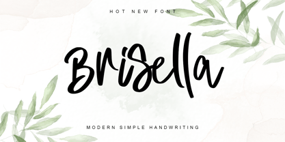 Brisella is a simple modern handwritten font with a wonderful choice of bold and elegant to choose from. Its natural and unique style makes it incredibly fitting to a large pool of designs. The only limit is your imagination! This font is PUA encoded which means you can access the available glyphs and ligature with ease!
 - ITC Migration Sans by ITC,
$29.99 Through his hands-on experience choosing fonts as a graphic designer, type newcomer André Simard developed a type family with a good measure of design sensibility. His ITC Migration™ Sans suite of fonts offers five readable weights that can be utilized across a variety of projects. Expect more to come from this designer-turned-typophile.
 - Penna by DSType,
$45.00 Penna is a calligraphic type system designed by Pedro Leal. Amidst the four available styles you get four different ascender and descender styles, two different styles of starting and ending swashes, a plethora of ligatures and several other features. Choose between regular, swashes, unconnected and connected versions or mix them all up for a deeper calligraphic feeling.
 - Budhayanti by madeDeduk,
$14.00 Budhayanti is a duo with both a script and sans-serif. This font perfect for poster design, book covers, merchandise, fashion campaigns, newsletters, branding, advertising, magazines, greeting cards, album covers, and quote designs and more. If you need anything else just shoot me an email at: dedukvic@gmail.com Find more previews on my Instagram here : https://www.instagram.com/acekelgondolayu/
 - Kingkey by TypeClassHeroes,
$17.00 Kingkey and Kingkey Neue is a serif family comes with Classic and Modern. It's clean and smooth with 9 variable much ligature inside. Suitable to create any branding, product packaging, invitation, quotes, t-shirt, label, poster, logo etc. Feature Uppercase & Lowercase Number & Symbol International Glyphs Multilingual support Alternative Ligature If you need anything else just shoot me message.
 - Viking Initials by Wiescher Design,
$19.50 Viking Initials are pure brute-force blackletter initials of the time just before the Nazis started to rule, somehow these initials are typical for that period. I made one alphabeth-set with rough edges on the uppercase keys and a second set with sharp edges on the lowercase keys. For you to choose. Your historical designer Gert Wiescher
 - Pasta Script by Just in Type,
$25.00 The Pasta Script Family is a delicious script typeface inspired by the Italian spaghetti movement. For display use on every kind of support, choose between Spaghetti or Spaghettini according to the size of your text, and if Fettucine is your choice – get pleased by it’s generous curves. The Cuccina Dingbats are free to use on any kind of work =)
 - Raque by madeDeduk,
$15.00 Introducing Raque is a Capital Modern Serif, use this font for any branding, product packaging, invitation, quotes, t-shirt, label, poster, logo etc. Feature Uppercase & Lowercase Number & Symbol International Glyphs Multilingual support Alternative Ligature Shoot me on email at: dedukvic@gmail.com and find more previews on my Instagram here : https://www.instagram.com/acekelgondolayu/?hl=en Hope you enjoy it.
 - Amerta by Eotype,
$9.00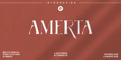 Amerta is a versatile, modern and unique serif font. Designed by Eotype Studio, It has a unique style with stylistic, alternates, ligatures and supports multilingual languages. Create unique & beautiful logotype, use it as an elegant solution for your next magazine layout, or choose Amerta for any graphics that require a bold look with a elegant flair.