10,000 search results
(0.121 seconds)
- Schiller Antiqua by Red Rooster Collection,
$45.00 Based on Hispalis from the Spanish foundry, Nacional.
 - rr - Personal use only

- Chiller by ITC,
$40.99Chiller is the work of British designer Andrew Smith, a chaotic, reckless fun font. Although the ink blots and stray strokes might look undisciplined, the forms of this typeface were carefully planned and it is surprisingly legible even in small point sizes. Chiller is equipped with a number of alternate characters as well as illustrations and almost guarantees eye-catching graphics. - Extra Old by Mans Greback,
$59.00 Extra Old is a vintage serif typeface. With heavy strokes and miniscule serifs, this classic font family is the perfect lettering for a headline to emit genuine quality. Why not use Extra Old for a traditional logo or balanced product label. Created with pride and care, this type has the optimal appearance of a classic vintage logo but for a modern setting. The font family consists of Regular and Italic, as well as Bold and Bold Italic. Also included are the font styles Coaster and Floria Corner, two typefaces for beautiful decorative elements, combining with the lettering. The font is built with advanced OpenType functionality and has a guaranteed top-notch quality, containing stylistic and contextual alternates, ligatures and more features; all to give you full control and customizability. It has extensive lingual support, covering all Latin-based languages, from Northern Europe to South Africa, from America to South-East Asia. It contains all characters and symbols you'll ever need, including all punctuation and numbers.
 - Ashby Extra Bold - Unknown license

- Anahita Extra Bold by Naghi Naghachian,
$95.00 Anahita ExtraBold is designed by Naghi Naghashian. This Headline Font is developed on the basis of specific research and analysis on Arabic characters and definition of their structure. This innovation is a contribution to modernisation of Arabic typography, gives the font design of Arabic letters real typographic arrangement and provides more typographic flexibility. This step was necessary after more than two hundred years of relative stagnation in Arabic font design. Anahita supports Arabic, Persian, and Urdu. It also includes proportional and tabular numerals for the supported languages. Anahita Font is available in ExtraBold. This font is designed to be used as advertising and newspaper headlines. Anahita design fulfills the following needs: A Explicitly crafted for use in electronic media fulfills the demands of electronic communication. Anahita is not based on any pre-digital typefaces. It is not a revival. Rather, its forms were created with today's technology in mind. B Suitability for multiple applications. Gives the widest potential acceptability. C Extreme legibility not only in small sizes, but also when the type is filtered or skewed, e.g., in Photoshop or Illustrator. Anahita's simplified forms may be artificial obliqued in InDesign or Illustrator, without any loss in quality for the effected text. D An attractive typographic image. Anahita was developed for multiple languages and writing conventions. E The highest degree of geometric clarity and the necessary amount of calligraphic references. This typeface offers a fine balance between calligraphic tradition and the contemporary sans serif aesthetic now common in Latin typography.
 - Sainted Extra Bold by Wooden Type Fonts,
$15.00 Extra Bold Serif
 - Stymie Extra Bold by Wooden Type Fonts,
$15.00 Extra Bold serif, ideal for large display.
 - Avesta Extra Bold by Naghi Naghachian,
$95.00 Avesta ExtraBoldCondensed is designed by Naghi Naghashian. This Headline Font is developed on the basis of specific research and analysis on Arabic characters and definition of their structure. This innovation is a contribution to modernisation of Arabic typography, gives the font design of Arabic letters real typographic arrangement and provides more typographic flexibility. This step was necessary after more than two hundred years of relative stagnation in Arabic font design. Avesta supports Arabic, Persian, and Urdu. It also includes proportional and tabular numerals for the supported languages. Avesta Font is available in ExtraBoldCondensed. This font is designed to be used as advertising and newspaper headlines. Avesta design fulfills the following needs: A Explicitly crafted for use in electronic media fulfills the demands of electronic communication. Avesta is not based on any pre-digital typefaces. It is not a revival. Rather, its forms were created with today’s technology in mind. B Suitability for multiple applications. Gives the widest potential acceptability. C Extreme legibility not only in small sizes, but also when the type is filtered or skewed, e.g., in Photoshop or Illustrator. Avesta's simplified forms may be artificial obliqued in InDesign or Illustrator, without any loss in quality for the effected text. D An attractive typographic image. Avesta was developed for multiple languages and writing conventions. E The highest degree of geometric clarity and the necessary amount of calligraphic references. This typeface offers a fine balance between calligraphic tradition and the contemporary sans serif aesthetic now common in Latin typography.
 - Antique Wells Extra by Wooden Type Fonts,
$15.00A revival of one of the popular wooden type fonts of the 19th century, extra bold, slab Antique. - Schindler by Red Rooster Collection,
$45.00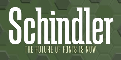 An original design.
 - Chillerz by Hanoded,
$15.00 I was doodling away on a piece of paper, when I noticed that the weird letters I was producing were in fact a nice font. So, I decided to build it! Chillerz is a lovely, messy handmade script font. It comes with double letter ligatures, a healthy attitude and a relaxed fit.
 - Extra Extra by Comicraft,
$19.00 EXCLUSIVE! Read all about it! The latest scoop from Comicraft is sure to be in all the newspapers today! The Times are a changin' -- comic book letterers everywhere can say a font farewell to typesetting the front pages of Planets and Bugles in Helvetica, Verdana or Gill Sans! Superhero's Pal, Johnny "Roshell" Olsen, was up all night writing copy for the late-night edition, making sure that your newspaper headlines and copy have a warm, pen lettered look... some might say a Rosen-glow! Put a little Extra Extra in your bylines and maybe there's a Pulitzer and an Eisner in your future! Not ready to purchase? Get ExtraExtra Engraved free with any purchase, or by subscribing to our newsletter at the bottom of this page. Features Seven fonts (Regular, Italic, Bold, Bold Italic, Heavy, Heavy Italic & Engraved) with upper and lower case alphabets.
 - Archive Antiqua Extra Condensed by Archive Type,
$19.95Extra condensed display typeface. - Burning Chiller by Letterhend,
$17.00 Introducing Burning Chiller, a playful typeface that captures the essence of the 90s era. Immerse yourself in its retro charm. Features : Uppercase & lowercase Numbers and punctuation Alternates & Ligatures Multilingual PUA encoded
 - Siller by Twinletter,
$14.00 Siller is a playful display typeface that is appropriate for a range of game applications. It is created in a relaxed, fun, and beautiful manner. This typeface is appropriate for both official and informal projects, and it is appropriate for all designs for children and adults. This typeface is appropriate for a broad range of creative applications, including game covers, titles, book covers, outdoor events, posters, banners, promotional materials, movie titles, YouTube covers and thumbnails, children’s games, cartoon projects, title, and text. . What are you waiting for? Go ahead and use this font in your amazing creations right now!
 - AuX DotBitC Xtra Bold - Unknown license

- Lightly Sailler by Zamjump,
$17.00 Lightly sailler is a beautiful new serif font that's created to complement a classic style for your project needs to be more perfect. Classic curves and sharp serifs make the Lightly sailler Serif feel elegant and nostalgic, at the same time, while still leaving enough simplicity to use for both headings and body types. It is also equipped with four special ligatures (ct, st, it, ck, sl, el, et, the, and end) as well as alternate features either capital or lowercase with a little tail that bumps the letters after which is a combination idea to give a more elegant impression. provides extra flair and body text legibility. Test the Lightly sailler in the box above to see how it works for your next project! Lightly sailler Includes: Uppercase & lowercase letters Numbers & Punctuation Ability Foreign language Ligature Alternate
 - Richis Stiller by Hanzel Space,
$25.00 Hello, introduce our font "Richis Stiller" this font has a playful nuance so it looks more cheerful and friendly. Fonts that have a slightly irregular shape to display a unique impression on the character of the font. And it is very suitable for use as book titles, product names, packaging, posters and so on. Features: Uppercase Numerals & Punctuation Alternates & Ligatures Multilanguage Supports To access the alternate glyphs, you need a program that supports OpenType features such as Adobe Illustrator CS and Adobe Indesign.
 - Antigua by Corradine Fonts,
$19.95 - Antiqva by Ultramarin,
$40.00 An alphabet based on classic Roman letterforms. As a model for our typography since ancient times, Roman stone inscription remains the starting point for all Latin letterforms. Working with these classical letters is an eternal dance for the graphic artist. The constant drawing and refinement of detail. A typographical relationship for ever.
 - Bolded by We Make Font,
$16.00 Bolded is a new complete type family, designed and developed by creative professionals. Contains geometric and rounded features, optimized for both long texts and small screens and texts. The complete family offers seven weights divided between the basic, italic, condensed and condensed italic family. Created in 2022, Bolded has a modern and functional look, designed for the most diverse uses and projects. Bolded is a geometric rounded family that can meet the needs of the most varied professionals looking for a clean and elegant font family with a wide set of Latin characters.
 - Bolde by Figuree Studio,
$18.00 Bolde is a powerful sans serif font family with modern touches. A balance of hard lines and smooth curves makes them able to stand on their own dynamically Features: five all caps font, Numbers & Punctuation / Extensive Language Support Bolde works great in any branding, logos, magazines, film. The different styles give you the full range to explore a whole host of applications. Thanks for having a peek at Bolde. As always, if you have any questions just send me a message!
 - Megaton Extras - 100% free

- Extra virgin - Unknown license

- Megaton Extras - 100% free

- Devroye Extra - Unknown license

- Zapfino Extra by Linotype,
$103.99 Today's digital font technology has allowed renowned font designer and calligrapher Hermann Zapf to realize a dream he first had more than fifty years ago: to create a typeface that would come very close to the freedom and liveliness of beautiful handwriting. The basic Zapfino font family, released in 1998, consists of four alphabets with many additional stylistic alternates that can be freely mixed together to emulate the variations in handwritten text. In 2003, Zapf completed Zapfino Extra, a large expansion of the Zapfino family. Designed in collaboration with Akira Kobayashi, Zapfino Extra has a cornucopia of new characters. It includes exuberant hyper-flourishes, elegant small caps, dozens of ornaments, more alternates and ligatures, index characters, and a very useful "forte" (bold) version. Use Zapfino to produce unusual and graceful advertisements, packaging, and invitations. Featured in: Best Fonts for Logos, Best Fonts for Tattoos
 - Extra C by Tipastype,
$28.00 It is an Extra Condensed, Extra Light, Extra experimental and Extra display font. Extra C is a fun font that doesn't take itself too seriously. Ideal for those who need a font with great character and personality but at the same time a delicate touch in their graphic pieces. EXTRA C has 4 static weights in addition to a variable version.
 - FF Extra by FontFont,
$41.99 American type designer Paul H. Neville created this display FontFont in 1995. The family contains 2 weights: Condensed and Black and is ideally suited for editorial and publishing and poster and billboards. FF Extra provides advanced typographical support with features such as ligatures. It comes with proportional lining figures.
 - Extra Crunchy by Bogstav,
$18.00 Extra Crunchy is my handwriting when I am eating cookies while drawing! No, it's true! I did eat a whole box of cookies while drawing this font! :) The letters are a bit jumpy, and have no steady x-height, however, your text may look a bit off, but it is clear and legible. Fits perfect for a children's book, a postcard/poster design or something else that needs that extra crunch :)
 - Exelancer Extra by Popskraft,
$9.00 Introducing the cutting-edge Excelancer Extra font, a modern masterpiece born from the rich heritage of classic sci-fi typography. Our inspiration? The boundless allure of outer space. And bestseller — the Excelancer font! https://www.myfonts.com/collections/exelancer-font-popskraft Excelancer Extra font is a harmonious blend of sleek, contemporary design, drawing from the timeless elegance of its predecessor. What sets Excelancer Extra apart is its captivating fusion of bold, ornate uppercase characters with meticulously crafted lowercase letters that maintain exceptional readability, even in extensive text. With Excelancer, you possess an all-encompassing font toolkit, designed to tackle every facet of forward-looking design. But that's not all. This font isn't just for intergalactic tales; it's also a striking choice for anything related to technology, innovation, progress, and even the world of sports. In essence, Excelancer embodies the pure essence of the future—an infusion of dynamism that knows no bounds!
 - Extra MF by Masterfont,
$59.00 Geometric forms make this elegant font a great choise for invitations and signs, indoor and outdoor.
 - Antiques by Fantasy Inspirations,
$9.75With my dingbats and your favorite software, you can create elegant web graphics in minutes! All these fonts were created with the web designer in mind. Each font consists on 26 original shapes with endless possibilities: virtual jewelry, buttons, framing, interfaces, etc. For examples of what you can do with these fonts: Click Now! - Antique by Storm Type Foundry,
$26.00The concept of the Baroque Roman type face is something which is remote from us. Ungrateful theorists gave Baroque type faces the ill-sounding attribute "Transitional", as if the Baroque Roman type face wilfully diverted from the tradition and at the same time did not manage to mature. This "transition" was originally meant as an intermediate stage between the Aldine/Garamond Roman face of the Renaissance, and its modern counterpart, as represented by Bodoni or Didot. Otherwise there was also a "transition" from a slanted axis of the shadow to a perpendicular one. What a petty detail led to the pejorative designation of Baroque type faces! If a bookseller were to tell his customers that they are about to choose a book which is set in some sort of transitional type face, he would probably go bust. After all, a reader, for his money, would not put up with some typographical experimentation. He wants to read a book without losing his eyesight while doing so. Nevertheless, it was Baroque typography which gave the world the most legible type faces. In those days the craft of punch-cutting was gradually separating itself from that of book-printing, but also from publishing and bookselling. Previously all these activities could be performed by a single person. The punch-cutter, who at that time was already fully occupied with the production of letters, achieved better results than he would have achieved if his creative talents were to be diffused in a printing office or a bookseller's shop. Thus it was possible that for example the printer John Baskerville did not cut a single letter in his entire lifetime, for he used the services of the accomplished punch-cutter John Handy. It became the custom that one type founder supplied type to multiple printing offices, so that the same type faces appeared in various parts of the world. The type face was losing its national character. In the Renaissance period it is still quite easy to distinguish for example a French Roman type face from a Venetian one; in the Baroque period this could be achieved only with great difficulties. Imagination and variety of shapes, which so far have been reserved only to the fine arts, now come into play. Thanks to technological progress, book printers are now able to reproduce hairstrokes and imitate calligraphic type faces. Scripts and elaborate ornaments are no longer the privilege of copper-engravers. Also the appearance of the basic, body design is slowly undergoing a change. The Renaissance canonical stiffness is now replaced with colour and contrast. The page of the book is suddenly darker, its lay-out more varied and its lines more compact. For Baroque type designers made a simple, yet ingenious discovery - they enlarged the x-height and reduced the ascenders to the cap-height. The type face thus became seemingly larger, and hence more legible, but at the same time more economical in composition; the type area was increasing to the detriment of the margins. Paper was expensive, and the aim of all the publishers was, therefore, to sell as many ideas in as small a book block as possible. A narrowed, bold majuscule, designed for use on the title page, appeared for the first time in the Late Baroque period. Also the title page was laid out with the highest possible economy. It comprised as a rule the brief contents of the book and the address of the bookseller, i.e. roughly that which is now placed on the flaps and in the imprint lines. Bold upper-case letters in the first line dramatically give way to the more subtle italics, the third line is highlighted with vermilion; a few words set in lower-case letters are scattered in-between, and then vermilion appears again. Somewhere in the middle there is an ornament, a monogram or an engraving as a kind of climax of the drama, while at the foot of the title-page all this din is quietened by a line with the name of the printer and the year expressed in Roman numerals, set in 8-point body size. Every Baroque title-page could well pass muster as a striking poster. The pride of every book printer was the publication of a type specimen book - a typographical manual. Among these manuals the one published by Fournier stands out - also as regards the selection of the texts for the specimen type matter. It reveals the scope of knowledge and education of the master typographers of that period. The same Fournier established a system of typographical measurement which, revised by Didot, is still used today. Baskerville introduced the smoothing of paper by a hot steel roller, in order that he could print astonishingly sharp letters, etc. ... In other words - Baroque typography deserves anything else but the attribute "transitional". In the first half of the 18th century, besides persons whose names are prominent and well-known up to the present, as was Caslon, there were many type founders who did not manage to publish their manuals or forgot to become famous in some other way. They often imitated the type faces of their more experienced contemporaries, but many of them arrived at a quite strange, even weird originality, which ran completely outside the mainstream of typographical art. The prints from which we have drawn inspiration for these six digital designs come from Paris, Vienna and Prague, from the period around 1750. The transcription of letters in their intact form is our firm principle. Does it mean, therefore, that the task of the digital restorer is to copy meticulously the outline of the letter with all inadequacies of the particular imprint? No. The type face should not to evoke the rustic atmosphere of letterpress after printing, but to analyze the appearance of the punches before they are imprinted. It is also necessary to take account of the size of the type face and to avoid excessive enlargement or reduction. Let us keep in mind that every size requires its own design. The longer we work on the computer where a change in size is child's play, the more we are convinced that the appearance of a letter is tied to its proportions, and therefore, to a fixed size. We are also aware of the fact that the computer is a straightjacket of the type face and that the dictate of mathematical vectors effectively kills any hint of naturalness. That is why we strive to preserve in these six alphabets the numerous anomalies to which later no type designer ever returned due to their obvious eccentricity. Please accept this PostScript study as an attempt (possibly futile, possibly inspirational) to brush up the warm magic of Baroque prints. Hopefully it will give pleasure in today's modern type designer's nihilism. - Xtra - Unknown license

- Chantelli Antiqua - Unknown license

- Senats-Antiqua - 100% free

- Bodoni Antiqua by URW Type Foundry,
$89.99
- Madison Antiqua by Linotype,
$29.99Madison Antiqua was original released as a metal typeface for hand-setting in 1965. The letters were produced by D. Stempel AG in Frankfurt, Germany. Their design was based heavily on an earlier German typeface named Amts-Antiqua, which had also been produced by Stempel. Amts-Antiqua is credited to Henrich Hoffmeister, and he developed it between 1909 and 1919. Madison Antiqua is an excellent selection for body text in magazines and newspapers. The typeface features a characteristic x-height, and attention-grabbing serifs. For a time, Madison Antiqua was associated with advertising design, because of its namesake: Madison Avenue in New York. Madison Avenue is a global center of advertising excellence.


Page 1 of 250Next page