10,000 search results
(0.019 seconds)
- LLT Good Vibes by Latam Type Foundry,
$10.00 A good typography created with love for you, can be used in logos, posters, postcards, graphic arts in general. Good vibes is created from a brush stroke from there its effect finished brush type. Good vibes for you. Thank you! Good Vibes includes several extras to speed up your creative process by opening the glyphs in any vectorization program, Adobe Illustrator, Freehand, Corel Draw and others.
 - Art Museum JNL by Jeff Levine,
$29.00 Art Museum JNL is yet another take on the classic Art Deco "solid letter" fonts that emulate the style of Futura Black. This version comes to you through the courtesy of a vintage WPA (Works Progress Administration) poster promoting national parks and Winter sports. Take note of the unusual inverted middle crossbar on the 'E' and 'F' as inspired by the poster's hand lettering.
 - Visual Arts JNL by Jeff Levine,
$29.00 Visual Arts JNL is a classic Art Deco typeface based on the hand lettering found on a 1930s-era WPA (Works Progress Administration) poster for Women Artists. The exhibit took place in the Federal Art Gallery in Boston, and was part of the arts project underwritten by the WPA to keep many creative people working during the Depression years.
 - Salt & Spices Pro by Fontforecast,
$29.00 Salt&Spices Pro is a welcome addition to the ever popular modern calligraphy genre. Digitizing the many handwritten samples into a fully functional connected script was done with great precision, carefully guarding the authentic look and feel of vintage dip pen calligraphy. Salt&Spices Pro is a very versatile 9 font family, consisting of 3 casual styles: Regular, Bold and Shadow. With 587 glyphs each, they offer great flexibility in customizing words and phrases to suit your personal taste. For instance: the appearance of initial and terminal letters can be customized using the glyph pallet. Contextual alternates, Swashes and Stylistic sets give you the ability to replace spaces by 3 alternate connecting spaces or add swashes to initial/terminal letters. Double letter ligatures help sustain the natural flow of handwriting. In addition to the 3 calligraphic family members 3 SmallCaps Sans styles and 3 SmallCaps Serif styles were added. They all have 435 glyphs and match very well because they were designed using the same vintage nib. Each of the styles can add great variation to your designs and they supplement and support each other perfectly. Add exceptional language support to all that and you have the perfect ingredient to spice up even the most demanding design project.
 - All Over Again by Hanoded,
$20.00 All Over Again is a messy, scratchy script that looks like someone wrote a lengthy letter, realized he had screwed up and had to start all over again.
 - Martial Arts JNL by Jeff Levine,
$29.00 The 1946 foreign publication entitled "100 Alphabets Publicitaires" ("100 Advertising Alphabets") collects a number of interesting and attractive lettering samples for design inspiration. One such example is Asian-inspired and was re-drawn as the digital type face now named Martial Arts JNL.
 - Art Nouveau Ornaments by Gerald Gallo,
$20.00 Art Nouveau Ornaments was inspired by designs from historic sources drawn in the Art Nouveau style. There is an assortment of 47 ornaments located under the character set keys.
 - Shes All That by Typadelic,
$19.00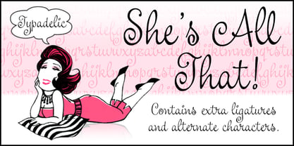
- All Pro JNL by Jeff Levine,
$29.00All Pro JNL is a sports font embellished with stars and stripes and is perfect for team banners, sportswear and sports-oriented ads. The font contains alphabet, numerals and the most basic of punctuation with very little kerning. - Art Techno JNL by Jeff Levine,
$29.00 The simple song title "May I", found on the sheet music from the 1934 Bing Crosby-Carole Lombard film "We're Not Dressing" was hand lettered in a blocky, ultra-bold Art Deco design that foreshadowed the techno look of the 1970s and 1980s. This became the basis for Art Techno JNL.
 - Art Class JNL by Jeff Levine,
$29.00 Art Class JNL was re-created from the titling of a lettering booklet called "Drawlet Portfolio", published by the Esterbrook Pen Company in the 1930s. Drawlet pens were Esterbrook's answer to the popular Speedball lettering pens, and the booklet was an instructional manual on hand lettering with the pen nibs.
 - Art Deco Arabic by Naghi Naghachian,
$102.00 Art Deco Arabic is a sans-serif Headline font. Designed by Naghi Naghashian as a sigle weight. Art Deco Arabic is reminiscence of Art Deco style, at the beginning of 20th century. The Latin part is a new design inspired from Art Deco style. It is extremely legible even in very small size. This font is a contribution to modernisation the Arabic typography, gives the font design of Arabic letters real typographic arrangement und provides more typographic flexibility. Art Deco Arabic supports Arabic, Persian ( Farsi ), Urdu and Latin.It also includes proportional and tabular numerals for the supported languages. Art Deco Arabic design fulfills the following needs: A Explicitly crafted for use in electronic media fulfils the demands of electronic communication. B Suitability for multiple applications. Gives the widest potential acceptability. C Extreme legibility not only in small sizes, but also when the type is filtered or skewed, e.g., in Photoshop, InDesgine or Illustrator. ArtDecoArabic’s simplified forms may be artificial obliqued in InDesign or Illustrator, without any loss in quality for the effected text. D An attractive typographic image. Art Deco Arabic was developed for multiple languages and writing conventions. Art Deco Arabic supports Arabic, Persian,Urdu and Latin. It also includes proportional and tabular numerals for the supported languages. E The highest degree of calligraphic grace and the clarity of geometric typography.
 - Art Magazine JNL by Jeff Levine,
$29.00 A 1920 art magazine from Great Britain entitled “Pan” had its three letter name hand lettered on the cover in a style that had elements of Art Nouveau, Art Deco and what would eventually be called Techno in the 1980s. This inspired the typeface Art Magazine JNL, which is available in both regular and oblique versions.
 - Arts District JNL by Jeff Levine,
$29.00 Although the model for Arts District JNL was a set of wood type, the design influence is clearly from the Art Nouveau era. Note the combination of unusual flat and curved sides on many letters. Decorative, yet legible; Arts District JNL works well with any period piece or as a pleasant alternative to traditional headline fonts.
 - Art Nouveau Flowers by Gerald Gallo,
$20.00 Art Nouveau Flowers was inspired by flowers from historic sources drawn in the Art Nouveau style. There is an assortment of 47 flowers located under the character set keys.
 - P22 Art Nouveau by P22 Type Foundry,
$24.95 The Art Nouveau styles of the late 19th century exhibited a bold approach to organic lines and lavish decoration. This new style was spread throughout the world and helped usher in a new era that led to modern art and design.
 - Performing Arts JNL by Jeff Levine,
$29.00 The sheet music for "I Used to be Color Blind" (from the 1938 Fred Astaire-Ginger Rogers movie "Carefree") had its title crafted in ornate Art Deco hand lettering. Keeping the original letter forms, the interior embellishment was simplified to a dot-and-line pattern [eliminating a secondary squiggly line] for a cleaner look. The type design is now digitally available as Performing Arts JNL, in both regular and oblique versions. For those who prefer no ornamentation, there are also regular and oblique versions in solid form.
 - P22 Art Deco by P22 Type Foundry,
$24.95 Art Deco turned mundane objects into graceful, sensual works of art, with a nod towards the opulent and extreme. Art Deco sought to build upon the elements of Modern Art movements by focusing on the principal object and removing the extraneous elements found in the Victorian era and in Art Nouveau. The concept of "form following function" and the technological advances of the early 20th century played a very important role in defining the direction of Art Deco. Popular images included stylized people, svelte animals, tall buildings, sleek vehicles and exotic scenes. Art Deco typographic designers were also inspired by these diverse themes. P22's Art Deco font set shows the influence of a cross section of some of the various European and American Art Deco styles.
 - P22 Pop Art by P22 Type Foundry,
$24.95 This font set was developed for the Albright-Knox Art Gallery and is inspired by their collection of Pop Art. Artists such as Warhol, Lichtenstein, and Rauchenberg sought to blur the lines between high and low art as well as the boundaries between art and everyday life. The alphabets and extras in this set reflect that spirit.
 - All for you by HOHOHtype,
$28.00 ‘Allforyou’ is an elegant serif type family. The family has 3 different weights. It was designed to have the flexibility of italics in the form of serifs. It has a feminine and elegant feeling due to its smooth curves. It was designed with applications such as advertising and packaging, editorial and publishing, logo, branding and creative industries, poster and social media, and marketing in mind.
 - Movie Arts JNL by Jeff Levine,
$29.00 In the June 18, 1929 issue of “The Film Daily”, the curvy and casual hand lettering found within the ad for the movie “Such Men are Dangerous” belies that this was actually a pre-code drama. Digitally redrawn as Movie Arts JNL, it is available in both regular and oblique versions.
 - All Is Quiet by Kitchen Table Type Foundry,
$15.00 The year 2022 went and 2023 came. I can honestly say that last year was a horrible year and I am happy it ended a couple of days ago. The first week after New Year’s Eve always fills my head with the U2 song ‘New Year’s Day’ - so I named this font after a line from the lyrics. I also happened to watch a fantastic movie called ‘Im Westen Nights Neues’, directed by Edward Berger, but based on a book by Erich Maria Remarque, which, in English, was published as ‘All Quiet On The Western Front’. So there you have it: naming a font in 2 easy steps! ;-) All Is Quiet is a lovely brush font, which I created using my father in law’s Chinese pencil and ink. I can suggest some uses here, but I am convinced you can come up with that yourself.
 - Art Nouveau SCF by Scholtz Fonts,
$21.00 The Art Nouveau styles of the the turn of the 20th century (1890 - 1905) exhibited a bold approach to organic lines and lavish decoration. This new style was spread throughout the world and helped usher in a new era that led to modern art and design. Art Nouveau SCF is strongly influenced by the style of decoration and typography created by Rennie Mackintosh as well as the Art Nouveau movement in general (with particular reference to Gustave Klimt and Alphonse Mucha). However, it differs from much of the art nouveau typography in that it largely avoids the use of straight lines in its letter forms. It is a decorative, romantic font and its subtly curved bolder lines contrast with delicate tracery to create an intricate pattern of organic flowing shapes. Use Art Nouveau SCF for: -- posters -- wedding invitations -- advertising material for clothing and beauty products -- Music CD covers and advertising media -- Film advertising media
 - Cover Art JNL by Jeff Levine,
$29.00 Cover Art JNL was inspired by the hand-lettered sans serif title of an Art Deco era Portuguese magazine called Ilustraçáo. The mix of conventional and non-conventional letter forms made it a perfect candidate to turn into a digital font.
 - Art Materials JNL by Jeff Levine,
$29.00 The cover of the 1930s-era “Catalog of Artists’ Materials” from Ernst H. Friedrichs, Inc. (New York) has the words “Artists’ Materials” hand lettered in a stylized Art Deco sans serif type style. This unique design is now the digital font Art Materials JNL, which is available in both regular and oblique versions.
 - Art Department JNL by Jeff Levine,
$29.00 Art Department JNL is a fun, casual serif typeface which fits perfectly with any number of visual projects. This is one of the many hand-lettered alphabets found in various Speedball® lettering textbooks that has been re-drawn digitally by Jeff Levine.
 - Modern Art NF by Nick's Fonts,
$10.00A font with a strong graphical appeal, based on the logotype lettering for the comic magazine of the same name, designed by Dutch illustrator Joost Swarte. Both versions of this font contain the Unicode 1252 Latin and Unicode 1250 Central European character sets, with localization for Romanian and Moldovan. - Folk Art Flowers by Gerald Gallo,
$20.00 Folk Art Flowers was inspired by the flowers used in many folk art designs. There is an assortment of 47 ornaments located under the character set keys.
 - Display Art Two by Gerald Gallo,
$20.00 Display Art Two is a display font inspired by the art nouveau fonts popular at the turn of the 20th century. It is not intended for text use. It was designed specifically for display, headline, logotype, branding, and similar applications. Display Art Two has an uppercase alphabet, numbers, and punctuation.
 - Industrial Arts JNL by Jeff Levine,
$29.00 In 1935, Morris Fuller Benton designed Phenix American for American Type Founders. For 2017, the classic Art Deco design has been reinterpreted in an all-caps display version with an ever-so-slight "hand made" feel. Industrial Arts JNL is available in both regular and oblique versions.
 - Display Art Three by Gerald Gallo,
$20.00 Display Art Three is a display font inspired by the art nouveau fonts popular at the turn of the 20th century. It is not intended for text use. It was designed specifically for display, headline, logotype, branding, and similar applications. Display Art Three has an uppercase alphabet, numbers, and punctuation.
 - Secca Art Std by astype,
$36.00 Secca Art recovers some of the expressive forms of early art nouveau and art deco grotesques — not copying it, but carefully adapting it for today. Secca Art is based on the Secca typeface family and is full interchangeable. Both are equal in weights, widths and word spacing, so you can decide to give your layout a more expressive or serious look. If you need Italic styles just use the Italics from Secca .
 - Art Student JNL by Jeff Levine,
$29.00Art Student JNL is a limited character set font inspired by hand lettering found on the box for a learn-to-draw set from the 1950s. - Art Lover JNL by Jeff Levine,
$29.00While browsing through a Dan Solo type reference book, Jeff Levine fell in love with the multiline stylings of one particular typeface, then sat down and re-drew from scratch his own interpretation of the design. Jeff's version is called Art Lover JNL - offering kudos to art in general, the Art Deco movement and (of course) type design. - Ante Cf Serif by Creative17studio,
$8.00 Ante Cf serif is an modern and elegant serif font family. This font is still included in the Ante Cf Family, created with a modern and vintage feel A very versatile font in a variety of designs you want. It is also suitable to be paired with Script / Handwritten / Minimalist Sans Serif Fonts for your project. We recommend that you have all types of Ante Cf Family Fonts (Serif / Sans Serif) to make your project even more amazing with a large selection from this Ante Cf Font Family. With Ante Cf Serif which has a large selection of alternative letters and ligatures, combined with Ante Cf Sans Serif which has a lot of weight, makes all your design projects seem complete and perfect, whether it’s for tagline, branding, editorial, magazine titles, poster design, logotypes, wedding invitations and other creative design projects.
 - That’s All Folks by Comicraft,
$19.00 Run amuck and head on down to Toon Town with us to enjoy some Madcap Laffs with our latest Frolicking Font, 'THAT'S ALL FOLKS'. It's good, clean family fun for all your favorite comic cuts and looney'toons! What's more, it's (sing along) S-O-E, A-S-Y, T-O-U-S-E! Includes new Inline Regular and Bold weights, Western European accents, and Crossbar I Technology!
 - Alto Rey NF by Nick's Fonts,
$10.00 Originally issued by the Palmer and Rey Type Foundry of San Francisco in 1884, this typeface bore the name Octagon Condensed, and is as fresh today as it was way back when. Both versions of this font support the Latin 1252, Central European 1250, Turkish 1254 and Baltic 1257 codepages.
 - ABTS Feather Pen by Albatross,
$7.95
- Art Event JNL by Jeff Levine,
$29.00 A 1930s WPA (Works Progress Administration) poster advertising an exhibit of New Jersey area posters had its main lettering rendered in a very condensed hand lettered interpretation of the ever-popular Futura Black Art Deco style. This has now been re-drawn and digitized as Art Event JNL, in both regular and oblique versions.
 - Art Deco Neue by Mom,
$49.00 ArtDeco Neue was design to give a strong characteristic to the titles of the Portuguese Art Magazine. From classic sans fonts (usual used by artists and galleries) this font developed with the double geometric lines of Art Deco architecture creating a contemporary design. The final result of each word depends of the choices the designer makes for each glyph.