10,000 search results
(0.201 seconds)
- Amateur Lettering JNL by Jeff Levine,
$29.00 From a vintage textbook on "modern" lettering circa the 1930s or 1940s comes a simple chamfered sans with oddly irregular shapes. Amateur Lettering JNL is available in both regular and oblique versions.
 - Big River by Ana's Fonts,
$15.00 Big River is an elegant sans serif and handwritten font duo with lots of extras. It includes: - A wide sans serif font in three weights (with caps and small caps); - A handwritten font with a regular and slant version, and bonus swashes to give your designs a more natural look. Each font includes: - A-Z, a-z, 0-9, accents, punctuation and symbols - Contextual alternates (script) - Ligatures (script) This font duo makes it so easy to achieve beautiful and eye-catching designs, and is perfect for both short and longer texts. It can be used for making postcards and notes, creating logotypes, social media posts, branding and packaging, etc. Please note: No special software is needed in order to access the extras, as they are in a different font file. You can simply access them directly in your font bar (a-z for terminals in regular, A-Z for terminals in italic, and 0-1 for squiggles).
 - Unitext by Monotype,
$50.99 Created with the needs of branding design in mind, Jan Hendrik Weber's Unitext is a crisp, clean typeface that functions well across print and online use. It blends humanist and grotesque qualities, adopting a style that the designer describes as “neo grotesque”. Narrow spacing is what sets this typeface apart, however it also uses open counters and angled details to boost readability. “The ideal font should work at every touchpoint,” says Weber. “And designers shouldn’t need an introduction or a set of rules on how to handle this typeface. Unitext allows designers to work without explanation.” The Unitext family includes 7 weights, spread across 14 fonts with extensive Western, Central and Eastern European language support. Unitext Variables are font files which are featuring one axis and have 14 names instances: Hairline, Hairline Italic, Extralight, Extralight Italic, Light, Light Italic, Regular, Italic, Semibold, Semibold Italic, Bold, Bold Italic, Black, Black Italic
 - Brownhill Script by sizimon,
$20.00 Brownhill Script is hand written fonts set . Very cool for logos, name tag, handwritten quotes, product packaging, merchandise, social media & greeting cards. And very easy to make design t-shirts and other products. Very save time in making the design of a product. It contains a full set of lower & uppercase letters, a large range of punctuation, numerals, and multilingual support. What's Include : Brownhill Script Brownhill Script Swash 3 sets of lowercase letter 2 sets of uppercase letter Bonus Swash Multilingual support To access the alternate glyphs, you need a program that supports OpenType features such as Adobe Illustrator CS, Adobe Photoshop CC, Adobe Indesign and Corel Draw. If you have any question please do not hesitate to contact me. Thank You!
 - Missiva by DSType,
$20.00The first inspiration for Missiva was a sixteen century letter from S. Francisco Xavier (St. Francis Xavier) but then I adapted my own handwriting in order to have the basic character set. - Jojo by Canada Type,
$24.95 A little more flower and a little less power, please. Fun, friendly, fashionable, and feminine to a fault, Jojo takes display typography to a whole new level, where eyes can’t help but appreciate the day and the design at hand. It takes a graphic designer very little imagination to see these letters on posters, book covers, clothes, and craft paraphernalia. Or how about a sign over a bakery? A music sleeve? A romantic comedy titling? Cosmetics products? Pretty much anywhere! Jojo takes its name from a Beatles song about getting back to where we once belonged. It also takes most of its shapes from vintage photo-setting days, when an art nouveau typeface called Spring, by B. Jacquet, was putting happy times back where they belonged, which was everywhere. The original photo-setting face came in just 26 letters and 10 numerals. This digital retooling optimizes the original forms and expands on them, for a full character set of over 430 glyphs, including ligatures and stylistic alternates, and support for the majority of Latin languages.
 - Dime Store by Breauhare,
$35.00 Dime Store is a font inspired by childhood memories of dime stores in downtowns and shopping malls in the 1970s. The font was tweaked and digitized by Bob Alonso, who also digitized Breauhare’s Cooper Goodtime font. Dime Store is a cool, hip, nostalgic way of creating a decorative display, and at times it seems to have a slightly futuristic look, too.
 - Virus by Phat Phonts,
$20.00It began as a series of photographs of the rusty metal brand names on old tractors in a museum. When I scanned the photos and began to trace the letters, I found the rust and deterioration created a level of detail which gave my letters a psychotic anger which, as an art director in an advertising agency, I closely identified with. - Mamirolle by The Ampersand Forest,
$20.00 Sometimes a sans serif just needs a sister. Meet Mamirolle! A geometric wedge-serif companion to Mimolette! (OR is Mimolette the sans serif companion to Mamirolle.... hmmmmm....) Mamirolle, like her sister, is great for text and display alike—she's super-readable AND super-legible, and her different weights lend themselves to creating clear contrast in your textual hierarchy! And she's got some nifty features, too! Mamirolle has a two-story a and g in the upright versions, but if you want a one-story a and g, just turn on Stylistic Set 01! Her italic is a true italic, not just an oblique. Want more playful cursive alternatives in the italic? Activate Stylistic Set 02, and you've got them in the A, E, K, Q, R, and k. She's got true small caps in all styles! She's got true fractions in all styles, as well as oldstyle (small cap) and lining numerals, in both tabular and proportional widths. Best of all, perhaps, Mamirolle was made with love, as always, by yer pals in the Ampersand Forest.
 - Cocomat Pro by Zetafonts,
$39.00 Cocomat has been designed by Francesco Canovaro and Debora Manetti as a development of the Coco Gothic typeface system created by Cosimo Lorenzo Pancini. It shares with all the other subfamilies in the Coco Gothic system a geometric skeleton with open, more humanistic proportions, a sans serif design with slightly rounded corners and low contrast proportions, without optical compensation on the horizontal lines, resulting in a quasi-inverted contrast look in the boldest weights. What differentiates Cocomat from the other subfamilies in Coco Gothic are some slight design touches in the uppercase letters, with a vertical unbalancing reminiscent of art deco design, notably evident in uppercase "E", "A","F","P" and "R" - while lowercase letters have been given some optical compensation on the stems, like in "n","m", "p" and "q". These design choices, evoking the second and third decade of the last century (Cocomat is also referred as Coco 1920 in the Coco Gothic Family) all give Cocomat a slight vintage feeling, making it a perfect choice every time you need to add a period vibe or an historical flair to your design, like in food or luxury branding. The typeface, first published in 2014, has been completely redesigned by the original authors in 2019 as Cocomat PRO to include eight extra weights (thin, medium, black and heavy in both roman and italic form), extra open type features (including alternate forms, positional numerals), and extra glyphs making Cocomat cover over two hundred languages using latin, cyrillic and greek alphabets.
 - Rezerv by Gaslight,
$25.00 Reserv was inspired by a logo, which I crated for the company, EVROTERM. Once I saw this logo I asked myself: "Why not font based on this? In two or three weight?" For use in advertising and display typography.
 - Benjamin by Solotype,
$19.95Fonts without curved lines were quite popular in Victorian times. We drew this one back in the days of T-squares and triangles, and based it on a type that we felt could stand to be improved. (Arrogant, eh?) - GHEA Shooter by Edik Ghabuzyan,
$40.00 This UltraLight weight original Display font GHEA Shooter includes Basic Latin, Latin 1 Supplement, Latin extended A, Cyrillic + Bulgarian Cyrillic + Ukrainian Cyrillic, Armenian. May be used in titles, posters, labels, etc. The font looks very nice in large sizes.
 - Raj JY by JY&A,
$39.00JY Raj has had a lengthy gestation. The original one was a sans serif adaptation of a slab serif typeface design by Jure Stojan. Raj looked instantly better as a sans serif. After refining it further one lengthy night in 2001, he showed the drafts to Jack Yan, who completed the character sets and finished the kerning. A characterful sans serif, JY Raj pushes the boundaries of what is possible with various geometric shapes, combining legibility and tradition with sharp, unexpected angles. As with Stojan's earlier JY Koliba, it possesses a delightful balance, thanks to the designer's eye for detail and typographic harmony. The name has little to do with the Asian subcontinent: it translates to paradise in Stojan's mother tongue, Slovenian. - VVDS Fifties by Vintage Voyage Design Supply,
$15.00Fifties is a mix of classic geometric and a bit of humanistic grotesque. The goal was to create the font for present with look to the past. In other words, I tried to came back the Modernism aesthetics of XX century into nowadays. The result gives you 60 styles including Italic (Slanted). Your typography may be airy and elegant with Expanded Thin, catchy and expressive with Condensed Bold or dynamic and sharp with Expanded Bold Italic. You will find your way to use this family certainly. Theatre posters or party flyers, vintage t-shirt or modern web service, movie titles or magazine header and even infographic – Fifties will suit you everywhere. You may use the completed styles or may use a Variable Font. To make it as you want to. Weights: Thin / Light / Regular / Medium / Semi Bold / Bold. Widths: Condensed / SemiCondensed / Medium / SemiExpanded / Expanded OTF and Variable Font (TTF) OpenType features: Stylistic alternates for A, G, K, M, N, R, W, a, e, g, j, m, n, r, t, u, w, y; Fraction figures; Subscript and Superscript figures; Tabular figures; Typographic spaces: Em / En / Third / Quarter / Thin / Sixth / Hair - Lubaline by Lián Types,
$39.00 Who haven't heard the phrase that ‘any past time was better’?. Although I sometimes find this phrase a little too pessimistic (because I try to think that the best is yet to come), it may be true regarding my passion, typography. I'm too young (29) unfortunately, and this means I did not have the pleasure of being contemporary with maybe the man who has influenced my work the most (1). The man that showed that letters are more than just letters to be read. Herb Lubalin (1918-1981), also called sometimes as ‘the rule basher’ (2), smashed the taboos and sacred rules of type design and gave it personality. He rejected the functionalist philosophy of europeans in favor of an eclectic and exuberant style. To him, letters were not merely vessels of form, they were objects of meaning. (3). Nowadays, when looking at his portfolio, who dares to deny that the term ‘typography’ and ‘beauty’ may go hand-in-hand without any problem? Ed Benguiat, one of Herb’s partners, still likes making jokes with the phrase “screw legibility, type should be beautiful” and what I understand of this is not to forget the rules, but to know and break them carefully. In an era of pure eclecticism, we, the lovers of flourishes and swashes, can't do nothing but admire all the legacy that Lubalin, this wonderful type-guru, left. My font Lubaline read as “the line of Lubalin” is my humble tribute to him. Those who know his work, may see the influences easily like in his ‘Beards’ (1976) and ‘The Sound of Music’ (1965) posters; the art-deco forms in many of his amazing logos and practically in all his creations where letters seem to be alive just like you and me. I really hope that the future finds me still learning more and more about type-design and letterforms, and like him, always willing to make innovations in my field: Because letters are not just letters to be read. NOTES (1) These are some of my fonts in which some of Lubalin’s influences can be seen (in order of creation): Reina, Aire, Erotica, String, Beatle, Heroe, Selfie, Model, Seventies, and many others that are still in progress. (2) (3) Steven Heller. Herb Lubalin: Rule Basher. U&lc (1998) http://www.printmag.com/imprint/my-favorite-lubalin/
 - Sign Helpers JNL by Jeff Levine,
$29.00Sign Helpers JNL is a collection of silhouette images carefully redrawn from two distinct sources. Prior to their bankruptcy in 1984, the Holes-Webway Company of St. Cloud, MN produced thousands of their "Webway" sign kits that were utilized by merchants, libraries and schools throughout the country. At one point they included in their sales catalog a selection of die-cut images for embellishing sign work. In the late 50s and throughout the 60s, the Joseph Struhl Company (now known as Magic Master Industries) produced cling vinyl sign kits for business, and a home movie titling set for do-it-yourself film makers. This set also featured die-cut embellishments. A generous selection of designs from both kits have been faithfully re-drawn in digital form to pay tribute to two innovative companies. Other fonts based on products from these companies are Sign Kit JNL (Webway® Sign Kit), Cling Vinyl JNL, and Sign Maker JNL (Magic Master® Sign Kits). Trademarked names are used purely for reference purposes. - Ronnia by TypeTogether,
$45.00 One of the most remarkable characteristic of this humanistic sans serif is its versatility. Ronnia’s personality performs admirably in headlines, but is diffident enough for continuous text and small text alike. The heavier weights deliver very cohesive shapes, and they have been successfully used for branding and newspaper headlines. Its ten styles grant the designer a broad range of coherent color and texture variations in text blocks, necessary tools to solve complex information and editorial design problems. Ronnia has been mainly engineered for newspaper and magazine applications manifested in its properties: economic in use, highly legible, and approaching the reader with some friendliness and charm. Ronnia features about 800 characters per weight, including small caps, fractions, old style and lining numbers, scientific superior/inferior figures, and a set of symbols and arrows. It supports over 40 languages that use the Latin extended alphabet. Ronnia Basic is a reduced version of Ronnia. It is still an OT-font but without any particular features except of a set of ligatures, class-kerning and language support including CE and Baltic.
 - Kumba by AukimVisuel,
$9.00 Kumba is inspired by classic typography and brings its own unique style to any design project. This fantastic sans serif font is best suited for headlines of all sizes, as well as for blocks of text that have both maximum and minimum variations. Whether it’s for web, print, moving images or anything else – Kumba will look spectacular. It is a great sans serif font. Whether you’re looking for fonts for Instagram or calligraphy scripts for DIY projects, Kumba will turn any creative idea into a true piece of art!
 - Sedhayu by Kulokale,
$19.00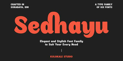 Sedhayu is a modern and bold sans serif font. It has a unique style and will give your design a friendly and expressive look. Sedhayu is perfect for many different projects such as logos and branding, invitation, stationery, wedding designs, social media posts, advertisements, product packaging, product designs, labels, photography, watermark, special events or anything. We hope you enjoy the font and have fun! Thank You.
 - Hallie by Gleb Guralnyk,
$14.00 Introducing a classic bold font Hallie. It's an elegant typeface with very high contrast shapes. Thin curly elements combined with bold base shapes brings vintage and modern impression at the same time. Hallie also has a lot of ligatures and swash symbols that helps to create an original lettering composition. It's perfect for labels and postcard design. Thank you and have a nice day!
 - Film Crew JNL by Jeff Levine,
$29.00It's not a new idea, but it's always a fun one... a typeface comprised of 35mm film frames. Film Crew JNL is Jeff Levine's version, utilizing his Koehler Sans JNL as the lettering inside the frames. The lesser and greater keys have solid black frames for end caps or word spacing, and there's an alternate pair of frames with clear centers on the brace keys. - Mechacore by takoliko,
$9.00 Mechacore is a variable modern sans serif display typeface designed by Takoliko Studio. It comes with regular and stencil style, it have 5 weights and expanded width. Its inspired by a mecha cyberpunk sub genre. the modern and unique characteristics makes it suitable for attention grabbing design projects such as a engineering, technology, cyber media, army stuff, headlines, posters, social media displays and editorials.
 - Seeking Brush by Java Pep,
$15.00 Introducing Fresh from the Oven, a casual handwritten brush font with a signature style called Seeking font. This font comes with ligature and swash, Seeking font is perfect for logotype, display text, headline, branding, advertising, social media posts, etc. Seeking font available for multilingual support that more than 25 languages. What's include Seeking font Seeking Swash PUA encoded Multilingual Support Thanks, and have a nice day
 - Saint Onki by Atom,
$10.00 Saint Onki is a natural brush font with 4 styles that will give a casual impression to your design. With stylistic sets and original handmade quality, your design will stand out more. You will get Saint Onki Regular Saint Onki Italic Saint Onki All Caps Saint Onki All Caps Bold Saint Onki Swash Hope you like it with this font. Have a great day and happy buying.
 - Bestorika by Mokatype Studio,
$19.00 Introducing Bestorika Beautiful Modern serif with contrast lines and balanced curves. This font may be conservative and classic, and also may be more playful and modern. A lot of stylish alternates will give you many useful variations for use. Try to play with compositions of curves / alternates letters basic. Like all of my fonts it is inspired by lettering from the good old past, but it still has a strong modern appearance. Its wide range of stylistic alternates allows versatile design options and works perfectly for headlines, logos, posters, packaging, coffee shops, restaurants, magazine's headers, signs or gift/post cards,cafe's and weddings. Try to use it in your beauty or travel blogs, you will see how many options you will have with stylish Bestorika. What's Included : Standard glyphs Ligatures Alternates Web Font International Accent Works on PC & Mac Simple installations Accessible in the Adobe Illustrator, Adobe Photoshop, Adobe InDesign, even work on Microsoft Word. PUA Encoded Characters - Fully accessible without additional design software. Fonts include multilingual support Image used : All photographs/pictures/vector used in the preview are not included, they are intended for illustration purpose only. Thank You
 - Boister Black Pro by CheapProFonts,
$10.00 I loved the look of this font so much that I couldn't resist reworking it - although it probably had the most basic character set I've ever used as a starting point. But here it is in its complete, professional, multilingual state. I hope this wonderful swashbuckling font now finds many new users and uses. Celebrate! ALL fonts from CheapProFonts have very extensive language support: They contain some unusual diacritic letters (some of which are contained in the Latin Extended-B Unicode block) supporting: Cornish, Filipino (Tagalog), Guarani, Luxembourgian, Malagasy, Romanian, Ulithian and Welsh. They also contain all glyphs in the Latin Extended-A Unicode block (which among others cover the Central European and Baltic areas) supporting: Afrikaans, Belarusian (Lacinka), Bosnian, Catalan, Chichewa, Croatian, Czech, Dutch, Esperanto, Greenlandic, Hungarian, Kashubian, Kurdish (Kurmanji), Latvian, Lithuanian, Maltese, Maori, Polish, Saami (Inari), Saami (North), Serbian (latin), Slovak(ian), Slovene, Sorbian (Lower), Sorbian (Upper), Turkish and Turkmen. And they of course contain all the usual "western" glyphs supporting: Albanian, Basque, Breton, Chamorro, Danish, Estonian, Faroese, Finnish, French, Frisian, Galican, German, Icelandic, Indonesian, Irish (Gaelic), Italian, Northern Sotho, Norwegian, Occitan, Portuguese, Rhaeto-Romance, Sami (Lule), Sami (South), Scots (Gaelic), Spanish, Swedish, Tswana, Walloon and Yapese.
 - Phitaya by Peterdraw,
$18.00 Let’s have fun with the sweet and fun handwritten font Phitaya that will brighten all your handy works. It is a suitable choice for children-themed work, book, logo, quote, greeting cards, quaint branding, and many more. It is also perfect for a stylish text overlay to any background image or semi-formal text. This font package consists of a full set of the alphabet from A to Z, uppercase and lowercase letters, numbering, and punctuation that available in OTF format only. For international use, Phitaya, a sweet handwritten font is supported for multilingual language so it will be a perfect match for fun and cheerful occasion. Phitaya is easy to download and uses a font that will complement your scribble works. Give a fresh and unique statement in every letter you make by using our brand-new font. Please contact our support team if you find any difficulties in purchasing, downloading, or using the font. You may also send us messages or questions regarding this or any other product of ours.
 - AM Bright by Angga Mahardika,
$16.00 Bright is a sans serif typefaace with classic touch. This font has alternate characters, ligatures and multi language support. Bright font is perfect for the classic design logo, branding or product packaging, signage and more other creative project. I really hope you enjoy using Bright Font, please don't hesitate to drop me a message if you have any question :) Thanks,
 - Midland Luxury by Areatype,
$15.00 Midland Luxury Sans serif is a very versatile font.perfect for magazine images, to wedding invitations, to branding, poster design, and more. Files included: Midland Luxury Family Midland Luxury Italic Family Numerals, Punctuation & Ligatures Thanks so much for looking, I really hope you enjoy it and please don't hesitate to drop me a message if you have any issues or queries :)
 - Lumiere Rosie by Kaligra.co,
$29.00 Introducing Lumiere Rosie – A Gorgeous modern sans serif with ton of stylistic alternates to choose. Its bold clean and simple. Works wonderfully on its own for logos, headlines, posters, packaging and many more! And with Three different weights to choose, your option to create more unique and versatile design is a lot wider. Have fun and create more. Your Imagination only your limit!
 - Chic Chalk by Kustomtype,
$25.00 Kustomtype’s “Chick Chalk” font is a sans serif font family with a regular & oblique version. It contains all upper & lower cases. The “Chick Chalk” family is coordinated into letterforms, metrics, and weights to work better together. Why still looking for old school types for your posters, advertising, text, design, artwork, headtext, editoral design, magazines, etc... ‘Chic Chalk is Perfectly Imperfect’
 - Progelud by Beary,
$13.00 Hello guys Proudly presents our font Progelud. Progelud is mazing sans-serif look attractive and natural! Every single letters have been carefully crafted to make your text looks beautiful. It has beautiful and well-balanced characters and as a result, it matches a wide pool of designs. Progelud is PUA encoded, which means you can access all of the glyphs!
 - HaruNami by PSY/OPS,
$32.00 HaruNami (“spring wave”) fuses Japanese ornamentation with the Roman alphabet. All the motifs in the typeface are based on traditional Japanese wave ornamentation. HaruNami has a unique stylistic system that ranges from Simple to Ornate. The Simple font is a purely functional sanserif that is ready to use as text type. The three other styles, Decorative, Embellished and Ornate, progressively apply the wave ornamentation to the capital letters. HaruNami Complete ships as a unified OpenType font, and as a set of individual fonts. If you're using an application that supports OpenType features, we recommend using the Unified font. The three decorated styles will be accessible as feature sets. Otherwise, you can install the individual fonts and use them in any application. (It is also all right to install the Unified and individual fonts simultaneously.)
 - Farao by Storm Type Foundry,
$21.00Originally designed in 1998 as a 3-font family, updated in 2016 by new italics, small caps and many OpenType functions, resulting in a set of highly visible poster typefaces. If a text is set in a good Egyptienne, we can observe a kind of sparkle in the lines. Slab-serifs are cheerful typefaces, possibly due to the fact that they developed simultaneously with Grotesque typefaces. The design principle originating from the first half of the 19th century does not have such firm and long-established roots as for example, the Venetian Roman typefaces, hence it’s much more prone to a “decline”. We know of Egyptiennes with uneven color, with letters falling backwards (this often happens in the case of “S”), and especially with slightly bizarre modeling of details. In the course of time, however, it was realized that such things could be quite pleasant and tempting. After a century and a half, we find that such Egyptiennes could refresh uniform computer typography. The forms of many twisted letters resemble the gestures of a juggler: others, rectangularly static ones, reflect the profile of a rail or a steel girder – things which, in their times, were new and were observed by the first creators of Egyptiennes. These typefaces are ideal for circus posters and programs for theatre performances, just as for printing on cement sacks. - DM Unarmed by DM Founts,
$12.50 Unarmed began life as a series of rectangles in Fireworks. The task was designing my own business card for the first time in years, and the perfect lettering couldn't be found in either free or commercial fonts. While there were some good choices, none of them really communicated who I was. Initially only the lowercase letters in my name were created, with each being designed around a 7 x 4 grid of squares. I liked the result so much that I wanted to use the same typeface in different projects - and to save time in future, I decided to create this font. In creating DM Unarmed, the intention was to avoid diagonal lines, and to keep all the lines horizontal, vertical and grid-like. This made creating some of the characters - particularly the rounded ones and the letters X and Z - challenging. Coming from both worlds, I wanted to achieve a blend of technicality and creativeness, without trying to pretend one was the other. For best results this font should be used for large and prominent text, although it works at smaller sizes up to 12pt. I've spent a lot of time trying to hint a few characters that wouldn't play ball, such as 2, 7 and 8. In case you're wondering: DM Unarmed got its name from my philosophy of facing challenges without reliance on tools and weapons.
 - Schoolmarm JNL by Jeff Levine,
$29.00A large assortment of stencil lettering guides made in the 1940's, 1950's and 1960's have been a treasure trove of wonderful "lost" stencil type designs. Schoolmarm JNL continues this series by font designer Jeff Levine. - Poison Ivy by Hanoded,
$15.00 Poison Ivy is a messy, scrawled font. It looks like the glyphs have been etched by an unsteady hand. Poison Ivy is ideal for use in books, albums and posters. Comes with a witches' kettle full of diacritics.
 - WerkSerif by Wilton Foundry,
$19.00 We created a serif version of our popular "Werk" Sans Serif that will greatly enhance the Work family of fonts. Like “Werk” Sans Serif, “WerkSerif” is a sturdy, well-tuned font that is a true “werkhorse” with plenty of character without being overbearing. “WerkSerif”is an ideal choice for corporate branding offering a complete typographic solution with the sans and serif range of fonts — also a prime choice for distinctive and dynamic logotype use. “WerkSerif” comes in a range of offerings from Light to Regular, to bold and Black with matching Italics.
 - Luxus Brut Sparkling by phospho,
$25.00 Luxus Brut Sparkling developed from sketches for a bolder version of Luxus Brut that I made for a poster design. Interventions like slightly tightening the (still generous) spacing and amplifying the contrast between thick and thin strokes ended in a complete rework of the original font. All the shapes have been redrawn in respect of their distinctive origin in mid 1900’s signage lettering. It has now even more timeless elegance!