10,000 search results
(0.04 seconds)
- Zoelander by Locomotype,
$15.00 Zoelander is an experimental geometric font. The distinctive feature of this font is having an irregular x-height. This will look unusual, but if you are looking for something unique and looks different, Zoelander can be an alternative to making an attractive typography. Zoelander comes in two versions, Zoelander Regular and Zoelander TF. Each has a bold and rounded style. Zoelander Regular is a sans serif font with irregular x-height but if you want the same x-height size, the stylistic alternates feature allows you to do it. While Zoelander TF is the development of a regular version where each letter is connected in a line at the baseline. Some of the other opentype features make it easier for you to explore more interesting typographic designs.
 - De Ruyter by Trafotype,
$29.00 De Ruyter font was inspired by old and new. Old beautiful calligraphy and blackletter fonts used across the ages and new clean, simple sans-serif style fonts which may be use in many types of modern media. This typeface include 438 glyphs which cover 98% of Latin Plus languages and 94% of Latin Plus diacritics. De Ruyter include regular and italic version which will perfect works in any branding, logos, magazines, films projects, badges and headlines. The font is distributed in TrueType format including kerning.
 - Dragonflight Pro by Fontforecast,
$29.00 Dragonflight Pro is a script collection of four modern calligraphy fonts. Each glyph was hand-drawn with a brass folded pen dipped in ink. The tip of the folded pen resembles the shape of a dragonfly’s wing, hence the name. By tilting the pen variations in line width are made. This produces fun, expressive letters with a spontaneous personality. The regular and rough version of Dragonflight Pro have alternate glyphs that can either be accessed by the swashes feature, stylistic set 1, or the glyphs panel, depending on the application you are using. There are lots of discretionary ligatures that offer even more variation. By typing _1 to _10 you can access bonus swashes that are part of Dragonflight Pro Regular and Rough. Both fonts have 567 glyphs. Dragonflight Pro Sans is an all caps font with 402 glyphs, also hand-drawn with the folded pen, that compliments the other styles perfectly. Dragonflight Pro Extra offers an additional 117 swashes, doodles and ink splatters. With Discretionary Ligatures activated you can type an underscore in front of a letter and (when available) this gives you the rough version of the glyph.
 - Newaves by IKIIKOWRK,
$19.00 Introducing Newaves - Display Type, created by ikiiko. Is a display type that have a unique wavy shape. Newaves is a neat & luxury sans serif typeface. This typeface is perfect for an elegant logo, luxury fashion brand, magazine layout for header or headline, beauty product, packaging product, quotes, or simply as a stylish text overlay to any background image. What's included? Uppercase & Lowercase Number & Punctuation Multilingual Support Works on PC & Mac Enjoy our font and if you have any questions, you can contact us by email : ikiikowrk@gmail.com
 - Maracatu by Bruno de Aviz,
$5.00 The family of Tipografia Maracatu was born in 2020 when we could not leave the house because of the coronavirus epidemic. I had no idea how it would turn out. I just wanted to draw letters. When I finished the regular version, I thought it looked a lot like the art and music from the Northeast of Brazil, and that is why I came up with the name Maracatu. Maracatu is a musical-style original from the Northeast of Brazil. After I had the font style and the Regular version, I thought it would be nice to have Bold and Light.
 - Blingston Brush Font by madjack.font,
$18.00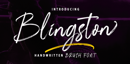 Blingston Brush. is a textured brush font, a contemporary approach to design, with handcrafted and natural underlines and also has alternatives & binders that make your designs more attractive. Suitable for use in title design. Such as clothes, invitations, book titles, stationery designs, quotes, branding, logos, greeting cards, t-shirts, packaging designs, posters, and others. Blingston Brush. equipped with Standard Characters upper and lower case, Punctuation, Numbers. And some glyph variations of OpenType features like Standard Ligatures and Stylistic Sets. Includes multiple multilingual support If you have any questions, feel free to message me :) Thank you so much for watching and enjoying it!
 - Tenterhooks by Hanoded,
$15.00 I like the expression ‘being on tenterhooks’. Not that I’m on tenterhooks very often! Tenterhooks was made with a broken satay skewer (see poster 2 for the actual thing) and Chinese ink. It came out rather rough, but it does have a nice flow and a certain ‘wild elegance’. Comes with double letter ligatures and a whole bunch of diacritics.
 - DuPlay by Dutype Foundry,
$39.00 Duplay is a sans-serif designed and developed by darman kadir in this late 2023, influenced by famous Swiss-style typefaces like Helvetica and others. This sans-serif typeface will become an alternative solution to enhance your sports and apparel presence. It has a solid and fast appearance, harder in certain font families, and stronger characteristics that will make your image more prominent.
 - Rum Plakat by Trine Rask,
$30.00 Rum Plakat is a display type developed as a display face within the type family »Rum« Rum Plakat is an alternative version of Rum Soft Sans Black. It is suitable for posters and editorial design in large sizes & other eye catching matters. The complete family consists of Sans Serif & Serif in both sharp and soft version + the display fonts Rum Plakat & Rum Silhouette.
 - Blacketor by Courtney Rhodes,
$20.00 Blacketor came about from hand lettering I had done for my own personal use several years ago. It remained unfinished until now. I was going for a more traditional serif font but in the process of play various versions came about while playing with the serifs, in an attempt to be slightly different. Many versions fell to the wayside as I learned more about what didn’t work than what did. What came about was a clean font with large open counters and short ascenders for an easy read. All caps works well for a bold but not shouty statement. A good font for Headlines and callouts as well as logotypes.
 - Oita by insigne,
$- Oita might be a carefully crafted typeface family, created by a meat-bag human. Or, it might have been made by a supremely clever sentient robot. Found in the dark recesses of a top secret spy agency’s quantum computer, this font came with this somewhat unusual description, which is presented without comment. "To conquer, we cannot simply overcome. Success is found in supremacy--in the dominance of Oita. While looking for the right tool for this success, our research has led us to the finely executed forms found of military domination throughout history. In our labs, we've used our specialized machines to harness these forms' power and refined their impact through elements of contemporary and computer design. The structure proves to be robotic and squared on its edges. However, the chutzpah of this technical face still allows it to pass as if created by human hands. Our resulting payload, Oita, is modern and sturdy. While based on a practical, octagonal structure, make no mistake; this new instrument will drive forward the energy you want to push through your projects. Oita has 42 cuts certain to encompass your designs on world domination. Each font contains the glyphs to support over 52 languages. The font also includes tabular and lining figures, numerous ligatures, and selected advanced Opentype options, including stencil and experimental options to bring out the dynamic characteristics that have already been crafted into Oita. Early tests have found that the new instrument is easily scalable to smaller dimensions without reducing its impact. The font remains highly readable across a variety of applications. We speculate from our findings that it will be successful for sporting and technical applications. So for you who venture to use Oita, use it boldly. Don't just overcome. Dominate. Go and conquer mightily with Oita. We'll be watching." We may never know whether Oita hails from mind or mechanism. What we do know is that, should you choose to take on Oita, you'll be acquiring a dynamic poster and packaging face, a minigun-toting bad robot of a font that exudes pace and power.
 - Peter by Vibrant Types,
$33.00 Peter started as a sketch in the static sans-serif tradition of Helvetica®. Then slight references to the calligraphic origin of type were added, giving it a more distinct character. This neo-grotesque sans has rational and clear basic letterforms, while in its details it unfolds attributes of humanist type. As a neo-grotesque sans it claims a very modest design, yet being a bit wider than its relatives and offering the warmth of humanist drafts. The early sketch grew to a type family of 18 fonts and now supports 700+ glyphs with pro opentype features.
 - 161 Vergilius by GLC,
$38.00 This font was inspired by the rare manuscript Roman Quadrata used by an unknown scribe to inscribe a copy of the Roman poet Virgil’s GEORGICS, somehwere around 161 to 180 AD. Only a few sheets have survived, now preserved by different libraries around the world. In creating this font, we have adapted it for contemporary users, making differences between U and V; I and J (which made no difference at all to ancient Latin scribes) and naturally adding the glyphs for Thorn, Oslash, Lslash, W, Y, as well as the usual accented characters and punctuation, none of which existed at the time. Only capitals are present in the original; but we have provided alternates: so alternating each character A-Z/a-z will give a pleasant appearance of manual script. We have added the Roman numerals “I V X L C D M” in the OTF/TTF versions usable as “Old Style Numerals” alternates.
 - Makiritare by John Moore Type Foundry,
$29.95 Makiritare is a display font for headlines that originates from a research work on pure geometry of great simplicity from a Venezuelan ethnicity artisanal form from men called Makiritare or Yecuana. These rivers sailors and architects of the jungle live in the village of Santa Maria de Erebato on the border with Brazil. Despite having a prodigious symbolism in their art, they didn't have until recently a font that is tailored to your expression. It all started with a trip to the Amazon in 1976 with the notion of creating my thesis as a graphic design student. In 1992 I created the first letterform that was evolving to a more elaborate version being presented and selected at the International Typography Biennial Letras Latinas in 2006. Today JMTF presents Makiritare with a more complete and mature family of three weights, alternative characters, small caps, ordinals and ligatures. Makiritare fits any application that have an innovative and modernist purposes. Recommended for titles or short phrases, with striking large-scale use.
 - GUNBATS - Unknown license

- Bad Films - Unknown license

- Joy Circuit - Unknown license

- Skaklia by Stefan Stoychev,
$39.99 Skaklia is a modern sans serif font with a geometric touch. It comes in 2 shapes regular and rounded and its matching italics.
 - Sea by Luke Thompson,
$30.00 Sea is a versatile sans serif font that works well in a variety of sizes and applications. It's friendly, but robust and professional.
 - Lovelica by PandAE86,
$10.00 Lovelica is a magical handwritten font carefully created with a touch of elegance. It will elevate a wide range of design projects to the highest level, be it branding, headings, wedding designs, invitations, signatures, logos, labels, and much more! Uppercase Lowercase Numeral Punctuation Ligatures Multilingual characters support Thank you and have a nice day ! Dedi T A
 - 112 Hours by Device,
$9.00 Rian Hughes’ 15th collection of fonts, “112 Hours”, is entirely dedicated to numbers. Culled from a myriad of sources – clock faces, tickets, watches house numbers – it is an eclectic and wide-ranging set. Each font contains only numerals and related punctuation – no letters. A new book has been designed by Hughes to show the collection, and includes sample settings, complete character sets, source material and an introduction. This is available print-to-order on Blurb in paperback and hardback: http://www.blurb.com/b/5539073-112-hours-hardback http://www.blurb.com/b/5539045-112-hours-paperback From the introduction: The idea for this, the fifteenth Device Fonts collection, began when I came across an online auction site dedicated to antique clocks. I was mesmerized by the inventive and bizarre numerals on their faces. Shorn of the need to extend the internal logic of a typeface through the entire alphabet, the designers of these treasures were free to explore interesting forms and shapes that would otherwise be denied them. Given this horological starting point, I decided to produce 12 fonts, each featuring just the numbers from 1 to 12 and, where appropriate, a small set of supporting characters — in most cases, the international currency symbols, a colon, full stop, hyphen, slash and the number sign. 10, 11 and 12 I opted to place in the capital A, B and C slots. Each font is shown in its entirety here. I soon passed 12, so the next logical finish line was 24. Like a typographic Jack Bauer, I soon passed that too -— the more I researched, the more I came across interesting and unique examples that insisted on digitization, or that inspired me to explore some new design direction. The sources broadened to include tickets, numbering machines, ecclesiastical brass plates and more. Though not derived from clock faces, I opted to keep the 1-12 conceit for consistency, which allowed me to design what are effectively numerical ligatures. I finally concluded one hundred fonts over my original estimate at 112. Even though it’s not strictly divisible by 12, the number has a certain symmetry, I reasoned, and was as good a place as any to round off the project. An overview reveals a broad range that nonetheless fall into several loose categories. There are fairly faithful revivals, only diverging from their source material to even out inconsistencies and regularize weighting or shape to make them more functional in a modern context; designs taken directly from the source material, preserving all the inky grit and character of the original; designs that are loosely based on a couple of numbers from the source material but diverge dramatically for reasons of improved aesthetics or mere whim; and entirely new designs with no historical precedent. As projects like this evolve (and, to be frank, get out of hand), they can take you in directions and to places you didn’t envisage when you first set out. Along the way, I corresponded with experts in railway livery, and now know about the history of cab side and smokebox plates; I travelled to the Musée de l’imprimerie in Nantes, France, to examine their numbering machines; I photographed house numbers in Paris, Florence, Venice, Amsterdam and here in the UK; I delved into my collection of tickets, passes and printed ephemera; I visited the Science Museum in London, the Royal Signals Museum in Dorset, and the Museum of London to source early adding machines, war-time telegraphs and post-war ration books. I photographed watches at Worthing Museum, weighing scales large enough to stand on in a Brick Lane pub, and digital station clocks at Baker Street tube station. I went to the London Under-ground archive at Acton Depot, where you can see all manner of vintage enamel signs and woodblock type; I photographed grocer’s stalls in East End street markets; I dug out old clocks I recalled from childhood at my parents’ place, examined old manual typewriters and cash tills, and crouched down with a torch to look at my electricity meter. I found out that Jane Fonda kicked a policeman, and unusually for someone with a lifelong aversion to sport, picked up some horse-racing jargon. I share some of that research here. In many cases I have not been slavish about staying close to the source material if I didn’t think it warranted it, so a close comparison will reveal differences. These changes could be made for aesthetic reasons, functional reasons (the originals didn’t need to be set in any combination, for example), or just reasons of personal taste. Where reference for the additional characters were not available — which was always the case with fonts derived from clock faces — I have endeavored to design them in a sympathetic style. I may even extend some of these to the full alphabet in the future. If I do, these number-only fonts could be considered as experimental design exercises: forays into form to probe interesting new graphic possibilities.
 - Bradley Gratis - Unknown license

- Xahosch by Ingrimayne Type,
$9.95 Xahosch uses a calligraphic pen to form a set of letters in which circular elements are based on a bottom-heavy egg shape. A pen-drawn san-serif face, it is available in three weights, each with an italic style.
 - Fancy by Arodora Type,
$15.00 Fancy Font Family is a font that I have been working on since 2012 and I have been trying to complete it for a long time. Thanks to its wide lines, you can use it easily in your paragraphs and poster designs. In fact, the purpose of using a font is entirely related to your imagination and your originality. The Fancy Font Family adapts to any design format you need and does not let you down.
 - Karnchang by Jipatype,
$17.00 Karnchang is a versatile sans-serif typeface that offers a range of 90 styles, spanning from thin to black in weight and condensed to expanded in width. Its adaptability makes it well-suited for a variety of purposes.
 - Nünooska by Okaycat,
$29.00 Nünooska is a sans serif type designed by Luke Turvey in 2014. The minimalist charm of Nünooska offers a soft unique style while remaining legible and clean. This rounded geometric sans serif is designed to look excellent for display or printed publication.
 - FF Cube by FontFont,
$62.99 Danish type designer Jan Maack created this display and sans FontFont in 2008. The family has 18 weights, ranging from Light to Bold in Condensed, Normal, Expanded, and Extra Expanded (including italics) and is ideally suited for advertising and packaging, logo, branding and creative industries, poster and billboards as well as sports. FF Cube provides advanced typographical support with features such as ligatures, alternate characters, case-sensitive forms, and stylistic alternates. It comes with tabular oldstyle and tabular lining figures.
 - Japan Gate by Senekaligrafika,
$12.00 "Japan Gate" is a Japanese-style display font inspired by traditional Japanese gate (Torii Gate) .This font is a sans serif font with a authentic japanese look and feel designed as unique as possible to create a beautiful and easy-to-read combination of sentences. This font is also very flexible for you to use in your various projects, ensuring that your project has a fantastic and appealing appearance that will be remembered by all audiences. Logotypes, food banners, branding, brochure, posters, movie titles, book titles, quotes, and more – may all benefit from this font. The owner of endless possibilities!
 - Gainsborough by Fenotype,
$30.00 Gainsborough - a clean-cut display pack. Gainsborough is a display combo pack of three styles and extra swooshes. Gainsborough fonts are straightforward with characteristic clarity. All the three fonts are designed to play together. Gainsborough is very easy to use. Gainsborough Pen is a clear script inspired by handwriting with pigment pen but polished clean to be legible and inviting. It’s equipped with Contextual Alternates and Standard Ligatures for smooth flow and connections between letters. In addition there’s Stylistic and Swash Alternates for standard characters. Gainsborough Sans is a sturdy street-sans ready for action. It’s has zero contrast and angular geometric shapes. It’s great for bold headlines. Gainsborough Serif follows pretty much the same proportions but with the serifs and a little bit of contrast and round shapes. Try combining Gainsborough Swooshes with Gainsborough Pen - type one character with Swooshes in the end of a word typed with Pen and you’ll have an ending swash reaching below the word. There’s different shapes and length swooshes + a couple of center balanced ornaments.
 - Joyful Juliana Pro by CheapProFonts,
$10.00 This is Kimberly Gesweins own handwriting, named for a sweet California friend of hers. Kimberly has spotted the original free version of this font in use in the far outskirts of China, and now - with the expanded language support - this Pro version can also be used in more remote parts of the western world. ALL fonts from CheapProFonts have very extensive language support: They contain some unusual diacritic letters (some of which are contained in the Latin Extended-B Unicode block) supporting: Cornish, Filipino (Tagalog), Guarani, Luxembourgian, Malagasy, Romanian, Ulithian and Welsh. They also contain all glyphs in the Latin Extended-A Unicode block (which among others cover the Central European and Baltic areas) supporting: Afrikaans, Belarusian (Lacinka), Bosnian, Catalan, Chichewa, Croatian, Czech, Dutch, Esperanto, Greenlandic, Hungarian, Kashubian, Kurdish (Kurmanji), Latvian, Lithuanian, Maltese, Maori, Polish, Saami (Inari), Saami (North), Serbian (latin), Slovak(ian), Slovene, Sorbian (Lower), Sorbian (Upper), Turkish and Turkmen. And they of course contain all the usual "western" glyphs supporting: Albanian, Basque, Breton, Chamorro, Danish, Estonian, Faroese, Finnish, French, Frisian, Galican, German, Icelandic, Indonesian, Irish (Gaelic), Italian, Northern Sotho, Norwegian, Occitan, Portuguese, Rhaeto-Romance, Sami (Lule), Sami (South), Scots (Gaelic), Spanish, Swedish, Tswana, Walloon and Yapese.
 - Avimode by Cubic Type,
$14.00 Avimode is bold, sharp, and futuristic. An original CubicType design with a design inspired by the holes and tracks on printed circuit boards. Text set in Avimode fills almost all the space available to it, and has small details. CubicType therefore recommends using this type at large sizes and with processes that are faithful to its fine details. It would look great cut 2 metres high on the side of your galactic spaceship. Please be aware that some of the lettershapes have sharp pointy corners: HANDLE WITH CARE!
 - Bocksay Mira by Trifásica Studio,
$9.00 Bocksay Mira is a text font family inspired by the manuscript Mira Caligraphiae Monumenta created between 1561 and 1596 by Georg Bocskay and Joris Hoefnagel for the Holy Roman Emperor. All shapes were taken from the original records in both regular and italic style: lower case (p. 5, 72), uppercase (p. 47, 121), small caps (p. 122, 7). The high contrast forms and the wide spacing makes this family suitable for long texts but also for titling uses, having always that calligraphic and stylish look. Find the original script here
 - Baker Half by Ingrimayne Type,
$9.00 One of the odder things I remember from high school (50+ years ago) is the tile floor of hexagons in the bathroom. There is something fascinating with the way hexagons fill the plane. BakerHalfDozen is made of white letters that fit on black, hexagonal tiles. BakerHalfWhite switches the letters to black on white tiles, and BakerHalfBare eliminates the tiles. There are no true lower-case letters, but some letters have alternate shapes. To make the tiles line up right, alternate lines must be indented half a space. Use the {} characters (brackets) to do this.
 - VLNL Thueringer by VetteLetters,
$30.00 We cannot imagine anyone not liking beer. Especially on a warm summer night there is simply little that can top an ice cold brewski. And with the current wave of home-brewed ales and lagers, Vette Letters decided to not stay behind and brew its own brand. Just so we can design our own beer bottle label using our own font. VLNL Thueringer comes from the drawing board of Jacques Le Bailly (a.k.a. Baron von Fonthausen), the German-French specialist in the fields of both beer and type design. One day Jacques got inspired by Albrecht Dürers 15th century Fraktur (blackletter) alphabet, and decided to design a contemporary rounded version of it. Although the historic context is clearly visible, Thueringer definitely stands its own ground. It's a modern techno-style blackletter with a (beer)truckload of interesting design details. Thueringer contains a number of ligatures and an alternate set of numbers. Apart from the regular uses like logos, posters, flyers and headlines we definitely would like to see our Thueringer used on beer bottle labels and crates, but also cafés and hipster bars would do well with this modern-day blackletter. Hell, even wine or liquor labels, football team jerseys, Oktoberfest flyers, it's just too much to mention. As long as it is accompanied by a cold beer.
 - Decima Mono by TipografiaRamis,
$39.00 Decima Mono – condensed geometric monospaced Sans Serif typeface, released back in 2009 and quite successful ever since (MyFonts Rising Star, February 2009). This new edition is an upgraded version of Decima Mono and Decima Mono X, combining both into one edition. New version supports more Latin languages with an extension to glyph amounts. Also, six more alternate styles have been added to the original six styles.
 - Museo Slab Rounded by exljbris,
$16.50 One of the most friendly Slab Serifs just got even more friendly. Museo Slab Rounded is the latest addition to the Museo font family. It has updated letterforms, spacing and kerning. It can perfectly be combined with Museo Sans Rounded. It comes in six weights with italics, that are not just slanted regulars. Key characters have been changed to give the italics more flow.
 - Alien Argonaut AOE by Astigmatic,
$19.95The Alien Argonaut typeface is an emaciated typeface made from the lettering of beings that have lived amongst us for centuries, evolving with humankind. Study your environment, all is not what it seems. Use this typeface to try and blend into their world within ours. Purchase Alien Argonaut today, for knowing the roots of others may help you learn to live in harmony with them. - Gimbo by Halbfett,
$30.00 Gimbo is bold. This heavy sans-serif design features thin counters. The interior spaces inside letterforms have been reduced as much as possible. Often, they seem abstract. There are three fonts in the Gimbo family: Black, Ultra, and Ultra Shadow. What do those terms mean? Well, Ultra is wider than Black. It takes up more pixels on-screen or brings more ink to the page.
 - Bestoom by Arterfak Project,
$15.00 Bestoom is a playful handwritten font, made with dynamic letter strokes and a bouncy layout that makes your design looks more cheerful! Inspired by comic typography and kids' storybook. This font is available in regular and bold that you can use separated or combined. Bestoom is an all-caps font that has the gorgeous uppercase and lowercase also complete with alternates and playful ligatures that expand your possibility to get many variations of typographic design! Other features: Uppercase Lowercase Numbers Punctuations Accented characters : ÀÁÂÃÄÅÆÇÈÉÊËÌÍÎÏÑÒÓÔÕÖØÙÚÛÜÝÞßàáâãäåæçèéêëìíîïñòóôõöøùúûüýþÿĀāĆćĈĉĊċČčĎďĒēĖėĚě ĜĝĠġĢģĤĥĨĩĪīİıĴĵĶķĹĺĻļĽľŃńŅņŇňŌōŐőŒœŔŕŖŗŘřŚśŜŝŞşŠšŤťŨũŪūŮůŰűŴŵŶŷŸŹźŻżŽžȘșŢţ ẀẁẂẃẄẅ Stylistic alternates Custom ligatures Thank you for visiting and have a nice day!
 - Big Stomach by Haksen,
$13.00 "Big Stomach" is a stylish modern handwritten font with casual quirky style. It is perfect for branding, birthday/valentine invitation, promotion, product packaging, and other needs. You will get full set of lowercase and uppercase letters, numerals and punctuation, multilingual symbols, ligatures and extra swashes that giving realistic hand-lettered style. In order to use the beautiful swashes, you need a program that supports OpenType features such as Adobe Illustrator, Adobe Photoshop, Adobe Indesign and Corel Draw. Or please check the end of the preview to know how to get the swashes. Thanks and have a wonderful day, Haksen Std


