10,000 search results
(0.133 seconds)
- Sketchetik by Hiekka Graphics,
$19.00 Sketchetik is a hand-drawn font in four styles: light, regular, bold and black. It is recommended for use as a display typeface.
 - Happy Cloud by Cultivated Mind,
$25.00 Happy Cloud is a fun, tall handwritten font created by Cultivated Mind. This font features five font weights (Light/Regular/Bold/Black/Heavy).
 - Naughty Brush by Good Java Studio,
$18.00 Naughty Brush is a set of two fonts, featuring an upright an upright caps and regular slant style, and also includes extra swashes.
 - Nouveau Impression JNL by Jeff Levine,
$29.00 Inspired by an image of some Art Nouveau wood type spotted online, Nouveau Impression JNL is available in both regular and oblique versions.
 - Aspidistra by Studio K,
$45.00 Aspidistra is a modern vintage typeface; which is to say a Studio K original with a period feel: it has a strong Art Nouveau influence (a distant cousin of Arnold Bocklin). Why Aspidistra? In the first half of the last century an Aspidistra was a must have accessory of the aspiring middle classes (see George Orwell's Keep the Aspidistra Flying), and to my mind this font evokes the chintzy charm of that era.
 - Plus De Vagues NF by Nick's Fonts,
$10.00The original release notes from England’s Stephenson Blake Type Foundry say it all: “a type of some waywardness in design, judged from any typographical standard…a type that seems unable to decide whether to be a roman or a script." Stephenson Blake called their release "Recherché"— sought after or in great demand, which seems quite appropriate. Both versions of the font include 1252 Latin, 1250 CE (with localization for Romanian and Moldovan). - Nada Fraktur by Johan Elmehag,
$19.00 Nada Fraktur is a modern geometrical blackletter made to serve your hip intentions. Think hip-hop album sleeves, your local t-shirt print shop, and Tumblr-boy action. The goal with this typeface is to blend medieval aesthetic with sharp modern cuts. You could say that the font is sort of monospaced, but it is not. The typeface includes an extended character set to support Central and Eastern European as well as Western European Languages.
 - Redflick by Zamjump,
$19.00 Introducing Redflick the display font, with consistent characters and a modern italic style. It has a naughty and unique look. The form has a firm consistency. I'd say that adds to its charm—and it does. It's great for headlines and titles, but also very easy to read in sentence form. It's perfect for branding and packaging, books, invitations, and anything else you want in a casual setting — without being too childish.
 - Glory Mathilda by Atharuah Studios,
$16.00 Introducing Glory Mathilda! An energetic brush stroke fonts. With two sets of all-caps letters, Glory Mathilda can support your creativity on your logo design, brand imagery, quotes, merchandise, product packaging, music projects, social media posts, etc. Glory Mathilda also has ten swashes that you can access in each alternative letter A-J. That's it! I hope you enjoy it. You can also say hello to me on Instagram: https://www.instagram.com/atharuah_ Thank You!
 - Obrigado by Hanoded,
$15.00 Obrigado means 'Thank You' in Portuguese. It is my way of saying thanks to the unknown designer of a Portuguese port-wine poster from the thirties. Obrigado font is based on that poster. As I had to work with a handful of glyphs, I designed the missing ones myself. Obrigado is a quite elegant and refined art deco font, which would be ideal for posters and logos. Obrigado speaks most Roman based languages.
 - Nowduke by Just Font You,
$19.00 Nowduke is a bold vintage font. Inspired by the rise of the Retro-Futurism trend in the digital industry nowadays. The undeniable invasion in every industry makes it a big trigger I can say, to bring this pop font to rise in this universe. Perfectly fit for logo, branding, gaming, esport design, poster, music video, album artwork, retro concept, advertising, digital content, stream overlay, cover, book, packaging, merchandise, apparel, fashion, and many more.
 - Clunic by Greater Albion Typefounders,
$16.95 Clunic is a Blackletter font in the best traditions of Victorian Gothic revival—that is to say aesthetically marvelous but no historical basis whatsoever. The design combines the perpendicular character of medieval manuscripts with modern legibility and a healthy respect for calligraphic principles. There are alternate large and small forms of some glyphs. Clunic is ideal for use on certificates, themed invitations, posters, headings, initial capitals or sign-writing with an historic theme.
 - Manihot by PintassilgoPrints,
$26.00 Manihot is a cool display sans-serif font, loaded with interlocks, ligatures and alternates to render your message in a nice eye-catching way, topped off with the usual je-ne-sais-quoi of PintassilgoPrints fonts. The family brings rough and clean styles and yet a very useful dingbat font with dozens of tiny graphics to complement your words. It’s up, witty, honest and just impossible to ignore. Give it a go!
 - Brittany Signature by Creatype Studio,
$25.00 Brittany Signature Script consists of a fashionable sophisticated signature-style script with its own unique curves and an elegant inky flow. This font is perfect for photography, watermark, social media posts, advertisements, logos & branding, invitation, product designs, label, stationery, wedding designs, product packaging, special events, or anything that needs handwriting taste. Thanks for checking it out, and feel free to message me if you have any questions! say hello by e-mail: creatypestudioco@gmail.com
 - Hybi17 Legend by Hybi-Types,
$12.00 The name says it: This font is made for usage in story-telling, movies, legends, fairy tales, sagas. It will tell about strength and bravery, forgotten tales and ancient kingdoms. You may use it for headlines, slogans and advertising. The style with real capitals will enlarge your potential of design. The fonts are offering a huge character set for usage in many languages. Also thousands of kerning pairs within both styles are obligatory.
 - ITC Ziggy by ITC,
$29.99ITC Ziggy was designed by Bob Alonso, who says it started out as phone doodles in the early 1970s." Alonso rediscovered the sketches years later, thought they revived the feel of the 70s, and decided to digitize the typeface. He liked the form of the letter Z best, so named the font Ziggy. ITC Ziggy reminds its designer of "elephant bellbottoms" and its style as a display face instantly evokes a nostalgia for the 1970s. - Enforcer by Tour De Force,
$25.00 Modern simple typeface expressing sharp and bright words without need for writing something really smart. Made by Dusan Jelesijevic one day when he left without anything smart to say or write, so he just grabbed a pencil and forced the paper to be cooperative. Someone said that this typeface looks like the ancient Greeks went in present future and used contemporary equipment for writing those letters. It is ideal for branding and avantgarde identities.
 - Joseph Sophia by Fargun Studio,
$14.00 Joseph Sophia! A new fresh ans modern hand lettered font with decorative characters and a dancing baseline. So beautiful on invitation like handicraft, greeting cards, branding materials, business cards, quotes, posters, and more design concepts. Features : Unique ligatures Stylistic sets Basic Latin A-Z and a-z Numbers International Symbols included Punctuation Please send a message if you have questions or problems, and don't hesitate to say hello on Instagram https://www.instagram.com/fargunstudio/ Thank you.
 - Sweet Dreams by Fargun Studio,
$14.00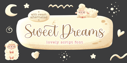 Sweet Dreams! A new fresh ans modern hand lettered font with decorative characters and a dancing baseline. So beautiful on invitation like handicraft, greeting cards, branding materials, business cards, quotes, posters, and more design concepts. Features : Unique ligatures Stylistic sets Basic Latin A-Z and a-z Numbers International Symbols included Punctuation Please send a message if you have questions or problems, and don't hesitate to say hello on Instagram https://www.instagram.com/fargunstudio Thank you.
 - Mollyta Script by Letterfreshstudio,
$15.00 Mollyta Script is a beautiful script font with many alternative styles, natural looking, elegant and perfect for any extraordinary project. Mollyta Script is suitable for various products such as invitations, product packaging, product design, crafters, labels, photography, watermarks, logos & branding. Everything can be accessed using software that supports Opentype, such as Adobe Indesign, Adobe CS Illustrator, Adobe Photoshop CC, and Corel Draw. Please message if you have any questions, and say hello. Thank you :)
 - Agustina Script by Letterfreshstudio,
$15.00 Agustina Script is a beautiful script font with many alternative styles, natural looking, elegant and perfect for any extraordinary project. Agustina Script is suitable for various products such as invitations, product packaging, product design, crafters, labels, photography, watermarks, logos & branding. Everything can be accessed using software that supports Opentype, such as Adobe Indesign, Adobe CS Illustrator, Adobe Photoshop CC, and Corel Draw. Please message if you have any questions, and say hello. Thank you :)
 - Total Black by Resistenza,
$39.00 Say hello to our first Sans Serif, a modern font family inspired by classic grotesk typefaces. It features 9 weights, including Italics and a formidable Display version. It has a clean, neutral look that is perfect for all types of graphic design projects. Its ample character set, including Standard and Contextual Alternate, ensures excellent typesetting performance. Sans Serif offers good readability and a strong, serious tone, perfect for logos, magazines and more.
 - Hanthing by IRF Lab Studio,
$12.00 Hanthing Script consists of a fashionable sophisticated signature-style script with its own unique curves and an elegant inky flow. This font is perfect for photography, watermark, social media posts, advertisements, logos & branding, invitation, product designs, label, stationery, wedding designs, product packaging, special events, or anything that needs handwriting taste. Thanks for checking it out, and feel free to message me if you have any questions! say hello by e-mail: irflabstudio@gmail.com
 - Indubitably NF by Nick's Fonts,
$10.00It’s said that what goes around, comes around, and there’s no better proof of the saying than this typeface. Originally released as Latin Antique by the Stephenson Blake foundry in the 1880s, this face achieved renewed popularity in the 1950s, and it’s back again as, like, Coolsville, Daddy-o. Both versions include the complete Unicode Latin 1252, Central European 1250 and Turkish 1254 character sets, as well as localization for Lithuanian, Moldovan and Romanian. - Smorens by RagamKata,
$16.00 Say hello to the new modern blackletter font, SMORENS Smorens is a unique modern blackletter font. With an elegant modern style, it adds a bold touch to your projects and will inspire you to create something unique and modern. Besides that, this font is also equipped with alternative characters, ligatures and multi-language support. Smorens is ideal for headings, flyers, greeting cards, product packaging, book covers, printed quotes, logotype, apparel designs, and album covers.
 - Search by PintassilgoPrints,
$19.00 Search is a brush script font, seasoned with unconventional choices here and there – 'Hey, they are everywhere!', one may say, and that's okay. This is a contemporary upbeat font with loads of personality and yet some alternates: there are two choices for each letter, delivering that nice, organic, tasty handmade feel. Available in two flavors: with and without a dry brush texture. Isn't it what you've been searching for? We bet! Cheers!
 - Cloud Dancer by Reyrey Blue Std,
$16.00 Say Hi to Cloud Dancer. It is bold and high-contrast display serif typeface with delightful nostalgic feeling. Cloud Dancer contain several stylistic alternates that can make it unique and different. This typeface is perfect for corporate identities, websites, publications, titles, books, magazines, business cards, logos, product labels, packaging, or any kind of advertising purpose. Features : · All Uppercase and Lowercase · Number & Symbol · Supported Languages · Alternates and Ligatures · PUA Encoded Hope you enjoy with our font!
 - Blauhaus by Hanoded,
$15.00 Yes, you're right. Blauhaus should have been 'Blaues Haus', as that is the proper way of saying Blue House in German. But hey, Blauhaus sounds much better and in writing, it is quite similar to Bauhaus. Blauhaus is a stylish, rounded sans serif font, modeled after some early 20th century German typefaces. It is easy on the eye and it will certainly give your work a sophisticated punch. Comes with a classy collection of diacritics.
 - Mirallove Restimond by MJB Letters,
$20.00 Hello everyone, we hope you have a great day. Say hi to Mirallove Restimond a new casual modern font that is very perfect for branding, wedding designs, quotes, posters, business cards, logotype, display, watermarks, signatures, etc. This font also has a special character in terms of thickness and thinness on each side, so it will give a neat handwritten impression that will make your design look very attractive and it is PUA Encoded.
 - ITC Magnifico by ITC,
$29.99ITC Magnifico Daytime and ITC Magnifico Nighttime are inspired by nineteenth-century decorated types and letterings. “Although they are designed as display typefaces, their use is not limited to large headings. Usually three-dimensional types are employed in gigantic headings in large posters, but I thought it would be interesting if such decorative types were used as well in small sizes, say at 12 point,” says designer Akira Kobayashi. “There were a few examples of small three-dimensional types used in cards printed in the nineteenth-century. I studied their letterforms carefully and became more and more interested in those small three-dimensional types. The outlines of ITC Magnifico are robust enough to endure use at small sizes. Sometimes the angle or the shape of the 'shadow' had to be slightly modified or even illogical, because the letterforms ought to look as simple as possible. The resulting types are fairly easy to read at small sizes, and I hope that at large sizes those occasional oddities will appear charming.” - Wolpe Fanfare by Monotype,
$50.99 “Fanfare is such a fun typeface,” says Toshi Omagari, who revived the design for The Wolpe Collection. “It was my happiest discovery when I was digging through the Monotype archive. I came across it and had to check the designer’s name.” No wonder: Fanfare is modern, light and playful – not what you’d expect from an 80-year old design. From the original, very heavy weight design, Omagari started by creating a black weight, followed by four lighter weights for Wolpe Fanfare, preserving the character of the letterforms all the way down to a thin version. “I wanted to do more than digitize the original weight,” he says. “It’s surprisingly modern, and its skeleton, its basic structure, is so beautiful.” The new design packs more into a small space than most typefaces. It’s a natural for publication and advertising design. With displays capable of revealing fine details such as Fanfare’s subtly slanted baseline, its lovely forms will easily translate to mobile devices. With an extended European character set that includes Greek and Cyrillic language support, Wolpe Fanfare can speak in many languages.
 - Mosquito by Monotype,
$29.99Éric de Berranger likes to multitask, and often works on two typeface families at once. Such was the case with Mosquito, a jaunty sans that was developed at the same time he was creating the more traditional Maxime. Mosquito represented a sort of recreation," says de Berranger. "When I grew tired of working on one design I could work on the other and then come back to the first, full of courage and desire!" Mosquito is built from simple, straightforward shapes, but its distinctive stroke terminals and slight oblique weight stress distinguish the design from more conventional sans serif faces. The relatively large x-height and open counters add to the legibility of the design. The capitals are straightforward (with just a hint of Peignot), while the lowercase has a softer, more inviting demeanor. "I drew Mosquito with the hope that it would be pleasant to look at and to read," says de Berranger. "I think the end result is almost feminine." Mosquito comes in three weights, with complementary italic designs and a suite of small caps, old style figures and alternate characters." - Linotype Sicula by Linotype,
$29.99Linotype Sicula, from German designer Roberto Manella, is part of the TakeType Library, chosen from the entries of the Linotype-sponsored International Digital Type Design Contest 1999 for inclusion on the TakeType 3 CD. It is available in two weights, regular and oblique. Linotype Sicula will quickly win over any nostalgic spirits. Ornamental and sweeping, the figures line up on the paper, their contrasting strokes and playfully irregular forms giving them an exuberant, decorative character. The careful details of each figure come to light best when used in larger point sizes. Linotype Sicula is therefore best for headlines and can easily inspire typographic experiments and its capitals can serve as initials combined with other typefaces, especially sans serif. - Augsburger2009 by Proportional Lime,
$24.95 This typeface was inspired strongly by one of Ernhardt Ratdolt’s (1442-1528?) many beautiful typefaces. Mr. Ratdolt was a printer from the city of Augsburg, who had also worked for several years as a printer in Venice. He made many advances in printing technique and technology, including the decorated title page. Early books have a mysterious rhythm to the appearance of the text, due to small variances in letters caused by casting irregularities and ink transfer from the press. This supposed defect, which is present in this typeface, gives a pleasing effect when compared to the sterile regularity of modern printing technology. This font has been released as version 2.0 with over two hundred additional characters and improved metrics.
 - ideoma SPRAY - Personal use only

- ideoma LINER - Personal use only

- SlabFace 2010 - 100% free

- Mager - Unknown license

- Raspoutine Classic - Unknown license

- HYERBA - Personal use only


