10,000 search results
(0.027 seconds)
- Gladstone by Michael Browers,
$25.00 Gladstone is a charming script typeface inspired by pen lettering techniques.
 - Stencilla by Otto Maurer,
$15.00 Stencilla is a Sanserif Stencil Font made for cutting by Plots.
 - Macarena DT by DTP Types,
$49.00Based on custom design work by DTP Types Limited in 1999. - Arcadia by Kraken,
$15.00A typeface inspired by the old computer games of the 1980s. - Bitmap Sketch by The Tree is Green,
$20.00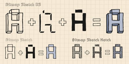 Inspired by early bitmap fonts, hand drawn for a contemporary twist.
 - College Grad by Throndsen,
$9.00 College Grad is inspired by my Graphic Design class of 2019!
 - Hausbau by FaceType,
$8.00 Hausbau is a radical geometric font, inspired by the German Bauhaus.
 - Bernhard Condensed No2 by SoftMaker,
$9.99 Bernhard Condensed No2 a freely drawn heading typeface published by SoftMaker.
 - ToreTtO by RodrigoTypo,
$25.00 Designed by Rodrigo Salas, ToreTtO is a display sans font family.
 - Zoria by samokat,
$15.00 Zoria is cool modern typeface, designed by samokat during May 2010.
 - Engravers DT by DTP Types,
$49.00Based on custom design work by DTP Types Limited in 1990. - As You Wish by Dismantle Destroy,
$9.00 This font was inspired by music from the band Dropout Year.
 - Newland by Resistenza,
$39.00 Newland is a blocky typeface inspired by Rudolf Koch’s calligraphic Neuland.
 - Triest DT by DTP Types,
$49.00Based on custom design work by DTP Types Limited in 1990. - Copperplate New by Caron twice,
$39.00 Imagine America in the 1930s. A gangster flick with Al Capone, a crime novel featuring Philip Marlowe. Our hero in a fedora sits in a classy bar, orders a double bourbon, lights a cigar and eyes the evening paper. He turns the pages, reading about a bank heist over on Third Avenue, a scandal involving a baseball player, a small ad for a general practitioner and a large spread about a famous law firm. What do the bottle of booze and the majestic facade of the bank have in common? The elegant baseball uniform and trustworthy attorneys? - Copperplate Gothic - When Frederick William Goudy created his legendary typeface in 1901, it went on to literally become the symbol of early 20th century America. Tiny serifs, characteristically broad letterforms, and particularly bold titles decorated calling cards at 6-point size, enormous bronze-cast logos, newspaper headlines, restaurant menus and more. This was the golden age of Copperplate, lasting up until the arrival of die neue Typografie and monospaced grotesques in the 1960s. Then the typeface almost completely disappeared. It made a partial comeback with the advent of the personal computer; digitizations of varying quality appeared, and one version even became a standard font in Adobe programs. This may have played a role in Copperplate later being used in DIY projects and amateur designs, which harmed its reputation. Copperplate New has been created to revive the faded glory of the original design. Formally, the new typeface expands the existing weight and proportional extremes. The slight serifs are reduced even further, making the typeface sans-like at smaller point sizes and improving readability. In contrast, at large point sizes it retains all of its original character. Decorative inline & shadow styles have been added and both have been created in all five proportions, making it easy to adapt the typesetting to the format you need. Despite these changes and innovations, Copperplate New remains true to Goudy’s original design and represents a snazzy way to evoke a golden era in American culture. Specimen: http://carontwice.com/files/specimen_Copperplate_New.pdf
 - Kingthings Serifique Pro by CheapProFonts,
$10.00 This is what you get when you mix monoline rounded letters with some bracketed serifs and finish it off with a sprinkle of ornamental appendages. The result is very readable, rather original and quite charming. I have fixed some inconsistencies in serif designs across the weights, cleaned up the serif connections - and added a fourth weight. But I have kept all the wonky curves and slightly differing stroke thicknesses, as they are so integral to the charm. Kevin King says: "I guess all type designers at some point think 'Well, I'll just have a go at a standard text face...' There is a long story here somewhere, suffice it to say that I started with the thinnest version - typical. I wanted to make a standard serif text face - until I saw it in print and thought "Yuk! it looks like everything else!" - still does really but with twiddles and pooneys..." If you find the "twiddles & pooneys" too much you can tone them down with the OpenType Stylistic Alternate feature (which will make sure they don't appear on three consecutive letters) or remove them completely with the OpenType Swash feature. ALL fonts from CheapProFonts have very extensive language support: They contain some unusual diacritic letters (some of which are contained in the Latin Extended-B Unicode block) supporting: Cornish, Filipino (Tagalog), Guarani, Luxembourgian, Malagasy, Romanian, Ulithian and Welsh. They also contain all glyphs in the Latin Extended-A Unicode block (which among others cover the Central European and Baltic areas) supporting: Afrikaans, Belarusian (Lacinka), Bosnian, Catalan, Chichewa, Croatian, Czech, Dutch, Esperanto, Greenlandic, Hungarian, Kashubian, Kurdish (Kurmanji), Latvian, Lithuanian, Maltese, Maori, Polish, Saami (Inari), Saami (North), Serbian (latin), Slovak(ian), Slovene, Sorbian (Lower), Sorbian (Upper), Turkish and Turkmen. And they of course contain all the usual "western" glyphs supporting: Albanian, Basque, Breton, Chamorro, Danish, Estonian, Faroese, Finnish, French, Frisian, Galican, German, Icelandic, Indonesian, Irish (Gaelic), Italian, Northern Sotho, Norwegian, Occitan, Portuguese, Rhaeto-Romance, Sami (Lule), Sami (South), Scots (Gaelic), Spanish, Swedish, Tswana, Walloon and Yapese.
 - FS Siena by Fontsmith,
$80.00 Eclectic FS Siena is a typeface with history, and not just in the sense of having its origins in classical Roman lettering. Fontsmith founder Jason Smith first committed it to tracing paper while still at college, instinctively redrawing letterforms based on Hermann Zapf’s Optima according to ‘what felt right’. When Krista Radoeva took up the challenge to edit and extend the typeface, she and Jason were determined to preserve its subtly nonconformist and eclectic spirit. Like a great dish, there are individual components throughout the character set that all add flavour, and need to be balanced in order to work together. The smooth connection of the ‘h’ ‘m’ ‘n’ and ‘r’ contrasts with the corners of the ‘b’ and ‘p’. The instantly recognisable double-storey ‘a’ – the starting point of the design – contrasts with the single-storey ‘g’ and the more cursive ‘y’. And only certain characters – ‘k’, ‘w’, ‘v’ and ‘x’ in the lowercase and ‘K’, ‘V’, ‘W’, ‘X’ and ‘Y’ in the caps – have curved strokes. Transitional FS Siena is a contrasted sans-serif typeface, blending classical elegance and modern simplicity. Its construction and proportions are descended from classical broad-nib calligraphy and humanist typefaces, with a high contrast between the thick and thin strokes. The angle of the contrast, though, is vertical, more in the character of pointed-nib calligraphy and modernist typefaces. This vertical stress helps to give FS Siena a strong, cultured presence on the page. Idiosyncratic italics The italics for FS Siena were developed by Krista to complement the roman upper and lower-case alphabets first drawn by Jason. Many of the letterforms are built differently to their roman counterparts: there’s a single-tier ‘a’, a looped ‘k’ and connections more towards the middle of stems, such as in the ‘m’, ‘n’ and ‘u’. These distinctions, along with generally much narrower forms than the roman, give the italics extra emphasis within body copy, where the two are side-by-side. In editorial, especially, the combination can be powerful. To cap it all… In his original draft of the typeface, Jason found inspiration in Roman square capitals of the kind most famously found on Trajan’s Column in Rome. In keeping with those ancient inscriptions, he intended the capitals of FS Siena to also work in all-upper-case text, in logotypes for luxury consumer brands and property developments, for example. A little added space between the upper-case letters lets the capitals maintain their poise in a caps-only setting, while still allowing them to work alongside the lower-case letterforms. The caps-only setting also triggers a feature called case punctuation, which adapts hyphens, brackets and other punctuation to complement the all-caps text.
 - ROBO - Personal use only

- Cartoonist - Personal use only

- Cyberspace - Personal use only

- Fairbank by Monotype,
$29.99Monotype Bembo is generally regarded as one of the most handsome revivals of Aldus Manutius' 15th century roman type, but the original had no italic counterpart. The story is told that Stanley Morison commissioned Alfred Fairbank, a renowned calligrapher, to create the first italic for Bembo, which was released as metal fonts in 1929. Alfred Fairbank, however, claimed that he drew the design as an independent project and then sold his drawings to Monotype. According to him, the statement has been made that I was asked to design an italic for the Bembo roman. This is not so. Had the request been made, the italic type produced would have been different." Whichever version you believe, it was obvious that Fairbank's design - while undeniably beautiful - was not harmonious with Bembo roman. A second, more conventional italic was eventually drawn and added to the Bembo family. Fairbank's first design, which was based on the work of sixteenth-century writing master Ludovico degli Arrighi, managed to have a modest life of its own as a standalone font of metal type. It never made the leap into phototype fonts, however, and the face could have been lost, were it not for Robin Nicholas, Monotype Imaging's Head of Typography in the United Kingdom, and Carl Crossgrove, a senior designer for Monotype Imaging in the US. Nicholas and Crossgrove used the original drawings for Fairbank as the starting point for a new digital design, but this was only the beginning. They improved spacing, added subtle kerning and optimized the design for digital imaging. In addition, Nicholas created an alternative set of lowercase letters, fancy and swash capitals and enough alternate characters to personalize virtually any design project. By the time his work was complete, Nicholas and Crossgrove had created a small type family that included Fairbank, a revived version of the earlier metal font, and Fairbank Chancery, a more calligraphic rendition of the design. An additional suite of ornate caps, elegant ligatures, and beginning and ending letters accompanies both fonts, as does a full complement of lowercase swash characters. Now, instead of a failed Bembo italic, Fairbank emerges in its true glory: a sumptuous, elegant design that will lend a note of grace to holiday greetings, invitations, and any application where its Italianate beauty is called for." - Aldo - Unknown license

- Cul De Sac - Personal use only

- Aint Nothing Fancy - Personal use only

- All Over Again - Personal use only

- ABC Idea by Alphabets by Chileans (A.B.C.),
$18.00 ABC Idea is a contemporary geometric sans full of opentype features in Regular, Bold and very "fast" Italic. The design is an experimental fusion or mix between Humanist, Geometric and Grotesque models. The fine drawing in all letters and signs has precise ink traps to highlight contrast jus like lettering and calligraphy does, then ABC Idea re-creates this exquisite graphic details into the digital world. Designed by Miguel H. Montoya Fonts in Use Images by letargo.cl Magazine. Art Direction by studioprado.cl
 - ITC Cheltenham by ITC,
$40.99 ITC Cheltenham font in its present form is the work of designer Tony Stan. Originally designed by architect Bertram Goodhue, it was expanded by Morris Fuller Benton and completed by Stan in 1975 with a larger x-height and improved italic details. ITC Cheltenham font is an example of an up-to-date yet classic typeface. In 1993 Ed Benguiat added the Handtooled weights to this family. ITC Cheltenham® font field guide including best practices, font pairings and alternatives.
 - Journal Sans by ParaType,
$30.00 The typeface was designed at the Polygraphmash type design bureau in 1940-56 (project headed by Anatoly Shchukin) based on Erbar-Grotesk typeface of Ludwig & Mayer company, 1929 by Jakob Erbar, and on Metro typeface of Mergenthaler Linotype, 1929 by William A. Dwiggins. A sans serif of geometric style. For use for text and display typography. In 2014 designer Olexa Volochay made some corrections in original digital data and extended character set. The family was rereleased in ParaType in 2014.
 - Zagolovochnaya by ParaType,
$30.00 Zagolovochnaya was based on the letterforms of Zagolovochnaya gazetnaya (Newspaper Display) type family of Polygraphmash in 1962 by Iraida Chepil et al. The face was a revival of Cyrillic version of Caslon designed in the late 1930s. The artworks of Zagolovochnaya gazetnaya were redrawn by Isay Slutsker (1924-2002) in the late 1990s. In spite of its name the font is useful both for display and text matter. The digital version was developed for ParaType in 2002 by Manvel Shmavonyan.
 - Matricule 59 by designdefontes,
$24.00 Matricule 59 is a typeface whose design is inspired by license plates and by the deformations due to the stamping in the metal plates. These deformations give a very specific style, especially concerning the hairlines. It is the Ultra Condensed version of Matricule, a Typeface designed by Loïc Choquet. It consists of 4 fonts : Light, regular, bold and black. For Mac or PC. Well-suited for edition, logotypes, posters, etc. Each font contains 359 glyphs and supports up to 89 different languages.
 - Gmuender Kanzlei by RMU,
$25.00 Inspired by some handwritten letter forms originally made by Hermann Zapf for his 1949 book "Pen and Graver", the drawings and designs finally became an entire font. It is an ideal companion to create diplomas, certificates and any other vintage projects. Take advantage of the long s which can be reached when you change the round s by the historical OpenType feature or when you simply type the integral sign [ ∫]. This font contains also swash forms of d, g, and v.
 - Matricule 57 by designdefontes,
$24.00 Matricule 57 is a typeface whose design is inspired by license plates and by the deformations due to the stamping in the metal plates. These deformations give a very specific style, especially concerning the hairlines. It is the Condensed version of Matricule, a Typeface designed by Loïc Choquet. It consists of 4 fonts : Light, regular, bold and black. For Mac or PC. Well-suited for edition, logotypes, posters, etc. Each font contains 359 glyphs and supports up to 89 different languages.
 - Humanist 531 by ParaType,
$30.00Humanist 531 is the Bitstream version of Syntax (Stempel, 1968) by Hans Eduard Meier. A humanist sans serif typeface with an optically even thickness of the line which interprets a humanist old style type of the Renaissance. Its vertical strokes are inclined to the right by one degree. Serves well in text and display typography. Cyrillic version was developed at ParaType in 1999 by Isay Slutsker and Manvel Shmavonyan and was awarded Diplomae at Kirillitsa'99 and "bukva:raz!" type design contests. - Attorney by Schriftlabor,
$26.99 Originally, Viktor Solt-Bittner developed Attorney as a custom font for a law firm, hence its name. Attorney shows a systematic, yet unconventional placing of its serifs, hard corners and a clean design. The typeface was produced by Schriftlabor’s type director, Lisa Schultz. Attorney consists of 7 weights, from Light to Black, each of them accompanied by an italic, totaling in 14 styles. All of them contain several figure sets, small caps and many alternative forms, which are accessible by OpenType features.
 - Ultras Liberi - Unknown license

- BP Diet - 100% free

- Slukoni - 100% free

- Wazoo - Unknown license

- Pelin by Koray Özbey,
$9.00 The design of Pelin, which began as an experiment, inspired by the harmony created by the contrast between the soft, flowing movements and sharp movements found in Circassian dances. To capture this harmony, both curved and sharp lines were used along with stems that contrasting angles.
 - Koehler Sans JNL by Jeff Levine,
$29.00Koehler Sans JNL was inspired by a set of cardboard sign kit letters made by the Koehler Sign Company of Missouri (presumably) in the late 1940s or early 1950s. Not much is known about them, other than the letters looked interesting enough to turn into a font.


