10,000 search results
(0.022 seconds)
- Dopamine by Luke Thompson,
$30.00 Dopamine is a friendly, flowing sans serif typeface. It works best for large headlines, particularly in packaging or editorial projects. Its most interesting feature is the flowing line across the top of many of the characters, creating smooth waves from one to another.
 - Analogue Photography by sizimon,
$25.00 Analogue Photography is a handwritten signature font with fashionable themes. The Analogue Photography matches apply in some designs such as the logotype, quotes, wedding invitation, business card, packaging, branding, and more custom design. If you have any questions, please contact us info@sizimon.com
 - Rough Love by Positype,
$27.50 Rough Love, it’s fair to say, came before Love Script. The brushed letter specimens that would ultimately serve as the template for the much ‘cleaner’ Love Script have now been turned into a typeface. As I packed these up, I just kept coming back to them and staring at the texture and movement caught on the page. On a lark, I decided it would be fun to let people see an almost a before and after scenario of how one led to the other and decided to produce a typeface from these specimens… Rough Love. For the most part, in typical fashion for me when I brush out a typeface idea, I try to brush the entire character set along with each of the planned variants for swashes, titling, and other alternates—the reason for that is simple -- each letter looks and acts a bit differently when the same movements are imposed on them. With Rough Love, I tried to adhere to that and made very few modifications to the originals, and only had to ‘borrow’ in a few occasions when I happened to forget to brush a variant.
 - Haboro Contrast by insigne,
$- Meet Haboro Contrast, the stylish little sister of the Haboro hyperfamily. While built from the same clean, geometric shapes of Haboro Sans, this new addition has been rebalanced for elegant performance with her high-contrast sans letterforms and has been adjusted to provide the greatest impact for each weight. It's a personality all her own, gentle in approach yet refined and modern with a confident appearance. Capitalize on Contrast's style with OpenType features, too. Packed with options like OpenType ligatures, stylistic sets, fractions, crafted small caps and old-fashioned figures, this font will keep your work fresh and attractive. If you need even more combinations for the right statement, use the entire Haboro hyperfamily and create the right balance to capture your reader's eye. Haboro Contrast (along with the rest of the Haboro family) has been tested for the web and is ready for use in both print and digital applications. Designed to serve as a display character for such publishing projects as magazines and company brochures, Contrast gives you comfort in having a great amount of versatility in the fonts you rely on. It's a prime example where high contrast simplicity lends itself to achieve excellent design results.
 - Pawl by The Ampersand Forest,
$20.00 Meet Pawl, an affordable 48-font squarish sans family with a little grotesque in him! Oh, you may think you’ve got him pegged at first glance, but he’ll surprise you with his versatility. AND he's just been totally refurbished from top to bottom and boy, did he need it! Pawl lives in the same visual landscape as fantastic modular superfamilies like Eurostile, Agency, Geogrotesque, Barlow, and even the great American Gothics. Unlike those faces, though, he's nimble enough to switch between looks effortlessly. Pawl is energetic, aggressive, strident, and structural. Depending on how you use him, his voice can be retro, futuristic, industrial, or sleek. He can be sober or splashy, techy or oldschool. Use his alternate characters and stylistic sets to create looks ranging from Streamline Moderne to Futurism to Brutalism to Swiss. He works from small paragraphs all the way up to monumental signage. This guy is smart and useful, with a lotta looks! How many times have you needed multiple weights, styles, and widths for your hierarchy, but standard type families were either shockingly expensive or couldn't deliver? Pawl delivers. Give him a shot!
 - Geliat by Wahyu and Sani Co.,
$99.99 Geliat would be the youngest brother of Creo, retaining the letterform and proportion but has more geometric looks. This font family comes in two versions which has some different default glyphs. Geliat family has similar letterform with Creo, while the Alt version has common geometric letterform. Italic styles of Geliat were designed using semi-rotalic method. The round parts have 5 degrees italic angle, while the vertical strokes were made in 10 italic degrees. The result gives the styles look more circular than most geometric typefaces with the same 10 degrees italic angle. Each version of Geliat has 2 variable fonts along with 10 different predefined weights from Thin to Heavy with matching italics. Each family member of Geliat also equipped with useful OpenType features such as Ordinals, Superscripts, Scientific Inferiors, Stylistic Sets, Tabular Lining, Standard Ligatures, Fractions, Numerators & Denominators. Each font has 500+ glyphs which covers Western & Eastern Europe, and other Latin based languages. Geliat will be suitable for many creative projects, from logos, posters, presentations, headlines, lettering, branding, quotes, titles, magazines, headings, web banners, mobile applications, art quotes, advertising, packaging design, book title, and more! Sky is the limit!
 - Ellie Script by Fenotype,
$25.00 Ellie Script is a hand drawn signature style typeface. Ellie is great for branding, headlines, invitation cards, poems, posters or as a logotype. Boasting over 600 glyphs, Ellie is equipped with handy OpenType features - Contextual Alternates and Standard Ligatures are automatically on and they help to keep the connections smooth and text varied to simulate hand writing. In addition Ellie Script is equipped with Swash and Stylistic Alternates that can be used for more customised look and in addition it has Stylistic Alternates that can be used for long end swash to a word. If that isn’t enough there are also Discretionary Ligatures: certain letter pairs like th, lt, or, is are made into more showy. They work best in shorter texts. Ellie has three ampersands and two sets of numerals, and even more alternates can be found from the Character Window. Ellie Script is PUA encoded so you can access the extras in most graphic design softwares. Ellie Script Ornaments is a set of strokes and arrows with the same look so that they can be used to complement layouts with Ellie Script. Have fun!
 - Adultometric Pro by CheapProFonts,
$10.00 This is the mature version of our previous release Infantometric Pro - The same basic skeleton, but with a more normal x-height. One feature is that no letters (except some accented letters - with cedillas, ogoneks and comma accents) go below the baseline, so this is one condensed font that is perfect for headlines! :) ALL fonts from CheapProFonts have very extensive language support: They contain some unusual diacritic letters (some of which are contained in the Latin Extended-B Unicode block) supporting: Cornish, Filipino (Tagalog), Guarani, Luxembourgian, Malagasy, Romanian, Ulithian and Welsh. They also contain all glyphs in the Latin Extended-A Unicode block (which among others cover the Central European and Baltic areas) supporting: Afrikaans, Belarusian (Lacinka), Bosnian, Catalan, Chichewa, Croatian, Czech, Dutch, Esperanto, Greenlandic, Hungarian, Kashubian, Kurdish (Kurmanji), Latvian, Lithuanian, Maltese, Maori, Polish, Saami (Inari), Saami (North), Serbian (latin), Slovak(ian), Slovene, Sorbian (Lower), Sorbian (Upper), Turkish and Turkmen. And they of course contain all the usual "western" glyphs supporting: Albanian, Basque, Breton, Chamorro, Danish, Estonian, Faroese, Finnish, French, Frisian, Galican, German, Icelandic, Indonesian, Irish (Gaelic), Italian, Northern Sotho, Norwegian, Occitan, Portuguese, Rhaeto-Romance, Sami (Lule), Sami (South), Scots (Gaelic), Spanish, Swedish, Tswana, Walloon and Yapese.
 - Dream Script by Lián Types,
$49.00 One of my dreams as a type-designer was making a good looking chancery cursive. Full of life, like some of the best calligraphers around the world do on their artworks. With Julian Waters, John Stevens and Denis Brown (just to name a few of them) (1) chancery, or italic script, was transformed into a new, exciting and very fresh style of calligraphy mainly at the end of 20th Century. Dream Script may be that dream named above made true. I have been practicing chancery in the way I learnt from those calligraphers for many years now. Making a font out of my ink-sketches was a tough work, since they were closer of -being art- than of -being type-. However, this font rescues many aspects of handmade calligraphy: You have to look at it really close to notice it is actually a font, and that was one of my goals. The secret of a good looking chancery is on its subtle details: pen angle is constantly changing, even on the strokes which seem straight. Capitals and swashes have to be done a little faster than lowercase letters. The rhythm has to be even, in spite of its playful look. The fact that makes Dream look alive is that it has many alternates per glyph. This makes each word look unique like it happens in calligraphy: you will find alternates for the beginning/ending of a word/phrase, some for the middle of it, some interchangeable. Also, to accompany the script, you will find Dream Caps, which was inspired in the eternally beautiful trajan capitals. Place them like I did on the posters and you will have great results for sure. The font works great in small, middle and big sizes and can be a great selection for magazines, wedding invitations, perfumes, and posters. Close your eyes, and Dream with me... TECHNICAL Dream Script Pro is the most complete style, it contains all the alternates and ligatures (OT programmed, better if you use Adobe applications) If you plan to use the font for text, be sure to activate the less decorative capitals, which are placed in the “salt” group of alternates. Dream Script Standard has less glyphs than the Pro one, it contains just some ligatures for a better legibility. (OT programmed, better if you use Adobe applications) NOTES (1) Not only are they great artists, but also good people, who are always willing to share with their students all what they know. I would also like to thank Ricardo Rousselot, whose work inspired me this time to make “The Dream Script” exlibris; and to Alisara Tareekes, a very talented friend which international calligraphy conferences gave me: She kindly helped me with some tips to make this font better.
 - RMU Belvedere by RMU,
$30.00 RMU Belvedere is a revival of Heinrich Wieyncks design, which was released by Bauer in 1906. The font was completely redrawn and redesigned, and comes with a long s, two framing elements and two tailpieces. Get the long s by typing [alt] + b or turn the round s into a long s by using the OT feature Historical Alternative. Start making the frame by typing [alt] + >, and continue with [alt] +
 - Bleck Stome by Malindo Creative,
$10.00 Introducing Bleck Stome Is a Layered fonts of retro style, with Bleck Stome Give your typography design a touch of retro style, Bleck Stome is one of hand lettering project. It was very inspired from the famous retro typography designs, Bleck Stome also comes with extra Extruded Font version. So you don’t need extra effort for create an extrude effect for this font. This mean it will saves your time. With Bleck Stome Font it suitable for Logotype, posters, business cards, merchandise, wedding invitations, greeting cards, banners blogs, clothing, water-based paint designs / prints, correspondence, quotes and more! . Bleck Stome Comes With 480+ Glyphs and OpenType Features are also added to this font. The Features includes: Stylistic Alternates, Swashes, Ligatures, and Stylistic Set. You can pick the alternate for all style Bleck Stome has given PUA encoded (fonts with special code). If you have any questions,please contact me at: malindocreative@gmail.com. Feel free to contact me, I am happy to help you. To enable the OpenType Stylistic alternates, you need a program that supports OpenType features such as, Adobe Indesign ,Adobe Illustrator CS & CorelDraw X6-X7, Microsoft Word 2010 or later versions. How to access alternate glyphs? you can see it on this link goo.gl/1vy2fv Thank you for your kindness and support,it’s not hidden,what you see in preview is what it contains, Hopefully Useful, Good Luck For You, And Love You All.
 - TwyliteZone - Unknown license

- Baby Blocks - Unknown license

- ABCTech Bodoni Cactus - Unknown license

- Zacken - Unknown license

- fat marker - Unknown license

- Minya - Unknown license

- Mayday - Unknown license

- Girl Next Door2 - Unknown license

- Tropic Sign by Kern Club,
$10.00 Aloha vibez bruhduh Uppercase Character Set A-Z Numerals & Simple punctuation OTF file format Drawn by Samborghini. Kerned by Dontrealllycare
 - Edgar Fernhout by Funk King,
$5.00 Edgar Fernhout is a font inspired by the Edgar Fernhout cover designer by the great typographer and designer, Wim Crouwel.
 - Alexon by Red Rooster Collection,
$45.00 Designed by Les Usherwood. Digitally engineered by Steve Jackaman. Originally in one weight, Steve designed and produced three additional weights.
 - Olympus Mons by AvarType,
$28.00 Olympus Mons is a geometric display font, characterized by sharp edges and straight lines, designed to support all European languages. It is intended to be used for headings as well as smaller information, by brands associated by masculinity, power, and ambitious goals.
 - Betm by Typesketchbook,
$39.00 Betm is a geometric sans-serif font family created by Chatnarong Jingsuphatada (a Thai type designer) and published by Typesketchbook. Inspired by clean modern and, somewhat, mild geometric lines, Betm comes in 10 very useful weights along with complementary italics. You’ll love Betm!
 - InavelTetka Cyr - Unknown license

- Benjamin Franklin - Personal use only

- Red Klin by ParaType,
$25.00 A decorative сaps-only typeface designed for ParaType in 2004 by Gayaneh Bagdasaryan. Inspired by Russian fine art from the beginning of the 20th century - lettering by Sergey Chekhonin (1878-1936), graphic design by El Lissitzky (1890-1941) and the Suprematism painting. Sketch design of the font (under the name Klin) was awarded a TDC2 2000 diploma. For use in advertising and display typography.
 - Linotype Didot by Linotype,
$29.00 Linotype Didot™ was drawn by Adrian Frutiger in 1991, and is based on the fonts cut by Firmin Didot between 1799 and 1811. Frutiger also studied the Didot types in a book printed by the Didots in 1818, "La Henriade" by Voltaire. This beautifully drawn family is the right choice for elegant book and magazine designs, as well as advertising with a classic touch.
 - Buttery Signature by Fontysia,
$13.00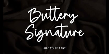 Buttery Signature is a unique and elegant monoline font, this font was created by being inspired by a signature by someone, then developed into a work that can be used by many people. It comes with an elegant and unique style which is perfect to make any design stand out! This font is perfect for branding, wedding invites, magazines, mugs, business cards, quotes, posters, and more.
 - Cocomat Pro by Zetafonts,
$39.00 Cocomat has been designed by Francesco Canovaro and Debora Manetti as a development of the Coco Gothic typeface system created by Cosimo Lorenzo Pancini. It shares with all the other subfamilies in the Coco Gothic system a geometric skeleton with open, more humanistic proportions, a sans serif design with slightly rounded corners and low contrast proportions, without optical compensation on the horizontal lines, resulting in a quasi-inverted contrast look in the boldest weights. What differentiates Cocomat from the other subfamilies in Coco Gothic are some slight design touches in the uppercase letters, with a vertical unbalancing reminiscent of art deco design, notably evident in uppercase "E", "A","F","P" and "R" - while lowercase letters have been given some optical compensation on the stems, like in "n","m", "p" and "q". These design choices, evoking the second and third decade of the last century (Cocomat is also referred as Coco 1920 in the Coco Gothic Family) all give Cocomat a slight vintage feeling, making it a perfect choice every time you need to add a period vibe or an historical flair to your design, like in food or luxury branding. The typeface, first published in 2014, has been completely redesigned by the original authors in 2019 as Cocomat PRO to include eight extra weights (thin, medium, black and heavy in both roman and italic form), extra open type features (including alternate forms, positional numerals), and extra glyphs making Cocomat cover over two hundred languages using latin, cyrillic and greek alphabets.
 - Bookable Sans by Stiggy & Sands,
$24.00 A Sans Serif Family with a few unique relatives Our Bookable Sans Family was inspired by a lettering specimen from “Letters and Lettering” by Carlyle & Oring, but you'll find the inspiration has come a long way, baby. From its original reference of displaying a standard width and weight, to the two words showing a light narrow and a heavy wide, this friendly utilitarian display text face has grown to include three width families, with six weights from light to black each. The outliers of the family are Bookable Mondo: an uber heavyweight wide style exuding all brute power in an all-caps form, and Bookable Noir: a lightweight and narrow style with many unique alternate letterforms and ligatures that spoof film noir titling, but also goes off the rails having fun. Opentype features for the traditional families include: - Full set of Inferiors and Superiors for limitless fractions. - A small collection of f-based Ligatures. - Tabular & Proportional figure sets. - Ordinals. - Approx. 419 characters. Opentype features for Bookable Mondo include: - Full set of Inferiors and Superiors for limitless fractions. - Ordinals. - Approx. 391 characters. Opentype features for Bookable Noir include: - Full set of Inferiors and Superiors for limitless fractions. - Five Stylistic Alternate Sets. - Sixty-six unique ligatures. - Ordinals. - Approx. 701 characters.
 - Linotype Ergo Paneuropean by Linotype,
$103.99Linotype Ergo was designed by American Gary Munch, and was a winner in Linotype's Second International Digital Design Contest in 1997. Conceived as a blend of traditional and modern type concepts, it works as a legible text family as well as a lively display or headline font. The word ergo means consequently," but it also comes from the Greek word "ergon" for "work." Consequently, Munch sees this family as full of energy -- an ideal font for working hard to make a point, and able to get it across with friendly vigor. The strokes of the characters are carefully designed to accommodate the tendency of the eye to enlarge horizontals and perceive verticals as lighter. The lowercase forms have open, friendly counters and are enhanced by small quirks, such as the slightly leaning s and the wide t. The deep branching of curves from main strokes helps this humanist sans to be very readable at smaller sizes. Linotype Ergo has four normal-width weights, five condensed weights, and two compressed weights - all with companion Italics! The family also includes a clever "Sketch" font for use in headlines, bringing the total number of font styles to 23. Ergo is available with Greek and Cyrillic and as W2G fonts with Hebrew." - Atyp BL by Suitcase Type Foundry,
$39.00 The sources of inspiration for the Atyp typeface are spread out widely both stylistically and chronologically. The basic proportions of the uppercase refer to the elementary geometric constructions of the Bauhaus. The subtle details in the drawing of the characters and the microscopic adjustments, which evoke the illusion of uniformity and mechanical purity, pay homage to the rationalism of the typefaces popular in the International Style. The increased contrast of the joints of the bowls and shoulders in the Display weight, which in certain diagonal curves transition into almost deconstructive permutations. For a change these take delight in doing things on purpose, teasing readability and breaking the rules of the new millennium's typography. Atyp was created by adapting a typeface originally made for a commercial television station. The potential of the neutral grotesque, proven by its excellent readability on screens, gave the impetus for its preparation into an extremely wide character set. Coherence across all eight key masters lays the groundwork ideally for using the variable font format. The key benefits of this technology are a significant reduction in data consumption in the case of web fonts, as well as an unlimited access to the full range of styles, which in turn is a significant benefit in the area of responsive design.
 - Alizé by TypeTogether,
$49.00 Alizé is a three-weight typeface inspired by the chancery italic of the 16th century. It is a high-contrast face, created with syncopations in axes and proportions and subtle irregularities that form a lively and delicate weave, suitable for setting a single word, a special expression, or a short block of prose. The family does not contain a roman, and instead promotes the italic as a primary style, a common printing convention in the 16th and 17th centuries. The italic lowercase predates inclined capitals by about twenty years, and as a nod to this typographic evolution, Alizé’s capitals, small capitals, and figures are very slightly inclined to match the energy of the lowercase. The low x-height and long ascenders and descenders, features associated with finesse and luxury, are reminiscent of the Venetian-style italic, but are further emphasised. Unlike the Venetian italic, however, Alizé has a sharp slope, giving a prominent sweep across the page (alizé is the name of trade wind). Each font of Alizé has a character set count of exceeding 700, and contains an abundance of ligatures, dynamic fractions, ornaments, and pan-European language support. They have also been manually hinted for the highest-quality display on both print and screen.
 - Lapoya by Cuchi, qué tipo,
$9.95 “LAPOYA” (meaning in english “the coolest”) is a large slab serif typeface family, with a certain Italian inverted contrast touch. Specially designed for advertising big shows and commerces, Lapoya has 36 variables and four axes, including a text and decorative versions, where the drawing and width of its counterforms vary. It also has icons that remember the old aesthetics of wood types from the early 20th century, and more than 400 characters with a multitude of signs and ligatures, that make Lapoya ideal for up to 89 languages. It is clearly inspired by the large wood types designed for posters, advertisements and newspapers. Since they were introduced in the 19th century, slab serifs have become extremely popular. In fact, serifs are often enlarged, not so much to look like beautiful or balanced letters, but to be more graphic and visual powerful than others. Furthermore, in the case of this typeface, this idea has been applied not only to capital letters, but also to the lowercase, numbers and signs of all kinds. “That’s why this typeface is LAPOYA!” Designed by Carlos Campos in 2023. cuchi@cuchiquetipo.com OPENTYPE FONT 426 GLYPHS 388 CHARACTERS 4 AXES 36 INSTANCES 9 LAYOUT FEATURES 89 LANGUAGES
 - Ongunkan Cypriot Linear C Sylla by Runic World Tamgacı,
$100.00 This font is an adaptation of the cyprus syllabic script to a Latin-based font. I tried to assign as many correct letters as possible, but there were too many characters so I had to fit them. Please review the alphabet table of Cypriot syllabic to use the Font. To see all the characters, you can see all the characters and add them to the text by selecting this font from the add character section on the word page. Cypriot syllabary The Cypriot syllabary was used in Cyprus from about 1500 and 300 BC and is thought to have developed from the Linear A. The earliest known inscriptions from between 1500 and 1200 BC are in an unknown language called 'Eteo-Cypriot', or 'True Cypriot', and the script in which they are written is called Cypro-Minoan. From around 1200 BC Cyprus began to be colonised by Mycenaean, Minoan and possibly Cretan Greek settlers, and they probably adapted the existing script to write their own language - the oldest known inscription in Greek dates from the 11th century BC. Cypriot Greek had much in common with Greek dialects of Arcadia and Pamphylia, which corresponds to the province of Antalya in Turkey.
 - DIY Fantasy Stamp by TypoGraphicDesign,
$19.00 The typeface DIY Fantasy Stamp is designed in 2020 for the font foundry Typo Graphic Design by Manuel Viergutz. The display typeface is inspired by the crafts of 20s and 40s. The basis for this authentic stamp font was a letter case with a rubber stamp from Simplex. This analog character set of 85 stamps, was digitally extended to 500+ glyphs. 5 font-styles (Sharp, Dirty, Rough, Invert, Heavy) with 546 glyphs (Adobe Latin 3) incl. decorative extras like icons, arrows, dingbats, emojis, symbols, geometric shapes, catchwords, decorative ligatures (type the word #LOVE for ❤ or #SMILE for ☺ as OpenType-Feature dlig) and stylistic alternates (4 stylistic sets). For use in logos, magazines, posters, advertisement plus as webfont for decorative headlines. The font works best for display size. Have fun with this font & use the DEMO-FONT (with reduced glyph-set) FOR FREE! Font Specifications ■ Font Name: DIY Fantasy Stamp ■ Font Weights: Sharp, Dirty, Rough, Invert, Heavy + DEMO (with reduced glyph-set) ■ Font Category: Display for headline size ■ Glyph Set: 546 glyphs (Adobe Latin 3) ■ Specials: Decorative extras like arrows, emojis, ornaments, geometric shapes, catchwords, decorative ligatures (type the word #LOVE for ❤ or #SMILE for ☺ as OpenType Feature. dlig) and stylistic alternates (4 stylistic sets) ■ Design Date: 2020 ■ Type Designer: Manuel Viergutz
 - Linotype Ergo W2G by Linotype,
$124.99Linotype Ergo was designed by American Gary Munch, and was a winner in Linotype's Second International Digital Design Contest in 1997. Conceived as a blend of traditional and modern type concepts, it works as a legible text family as well as a lively display or headline font. The word ergo means consequently," but it also comes from the Greek word "ergon" for "work." Consequently, Munch sees this family as full of energy -- an ideal font for working hard to make a point, and able to get it across with friendly vigor. The strokes of the characters are carefully designed to accommodate the tendency of the eye to enlarge horizontals and perceive verticals as lighter. The lowercase forms have open, friendly counters and are enhanced by small quirks, such as the slightly leaning s and the wide t. The deep branching of curves from main strokes helps this humanist sans to be very readable at smaller sizes. Linotype Ergo has four normal-width weights, five condensed weights, and two compressed weights - all with companion Italics! The family also includes a clever "Sketch" font for use in headlines, bringing the total number of font styles to 23. Ergo is available with Greek and Cyrillic and as W2G fonts with Hebrew." - Carlton by ITC,
$29.99Carlton is based on a typeface designed by Prof. F. H. Ehmcke. In 1908, Ehmcke released his Ehmcke-Antiqua design through the Flinsch typefoundry in Germany. Ehmcke-Antiqua was later distributed by the Bauer typefoundry in Frankfurt am Main. The Caslon Letter Foundry in England discovered the design and released their own typeface based upon the model, which they named Carlton. Carlton entered the Stephenson Blake program after they acquired the Caslon Letter Foundry in the late 1930s. As hot and cold metal typesetting became outdated technologies, Carlton and Ehmcke-Antiqua fell out of general use. In the 1990s, Letraset revived this classic design, distributing it under its English name, Carlton. Carlton's clean and generous capitals, as well as its understated yet detailed lower case, have found popularity again in recent years. The elegance of Carlton is best used for displays with large letter and word spacing. Carlton shows all of the hallmarks of a delicate serif typeface design; its forms capture a distinct moment that was common within Central European type design during the first third of the 20th Century. Carlton is similar to several other expressive typefaces from the early 1900s, including Bernhard Modern, Koch Antiqua, Locarno, and Nicolas Cochin." - Bunny Flowers by Gilar Studio,
$16.00 Bunny Flower a Handwritten Display Font With 3 Style (Regular,Outline and Shadow) You Can Mix And Match for Your Awesome Project This fonts is ideal for crafting, branding and decorate your any project. This fonts are perfect for wedding invitation or your blog. Also with their help, you can create a logo or beautiful frame for your home. Or just use for your business, book covers, stationery, marketing, magazines and more. FEATURES : Uppercase & Lowercase Number & Punctuation More than 248 of glyphs Multilingual Language PUA Encode 9 Ligatures Alternate 7 OpenType features were detected in the font (aalt dlig frac liga ordn salt sups kern) Support for 67 languages detected The alternative characters were divided into several Open Type features can be accessed by using Open Type savvy programs such as Adobe Illustrator, Adobe InDesign, Adobe Photoshop Corel Draw X version, And Microsoft Word. And this Font has given PUA unicode (specially coded fonts). so that all the alternate characters can easily be accessed in full by a craftsman or designer. If you don't have a program that supports OpenType features such as Adobe Illustrator and CorelDraw X Versions, you can access all the alternate glyphs using Font Book (Mac) or Character Map (Windows). Check my other Font here : https://gilarstudio.com/ Thanks and happy designing :-)


