10,000 search results
(0.045 seconds)
- Dnipro by Apostrof,
$36.00 Dnipro is a version of experience generalization of Ukrainian decorative font creation. The generalization development was initited by Georgy Narbut and Mark Kirnarsky in the 1920s and continued in 1970-80s. Latin letters of the font have half-uncial forms, which makes it appropriate for the printing of the relevant content. Besides its decorative properties the font is easy to read and quite suitable for short texts. It is well suited for folk tales, Ukrainian and Slavic in general as well as Western European.
 - Telephone Extended by K-Type,
$20.00 Telephone Extended is a geometric semi-slab family with block serifs positioned to assist wordflow. The typeface evolved from an italic wordmark designed in 1966 for the British GPO by the Banks & Miles agency to publicize all-figure telephone dialling (all-number calling), and the new fonts retain that italic spirit, even in the upright romans. The squarish glyphs, with a mix of rounded and angular corners, have a post-modern feel suggesting technological advance, innovation and vitality. A normal width family, Telephone, is also available.
 - Carot Text by Storm Type Foundry,
$39.00 Carot Text fonts are especially tuned for reading sizes: their serifs have adequate strength and do not cause fatigue when reading long. Originality lies in the tradition revived by modern language. The whole Carot system is built up from what has long been around; in any case, it was the intention: to evoke the already experienced visual reminiscences of today's spectacled people. I believe in the raw effect of “Carot” typefaces. The family of 64 members offers a modern alternative for all types of design work.
 - Toews by Blank Is The New Black,
$10.00 Toews is a continuation of the work started with Versteeg, Huet, and Niemi. It combines the elements of the letterforms found in Huet and Niemi and uses the letterform outlines to create shapes that intersect with themselves. While Huet and Niemi can easily be outlined in most design programs, Toews outlining would not work smoothly in most programs, which is why an outlined version is available. The two styles are carefully designed to be able to transition from one to another smoothly within the same type field.
 - Telephone by K-Type,
$20.00 Telephone is a geometric semi-slab family with block serifs positioned to assist wordflow. The typeface evolved from an italic wordmark designed in 1966 for the British GPO by the Banks & Miles agency to publicize all-figure telephone dialling (all-number calling), and the new fonts retain that italic spirit, even in the upright romans. The squarish glyphs, with a mix of rounded and angular corners, have a post-modern feel suggesting technological advance, innovation and vitality. A wide version, Telephone Extended, is also available.
 - Jazz Beat Stencil JNL by Jeff Levine,
$29.00 The 1960 British film “Beat Girl” (released in the U.S. as “Wild for Kicks”) was a typical [for its time] story of a teenage girl looking to have some fun by hanging out with SoHo beatniks and going against parental authority. One of the posters for the film features the title in a condensed slab serif stencil form, with eroded edges. The basic letter forms were smoothed out and cleaned up resulting in Jazz Beat Stencil JNL, which is available as in both regular and oblique versions.
 - Memesique by Egor Stremousov,
$50.00 The Memesique Font is unicase sans-serif typeface with ultra-thick strokes, compressed letterspacing and strong regular rhythm. It is a product of the analysis and the reinvention of the font Impact created by Jeffrey Lee. Each parameter of Impact was increased to the absolute. As a result, we have a modern grotesque with a large collection of glyphs and stylistically referring us to the mid-1960s. A font designed for memes, good for advertising, ideal for headlines. Videos: — Memesique Font Logotype — Memesique Font Presentation
 - Tapas by Fenotype,
$20.00 Tapas is a delicious multi type family with a little something for everyone's tastes and needs. The family consists of four distinct members that share same traits but communicate different aspects. Together they’ll create a bold and effortless mix of various flavors and accents. Naturally, the fonts can be used individually too. Use the Tapas type family in packaging, branding or editorial – wherever some delicious flavors are needed.
 - Incus by VladB,
$20.00 Incus is a modern sans serif geometric font, includes upper and lower case characters, Latin, Cyrillic, Latin Eastern Europe, Turkish, Baltic and other. The Incus family consists of 6 fonts, divided into 2 subgroups (according to the type of style - St, Cut), and have the 3 types of thickness in each subgroup. Incus fonts will be useful in developing a brand, creating posters and other graphic products, and for word processing
 - Lazycat by VladB,
$28.00 Lazycat is a modern sans serif geometric font, includes upper and lower case characters, Latin, Cyrillic, Latin Eastern Europe, Turkish, Baltic and other. The Lazycat family consists of 8 fonts, divided into 2 subgroups (according to the type of style - St, Rg), and have the 4 types of thickness in each subgroup. Lazycat fonts will be useful in developing a brand, creating posters and other graphic products, and for word processing.
 - Lokko by VladB,
$20.00 Lokko is a modern sans serif geometric font, includes upper and lower case characters, Latin, Cyrillic, Latin Extended symbols and other. The Lokko family consists of 8 fonts, divided into 2 subgroups (according to the type of style - St, Cut), and have the 4 types of thickness in each subgroup. Lokko fonts will be useful in developing a brand, creating posters and other graphic products, and for word processing.
 - Hem And Haw SRF by Stella Roberts Fonts,
$25.00 Hem and Haw SRF is another Ray Larabie original for Stella Roberts Fonts. Rebuilt from Ray's former freeware design "Stitchen", the lettering looks as if it were stitched into fabric. The font now is more complete with foreign characters and additional accents, punctuation and currency symbols. The net profits from my font sales help defer medical expenses for my siblings, who both suffer with Cystic Fibrosis and diabetes. Thank you.
 - Valerie Indirose by sizimon,
$20.00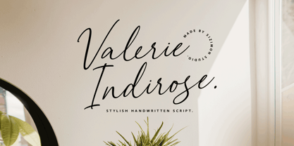 The font is called "Valerie Indirose", it is with fashionable themes. Script font contains 2 set alternates and some ligatures. The Valerie Indirose matches apply in some designs such as the logotype, quotes, wedding invitation, business card, packaging, branding, and more custom design. What's Include : Uppercase, lowercase, numeral, symbol and punctuation, alternates (ss01-ss02), ligature in script font PUA Encoded Multilingual support If you have any questions, please contact : info@sizimon.com
 - Millard by Artegra,
$29.00 When you need a classic serif typeface that is up to the modern standards, Millard comes to your rescue with its alluring beauty and legibility. You have a contemporary serif family that offers great variety with regular and bold weights in both normal and condensed widths, along with their true italics. Over 500 glyphs in each font offers you the language support you need for all the Latin languages.
 - Basik by Superfried,
$32.50 As the name suggests, Basik is a simple, clean and versatile sans-serif typeface designed by Superfried. It is equally apt in both body and display scenarios. There are already numerous san-serif fonts available which is why we have tried to create some unique styles and cuts throughout the typeface. Basik has been featured on the Behance curated typography gallery TypographyServed.com. It is available in two styles, book and stencil.
 - Urbancat by VladB,
$20.00 Urbancat is a modern sans serif geometric font, includes upper and lower case characters, Latin, Cyrillic, Latin Eastern Europe, Turkish, Baltic and other. The Urbancat family consists of 8 fonts, divided into 4 subgroups (according to the type of style - St, Rg), and have the 4 types of thickness in each subgroup. Urbancat fonts will be useful in developing a brand, creating posters and other graphic products, and for word processing.
 - Leathercrafter JNL by Jeff Levine,
$29.00A popular hobby in the 1950s and 1960s was creating your own wallets, belts and other items from leather do-it-yourself kits. Stamped or carved initials, names or phrases were often added to the leather with special tools and templates - many featuring a Western-styled alphabet with a hand-lettered look. Leathercrafter JNL recreates that same look in a digital font format, complete with the unusual and contrasting letter shapes. - Forest Trophy Textured by Sronstudio,
$10.00 Forest Trophy - Classic Display Font comes with a rough texture that gives a natural and vintage impression, suitable for the needs of outdoor apparel, merchandise, event posters, movies, etc Features: Uppercase and lowercase letters Multilingual, numerals, and punctuation Available in 3 styles: Clean, Rounded & Textured Style Note: the design in the preview images is not included If you have any questions feel free to drop me a message Thank You!
 - Katherine by ParaType,
$30.00Script font developed for ParaType in 2007 by Gennady Fridman based on informal handwriting. The handwriting belongs to a woman of middle class that have found her place in the life and does not pretend to get more. It produces a feeling of reliability and promptness. The font can be used for advertising of house goods and in other printed materials where it's important to show informality and personal attitude. - Tombouctou by Hanoded,
$15.00 Tombouctou is the French name for Timbuktu, a city in central Mali. I have been to Timbuktu several times; usually arriving after a three day boat trip up the Niger river. Timbuktu is a smallish city, literally in the middle of nowhere, with a treasure trove of UNESCO listed sights. Tombouctou font is a handmade brush font. It is nice and elegant and will give your designs an ‘oriental’ touch.
 - Parus by VladB,
$20.00 Parus is a impacted modern sans serif geometric font, includes upper and lower case characters, Latin, Cyrillic, Latin Eastern Europe, Turkish, Baltic and other. The Parus family consists of 8 fonts, divided into 2 subgroups (according to the type of style - St, Obl), and have the 4 types of thickness in each subgroup. Parus fonts will be useful in a word processing, developing a brand, creating posters and other graphic products.
 - Rocinante Titling by XO Type Co,
$40.00 Rocinante Titling is a study in interior and exterior tension, with tightly-packed interiors and unexpected lightwells contrasting generous letterspacing. 5 weights and obliques on the same weight range as Havelock Titling, the family is a contrasting partner meant for combination. It’s made for creating contrast and tension in your work. Here’s a downloadable PDF specimen, and here's more about the process of getting from Havelock to Rocinante.
 - Flottenheimer by PizzaDude.dk,
$20.00 Flottenheimer was done with a semi dry pen, that leaves the strokes quite rough. Some letters are more rough than other, giving a very realistic overall look to the text. To add more spice to the realistic look, I have added several versions of each letter. That means that there is 5 different versions of each letter that automatically cycles as you type! Packed with loads of accented characters!
 - Engravia by K-Type,
$20.00 Engravia is a Didone display face supplied in three varieties of engraving – Inline, Shaded and Sawtooth – plus a plain basic font. All four fonts share the same spacing and kerning, so engraved characters can be overlaid onto plain ones to produce bicolor effects. All four Engravia fonts are included in the download. The typeface was developed from K-Type’s rustic Building & Loan font, redesigned and drawn with precision outlines.
 - Youthink by 38-lineart,
$16.00 'Youthink'. An energetic handwritten font, a reflection of the lifestyle of young people with an expression of what it is. Equipped with unique ligature makes this font appear with unpredicted surprises, worthy of a young soul that always accentuates freedom of work and thought. In short, this Font is an analogy from young people's creations. YOUTH - THINK - INK. from these words we put it together as Youthink. Pure handwriting makes this font more personal touch, complemented by multi-language support makes it free to appear in any part of the world, plus some alternate makes it more stand out. This font is very suitable for young and modern designs, very suitable for YouTube broadcasts, brand logos, prints for crafts and t-shirts, adrenaline sports hobbies, Journey Caption and certainly very instagramable. Stay safe and enjoy the font. Thanks
 - Altaria Miguel by Rillatype,
$15.00 Introducing, my latest font. Altaria Miguel! Altaria Miguel is an elegant and modern sans serif font. altaria miguel can offer a thin font with a modern look that's perfect for your various design needs from headline, branding, logo, advertisement, product design, etc. Altaria Miguel was created with great care and precision with the aim of none other than to make this font perfect as a font that can be used in a variety of needs. The kerning in this font is also done with great care to maintain the perfection of this font. In addition, Altaria Miguel also provides a slanted version which is also re-kerned separately to get maximum kerning results. There it is. We really hope that you enjoy this font, and please feel free to reach me if you have any question. Thank You!
 - Global Bikers by Din Studio,
$29.00 Would you like to have a unique, firm, energetic design? Global Bickers ensures you to deliver the clearest messages to anyone. Global Bickers a racing-themed script font made in thick displays. Unlike other useful cursive fonts looking similar to hand writings, this font really fits into bigger-sized texts. The available features in this font are: Stylistic Sets Ligatures Swashes Multilingual Supports PUA Encoded Numerals and Punctuations Global Bickers is greatly appropriate for various designs, such as posters, banners, logos, book covers, headings, printed products, merchandise, social media, and more. Find out more ways to use this font by taking a look at the font preview. Enjoy your experience with this font and feel free to contact us for further product information or trouble complaints. Thank you and wish you good luck with your designs.
 - Bobby Jones by Tom Chalky,
$19.00 Introducing The Loud & Proud Bobby Jones Font Collection Inside you'll find 16 quirky handcrafted fonts, oozing with personality, ripe and ready to take center stage within a variety of creative and fun design projects. If you're looking to grab eyeballs with an ad campaign, a logo design, apparel, printed stationery, and all that other good stuff, then worry not. Bobby has you covered. We all come with imperfections and Bobby is no exception! His outlines are slightly off, his corners are irregular, his straights aren't straight, but he's cool with it. In fact, he's too busy strutting his stuff. - What's Inside? Each of the fonts listed below boast multilingual glyph ranges and their own individually handcrafted outline style! (16 fonts in total!) - Bobby Jones - The original Bobby.J - Bobby Jones Soft - A rounded version of the above - Bobby Jones Condensed - The thinner and leaner sibling to Bobby Jones - Bobby Jones Condensed Soft - A rounded version of the above - Bobby Rough - A high-res textured version of the original - Bobby Rough Soft - A textured version of Bobby Jones Soft - Bobby Rough Condensed - A textured version of Bobby Jones Condensed - Bobby Rough Condensed Soft - A textured version of Bobby Jones Condensed Soft Designed a little over five years ago, the original Bobby Jones Font was my first ever product. This new and improved version has been entirely redesigned from bottom to top. Holding dearly to the punch that the original had, while adding a whole lot of extra power. I hope you enjoy the Bobby Jones Family as much as I do and have, and as always if you have any questions or comments, please do not hesitate to get in touch. I'd love to hear from you. (tom[at]tomchalky.com)
 - ROBO - Personal use only

- Dynasty by Device,
$39.00 Dynasty is an extensive and versatile family that exploration and modernisation of the typographic quirks associated with the 'American Gothic' type school (in much the same way as English Grotesque was an exploration of Gill/Johnston idea-space) and adds chamfered elements to dots and tails to emphasise and extend the early machine-made aesthetic. Elegantly clean and readable at headline and small text settings, where (as with all fonts in small sizes) the introduction of tracking will improve legibility.
 - Boetia by Scriptorium,
$24.00Boetia is an Art Nouveau period font which is designed to give some of the feel of ancient Greek lettering and design. It also echoes the lettering of the Psychedelic poster era and would be a great addition to any 60s font collection. The overall effect is both modern and classical at the same time, with readable, bold character forms perfect for posters or other titling uses. If you like our Hendrix or Pantagruel fonts you're going to love Boetia. - Andeas by Gatype,
$12.00 The Andeas font is perfect for branding, poster design, t-shirts, invitations, designs for kids, and editorial design. It comes with over 400 glyphs, including ligatures. OpenType features include style sets, character variants, starting and ending forms, and multilingual support. Important information: To access the alternatives, you must have access to an older version of Photoshop to copy/paste the glyphs from the included PSD, OR the Glyphs Panel, which can be found in Photoshop CC or any Version of Adobe Illustrator. Thanks.
 - Monotype Goudy Modern by Monotype,
$29.99First cut by Lanston Monotype, the Goudy Modern font family was based on designs used by French engravers during the eighteenth century. Although called a modern it possesses a number of old style characteristics. Capitals are much shorter than the ascenders, serifs are fully bracketed and round shapes have a slight stress. The overall weight of Monotype Goudy Modern is on the heavy side, giving good emphasis in display sizes but it is not too heavy for use in text. - Nanami Pro by Thinkdust,
$19.00 Nanami Pro is the heavily engineered follow up to the hugely successful Nanami and Nanami Rounded font families. Nanami Pro contains all the wonder of the original Nanami families, but with vastly extended language support including Cyrillic and Extended Latin, leading to a total of 458 carefully crafted glyphs. The original Nanami was a key font in many a typography collection, but with these new multi-lingual credentials, Nanami Pro has become a true must-have font for anyone who’s serious about design.
 - Crazy Harold - Unknown license

- Sun by LucasFonts,
$49.00 Sun is a family of compact typefaces closer to old industrial-style American newspaper headlines than to Luc(as)’s other designs. The fonts also work in text, and have been used for corporate identity and editorial projects for more than two decades now.
 - Bistro by Letterhead Studio-YG,
$29.00 Bistro and Hot Sauce have been prepared quickly. In Bistro you will find 10 fine traces from coffee cups, and in HotSauce 10 pleasant-for-eyes stains from sauce. Both fonts are created in the 1998. OpenType revision, with extended Latin characters, made in 2009.
 - Zornale Title by Eurotypo,
$20.00 Zornale TITLE is a family of four fonts that can be combined with the rest of Zornale family (text and caption). These fonts have been designed with precise kerning and full OpenType features: Old-style figures, swashes, stylistic alternates, ligatures and case-sensitive forms.
 - Colosseum by Alan Meeks,
$45.00 Although a sans serif, Colosseum owes its style to the original Trajan Roman form. Borrowing some characteristics from Friz Quadrata, in its san serif form it is more adaptable to text usage whilst still having a modern and original look which works well in headlines.
 - Kentledge by Namogo,
$35.00 Kentledge is a grotesque sans type family based on geometric forms that have been optically corrected for better legibility. The family includes extended language support (over 200 languages), alternates, ligatures and more. It is best suited for graphic design and any display / text use.

