10,000 search results
(0.079 seconds)
- Liquoia by Wiescher Design,
$39.50 Liquoia are three scripts with lots of contrast and different embellishments. Liquoia-A has the elegant, flaming decoration it blends well with Fleurons-Six. Liquoia-B has the flowery embellishments and goes very well with my Ornata-A and Ornata-B. Liquoia-C is the plain, straightforward and solid floating script. The name is derived from "liquid", meaning it is a fluid script that has a distinctive waveform. The "oia" part of the name comes from Sequoia, the sturdiest tree that came to my mind. Your sturdy, floating designer Gert Wiescher
 - Aabak by Polimateria,
$39.00 Aabak is a sumptuous modern typeface family. The high contrast, super elegant, didone like shapes were infused with a little fluidity from 60’s psychedelic lettering, the results is a contemporary face that screams freshness. It is ideal for branding, advertising, headlines, posters, movie titles, and much more! This design deliberately sabotages a lot of white space to have that compressed punchy look. The tear drop terminals and the melting serifs create a surprisingly superb combo. Sharp joints were smoothen to convey a warm and subtle feeling. Aabak comprises a total of 18 styles, 6 weights in 3 different cuts: Upright, Italic and Swash. The Swash styles have also a terminal forms feature that gives that extra lush feel. Have fun playing with it!
 - Zenith by Glyphobet,
$9.99 Chinese characters have simplifed and more complex, "traditional" variants. Zenith imagines what an un-simplified, traditional version of the Latin alphabet might have looked like.
 - Black Storm by Nathatype,
$29.00 Black Storm, a captivating serif display font, commands attention with its bold presence and refined aesthetics. It's a versatile tool that empowers your projects with a sense of authority and intricate detailing. The characters in Black Storm are boldly large, ensuring a striking visual impact suitable for attention-grabbing designs. The stable letter size contributes to a balanced and authoritative aesthetic. What elevates Black Storm to new heights is the thoughtful incorporation of additional lines and ornaments, meticulously placed to create a harmonious blend of structure and embellishment. In addition, enjoy the features here. Features: Alternates Multilingual Supports PUA Encoded Numerals and Punctuations Black Storm fits in headlines, logos, posters, flyers, branding materials, greeting cards, print media, editorial layouts, and many more designs. Find out more ways to use this font by taking a look at the font preview. Thanks for purchasing our fonts. Hopefully, you have a great time using our font. Feel free to contact us anytime for further information or when you have trouble with the font. Thanks a lot and happy designing.
 - ITC Mister Chuckles by ITC,
$29.99Round, firm, and bursting at the seams with good humor, ITC Mister Chuckles is based on the premise that barrel shapes have pleasant associations. Think: beer-barrel polkas, a barrel of fun, or a barrel of laughs, and you'll get the idea. Designer Nick Curtis has combined sans serif sturdiness, a hint of 1930s deco and a handful of giggles in this remarkably versatile all-cap face. If the typographic occasion calls for mirth and merriment, invite Mister Chuckles to the party. You'll have more fun than a barrel of monkeys! - Chino Tattoo by Otto Maurer,
$25.00 Chino Tattoo is best for all Tattooartists and Tattoofans. You can use it to make Tattooflashs for your Tattoostudio. Chino Tattoo is a typical Tattoostyle Font. The Chinostyle comes from the Gangs of the USA (with latin roots). They often have Chist-Symbols.
 - Vividangelo by Wiescher Design,
$24.50 Vividangelo is designed after the handwriting of a real person. I saw it on the pricetags in a small shop and convinced the person to have her handwriting converted into a font. She is very happy about it now, so am I.
 - Gazeta Slab by Vanarchiv,
$35.00 This humanist slab-serif style is an extension from Gazeta font family, the letterform are more sharp, racional and mechanical. Italics are having small differences from roman letterforms, the characters are slightly more narrow (weight) and the proportions are less open (width).
 - One Night Stand by T4 Foundry,
$21.00Torbjörn Olsson's experimental type One Night Stand deserves a longer relation. Use it for drop caps or quotes, to add drama in dull surroundings and to spice up bland editorial content. One Night stand is also the perfect way to seduce readers of advertisments, as well as delivering contrast in headlines. Do you want to show the world in stark black and white? The One Night Stand is for you! One Night Stand is an OpenType typeface for both PC and Mac. Swedish type foundry T4 releases new fonts every month. One Night Stand is our twelfth introduction. Note: The underlying sans-serif font for One Night Stand is Esans Bold, also designed by Torbjörn Olsson. Esans is a fine sans, excellent for headline use, inspired by Granby, Tempo, Gill and others. - Lalibela by CyberGraphics,
$43.00My motivation for designing the Lalibela family (which is based on Bodoni) was to pay homage to Ethiopic script. The script has been around for about 3 000 years, but I took artistic licence to deviate from the original model and add personal touches. I chose Bodoni as a historical model because of its display value and not its text size use because the extreme contrast made it difficult to read at small sizes. A Modern typeface characterized by consistently horizontal stress, flat and un-bracketed serifs, and a high contrast between thin and thick strokes, were the final step in typography two-hundred-year journey away from calligraphy. The austerity, simplicity and greater contrast style was perfected.Contrary to all the refinements in Bodoni, I have revisited calligraphy with the font Lalibela that mimics Ethiopic Script. It was drawn with a much larger x height and less geometric than Bodoni for its primary use as a display font. For example, a lot of italic serifs were added to the roman face as well as 16 additional ligatures to obtain more a feel of calligraphy. I made the serifs thicker and bracket one side with straight steps obtaining a reduced contrast to withstand breaking up at smaller sizes.An additional variant, "Lalibela Alternate" was designed to provide an interesting mixing possibilities with the Bold face for more expressive headlines. - Lust Stencil by Positype,
$39.00 When you hear that name, you likely ask yourself, ‘why?!’ I did too, but the number of requests could not be ignored. Once I finally decided to move forward with it, the only way to solve the offering would be to adhere to the same theme of indulgence, I planned for the same number of optical weights AND Italics. Yeah, italic stencils… ok, why not? It’s not a new concept. One thing to note and a creative liberty I assumed during the design. Lust Stencil would not be just a redaction or removal of stress to produce a quick stencil. To do that, would just be a cheap solution. Strokes had to resolve themselves correctly and/or uniquely to the concept of the stencil format. And, it had to be heftier. For it it to look correctly, it needed about 8% additional mass to the strokes for it to retain the effervescent flow of the curves and the resolute scalloped lachrymals. The Lust Collection is the culmination of 5 years of exploration and development, and I am very excited to share it with everyone. When the original Lust was first conceived in 2010 and released a year and half later, I had planned for a Script and a Sans to accompany it. The Script was released about a year later, but I paused the Sans. The primary reason was the amount of feedback and requests I was receiving for alternate versions, expansions, and ‘hey, have you considered making?’ and so on. I listen to my customers and what they are needing… and besides, I was stalling with the Sans. Like Optima and other earlier high-contrast sans, they are difficult to deliver responsibly without suffering from ill-conceived excess or timidity. The new Lust Collection aggregates all of that past customer feedback and distills it into 6 separate families, each adhering to the original Lust precept of exercises in indulgence and each based in large part on the original 2010 exemplars produced for Lust. I just hate that it took so long to deliver, but better right, than rushed, I imagine. It would have taken even longer if not for font engineer and designer, Potch Auacherdkul. Thanks Potch.
 - Felicidade by IKIIKOWRK,
$17.00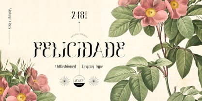 Introducing Felicidade - Oldfashioned Typeface, created by ikiiko. A classy decorative type with vintage touch. This typeface is perfect for an luxury brand logo, books cover, ancient or vintage product, packaging design, magazine header, poster, quotes, and so much more. What's included? Uppercase & Lowercase Number & Punctuation Multilingual Support Works on PC & Mac Enjoy our font and if you have any questions, you can contact us by email : ikiikowrk@gmail.com
 - Poblano by Niche,
$26.99 Poblano is a masterfully designed flared typeface, inspired by Gothic Tuscan that incorporates an aura of modern fun and classic southwest whimsy. With serifs that embody the beautiful, natural curve of the Poblano Pepper, it captures the pepper’s essence and attitude of having the perfect amount of piquant heat. Perfectly suited for menus, headlines, and logos, Poblano will be the ideal garnish to complete and elevate your food, rustic, grunge and hipster themed designs. The Poblano menu includes: • A range of styles from elegantly thin to boastful black • Over 400 glyphs per weight • More than 50 stylistic alternatives • Upper and lowercase characters • Uniquely stylized to elevate your design and add that finishing touch This is the ultimate niche solution to both display and functional Tuscan serif fonts.
 - One United Font by TypoGraphicDesign,
$9.00 The typeface One United Font is designed from 2020 for the font foundry Typo Graphic Design by mäd • madeleine maros × Manuel Viergutz as a political statement #leavenoonebehind The display font is inspired in the past and present. 3 font-styles (Bubble, Bubble Behind, Outline) + 1 icon-style with 390 glyphs (Adobe Latin 1) incl. 100+ decorative extras like icons, arrows, dingbats, emojis, symbols, geometric shapes (type the word #LOVE for ❤ or #SMILE for ☺ as OpenType-Feature dlig) and stylistic alternates (3 stylistic sets). For use in logos, magazines, posters, advertisement plus as webfont for decorative headlines. The font works best for display size. Have fun with this font & use the DEMO-FONT (with reduced glyph-set) FOR FREE!
 - Biscuit Boodle Ornaments by insigne,
$5.00 Biscuit Boodle Ornaments are the ornament complement to Biscuit Boodle, a fun and uplifting brush-drawn script. Biscuit Boodle Ornaments offers a total of 72 vignettes, crests, fleurons, frames and many other useful ornaments. These ornaments were brush-drawn by Portland Studios‚ Illustrator Justin Gerard and have just a slight amount of natural texture. These energetic and lively ornaments can be resized and rotated easily without any loss of quality and can easily be converted to outlines and modified. Combine them to form unique compositions or insert them into text to add some excitement to your designs. Please see the sample .pdf to see all 72 ornaments in action.
 - Avento by Larin Type Co,
$16.00 Avento this is a wonderful vintage font designed in the Art Deco style. With it, you will be transported to the era of the 20s-60s. it will add charm, estetica and create a unique atmosphere of this time in your design project. this font includes four styles : regular, InLine, thin outline and bold outline, as well as it has many alternates that you can use to play with the dynamics of the font. This font is easy to use and has OpenType features. Following international .
 - Trigger by Sohel Studio,
$16.00 Trigger slab serif inspired by sporty design, vintage style with a touch of classic style. There are 8 different styles that you can apply in your design projects. This font is built with solid foundations, strong visuals, old-school movement, and a modern minimalist style. Trigger is perfect for , Jersey , athletic, poster, branding projects, Logo design, Clothing Branding, product packaging, for magazine titles. for something with the theme of sports, album title, etc Trigger Features: · 8 Weights font · Numerals & Punctuation · Accented characters · Multilingual Support · PUA Encoded While using this product, if you encounter any problem or spot something we may have missed, please don't hesitate to drop us a message. We'd love to hear your feedback in order to further fine-tune our products. Thanks and have a wonderful day
 - Outright by Sohel Studio,
$16.00 Outright slab serif inspired by sporty design, vintage style with a touch of classic style. There are 4 different styles that you can apply in your design projects. This font is built with solid foundations, strong visuals, old-school movement, and a modern minimalist style. Outright is perfect for , Jersey , athletic, poster, branding projects, Logo design, Clothing Branding, product packaging, for magazine titles. for something with the theme of sports, album title, etc Outright Features: · 4 Weights font (Regular,Italic,Bold,Outline) · Numerals & Punctuation · Accented characters · Multilingual Support · PUA Encoded While using this product, if you encounter any problem or spot something we may have missed, please don't hesitate to drop us a message. We'd love to hear your feedbacks in order to further fine-tune our products. Thanks and have a wonderful day
 - Caballero by Fabio Godoy,
$29.95 Typographical Caballero is a family created by Fabio Eduardo Godoy Angel, the concept is inspired by a type with firm and clear, with perfect posture and personality to be used by Graphic Designers and Architects, in terms of print, TV Corporate Identity, Merchandising - Other Projects. Ideal for antetétulos, titles, subtitles, texts from 12 Pts. Caballero Outline and Caballero Outline Italic, are presented as an option for antetétulos, titles and subtitles as well as short texts from 20 Pts. Caballero in his presentation Outline, allows wide range of applications in regard to the use of color, and be combined with Caballero Regular and Caballero Italic. Font Project Caballero, is set with a vertical and horizontal logic calligraphic lines, amount of contrast medium, antlers mullet and its completions are straight.
 - Sailing Heart by Din Studio,
$22.00 Say hello to Saling Heart Script... Saling Heart is a beautiful script font, made to look naturally brushed. The texture from the brush font will make your design more beautiful and powerful. This font is suitable for any design like branding, quotes, wedding invitation, lettering project and etc. Included: - Sailing Heart Regular - Sailing Heart Solid Features: - Many Alternates (lowercase) - Accents (Multilingual Characters) - Ligatures - PUA encoded - Numerals and Punctuation (OpenType Standard)
 - Alpha One by Wiescher Design,
$18.00 »AlphaOne« is my newest addition to the experimental Alpha-font-collection. I just had to do this one! It is based on Paul Renners fonts, but has got nothing to do with them, I just took the widths and some basic forms. No – or hardly no – optical corrections were made to the glyphs. I wanted the pure geometric forms to come to life. This was a lot of fun to design, I especially like the »Q« with the negative tail. I did make four weights, but nothing is normal with this font, so weight doesn’t really mean anything. Have fun!
 - Rambat Campotype - Personal use only

- Copperplate Classic Light Floral by Wiescher Design,
$39.50 Copperplate Classic Light Floral is the latest addition to my Copperplate Classic Group of fonts. The floral decorations go perfectly well together with the classic forms of the Copperplate. Your decorative designer Gert Wiescher.
 - Diablo by Monotype,
$29.99Jim Parkinson's Diablo typeface is a single weight display design. The look comes from samples found in early 20th century books on hand-lettering books, as well as general poster lettering styles from that same of the period. Diablo has a touch of the Arts and Crafts" movement in its appearance, and it also looks rather heavy. It is a unicase design, in that there is no real "lowercase." Some glyphs on the uppercase keys are alternates to the capital-style forms found on the lowercase keyboard, like A, E, F, H, J, K, M, N, Q, R, V, W, and Z. In fact, the uppercase itself is a bit more decorated and round than the lowercase. Nevertheless, the upper and lowercase letters may be freely interchanged with each other to create the best possible image for the text. The name of the typeface, Diablo, is another term for the devil, or Satan." - Catesque by Gumpita Rahayu,
$20.00 After several months discovering and developing the traits and personalities well balanced typefaces such like Frutiger and the other identical typefaces, Catesque was born as the new typefaces. The vocal flourish yet harmonious shapes not purely geometrically, it has imperfect rounded characters such as “O” “C” and “G”. Catesque can make some distinctness for large scale design as well as small text. The traits versatilities usable for many design applications, it’s comes with five weights from light to black plus mathcing italics. All characters included the Tabular figures, case-sensitive forms, fractions, and another most common numerals features such as super & subscript to accomplish the numeric design works such like menu, annual reports, etc. The alternate characters are included as well, all features can accessed with OpenType-savvy programs on Adobe Creative Suite via OpenType Panel.
 - Metrisch by Gumpita Rahayu,
$18.00 Metrisch is new sans serif typefamily of seven weights plus seven italics uprights in each weights. The typefaces designed based on traditional geometric construction that have been built with letter size wider, the x-heights taller and short descender that almost proportioned with the basic letter shape. With little details added like clean vertical cuts on the terminals and optimized sharp corners that makes this fonts smooth and refined looks. It was represents the flavor of the most common humanist typefaces style and grotesk feels. The weights comes from extra light to extra bold suitable to make display appearance, and the book and medium weights also works well as small/medium text sizes to accompany your design, such as editorial fashion magazine, solid headline, websites heading, poster, advertising, logo, signage, etc Also, Metrisch type-family fully loaded with OpenType features such as some stylistic alternates, case-sensitive forms, fractions, small capitals,and another most common numerals features such as super & subscript, tabular & oldstyle figures, numerator-denominator, and has more extended latin diacritics characters.
 - Weisy by MIX.Jpg,
$12.00 Weisy Signature is a modern calligraphy font that is light, smooth, modern with original pen strokes. This script includes holes or spaces in strokes, because all handwritten strokes with brushes use the ink flow structure. Suitable for branding, signatures, wedding invitations, and cards. Weisy Signature includes a complete set of upper and lower case letters, numbers, various punctuation marks and binders. All lowercase letters include the beginning and end of swash, giving a realistic handwriting style. All uppercase letters include the beginning of swash, which makes the font look great! If you don't have the Glyph panel to use swash, don't worry. You can type -1 instead of swash. For example, if you type -1A, the initial "A" swash appears and the "a" swash ends. If you type-1, the initial "a" swash will appear. PLEASE NOTE: With a Standard License you are NOT permitted to sell digital goods using fonts in editable software such as Templates. Please, contact me for a license extension. Thank you and enjoy MIX.Jpg
 - Marvaloha by Fontforecast,
$14.99 Marvaloha is based on the handwriting of an Advertising creative director. The casual but powerful strokes he uses for sketching are also visible in his writing. The Marvaloha font family consists of the original Marvaloha Regular and a Bold version. Both have matching Italics. All four styles have double letter ligatures and a set of symbols and catchwords to give your design some extra power. You will need an Open Type Savvy Application to get the most out of Marvaloha.
 - Evanston Alehouse by Kimmy Design,
$10.00 Evanston Alehouse is the first font in a larger collection of typefaces inspired by years leading up to the American prohibition. For the past two years I was living in Evanston, IL, a suburb of Chicago. After learning it was one of the birthplaces of the prohibition movement, I set out to learn more about it, and decided to develop a type collection that captures the dynamic era in our nation’s history. In the century that prefaced the ratification of the 18th amendment, saloons, taverns and alehouses boomed as the American working class enjoyed beer and discovered whiskey and gin. At the same time, the Temperance League was forming and gaining strength. By the turn of the century, these temperance societies were common in the culture of the country, with individual towns and states already on the move to abolish alcohol consumption. However, it was undeniable that by this time in history, America loved to drink. This font is inspired by the signage seen outside such drinking establishments. Back to the modern era, Evanston Alehouse is a 25 font family that includes 3 weights, 4 widths and 3 heights. It has special features that add depth to the font, with discretionary ligatures and stylistic alternatives. It also includes a complementary set of ornaments, including line breaks, frames, borders, and laurels. Here’s a snapshot of what you get with Evanston Alehouse: 2 Styles/Postions: Sharp (regular) and Round 3 Weights: Light, Medium and Black 4 Widths: 1826 (condensed), 1858 (narrow), 1893 (wide) and 1919 (expanded) 3 Heights: Capitals, lowercase and small caps 2 Alternatives: Discretionary Ligatures and Stylistic Alternatives 1 Ornament font with over 100 graphic extras
 - Berganza by Cuchi, qué tipo,
$9.95 "Berganza" is a typeface designed as a tribute to the spanish century called "Siglo de Oro". Embellished with several ornaments and swashes, it quickly reminds an age in which castilian arts & letters were flourished, as well as the fantasy knighty fables adventures of heroes, loved ladies and evil villains. Although the Siglo de Oro cannot be set in specific dates, it is generally considered to have lasted more than a century; between 1492, the year of the discovery of America and 1681, the year in which the writer Pedro Calderón dela Barca died. Lope de Vega, Francisco de Quevedo, or even William Shakespeare (in England) are also famous figures of this time. Berganza typeface takes its name from the main character of the picaresque novel "The Conversation of the Dogs" (Cervantes, 1613). Berganza is able to speak with the other dog Scipio on a big number of social & philosophical topics. Talking about technics, Berganza is a modern typeface but with a humanist flavour. Thanks to its various styles and flourishes, it immediately refers to the culteranism aesthetic of that time, whose aim was to elevate the noble over the vulgar. But also, Berganza takes advantage of the contemporary technology, highlighting in his drawing the contrasted forms and certain broken and unusual strokes in order to give it a brave and different style touch. Berganza includes four weights to be used for continuous reading with great visual richness. However, it is more recommended for large sizes, since its unusual and particular details appear when the letter grows. Finally, the hundreds of glyphs and Opentype features that it has incorporated, allow us to change the aesthetics of the type according to our needs. OPENTYPE FONT 518 CHARACTERS 1113 GLYPHS 4 INSTANCES (Regular, Bold, Italic & Bold Italic) 38 LANGUAGES 28 LAYOUT FEATURES (stylistic sets, ligatures, historical ligatures, swashes, contextual alternates, numerals, etc) DESIGNED BY CARLOS CAMPOS IN 2021 www.cuchiquetipo.com Dummy text from wikisource.org («Rinconete y Cortadillo», by Miguel de Cervantes).
 - Pirates Rum by Fractal Font Factory,
$13.00 Hi! Introducing a vintage layered typeface set named "Pirates Rum". This is an experiment of combining pirate motives with a touch of Gothic. It is a multi-layered decorative font containing a base layer, a layer with internal decorative elements, a layer with a shadow, and a separate aged font. It contains basic uppercase and lowercase glyphs, punctuation, numbers as well as multilingual characters for all kinds of layers. Pirates font, great for labels, logos, headers, and illustrations. Thank you & have a great day!
 - Distill by MADType,
$19.00 Distill draws its inspiration mainly from Theo van Doesburg's De Stijl era lettering. The type he designed for the Aubette Café, De Stijl Magazine, etc was used as a starting point and then expanded upon. While this typeface was inspired by historical references, it also has the ability to invoke a contemporary feel under the right conditions. Distill will work hard whether you are designing a neo-constructivist poster or a futuristic website. Distill is a family of 12 fonts: 4 weights, each containing condensed, regular, and expanded widths. It also features several alternate characters.
 - Kardinal by Ani Dimitrova,
$30.00 Kardinal is a sans serif humanistic type family. The family has 16 weights, ranging from Thin to Black with extra drawn italics and small caps versions. The Kardinal type family is ideally suites for small text, books and magazines, branding, posters, as well as web and screen design, headlines and more. Kardinal comes in 16 styles with extended language support. All weights contain standard ligatures, proportional figures, tabular figures, old style figure, numerals and arrows, matching currency symbols and fraction. The construction of characters combines clean grotesque style and calligraphic features with humanist fragrance. Out standing for the designs are the small serifs. They are giving the letters movement and freshness, as well as contribute to a better readability in different volume texts and including lots of details that give it a unique personality. The Regular and Medium weights are perfect for body text while the italic give an interesting texture to the text. The range of styles give a good flexibility to this family. The fonts are carefully hinted and perfect for digital use.
 - FS Rosa by Monotype,
$52.99 FS Rosa is a free-spirited and optimistic serif typeface – reminiscent of those used on fanzines, film sequences and book covers of the 1970s, such as Cooper and Windsor, it has a laid-back nature with a touch of rebellion. It also reminds of type used in colourful protest graphics by nun-turned-designer Corita Kent, and its personality is akin with brands like Whole Foods - positive rather than preachy. While unconventional, it’s sensible enough to work perfectly for socially conscious brands, magazines, websites and campaigns that want a fairer and more responsible world. Hand-drawn digitally, FS Rosa is warm and open-minded – its irregular letterforms are rounded, with soft terminals, a large x-height and wide apertures. But it is also quirky and eclectic, with irregular shapes – its short ascenders and descenders have slanted serifs, its uppercase forms have unusually low crossbars and the letters are filled with oddities and surprises. The typeface looks to stand out against a sea of homogenous, geometric sans serifs, and celebrates beauty through imperfection. It comes in five weights of Thin, Light, Regular, Bold and Black. The heavier weights make an impact and are great for loud, headline statements. The Regular weight is functional, balanced and robust for text, and the lighter weights have an elegance and contemporary beauty. FS Rosa is eclectic yet with its soft roundness, also positive and progressive. Its name, inspired by the phrase “rose-tinted glasses”, reflects its optimism.
 - Blazing Furnace by Kitchen Table Type Foundry,
$16.00 At home we have a wood stove. Last year, I bought a whole bunch of tree trunks, which I cut up with a chainsaw and then chopped with my Swedish axe. In Holland we have a saying that firewood keeps you warm three times: when you cut the tree, when you chop the wood and when you burn it in the stove. Our stove is rather small, so it is not exactly a blazing furnace, but I liked the name because it seems to fit this font. Blazing Furnace was made with ink and a brush. It is a bit messy and rough, but it comes with multilingual support and a nice set of alternates for the lower case letters.
 - Night Life JNL by Jeff Levine,
$29.00 Night Life JNL follows the classic lettering forms of the Art Deco era of the 1930s and 1940s. On the upper case letters, the A,B,E,F,H,K,P and R have extended horizontals, while the lower case a,b,e,f,h,k,p and r have those extensions removed and are more traditional in design.
 - Copperplate Classic Medium by Wiescher Design,
$49.50 Copperplate was the classic nineteenth century engravers typeface, consisting of capitals and small caps only. Among others (for example Deberny & Peignot) F. W. Goudy's cut for ATF around 1901 is probably the most widely known. Copperplate typefaces are traditionally used for business cards and all that "serious" stuff. My Copperplate Classic is a completely new design, based on some old samples. To make it look more up-to-date and elegant, I gave it some extra swings here and there. The old fonts were all designed with clogging corners or points that can break off in the minds of its designers. Today we do not have those problems any longer, so I could give my Copperplate Classic real sharp pointed serifs. To give you more choice I now added this medium cut in three variations, medium, sans and rounded! Enjoy! Gert Wiescher
 - Copperplate Classic Light by Wiescher Design,
$88.00 Copperplate was the classic nineteenth century engraver's typeface, consisting of capitals and small caps only. Among others (for example Deberny & Peignot) F. W. Goudy's cut for ATF around 1901 is probably the most widely known. Copperplate typefaces are traditionally used for business cards and all that "serious" stuff. My Copperplate Classic is a completely new design, based on some old samples. To make it look more up-to-date and elegant, I gave it some extra swings here and there. The old fonts were all designed with clogging corners or points that can break off in the minds of its designers. Today we do not have those problems any longer, so I could give my Copperplate Classic real sharp pointed serifs. To give you more choice I now added this light cut in three variations, light, sans and rounded! Enjoy! Gert Wiescher
 - Spaghetti Western NF by Nick's Fonts,
$10.00One in the series of fonts called Whiz-Bang Wood Type, intended to be set large and tight. Spaghetti Western is a based on an Italian interpretation of a classic ultrabold Western-style face; so, fittingly, the font is named for the genre of “cowboy” film pioneered by Sergio Leone. Both versions of this font contain the complete Unicode Latin A character complement, with support for the Afrikaans, Albanian, Basque, Bosnian, Breton, Catalan, Croatian, Czech, Danish, Dutch, English, Esperanto, Estonian, Faroese, Fijian, Finnish, Flemish, French, Frisian, German, Greenlandic, Hawaiian, Hungarian, Icelandic, Indonesian, Irish, Italian, Latin, Latvian, Lithuanian, Malay, Maltese, Maori, Moldavan, Norwegian, Polish, Portuguese, Provençal, Rhaeto-Romanic, Romanian, Romany, Sámi, Samoan, Scottish Gaelic, Serbian, Slovak, Slovenian, Spanish, Swahili, Swedish, Tagalog, Turkish and Welsh languages, as well as discretionary ligatures and extended fractions. - Hogar by Latinotype,
$39.00 This font is the result of merging my architecture background and my love for typography, which inspired me to create a system of fonts based on interior architecture design, furniture design and, especially, the love I feel for my home. The system comes with a monolinear style in sans and script versions, each including 5 weights, that share similar proportions, weight interpolation and details. Hogar is basically a sans with script gestures and a script with sans shapes. In order to make the system more complete, I included an italic version, also in 5 weights, which represents a transition between both main styles. Additionally, I developed a set of monolinear dingbats including some furniture designs by well-known architects.. The family supports more than 200 Latin derived languages.
