10,000 search results
(0.041 seconds)
- Freshline by Mega Type,
$16.00 Freshline is a textured brush font, a contemporary approach to design, handmade with an irregular baseline. Suitable for use in title design such as apparel, invitations, book tittles, stationery design, quotes, branding, logos, greeting cards, t-shirts, packaging design, posters and more. Freshline includes a complete set of uppercase and lowercase letters, as well as multi-language support, numbers, punctuation, ligatures, alternatives and extra swash. If you have any question, don't hesitate to contact me by email : megatype04@gmail.com Thanks so much for looking and Enjoy it!
 - Humeira by Arterfak Project,
$12.00 Humeira is a playfully font, inspired by handwriting lettering and doodle art movement. Designed with a manual brush and carefully vectorized with many alternates that you can apply to give handwritten looks! Humeira is perfect for headlines or body text. You have a regular and a bold weight that you can combine well. Humeira also has an Outline Shadow style with bolder contrast, funny and childish looks. Humeira font family is suitable for T-shirts, mugs, coffee cups, flyers, brochures, quotes, branding and more.
 - Black Dragon by Mega Type,
$12.00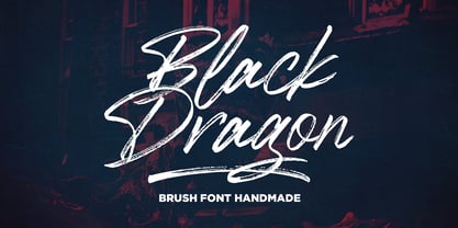 Black Dragon is a handmade brush font, naturally handmade and with underscores. Black Dragon is perfect for use in title designs such as clothing, invitations, title books, stationery designs, quotes, branding, logos, greeting cards, t-shirts, packaging designs, posters, and more. Black Dragon includes a complete set of uppercase and lowercase letters, as well as multi-language support, numbers, punctuation, ligatures, alternatives and extra swash. If you have any question, don't hesitate to contact me by email : megatype04@gmail.com Thanks so much for looking and Enjoy it!
 - Neutraface Display by House Industries,
$33.00 Although better known for his residential buildings, Richard Neutra’s commercial projects nevertheless resonate the same holistic ecology—unity with the surrounding landscape and uncompromising functionalism. His attention to detail even extended to the selection of signage for his buildings. It is no wonder that Neutra specified lettering that was open and unobtrusive, the same characteristics which typified his progressive architecture. House Industries brings the same linear geometry to Neutraface without sacrificing an unmistakably warm and human feel. FEATURES LIGATURES: This feature is on by default. It will substitute a long list of “f” and “t” ligatures. For example, open InDesign or Photoshop and type “ff” or “tt”. NEUTRAFACE DISPLAY ALTERNATES: Neutraface Display contains several stylistic alternate characters useful when a purely geometric setting is desired. Like all good subversives, House Industries hides in plain sight while amplifying the look, feel and style of the world’s most interesting brands, products and people. Based in Delaware, visually influencing the world.
 - Knight Souls by Ditatype,
$29.00 Knight Souls is a captivating display font inspired by epic medieval adventures. Designed in uppercase, this typeface captures the spirit of heroic quests with its bold and commanding style. The consistent letter proportions of Knight Souls create a sense of balance and harmony throughout the font. This design choice guarantees that every character fits seamlessly together, resulting in a typographic composition that exudes strength and resilience. With sharp endings, Knight Souls adds an element of dynamism and edge to the font. Each letter is defined by precise angles and sharp corners, evoking a sense of power and determination. This feature lends a bold and assertive quality to the font, reflecting the courage and bravery of knights on epic quests. High letter contrast in Knight Souls emphasizes readability and visibility. The distinct difference between thick and thin strokes enhances the visual impact of each character, making them easily distinguishable and captivating to the eye. The high contrast design adds depth and intensity to the font, making it stand out in any game-themed design. You can also enjoy the available features here. Features: Multilingual Supports PUA Encoded Numerals and Punctuations Knight Souls fits in headlines, logos, posters, titles, branding materials, print media, editorial layouts, website headers, and any projects that aim to transport players to a world of valor and fantasy. Find out more ways to use this font by taking a look at the font preview. Thanks for purchasing our fonts. Hopefully, you have a great time using our font. Feel free to contact us anytime for further information or when you have trouble with the font. Thanks a lot and happy designing.
 - Bodoni Classic Cyrillic by Wiescher Design,
$55.00 One day shortly after Christmas 2004, the art-director of Vogue Moscow called me. Would I maybe make a Cyrillic version of my Bodoni Classic Text typeface? Well, since I had been thinking about doing it since a long time, this was the perfect reason to finally do it. It was not an easy venture, since I do not have the faintest idea of Russian but, together with those nice people in Russia and a fellow helpful type designer in Kiev, I managed. I did an enormous amount of kerning, thanks to the help of the Moscow Vogue office. Here the fonts are now for all of you: five text cuts, plus one standard roman cut that has no Cyrillic letters but an extra set of medieval numbers. At Vogue they are happy with the fonts, even though I did not quite adhere to Bodoni's originals in this case. Nastarowje (or whatever you say in Russia), Gert Wiescher
 - Oscar by Pelavin Fonts,
$25.00 Inspired by the elegance and sophistication of Hollywood's Golden Era, Oscar is a lyrical nod to the pinnacle of cinema achievements, the Academy Awards. Its slim, graceful features are accentuated by undulating triple waves. Delicate yet study, it will handily support messages both solemn and joyful. Use Oscar when you wish to convey a sense of celebration and prestige, a reference to the era of Art Deco and the 1920s or, a feeling of grace and ceremony.
 - Cadmus Pro by Canada Type,
$39.95 Cadmus Pro is the newly remastered and greatly expanded version of a Jim Rimmer design based on a type originally done by hand lettering artist Robert Foster. Foster’s type, named Pericles, was published by ATF in the 1930s, and used in lettering magazines and advertising headings. The design is based closely on early inscriptional Greek. Cadmus Pro comes with over 1130 glyphs, covering pretty much all Latin languages (including Vietnamese) as well as Cyrillic, Greek and Hebrew. OpenType features include stylistic alternates, automatic fractions, ordinals, and small figure ranges for superiors and inferiors. Proceeds from this font will be put towards a variety of Canadian typography education causes.
 - Handcraft by Artcity,
$19.00 Handcraft is a handwritten script font. This font is ideal for any design project that needs a more handmade look. Handcraft is a great way to add a touch of handcrafted charm to your next project. Central Europe is supported in the extended glyph set. Font contains 346 glyphs and includes some alternates, as well as others, all accessible via OpenType features. Remember to turn on contextual alternates and ligatures for the best experience. Handcraft /ˈhænd.krɑːft/ A skilled activity in which something is made in a traditional way with the hands rather than being produced by machines in a factory, or an object made by such an activity.
 - Wagner Grotesk by Canada Type,
$49.95 This is the elaborate digital version of Edel Grotesque Bold Condensed (also known as Lessing, Reichgrotesk, and Wotan Bold Condensed) a 1914 typeface by Johannes Wagner, which was later adopted by pretty much every European type foundry, exported into the Americas, and used on war propaganda posters on either side of the Atlantic. Bold, condensed, yet clear and legible, Wagner Grotesk is good for cramming information into tight spaces. Extended language support includes Western, Central and Eastern European character sets, as well as Greek, Cyrillic, Baltic, Esperanto, Maltese, Turkish, and Celtic/Welsh languages. Biform letters and small caps make Wagner Grotesk a most versatile and functional headline face.
 - Enotria by Aspro Type,
$39.99 Enotria is a contemporary neo-grotesk typefaces inspired by the Swiss school but with a Calabrian’s soul (south Italy region). It is composed by 8 weights and 7 widths for 112 styles with also 4 stylistic set for the letters, 2 stylistic set for numbers, 1 more stylistic set for symbols and punctuations, for three languages scripts. Enotria sports elegant 8° italic angle and a lot of adjustment between the letters for a better legibility as well as true fractions, ordinals, tabular and old style figures, numerators and denominators. Enotria typefamily is more then a typeface, it is a huge design and typographic system, flexible and suitable for any occasion.
 - ITC Novarese by ITC,
$40.99 Novarese font is the work of designer Aldo Novarese. He created 218 typeface cuts but as he was writing his book, Alfabeta, he decided to include only those he considered indispensable. He divided his fonts into 4 categories and in the designing of Novarese, took the best characteristics of each group and combined them into this font. In the style of Latin stone scripts of the second century BC. Novarese is a well-balanced and relatively wide text font with classic forms. ITC Novarese™ font field guide including best practices, font pairings and alternatives.
 - Frisco Antique Display SG by Spiece Graphics,
$39.00 Here is a decorative condensed antique design that is sure to fit a variety of contemporary situations. The Bruce Type Foundry (later acquired by V. B. Munson) developed this wonderfully shaded Tuscan in the 1880s - or possibly earlier. It was known back then as Style No. 1050 and carried a pronounced three-dimensional look with a thin hairline at the bottom and right of each stroke. It is best to use Frisco Antique in large display sizes because it is easy to lose these delicate hairlines. A lowercase and several alternate characters have been provided for your convenience. Frisco Antique Display is also available in the OpenType Std format. Some new characters have been added to this OpenType version. Advanced features currently work in Adobe Creative Suite InDesign, Creative Suite Illustrator, and Quark XPress. Check for OpenType advanced feature support in other applications as it gradually becomes available with upgrades.
 - Ingleby II by David Engelby Foundry,
$25.00 Ingleby II is a typeface with firm roots in the classic stroke of the pen. The digital design of Ingleby II is legible and distinct in small sizes as well as expressive when used for larger display design. It contains small caps, an innovative range of subtle ligatures, dingbats and adjusted variations of numerals. The glyphs have many detailed designs for better legibility and precise kerning. Also, the italic glyphs are designed with optical accuracy in relation to the skewing of stem width and height. I hope you will welcome the Ingleby II family as a part of your personal font toolbox.
 - Lamna by Craft Supply Co,
$20.00 Introduction to Lamna – Wide Serif Font Lamna is a distinct wide serif font, characterized by its upright and bold appearance. Its design combines traditional elegance with modern simplicity, making it versatile for various applications. This font stands out due to its unique wedge-shaped serifs and strong structure. Design Features The key feature of Lamna is its wedge-shaped serifs. These serifs are not just decorative; they add a sense of stability and formality to the text. The wide structure of the font enhances readability, making it ideal for both print and digital media. Moreover, its upright stance contributes to its authoritative tone, suitable for titles and headings. Versatility and Usage Remarkably, Lamna adapts well to different contexts. Its clear, strong lines make it perfect for headlines and logos, where a commanding presence is needed. Additionally, it performs well in body text, offering a comfortable reading experience. Its versatility extends to various industries, including publishing, advertising, and digital design.
 - Gretchen by Solotype,
$19.95Apparently original with the Lindsay brothers type foundry in New York shortly before they were merged into the American Type Founders Company. A few characters of the original font have been modified slightly to make them more harmonious with the rest of the alphabet. - BeachBar by DearType,
$40.00 BeachBar is a modern bold script with a sunny mood. It is inspired by, well, Beach bars, the summer and the sea, the hot afternoons with a cocktail in your hand and the sound of splashing waves. Beachbar turns our love for summer into a dynamic and vivacious font that comes in three different styles to choose from: BeachBar (connecting small letters, disconnected basic caps, ideal for text), BeachBar Alt (all letters are disconnected) and last but not least BeachBar Script (connecting letters, script-like caps and a bold set of swash capitals for more eye-catching designs). All three styles come in six weights making the font versatile and useful both for web and print; think websites, posters, menus, logotypes, cards, signage, packaging and whatnot. BeachBar is friendly, sturdy and it makes a statement, but most of all, it is fun to play with.
 - Antonietta by Latinotype,
$59.00 Antonietta is Mauricio Astete Brito's first typeface, which is inspired by the eccentricity of the rococo style and Queen Marie Antoinette's wild personality. This project, supervised by Latinotype Team, was born from the idea of turning lettering into a digital typeface. Antonietta is based on the Copperplate style and inspired by the works of, among others, Hermann Zapf, Ricardo Rousselot and Herb Lubalin. The font comes in the following variants: Antonietta Script, Antonietta Caps, Antonietta Caps Illuminated, Antonietta Caps Shadow, Antonietta Caps Inline and Antonietta Ornaments. Antonietta Script is characterised by a big x-height, condensed proportions, and short ascenders and descenders, which can be modified by using the contextual alternates included in the set. Antonietta Caps, a companion font to the Script, is an all-caps typeface with rational structure and high contrast between thin and thick strokes. Antonietta is a 7-weight typeface well-suited for logotypes, labelling, headlines and short text. The Script variant contains a set of 878 characters that provide a wide range of contextual alternates to fit any project. The typeface also comes with an 'Ornaments' variant, which includes dingbats, borders and catchwords that complement the rest of the fonts.
 - WildWords Lower by Comicraft,
$49.00 WILD WORDS! WILD WORDS! Buh-Buh-Buh-DUH-DUH! WILD WORDS! Wild Words never lose it! Wild Words never chose this way… Wild Words never close their eyes… Wild Words always sh-- I'm sorry? WILD WORDS is NOT a song by Duran Duran? Really? But I got myself the Simon Le Bon ’80s haircut and my MAD MAX outfit and everything… It’s a font from Comicraft? Now available in lower case? Well that’s good too, right? Comicraft fonts are created BY comic book letterers FOR lettering comic books. Accept no substitutes! See the family related to WildWords Lower: Wild Words
 - Targa Pro by Zetafonts,
$39.00 For many years license plates in Italy have been using a quite peculiar sans serif monospace typeface with slightly rounded corners and a geometric, condensed skeleton. These letterforms have been used by Cosimo Lorenzo Pancini as an inspiration for Targa, published as the first-ever Zetafonts typeface in 2003. Almost twenty years later, Francesco Canovaro has brought the project under scrutiny for a complete redesign, keeping its inventions, solving its issues, and making it into a versatile multi-weight typeface. The original type family has been developed in two subfamilies: Targa Pro Mono (which keeps the original monospace widths) and Targa Pro Roman (with proportional widths), both in five weights plus italics. The original family also included the handmade version Targa Hand which has been paired with a new Targa Pro Stencil to allow for more versatility and choice for display use. All weights of Targa Pro feature an extended latin character set covering over 200 languages, as well as a full set of Open Type features including positional numbers, alternates and stylistic sets. Halfway between postmodern appropriation of utilitarian design and rationalist design, Targa Pro sits comfortably at the crossroads between artificial nostalgia and modernist functionality, ready to surprise the user with its versatility and quirky Italian flavour.
 - Sottalica by Mightype,
$17.00 Sottalica Script is a modern calligraphy font with the current handwriting style, this font is perfect for branding, wedding invites, magazines, mugs, business cards, quotes, posters, and more, you can try first if you want to buy this font. Sottalica Script is equipped with 315 glyphs. and by having many of these glyphs there will be able to choose the letters according to your likes, lots of variations and options for each letter, so you can customize on your design choices. with pleasure and happiness, in this font package you will get: Sottalica Script OTF to use a variety of flying machines, you need a program that supports OpenType features such as Adobe Photoshop Cs / Adobe Photoshop CC, Adobe Illustrator CS / Adobe Illustrator CC, Adobe Indesign and Corel Draw and many more programs that support OpenType. If you do not have a program that supports OpenType, you can access all the alternate glyphs using Font Book (Mac) or Character Map (Windows) if you have any question, do not hesitate to contact me by email mightype89@gmail.com Thanks and happy designing :-) Thank You for purchase!
 - Huxley Cyrillic by HiH,
$12.00 Huxley Cyrillic is based on our Huxley Amore Bold, retaining all the Western and Central European characters of the latter, while adding upper and lower case Cyrillic characters. Huxley Cyrillic, like Huxley Amore, is visually simple and direct and yet sophisticated and unexpected. Those are the qualities that give it such freshness in so many applications. This font is intended for display use. It is highly condensed and is therefore difficult to read below 18 points. It works well at 36 points, but really works best at 48 points and larger. Huxley Cyrillic has 499 glyphs. I think we should have made at least one more!
 - Burowai by Arterfak Project,
$18.00 Burowai is an ancient font style. Inspired by the ancient greek letters and the tribal ornaments. This ethnic font inspired by the shapes of tree branches and combined with rough strokes such as ancient symbols found inscribed in caves. Perfect for the natural theme, folk, tribal, children, adventures, and social movement. Burowai is a display font, that represents brave, spirits, natural, and tradition. Perfect for the headline, logo, books, poster, signage, and more. You can mix and match the alternates characters to get more unique tribal handwritten. Fonts featured: Uppercase Allcaps Numbers & symbols Accents Alternates Hope you like it! Thank you for your support and happy designing!
 - Step Better by Ronny Studio,
$19.00 Step better font Inspired by street graffiti markings, Urban Tag comes with the iconic round tip markers, this style is often used by several graffiti artists around the world because of its very unique style, very fun to write on markers. Perfect if you want a realistic street art or hip hop style for your designs, posters, props, etc. Features : All Caps numbers and punctuation multilingual Swash / Ornament PUA encoded Please contact us if you have any questions. Enjoy Crafting and thanks for supporting us! :) Thank you
 - Eingrantch Mono by Harmnessless Type,
$30.00 Eingrantch Monospaced is a monospaced sans serif based typeface, inspired by an old Continental typewriter in sans serif version. Available in 7 weights from thin to black. Well suited for modern logotypes, branding, editorial design as well as web and screen design.
 - California Kingston by Crumphand,
$25.00 California Kingston display is a typography design product that is specifically created for use in the headlines, titles, or other prominent text elements of a design. This typeface is often characterized by its bold, attention-grabbing appearance and its ability to make text stand out on a page. The main goal of a California Kingston font display is to create an impact and draw the viewer's attention. This is typically achieved through the use of thicker and more pronounced strokes, unique shapes and design elements, and often, a more stylized appearance. California Kingston displays can be used in a variety of design projects, including posters, logos, packaging, advertisements, and more. They are often paired with complementary fonts to create a well-designed and cohesive visual identity. When choosing a California Kingston font display, it is important to consider the project's overall aesthetic and message, as well as the intended audience. It's also essential to ensure that the font is legible and easy to read, even at smaller sizes. Overall, a California Kingston font display is an excellent way to make a bold statement in a design and to capture the viewer's attention.
 - Inked Bones by Mans Greback,
$59.00 Inked Bones is a hand painted blackletter typeface, created by Måns Grebäck during 2019. It works perfectly in Medieval contexts as well as in modern Gothic style typesetting. Use the typeface for a tattoo graphic or for your Middle Age project. The font supports all Latin-based European languages, contains numbers and all symbols you'll ever need.
 - Slogan by Linotype,
$29.99Helmut Matheis originally designed Slogan for the Ludwig and Mayer type foundry in Frankfurt, Germany. Slogan is an informal script of medium weight, with some variation in color. Its caps are flowing and the lowercase letters are close fitting. A lighter, more upright companion was designed by Helmut Matheis as well; its design is named Charme. - Albrecht Pfister by Proportional Lime,
$14.99 Herr Pfister was a printer in the city of Bamberg Bavaria. He is known to have published nine works. And it has been contentiously argued that he printed the “36 line Bible.” He was responsible for two innovations. The first was printing in his native German language and the second was the use of woodblock prints to add illustrations to the text. These were both first with the use of movable type. He was heavily influenced by Gutenberg’s typefaces but there are a range of notable and also subtle differences between the two men’s output. He was known to be active in the industry from about 1460 to his death in 1466. This font was specifically based on his "Biblia Paperum."
 - Baldufa Cyrillic by Letterjuice,
$66.00 Baldufa is a charming typeface with strong personality, which looks very comfortable in text. There is a search to obtain complicated curves and detailed features, which gives the typeface a touch of beauty and elegance. However, this is also a self-conscious design that claims through the rounded serifs and irregular vertical stems appreciation for quirkiness and human imperfection. The letterforms are inspired by the slight distortions and idiosyncrasies that came with old printing methods. It has distinct, features such as rounded serifs, irregular vertical streams, ink traps and extremely thin junctions. In the Italic, serifs have been removed to enhance movement and expressivity. These experiments in form have not come at the cost of legibility: The typeface remains suitable for both small and display text.
 - Baldufa Greek by Letterjuice,
$47.00 Baldufa is a charming typeface with strong personality, which looks very comfortable in text. There is a search to obtain complicated curves and detailed features, which gives the typeface a touch of beauty and elegance. However, this is also a self-conscious design that claims through the rounded serifs and irregular vertical stems appreciation for quirkiness and human imperfection. The letterforms are inspired by the slight distortions and idiosyncrasies that came with old printing methods. It has distinct, features such as rounded serifs, irregular vertical streams, ink traps and extremely thin junctions. In the Italic, serifs have been removed to enhance movement and expressivity. These experiments in form have not come at the cost of legibility: The typeface remains suitable for both small and display text.
 - Jorge by Galapagos,
$39.00(pronounced hor-hay) Some years ago my wife and I had our evening meal in a restaurant on what is called the northshore of Massachusetts. Of course, if you check a globe or map you'll see that the pilgrims needed a compass, it should have been called the eastshore as it's on the east end of the rectangle/hook we call the Commonwealth of Mass. In any event, the menu our waitress gave us was hand-lettered with shapes that I used to develop the 4 fonts called Jorge. When I brought the preliminary drawings into the office Steve Zafarana, a designer and cartoonist referred to them as Jorge's new design, the name stuck. - Grund by SIAS,
$29.90 GRUND is a new fontographic adaption of a remarkable 1920s epigraphical find in the city of Leipsic. This old well-known European trade fair hotspot struggled with a severe shortage of exhibition space around 1920. The solution was to dig deeper into the matter – literally – and 1924 the world’s first underground trade fair exhibition hall was opened right under the city’s central market square. After several changes of use during the past decades the sophisticated Art Deco entrance structure (architect: Otto Droge) was re-opened in December 2013 as a gateway to a new subway rail track. – The original brass lettering of the UNTERGRUNDMESSHALLE MARKT has been retrieved – and served as the inspiration for this new and unique font. If you’d like to see more exceptional Art Deco type, have a look at my Arthur series. __________________________________________________________________________________________
 - Prismatic Interlaces by MMC-TypEngine,
$93.00 PRISMATIC INTERLACES TYPEFACE! Prismatic Interlaces is a decorative system and ‘Assembling Game’, itself. Settled in squared pieces modules or tiles, embedded by unprecedented Intertwined Prismatic Structures Design, or intricate interlaced bars that may seem quite “impossible” to shape. Although it originated from the ‘Penrose Square’, it may not look totally as an Impossible Figures Type of Optical Illusions. More an “improbable” Effect in its intertwined Design, that even static can seem like a source of Kinetical Sculptures, or drive eyes into a kind of hypnosis. Prismatic Interlaces has two related families, both as a kind of lighter weight versions Prismatic Spirals Default & Pro. While Default is simpler or easier to use, same way as Prismatic Interlaces, Pro provides a more complex intricate Design that requires typing alternating caps. Instructions: Use the Map Font Reference PDF as a guide to learn the 'tiles' position on the keyboard, then easily type and compose puzzle designs with this font! All alphanumeric keys are intuitive or easy to induce, you may easily memorize it all! Plus, often also need to consult it! *Find the Prismatic Interlaces Font Map Reference Interactive PDF Here! (!) Is recommended to Print it to have the Reference in handy or just open the PDF while composing a design with this typeface to also copy and paste, when consulting is required or when it may be difficult to access, depending on the keyboard script or language. As a Tiles Type-System, the line gap space value is 0, this means that tiles line gaps are invisibly grouted, so the user can compose designs, row by row, descending to each following row by clicking Enter, same as line break, while advances on assembling characters. Background History: The first sketches of my Prismatic Knots or Spirals Designs dates back then from 2010, while started developing hand-drawn Celtic Knots and Geometric Drawings in grid paper, while engage to Typography, Sacred Geometry and the “Impossible Figures” genre… I started doing modulation tests from 2013, until around 2018, I got to unravel it in square modules or tiles from the grid, then idealized it as fonts, along with other Type projects. This took 13 years to come out since the first sketches and 6 months in edition. During the production process some additional tiles or missing pieces were thought of and added to the basic set, which firstly had only the borders, corners, crossings, nets, Trivets connectors or T parts and ends, then added with nets and borders integrations. Usage Suggestions: This type-system enables the user to ornate and generate endless decorative patterns, borders, labyrinthine designs, Mosaics, motifs, etc. It can seem just like a puzzle, but a much greater tool instead for higher purposes as to compose Enigmas and use seriously. As like also to write Real Text by assembling the key characters or pieces, this way you can literarily reproduce any Pixel Design or font to its Prismatic Spirals correspondent form, as Kufic Arabic script and further languages and compose messages easily… This Typeface was made to be contemplated, applied, and manufactured on Infinite Decorative Designs as Pavements, Tapestry, Frames, Prints, Fabrics, Bookplates, Coloring Books, Cards, covers or architectonic frontispieces, storefronts, and Jewelry, for example. Usage Tips: Notice that the line-height must be fixed to 100% or 1,0. In some cases, as on Microsoft Word for example, the line-height default is set to 1,15. So you’ll need to change to 1,0 plus remove space after paragraph, in the same dropdown menu on Paragraph section. Considering Word files too, since the text used for mapping the Designs, won't make any literal orthographical sense, the user must select to ignore the Spellcheck underlined in red, by clicking over each misspelled error or in revision, so it can be better appreciated. Also unfolding environments as Adobe Software’s, the Designer will use the character menu to set body size and line gap to same value, as a calculator to fit a layout for example of 1,000 pts high with 9 tiles high, both body size and line gap will be 111.1111 pts. Further Tips: Whenever an architect picks this decorative system to design pavements floor or walls, a printed instruction version of the layout using the ‘map’ font may be helpful and required to the masons that will lay the tiles, to place the pieces and its directions in the right way. Regarding to export PNGs images in Software’s for layered Typesetting as Adobe Illustrator a final procedure may be required, once the designs are done and can be backup it, expanding and applying merge filter, will remove a few possible line glitches and be perfected. Technical Specifications: With 8 styles and 4 subfamilies with 2 complementary weights each (Regular and Bold) therefore, Original Contour, Filled, Decor, with reticle’s decorations and 2 Map fonts with key captions. *All fonts match perfectly when central pasted for layered typesetting. All fonts have 106 glyphs, in which 49 are different keys repeated twice in both caps and shift, plus few more that were repeated for facilitating. It was settled this way in order for exchanging with Prismatic Spirals Pro font which has 96 different keys or 2 versions of each. Concerning tiles manufacturing and Printed Products as stickers or Stencils, any of its repeated pieces was measured and just rotated in different directions in each key, so when sided by other pieces in any direction will fit perfectly without mispatching errors. Copyright Disclaimer: The Font Software’s are protected by Copyright and its licenses grant the user the right to design, apply contours, plus print and manufacture in flat 2D planes only. In case of the advent of the same structures and set of pieces built in 3D Solid form, Font licenses will not be valid or authorized for casting it. © 2023 André T. A. Corrêa “Dr. Andréground” & MMC-TypEngine.
 - Guy Doodles by Outside the Line,
$19.00 Fun, illustrations of guy stuff. This font is another of the many doodle fonts from Outside the Line. Goes well with Diva Doodles and Diva Doodles Too.
 - Bio Sans by Dharma Type,
$29.99 Bio Sans is a super neutral sans-serif family for text designed by Ryoichi Tsunekawa and the whole family consists of 6 weights from ExtraLight to ExtraBold and their matching Italics. The basic concept of this family is the same as Bebas Neue which is our most popular free font and used all over the world, that is to say, Neutral, Natural, Minimal, Harmless, Super-flat, Transparent and Legible. The basic skeleton of their letterform was designed geometrically and the sophisticated design gives them universality, neutrality and sense of unity for the use in all media, all purposes and their large x-heights makes this family legible and readable even on small size screen. Bio Sans supports almost all European languages: Western, Central, South Eastern Europeans and afrikaans. And proportional figures, superior figures, inferior figures, denominators, numerators, fractions, ordinals and case-sensitive-forms can be accessed by using OpenType features.
 - Mountain by Volcano Type,
$29.00Mountain is a digital revival and extension of Teutonia, an old metal typeface released by the Roos & Junge type foundry (Offenbach am Main, Germany) in 1902. Teutonia’s design was popular during both the Art Nouveau and the Constructivist eras, where similar letterforms could be seen as far away as the Soviet Union. Although it slipped under the radar during the 1930s and 40s, this style feels extremely contemporary today. Mountain’s underlying geometric feeling is reminiscent of pixels and grids, suiting it for application with music and art, as well as history. Yet this typeface is not as static as it seems at first glance; playful diagonals—like those seen on the capitals D, L, P, and W—enliven the otherwise stern horizontal and vertical motion. Teutonia was a simple upper and lowercase display type. Mountain adds upon these by adding small caps and obliqued italic companions, rounding out this typographic toolkit. - Segment B Type by Kobuzan,
$19.99 Segment B is a powerful display type family with 18 styles inspired by condensed European grotesques of 19th-century with a reference to the first grotesques, which differ in the contrast of strokes, but with clear geometric proportions. In Black weights, the letterforms are inspired by the aggressive industrial graphic design of the 1960s and 70s. Both have 3 axes and are adjustable in weight, width and 10? italic. It is a typeface with narrow proportions, distinctive character, high-quality outline and lots of details. Characters have oblique cuts, sharp tails and highly visible ink traps. All this makes the font more aggressive and edgy. The huge x-height with short ascenders and descenders allows this typeface to be used in blocks with minimal line spacing. Features: – Total glyph set: 631 glyphs; – 18 styles (3 weights x 3 widths + italic); – Support 210+ languages; – Latin Extended; – Cyrillic Basic + Bulgarian letters; OpenType features: – Proportional numerals, tabular numerals, superiors, fractions; – Punctuations and symbols; – Arrows; – Stylistic alternates (ss01-ss05); – Ligatures; – Case-sensitive forms.
 - Kuma by L'île Foundry,
$35.00 In Ancient Greek, Kuma means wave. This wavy, dynamic and poetic all-caps display typeface is useful for headlines or short texts. Kuma is the result of a graphic and perceptual game that, using experimentation as a working method, explores the possibilities of writing as an image. This grid-based typeface creates different shapes and directions, never predictable. There are different types of waves created by the wind. That's why there are three different versions of Kuma: Kuma, Kuma Rounded and Kuma Square. Each version is available in seven weights which can be combined together. In their black and white rhythm, they guarantee global readability and balance. Kuma was designed by Jérémy Ruiz. Supported languages: Afrikaans, Albanian, Basque, Bosnian, Breton, Catalan, Croatian, Czech, Danish, Dutch, English, Esperanto, Estonian, Faroese, Fijian, Finnish, Flemish, French, Frisian, German, Greenlandic, Hawaiian, Hungarian, Icelandic, Indonesian, Irish, Italian, Latin, Latvian, Lithuanian, Malay, Maltese, Maori, Moldavian, Norwegian, Polish, Portuguese, Provençal, Romanian, Romany, Sámi (Inari), Sámi (Luli), Sámi (Northern), Sámi (Southern), Samoan, Scottish Gaelic, Slovak, Slovenian, Sorbian, Spanish, Swahili, Swedish, Tagalog, Turkish, Welsh.
 - Kuma Square by L'île Foundry,
$35.00 In Ancient Greek, Kuma means wave. This wavy, dynamic and poetic all-caps display typeface is useful for headlines or short texts. Kuma is the result of a graphic and perceptual game that, using experimentation as a working method, explores the possibilities of writing as an image. This grid-based typeface creates different shapes and directions, never predictable. There are different types of waves created by the wind. That's why there are three different versions of Kuma: Kuma, Kuma Rounded and Kuma Square. Each version is available in seven weights which can be combined together. In their black and white rhythm, they guarantee global readability and balance. Kuma Square was designed by Jérémy Ruiz. Supported languages: Afrikaans, Albanian, Basque, Bosnian, Breton, Catalan, Croatian, Czech, Danish, Dutch, English, Esperanto, Estonian, Faroese, Fijian, Finnish, Flemish, French, Frisian, German, Greenlandic, Hawaiian, Hungarian, Icelandic, Indonesian, Irish, Italian, Latin, Latvian, Lithuanian, Malay, Maltese, Maori, Moldavian, Norwegian, Polish, Portuguese, Provençal, Romanian, Romany, Sámi (Inari), Sámi (Luli), Sámi (Northern), Sámi (Southern), Samoan, Scottish Gaelic, Slovak, Slovenian, Sorbian, Spanish, Swahili, Swedish, Tagalog, Turkish, Welsh.