8,625 search results
(0.03 seconds)
- 13_Fletcher - Personal use only

- akaFrivolity - 100% free

- 13_Ghosts - Unknown license

- 13_Misa - Unknown license

- Mah Jongg by Bogusky 2,
$10.00No, it's not the complete set but a great way to send out invitations for Mah Jongg Parties, Notices, Posters, Banners and Flyers. Here's a menu of what's contained and take a look at the Character Chart for some close-ups. It may seem complicated but not really. Shift, Alphabet keys will give you caps Mah Jongg characters, tiles beside a letter of the alphabet. The "lower case" alphabet is the same letter font used in the caps but without a tile. The regular keys "1 through 9" are the actual Crack tiles with the correct oriental glyph. Numerals to match the "lower case" are found using Shift and the Number keys. The $ sign is the Forward Slash and the "¢" sign is the Back Slash Dragons: Left & Right brackets Nice One Bam symbols: Shift, Left & Right brackets Hitting Option & the keys, "A,S,F & C" will reveal attractive flower designs. Punctuation, period, comma, quotes, etc. are in their usual locations. You may want to print this menu as a handy guide. The license agreement stipulates that you may disassemble and use elements from this font to create colorful art as in the illustration shown with the font listing. - VVDS Fifties by Vintage Voyage Design Supply,
$15.00Fifties is a mix of classic geometric and a bit of humanistic grotesque. The goal was to create the font for present with look to the past. In other words, I tried to came back the Modernism aesthetics of XX century into nowadays. The result gives you 60 styles including Italic (Slanted). Your typography may be airy and elegant with Expanded Thin, catchy and expressive with Condensed Bold or dynamic and sharp with Expanded Bold Italic. You will find your way to use this family certainly. Theatre posters or party flyers, vintage t-shirt or modern web service, movie titles or magazine header and even infographic – Fifties will suit you everywhere. You may use the completed styles or may use a Variable Font. To make it as you want to. Weights: Thin / Light / Regular / Medium / Semi Bold / Bold. Widths: Condensed / SemiCondensed / Medium / SemiExpanded / Expanded OTF and Variable Font (TTF) OpenType features: Stylistic alternates for A, G, K, M, N, R, W, a, e, g, j, m, n, r, t, u, w, y; Fraction figures; Subscript and Superscript figures; Tabular figures; Typographic spaces: Em / En / Third / Quarter / Thin / Sixth / Hair - Ultras Liberi - Unknown license

- Pea Jennifer - Unknown license

- FZ JAZZY 12 CRACKED - Unknown license

- Zombie Holocaust - Unknown license

- fancyPens by JOEBOB graphics,
$9.00 In case you find yourself looking for an erratic, inconsequent and loose free-style calligraphy font, I guess you need to look no further and try fancyPens. I used several pens in several ways on several days to create it and it shows. Hope you like it.
 - Designer by Artyway,
$12.00 I suggest you to pay attention to the "Design" font. It's bold, with softened corners and some slope for dynamic effect. "Design" font has a unique charm and easy visual readability, so it's perfect for headlines, whether for sports events, automotive posters, logo or monograms designs.
 - Nice Summer by Yoga Letter,
$16.00 "Nice Summer" is a display font with shading on each letter, making this font unique. Equipped with regular and italic letters, uppercase and lowercase numerals, punctuation, and multilingual support. This font can be used for summer moments, holidays, vacations, traveling, graduation, Father's Day, Christmas, and others.
 - RM Opensans by Ray Meadows,
$19.00 This delightful new design has a friendly, open face and will be useful for many display purposes. Due to the modular nature of this design there may be a very slight lack of smoothness to the curves at extremely large point sizes (around 200 pt and above).
 - Foolish Hand by Sipanji21,
$10.00 Foolish Hand is a handwritten font written in original handwriting, this font is good for various graphic designs, such as making children's drawings, coloring book covers, packaging, advertising, movie covers, posters and for any crafting. I hope this font is useful for you, have a nice day.
 - Goldmint by Fridaytype,
$17.00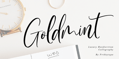 Golmint - Luxury Handwritten Calligraphy Golmint is a stylish modern calligraphy font with a calligraphy flair. This font a luxurious calligraphy font perfect for elegant logos, wedding stationery, photography branding, modern websites, and more! - Uppercase & Lowercase - Numbers & punctuation - Multilingual - Ligature - Swash Thanks and have a wonderful day Fridaytype
 - RM Slabb by Ray Meadows,
$19.00 This bold display font has considerable strength and will grace any design that requires extra impact. Due to the modular nature of this design there may be a very slight lack of smoothness to the curves at extremely large point sizes (around 100 pt and above).
 - Sundowners by PintassilgoPrints,
$29.00 Sundowners is a smiley face. It is a simple and versatile font, with a pocketful of cool interlocking glyphs for those days of groovier moods. It also brings a handful of amusing initial and terminal forms and a couple of ornaments. That simple. And that nice.
 - 1906 Fantasio by GLC,
$38.00 We have created this font inspired from the hatched one used for the inner title and many headlines by the old French popular "cheerful" satirical magazine Fantasio (1906-1948). This family may be used together with 1906 French News, 1906 Titrage, 1906 Fanatasio Auriol and 1890 Notice.
 - Twitty Bird NF by Nick's Fonts,
$10.00Dan X. Solo's book of Showcard Alphabets featured the pattern for this devil-may-care face under the name "Conway". Not too pretty, not too proud, but a whole lotta fun. Both versions of the font include 1252 Latin, 1250 CE (with localization for Romanian and Moldovan). - OK Corral by FontMesa,
$20.00 OK Corral is a revival of a very old Italian font that you may have seen in the past under the original name of Italian Print. The Lined version of this font has never been known to have a lower case set of letters until now.
 - Easter Moment by AEN Creative Studio,
$15.00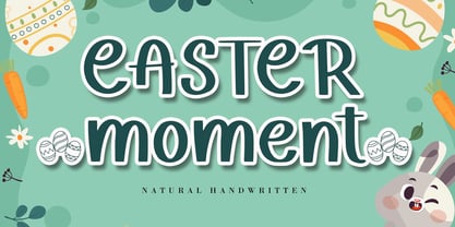 Easter Moment is a natural cute handwritten font. It is ideal for Easter-themed crafting, greeting cards, or any other design that may need a lovely, personalized touch! This font is PUA encoded which means you can access all of the glyphs and swashes with ease!
 - Box Lunch JNL by Jeff Levine,
$29.00Just two capital letters from a sign inspired Box Lunch JNL from Jeff Levine. The restaurant - an early 1950s favorite in Miami Beach, Florida specialized in fried chicken meals and other delights of the day - long before the big corporate chains took over the local landscape. - Kolkman by Ingrimayne Type,
$8.95 Kolkman is a nondescript, bold, sans-serif typeface. In addition to a standard version, there is a version with shattered letters and another with striped or grayed letters. The shattered and striped versions can be layered on the regular version to get letters with two colors.
 - Night Michy by Zeenesia Studio,
$16.00 Have a great day! My new font was present, Night Michy!! Night Michy is a Bold vintage style serif font with strong character and soft features. modern and classic serif font with a clear and bold look. It’s a very versatile font that works great in large.
 - Zagora by CastleType,
$19.00 Based on an art deco design, with alternate characters and numerals. Named for a little town in Morocco on the border of the Sahara desert, with a billboard at the edge of a great expanse of sand that points the way to Timbuktu (several days by camel).
 - Some Assembly by Open Window,
$14.95 Some Assembly is a sans serif printer font which ran into a few problems when it came time to print. Offered with a wide range of distressed styles. It is a pleasantly styled geometric face which is highly legible and its various styles provide dynamic alternatives.
 - Sapiens by Hemphill Type,
$25.99 Sapiens is a prehistoric font family characterised by simplicity & crudeness, as if carved out and assembled by our sapiens ancestors. The family is built with a rough edged style that evolves through various styles and becomes more legible while retaining the raw roots of its origins.
 - Bobbin Cyrllic by Typoforge Studio,
$25.00 To design the font Bobbin Cyrillic I was inspired by the You And Me Monthly published by National Magazines Publisher RSW Prasa that appeared from Mai 1960 till December 1973 in Poland. In the Bobbin Cyrillic family, every variety contains 3 alternative characters with automatic replacement.
 - Merlo by Typoforge Studio,
$25.00 Font Merlo is the younger sister of Cervo. Font Merlo is characterized by eight different varieties – lower and uppercase characters. It is inspired by a You And Me Monthly published by National Magazines Publisher RSW "Prasa” that appeared from May 1960 till December 1973 in Poland.
 - Speed by Artyway,
$16.00 I suggest you to pay attention to the "Speed" font. It's bold, with sharp angles corners, spurs and slope for dynamic effect. "Speed" font has a unique charm and easy visual readability, so it's perfect for headlines, whether for sports events, automotive posters, logo or monograms designs.
 - Houschka Rounded by G-Type,
$72.00 Houschka Rounded is the companion family to Houschka Pro, featuring CE, Baltic, Turkish & Cyrillic language support plus small caps, stylistic sets, contextual alternates, ligatures and 4 sets of numerals. Houschka Rounded may be a softer & cuter sans serif than her big sister but she's equally versatile.
 - Vallecito by Matteson Typographics,
$19.99 Vallecito or “Little Valley” is an Aldine woodtype design popular in the 19th century for posters and headlines. Vallecito’s multitude of weights and widths allows for impactful typography in signage, posters, menus and logos. Vallecito’s exaggerated, reversed stress shapes may be used in traditional or impressionistic typography.
 - Bluesman JNL by Jeff Levine,
$29.00 The classic blues album "I'm Jimmy Reed" released on the legendary Vee-Jay label out of Chicago featured title lettering in a bouncy, fun, casual take on the classic Latin Wide style of alphabet. Bluesman JNL offers a full digital typeface based on that album titling.
 - Oggie Marker by Dear Sue,
$15.00 Oggie Marker is a hand drawn thick marker display font with a textured edge. It has a raw but whimsical feel, which makes it perfect for posters, signage, menus, comics and toys/ product/ packaging for kids. Try it on themes of summer, Halloween, camping/ outdoors, and more!
 - Discotheque JNL by Jeff Levine,
$29.00 A 1930s casual Art Deco type style with as much influence in 1970s graphic design as in its day was found within the pages of the 1930s French publication L'Art du Tracé Rationnel de la Lettre. Discotheque JNL is available in both regular and oblique versions.
 - Futura BT by Bitstream,
$39.99 Futura is the fully developed prototype of the twentieth century Geometric Sanserif. The form is ancient, Greek capitals being inscribed by the Cretans twenty-five hundred years ago at the time of Pythagoras in the Gortyn Code, by the Imperial Romans, notably in the tomb of the Scipios, by classical revival architects in eighteenth century London, which formed the basis for Caslon’s first sanserif typeface in 1817. Some aspects of the Geometric sanserif survived in the flood of Gothics that followed, particularly in the work of Vincent Figgins. In 1927, stimulated by the Bauhaus experiments in geometric form and the Ludwig & Mayer typeface Erbar, Paul Renner sketched a set of Bauhaus forms; working from these, the professional letter design office at Bauer reinvented the sanserif based on strokes of even weight, perfect circles and isosceles triangles and brought the Universal Alphabet and Erbar to their definitive typographic form. Futura became the most popular sanserif of the middle years of the twentieth century. Ironically, given its generic past, Futura is the only typeface to have been granted registration under copyright as an original work of art, and, further irony, given the key part played by the Bauer letter design office, the full copyright belongs to Renner and his heirs. This decision in a Frankfurt court implies that a further small group of older typefaces may also be covered by copyright in Germany, particularly those designed for Stempel by Hermann Zapf. This situation appears to be limited to this small group of faces in this one country, although protection of designers’ rights in newer typefaces is now possible in France and Germany through legislation deriving from the 1973 Vienna Treaty for the protection of typefaces. Mergenthaler’s Spartan is a close copy of Futura; Ludlow’s Tempo is less close. Functional yet friendly, logical yet not overintellectual, German yet anti-Nazi... with hindsight the choice of Futura as Volkswagen’s ad font since the 1960s looks inevitable.
 - PF DIN Stencil by Parachute,
$39.00 DIN Stencil on Behance. DIN Stencil: Specimen Manual PDF. Despite the fact that over the years several designers have manually created stencil lettering based on DIN for various projects, there has never been a professional digital stencil version of a DIN-based typeface. After the successful introduction of DIN Monospace a few months earlier, PF DIN Stencil now completes Parachute’s extensive library of DIN superfamilies. It was based on its original counterpart DIN Text Pro and was particularly designed to address contemporary projects, by incorporating elements and weights which are akin to industries such as fashion, music, video, architecture, sports and communications. Traditionally, stencils have been used extensively for military equipment, goods packaging, transportation, shop signs, seed sacks and prison uniforms. In the old days, stencilled markings of ownership were printed on personal possessions, while stencilled signatures on shirts were typical of 19th century stencilling. Two companies dominated the market in the mid-twentieth century: the Marsh Stencil Machine Company in the United States and the Sächsische Metall Schablonen Fabrik in Germany. Ever since the late 1930s, it was the German Sächsische Metall Schablonen Fabrik which used heavily the new DIN 1451 standard font (introduced in 1936), attempting to overthrow the reign of the Didot-style modern roman which was at the time the most common stencil letter in Germany. These letters were manufactured mainly as individual zinc stencils which could be ordered in sizes between 10 and 100mm. The DIN Stencil family manages to preserve several traditional stencil features, but introduces additional modernities which enhance its pleasing characteristics and make it an ideal choice for a large number of contemporary projects. Furthermore, the spacing attributes of the glyphs were redefined and legibility was improved by revising the shape of the letterforms. The DIN Stencil family consists of 8 diverse weights from the elegant Hairline to the muscular Black. Currently, it supports Latin, Eastern European, Turkish and Baltic.
 - Reina by Lián Types,
$37.00ATTENTION! See the newest version of Reina here. Reina Neue is now a family of 45 styles and it's also a Variable Font! Have a look. For the traditional version of Reina, you may stay here ;) --- Reina is Sproviero’s didone of the year. We recommend seeing its user’s guide . Inspired in the sweet letters of calligraphy and typography masters of our past; such as Didot, Bodoni and the incredible Herb Lubalin, its aim was to incorporate the decorative accolades from blackletter and copperplate styles of calligraphy into a Modern Roman typeface. Reina reflects sovereignty due to the enveloping atmosphere and the sensation of greatness that can be felt when using it. It has an unique way of standing over paper and screen, being its swashes responsible of an extreme elegance. Similar to what Lian did in his last font Breathe , Reina was designed to be playful yet formal: While none of its alternates are activated it can be useful for short to medium length texts; and when the user chooses to make use of its open-type decorative glyphs, it can be useful for headlines with dazzling results. TECHNICAL Reina is a family with many members. In order to achieve better results when printing, Lian took his time to design the necessary styles: Reina 72 Pro, prepared for display sizes; Reina 36 Pro, for medium sizes; and Reina 12 Pro, the best for text or decorative words in small size. Each of these members have variants inside, which are open-type programmed: The user decides which glyph to alternate, equalizing the amount of decoration wanted. Reina Engraved Pro has the same features than the variants mentioned above. The family also contains variants which were made exclusively for decoration. These are: Reina Words, a set of the most common words used in english, german, italian, french and spanish; Reina Capitals, which consists in a big set of ornamented capitals; and Reina Fleurons, those little friends which always help to embellish our work. - Brazarri Pro AOE by Astigmatic,
$24.00 The Brazzari Pro AOE is an unusual but fun geometric typestyle design. It is the historical revival and elaboration of the "Bizarre" typeface created by MacKellar, Smiths, & Jordan Co. in 1884. What began as a basic character set of Capitals, lowercase, numerals, and a small handful of punctuation characters has been expanded to a full character set including unlimited fractionals, superiors & inferiors, ordinals, tabular & proportional figures, and an expanded language glyph set, all with a smallcaps and Caps to Smallcap set to match. Definitely a niché use typeface, however, it has some great appeal. The letterforms of Brazarri Pro AOE are easy to convert to paths and extend various stems, making this revival something you can really let your imagination run wild with for your designs. WHAT'S INCLUDED: Enable the Stylistic Alternates feature for standardized letterforms without the extensions. Extensive language support. Invocation has accented and special characters that support the following languages: Afrikaans, Albanian, Basque, Bosnian, Breton, Catalan Cornish, Corsican, Croatian, Czech, Danish, Dutch, Embu, English, Esperanto, Estonian, Faroese, Filipino, Finnish, French, Galician, German, Hungarian, Icelandic, Irish, Indonesian, Italian, Kurdish, Leonese, Luxenbourgish, Malay, Maltese, Manx, Maori, Meru, Morisyen, North Ndebele, Norwegian Bokmål, Norwegian Nynorsk, Nyankole, Occitan, Oromo, Polish, Portuguese, Rhaeto-Romanic, Romanian, Scottish Gaelic, Scots, Serbian (Latin), Slovak, Slovenian, Spanish, Swahili, Swedish, Tagalog, Turkish, Walloon, & Welsh. One of my guilty pleasures is in taking the time to recreate historical typefaces as digital fonts, and expand on their character sets to enable them to be used more widely than their limited originals. A lot of incredible historical typestyles created as wood or metal type with bare bones character sets have been lost or only exist as limited specimen proofs in old books. These typefaces may have more niché uses than modern typefaces, but I believe it is important nonetheless to preserve these typefaces for future generations. These typefaces, if nothing else, can often inspire new creations.


