10,000 search results
(0.044 seconds)
- Mint And Sage by Attract Studio,
$18.00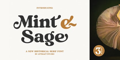 Mint And Sage is a nostalgic typeface modernized from the old style serifs of the sixties and seventies. With soft serifs suitable for many projects: invitations, postcards, posters, books, advertisements, websites, blog headers, logos, branding, magazines, fashion, photography, editorial design and many others. Typeface Features: - 3 Font Weights (Regular, Outline & Extrude) - Numerals & Punctuation - Stylistic Alternates & Ligatures - PUA Encoded Characters.
 - Clarks by PintassilgoPrints,
$45.00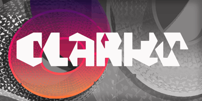 Clarks is a modular typeface built from a work by Lygia Clark, one of the giants of Brazilian postwar art. Packed in a font equipped with clever OpenType programming, there are at least 7 different designs for each letter, thus allowing, or rather, proposing, boldly unconventional compositions. The font is programmed to cycle all these different lettershapes, avoiding repetition. The user can also manually pick up preferred forms in a glyph palette. There are choices to both keep and to defy readability and it's almost hypnotic to play with these. Lygia Clark used to invite viewers to touch her works and so we did with her 'Planes in Modulated Surface no. 4', from 1957: we fragment it and turned and inverted and recombined it. Now we return it as audacious typography and invite you to put it to work in your designs. Keep it bold and have fun! Cheers!
 - Paddington - Unknown license

- Ashby - Unknown license

- Pixeldust - 100% free

- Console - Unknown license

- BARBEDWIRE PERSONAL USE - Personal use only

- JASON PERSONAL USE - Personal use only

- Leaden Skies by Kitchen Table Type Foundry,
$16.00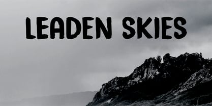 A ‘Leaden Sky’ is a dark grey sky without clouds. We don’t see too many of them here in Holland, as we usually have lots of clouds. Yesterday, however, the sky turned a sinister greyish green and it spewed out an an enormous amount of hailstones the size of walnuts. Leaden Skies is a handmade, all caps display font. I made it with a brush and Chinese ink. It comes with extensive language support and a set of alternates for the lower case glyphs.
 - Golemi Display by Sihan Wu,
$30.00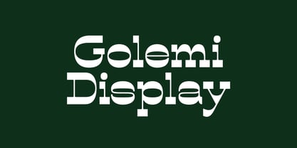 Golemi Display is a reverse-contrast fat face font inspired by the Caslon Italian specimen from 1821. It is intentionally designed to keep its wood type feel—the overall chunky body with rounded junctures to imitate the old look. However, compared to its prototype, Golemi is redrawn to have smoother shapes with a modern look. Golemi Display is suitable for large applications, such as headlines for editorial design, branding, webpages, and environmental design. It is currently a single styled typeface disposed for extension.
 - Mint Condition by Hanoded,
$15.00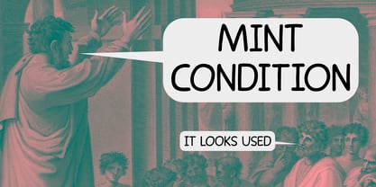 My kids like to read Donald Duck magazine. They have boxes full of old editions that we bought second hand. Most of the comics are well-used, but there are some in near mint condition. I thought it would be nice to create a font that mimics the lettering found in comics. Mint condition is a very nice, very friendly handmade comic book font that comes with extensive language support (including Vietnamese and Cyrillic), plus two sets of alternate glyphs.
 - Paralex by Tipo Pèpel,
$27.00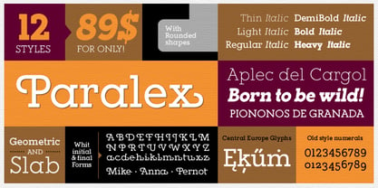 Paralex is a complete typeface family of 12 fonts with geometric-slab style. The edges of shapes are rounded to give a smoother appearance. It contains several OpenType functionality, such as initial and final decorative forms, old style numerals and an extensive set of geometric style ornaments. The character set supports Central and Eastern European as well as Western European languages. Despite the robustness of its forms has a warm appearance, and good readability that make it useful for a variety of situations.
 - Sincerity Stencil by Océane Moutot,
$32.90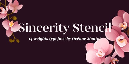 Sincerity Stencil is the new extension of the typeface Sincerity. It's a fierce and elegant typeface identified by its high contrast, sharp shapes and triangular. The stencil component of this new version will add originality to your designs. Its large variety of glyphs, including accents, old-style numbers and ligatures will give uniqueness to your designs. It's a great fit for branding, magazines, newspapers, and so on. Sincerity Stencil is available in 16 styles, from thin to black in roman and italic.
 - Galavant by Atlantic Fonts,
$32.00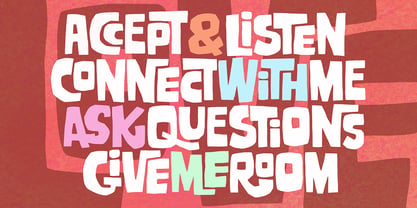 Galavant will take you anywhere you want to go! Enjoy three font looks in one; a fun, chunky lower-case, a bold, animated upper-case, and in all-caps with discretionary ligatures turned on, Galavant is tightly interlocking. To explore the interlocking possibilities, turn some ligatures off and others on until you settle on the best combo. There are over 260 two, three, and four-letter ligatures available. Discover interlocking ligatures featuring lower-case "i" along the road as well. In sentence-case, turn discretionary ligatures off, except to add more handmade variation in double-letter pairs and to access a fine "ft". However you roam, Galavant aims to entertain.
 - Lancelot Pro by Canada Type,
$39.95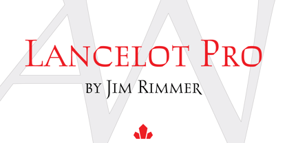 When type historians look back on Jim Rimmer, they will consider him the last type designer who just couldn't let go of metal type, even though he was just as proficient in digital type. Lancelot is one definite case in point: A face designed and produced in digital as late in the game as 1999, only to spring onto the new millenium a couple of years later as a metal type cast in three sizes. That was Jim, a time traveler constantly reminding the craft of its origins. This particular time machine was originally designed as a simple set of attractive caps that emphasize the beauty of the variable conventional dialogue between the drawing tool and the intended final form, and the one exchanged within the totality of the forms themselves. Jim designed two weights, with contrast and counterspace being the main difference between them. In 2013, the Lancelot family was remastered and greatly expanded. Lancelot Pro is now a wonder of over 840 glyphs per font, including smaller versions of the caps in the minuscule slots, and alternates and ligatures that can transform the historic spirit of the original design into anything from half-uncial to outright gothic. Language support goes beyond the extended Latin stuff, to cover Cyrillic and Greek as well. 20% of the Lancelot Pro family's revenues will be donated to the Canada Type Scholarship Fund, supporting higher typography education in Canada.
 - A La Nage - Personal use only

- Engebrechtre - Unknown license

- SF Laundromatic - Unknown license

- SF Wasabi - Unknown license

- SF Retroesque - Unknown license

- SF Speedwaystar - Unknown license

- SF DecoTechno - Unknown license

- Good Karma by Positype,
$15.00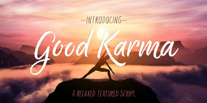 Good Karma (its namesake) will be extended to you as you use this new relaxed script family. Produced from hand and sumi brush of Neil Summerour, Good Karma is a natural brush textured font family. Good Karma is filled with a lot of heart, reliable and genuine movements, and a wide range of letter options to befit any project needing an honest hand-lettered look. Each typeface comes with an additional set of stylistic alternates (upper AND lowercase) that harmonize wonderfully when you have the Opentype Ligature feature active. Additionally, special double-letter ligatures have been produced for specific combinations in need of more expressive flair, as well as a few swashes that work with the economical strokes originally produced from the sumi brush. To further expand the usefulnesss of this peaceful script, a separate Caps/Small Caps font has been added that provides the simple contrast needed to bring the script fonts forward. Rather than limit the personality of this script, various styles have been produced to complement the original Regular—Upright, Wide, Wide Upright, and the aforementioned Caps fonts are included in hopes of helping you find the perfect variation needed for your composition. Good Karma is the first release of the Positype Relaxed Script Collection of typefaces—all focused on fluid, effortless script fonts for simple use.
 - Yorkten Slab by insigne,
$-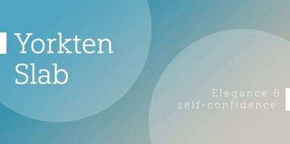 The Yorkten family of fonts is back with another satisfying addition to its clean style. The rhythmic, new Yorkten Slab expands Yorkten’s basic, contemporary form of geometric and simple lines and adds a level of self-confidence and elegance to your work. Slab's basic structure is compact. It’s more condensed than most slabs, so you can save space yet still have clear, consistent readability. The added serifs create a fresh text color, too, that syncs well with the new font’s inherited features. Like its predecessor, Yorkten Slab offers its natural, simple structure with more than fifty fonts in the family and three different widths - extended, normal or condensed. Each group has eight weights from a lean thin to tough looking black, giving Yorkten Slab plenty of bragging rights among its peers. And like Yorkten, too, Yorkten Slab’s greatest value is the ability of its members to work easily and well together and with a variety of other fonts. Yorkten Slab ensures that you have the necessary tools for any challenge. In combination with its superior functionality and excellent readability, this versatile font can be effectively used for many print and screen operations: e-books, applications, headlines, banners, posters and websites to name a few options. Don’t wait any longer. Start tapping the possibilities that Yorkten Slab offers your work.
 - Greuceanu by DePlictis Types,
$36.00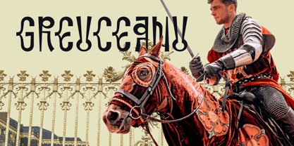 “Greuceanu” is the the name of a brave romanian fairy tale character and his mission was to eliberate de Sun and the Moon that were stolen by some Dragon like creatures that in romanian folklore they are called “ Zmei”. It inspired me to create this decorative uppercase display typeface with strong influences from old cyrillic writing and also a touch of fun and geometrical construction explorations. Besides Extended Latin Support it includes also Cyrillic and Greek alphabets as you already can expect from most of DePlictis Types releases. This decorative typeface goes well for use in book covers and headlines and only your creativity is the limit of its usability.
 - Politica by Sudtipos,
$39.00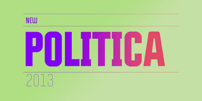 Describe the 21st century politician. Left or right? Fat or thin? War or peace? Straight or gay? Hard or soft? Male or female? Pro or con? Young or old? East or west? Now look at the Politica super-family and see which font they may be. The overused sans serif faces don’t cut it anymore. This day and age requires a sturdy, modern and straight-to-the-point sans to cover the issues. The Politica family also come in OpenType variations which extend the character set to include Cyrillic, Greek, Baltic, Turkish and Central European languages. You have no excuse: the globe is yours with Politica.
 - Americane by HVD Fonts,
$40.00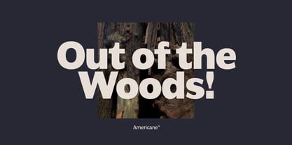 "It's all about Soul!" – Strong, decided and edgy. The Americane super family is inspired by the old wood type specimen books. Delivering some glorious vibes of the handcrafted values from the pioneers AND keeping one eye on todays demands and technology, Americane is made for high professional use. Americane & Americane Condensed is a super family of 24 fonts in total – a normal and a condensed width in six weights with matching italics. Made for complex, professional typography, the OpenType fonts feature five variations of numerals, alternate letters, arrows and an extended character set to support Central and Eastern European as well as Western European languages.
 - Strato Pro by Mostardesign,
$35.00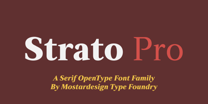 Strato Pro font family is a modern serif typeface family with readability and legibility in mind. Inspired by Classic Roman typeface design, Strato Pro has 16 weights, which range from book to black with small caps, and an ornament set if you want to give your creation a distinctive elegance. Strato Pro includes functions with all the OpenType features you would expect in a modern serif font family, such as stylistic alternates, discretionary ligatures, pro kerning, ornaments, language support, case-sensitive forms, old-style figures, and many more features. Strato Pro has an extended character set to support Central and Eastern European as well as Western European languages.
 - Toppler by K-Type,
$20.00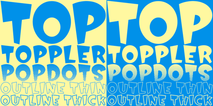 TOPPLER is a top-heavy comic font, K-Type’s salute to nineties freebies such as Ben Balvanz’s Baby Kruffy, Comix Heavy from WSI, and Dave Bastian’s Startling. Unlike those glorious fonts-of-old, Toppler contains a complete repertoire of symbols, dingbats and Latin Extended-A accented characters, as well as a proper lowercase, careful spacing and tasty kerning. Toppler also boasts cleaner outlines and more refined shapes. The Toppler family comprises four fonts that share spacing and kerning, so can be overlapped to produce bicolor and multicolor effects. In addition to the regular, solid style of Toppler, there is a shaded ‘Popdots’ style, plus thick and thin outline fonts.
 - Americane Condensed by HVD Fonts,
$40.00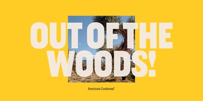 “It’s all about Soul!” – Strong, decided and edgy. The Americane super family is inspired by the old wood type specimen books. Delivering some glorious vibes of the handcrafted values from the pioneers AND keeping one eye on todays demands and technology, Americane is made for high professional use. Americane Condensed & Americane is a super family of 24 fonts in total – a normal and a condensed width in six weights with matching italics. Made for complex, professional typography, the OpenType fonts feature five variations of numerals, alternate letters, arrows and an extended character set to support Central and Eastern European as well as Western European languages.
 - Zega Grot by Isaco Type,
$24.00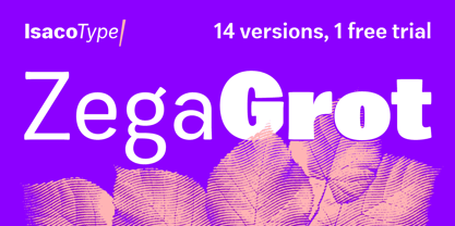 Celebrate good times with Zega Grot family! This font is the companion of Zega Text but less “serious” than its predecessor. The Grot version has old vertical proportions, with higher capitals and asc-descenders, height difference between capitals and ascenders, beyond the redesign of various glyphs, giving a less formal tone, more rounded and cheerful. The family consists of 14 styles, 7 weights plus their respective italic versions. The fonts are available in OpenType PS and have extended character set to support CE, Baltic, Turkish as well as Western European languages. You can test Zega downloading the free trial font in Extrabold version (TT only).
 - Night Sign JNL by Jeff Levine,
$29.00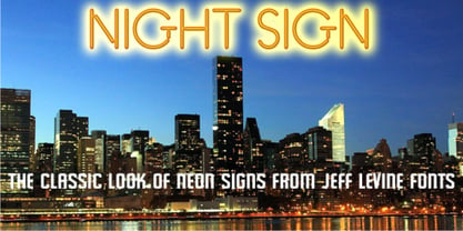 For decades, the soft glow of a neon sign beckoned weary travelers to roadside rest courts, told the hungry individual where to eat; let enthusiastic revelers know where the night life was happening. There is something special about a neon sign, yet changing times, city ordinances and even technology itself is turning this staple of urban life for over a hundred years into a museum piece. Night Sign JNL emulates the craft of hand-formed neon signage and it (along with a few added special effects) can really add some good-old-fashioned pizzazz to a print or web project.
 - Cloud - Personal use only

- Lettering1 - Unknown license

- Mir by Juliasys,
$22.00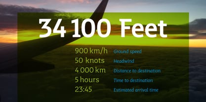 Мир is Mir. The Russian word Мир (Mir) means both World and Peace. The rendezvous of the two terms seems quite unique and utopistic today, but it is comforting to see that it was natural at some time deep down in Russian history. Bits of both meanings were going through my mind while I was designing this typeface. Mir’s character set is multiscript – Latin, Cyrillic and Greek – and extends to many parts of the linguistic world. In fact it covers more than 100 languages. Stylistic consistency between the language systems make typographic border crossings painless even where national borders are still closely guarded. And in regions where mathematics, physics or chemistry are to be expressed, a rich set of OpenType features lets Mir master also these situations. Serious things are best be said in a relaxed, unpretentious way. So Mir doesn’t put on a show. Mir has authority without being authoritarian, it is serious but not stern. It can explain difficult things and stay calm and down to earth at the same time. Mir Medium has another useful feature: It can be freely downloaded and used by anybody anywhere. You can test the Mir Family with free Mir Medium and get more styles when you need them. @juliasys
 - Covington SC Exp - Unknown license

- Covington SC Cond - Unknown license

- Amariya by Monotype,
$40.99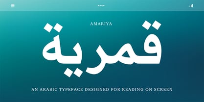 Designed by Nadine Chahine, the Amariya™ typeface family is intended for long form, on-screen textual content. It supports the Arabic, Persian and Urdu languages. The design is consistent with traditional text typeface models popular in the Middle East, but has a lower level of stroke contrast optimized for on-screen reading. The family is available in nine weights ranging from a light hairline to a very bold black. The middle weights are intended for setting text copy while the extreme hairline and black designs are best suited for headlines, sub heads and similar applications. The Amariya family can be used for numerous projects from branding to blogs, in a variety of interactive design environments on both large and small screens. The fonts include the ITC Charter design by Matthew Carter as a Latin companion.
 - CONFLICT DRIPS PERSONAL USE - Personal use only

- SF Intermosaic - Unknown license


