10,000 search results
(0.037 seconds)
- Chakie by Garisman Studio,
$20.00 Just call me CHAKIE. I'm born from the old natural brush chalk look from the 60's and 70's. Use meto create very bold and strong design! Great for posters, t-shirt designs, branding, packaging, labels, and more. Bring back me to the 60's brother! :D And why you must grab me? - Simple installation - Support for 23 languages (WOW!) - Compatible with MAC or PC - PUA encoded - Lots of fun!
 - Astonice by Asritype,
$26.00 Astonice is a beautiful calligraphy font family with 3 weight variants: Regular, Semibold and Bold. Astonice has more than 1100 glyphs each, has opentype feature such as stylistic sets, stylistic alternatives, and old number form. Astonice supports a wide range language: Latin plus Greek and Cyrillic. Astonice is suitable for most typing and design such as cards, logos, banner, posters and others as you intended. Beautiful glyphs, OpenType features and 3 weight, Astonice provide you the right choice for your best design.
 - Cherritt by Greater Albion Typefounders,
$9.95 We think of Cherritt as a 'bullnosed' serif face, because of its rounded off serifs. What that phrase may not convey is the friendly, approachable nature of this large family of faces. The design was originally inspired by traditional draftsmens' hand-drawn serif lettering, but has been given a precise geometric flavor that suits it for work owing its inspiration to any era, from Victorian times through to the purely modern. They are ideal for headings and poster work, but also for setting small volumes of text. Four weights are included in the family, as well as wide, expanded and condensed forms, true small capitals and openface forms. All family members embody extensive OpenType features.
 - Explore Wonders by Sarid Ezra,
$15.00 Explore Wonders is a bold handwritten font that will make all your project more unique and handy. With bold touch, this font will make your artwork feels more natural. This font is suitable for quotes & instagram post. Comes with number & symbol! Also support multi language!
 - Lunaris by Artisticandunique,
$38.00 The Lunaris font family has an elegant character with soft curved turns and includes 9 styles. If you want to try a modern or classic, elegant appearance, it can meet all your needs with its timeless structure that is ideal for your projects with capital and small letters. Lunaris is a versatile serif with a luxurious feel. You can easily use Lunaris in magazines, books, titles, websites, logos, clothing, invitations, branding, packaging, advertising, and more. CHARACTER RANGES : Basic Latin, Latin-1 Supplement, Latin Extended-A, Latin Extended-B, General Punctuation, Currency Symbols, CJK Symbols And Punctuation, Private Use Area (plane 0),
 - Calanda by Hoftype,
$49.00 Calanda is a forceful, sturdy and dynamic slab serif with distinctly shaped characters. The Calanda family consists of 16 styles and comes in OpenType format with extended language support. Calanda is very well suited for ambitious typography. All weights contain ligatures, proportional lining figures, tabular lining figures, proportional old style figures, lining old style figures, matching currency symbols, fraction- and scientific numerals and arrows.
 - Bethencourt by Apostrof,
$30.00 Bethencourt is a font family designed by Vsevolod Buravchenko & Viktor Kharyk with technical support by Konstantin Golovchenko. It is based on uncial, half-uncial, Old Roman Cursive and New Roman Cursive. The character set includes Latin Extended characters, stylized Cyrillic and decorative elements in the form of playing dolphins.
 - Stereohead by Stationjack,
$13.00 Stereohead is a retro sans serif display typeface inspired by old eighties video cassette cover designs. This font would work perfectly in magazine headlines, t-shirt design, posters, packaging, advertising purposes. Uppercase and lowercase characters, numbers, punctuation and extended latin characters included. 2 font styles available, regular and italic.
 - Florencia by insigne,
$21.99 Florencia flows with the spirit and excitement of a beautiful dancer. Its extended and flowing letterforms are designed to glide across the page. This contemporary script is perfect for any project that calls for a spicy, exotic feel. Florencia includes OpenType swash alternates, old style figures and ligatures.
 - Regon by Dicubit,
$9.00 Regon is a modern sans serif typeface/font family (18 fonts) designed with carefully handcrafted. This perfectly made to be applied in logo or branding, stationery, books, packaging, fashion, magazines, t-shirt, novels, labels and many advertising purposes. Styles: Thin, Extra Light, Light, Regular, Medium, Semi Bold, Bold, Extra Bold, Black (All with Italic). Features: Uppercase, Lowercase, Number, Punctuation, Symbol, Multilingual. All the pictures used in the preview are not included. They are intended only for illustration purpose.
 - PT Sans Pro by ParaType,
$50.00PT Sans Pro is a comprehensive type family intended for a wide range of applications. It consists of 32 styles: 6 weights (from light to black) with corresponding italics of normal proportions; 6 narrow styles; 6 condensed styles; 6 extra condensed styles and 2 caption styles (regular and bold). The design combines traditional conservative appearance with modern trends of humanistic sans serif and possess enhanced legibility especially in caption styles. These features, besides conventional use in business applications and printed materials, make the fonts usable for direction and guide signs, schemes, screens of information kiosks, and other objects of urban visual communications. The fonts have extended Latin and Cyrillic character sets serving alphabets of all title languages of the national republics of Russian Federation and supporting the most of the languages of neighboring countries. Each font contains about 1400 characters including small caps for all alphabetic characters, 4 sets of figures with lining and old style variations, stressed Cyrillic vowels, indices, fractions and so on. Design -- Alexandra Korolkova with assistance of Olga Umpeleva and supervision of Vladimir Yefimov. The fonts released by ParaType in 2010. - Steinwald by Kitchen Table Type Foundry,
$15.00 Steinwald font was named after a mountain range slash nature park in southern Germany. I have to admit that I have never been there, but this font was just screaming for a good German name and I settled on Steinewald (which, in German, means Stone Forest). Steinwald was made by hand and cleaned up by computer. It looks quite neat, but its edges are a bit rough, giving it ‘ye olde handmade look’! Use it for your posters, your product packaging and your supermarket signs. Comes with extensive language support.
 - Tight Spot BB by Blambot,
$12.00 Based on the feedback provided by manga letterers and translators, Blambot's new comic book dialogue font meets their specific needs for condensed type, unique manga-related glyphs like stars, wavy dashes, and hearts. In addition, Blambot has included contextual alternates to cycle through six sets of alphabets, three sets of numerals, and various punctuation for a more organic, "hand lettered" look. The set includes for fonts: Regular, Italic, Bold, and Bold Italic, each with extensive diacritical letters for multi-language support.
 - SG Sunblum by Studio Gulden,
$20.00 Introducing the "SG-SUNBLUM" font, a modern sans-serif typeface that stands out from the crowd with its extraordinary design elements. This font features sleek, elongated lines and bold, asymmetrical letterforms that give it a dynamic and eye-catching appearance. It also includes an extensive range of special characters and multilingual support for added versatility. Whether you're looking for a font for a headline, logo, or any other design project, SG-SUNBLUM is sure to make a bold statement and capture attention.
 - Blacker Pro by Zetafonts,
$39.00 Blacker Pro is the revised and extended version of the original wedge serif type family designed by Cosimo Lorenzo Pancini and Andrea Tartarelli in 2017. Blacker was developed as a take on the style that Jeremiah Shoaf has defined as the "evil serif" genre: typefaces with high contrast, oldstyle or modern serif proportions and sharp, blade-like triangular serifs. Due to the high contrast in the design - slightly reminescent of didone typefaces - Blacker has been developed in two optical subfamilies. The display version offers tighter tracking, higher contrast and sharper corners for maximum effect at big sizes, while the text variant offers better readability and screen rendering at smaller sizes, with lower contrast and looser spacing. In the pro version, two additional condensed variant families have been added (condensed display and condensed text) allowing for more freedom and versatility in typesetting where space constraints are present. Also, three titling uppercase-only variants have been added, with a slightly extended feel, and two decorative subfamilies (inline and diamond). Each of these seven variants has been developed in six weights from light to heavy, with matching italics, for a total of 69 styles covering a wide range of editorial and advertising uses. All Blacker Pro feature a revised and extended character set covering over two hundred languages using the latin, cyrillic and greek alphabets. Open type features include small caps, positional numerals, fractions, superior & inferior figures, alternate forms, and an extended set of standard and discretionary ligatures. With its bold personality, Blacker aims to be a modern classic used for bold statements and self-conscious brands, making your text look great both on paper and on the screens.
 - TT Commons™️ Pro by TypeType,
$39.00 Introducing TT Commons™️ Pro, version 3.300! We’ve extended our bestseller and made it even better by adding the Greek alphabet and updating the OpenType features. The TT Commons™️ Pro typeface currently includes: 5 different subfamilies: Standard, Condensed, Compact, Expanded, and Mono; 102 font styles + 2 variable fonts: TT Commons™️ Pro Variable and TT Commons™️ Pro Mono; 1546+ characters in each Mono font style set and 1656+ characters in each Standard, Condensed, Expanded, and Compact font style; 275+ languages support, along with the Vietnamese and Greek alphabets (in all subfamilies but Mono); flawless kerning and manual TrueType hinting; 32+ OpenType features.
 - Vox Round by Canada Type,
$39.95 Vox Round is the softer version of the Vox family. The original brief for Vox was a extensive monoline typeface that can be both precise and friendly, yet contain enough choice of seamlessly interchangeable variants for the user to be able to completely transform the personality of the typeface depending on the application. Basically, a sans serif with applications that range from clean and transparent information relay to sleek and angular branding. When the first version of Vox was released in 2007, it became an instant hit with interface designers, product packagers, sports channels, transport engineers and electronics manufacturers. This new version (2013) is the expanded treatment, which is even more dedicated to the original idea of abundant application flexibility. The family was expanded to five weights and two widths, with corresponding italics, for a total of 20 fonts. Each font contains 1240 glyphs. Localization includes Cyrillic and Greek, as well as extended Latin language support. Built-in OpenType features include small caps, caps to small caps, four completely interchangeable sytlistic alternates sets, automatic fractions, six types of figures, ordinals, and meticulous class-based kerning. This kind of typeface malleability is not an easy thing to come by these days.
 - Revolution Gothic P by Dharma Type,
$19.99 Revolution Gothic P font family is designed based on Revolution Gothic and a distressed offshoot from the original. Revolution Gothic is an arranged and extended version of PAG Revolucion released from Prop-A-Ganda type foundry in 2008. The original font is inspired by retro propaganda posters and wallpainting in Cuba from the 60s to 80s. And the original PAG Revolucion is the most popular font from Prop-A-Ganda. The glyphs that damaged by printing the original had been tweaked by hand work with great care to be looked like natural damaged effect. This Revolution Gothic P family contains basic Roman, Italic, Bold and it’s Italic to suit a wide range of your creative works and it will be one of the most powerful solutions for printing and web.
 - Outset by Alexander Phelps,
$5.98 Outset is a rough, display font family designed for a wide range of expression. It's all-caps design gives additional variants to make sure that you can create with your desired intention. Each letterform for the Outset font family was drawn by hand to insure natural deviations for it's roughness. These deviations help make this typeface feel authentic and relatable. The boldness of the letterforms makes this typeface an excellent choice for display type for posters, titles, merchandise, and specific marketing opportunities. Outset was originally drawn up for a range of t-shirt designs, and has now been extended into the full typeface you see now. It's rough edges interact perfectly with textures and overlays. Outset's multiple styles and variant letterforms allow for a very versatile range of outputs.
 - Volatter by Maulana Creative,
$11.00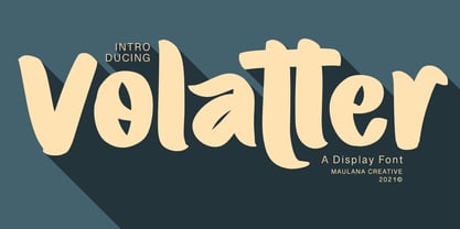 Volatter is simply handwritten display font with natural hand drawn, clean bold stroke, uprights and fun character. To give you an extra creative work. Volatter font support multilingual more than 100+ language. This font is good for logo design, Social media, Movie Titles, Books Titles, a short text even a long text letter and good for your secondary text font with sans or serif. Make a stunning work with Volatter font. Cheers, MaulanaCreative
 - Silverspoon by Vred Letters,
$25.00 The design of Silverspoon reproduces classic antiqua with rounded contours, and is ideal for many uses including headlines, neon signage, and stencil. Silverspoon supports Extended Latin as well as Extended Cyrillic.
 - Milky Rainbow by Abo Daniel,
$16.00 introducing MILKY RAINBOW - Bold and Bouncy Handwritten Font - MILKY RAINBOW is natural handwritten font. come with a bold style, it is very eye-catching. It is great for packaging, branding, quotes, cards, banner, book, cutting, silhouette, social media content, and anything of your craft project. I created some ligatures to make it look so natural. Features: - Uppercase - Lowercase - Number & punctuations - Multilingual - PUA encoded I hope you love it. regards, Abo Daniel Studio
 - Relativity by Bedoodle,
$9.00Decorative extended characters font. - Temporal Shift by Comicraft,
$19.00You're trapped in an endless now... seconds seem to be stretching out interminably... There’s an eternity between every tick, every tock of the clock... Your consciousness is stretched to the limit as time is expanded to fill the void between each microsecond. There’s a signpost up ahead... the letters appear to stretch into infinity. Anyone know the name of the font it’s set in? See the families related to Temporal Shift & Gap Expanded: Temporal Shift & Gap & Temporal Shift & Gap Compressed Features Four fonts (Shift Regular, Shift Bold, Gap Regular & Gap Bold) with upper and lowercase characters. - Temporal by Comicraft,
$19.00 You're trapped in an endless now... seconds seem to be stretching out interminably... There’s an eternity between every tick, every tock of the clock... Your consciousness is stretched to the limit as time is expanded to fill the void between each microsecond. There’s a signpost up ahead... the letters appear to stretch into infinity. Anyone know the name of the font it’s set in? See the families related to Temporal Shift & Gap Expanded: Temporal Shift & Gap & Temporal Shift & Gap Compressed Features Four fonts (Shift Regular, Shift Bold, Gap Regular & Gap Bold) with upper and lowercase characters.
 - Mymra by TipografiaRamis,
$35.00 Mymra fonts – an upgraded version of Mymra Forte and Mymra Mono (2009), with a careful re-dress of glyph shapes, and the extension of glyph amounts – which enables support of more Latin languages. One more weight – Black – has been added to the original three of Mymra Forte fonts. Fonts are intended for use in a vast variety of publications.
 - Geodec by Intellecta Design,
$12.95Geodec is a bold sans serif with classical ornament turning it in a Ornate Initial - Gothiks Round Compressed by Blackletra,
$50.00 Gothiks Round Compressed is the rounded version of Gothiks Compressed. It is a 6-weight display sans-serif influenced by Texturas. The rhythm and verticality of Texturas can be easily identified on the letters with diagonal strokes like A N M K k V v W w X x Y y Z z: here they are all vertical. This kind of morphology was chosen because it accepts condensation in a very natural way, giving to this sans-serif a very unique personality. It has an extensive character set—with extensive language support—and many OpenType features like fractions, small capitals and different figure sets. Default figures align with lowercase. The typeface’s name refers to the plural of the word Gothic, which in turn can refer to both sans-serifs or Blackletter, depending on geographic location. Use it BIG!
 - Gothiks Round Condensed by Blackletra,
$50.00 Gothiks Round Condensed is the rounded version of Gothiks Condensed. It is a 6-weight display sanserif influenced by Texturas. The rhythm and verticality of Texturas can be easily identified on the letters with diagonal strokes like A N M K k V v W w X x Y y Z z: here they are all vertical. This kind of morphology was chosen because it accepts condensation in a very natural way, giving to this sans-serif a very unique personality. It has an extensive character set—with extensive language support—and many OpenType features like fractions, small capitals and different figure sets. Default figures align with lowercase. The typeface’s name refers to the plural of the word Gothic, which in turn can refer to both san-serifs or Blackletter, depending on geographic location. Use it BIG!
 - Maiers Nr. 8 Pro by Ingo,
$27.00 A handwritten ”font for technicians“ from ca. 1900. Very geometrical, rigid forms borrowed from the typical characteristics of Jugendstil / Art Nouveau. This script is found in an old magazine which was issued sometime in the years shortly before WWI. The original copy, produced by means of a galvanized plate, is just 7 centimeters wide. It served as the model for technical professions in which, at that time, the captions of drawings were still done by hand. ingoFonts has not only digitized this beautiful typeface, we have also extended it to a whole family. In »Maier’s Alte Nr. 8« special attention was given to ensure the ”uneven“ edges, typical of handwritten script, remained effectively noticeable even in the digitized form. As a result, this ”technical“ font retains a handmade touch, while »Maier’s Neue Nr. 8« is the clean version with exact contours. The Art Nouveau forms, which are characteristic for the period of origin around the turn of the century around 1900, look especially pretty. The high degree of abstraction also seems strange in Maier's No. 8, especially when the age of the original is known. It is generally assumed that it was not until the Bauhaus in the late 1920s that such "modern" typefaces were created. Maier's No. 8 is a generation older! So many of today's supposedly "ultramodern" typefaces look quite old in comparison. In addition to the original two weights, Light and Bold, the Maiers Neue Nr. 8 got a regular and a extra-bold weight. Furthermore, the Neue is also available in italics. Although this is only a slanted version, unlike common practice, it is inclined to the left. Maier’s Nr. 8 Pro is suitable for all European languages. It includes ”Latin Extended-A,“ for Central and Eastern Europe incl. Turkish, and even Cyrillic and Greek, too. The font includes several stylistic alternates as well as a number of ligatures.
 - Anonima by Gassstype,
$29.00 Hello Everyone, introduce our new product Font ANONIMA This Is Classic Bold Font.This is a Textured Natural Style and classy style with a clear style and dramatic movement. That is has charming, authentic and relaxed characteristic more natural look to your text.
 - Rollingtime by Cititype,
$14.00 'Rollingtime.' is a bold script font with a graffiti style. this font looks natural. purely produced from hand sketches. we added a few ligatures to emphasize the natural impression. This font is great for logotypes, brands, website, header, writing quotes and graffiti.
 - VVDS Fifties by Vintage Voyage Design Supply,
$15.00Fifties is a mix of classic geometric and a bit of humanistic grotesque. The goal was to create the font for present with look to the past. In other words, I tried to came back the Modernism aesthetics of XX century into nowadays. The result gives you 60 styles including Italic (Slanted). Your typography may be airy and elegant with Expanded Thin, catchy and expressive with Condensed Bold or dynamic and sharp with Expanded Bold Italic. You will find your way to use this family certainly. Theatre posters or party flyers, vintage t-shirt or modern web service, movie titles or magazine header and even infographic – Fifties will suit you everywhere. You may use the completed styles or may use a Variable Font. To make it as you want to. Weights: Thin / Light / Regular / Medium / Semi Bold / Bold. Widths: Condensed / SemiCondensed / Medium / SemiExpanded / Expanded OTF and Variable Font (TTF) OpenType features: Stylistic alternates for A, G, K, M, N, R, W, a, e, g, j, m, n, r, t, u, w, y; Fraction figures; Subscript and Superscript figures; Tabular figures; Typographic spaces: Em / En / Third / Quarter / Thin / Sixth / Hair - Sevigne ST by Reserves,
$39.99 Sevigne [sey-vee-nyey] is a highly refined, contemporary geometric stencil, inspired by the ambience of high-end fashion and luxury combined with the raw, utilitarian nature of the stencil. The inclusion of over 130 unique ligatures expand it’s sensibility of alluring, well-balanced letterforms and distinctive style. The stencil marks are atypically placed and vary throughout, giving it a purposely forward presence. Stylistically, as an all-caps typeface, Sevigne exudes a greater sense of harmony and polish due to it’s unicase form where the interplay of a limited amount of characters is the focus. Subtle, considered details are found within individual letters, contrasted by the complex, intersecting forms that make up the various ligatures. With multiple stylistic sets added to the expanded ligatures, individual letters and ligature pairs can be carefully exchanged to fine-tune text settings for a unique custom type solution. Features include: Precision kerning- Expanded set of over 130 Ligatures, including alternates (ae, oe, fi, fl, ffi, ffl, ffj, ff, fh, fj, ft, tt, th, ct, st, oo, og, go, ogo, gog, la, ea, ev, ew, fy, ez, et, oc, ga, do, uv, vu, yu, uy, nn, mm, xy, yx, ao, oa, ac, da, aq, nt, aa, ll, ss, ut, tu, ka, ca, ag, of, off, co, ne, nr, nl, nd, nk, hn, mn, me, mp, al, an, af, ar, ak, ah, ad, ab, and, gg, all, co, ço, he, the, tl, tn, tf, tr, tk, td, tb, te, am, ame, amb, tm, ap, tp, wu, uw, kt, tz, ra, za, mk, xx, yy, vv, ww, ky, fu, oq, cc, cq) Alternate characters (A, G, R, Q, _, $, ®, •, ¶) Slashed zero Full set of numerators/denominators Automatic fraction feature (supports any fraction combination) Extended language support (Latin-1 and Latin Extended-A) *Requires an application with OpenType and/or Unicode support.
 - Alphabeta - Unknown license

- Retrosey by Garisman Studio,
$20.00 Inspired by the old style of letters used for signs or signs in the 60s era, Retrosey was born with two main styles; Retrosey One (Bold) and Retrosey Two (Inline). Born with the old spirit and evoking new styles from the past. Retrosey is able to fulfill your desire to feel the era again. Make it in your style with happiness! You can use Retrosey for the needs of making signs, signpainting, advertisements, price lists in stores, menu lists, posters, movie titles, book covers, main text in titles, clothing designs, or whatever you want by returning to the 60s era.
 - Aviano Sans by insigne,
$24.99 insigne returns to Aviano’s classically inspired forms with this sans serif variant. Wide and geometric, Aviano Sans is perfect for any job that calls for a chic and dignified sans serif as seen in this demonstration video. Aviano Sans has consistently topped insigne’s best-seller chart for more than seven years, earning its stripes as an expressive and versatile typeface that belongs in any designer’s tool chest. Aviano Sans' five weights of Regular, Thin, Light, Bold, and Black include 42 Art Deco-inspired alternate characters that can turn you and your project into a force to be reckoned with. The typeface family also includes 40 unique ligatures that add a bit of swagger to this serious sans. insigne released the first Aviano in early 2007. Its beautifully drawn extended letterforms were a hit with designers, and Aviano quickly became one of insigne’s most popular offerings. The simplified variant of Aviano Sans followed soon after, paring down the structure around the core concept. The Aviano series continues to develop further today with new variants on this classic form. Be sure to check out the rest of the Aviano series, including Aviano, Aviano Serif, Aviano Flare, and Aviano Contrast.
 - Arrear by Kirill Malykhin,
$15.00 Arrear is a modern sans-serif font family. It includes three weights: regular, medium and bold. Has cut corners for lowercase letters. This is a versatile font that suits any project and is modern and easy to read. With it, you can create websites, logos, use in advertising, packaging, magazines and much more. This font will inspire you to create impressive designs that will amaze everyone! Multilingual support: extended latin and cyrillic.
 - BAR SADY by Borutta Group,
$- BAR SADY is a revival of a typeface based on famous lettering from "BAR SADY". The project was implemented as part of the Warsaw Participatory Budget 2023. Mateusz Machalski & Małgorzata Bartosik were responsible for the new digital version of the typeface. In the first phase, the original lettering was lifted, then extended to a full set of characters (A-Z). Finally, the bold style was created. The whole family is available under a free license.
 - Energy Grotesk by Tall Chai,
$9.00Energy Grotesk is a modern grotesque family. It is an OpenType Variable font with weight axis going from 100 to 900. Energy Grotesk is extrovert, bold and full of energy. Most wide, grotesque fonts are uppercase only, but Energy embraces upper and lowercase. Available in 9 weights Over 1000 glyphs supporting extended Latin Ideal for display texts: Titles, Logos and Headlines etc. Supports OpenTypes features like Ligatures and Stylistic Alternates Tabular Numerals included
