10,000 search results
(0.025 seconds)
- Glade by Dear Alison,
$24.00 My latest typeface is a formal, copperplate script named Glade. Beginning as a project for a client who wanted several widths of a formal script style, the project never saw fruition. However, it did get me excited about the idea of a width family of steel nib scripts, ranging from extra narrow to extra wide, and the result is the Glade family. To give Glade a minor modern makeover from the original intent, the lowercase has been scaled up, and the Capitals scaled down for a more friendly personality. The character set has been expanded, and OpenType support has been added for unlimited fractions, ordinals, superiors and inferiors. So if you have the need for a formal connecting script, but are short on space, try Glade Narrow or Glade Extra Narrow. If space is not an issue, then the Regular, Wide or the generously gracious Extra Wide should do nicely. And if you get the whole family, well then you are set for anything that comes your way.
 - Street Tag Vol 2 by Tomatstudio,
$19.00 Street Tag vol 2 is the second version of Street Tag fonts. Inspired from realistic caligraphy tagging style in many big cities. This style is more bold and readable, perfect for your “street art” designs style. I combined the real graffiti experiences into computer fonts, I think it will be different with other fonts if you can feel it, cause I draw graffiti, tagging and throw ups since I was high school. The real tagging style is never be tidy, but don’t worry, I already adjust the kerning and spacing in the best possible way. You’ll find the better result when you adjust the kerning, and edit baseline manually, especially for the alternates font, if you unfamiliar with these one, you can find many tutorials in youtube, for the example https://www.youtube.com/watch?v=251cTL029M4. what will you get You’ll get some alternates in several alphabet, see that in the font preview, some sample fonts I change the dot in “I” to stars, and I add ‘ into “O”, sometimes we do that in the real walls! You can explore more with this font!
 - VLNL Wasabi Turbo by VetteLetters,
$35.00 Wasabi is one of the key ingredients in the Japanese kitchen. Also known as japanese horseradish, it is an extremely spicy condiment made out of the graded root of the Wasabi plant. Its spiciness is different than that of a chili pepper though, more like a hot mustard. The spicy taste shoots right through your nose, but does not last for long. Wasabi is traditionally used in sushi and sashimi dishes, soba noodles, and in a number of Japanese snack foods. Equally sharp and stingy, VLNL Wasabi Turbo was designed by Donald Roos. Despite its japanese outward appearance, the font has its origin in lettering found on a German book. It is hot, and edgy like a samurai sword. Wasabi Turbo will stand out as headline and logo!
 - Orthotopes by Megami Studios,
$7.50 Orthotopes is reminiscent of that ever-familiar 70s style sci-fi font whose name I cannot recall and probably doesn't look a thing like this anyway.
 - Bodoni Classic Free Style by Wiescher Design,
$39.50 Bodoni Classic Free Style is my really fat, high contrast free flowing, liberated designed, script-like non-script extension to my ever expanding Bodoni Classic family.
 - Stilson by Carter & Cone Type Inc.,
$35.00 Since 1997, The Washington Post’s iconic headlines have been distinguished by their own sturdy, concise variation on Bodoni, designed by Matthew Carter. For the 2009 redesign, Richard Lipton, Jill Pichotta, and Dyana Weissman expanded the family with more refined Display and Condensed styles for use in larger sizes. Originally called Postoni, the fonts were renamed in honor of The Post’s founder, Stilson Hutchins
 - Frusta by District,
$20.00 Frusta is an earnest family of slab-serifs softened by tapered serifs and slightly squared curves that give it a warmth often absent in other slabs. Monoline and with a geometric foundation, this three-weight family includes true italics that can be their own headline face. The airy, yet sturdy construction makes this perfect for small text, infographics, and headlines of all sizes.
 - Miller Display by Carter & Cone Type Inc.,
$35.00 Miller, designed by Matthew Carter, is a “Scotch Roman,” a class of sturdy, general purpose types of Scottish origin, widely used in the US in the last century, but neglected since & overdue for revival. Miller is faithful to the Scotch style though not to any one historical example — and authentic in having both roman & italic small caps, a feature of the originals.
 - Squat by BA Graphics,
$45.00 Squat may be vertically challenged but hey, even the vertically challenged need love too! And you know what? Squat is worth much more than Diddley Squat! It gets the tough jobs done in half the vertical space with its sturdy, low profile. Randy Newman may not care for it, but Squat shows that short fonts got plenty of reason to live! So there.
 - Coupler by District,
$25.00 Coupler is a sturdy text face with low contrast, airy counters, and a strong baseline for smaller sizes and extended reading. Lightly bracketed serifs and pleasantly conspicuous italics temper Coupler’s formal demeanor—well suited for financial reports, news magazines, catalogs, academic journals, and any instructional setting. Four weights with italics and advanced typographical support provide design flexibility in any layout.
 - AT Move MMM by André Toet Design,
$75.00 MMM is a sturdy Typeface, the design is based on a old Soap-Powder advertisement. MMM is very useful for headings and/or logotypes. André Toet his 17th Font Caps, Lowercase. With Numbers, Glyphs and the normal Punctuation. Use this Font well, it’s made with the greatest care. Concept/Art Direction: André Toet © 2017 - Design: André Toet / Jasper Terra
 - Barrage by RagamKata,
$14.00 Barrage Display Font Barrage presents a modern take on typeface design, merging cheerful boldness with artistic touches. Each letter is meticulously shaped, striking a balance between confidence and elegance. The box-like lines provide a sturdy foundation, while the subtle curves add a delightful creative flair. With its lively boldness and delicate lines, Barrage conveys courage and a positive personality.
 - Monem by Wiescher Design,
$39.50 Monem is the word for the smallest significance-carrying part of a language. I thought that was a good name for a clean, straightforward Sans typeface. Monem is very sturdy and usable for lots of occasions. I am using this font myself for those of my clients that want to convey a clean unobtrusive image. Your very restrained Gert Wiescher
 - Ps Kampen by Fontopia,
$25.00 psKampen is a contemporary font with a medieval experience. It has no real serifs, but is good to use as a book character. Several characters have a swash variant in addition to the normal versions.
 - Little Mess by Gleb Guralnyk,
$12.00 Hi! Introducing this handcrafted calligraphic script named "Little Mess". It's made with a calligraphic pen in a casual rough style. It has a multilingual support and several ligatures. Thank you and have a great day!
 - Merina by ActiveSphere,
$30.00 Merina is a fat slab typeface, and works best in text and display applications, such as headline, posters, signage, magazine, product branding, corporate branding, logos and titles. Several alternate characters are included in this typeface.
 - Wild Style Basic by Graffiti Fonts,
$14.99Wild Style basic is a simpler version of our Wild Style font with outlined letters on the capital keys and filled letters on the lowercase keys. This font also includes several symbols & foreign language characters. - Mossimo by ActiveSphere,
$30.00 Mossimo is a fat slab typeface, and works best in text and display applications, such as headline, posters, signage, magazine, product branding, corporate branding, logos and titles. Several alternate characters are included in this typeface.
 - Black Queen by Gleb Guralnyk,
$14.00 Presenting the vintage style typeface "Black Queen". It includes font files for each decorative element which can be useful for manipulating colors and effects. Black Queen font has multilingual support and several alternative letter glyphs.
 - Alire by Gittype,
$20.00 Alire is a cursive font and inspired from the famous retro typography design. It includes a total of 518 glyphs and includes several OpenType Features such as: Stylistic Alternates, Swashes, Ligatures, Contextual and Stylistic Set.
 - Sailfin by ActiveSphere,
$30.00 Sailfin is a condensed geometric typeface, and works best in text and display applications, such as headline, posters, signage, magazine, product branding, corporate branding, logos and titles. Several alternate characters are included in this typeface.
 - Distopia by Unio Creative Solutions,
$5.00 Distopia is a contemporary type system which focus on clarity and legibility, developed in two weights with true matching italics. Distopia includes, as previously said, two contrasting versions: Light and Regular with corresponding true italics. This font family combines modernist shapes with slight grotesque touches. Each variant was designed with an attentive optical evaluation; curves, details and spaces were specifically tweaked to better suit the requirements of a highly-legible typeface. The end result is a family with full multilingual capabilities and a coverage of several languages based on the Latin alphabet; Distopia aims to become your next typographic companion. Specifications: - Files included: Distopia Light, Distopia Regular with corresponding true italics - Multi-language support (Central, Eastern, Western European languages) - OpenType features Thanks for viewing, Unio.
 - Saffron Walden by Hanoded,
$15.00 Saffron Walden is a small market town in Essex, England. When I created my first ever connected script font, I decided that a 'flowery' name would be best (since that seems to be the most popular choice for connected fonts….). Saffron Walden is a fattish, inky brush font, with a slight tilt to the right. It would be perfect for book covers, magazines, headlines and posters, but could also be used for packaging. Comes with a bunch of ligatures and a heap of diacritics.
 - Florentina by Namistudio,
$15.00 If you ever dream about light vibe, playful, easy going, cute, has some nature touch in it and still has a good read-ability font: it's time to wake up. Florentina is here. The "ink bleed", irregular line, it looks like you write it by yourself. Not mentioning that dreamy hand-drawn bonus... LOTS OF THEM. And it is support 22 languages as well. I hope it support yours. Happy designing! BONUS vector can be downloaded from https://www.dropbox.com/sh/fwgkzcecjy8tqsu/AADi06i-Hf0R49mtT8_DPMw8a?dl=0
 - Vadelma by Melvastype,
$29.00 Vadelma is a script type family of four fonts. It is inspired by brush lettering and has soft and friendly looks. Vadelma can be used for branding, packaging and where ever you need a legible and smooth script font. Vadelma has lots of ligatures, swashes and alternative characters that will make your design unique and beautiful. You can also buy Vadelma as Variable Font and adjust the weight of Vadelma smoothly between Light and Bold weights. Notice that you need design software that supports Variable Fonts.
 - PF DIN Text by Parachute,
$79.00 The purpose of the original DIN 1451 standard was to lay down a style of lettering which is timeless and easily legible. Unfortunately, these early letters lacked elegance and were not properly designed for typographic applications. Ever since its first publication in the 1930’s, several type foundries adopted the original designs for digital photocomposition. By early 2000, it became apparent that the existing DIN-based fonts did not fulfil the ever-increasing demand for a diverse set of weights and additional support for non-Latin languages. Parachute® was set out to fill this gap by introducing the PF DIN series which has become ever since the most comprehensive and sophisticated set of DIN typefaces. It was based on the original standards but was specifically designed to fit typographic requirements. Its letterforms divert from the stiff geometric structure of the original and introduce instead elements which are familiar, softer and easier to read. The first set of fonts was completed in 2002 as a group of 3 families which included condensed and compressed versions. With its vast array of weights, the extended language support, but most of all its meticulous and elaborate design, it has proved itself valuable to numerous design agencies around the world. Ever since its first release, it has been used in diverse editorials, packaging, branding and advertising campaigns as well as a great number of websites. It was quoted by Publish magazine as being “an overkill series for complex corporate identity projects”. The whole PF DIN Text type system (with normal, condensed and compressed styles) includes 45 weights from Hairline to Extra Black including true-italics. Additionally, every font in the Pro series is powered by 270 very useful symbols for packaging, environmental graphics, signage, transportation, computing, fabric care. There are 2 versions to choose from: The PRO version is the most powerful. All weights support Latin, Cyrillic, Greek, Central/Eastern European, Romanian, Baltic and Turkish, with 20 advanced opentype features including small caps. The standard STD version is more economic. All weights support Latin, Central/Eastern European, Romanian, Baltic and Turkish, with 18 advanced opentype features including small caps. In 2010 Parachute® released 4 new families DIN Monospace, DIN Stencil, DIN Text Arabic and DIN Text Universal. All these are complemented by the popular DIN Display version. Altogether the Parachute DIN series is a set of 8 superfamilies with a total of 96 weights.
 - Berolina - 100% free

- Frankly JNL by Jeff Levine,
$29.00 Frankly Plain JNL is an all-caps version of the ever-popular Franklin Gothic, while Frankly Ornate JNL adds a decorative embellishment to the letters and numbers.
 - Winsel by insigne,
$29.00 You stand, poised at the brink. If you do not choose the right, the best typeface, this may be one of the greatest disasters in your history. The whole root and core and brain on which and around which your project is built seems about to perish into an ignominious end. But I do not for a moment fail to believe that Winsel shall prevail for you. This bold new face, founded from the tested mind of insigne design, will in the moment of need wield for you the full might of its ancestors. The entire strength of the British Empire’s vernacular poster lettering spanning the 1920’s to the 1950’s drives the very heart of every feature and weight this font has to offer. Winsel’s expanded design is sharp and angular, based on pointed brush strokes. Its thick, sturdy appearance will draw and direct your reader’s mind to the weight and importance of your messages and titling. Within the font’s full forces work a range of styles to achieve victory in the contest ahead: thick weights that are compact and muscular for carrying a heavier load and lighter, finer weights to lead you through your more sensitive operations. It stands equipped with OpenType features, ready to support most European Latin-based languages and providing features such as Small Caps and Titling Caps in all nine of its weights. Well-honed for the task ahead, Winsel has been crafted to ride out the storm of mediocrity and to outlive the merits of inconsequence, if necessary for years, if necessary alone. There has never been in all the world such an opportunity for you. With Winsel, you shall go on till the end. You shall write on the beaches. You shall write on the landing grounds. You shall write with growing confidence and growing strength in print or on the air. Every morn has brought forth a noble chance. Your chance this day is Winsel.
 - Decorata by Positype,
$29.00 How many times have you seen lettering on a book cover, poster, or card and wanted to make something similar? Decorata’s eight intertwining weights finally make that possible in an intelligent way. The first major collaboration of its kind, Decorata pairs the talents of supreme lettering artist Martina Flor and masterful type designer Neil Summerour. Lettering was traditionally understood as using words in an artistic way, while type design created written language for easy reading, the one overlapping the other in several ways. For this unique project, Martina created several versions of the alphabet and its decorative layers in her eye-catching style. Neil then took those designs and created an enormous eight-style font family that respects the designer’s need for control and capitalizes on the artist’s expressiveness. Each style can work separately but, on top of the foundational styles, try placing the Lace, then Filigree in contrasting colors. Use any OpenType-capable program to turn headlines from blasé to wowza, make posters with some pow, and design your own cards with that just-right level of detail. Whatever idea you can imagine with the Decorata family, it promises to be a playful and precise wordsmith where the words themselves are the art. Decorata’s glyphs are bifurcated, have medium contrast to showcase their intricate interactions, and include Shadow, Regular, Outline, Filigree, Lace, Fancy, Intricate, and Dingbat styles — eight in all. The Regular style sets the word or phrase to begin the design, Shadow ensures it lifts off the background, and Outline attempts to restrain its ornate flair. Think of those as the foundation and use the rest of the styles for flamboyance. The Intricate and Filigree styles vary only in the thickness of the glyphs, with Filigree being thinner. Lace removes the external curls around each letter but keeps the internal negative space from those decorative lines. The Fancy style is a solid lettershape that includes its attendant elements, and the Dingbats are exactly as expected: borders, manicules, patterns, frames, and many stylized items to bring designs to life.
 - PF Diplomat Sans by Parachute,
$45.00 A clean humanistic sans-serif typeface which complements its serif version Diplomat Serif. It has preserved several of its original characteristics and comes complete with true-italics with a distinct flowing structure. Supports Latin and Greek.
 - TCF Colar by TypeCult Foundry,
$22.00 TCF Colar is the first typeface published by portuguese type designer Joel Vilas Boas. TCF Colar is a labyrinthian, caps only, display typeface with several stylistic alternates and discretionary ligatures, inspired by the late 70s typefaces.
 - Kevlac by Jehansyah,
$9.00 Kevlac This unique design you can make as a very beautiful logo font if you mix it with the several alternatives provided, very suitable for a luxurious and elegant look, make sure you don't miss it.
 - Thanks Friend by Attractype,
$12.00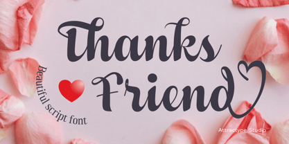 Thanks Friend is a beautiful script font with thickness suitable for greeting card designs, invitations, t-shirt sublimation, event lettering, and crafts. This font features a lovely swash in all lowercase and several ligatures and alternatives.
 - Mentari by Surotype,
$35.00 Mentari a brush script typeface, bold and elegant, with several alternate characters in each letter to give you ease in accomplishing the work of typographic such as logotype, poster, headline, T-shirt and other creative projects.
 - Via Roma Display by Font&Co.,
$19.00 A font inspired by regime propaganda inscriptions found in Italian institutional and civic architecture of the 20’s and 30’s. Bold, severe lettering, suggestive of pre-war Italian Art Deco and American Depression Modern aesthetics.
 - Relic Island 1 by Jehansyah,
$9.00 this is a very special curving font, designed in such a way to add an old feel but still maintain a modern feel, there are several options that you can use and get creative with it
 - Calingthon by Jehansyah,
$10.00 calington is a very charming, beautiful and elegant calligraphy font, there are several alternate characters that you can use, it is perfect for all types of your design needs, covers, branding, magazines, invitations and many more
 - Aicho by Handpik,
$13.00 Aicho is beauty serif display.This font is suitable for invitation cards, decorations, clothing products, greeting cards and others. This font also has uppercase, lowercase, numeric, puntuation and multilingual. and there are several ligature and stylistic alternate.
 - Perfume by Fenotype,
$25.00 Perfume - a luxurious display pack. Perfume is a display combo pack of three styles and eight fonts. Perfume fonts are soft and clean and they have a distinguishable character. Perfume Pen is a monoline script with three weights and large x-height. Perfume Pen is equipped with automatic Contextual Alternates that keep the connections smooth. In addition Perfume Pen has Swash, Stylistic and Titling Alternates, boasting over 500 glyphs in total. Perfume Brush is a bold brush script with two weights. Perfume Brush is also equipped with Contextual Alternates to keep connections smooth and Swasha lternates for more imposing character forms. Perfume Sans is a sturdy all caps Sans with three weights. For the best price purchase the whole pack!
