10,000 search results
(0.05 seconds)
- Heydista Notes by Colllab Studio,
$19.00 "Hi there, thank you for passing by. Colllab Studio is here. We crafted best collection of typefaces in a variety of styles to keep you covered for any project that comes your way! Heydista Notes is a traditional hand-written monoline signature font with clean, geometric outlines. This makes it the perfect choice for high-end branding or marketing materials. The font is modeled after the calligraphy of ancient Rome and Greece. It has a classic and timeless feel, but the clean lines give it a modern edge. Heydista Notes has been designed with attention to detail and with very high quality standards in mind. It includes over 200 glyphs, stylistic alternates with beginning and ending swashes that you can use with your designs, and alternate letters for each letter of the alphabet so you can create unique-looking words and phrases with ease. Whether you're looking for a classic feel or something more modern, Heydista Notes will elevate your designs to the next level. A Million Thanks www.colllabstudio.com
 - Bardamu by Groteskly Yours,
$25.00 Bardamu is a variable slab serif font family designed by Eugene Tantsurin and Anna Remm, and released by Groteskly Yours Studio. Bardamu is a type family that is open to interpretation and experimentation, yet this ambiguity does little to hide its inherent friendliness and good vides. Bardamu can easily be used in a variety of projects and feel at home both in graphic design, branding, web design or editorial design. Thanks to its unique letterforms and eye-catching design choices, it can be that final touch that makes your brand pop! One of the standout qualities of Bardamu is its remarkable versatility. Bardamu comes in 25 styles, allowing users to choose a style that best fits their needs. In addition to that, it offers a wide range of styles, from sleek backward-slanted italics at -20° to elegant upright styles, as well as regular 20° italics. For static fonts, there are two extra subfamilies available (10° Half Italic and 10° Half Reverse) that can be used for creating more complex hierarchy in any text. With a total of 25 static fonts and 1 Variable font, Bardamu is the perfect workhorse display slab serif with unlimited typesetting capabilities. Each font in the Bardamu family boasts an extensive 700+ character set, encompassing all major Latin-based languages, punctuation marks, symbols, and even supplementary characters. Bardamu takes flexibility to a whole new level with its incredible OpenType features that further enhance its versatility. With features such as Case-Sensitive Punctuation, Stylistic Alternates, Sub- and Superscript, Tabular Figures, and Localised Forms, you can fine-tune every detail of your design to perfection. Moreover, the multiple stylistic sets available in Bardamu allow you to switch between various versions of the same glyph effortlessly. Bardamu type family includes 25 static styles as well as a variable font. All styles can be purchased separately or as a full family package. Two styles can be downloaded free of charge. If you'd like to explore Bardamu further, we also offer free trials upon request.
 - Bench Grinder by Typodermic,
$11.95 Step onto the farm and experience the essence of Bench Grinder, a unique display typeface crafted with the inspiration of 19th century metal headline type. With its serifs stripped away, Bench Grinder is a font that embodies rustic charm and familiar comfort, evoking a feeling of being at home in the country. This one-of-a-kind typeface is the perfect tool to help you express your message in an unpredictable way. Whether you’re a farmer or a designer, Bench Grinder can convey your words with unhinged creativity and unbridled passion. Let it take you on a journey through the rolling hills and green fields of the countryside, where life is simpler and beauty is found in the most unexpected places. So embrace the unique and make your words stand out with Bench Grinder. Let it be your tool of choice to bring your message to life, and let it capture the essence of the rustic charm of the farm. Experience the beauty and unpredictability of this font and let your creativity soar! Most Latin-based European writing systems are supported, including the following languages. Afaan Oromo, Afar, Afrikaans, Albanian, Alsatian, Aromanian, Aymara, Bashkir (Latin), Basque, Belarusian (Latin), Bemba, Bikol, Bosnian, Breton, Cape Verdean, Creole, Catalan, Cebuano, Chamorro, Chavacano, Chichewa, Crimean Tatar (Latin), Croatian, Czech, Danish, Dawan, Dholuo, Dutch, English, Estonian, Faroese, Fijian, Filipino, Finnish, French, Frisian, Friulian, Gagauz (Latin), Galician, Ganda, Genoese, German, Greenlandic, Guadeloupean Creole, Haitian Creole, Hawaiian, Hiligaynon, Hungarian, Icelandic, Ilocano, Indonesian, Irish, Italian, Jamaican, Kaqchikel, Karakalpak (Latin), Kashubian, Kikongo, Kinyarwanda, Kirundi, Kurdish (Latin), Latvian, Lithuanian, Lombard, Low Saxon, Luxembourgish, Maasai, Makhuwa, Malay, Maltese, Māori, Moldovan, Montenegrin, Ndebele, Neapolitan, Norwegian, Novial, Occitan, Ossetian (Latin), Papiamento, Piedmontese, Polish, Portuguese, Quechua, Rarotongan, Romanian, Romansh, Sami, Sango, Saramaccan, Sardinian, Scottish Gaelic, Serbian (Latin), Shona, Sicilian, Silesian, Slovak, Slovenian, Somali, Sorbian, Sotho, Spanish, Swahili, Swazi, Swedish, Tagalog, Tahitian, Tetum, Tongan, Tshiluba, Tsonga, Tswana, Tumbuka, Turkish, Turkmen (Latin), Tuvaluan, Uzbek (Latin), Venetian, Vepsian, Võro, Walloon, Waray-Waray, Wayuu, Welsh, Wolof, Xhosa, Yapese, Zapotec Zulu and Zuni.
 - Markerfield by Typodermic,
$11.95 Hey there, looking for a typeface that screams “I’m spontaneous and creative, but also a little bit messy”? Look no further than Markerfield. This typeface is like the lovechild of a whiteboard and a permanent marker—it’s got that super-satisfying squeaky texture that you can almost feel in your fingers. But wait, there’s more! If your program supports OpenType ligatures (which, let’s be real, it totally should), Markerfield will automatically swap in custom pairings to make it look even more like you just scribbled this message on a whiteboard during a brainstorming session. And let’s not forget about the most important part—the message itself. With Markerfield, your words will have an instant aura of authenticity and urgency. It’s like, “Hey, I may not have spent hours crafting this message, but that’s because I’m a busy person with important things to do!” So if you want to inject some playfulness and spontaneity into your designs (or just make your coworkers think you spent all day brainstorming on the whiteboard), give Markerfield a try. Most Latin-based European writing systems are supported, including the following languages. Afaan Oromo, Afar, Afrikaans, Albanian, Alsatian, Aromanian, Aymara, Bashkir (Latin), Basque, Belarusian (Latin), Bemba, Bikol, Bosnian, Breton, Cape Verdean, Creole, Catalan, Cebuano, Chamorro, Chavacano, Chichewa, Crimean Tatar (Latin), Croatian, Czech, Danish, Dawan, Dholuo, Dutch, English, Estonian, Faroese, Fijian, Filipino, Finnish, French, Frisian, Friulian, Gagauz (Latin), Galician, Ganda, Genoese, German, Greenlandic, Guadeloupean Creole, Haitian Creole, Hawaiian, Hiligaynon, Hungarian, Icelandic, Ilocano, Indonesian, Irish, Italian, Jamaican, Kaqchikel, Karakalpak (Latin), Kashubian, Kikongo, Kinyarwanda, Kirundi, Kurdish (Latin), Latvian, Lithuanian, Lombard, Low Saxon, Luxembourgish, Maasai, Makhuwa, Malay, Maltese, Māori, Moldovan, Montenegrin, Ndebele, Neapolitan, Norwegian, Novial, Occitan, Ossetian (Latin), Papiamento, Piedmontese, Polish, Portuguese, Quechua, Rarotongan, Romanian, Romansh, Sami, Sango, Saramaccan, Sardinian, Scottish Gaelic, Serbian (Latin), Shona, Sicilian, Silesian, Slovak, Slovenian, Somali, Sorbian, Sotho, Spanish, Swahili, Swazi, Swedish, Tagalog, Tahitian, Tetum, Tongan, Tshiluba, Tsonga, Tswana, Tumbuka, Turkish, Turkmen (Latin), Tuvaluan, Uzbek (Latin), Venetian, Vepsian, Võro, Walloon, Waray-Waray, Wayuu, Welsh, Wolof, Xhosa, Yapese, Zapotec Zulu and Zuni.
 - Barito by Authentype,
$14.00 The Barito Serif 9 font is full of cursive typefaces with sharp, bold lines that create an optical illusion that appears to intimidate the reader. Barito serif font comes with many languages like Cyrillic • Greek • Latin and is perfect for designing books, magazines, titles for online advertising media websites and much more. The barito serif font not only comes with 9 weights, but is also accompanied by an italic for complement and confirmation.
 - Aromanis by Oui Studio,
$14.00 Hello friends! The 'Aromanis' font is coming, a playful and sweet font in two variants: Regular and Shadow. Aromanis font comes with a complete package of uppercase, lowercase, numeric, punctuation, multilingual characters, and some of the alternative glyphs to add an extra to your word. It's perfect for branding, logo, invitation, greeting card, packaging, graphic tee, poster, anything that you need to make a playful, fun, neat and sweet effect in your works. Happy creating :)
 - Ports Play by Alandya TypeFoundry,
$19.00 Port Play ... Based on Density Slab Serif, now with other styles, Normal and Expand, equipped with alternative letters that are so wide that they give a strong, clear, masculine feel, and have good legibility. Port Play comes in regular, oblique, outline, and outline oblique styles along with regular and oblique variable files. This font is perfect for every project. suitable for branding logo, badge design, or apparel design. This font also comes with multilingual support.
 - Lovadelic by Aiyari,
$20.00 Introducing a new retro & groovy typeface called Lovadelic. Inspired from 70's script lettering combine with psychedelic balloon typography. Lovadelic comes with open type features such stylistic alternates, stylistic sets, contextual alternates & ligatures. The package also comes with extras graphic to help you make stunning design. Lovadelic typeface is best uses for headings, Logo type, quotes, apparel design, invitations, flyer, poster, greeting cards, product packaging, book cover, printed quotes, cover album, movie, etc
 - Cosmic Dust by Kitchen Table Type Foundry,
$16.00 Cosmic Dust is dust that occurs in outer space or has fallen onto earth. Cosmic Dust font isn’t a dusty or celestial affair, no, it is a nice and useful font I made with a Sharpie pen. It is a little uneven, a little wobbly, but comes with a lot of character. Use it for your book covers, product packaging or posters. Cosmic Dust comes with extensive language support and a cool set of alternates.
 - Only Kidding by PizzaDude.dk,
$20.00 Massive text suits my Only Kidding very well. Even at small sizes it is super legible, and it really keeps that handmade image. At larger sizes the crunchiness really comes forward and may surprise you how detailed edges the letters has got! I am going to use this font for one of my children's books - I am thinking something adventure-ish! What you think? Comes with fi and fl ligatures and double letter substitutions!
 - Romla by HansCo,
$12.00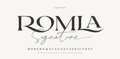 Romla is an elegant and classy font with a modern touch. This font come with signature ballpoint style that give you a sleek, elegant look for your logos, business card, wedding invitations, quotes, advertisements, and more. This typeface comes in uppercase and lowercase, with punctuation, symbols, numerals, stylistic alternates and also has multilingual support. Create something beautiful today with this font. Tutorial how to Install & use Alternate / Special Character : https://hanscostudio.com/tutorial/ Enjoy!
 - Amarela Stencil by Latinotype,
$29.00 Amarela Stencil is a contemporary typeface, specially designed for titles, packaging and branding. Sharp serifs and an extreme stroke contrast give the font a classy look and a strong personality. Amarela Stencil comes in 5 weights, ranging from Ultralight to Black, plus two decorative styles- One and Two. As you would expect from Latinotype, this font comes with a standard character set that supports over 200 languages. Alternates and OpenType features are also included.
 - Fabuleuse Slab by Nuno Dias,
$18.00 Fabuleuse Slab is a one-style font that features a thin, condensed and high cap height and x-height. This gives the font a distinct retro look & bohemian feeling that is great for logos & branding, packaging, titles, magazines, posters, signs, shirts, scrap-booking, … This display font comes in Capital letters as well as Lowercase. It also comes equipped with Ligatures, Numbers, Punctuation Marks, Diacritic Marks and a well stocked supply of special characters.
 - Bigwogs GT by Gartype Studio,
$15.00 Bigwogs is a Street Arts inspiration typeface with a touch of street artistic typeface with graffiti vibes. Bigwogs is an urban inspired typeface from us, that more come with touch of graffiti urban vibes and also comes with multilingual features and extra graffiti swashes to make graffiti vibes. This font look so cool when you using it for projects like text headlines, product packaging, poster, music purpose, game logo title, brands, and mascot logo designs.
 - Oblik by Tour De Force,
$25.00 Like Refused said in their song ”The Shape of new Punk to come”, Oblik could be “The Shape of new Fonts to come”, we present you our uprising star - Oblik - that could shine in your monitors. Modern family, stylish and secure, with its own personality (it’s photogenic, too), available for all kind of use, even you're an doctor or policeman or butcher or truck driver or maybe rock star, this font will rock your world.
 - Notedinary by Invasi Studio,
$17.00 Notedinary comes with elegant script calligraphy with a personal touch. Take inspiration from diary notes. A delicate modern calligraphy script ideal for weddings, elegant branding, and adding a soft feminine touch to your projects. Notedinary comes with alternates and supports 60+ Latin-based languages. In the previews, I have paired Notedinary Script with the free Cormorant font. Features: - Total 204 Glyph - Uppercase & Lowercase - Numerals & Punctuation - Alternates - Multilanguage Supports 60+ Latin based languages
 - Ringo by typoland,
$9.00 Whassup y’all! Me and my bros got this li’l gang together: we is Ringo, and we got da bling, yo! We is da typeface family for ya all! We got some real sweet stuff for ya, some nice characters. We got all ’em OpenType features like fractions and proportional figgers, we even got da cubic root, man! And check out da question mark, man, is real sweet. And the ampersand, yeah! I luv ’em ampersands. Now my brothers over here got some light action for ya, and they got some real bold action for ya. We got some nice foxy curves goin’ on, some nice tension, and some nice relaxation. My bro Light over here is kind of like the subtle guy, ya know. He’s in for the female fans, ya know. Heh! Hell, yeah! And man, we speak like 84 languages: we speak the German, and the French, and the Spanish, and we speak the Polish, and the Czech, and the Hungarian, and we even speak Shambala and Swahili and Rundi, and we got some Esperanto thing as well for ya. And check out my bro Black right over here, he’s like the action superhero, man! He’s got impact, man! Yeah yeah, but you know, my bros Regular and Bold are the real deal. Them is like da word of da street, man! Like da word of you, and you. And we got a message for y’all: life is hard, life is real, but you should work your mojo, be smooth, be nice, chill. We got all them kerning pairs, and all them weights, and we got ’em alternate letters. So check us out, yo!
 - Plakato Pro by Underware,
$50.00 Plakato, a stencil love affair Plakato is a family of display fonts, consisting of various eye-catching styles, each of them very bold. Plakato is an identity toolkit, a heavyweight building block in case you need a strong personality, a small stencil font family to cut out your best ideas and grab all the attention. But just as with many other creations, its outcome is as divers as its multiple origins. Plakato comes in 16 eye-catching styles. The default stencil style comes in Regular & Italic. They both have 2 variations: one version, named Plakato Stencil, automatically creates borders around the text, putting any text into a graphic stencil in this way. Another version, the extruded three-dimensional version, guarantees even more attention for your message. Next to this there is also the Inline version, which is an optical play with a lot of lines. Plakato Inline has a supportive background layer, a separate font in case you want to add a background in a different colour. Then there is Plakato Paper, a manually teared version of Plakato offering a more physical look. This small family of eye-catching display fonts also contains a Neon font, an independent design in Plakato style, which can actually be used for making neon signs due to its construction. Plakato Neon comes with its own Dingbat font for that extra flush-flush. Plakato has also been redrawn on a C64, and with all its accompanying limitations been ported back and turned into a font: Plakato Game. Also this font comes with its own Dingbat font, full of emoji’s and icons for oldskool pleasure. Last but not least there is Plakato Build, constructed out of blocks. As if that wasn’t enough, there are various dynamic versions in the Plakato Play package, which offer a whole new range of possibilities for typographic expression, with new animation and interaction opportunities.
 - Monalliza by Ardyanatypes,
$20.00 "Monalliza" comes with an aesthetic style, and its serif-type tagline is Vintage and elegant. "Monalliza" is also equipped with the latest professional characteristics that present a sleek and attractive identity for your company or project for business purposes. It goes well with modern serifs and scripts that depict or stand firm as a title and brand representative for an elegant look. "Monalliza" also comes with multiple languages, making any country and language easy to use. It also comes with alternative Ligatures and styles to make your designs more attractive. "Monalliza" is suitable for branding projects and various design purposes such as business cards, name tags, and uniforms as a brand enhancement. Advertisements, posters, invitations, branding, logos, magazines, merchandise, presentations, etc.
 - Hunterland by Aminmario Studio,
$20.00 Hunterland is a modern signature font. This font was created to look as close to a natural handwritten as possible by including some alternates lowercase, ligature and underlines. Perfect for any awesome projects that need hand writing taste. Comes with regular and italic. Built in Opentype features, this script comes to life as if you were writing it yourself. Also support multilingual. It's highly recommended to use it in opentype capable software - there are plenty out there nowadays as technology catches up with design ... Other than Photoshop, Illustrator and Indesign, many standard simple programs now come with Opentype capabilities - even the most basic ones such as Apple's Text Edit, Pages, Keynote, iBooks Author, etc. Even Word has found ways to incorporate it. AminMario
 - Report School by Typodermic,
$11.95 Report School is a geometric sans-serif typeface that was inspired by student handwriting practice worksheets. But don’t worry, it’s not just a copy of those worksheets. Report School is designed to be easily readable, with legible letterforms that make it perfect for use in educational materials. You might be wondering what makes Report School different from other school-oriented geometric sans-serif typefaces. Well, for starters, it’s designed with readability in mind. While other typefaces might prioritize pure geometry, Report School puts legibility first. That means that when you use Report School, your readers will have an easier time reading your text. And speaking of easier reading, Report School has some features that are designed to make things even more legible. For example, instead of using straight quotes for inches, feet, or degrees, you can use primes. And Report School has regular primes, double primes, and triple primes, so you can choose the right one for your needs. Plus, the numerals in Report School are tabular, which means they’re vertically aligned for easier math equation alignment. But that’s not all! If you’re using OpenType savvy applications like InDesign, Illustrator, or Photoshop, you can access even more features. For example, you can use the stylistic alternates feature to access the letters “I” and “J” with no serifs, as well as a straight lowercase “q”. And if you’re looking for something a little different, you can check out Report School’s rounded version, called Report, or a version with casual strokes, called Sweater School. If you’re looking for a typeface that’s easy to read, but still has some personality, look no further than Report School. It’s the perfect choice for any educational materials that need to be both legible and stylish. Most Latin-based European writing systems are supported, including the following languages. Afaan Oromo, Afar, Afrikaans, Albanian, Alsatian, Aromanian, Aymara, Bashkir (Latin), Basque, Belarusian (Latin), Bemba, Bikol, Bosnian, Breton, Cape Verdean, Creole, Catalan, Cebuano, Chamorro, Chavacano, Chichewa, Crimean Tatar (Latin), Croatian, Czech, Danish, Dawan, Dholuo, Dutch, English, Estonian, Faroese, Fijian, Filipino, Finnish, French, Frisian, Friulian, Gagauz (Latin), Galician, Ganda, Genoese, German, Greenlandic, Guadeloupean Creole, Haitian Creole, Hawaiian, Hiligaynon, Hungarian, Icelandic, Ilocano, Indonesian, Irish, Italian, Jamaican, Kaqchikel, Karakalpak (Latin), Kashubian, Kikongo, Kinyarwanda, Kirundi, Kurdish (Latin), Latvian, Lithuanian, Lombard, Low Saxon, Luxembourgish, Maasai, Makhuwa, Malay, Maltese, Māori, Moldovan, Montenegrin, Ndebele, Neapolitan, Norwegian, Novial, Occitan, Ossetian (Latin), Papiamento, Piedmontese, Polish, Portuguese, Quechua, Rarotongan, Romanian, Romansh, Sami, Sango, Saramaccan, Sardinian, Scottish Gaelic, Serbian (Latin), Shona, Sicilian, Silesian, Slovak, Slovenian, Somali, Sorbian, Sotho, Spanish, Swahili, Swazi, Swedish, Tagalog, Tahitian, Tetum, Tongan, Tshiluba, Tsonga, Tswana, Tumbuka, Turkish, Turkmen (Latin), Tuvaluan, Uzbek (Latin), Venetian, Vepsian, Võro, Walloon, Waray-Waray, Wayuu, Welsh, Wolof, Xhosa, Yapese, Zapotec Zulu and Zuni.
 - Schism One by Alias,
$55.00 Schism is a modulated sans-serif, originally developed from our Alias Didot typeface, as a serif-less version of the same design. It was expanded to three sub-families, with the thin stroke getting progressively heavier from Schism One to Schism Three. The different versions explore how this change in contrast between thick and thin strokes changes the character of the letterforms. The shape is maintained, but the emphasis shifts from rounded to angular, elegant to incised. Schism One has high contrast, and the same weight of thin stroke from Light to Black. Letter endings are at horizontal or vertical, giving a pinched, constricted shape for characters such as a, c, e and s. The h, m, n and u have a sharp connection between curve and vertical, and are high shouldered, giving a slightly square shape. The r and y have a thick stress at their horizontal endings, which makes them impactful and striking at bolder weights. Though derived from an elegant, classic form, Schism feels austere rather than flowery. It doesn’t have the flourishes of other modulated sans typefaces, its aesthetic more a kind of graphic-tinged utility. While in Schism Two and Three the thin stroke gets progressively heavier, the connections between vertical and curves — in a, b, n etc — remain cut to an incised point throughout. The effect is that Schism looks chiselled and textural across all weights. Forms maintain a clear, defined shape even in Bold and Black, and don’t have the bloated, wide and heavy appearance heavy weights can have. The change in the thickness of the thin stroke in different versions of the same weight of a typeface is called grading. This is often used when the types are to used in problematic print surfaces such as newsprint, or at small sizes — where thin strokes might bleed, and counters fill in and lose clarity, or detail might be lost or be too thin to register. The different gradings are incremental and can be quite subtle. In Schism it is extreme, and used as a design device, giving three connected but separate styles, from Sans-Didot to almost-Grotesk. The name Schism suggests the differences in shape and style in Schism One, Two and Three. Three styles with distinct differences, from the same start point.
 - Schism Three by Alias,
$55.00 Schism is a modulated sans-serif, originally developed from our Alias Didot typeface, as a serif-less version of the same design. It was expanded to three sub-families, with the thin stroke getting progressively heavier from Schism One to Schism Three. The different versions explore how this change in contrast between thick and thin strokes changes the character of the letterforms. The shape is maintained, but the emphasis shifts from rounded to angular, elegant to incised. Schism One has high contrast, and the same weight of thin stroke from Light to Black. Letter endings are at horizontal or vertical, giving a pinched, constricted shape for characters such as a, c, e and s. The h, m, n and u have a sharp connection between curve and vertical, and are high shouldered, giving a slightly square shape. The r and y have a thick stress at their horizontal endings, which makes them impactful and striking at bolder weights. Though derived from an elegant, classic form, Schism feels austere rather than flowery. It doesn’t have the flourishes of other modulated sans typefaces, its aesthetic more a kind of graphic-tinged utility. While in Schism Two and Three the thin stroke gets progressively heavier, the connections between vertical and curves — in a, b, n etc — remain cut to an incised point throughout. The effect is that Schism looks chiselled and textural across all weights. Forms maintain a clear, defined shape even in Bold and Black, and don’t have the bloated, wide and heavy appearance heavy weights can have. The change in the thickness of the thin stroke in different versions of the same weight of a typeface is called grading. This is often used when the types are to used in problematic print surfaces such as newsprint, or at small sizes — where thin strokes might bleed, and counters fill in and lose clarity, or detail might be lost or be too thin to register. The different gradings are incremental and can be quite subtle. In Schism it is extreme, and used as a design device, giving three connected but separate styles, from Sans-Didot to almost-Grotesk. The name Schism suggests the differences in shape and style in Schism One, Two and Three. Three styles with distinct differences, from the same start point.
 - Schism Two by Alias,
$55.00 Schism is a modulated sans-serif, originally developed from our Alias Didot typeface, as a serif-less version of the same design. It was expanded to three sub-families, with the thin stroke getting progressively heavier from Schism One to Schism Three. The different versions explore how this change in contrast between thick and thin strokes changes the character of the letterforms. The shape is maintained, but the emphasis shifts from rounded to angular, elegant to incised. Schism One has high contrast, and the same weight of thin stroke from Light to Black. Letter endings are at horizontal or vertical, giving a pinched, constricted shape for characters such as a, c, e and s. The h, m, n and u have a sharp connection between curve and vertical, and are high shouldered, giving a slightly square shape. The r and y have a thick stress at their horizontal endings, which makes them impactful and striking at bolder weights. Though derived from an elegant, classic form, Schism feels austere rather than flowery. It doesn’t have the flourishes of other modulated sans typefaces, its aesthetic more a kind of graphic-tinged utility. While in Schism Two and Three the thin stroke gets progressively heavier, the connections between vertical and curves — in a, b, n etc — remain cut to an incised point throughout. The effect is that Schism looks chiselled and textural across all weights. Forms maintain a clear, defined shape even in Bold and Black, and don’t have the bloated, wide and heavy appearance heavy weights can have. The change in the thickness of the thin stroke in different versions of the same weight of a typeface is called grading. This is often used when the types are to used in problematic print surfaces such as newsprint, or at small sizes — where thin strokes might bleed, and counters fill in and lose clarity, or detail might be lost or be too thin to register. The different gradings are incremental and can be quite subtle. In Schism it is extreme, and used as a design device, giving three connected but separate styles, from Sans-Didot to almost-Grotesk. The name Schism suggests the differences in shape and style in Schism One, Two and Three. Three styles with distinct differences, from the same start point.
 - Ventography Personal Use Only - Personal use only

- Capitol Pro by RMU,
$30.00 Like a phoenix from the ashes - here comes Capitol Pro, a complete redesign of Schriftguss' 1931 Capitol font of which just a few letters existed.
 - Andorra Script by Hanoded,
$15.00 Andorra Script is a hand written font - it is very legible, quite elegant (in an informal way) and useful. Andorra Script comes with all diacritics.
 - Legoix by PizzaDude.dk,
$20.00Legoix is a simulates scribbled letters - comes with ligatures to avoid repeating letters. You will need to use OpenType supporting applications to use the autoligatures. - Entourage by Hanoded,
$15.00 Entourage is a sweet little font - rounded, quirky and cute. Entourage will shine on product packaging, posters and websites. Comes with an ‘entourage’ of diacritics.
 - American Brewery by Decade Typefoundry,
$15.00 American Brewery was inspired by lettering found on vintage beer label. Clean and rough version are available, “rough” version comes with a vintage letterpress feel.
 - Phoenix Squad by Stringlabs Creative Studio,
$29.00 Phoenix Squad is a modern and bold display font. Add this font to your favorite creative ideas and notice how it makes them come alive!
 - Megot by Brainware Graphic,
$12.00 Megot is a modern fancy display font with playful feel. Comes with opentype features, Megot also supports multilingual covering Latin based language (Latin Extended Additional)
 - Barbed Wire by Monotype,
$29.99Andrew Smith played with his pencil and scetched an alphabet with several strokes. and as he made come cross strokes it lokes like barbed wire. - Dondolare by Tour De Force,
$25.00 Dondolare is simple hand-drawn font family. Squarish looking and ready for typography cooking, comes in 2 weights with support for extended Latin character set.
 - Minnie by Lebbad Design,
$24.95 Minnie is a clean monoline upright script. This fun-loving font is great for headline display and text use. It comes with numerous alternate characters.
 - NBAres by Nicola Burgarella,
$9.00 This new font family full fit all your comic balloons, onomatopoeia and... SCREAMS! Comes with Regular, Italic and Bold Italic with a great organic look.
 - Agenor by Graphite,
$17.00 Agenor is an all caps display typeface family. It comes in five weights and is suitable for headlines, headings, branding, posters, packaging, titles and logos.
 - South Louisville by Sarid Ezra,
$15.00 South Louisville is an applicable handwritten font that contains uppercase, lowercase, number and symbol, also comes with ligatures and underline. This font support multi language!
 - Architec by Monotype,
$29.99This caps only hand lettering could have come from an architect. Speedy written on a 45 degree slope with a bold felt pen or brush. - Aztec Day Signs by Deniart Systems,
$15.00 Contains the 20 Days of the Mexican Calendar Stone in outline and silhouette mode NOTE: this font comes with an interpretation guide in pdf format.
