10,000 search results
(0.063 seconds)
- Mc Cartey by Maulana Creative,
$11.00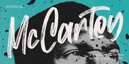 Mc Cartey is a Fancy Handwritten Brush Display font. With raw brush stroke, slanted and fun character with a ligatures. To give you an extra creative work. Mc Cartey font support multilingual more than 100+ language. This font is good for logo design, Social media, Movie Titles, Books Titles, a short text even a long text letter and good for your secondary text font with sans or serif. Make a stunning work with Mc Cartey font. Cheers, MaulanaCreative
 - Orttisa by Maulana Creative,
$12.00 Orttisa is an slanted style script font. With light contrast stroke, fun character with a bit of ligatures and alternates. To give you an extra creative work. Orttisa font support multilingual more than 100+ language. This font is good for logo design, Social media, Movie Titles, Books Titles, a short text even a long text letter and good for your secondary text font with sans or serif. Make a stunning work with Orttisa font. Cheers, Maulana Creative
 - Hollestik by Maulana Creative,
$15.00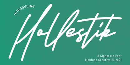 Hollestik is a casual signature font. With mono-line stroke, slanted and fun character with a bit of ligatures and lowercase alternates. To give you an extra creative work. Hollestik font support multilingual more than 100+ language. This font is good for logo design, Social media, Movie Titles, Books Titles, a short text even a long text letter and good for your secondary text font with sans or serif. Make a stunning work with Hollestik font. Cheers, MaulanaCreative
 - Jullysinty by Maulana Creative,
$13.00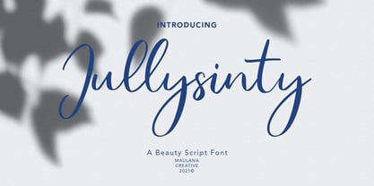 Jullysiinty is casual script font, with high contrast light stroke, slant and fun character. It has Opentype features ligatures of character, To give you an extra creative work. Jullysiinty script font support multilingual more than 100+ language. This font is good for logo design, Social media, Movie Titles, Books Titles, a short text even a long text letter and good for your secondary text font with sans or serif. Make a stunning work with Jullysiinty font. Cheers, MaulanaCreative
 - Nishyad by Maulana Creative,
$14.00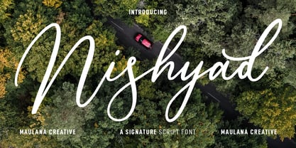 Nisyhad is an unique signature script font. With regular contrast stroke, fun character with a bit of ligatures and alternates. To give you an extra creative work. Nisyhad font support multilingual more than 100+ language. This font is good for logo design, Social media, Movie Titles, Books Titles, a short text even a long text letter and good for your secondary text font with sans or serif. Make a stunning work with Nisyhad font. Cheers, MaulanaCreative
 - Oshirist by Maulana Creative,
$11.00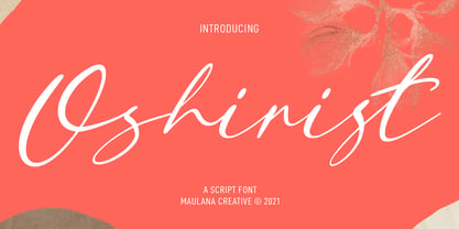 Oshirist is a Fancy unique script font. With high contrast stroke, slanted and fun character with a bit of ligatures. To give you an extra creative work. Oshirist font support multilingual more than 100+ language. This font is good for logo design, Social media, Movie Titles, Books Titles, a short text even a long text letter and good for your secondary text font with sans or serif. Make a stunning work with Oshirist font. Cheers, MaulanaCreative
 - Owlishly by Maulana Creative,
$12.00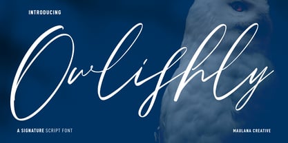 Owlishly is an expressive modern script font. With high contrast stroke, fun character with a bit of ligatures and alternates. To give you an extra creative work. Owlishly font support multilingual more than 100+ language. This font is good for logo design, Social media, Movie Titles, Books Titles, a short text even a long text letter and good for your secondary text font with sans or serif. Make a stunning work with Owlishly font. Cheers, MaulanaCreative
 - Crisp Cracks by Maulana Creative,
$11.00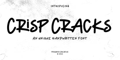 "Crisp Cracks" is a casual Handwritten font. With regular stroke, fun character with a bit of ligatures, lowercase alternates and swashes. To give you an extra creative work. "Crisp Cracks" font support multilingual more than 100+ language. This font is good for logo design, Social media, Movie Titles, Books Titles, a short text even a long text letter and good for your secondary text font with sans or serif. Make a stunning work with "Crisp Cracks" font. Cheers, MaulanaCreative
 - MC Bazelle by Maulana Creative,
$15.00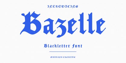 Bazelle is a modern experimental blackletter font. With medium low contrast stroke, fun character with a bit of ligatures and alternates. To give you an extra creative work. Bazelle font support multilingual more than 100+ language. This font is good for logo design, Social media, Movie Titles, Books Titles, a short text even a long text letter and good for your secondary text font with sans or serif. Make a stunning work with Bazelle font. Cheers, Maulana Creative
 - Hitshot Signature by Maulana Creative,
$12.00 Hitshot is an expressive signature brush script font. With regular brush stroke, slanted and fun character with some of ligatures and lowercase alternates. To give you an extra creative work. Hitshot font support multilingual more than 100+ language. This font is good for logo design, Social media, Movie Titles, Books Titles, a short text even a long text letter and good for your secondary text font with sans or serif. Make a stunning work with Hitshot font. Cheers, MaulanaCreative
 - Sunnycyclops by Maulana Creative,
$12.00 Sunnycyclops is a Handwritten script font it's monoline and clean stroke with fun character. It has Opentype features ligature rich to give you an extra creative work. Sunnycyclops support multilingual more than 100+ language. This font is good for logo design, Social media, Movie Titles, Books Titles, a short text even a long text letter and good for your secondary text font with sans or serif. Make a stunning work with Sunnycyclops Handwritten font. Cheers, MaulanaCreative
 - Tavern by FontMesa,
$25.00 Tavern is a super font family based on our Algerian Mesa design, with Tavern we've greatly expanded the usability by creating light and bold weights plus all new for 2020 with the introduction of extra bold and black weights Tavern is now a five weight family. The addition of the bold weight made it possible to go further with the design by adding open faced shadowed, outline and fill versions. Please note, the fill fonts are aligned to go with the open faced versions, they may work with the outline versions, however you will have to apply them one letter at a time. The Tavern Fill fonts may also be used a stand alone font, however, the spacing is much wider than the regular solid black weights of Tavern. In the old days of printing, fill fonts rarely lined up perfect with the open or outline font, this created a misprinted look that's much in style today. To create that misprinted look using two different colors, try layering the outline fonts offset over the top of the solid black versions. Next we come to the small caps and X versions, for a font that's mostly seen used in all caps we felt a small caps would come in handy. The X in Tavern X stands for higher X-height, we've taken our standard lowercase and raised it for greater visibility in small text and for signage where you want the look of a lowercase but it needs to be readable from the street. In August of 2016 I started the project of expanding this font into more weights after seeing the font in use where someone tried creating a bold version by adding a stroke fill around the letters. The result didn't look very good, the stroke fill also caused the shadow line to merge with the serifs on some letters. This lead me to experiment to see if a new bold weight was possible for this font and I'm pleased to say that it was. After the bold weight was finished I decided to type the regular and bold weights together in a first word thin second word bold combination, however the weight difference between the two wasn't enough contrast. This lead me to wonder if a lighter weight was possible for this font, as you can see yes it was, so now for the first time in the history of this old 1908 type design you can type a first word thin second word bold combination. So why the name change from Algerian to Tavern? Since the original font was designed in England by the Stephenson Blake type foundry I decided to give this font a name that reminded you of the country it came from, however, there were other more technical reasons. During the creation of the bold weight the engraved shadow line was sticking out too far horizontally on the bottom right of the serifs dramatically throwing the whole font off balance. The original font encountered this problem on the uppercase E, L and Z, their solution was a diagonal cut corner which was now needed across any glyph in the new bold weight with a serif on the bottom right side. In order to make the light and regular weights blend well with the bold weight diagonal cut offs were needed and added as well. This changed the look of the font from the original and why I decided to change the name, additional concerns were, if you're designing a period piece where the font needs to be authentic then this font would be too new. Regular vs. Alt version? The alternate version came about after seeing the regular version used as a logo and secondary text on a major product label. I felt that some of the features of the regular version didn't look good as smaller secondary text, this gave me the idea to create an alternate version that would work well for secondary text in an advertising layout. But don't stop there, the alternate version can be used as a logo too and feel free to exchange letters between both regular and alternate versions. Where are the original alternates from Algerian? Original alternates from Algerian are built into the regular versions of Tavern plus new alternates have been created. We're excited to introduce, for the first time, all new swash capitals for this classic font, you're going to love the way they look in your ad layout, sign or logo. The best way to access alternate letters in Tavern is with the glyph map in Adobe Illustrator and Adobe InDesign products, from Adobe Illustrator you can copy and paste into Photoshop as a smart object and take advantage of all the text layer style features Photoshop has to offer. There may be third party character maps available for accessing alternate glyphs but we can't advise you in that area. I know what you're thinking, will there be a Tavern Condensed? It takes a lot of hours to produce a large font family such as this, a future condensed version will depend on how popular this standard version is. If you love Tavern we're happy to introduce the first weathered edge version of this font called Bay Tavern available in February 2020.
 - Springsteel Serif by Paragraph,
$21.00 A companion to Springsteel (sans), this serif typeface is intended for longer text blocks and smaller sizes. Like the sans-serif, it has unusual construction using curves on the outside and straight lines inside characters, giving it quite an expressive and warm feel. It contains small caps and old-style figures, as well as superior/inferior figures and common fractions and mathematical symbols. It supports Western plus Nordic, Eastern European and Turkish languages. Excellent spacing and extensive kerning (over 2800 pairs) provided by Igino Marini/iKern. The free fonts in the Springsteel Serif Extreme family (thin and heavy weights) should only be used as display typefaces, at large size and short text blocks.
 - Bosamble by IbraCreative,
$17.00 Bósamble is a striking and contemporary Bold Display Sans Serif typeface that effortlessly commands attention with its bold, geometric letterforms. Its distinctive design features a perfect balance between thick and thin strokes, creating a sense of power and modernity. Bósamble’s uppercase characters exude a sense of confidence and boldness, making it an excellent choice for headlines, posters, and branding projects where a strong and impactful typographic statement is desired. Its clean lines and clear readability make it a versatile choice for a wide range of design applications, allowing Bósamble to stand out as a compelling choice for those seeking a bold and assertive typeface.
 - Urbane Rough by Device,
$39.00 Urbane Rough is a distressed version of Urbane, giving it an urgency and immediacy reminiscent of photocopied flyers or inky printing. A versatile all-purpose sans-serif family of six weights plus italics, it explores the same idea-space as early geometric modernist sans such as Futura, Erbar, Spartan and Elegant Sans, with a single-story a, a contemporary high x-height and very slightly condensed bowls. Perfect for headlines and running text, it is clear, classic and authoritative. Unusually for a geometric moderne sans, letter-widths are optically balanced, giving an even colour in setting. Includes a full international character set, lining, tabular and old-style numerals.
 - Textbook New by ParaType,
$30.00 Designed for ParaType in 2007 by Isabella Chaeva. The type is based on Bukvarnaya (TextBook) photocomposing version designed in 1987 by Emma Zakharova. The initial Bukvarnaya for metal composition was created at Polygraphmash in 1958 by Elena Tsaregorodtseva. It was developed for primers and the first level school textbooks. An early sans serif ('Grotesque') with half-closed static letterforms. For use in book and magazine typography, advertising and headlines. Also may be useful as screen font.
 - Humus by AndrijType,
$25.00 Ukrainian humanistic sans of universal purpose. Thanks to humanistic proportions and somewhat calligraphic sharpness, the typeface unobtrusively disturbs the eye, while remaining at the same time a “strong” modern grotesque. Asymmetric motive, distinctive letters and alternative glyphs give the font a Ukrainian flavor. The character set includes Slavic Cyrillic, European Latin and Monotonic Greek. Humus contains traditional and original ligatures, numeral variants, fractions, stylistic and historical alternatives in Cyrillic. The typeface was designed by Andrij Shevchenko in 2007-2022
 - Gothica by Type Innovations,
$39.00 Say hello to Gothica. It’s a display geometric sans designed with Stencil-like elements and letter cutouts specifically created for visual impact—ideal for logo, branding and advertising purposes. The font includes capitals and capital alternatives in the lower case keystroke positions—it’s like having 2 display fonts in one. In addition, Gothica includes various opentype features that allow graphic designers to tailor the type for custom needs. The development of Gothica started in 1997, inspired by Alex Kaczun’s best selling grotesque font family called Contax Pro. An experimental design, Gothica is specifically introduced as a bold weight, but Alex plans to expand the design to include many weights, styles and alternative design treatments. Stay tuned! If you like Gothica—check out similar gothic alternates like Decrypt 01, Decrypt 02, Decrypt H1 and all of Type Innovations fonts from Alex Kaczun.
 - Novel Mono Pro by Atlas Font Foundry,
$50.00 Novel Mono Pro is the monospaced typeface family within the largely extended award winning Novel Collection, also containing Novel Pro, Novel Sans Pro, Novel Sans Condensed Pro, Novel Sans Rounded Pro and Novel Sans Office Pro. Novel Mono Pro has a carefully attuned character design and a well balanced weight contrast. It combines the feeling of a modern humanist with the technical appearance of a typewriter. Many similarities with the other typeface families within the Novel Collection enable designers to combine the families and reach highest quality in typography. Novel Mono Pro [948 glyphs] comes in 12 styles and contains small caps for the uprights and the italics, ligatures, lining figures, hanging figures, small caps figures, positive and negative circled figures for upper and lower case, superior and inferior figures, fractions, extensive language support, arrows for uppercase and lowercase and many more OpenType™ features.
 - Just Heavenly by Nicky Laatz,
$18.00 Say hello to JUST HEAVENLY - A flamboyant & natural-looking, textured brush font with a really big heart! Just heavenly is intended to give your type designs a natural and fresh handwritten look. To make your designs look even more natural and unique, Just Heavenly has a large selection of ligatures and alternate letters built in. Just heavenly actually has a whole extra set of uppercase AND lowercase alternate letters - so you are guaranteed to find just the right feel for your project. These are all provided as a whole extra font for folks without special Opentype capable software :) That's not all :) Just Heavenly comes with 62 lovely flamboyant swashes and ornaments as a separate font - Just add a swash, and watch your design pop in an instant :)
 - Corner by URW Type Foundry,
$35.99 A unique kind of type by Michael Herold: The 14 cuts of Corner are equally distributed to the two style variants A and B. From Thin to Extra Bold, variant A comes with technical and pure forms while B appears with a soft, more personal character. In combination, the two variants add up to a highly versatile family which is very well suited for branding purposes, thanks to its diverse forms of expression. Eine besondere Schriftfamilie von Michael Herold: Die 14 Schnitte der Corner sind auf die beiden Stilvarianten A und B verteilt. Von Thin bis Extra Bold kommt die Corner im Stil A mit technischen, reinen Formen und im Stil B mit weichem, persönlicherem Charakter. Als Kombination ergibt sich eine sehr vielfältige Familie, die sich mit ihren verschiedenen Ausdrucksformen besonders fürs Branding eignet.
 - Haven Code - Unknown license

- Raj JY by JY&A,
$39.00JY Raj has had a lengthy gestation. The original one was a sans serif adaptation of a slab serif typeface design by Jure Stojan. Raj looked instantly better as a sans serif. After refining it further one lengthy night in 2001, he showed the drafts to Jack Yan, who completed the character sets and finished the kerning. A characterful sans serif, JY Raj pushes the boundaries of what is possible with various geometric shapes, combining legibility and tradition with sharp, unexpected angles. As with Stojan's earlier JY Koliba, it possesses a delightful balance, thanks to the designer's eye for detail and typographic harmony. The name has little to do with the Asian subcontinent: it translates to paradise in Stojan's mother tongue, Slovenian. - Optima Cyrillic by Linotype,
$65.00Many typefaces are distinctive or attractive at the expense of legibility and versatility. Not so the Optima® family. Simultaneously standing out and fitting in, there are few projects or imaging environments outside of its range. Although Optima is almost always grouped with sans serif typefaces, it should be considered a serifless roman. True to its Roman heritage, Optima has wide, full-bodied characters – especially in the capitals. Only the E, F and L deviate with narrow forms. Consistent with other Zapf designs, the cap S in Optima appears slightly top-heavy with a slight tilt to the right. The M is splayed, and the N, like a serif design, has light vertical strokes. The lowercase a and g in Optima are high-legibility two-storied designs. Optima can be set within a wide choice of line spacing values – from very tight to very open. In fact, there are few limits to the amount of white space that can be added between lines of text. Optima also benefits from a wide range of letter spacing capability. It can be set quite tight, or even slightly open – especially the capitals. If there are any guidelines, Optima should be set more open than tight. It’s not that readability is affected that much when Optima is set on the snug side; it’s just that the unhurried elegance and light gray typographic color created by the face are disrupted when letters are set too tight. Optima is also about as gregarious as a typeface can be. It mixes well with virtually any serif design and a surprisingly large number of sans serif faces. The Optima family is available in six weights, from roman to extra black, each with an italic counterpart. In addition, the family is available as a suite of OpenType® Pro fonts, providing for the automatic insertion of small caps, ligatures and alternate characters, in addition to offering an extended character set supporting most Central European and many Eastern European languages. When you’re ready to find its perfect pairing, browse these fantastic matches: Monotype Century Old Style™, Dante®, Frutiger® Serif, Joanna® Nova, Malabar™, and Soho®. - Optima by Linotype,
$45.99 Many typefaces are distinctive or attractive at the expense of legibility and versatility. Not so the Optima® family. Simultaneously standing out and fitting in, there are few projects or imaging environments outside of its range. Although Optima is almost always grouped with sans serif typefaces, it should be considered a serifless roman. True to its Roman heritage, Optima has wide, full-bodied characters – especially in the capitals. Only the E, F and L deviate with narrow forms. Consistent with other Zapf designs, the cap S in Optima appears slightly top-heavy with a slight tilt to the right. The M is splayed, and the N, like a serif design, has light vertical strokes. The lowercase a and g in Optima are high-legibility two-storied designs. Optima can be set within a wide choice of line spacing values – from very tight to very open. In fact, there are few limits to the amount of white space that can be added between lines of text. Optima also benefits from a wide range of letter spacing capability. It can be set quite tight, or even slightly open – especially the capitals. If there are any guidelines, Optima should be set more open than tight. It’s not that readability is affected that much when Optima is set on the snug side; it’s just that the unhurried elegance and light gray typographic color created by the face are disrupted when letters are set too tight. Optima is also about as gregarious as a typeface can be. It mixes well with virtually any serif design and a surprisingly large number of sans serif faces. The Optima family is available in six weights, from roman to extra black, each with an italic counterpart. In addition, the family is available as a suite of OpenType® Pro fonts, providing for the automatic insertion of small caps, ligatures and alternate characters, in addition to offering an extended character set supporting most Central European and many Eastern European languages. When you’re ready to find its perfect pairing, browse these fantastic matches: Monotype Century Old Style™, Dante®, Frutiger® Serif, Joanna® Nova, Malabar™ and Soho®.
 - Moments by DearType,
$35.00 Moments is a charming font family inspired by all those moments in life that make us smile. As usual, it is a combo of an informal script, two handmade sans variations and some extras to spice up your designs. The script has 1300+ lovely glyphs with lots of stylistic variations, ligatures and swashes, which you can mix and match for a more interesting effect. The dancing baseline makes it very casual and full of personality, thus a great addition to every design project. Moments is versatile and can be used on cards, posters, merchandise, book covers, websites, packaging, and basically anywhere you like. The overall feel of the font is warm, elegant and informal and it is perfect if you want to convey a sense of friendliness and style.
 - CA Gothique Superfat by Cape Arcona Type Foundry,
$44.00 The name says it all. It is aesthetically located between American Gothics and European Grotesques and features small caps, a Central European character set and four number formats plus small caps numerals. This makes it not only a heartbreaking headline font, but also extremely versatile.
 - Earmark NF by Nick's Fonts,
$10.00This extra stout slab serif derives its inspiration from two Vincent Pacella designs: Pacella Barrel and Pacella Colossus. Essentially it’s an all-caps font, but there are biform variants of a, e, m, n and u, so you can mix things up to create more interesting headlines. This font contains the complete Latin language character set (Unicode 1252) plus support for Central European (Unicode 1250) languages as well. - Sincerely Yourz by Outside the Line,
$19.00 Sincerely Yourz is another font in the Love Letters series from Outside the Line. It is a hand-printed font with extra letter spacing. All the letters have about the same height. All vowels are lower case whether they are caps or not. This font has a fresh contemporary hand-lettered look. While it can be used as a headline font it is really designed for body copy.
 - Blossoms by Fenotype,
$35.00 Blossoms is a fresh connected script family of four weights and a pack of Extras. It’s packed with Contextual Alternates and Standard Ligatures that will keep the flow natural and for extra impact there’s Swash and Titling Alternates, and even more alternates to choose from in the Glyph Palette. You can also combine it with Blossoms Extras to add swashy beginnings and endings. Blossoms is a radiant display font choice for any project from branding to packaging and from websites to greeting cards.
 - Condell Bio Poster by Letritas,
$5.00 Condell Bio Poster is part of the bigger Condell family: a project that involves series of typographies that started to be conceived and developed since 2006. It also includes a bigger legibility version and a sans serif. Condell Bio is very versatile and can be used in the agroindustrial production. Thanks to its strongness and its charm, it can be used in different projects where a short and powerful message is required. For instance in a brand marketing campaign. The Condell project follows in terms of time the design of Comalle (a font also designed by Juan Pablo de Gregorio in 2006), but if we compare them, Condell seems to look for a major range of uses rather than a mere stylistic inspiration. And even if it keeps in its shape some organic forms, Condell seems to be much more similar to a sans serif traditional typography. Condell's fat and soft forms and its nice endings, inspired through spontaneous brush strokes, give it a very peculiar pleasant connotation. Its Italic (10 degrees inclination) have been produced singularly, not automatically calculated by the software. Condell Bio Poster is composed of 2 styles: the regular and the italic. Each one of them have 599 characters and is composed of 206 languages.
 - Epitet by Tour De Force,
$25.00 Epitet, a subtle compact type family with a modern mixture of geometrical and simple shapes, comes in 6 weights, from Thin to Bold. It is a clean elegant sans serif typeface, with a small x-height. Epitet is highly legible in all sizes. Very versatile and easy to use, Epitet can be used in a wide range of corporate and editorial applications. I'm sure Epitet could get even more epitets, but the appropriate use of Epitet would be the biggest one it could get.
 - Shàngó Chiseled by CastleType,
$59.00 Based on the elegant and somewhat delicate Shàngó "Classic", Shàngó Chiseled goes to the other extreme with a bold and emphatic design that continues the legacy of the beautiful classic proportions of Dr. Schneidler's original titling typeface. Warm, cheerful, open, and sensitively masculine, Shàngó Chiseled can give you the impact you need. Perfect for an embossed look, or of classic lettering in stone. A complete character set that supports most European languages. Shàngó Chiseled is a member of the extended Shàngó family (Classic, Chiseled, Sans, Gothic).
 - Roundkey by 38-lineart,
$18.00 Roundkey Is the font sans serif family for branding and text. Comes with two basic characters, namely "sharp" and "soft", each character consists of 6 weight with matching oblique. A total of 24 fonts with basic condensed shapes and unique curves. the soft version has a different degree of softness. medium and bold have wider curves because they are suitable for displays, while thin to regular have smaller curves for easier reading. With these sharp and soft version make it can be applied more widely
 - North Star by Fontop,
$10.00 Aaaaand here it comes! New sans serif typeface NORTH STAR. Pure geometric forms – this is what makes these fonts look so special. Ad materials, logos, posters and so on so on. The font comes in Regular and Bold, both are Latin multilingual and have uppercase letters, lowercase letters, numbers and basic punctuations. Thanks to its geometric shape you can also make an additional effect with combining different colors in the one letter and adding shades. Its easily done in AI after you convert your text to outlines.
 - Gladiora by Owl king project,
$37.00 Gladiora Sans serif font family with tapered accents in some of the letters gives it a modern and bold character, even being quite prominent in thin characters. This font aims to give an elegant impression and also looks so luxurious in short wording for a letter-based title and logo. With 20 types and support for multi-languages, this font provides a wider range of exploration, which can be useful also for reading sentences and giving variety to each sentence by combining it with several sizes.
 - Hupaisa by Melvastype,
$22.00 Hupaisa is a geometric sans serif with a casual hand-drawn feeling. It has six weights: thin, light, regular, medium, bold and black. Although Hupaisa is a display font, it is very legible also in small sizes. That makes Hupaisa very useful in design projects. You can use it on titles and body texts. Create interesting typography with a proper hierarchy. Hupaisa also includes many alternate characters, ligatures and swashes to give you options to play with. Use them to create interesting titles, wordmarks, quotes or logos.
 - Glaser Stencil by Linotype,
$40.99 The renowned American illustrator and graphic designer Milton Glaser designed Glaser Stencil in 1970. Glaser Stencil is a perfect summation of both Modernist proportion and New York-style solidity and self-assurance. An all capitals font, the shapes of the letters are reminiscent of popular sans serif faces of the time, such as Futura and ITC Avant Garde Gothic. Like everything New York-related, Glaser Stencil should be used big, in headlines and display applications, where it can play a bold, proud, and confident role.
 - Grovana by Larin Type Co,
$15.00 Grovana is a modern family of sans serif fonts, which includes 12 fonts: 3 styles - regular, round and rough, each of them has 4 weight - light, regular, medium and bold. I also prepared many ligatures and alternatives that give you more opportunities to create your project. with them you can be unique and experiment with your design. This font is easy to read and universal, perfect for creating logos, book and magazine covers, advertising, branding, wedding invitations, posters, postcard, labels, business cards, packaging and much more.
 - African Jungle by Scholtz Fonts,
$19.00Dominated by a vigorous, african-inspired, jungle-like pattern, this contemporary, 21st century, sans serif font - African Jungle - contains an eclectic mix of elements from the 20th century. It combines gentle curves with base and caps-line transgressions but is substantially more rounded than in most commercial-style sans serif faces. Terminal strokes are slightly rounded and occasional elements are strongly rounded. The African-inspired pattern fill is suggestive of dense vegetation without being too literal. African Jungle is readable and can be successfully used for headers in presentations, magazines etc, and for display use in newspapers, advertising and promotions. Professionally kerned and spaced with 256 characters.
