6,939 search results
(0.042 seconds)
- ITC Resavska by ITC,
$29.99 Olivera Stojadinovic made her first sketches of the ITC Resavska family with the goal of creating a typeface that would be readable at small sizes. Stojadinovic added geometric serifs to the original design to create four weights in serif and sans serif sub-families. Each weight (except the black) has an italic counterpart.
 - Balgoat by Authentype,
$14.00 Balgoat is a simple sans serif font with a touch of contrast in each glyph stroke. The simplicity makes this font applicable in a variety of your designs. Balgoat is available in 9 weights ranging from thin to black so you can choose the weight you need for your design. Simple and elegant.
 - Prosa GT by Gartype Studio,
$20.00 Introducing Prosa GT is a condensed sans serif which has styles from thin to black to make your design more variative and unique. Good for bold branding, titling and headline who has come to be seriously and fun. This typeface can be so serious, fun, and bold it depends on for what purpose.
 - Zerno by Pepper Type,
$25.00 Zerno is a glyphic typeface with geometric roots. Its symmetrical flared serifs are reminiscent of stone carving techniques. With weights ranging from Thin to Black, it is versatile enough to be used in any environment - from screen to literal stone carving, as well as from posters to body copy that stands out.
 - ITC Resavska Sans by ITC,
$40.99Olivera Stojadinovic made her first sketches of the ITC Resavska family with the goal of creating a typeface that would be readable at small sizes. Stojadinovic added geometric serifs to the original design to create four weights in serif and sans serif sub-families. Each weight (except the black) has an italic counterpart. - Moneta Sans by Monotype,
$28.00 Moneta™ Sans is an elegant transitional sans-serif with high contrast. Its morphology is based on the study of traditional broad-edge pen script. It comes in 2 styles and 4 different weights (Light, Regular, Bold and Black) and has variable features. Designed by Santi Rey and launched on May 2020.
 - Fordor Incised NF by Nick's Fonts,
$10.00Based on a old standard, Tudor Black, this version offers a dramatic inline treatment that adds sparkle and grace. The typeface takes its name from Ford Motor Company's old designation for a sedan. Both versions of the font include 1252 Latin and 1250 CE (with localization for Romanian and Moldovan) character sets. - Maest by Omine Type,
$24.00Constructed only with straight lines, Maest is an unusual script typeface. The straight lines give the letters a striking visual effect, specially in small sizes. Maest also features four styles of figures, plus swash capitals, a few ending forms and the f-ligatures. It is available in three weights, from regular to black. - Livery Stable by FontMesa,
$25.00Livery Stable is a revival of an old classic font from the 1800s. Much research was done to recreate the original versions of Livery Stable which include regular, black, condensed and shadow lined versions of this font. Also look for the Horse Head symbol placed on the Less-Than and Greater-Than keys. - Londrina by Tipos Pereira,
$- Londrina is formerly known as Folk. The Londrina family originally had four typefaces: Solid, Shadow, Outline and Sketches. The idea is to combine the main typeface Solid with the others, experiencing different outlines. Now Londrina has three new weights: Thin, Book and Black, growing the family to work with the Solid version.
 - Deco Holiday JNL by Jeff Levine,
$29.00 A hand lettered Art Deco ‘stencil’ design used in various ads for “Holiday” and other Pathé films was found in the July 22, 1930 issue of “The Film Daily”. Similar in style to Futura Black and other like designs, it is now available as Deco Holiday JNL in both regular and oblique versions.
 - Screwby by Pink Broccoli,
$14.00 A slightly offbeat latin typestyle, Screwby started as a digitization of a film typeface called Surf by Lettergraphics. From there, this wonderful typeface was expanded into a giant family of fun widths and weights to play with: from spindly thin and light weights, to chunky bold and blacks. An all-around fantastic treat!
 - Slapsie Maxi NF by Nick's Fonts,
$10.00Our old friend Carl Holmes, in another offering from his ABC of Lettering, takes the blacks to the max with this commanding face. A perfect choice for can't-miss headlines. Both versions of this font contain the Unicode 1252 (Latin) and Unicode 1250 (Central European) character sets, with localization for Romanian and Moldovan. - Village Green JNL by Jeff Levine,
$29.00 Village Green JNL is based upon a font called “Giraffe Extended” from the 1892 edition of the MacKellar, Smiths & Jordan type specimen book, and is available in both regular and oblique versions. Its Art Nouveau styling can also fit well with 1960s counter-culture revival projects. According to Wikipedia “A village green is a common open area within a village or other settlement. Historically, a village green was common grassland with a pond for watering cattle and other stock, often at the edge of a rural settlement, used for gathering cattle to bring them later on to a common land for grazing. Later, planned greens were built into the centres of villages.”
 - Darling Nikki by Chank,
$49.00Goth icon and Saturday Night Live voice-over talent, Nicole Blackman grew up surrounded by design; her dad and her sister are architects, her mom is a retired fashion designer and her grandfather invented clip art. “No lie, Volk Clip Art in NJ,” she says. “Herb Lubalin designed his logo!” Sharing her grandfather’s fondness for fonts, Ms. Blackman created this alphabet. Her creativity sparked this lanky lettering’s theatrical nature in all caps and its supple beauty in upper and lower cases. Final fontification and adjustments were done by Chank Diesel. Blackman drew the original art for the alphabet in 1997; the newest version of the font was completed in 2006. Enjoy this seductive and stylish hand-drawn font. - Hyper Top by Bisou,
$12.00 Made in La Chaux-de-Fonds (Switzerland), Hyper Top is born while the designer (Bisou) watches "One from the Heart", a movie from Francis Coppola where Las Vegas is completely rebuilt in studio. The opening scene stages the signboard of the Dunes hotel and casino. This is the starting point of the most modern font ever designed by Bisou. Hyper Top is thought from ground up to give a strong impact. Dynamic, joyful, fast, this modern bold font is best suitable titles. It works perfectly with short texts for advertisement like candies, fireworks, protein bars or chewing gums. Just hang it over a prank and trap shop and see the coolest bad ass kids come in.
 - Hyper Schlag by Bisou,
$9.00 Made in La Chaux-de-Fonds (Switzerland), Hyper Schlag is born while the designer drinks a beer with friends. One of his fellow beverage partner wears a sweatshirt written in embroidery. The text is quite clumsy, at least this is what he saw. This is how the most spontaneous font ever designed by Bisou is born. Hyper Schlag is thought from ground up to give a strong feeling of friendliness. Clumsy, naive, playful, this handwriting font is best suitable slogans of sweet revolution. It works perfectly with short texts, punk music album covers or underground film festival posters. Be aware that it is not recommended for police stations or administrative office signboard.
 - Acton by Device,
$29.00 Acton is a deceptively simple, grid-based design. Though derived from a 2 by 3 arrangement of blocks, it uses white spaces to allow for more complex shapes – for example as the R – where the underlying 3 by 5 arrangement is apparent. It also departs from this strict grid-based logic for characters such as the the T, L, f and r, whose cross-bars are shorter than they would otherwise be in order to promote optical evenness. No elegant solution could be found for the V, which in geometric fonts can appear very similar to the U, lacking as it does the cross-bar that can differentiate a square A from the capital form of the n. However, the resultant diagonal retroactively proved useful on the lower-case e and a, characters that otherwise would have more uninteresting design solutions.
 - Dealers by Gumpita Rahayu,
$20.00 Back to the past when the old building and the beauty of a old store decorated by distinctive signage. With a clear feels of authentic historical value and the today's needs must be balanced in order to create the nostalgic feels. Introducing an authentic touch based on old fashioned signage developed into the wood type feels, and it's called Dealers. Dealers is a development of the classic taste wood type to form a solid blocked shapes, modern serifs, and with all caps based characters and slightly condensed. With specific characteristics, dealers font is intended for coffee shops, stores, restaurant menu that you want to create the impression of a classic and harmonious. With the addition of catchwords in the OpenType features, allowing you to be more creative to meet the requirements on the design you create.
 - Bex Script by The Ampersand Forest,
$35.00 Bex Script is a riff on traditional French script forms: the Bâtarde, the Ronde, and the Coulée. It has two versions: First, there’s La Belle, a straightforward, lovely interpretation of the script form, suitable for things like invitations, poetry and branding. La Belle’s evil twin is La Bête, a more whimsical (and considerably more hairy) version, great for anything that requires an elegant-but-beastly feel. Bex is surprisingly versatile! With three optional capital forms (Swash, Caps, and Small Caps) all taller than the x-height, Bex has a variety of voices. A full small cap set and a full set of Swash Caps, plus a large complement of alternates, initial forms, terminal forms, and ligatures makes it customizable and… well, FANCY! Additionally, both versions of Bex Script have a set of ten ornament glyphs. La Belle has a combination of fleurons on a culinary theme and symbols of France. La Bête has ten pseudoheraldic beasts that would feel at home at the top center of any whimsical letterhead. NOTE: A few years ago in Paris, I was lucky enough to stop at the Librairie Paul Jammes in St Germain-des-Prés, where I bought a turn-of-the-19th-century signature from a Type Specimen of the printer Joseph Gaspard Gillé. The irregularity of his script types — particularly the ones at smaller sizes, like the Cicéro — was very intriguing. They seemed to blend the Ronde with some elements of the Bâtarde and Coulée. And they, along with the work of French master penman Louis Rossignol, gave Bex Script its initial form.
 - Navaja by Andinistas,
$39.95 Very few letter types with the context of grunge style fonts offer hierarchies to differentiate words in sentences or paragraphs. With Navaja I developed a font family that meets this need. This family is useful to organize the information into a hierarchy with an eroded look. Its central idea mixes grotesque, geometric and humanistic letter conventions. This way, Navaja is a grunge-sans with dense proportions to make graphic design with eroded character. Its main purpose appeared when one of my customers asked me for a t-shirt design for a fan club of an important football player. For this reason its starting point were stained and muddy letters characterizing the toughness and coldness of the sport. Over time their glyphs began to imitate the robustness of "wood type & Tuscan Type" widely used in posters in the late nineteenth century. Its purpose was strengthened in a family with 6 members that when mixed they produce mind catching contrast levels ideal for designing T-shirts, stickers, flyers, brochures, posters, billboards, cinema or TV. Therefore its variants are short up and down height X combined with different widths that by working together produce information that radiates outstanding apparently destroyed controlled violence. Navaja Dingbats consists of 52 illustrations useful for frames and textures. In that vein, the origin of each member comes from skeletons of Roman and Italic calligraphy. The low amount of contrast between thick and thin lines matching the contours apparently gnawed but strictly regulated by optical adjustments equating the sum between full and empty areas. Factors such as finishes, shapes and counter internal and external forms are meticulously planned although its scruffy look which strategic arrangements are offset to provide color typographical homogeneous. And in conclusion, I have plans to continue expanding the family with more complete versions in the future.
 - Jubilant by Gerald Gallo,
$20.00 Jubilant is an extended, geometric, curveless sans serif font. The font is ideal for headlines, titles, branding or small blocks of text.
 - FG Carola by YOFF,
$13.95FG Carola is bold and easy to read; the lowercase has an even appearance, so it looks really neat in block text. - Noteworthy by Gerald Gallo,
$20.00 Noteworthy is an all caps, bold, contemporary, sans serif font. It is ideal for headlines, titles, branding and small blocks of text.
 - Thurbrooke by Greater Albion Typefounders,
$18.50 Thurbrooke is an early 20th century inspired display family, offering two sizes of Roman capitals. Five typefaces are offered in the Thurbrooke family. The Regular face is shaded in horizontally engraved lines and suggests something of vintage advertising captions. A reversed 'Reverso' face, transposing black and white space is offered, as is a 'Black' face with solid letterforms. The remaining two faces are a bit more specialised. Thurbrooke 'Banner' is the latest in our popular line of masthead or cartouche faces-very impressive for banner headings. Thurbrooke Initials is a set of initial capitals, which blend in perfectly with Thurbrooke Reverso, or which also make splendid drop capitals. Why not explore some (or all) of the elements of the Thurbrooke family today, and introduce some early 20th century inspired colour to your work?
 - 1512 Initials by GLC,
$20.00 This set of initial decorated letters is an entirely original creation, drawn inspired by Italian renaissance patterns. It contains two roman alphabets : one drawn in white on black background and the other in black on white. We have included a few fleurons and decorative elements. It can be used as variously as web-site titles, posters and flyers design, publishing texts looking like ancient ones, or greeting cards, all various sorts of presentations, as a very decorative, elegant and luxurious additional font... This font supports strong enlargements remaining very smart and fine. It's prefered height is about one inch equivalent to about four lines of characters. This font may be used with all blackletter fonts, but works especially well with 1543 Humane Jenson, 1557 Italique and 1742 Civilite, without any anachronism.
 - Godan by Afkari Studio,
$10.00 Godan Modern Slab Serif Font Family Godan is A modern Slab Serif font family with minimal, modern,and futuristic style. This font works perfect for you who needs a typeface for headline, logotype, apparel, branding, packaging, advertising, branding, packaging, advertising etc. This typeface is comes in uppercase, lowercase, punctuation, symbols, numerals, alternates, and support multilingual. Features; - 10 styles; Godan Thin, Godan Thin Italic, Godan Light, Godan Light Italic, Godan Regular, Godan Italic, Godan Bold, Godan Bold Italic, Godan Black, Godan Black Italic - Works on PC & Mac - Simple installations - Accessible in the Adobe Illustrator, Adobe Photoshop, Adobe InDesign, even work on Microsoft Word - Fully accessible without additional design software. - Mültîlíñgúãl Sùppört for; ä ö ü Ä Ö Ü ß ¿ ¡ Hope you enjoy with our font and this font usefull font your projets!
 - Murality by Mans Greback,
$49.00 Murality is a cartoon graffiti typeface. The letters are fun and friendly, with a happy personality and optimistic quirkiness. A street sans-serif style, Murality is drawn and created by Mans Greback, and is the perfect combination of cool and childish typography. This hip-hop styled comic typeface family consists of six styles: Regular, Thin, Black, Black Thin, Outline, Shadow The font is built with advanced OpenType functionality and has a guaranteed top-notch quality, containing stylistic and contextual alternates, ligatures and more features; all to give you full control and customizability. It has extensive lingual support, covering all Latin-based languages, from North Europe to South Africa, from America to South-East Asia. It contains all characters and symbols you'll ever need, including all punctuation and numbers.
 - Altra Two by Hackberry Font Foundry,
$24.95AltraTwo is a complete redraw of a family based on a tracing of a clip art font from an old printed book. The AltraTwo family adds italic, black, and black italic. I liked the gentle calligraphic look. Consider it a sans serif with style. This is a typical NuevoDeco OpenType pro font with caps, lowercase, small caps, lining, oldstyle, and small cap figures, numerators, denominators, fractions, swashes, and so on. There aren't many unusal ligatures for this one, though. It does have the Latin 2 character set or what Adobe calls CE, Central European characters. Altra has been my preferred header face for sevral years. it also works very well for body copy. I usually use it for my contrasting tip and quote paragraphs with Bergsland Pro as my normal body copy. - Buddy by Hackberry Font Foundry,
$24.95 Buddy is the new companion sans for Contenu, the book font family designed for my book on font design design. Originally, I called it Compagnon, but that seemed to pompous. Then I called it Aide, but that was too formal and dry. It's a loose, free, easy to read sans, so when my wife suggested Buddy, it clicked. This is the 4-font Buddy family of Regular, Italic, Bold, & Bold Italic. I made a new, more limited feature set for these fonts due to their designed usage, but there are still small caps, small cap figures, oldstyle figures, numerators, and denominators. The bold is closer to a black, and the italics are only slightly slanted obliques. If you need a strong black in caps, use the small caps of the bold.
 - Gulitov by ParaType,
$25.00 Original type work designed in unconventional technique by type and graphic designer Yuri Gulitov. The shapes of signs were built up in a very specific routine. At the first stage signs were drawn on the black sheets of paper by the PVA adhesive, then a white sheets was placed above, and finally after some time the white sheets were torn off. The scraps of white paper presented the signs. Inverse style shows hypothetic result of tearing off the black sheets. The style together or separately can be used in display and advertizing works for demonstration of fight between the forces of good and evil or vice versa. Analog version of the font was awarded by diploma on Third International Biennale of Graphic Design “Golden Bee”. Digital version was released by ParaType in 2008.
 - Stack Braille by Echopraxium,
$5.00 This is a monospace font for the Braille alphabet. The idea came while exploring new ways to display the regular braille glyph ( 3 rows of 2 dots ). The glyph design is inspired by "stackable multiple board" games like the famous Vulcan chess (from Star Trek series) and the Qubic (3D tic-tac-toe). The stack is made from 3 levels, each level is a 3x3 grid with 2 "playable" cells (South-West and North-East). Each cell can be either empty, filled by a white square token or a black square token. The 3D effect is obtained by means of the classic isometric perspective. Lowercase letters use black tokens, while uppercase letters use white tokens. Most special characters (e.g. digits, *$#@, []{}() etc.. ) are also provided for special usages like program source code (see poster 5).
 - F2F HogRoach by Linotype,
$29.99The Techno sound of the 1990s, a personal computer, a font creation software and some inspiration had been the sources to the F2F (Face2Face) font series. Thomas Nagel and his friends had the demand to create new unusual faces that should be used in the leading german techno magazine Frontpage". Even typeset in 6 point to nearly unreadability it was a pleasure for the kids to read and decrypt the messages." - Quitter by Hatftype,
$15.00 Is a font with groovy retro style. With distinctive handwritten characters perfect for branding projects, logos, wedding designs, media posts, advertisements, product packaging, product designs, labels, photography, watermarks, invitations, stationery, and any project who need handwritten dishes. Features : 1. Uppercase & Lowercase 2. Multilingual support 3. Number 4. Symbol 5. Punctuation 6. Support in Mac and Windows OS -Support in design application (photoshop, illustrator, and more) I really hope you enjoy it.
 - Incus by VladB,
$20.00 Incus is a modern sans serif geometric font, includes upper and lower case characters, Latin, Cyrillic, Latin Eastern Europe, Turkish, Baltic and other. The Incus family consists of 6 fonts, divided into 2 subgroups (according to the type of style - St, Cut), and have the 3 types of thickness in each subgroup. Incus fonts will be useful in developing a brand, creating posters and other graphic products, and for word processing
 - Honeymoon Phase by Hatftype,
$17.00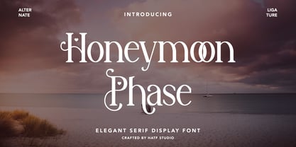 Is a elegant serif font with distinctive handwritten characters perfect for branding projects, logos, wedding designs, media posts, advertisements, product packaging, product designs, labels, photography, watermarks, invitations, stationery, and any project who need handwritten dishes. Features : 1. Uppercase & Lowercase 2. Multilingual support 3. Number 4. Symbol 5. Punctuation 6. Support in Mac and Windows OS -Support in design application (photoshop, illustrator, and more) I really hope you enjoy it.
 - EFCO Boldfrey by Ilham Herry,
$20.00 Inspired by vintage labels where there are many types of style in one design label, that's why Boldfrey came up with 6 styles, compressed to superwide for mixing and match each other for design needs. Boldfrey is also available in variable font format. Opentype features with stylistic character, lining figure, and ligature in Co. and LTD. Suitable in display needs, such as headline, logo, T-shirt, signage, poster, etc
 - Bergen Mono by Mindburger Studio,
$40.00 Bergen Mono is the latest addition to Bergen font bundle. It's a monospaced 6 piece font family engineered to speak the language of monospaced world fluently, without losing it's legibility and distinctive personality of it's predecessors, Bergen Sans and Bergen Text. It is built to handle most demanding tasks, uncompromisingly, from print to digital. It has Extended Latin, Cyrillic (including Bulgarian character set) and Greek language support included.
 - F2F Screen Scream by Linotype,
$29.99Heavy techno music, a personal computer, a font creation program and some inspiration had been the sources to the Face 2 Face font series. Thomas Nagel and his friends had the demand to create new unusual faces that should be used in the leading german techno magazine Frontpage". Even typeset in 6 point to nearly unreadability it was a pleasure for the kids to read and decrypt the messages." - NorB Comic by NorFonts,
$28.00 NorB Comic fonts are handwritten text fonts inspired from my childhood comic comic-books, they can be used with any word processing program for text and display use, print and web projects, apps and ePub, Comic Books, graphic identities, branding, editorial, advertising, scrapbooking, cards and invitations … or even just for fun! NorB Comic fonts come with 6 weights each with their matching italics and in a Normal and Condensed version.