10,000 search results
(0.304 seconds)
- Ongunkan Bosnia Pyramid by Runic World Tamgacı,
$100.00 The signs of the Bosnian pyramids The pyramid researcher, Semir Osmanagic, began excavations in 2005 in Visoko, Bosnia, 30 km North from Sarajevo. Mr. Senad Hodocic, the curator at the local museum, pointed out at the pyramidal shape of the Visocica Mountain, which grabbed Osmanagic's attention. It is also suspected that the four adjacent hills, covered by plants and greenery, also hide the pyramids. The main sites of the excavations are called the Pyramid of the Sun and the Pyramid of the Moon, and the results achieved so far have already proved that those structures are man-made and artificial. The Pyramid of the Sun is bigger and older than the pyramid in Giza, which was built by Pharaoh Cheops 4600 years ago. Gábor Szakács, who went to the site in June 2006 for the first time, found the symbols on the megalithic blocks inside the tunnel of the Pyramid of the Sun, which correspond to the ancient Hungarian runic writings. Further information about the Bosnian Pyramids is available at the website http://www.piramidasunca.ba/. There are also researchers who do not accept the subject of the Bosnian pyramids. Time will tell the truth.
 - Cooper Screamers by Wordshape,
$- In 1925, at the request of Barnhart Brothers & Spindler, the foundry he worked for, Oswald Bruce Cooper designed a wide selection of "screamers", oversized exclamation points used to grab attention in display advertising. The foundry rushed the screamers into production, much to Cooper's dismay. Cooper was disappointed with the final form of the screamers– they were designed in assorted weights to match the assorted Cooper series of typefaces, as well as in a variety of other formal solutions- squaredoff, incised, wavy, Tuscan, and rounded. Cooper's working design methodology was to re-draw his projects a number of times in order to refine the formal results. However the screamer project was hastily cut by the head of BB&S's matrix engraving room in fourteen sizes from the initial sketches, causing Cooper to fire off a fiery missive stating, "Everything I draw is bum the first half-dozen times I draw it; the trouble with these is that I drew them only once!" This typeface is the result of researching Cooper's original drawings and series of engraved proofs for the screamers, as well as the original Screamer type specimen. Cooper Screamers have never been available before in digital format.
 - Trigomy by Markus Reiter,
$24.90 Trigomy is a proportional pixel font designed on a 5 pixel grid. It is intended for either very small text or as huge display font for posters and the like. To get a crisp look this font should be used at 10 pt or multiples of 10 pt. (A tip for Adobe Creative Suite applications is to change the standard anti-aliasing method from “sharp” to “crisp” and to align the text to whole pixels. Also avoid centered text.) To get started with type design I thought it was best to start with a pixel font because you don't have to focus much on the design itself, but rather have to focus on how kerning and spacing works and the various features you can implement with OpenType. And of course I wanted to have a pixel font that had all that I was missing from other pixel fonts. We were learning trigonometry at the time I started designing Trigomy, and most of the time I misspoke it “trigometry”. So, when I had to come up with a name for my first font I thought: "Why not go with Trigomy?"
 - Yakout by Linotype,
$187.99Yakout is an Arabic text face that was developed by Linotype & Machinery in 1956 for hot-metal typesetting. Similar to the typewriter fonts created during this period, it utilises a limited range of letterforms to represent a full Arabic characer set, thus forming a style of type design known as Simplified Arabic. The skilful reshaping of letterforms demanded by the constraints of the original restrictive technology has given Yakout a very dynamic effect, and has helped to produce a design whose overall pattern works particularly well in newspaper setting. Digital technology has enhanced the original design by permitting the introduction of wide characters and some additional letterforms, and by improving the joining of the strong, slightly curved baseline. Yakout is available in two OpenType weights: Yakout Light and Yakout Bold. Both of the fonts include Latin glyphs (from Times Europa Roman and Times Europa Bold, respectively) inside the font files, allowing a single font to set text in both most Western European and Arabic languages. Yakout incorporate the Basic Latin character set and support all languages that use the Arabic script. They include tabular and proportional Arabic, Persian, and Urdu numerals and a set of tabular European (Latin) numerals. - Niemeyer by Latinotype,
$36.00 Oscar Niemeyer is one of the greatest architects of our time—his unique way of mixing straight lines and abstract curves gives rise to an unmistakable and characteristic style. This typeface is my own tribute to Brazilian architect Oscar Niemeyer. The design process started when my wife and I visited Brazil while she was running a series of workshops on calligraphy. In my spare time, I would walk through the streets of beautiful cities like Rio de Janeiro or São Paulo, enjoying the local architecture and urban life. I had also the opportunity to attend to some of the workshops during which I was able to observe the organic of calligraphy and people. Then, I started to draw some shapes that reflected everything about this beautiful place: Niemeyer’s architecture and work and, in his own words ‘the curves on the body of the beloved woman’. This versatile typeface comes in 8 weights with matching italics, alternative characters, oldstyle figures and much more! Niemeyer is well-suited for logotypes, advertising, publishing, branding and corporate use. Special thanks to everyone in the Latinotype Team (especially to César Araya) for their support, help with corrections and digital editing.
 - Lovingly Friends by My Creative Land,
$35.00 Introducing “Lovingly Friends” - a community of fonts that get along together as good as best friends do. All of the fonts - Sans, Serif, Notes, Script and Extras are packed with stylistic alternates and ligatures, you can combine them the way you like - they will look balanced together as well as individually. Script and Engraved fonts also have a Shadow style - to add more personality to your designs. You can download the Specimen & Instructions pdf here http://bit.ly/2x975US Since the Christmas is not that far away (time flies!), the Extras font has a set of Winter Holidays elements - so you could create and send your best wishes to your friends in no time. While all the fonts are fully unicode mapped so you can use them in ANY application, they are still best used in an OpenType aware application. If the application you are using doesn’t support OpenType features, you can use Character Map (Windows) or Font Book (Mac) to select the glyphs you need. Hope you enjoy the fonts as much as I enjoyed creating them! P.S. The flowers used in the preview images are from Liza Glanz 4 in 1 Elegant Watercolor Collection https://crmrkt.com/do4Wpb
 - Black Butter by Ditatype,
$29.00 Arranging fonts is a difficult, time-consuming process, especially the handwriting arrangement which needs careful considerations and precisions for a natural-looking font. Because you deserve a unique, real essence-catching font, let us introduce you to the Black Letter, an attention-catching script font. This capitalized font designs with brush details have curvy, infirm lines to make the designs look more artistic and unique. The letters’ proportions are similar, yet it has high contrast to add some visual attractions to the font. However, a brush font lacks legibility in lengthy texts. As a result, it is more suitable to apply for short texts or titles only. You can also enjoy the available features here. Features: Multilingual Supports PUA Encoded Numerals and Punctuations Black Letter fits best for various design projects, such as brandings, posters, banners, headings, magazine covers, quotes, printed products, merchandise, social media, etc. Find out more ways to use this font by taking a look at the font preview. Thanks for purchasing our fonts. Hopefully, you have a great time using our font. Feel free to contact us anytime for further information or when you have trouble with the font. Thanks a lot and happy designing.
 - Chikita by Canada Type,
$24.95 Chikita greets you with big, happy eyes, and all the energy in the world. She wants to skip the talking and get to the dance floor, where she owns the beat and sways like a tongue of fire. She doesn't settle for anything less than everyone in the room fixating on her, and every pair of eyes is indeed happy to oblige. Being both the noumenon and phenomenon of the party, she remains in your mind long after closing time. And you just know the next time you see her your heart will skip a beat and a welcome wave of contentedness will wash over you. The Chikita design is rooted in the work of 1930s Dutch lettering artist Martin Meÿer, whose little-known work concerned itself with the beauty of letters mostly as individual forms, rather than part of a flowing alphabet. Chikita was reconceptualized to strike a great balance between singular and flowing beauties, resulting in a cheerful and very memorable expression. Chikita is available in all popular font formats, and the character sets cover a wide range of codepages, including Central and Eastern European languages, Esperanto, Turkish, Baltic, Celtic/Welsh and Vietnamese.
 - Heirloom Artcraft by Baseline Fonts,
$29.00 Presenting Heirloom Artcraft-- by Baseline Fonts within the Grit History B series. Like an auntie who insists on baking cookies from scratch every time you visit, Heirloom Artcraft is a beacon of tradition and consistent delight with every letterform. Gentleness and subtlety keep this font far away from kitsch. This font sincerely says "ma'am" and "sir" and is perfect for business cards, custom stamps, coffeetable books, letterhead, invitations and anywhere you or your client wish to make an extremely well mannered and charming statement. There are many alternate ligatures available within the font including capital alternates for T, A, P, B, D, and N. It also boasts a full symbol set and the most darling little swashes scattered tastefully throughout the character map you ever did key. Heirloom Artcraft is available in Thin, Thin Italic, Book, Book Italic, Demi Italic, Black, and Black Italic. It also features Metrics and Optical kerning - metrics displays characters with letterpress-traditional spacing that is pleasantly askew, or more rigid optical kerning which displays characters at identical distances for times when the importance of readability exceeds that of stylistic merit.
 - Mencken Std by Typofonderie,
$59.00 An American Scotch remixed in 27 fonts Mencken has twenty seven styles, divided into three widths, three optical sizes, romans and italics. Generally, optical size typeface families belong to a same common construction. It falls into the same category of type classification, while presenting different x-heights or contrasts. Mencken is unique because it is designed according to different axis and optical sizes. Firstly, Mencken Text is a low-contrast transitional typeface, designed on an oblique axis, asserting horizontal with featuring open counters. Its capitals follow Didots to better harmonize the rest of the family. On the other side of the spectrum, Mencken Head (and narrow variations) is designed on a vertical axis, high contrast, in a contemporary Didot style. The Mencken is therefore a typeface answering to different sorts of uses, whose design is different according to its uses: from oblique axis in small size to vertical axis in large sizes. Vertical proportions (x-height, capitals height, etc.) were calibrated to be compatible with many Typofonderie typeface families. Lucie Lacava and I followed the idea launched by Matthew Carter few years ago for some of his typefaces intended for publications. From Baltimore Sun’s project to Typofonderie’s Mencken It is a bespoke typeface for American newspaper The Baltimore Sun started at the end of 2004 which marks the beginning of this project. The story started with a simple email exchange with Lucie Lacava then in charge of redesigning the American East Coast newspaper. As usual, she was looking for new typeface options in order to distinguish the redesign that she had started. At the time of its implementation, a survey of the newspaper’s readers has revealed that its previous typeface, drawn in the mid-1990s, was unsatisfactory. The Mencken was well received, some reader responses was particularly enjoyable: “It’s easier to read with the new type even though the type is designed by a French.” Why it is called Mencken? The name Mencken is a tribute to H. L. Mencken’s journalistic contributions to The Sun. According to the London Daily Mail, Mencken ventured beyond the typewriter into the world of typography. Because he felt Americans did not recognize irony when they read it, he proposed the creation of a special typeface to be called Ironics, with the text slanting in the opposite direction from italic types, to indicate the author’s humour. Affirming his irreverence, the Mencken typeface does not offer these typographic gadgets. Henry Louis Mencken (1880 — 1956) was an American journalist, satirist, cultural critic and scholar of American English. Known as the “Sage of Baltimore”, he is regarded as one of the most influential American writers and prose stylists of the first half of the twentieth century. He commented widely on the social scene, literature, music, prominent politicians and contemporary movements. Creative Review Type Annual 2006 Tokyo TDC 2018
 - Maffa Latte by Yumna Type,
$15.00 Sometimes it is a boring, tiring process to find a proper font for your project, and what is worse is that the font type you find has no specific character preventing you from delivering messages effectively. For that reason, we have the best solution to your problems. Maffa Latte is a perfect display font for delivering your messages on every design you are working on. Such a display font generally shows you a unique, funny, fun impression for any necessities, increases the nuances of professionalism and attractiveness to the product or brand promoted. The right use of this font makes the design more interesting and fun to cheer up customers. This font, with a clipart as an extra bonus, is legible due to its simple forms and proportions along with high contrasts. You can enjoy the available features here as well. Features: Multilingual Supports PUA Encoded Numerals and Punctuations Maffa Latte fits best for various design projects, such as brandings, posters, banners, headings, magazine covers, quotes, invitations, name cards, printed products, merchandise, social media, etc. Find out more ways to use this font by taking a look at the font preview. Thanks for purchasing our fonts. Hopefully, you have a great time using our font. Feel free to contact us anytime for further information or when you have trouble with the font. Thanks a lot and happy designing.
 - Shout Out by Comicraft,
$19.00 Here's a big shout out to all our Loud and Proud font homies -- If you've got a good set of lungs on you -- fill 'em up and get ready to Shout, SHOUT! Yes, let it all out because this is a font you can't do without -- It will make you wanna SHOUT! Throw your hands up, SHOUT! Kick your heels back, SHOUT! Throw your head back, SHOUT! Come on now, SHOUT! And don't forget to say you will... Don't forget to SHOUT! Yeah yeah yeah yeah, SHOUT! A little bit softer now, (Shout) A little bit softer now, (Shout) A little bit softer now, (Shout) A little bit louder now, SHOUT! A little bit louder now, SHOUT! A LITTLE BIT LOUDER NOW! SHOUT! SHOUT! SHOUT! SHOUT! PHEW -- Who says Comicraft doesn't know how to Pump it Up AND Get Down?!
 - Little Insect - Unknown license

- Spring#7 by Joey Maul,
$12.00 Spring#7 is a 1900s-style font based on text on postcards found after the turn of the century. Italic in nature, it works nicely for text and graphics that need a humble old-timey look.
 - Nickel Box NF by Nick's Fonts,
$10.00 No mystery here—it's a larrupin' good lighter version of the original Whiz-Bang Woodtype goody, Dime Box. Both versions of this font support the Latin 1252, Central European 1250, Turkish 1254 and Baltic 1257 codepages.
 - Automotive Service JNL by Jeff Levine,
$29.00 A 1930s print ad for Miller Tires featured lettering in a condensed slab serif design. This provided a design model for the digital typeface Automotive Service JNL, which is available in both regular and oblique versions.
 - Screwball - Unknown license

- Violeta by Larin Type Co,
$15.00 Violeta script- a new modern calligraphy font. This font is ideal for branding and to decorate your projects, perfect for wedding invitations or your blog. You can also create a logo or beautiful frames for your home. Or just use for your small business, book covers, stationery, marketing, magazines and more.
 - TOMO Tosca by TOMO Fonts,
$15.00 Tosca is a new face designed by TOMO FONTS. Is a massive all-caps font with a stone age feel. Good-humoured shapes ideal strong messages. Very useful for kids related stuff, like books, posters, or websites. Lowercases are a slightly different from uppercases for a more natural look. Enjoy!
 - Shirah 25 by LightHouse,
$49.00Shirah 25 started as a freehand study, while experimenting with ink and new nibs. Later on, when David decided to have a digital version, he drew it merely with the tablet, trying to keep the spirit of the ink and the nib. Shirah 25 is an OpenType/TTF Unicode font. - Wild Thing by ITC,
$29.99Wild Thing was created by British designer Martin Wait and appeared in the ITC library in 1995. The forms look as though they are normal alphabet figures viewed through swirling water, wavy and irregular. Wild Thing is a font which is always moving and is perfect for fresh new designs. - Noma by Spinturnix,
$15.00 Noma is a new wide-set display font with a minimal geometric style. I designed Noma because I wanted a tech-inspired font that has plenty of character while remaining legible. Noma is a great choice for high-impact headings and logotypes. I hope you enjoy, thanks for checking it out!
 - Spinach by Larin Type Co,
$12.00 Spinach - a new fun display font. This is a fun font that is perfect for creating your project, it can be used to create a beautiful inscription for t-shirts, children's books, branding, small business, book covers, stationery, marketing, blog, magazines and more. All characters of this font support PUA encoded.
 - Quadrus by ITC,
$29.99Quadrus is the work of New York graphic designer Peter Fahrni, a condensed open slab serif typeface. Fahrni was inspired by the lettering styles typical of baseball, basketball and American football sportswear. Quadrus is an all caps alphabet ideal for a variety of applications, particularly for those related to sports. - Pathways by Aestherica Studio,
$12.00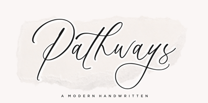 Introducing the new Fun Handwritten Font by Aestherica Studio. Proudly Present, Pathways Pathways is perfect for product packaging, branding project, megazine, social media, wedding, or just used to express words above the background. Pathways also multilingual support. Enjoy the font, feel free to comment or feedback, send me PM or email.
 - Bitsaylen by Aqeela Studio,
$20.00 Bitsaylen is a new script full of elegance and quirk with a playful demeanor and a playful side. Perfect for adding a unique yet relaxed feel, this bag comes with a wide selection of natural looking ligatures. This font is perfect for logos, invitations, wedding designs, social media posts, and more!
 - Matteus by Epiclinez,
$18.00 Matteus is a new, fresh, and beautifully crafted signature script font. It's suitable for branding, logos, social media posts, and everywhere else you're looking for an awesome signature style. So what’s included : Basic Latin Uppercase and Lowercase Numbers, symbols, and punctuations Ligatures Multilingual Support Simple Installations Works on PC & Mac
 - Omarbig by Dhan Studio,
$27.00 Omarbig is a beautiful hand-painted font that looks more natural, fun and combines a mixture of small and large letters, making it look attractive and unique. This fonts can be used for various purposes such as headings, signature, logos, wedding invitations, t-shirts, letterhead, signage, labels, news, posters, badges etc.
 - The Lord Of Bronze by Rockboys Studio,
$23.00 The Lord Of Bronze is a unique handwritten font. It includes elegant swashes which can be used to give a luxurious look to your designs. It can be used for various purposes such as logos, wedding invitations, headings, t-shirts, letterhead, signage, labels, news, posters, badges and so much more.
 - Autelan by Aqeela Studio,
$20.00 Autelan Script is a contemporary calligraphy typeface. It's a mix of retro and modern sans serif script. With Autelan, your designs will get a classic and elegant touch. Autelan can be used for various purposes such as logos, wedding invitations, T-shirts, letterheads, signage, labels, news, posters, badges etc. Thank You
 - GS Franklin Ave. by Great Scott,
$18.00 Franklin Ave. is a condensed sans serif in the style of the classics Franklin Gothic and News Gothic. Nostalgic and gives a great vintage feel. It's bold and comes in two styles: Regular and Oblique. Franklin Ave. is best used in headlines and large formats or in logos or branding.
 - F2F Shakkarakk by Linotype,
$29.99The Techno sound of the 1990s, a personal computer, a font creation software and some inspiration had been the sources to the F2F (Face2Face) font series. Thomas Nagel and his friends had the demand to create new unusual faces that should be used in the leading german techno magazine Frontpage"." - Tenar Black by Eaver Studio,
$19.00 Introducing our new friendly, soft and heavy serif typeface with retro feel! Tenar Black is display serif which is highly influenced by Souvenir and Cooper Black typeface. This font has 362 glyphs including alternates & ligatures and support 61 Latin languages. This font would be great additional collection to your design weaponry!
 - Badger Pro by Red Rooster Collection,
$60.00 Badger Pro has been completely redrawn and remastered by Steve Jackaman and Ashley Muir. The new Badger Pro family has been fleshed out with a glyph set that is over 40% larger than the original Badger release, and contains all the high-end features expected in a quality OpenType Pro font.
 - The Old Navy by Larin Type Co,
$12.00 The Old Navy - a new stencil style font collection. These fonts are ideal for military-style branding and will decorate any of your projects. You can also use them to create a logo or use for small businesses, t-shirts, hoody, book covers, stationery, logo creation, marketing, blogs, magazines, and more.
 - Boardley by Craft Supply Co,
$15.00 Boardley Script is a script-style display font in two layers, Boardley Script was the result of an exploration of mid-century American and European bold script lettering for advertising. is an attractive contemporary typeface drawn from scratch with brand-new, more vigorous detailing — and layerable variations for chromatic use.
 - P22 Catalan by IHOF,
$24.95 Catalan is inspired by such influential artists as Antonio Gaudi, Joan Miro, and Salvador Dali with glimmers of the work of Jean Arp and Pablo Picasso. Surrealist shapes and motifs dance in this highly creative alphabet. This new design has a fresh immediacy that makes it perfect for festive occasions.
 - Bartino by OKSHUtypeCO,
$9.00 Bartino Family - a new fresh handmade sans serif font. Very suitable for greeting cards, branding materials, business cards, quotes, posters, and more!This font are perfect for wedding postcard. Or you can create perfect and unique design of your logo, blog, stationery, marketing, magazines and more :) Multilingual outline version streak version
 - Somtam by S6 Foundry,
$12.00 Somtam is a new decorative geometric display typeface, based on the continuation of a single line. It complements the style and personality of the ascetics of the continuum. Somtam is perfectly suited for headlines, large-format prints, brand identities, social media, advertising, editorial design, posters, magazines, logos, headings, and more.
 - Kraft Stencil by Dan Choi,
$30.00 Kraft Stencil is a bold, display typeface that takes a new approach to vintage crate stencils. Utilizing octagon shapes as the backbone, the aim was to develop modernized stencil fonts. The font family comes in three weights, and each style consists of the different edge finishes of the character sets.

