4,420 search results
(0.015 seconds)
- 8-bit Limit RO (BRK) - 100% free

- 8-bit Limit RO BRK - Unknown license

- PR Hearts Take Wing 01 by PR Fonts,
$10.00
- Bordini (Unregistered) - Unknown license

- Cinque by Adrianna Bilas,
$18.99
- Granic by Gror,
$9.00
- Mounth by Linecreative,
$16.00
- Calcite by Adobe,
$35.00 - Konga Rock by RodrigoTypo,
$35.00
- Abula by Typesketchbook,
$30.00
- SlabFace 2010 - 100% free

- KG Be Still & Know - Personal use only

- Rabanera - Personal use only

- Janda Quirkygirl - Personal use only

- Gipsiero - Unknown license

- Rockwell Nova by Monotype,
$40.99 - Manometer by Fontador,
$18.99
- Baby Face - Unknown license

- Bujardet Freres - Unknown license

- Bear Anark by Ingrimayne Type,
$9.00
- Lindsey by Ascender,
$29.99
- Edda by profonts,
$41.99
- AngeGardien - Unknown license

- BoumBoum (Free version) - Unknown license

- Dactylographe (Unregistered) - Unknown license

- Calebasse (Unregistered) - Unknown license

- Christmas Collection by Yoga Letter,
$16.00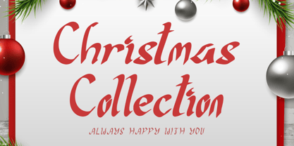
- Dietal Sans by Tour De Force,
$25.00
- Retroman by Almarkha Type,
$29.00
- Mexican City by Typefactory,
$14.00
- Empirez by Almarkha Type,
$29.00
- Sadi Sans by Koray Özbey,
$19.00
- Dietal by Tour De Force,
$25.00
- Over Under by Ingrimayne Type,
$5.00
- Kevlar by Letterbox,
$50.00
- Density by Alandya TypeFoundry,
$15.00
- Chancellerie Moderne Demo - Unknown license

- Tortillon Tryout - Unknown license

- Boulons Tryout - Unknown license

- Candy Cane (Unregistered) - Unknown license


