10,000 search results
(0.422 seconds)
- Kyber Ricon by TypeClassHeroes,
$17.00 Kyber Ricon and Kyber Ricon Neu is a Monospaced sans serif family. Design with various width and weight that you can explore and combine creating rhythm and texture for comfortable reading. This font supports more than 400 Latin-based languages and has extensive Cyrillic and Greek support for languages like Russian, Bulgarian, Ukrainian, and many more. In variable version, it allows multiple options when designing, adapting to different composition solutions. Feature Uppercase & Lowercase Number & Symbol International Glyphs (Cyrillic & Greek) Multilingual support Hope you enjoy it.
 - Gladiora by Owl king project,
$37.00 Gladiora Sans serif font family with tapered accents in some of the letters gives it a modern and bold character, even being quite prominent in thin characters. This font aims to give an elegant impression and also looks so luxurious in short wording for a letter-based title and logo. With 20 types and support for multi-languages, this font provides a wider range of exploration, which can be useful also for reading sentences and giving variety to each sentence by combining it with several sizes.
 - Hupaisa by Melvastype,
$22.00 Hupaisa is a geometric sans serif with a casual hand-drawn feeling. It has six weights: thin, light, regular, medium, bold and black. Although Hupaisa is a display font, it is very legible also in small sizes. That makes Hupaisa very useful in design projects. You can use it on titles and body texts. Create interesting typography with a proper hierarchy. Hupaisa also includes many alternate characters, ligatures and swashes to give you options to play with. Use them to create interesting titles, wordmarks, quotes or logos.
 - Glaser Stencil by Linotype,
$40.99 The renowned American illustrator and graphic designer Milton Glaser designed Glaser Stencil in 1970. Glaser Stencil is a perfect summation of both Modernist proportion and New York-style solidity and self-assurance. An all capitals font, the shapes of the letters are reminiscent of popular sans serif faces of the time, such as Futura and ITC Avant Garde Gothic. Like everything New York-related, Glaser Stencil should be used big, in headlines and display applications, where it can play a bold, proud, and confident role.
 - Violence PS by pentagonistudio,
$19.00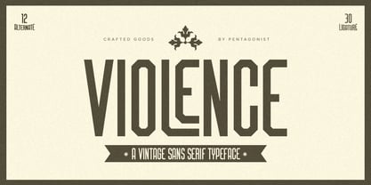 Violence Is Vintage Sans Serif Inspired By Retro Font. SOFTWARE REQUIREMENTS : Fonts and alternate : No special software required they may be used in any basic program /website apps that allows standard fonts That's it folks! You can go ahead and get cracking :) Follow My Shop For Upcoming Updates Including Additional Glyphs And Language Support. And Please Message Me If You Want Your Language Included or If There Are Any Features or Glyph Requests, Feel Free to Send me A Message. Have a Good Day !
 - Grovana by Larin Type Co,
$15.00 Grovana is a modern family of sans serif fonts, which includes 12 fonts: 3 styles - regular, round and rough, each of them has 4 weight - light, regular, medium and bold. I also prepared many ligatures and alternatives that give you more opportunities to create your project. with them you can be unique and experiment with your design. This font is easy to read and universal, perfect for creating logos, book and magazine covers, advertising, branding, wedding invitations, posters, postcard, labels, business cards, packaging and much more.
 - Submariner by Type Fleet,
$- Submariner waterproof sans serif technology Submariner is a waterproof type family that displays the right amount of power and character on every depth level. Thanks to its strong and humanistic construction, it can endure great information pressure. It is a marvelous typographic experience. The letter construction is more open and endings are slightly wider. It is suitable for longer texts, information graphics, annual reports and signalization. The typeface’s x-height is exactly 70% of its capitals. The italics are designed at a 9° angle.
 - Bruta Global by Ndiscover,
$59.00Bruta is a contemporary sans-serif grotesque typeface, conceived to become the Swiss army knife of your font library. Inheriting the modernist approach of the grotesque fonts, Bruta aims to be a rational and neutral typeface suitable for a wide range of applications. Whether it’s used for print or screen, in large or small sizes, for magazines or branding, Bruta will stay on your font library for long time. Loaded with Opentype Features, +100 emojis, Greek and Cyrillic support, Bruta can easily become your new default font. - Noble Criatura by pentagonistudio,
$19.00 Noble Criatura Is A Display Font Combinated with Sans/Serif Typefaces. SOFTWARE REQUIREMENTS : Fonts and alternate : No special software required they may be used in any basic program /website apps that allows standard fonts That's it folks! You can go ahead and get cracking :) Follow My Shop For Upcoming Updates Including Additional Glyphs And Language Support. And Please Message Me If You Want Your Language Included or If There Are Any Features or Glyph Requests, Feel Free to Send me A Message. Have a Good Day !
 - Bankal by Hugo Kuder,
$10.00 After a few months my new typeface "Bankal" is here! To create it, I always tried to keep a 90 degree angle. In French when you say that something is "bancal" it means that it's not right. This is why I choose this as a name because despite the name she is right. And for the K it's just for the style here. Bankal is a sans-serif font with 3 variations (bold, regular, light) Check more on my website : https://www.hugokuder.com/ or my instagram : hugokuderdesign
 - Relevance by Chromatype Studio,
$20.00 Every Weight of font can create relevance for any purpose and feel, RELEVANCE is a geometric grotesque sans serif typeface that was created to connect that. done with modern appeal to blend with modern needs. Ranging from extra light to black weights, Relevance offers many possibilities to be applied in many graphic or editorial projects. The lighter weights are suitable for short paragraphs, and the heavier weights are perfect for headlines, perfectly suitable for display purposes such as book covers, web headlines, branding, or editorial.
 - Geometrix by d[esign],
$17.38 The handprinted Geometrix font family is an alternative to the usual distressed typeface. Rather than drawing on a sans-serif style and tearing it to shreds, Geometrix provides an intresting and compelling set of shapes which ties into a nice worn effect. The Geometrix font family consists of two fonts; Geometrix and Geometrix Nero. Geometrix and Geometrix Nero can be used together to create a fill for Geometrix's letters, by layering Geometrix above a differently coloured Geometrix Nero in your image editor of choice.
 - Slate by Monotype,
$34.99 A typeface of grace, power and exceptional versatility, the Slate collection is a truly beautiful design that achieves stellar levels of readability, both in print and on screen. Created by the award winning type designer Rod McDonald, this six-weight sans serif family is a rare example of sublime aesthetics meeting world-class functionality. The typeface’s legible letterforms embody an amalgam of the best traits of both humanistic and grotesque letterforms. “I didn’t want a face with an ‘engineered’ look, or with any noticeable design gimmicks or devices,” admits designer McDonald. “I wanted a pure design. I confess that I was ruthless with any character that wanted to stand out from the rest.” The Slate collection is available in six weights with complementary italics, with slight changes in structure from the light to the black weights. Its light weight is reminiscent of early American sans. Whether for use in display work or in longer-form settings, few typefaces possess the beauty and power of this design, leaving the Slate family an excellent addition to any designer’s typographic quiver.
 - Gorgonzola Gothic by The Ampersand Forest,
$20.00 Gorgonzola Gothic is a geometrically-inspired gothic sans serif family that's robust and versatile. Inspired by the geometric quirkiness of IxD (also by The Ampersand Forest), Gorgonzola Gothic expands into a thirty-style family that works for everything from branding to text. It further mitigates IxD's quirkiness by offering two options in the round and shouldered lowercase glyphs. The standard letterforms, like IxD, have notched joins, giving them an assertive, almost futuristic look. The alternates of those letterforms (housed in Stylistic Set 01, and available as immediate hoverable glyph options in the Adobe Suite) are more conventional (as are the SS01 ampersand, Q, S, a, and s). In this way, Gorgonzola Gothic offers the best of both worlds: a flavorful, slightly futuristic family (in the same world as geometric classics like Eurostile) and a workhorse gothic sans (like the Benton classics Franklin Gothic, News Gothic, etc.). Its three widths: Skinny, Slim, and Standard, give it a wide range of applications, from display to body. Gorgonzola Gothic makes a statement with strength and sureness.
 - Warm Curves by Nathatype,
$29.00 Most traditional display fonts are old-fashioned and hard to read in small sizes and are not applicable for any contexts in which you need to deliver messages to the audience clearly. Therefore, think about a beautiful, clean, legible modern font which is multipurpose and applicable anywhere along with the pretty serif style. Warm Curves is a display serif font to meet your needs. This elegant, modern, legible display serif font is perfectly applicable to formal, serious contents. It looks more stylish and has its own protruding characters to strengthen the points delivered. Furthermore, this display serif font is legible due to the thick, regular serif to ease readers to recognize every letter accurately. For that reason, you can use this font for any text length and size due to its great legibility. Also enjoy interesting features available in this font. Features: Alternates Multilingual Supports PUA Encoded Numerals and Punctuations Warm Curves fits best for various design projects, such as brandings, posters, banners, logos, magazine covers, quotes, headings, printed products, invitations, name cards, merchandise, social media, etc. Find out more ways to use this font by taking a look at the font preview. Thanks for purchasing our fonts. Hopefully, you have a great time using our font. Feel free to contact us anytime for further information or when you have trouble with the font. Thanks a lot and happy designing.
 - Ambroise Std by Typofonderie,
$59.00 An exquisite Didot font in 18 series Ambroise is a contemporary interpretation of various typefaces belonging to Didot’s late style, conceived circa 1830, including the original forms of g, y, &; and to a lesser extent, k. These unique glyphs are found in Gras Vibert, cut by Michel Vibert. Vibert was the appointed punchcutter of the Didot family during this period. It is the Heavy, whom sources were surest that Jean François Porchez has been used as the basis for the design of the typeface family. In the second half of the 19th century, it was usual to find fat Didots in several widths in the catalogs of French type foundries. These same typefaces continued to be offered until the demise of the big French foundries in the 1960s. Ambroise attempts to reproduce more of what we see printed on paper in the 19th century; a more accurate representation of Didot punches. So, the unbracketed serifs are not truly square straight-line forms but use tiny transitional curves instead. The result on the page appears softer and less straight, particularly in larger sizes. The illustrious Didot family of type founders and printers Every variation of the typeface carries a name in homage to a member of the illustrious Didot family of type founders and printers. The condensed variant is called Ambroise Firmin. The extra-condensed is called Ambroise François. Ambroise Pro brought back to life: fifteen years in the making! Club des directeurs artistiques, 48e palmarès Bukva:raz 2001
 - Lunatica by André do Carmo Gonçalves,
$29.00 Lunatica Display is a single weight, all capitals, slanted typeface ideal for titles and headlines due to its strong presence. It is constructed in a very modular fashion, stepping away from some typographic conventions, while keeping the form of its characters familiar and easily recognisable. This typeface is heavily inspired on the aesthetics of the space related sci-fi movie genre, specifically on the movie Moon (2009), directed by Duncan Jones and starring Sam Rockwell, from where it also picks up the inspiration for the name “Lunatica”. It was first designed as a branding exercise, thought to be the official typeface of Lunar Industries Ltd. — the company through wich the movie exists and unfolds. You can use Lunatica Display in more conventional contexts like branding but also in more experimental and futuristic-looking ways.
 - Optima Cyrillic by Linotype,
$65.00Many typefaces are distinctive or attractive at the expense of legibility and versatility. Not so the Optima® family. Simultaneously standing out and fitting in, there are few projects or imaging environments outside of its range. Although Optima is almost always grouped with sans serif typefaces, it should be considered a serifless roman. True to its Roman heritage, Optima has wide, full-bodied characters – especially in the capitals. Only the E, F and L deviate with narrow forms. Consistent with other Zapf designs, the cap S in Optima appears slightly top-heavy with a slight tilt to the right. The M is splayed, and the N, like a serif design, has light vertical strokes. The lowercase a and g in Optima are high-legibility two-storied designs. Optima can be set within a wide choice of line spacing values – from very tight to very open. In fact, there are few limits to the amount of white space that can be added between lines of text. Optima also benefits from a wide range of letter spacing capability. It can be set quite tight, or even slightly open – especially the capitals. If there are any guidelines, Optima should be set more open than tight. It’s not that readability is affected that much when Optima is set on the snug side; it’s just that the unhurried elegance and light gray typographic color created by the face are disrupted when letters are set too tight. Optima is also about as gregarious as a typeface can be. It mixes well with virtually any serif design and a surprisingly large number of sans serif faces. The Optima family is available in six weights, from roman to extra black, each with an italic counterpart. In addition, the family is available as a suite of OpenType® Pro fonts, providing for the automatic insertion of small caps, ligatures and alternate characters, in addition to offering an extended character set supporting most Central European and many Eastern European languages. When you’re ready to find its perfect pairing, browse these fantastic matches: Monotype Century Old Style™, Dante®, Frutiger® Serif, Joanna® Nova, Malabar™, and Soho®. - Optima by Linotype,
$45.99 Many typefaces are distinctive or attractive at the expense of legibility and versatility. Not so the Optima® family. Simultaneously standing out and fitting in, there are few projects or imaging environments outside of its range. Although Optima is almost always grouped with sans serif typefaces, it should be considered a serifless roman. True to its Roman heritage, Optima has wide, full-bodied characters – especially in the capitals. Only the E, F and L deviate with narrow forms. Consistent with other Zapf designs, the cap S in Optima appears slightly top-heavy with a slight tilt to the right. The M is splayed, and the N, like a serif design, has light vertical strokes. The lowercase a and g in Optima are high-legibility two-storied designs. Optima can be set within a wide choice of line spacing values – from very tight to very open. In fact, there are few limits to the amount of white space that can be added between lines of text. Optima also benefits from a wide range of letter spacing capability. It can be set quite tight, or even slightly open – especially the capitals. If there are any guidelines, Optima should be set more open than tight. It’s not that readability is affected that much when Optima is set on the snug side; it’s just that the unhurried elegance and light gray typographic color created by the face are disrupted when letters are set too tight. Optima is also about as gregarious as a typeface can be. It mixes well with virtually any serif design and a surprisingly large number of sans serif faces. The Optima family is available in six weights, from roman to extra black, each with an italic counterpart. In addition, the family is available as a suite of OpenType® Pro fonts, providing for the automatic insertion of small caps, ligatures and alternate characters, in addition to offering an extended character set supporting most Central European and many Eastern European languages. When you’re ready to find its perfect pairing, browse these fantastic matches: Monotype Century Old Style™, Dante®, Frutiger® Serif, Joanna® Nova, Malabar™ and Soho®.
 - Open TECH Neue by TypoGraphicDesign,
$9.00 The typeface Open TECH Neue is designed from 2018—2021 for the font foundry Typo Graphic Design by Manuel Viergutz. 6 font-styles (Sans Serif, Invert, Outline, Slab Serif, Stretch, Box Puzzle) + 1 icon-style with 1097 glyphs (Adobe Latin 3) incl. 400+ decorative extras like icons, arrows, dingbats, emojis, symbols, geometric shapes, catchwords, decorative ligatures (type the word #LOVE for ♥︎ or #SMILE for ☺ as OpenType-Feature dlig) and stylistic alternates (6 stylistic sets). For use in logos, magazines, posters, advertisement plus as webfont for decorative headlines. The font works best for display size. Have fun with this font & use the DEMO-FONT (with reduced glyph-set) FOR FREE! ■ Font Name: Open TECH Neue ■ Font Styles: 6 (Sans Serif, Invert, Outline, Slab Serif, Stretch, Box Puzzle) + Icons + DEMO (with reduced glyph-set) ■ Font Category: Display for headline size ■ Glyph Set: 1097 glyphs (Adobe Latin 3) incl. 400+ icons (decorative extras like arrows, catch words, dingbats, emojis, symbols) ■ Design Date: 2018—2021
 - Beatrix Antiqua by Zetafonts,
$39.00 Beatrix Antiqua is a humanist sans-serif typeface designed by Francesco Canovaro. Beatrix Antiqua is part of the Beatrix Family that takes its inspiration from the classic Roman monumental capital model: its capitals are directly derived from the stone carvings in Florence Santa Croce Cathedral - where the serifs are often removed while keeping the variable width strokes. So, even if it’s basically a sans-serif, Beatrix keeps a subtle swelling at the terminals suggesting a glyphic serif - in the same vein as Herman Zapf classic Optima typeface. In the lowercase design, Beatrix references early humanist typefaces, keeping small calligraphic details (as the prolongation of the e nose) that are especially visible in the italics. While Beatrix Antiqua, the companion typeface to Florentia , slightly exaggerates its antique stylistical features, Florentia tries to mix those influence with a more robust & digital age ready design, featuring bigger X-height and an extended character set that covers over forty languages using the latin alphabet, as well as Greek and Russian Cyrillic.
 - FS Emeric by Fontsmith,
$60.00 Right now! FS Emeric reconciles a pair of seemingly opposing approaches: the systematic but chilly functionalism of early modernist typography, trapped in time, and a warmer, more emotional, more optimistic spirit. What Fontsmith created was something that marries precision with expression, geometry with movement, functionality with humanity. FS Emeric has a sharp, kinetic edge that cuts across design disciplines – graphic, fashion, product, automotive. It’s about what’s happening right now. Contemporary, optimistic, distinctive – a classic working sans serif. Appetite Discussions with some of Fontsmith’s design studio clients had revealed an appetite for a new kind of typeface that could express mid-century modernist principles in a fresh, contemporary voice. As he crafted the letterforms that would form FS Emeric, Phil Garnham was guided by two central ideas. First, there was Jan Tschichold’s contention that a good letter is “one that expresses itself, speaking with the utmost distinctiveness and clarity”. Second was a belief that a font can be personally expressive without compromising its functionality. These provided the fuel that drove the project to its conclusion. Posters To mark the launch of FS Emeric, Fontsmith asked 11 eminent design studios from around the world – the likes of Pentagram, Studio Dumbar, Bibliotheque, Non-Format and Build – to create a limited edition A1 poster. Each poster celebrated a different weight of FS Emeric, and just 50 of each were screen-printed by Dan Mather onto 175gsm Colorplan stock. “We gave away a randomly selected poster every time two or more weights of the FS Emeric were purchased,” says Phil Garnham. “They’ve now become somewhat of a collector’s item in their own right.” Superfamily In the spirit of Univers, the original font superfamily, FS Emeric now comprises 22 Roman and italic typefaces overall, making it one of the most versatile and functional modern fonts across all kinds of media, as well as one of the most distinctive.
 - TA Modern Times by Tural Alisoy,
$17.00 The Modern Times is the most popular font developed by me. It was sold more than any other of font that I created. The earlier version supported Western Europe, Central/Eastern Europe, Baltic, Turkish, Romanian, Cyrillic, Greek, Georgian languages. Last year, I decided to update it. The new version is called TA Modern Times. Its OpenType features include 1200 glyph, Stylistic Alternates, Stylistic Set 01–12, Standard and Discretionary Ligatures, Numerators, Denominators, Subscript, Superscript, Ordinals, Contextual Alternates and Kerning. Currently, supported languages are as following: Western Europe, Central/Eastern Europe, Baltic, Turkish, Romanian, Cyrillic, Greek, Hebrew. Additionally, the font has multiple styles such as Semi Condensed, Condensed, Extra Condensed, Ultra Condensed, Rounded, Inline, Outline, Semi Expanded, Expanded, Extra Expanded, Ultra Expanded. 6 previous versions of the font are FREE. You may download and enjoy it. Latin Plus languages supported 95% Latin Plus diacritics included 88% TA Modern Times OpenType features list: aalt, calt, case, dlig, dnom, frac, kern, liga, locl, numr, ordn, salt, sinf, ss01, ss02, ss03, ss04, ss05, ss06, ss07, ss08, ss09, ss10, ss11, ss12, subs, sups TA Modern Times graphic presentation at Behance
 - Broadgauge Ornate by FontMesa,
$25.00Broadgauge Ornate originated from MacKellar, Smiths & Jordan in 1869 and was only available as an all caps font with numbers. Today this old beautiful wood type rises again from the archives complete with original numbers and an all new lowercase. An all caps Greek character set has also been added plus accented characters for western, central and Eastern European countries. Included in each font file are two sets of left and right pointing hands located on the Less Than and Greater Than keys and also on the Bracket keys. Because this font works well with a Las Vegas theme I've decided to make the pointing hands gambling related with one set of hands rolling dice and the other holding cards. The condensed versions were created because in today's computer graphics applications people stretch and condense fonts to fit their project but don't notice the change in vertical stroke widths or line thickness. After compressing the letter shapes of each Broadgauge Ornate condensed font the vertical lines were corrected making sure they were the proper width or thickness. The results are balanced condensed versions that weren't simply compressed with out consideration for their appearance. - Strima by Nicolas Deslé,
$24.90 Strima is a geometric sans serif typeface that stands for minimalism and legibility. With over 1000 glyphs and extensive language support Strima offers full professional typographic features. The Strima family consists of 4 weights: light, book, medium and bold.
 - AdPro by Linotype,
$29.99Roman Sehrer, a seasoned German advertising professional, digitized his handwriting to create this family of three fonts. Sehrer recommends this family for posters, logos, and restaurant menus. It works well with traditional sans serifs such as Helvetica or Univers. - Incompleeta by Rex Face,
$19.99 Incompleeta is a modern sans serif, display font. Removing structural elements from some of the characters results in some really interesting word forms. Incompleeta is a graphic designer�s best friend. It�s great for branding, headlines, and signage.
 - Gothic Special Normal Italic by Wooden Type Fonts,
$15.00 A revival of one of the popular wooden type fonts of the 19th century, suitable for text or display, short descenders, tall ascenders, the narrow, italic version, completing the Gothic Special family of 5 fonts in total, sans serif.
 - Halena by Sakha Design,
$12.00 Halena is a modern and adaptable sans serif font. Suitable to a wide variety of designs due to its neat and simple style, this font has the potential to become your favorite go-to font, no matter the occasion!
 - Linear Tektu by TeGeType,
$19.00 The basic idea of this type family was to keep the "ductus" of the fraktur calligraphy only. And to adapt it to draw a sans serif typography which still keep the magic rhythm and colour of the original letters.
 - Atlantis by Solotype,
$19.95This is Solotype's alternative sans serif version of the once popular caps-only font Atlanta issued by the Central Type Foundry in St. Louis in 1885. As we often do, we have created a lowercase, adding to its versatility. - Nyack JNL by Jeff Levine,
$29.00 Nyack is a built-from-scratch sans serif font with both inline and solid versions. There's a touch of Art Deco to its design for a touch of past elegance, but its use is not limited to retro projects.
 - Showmanship JNL by Jeff Levine,
$29.00 Despite the racially demeaning 1906 sheet music for "The Ghost of the Banjo Coon", the title's lettering provided an interesting hand-lettered sans serif that has been re-drawn digitally as Showmanship JNL in both regular and oblique versions.
 - Radian by Ayca Atalay,
$8.00 Radian is a modern geometric sans serif typeface that comes in 16 weights: 8 upright fonts and their matching italics. Radian works well in any graphic design project and purpose, both as a display typeface and in smaller sizes.
 - Moderna by Los Andes,
$16.00 Moderna is a sans serif family inspired in simplicity of Modernism. Its contruction neutral and clean has been especially designed for short texts, headlines, logos and branding. With sixteen variants includes unicase version, some alternate characters, arrows and labels.
 - Kompress Pro by RMU,
$35.00 Kompress Pro - a font family of two highly compressed sans serif fonts, regular and shadowed. Both fonts contain West and East European character sets, as well as Cyrillic glyphs. This multilingual font family is well suited for decorative purposes.
 - Nffinitage by Eoriraya.type,
$17.00 Nffinitage is a sans serif typeface design, published by Eoriraya. The basis of this typeface is geometric shapes with a modern and futuristic impression, making it suitable for digital communication needs. Nffinitage consists of the regular and rounded typestyle
 - Slippery Slope by Dear Sue,
$15.00 Slippery Slope is a friendly, storybook font, that has the legibility of a clean sans serif combined with a subtle hand-drawn quality. A great whimsical font for books and stationery, posters, signage and product or packaging for kids!
 - Cubition by NicolassFonts,
$17.00 Cubition font family was designed by Nikolay Savchuk. Cubition was created on base Everest Pro sans-serif typeface. It is brilliantly suited for graphic design and display use and perfect for brand identity, magazines, newspapers, books, websites, and advertising.
 - Linear Fraktu by TeGeType,
$19.00 The basic idea of this type family was to keep the "ductus" of the fraktur calligraphy only. And to adapt it to draw a sans serif typography which still keep the magic rhythm and colour of the original letters.