10,000 search results
(0.155 seconds)
- Anselm Serif by Storm Type Foundry,
$63.00 One of the good practices of today’s type foundries is that they release their type families as systems including both serif and sans serif type. Usually, the sources of inspiration need to be well tried with time and practice, since production of a type family is such a laborious and complex process. From the beginning, it needs to be clear that the result will be suited for universal use. Such systems, complete with the broad, multi-lingual variations permitted by the OpenType format, have become the elementary, default instrument of visual communication. Non-Latin scripts are useful for a wide scope of academic publications, for packaging and corporate systems alike. And what about outdoor advertisement designated for markets in developing countries? Cyrillics and Greek have become an integral part of our OpenType font systems. Maybe you noticed that the sans serif cuts have richer variety of the light – black scale. This is due to the fact that sans serif families tend to be less susceptible to deformities in form, and thus they are able to retain their original character throughout the full range of weights. On the other hand, the nature of serifed, contrasted cuts does not permit such extremes without sacrificing their characteristic features. Both weights were drawn by hand, only the Medium cut has been interpolated. Anselm Ten is a unique family of four cuts, slightly strengthened and adjusted for the setting in sizes around 10 pt and smaller, as its name indicates. The ancestry of Anselm goes back to Jannon , a slightly modified Old Style Roman. I drew Serapion back in 1997, so its spirit is youthful, a bit frisky, and it is charmed by romantic, playful details. Anselm succeeds it after ten years of evolution, it is a sober, reliable laborer, immune to all eccentricities. The most significant difference between Sebastian/Serapion and Anselm is the raised x-height of lowercase, which makes it ideal for applications in extensive texts. Our goal was to create an all-round type family, equally suitable for poetry, magazines, books, posters, and information systems.
 - Gift Wrap JNL by Jeff Levine,
$29.00 Gift Wrap JNL takes a classic wood type display font and cuts it into diagonal striped lines to emulate package wrapping paper. An interesting side effect of the lettering is that at first glance you might perceive the style as being an oblique, but the letters are actually vertical. This typeface is perfect for holidays, birthdays and special events featuring a festive theme.
 - Micromoon by Neoglyph Studio,
$15.00 Inspired by futuristic vehicle print designs like seen in Star Trek, Blade Runner, Altered Carbon and the Alien franchise. The goal was a clean, abstract design where horizontal, vertical and diagonal 45 degree lines are the primary guidelines. Features : uppercase and lowercase numbers and punctuation multilingual Ideal for: Logo design Movie promotion Book & magazine print Package design Vehicle print designs Game design
 - Keep Calm by K-Type,
$20.00 Keep Calm is a family of fonts developed from the now famous World War 2 poster that was designed in 1939 but never issued, then rediscovered in 2000. As well as the original Keep Calm font, the medium weight of the poster, new weights are now available – Keep Calm Book (regular weight), Heavy and Light – and each weight comes with a complimentary italic. Version 2.0 (2017) is a comprehensive update which consists of numerous refinements and improvements across all weights. The family now contains a full complement of Latin Extended-A characters, Welsh diacritics and Irish dotted consonants. The four italics have been optically corrected with revised, ‘true italic’ forms of a and f. The crown motif from the top of the Keep Calm poster is located at the plus minus ± and section § keystrokes (Alt 0177 and Alt 0167 on Windows). The lowercase g follows the Gill/Johnston eyeglass model, but also included is an alternative, single-story g at the Alt G keystroke (Alt 0169 on a Windows keyboard), the normal location of the copyright symbol which has been relocated elsewhere in the fonts. An alternative lowercase t, without the curved wedge cutaway, is provided at the Alt T (dagger) keystroke (Alt 0134 on Windows). When I first saw the Keep Calm and Carry On poster, I wrongly assumed the letters to be Gill Sans. Recent research at the National Archive by Dr. Bex Lewis of Manchester Metropolitan University has revealed that the original poster was hand drawn by the illustrator and painter, Ernest Wallcousins. The Gill Sans influence is apparent, in the R particularly, the M’s perfectly pointed vertex is redolent of Johnston’s Underground, and the most anomalous character, the C, resembles the ‘basic lettering’ of engineers that provided the vernacular sources for the Gotham typeface. Developing the Keep Calm typeface has been an exercise in extrapolation; an intriguing challenge to build a whole, high quality font family based on the twelve available capitals of the Keep Calm poster, and on similar lettering from the other two posters in the original series. This has required the creation of new lowercase letters that are believably 1939; that maintain the influence of Gill and Johnston while also hinting at the functional imperative of a wartime drawing office. Wallcousins’s lettering balanced intuitive human qualities and the pure pleasure of drawing elegant contemporary characters, against an underlying geometry of ruled lines, perfect circles, 45° terminals, and a requirement for no-nonsense clarity.
 - ABTS Crestwing by Albatross,
$19.95 ABTS Crestwing is a unique initial font with extraordinary flexibility and beauty. There are 5 wing styles to choose from. The wings are accessed through typing numbers. The 5 pairs are: [1, 2] [3, 4] [5, 6] [7, 8] & [9, 0]. The odd numbers in the pairs will give you a left wing, and the even numbers will give you a right wing. The letters are separated into upper and lowercase. Uppercase has a crest point, the lowercase does not, giving you the ability to string letters together to form words and phrases, and place the tip of the crest above the letter of your choosing. Optional endcaps are available using the brackets on your keyboard "[, ]." This allows you to cap off a word if you wish not to use a wing to do so. Crestwing is both beautiful and unique, and works best at large sizes.
 - Gill Hebrew by Lerfu,
$55.00Near the end of his life, legendary type designer Eric Gill lived in Jerusalem, and became interested in the typesetting of the Hebrew alphabet and the challenges it entailed. He designed his own Hebrew font which has not (to my knowledge) been digitized before. It is sometimes held up as an example of how not to do a Hebrew font: Gill introduced strange serifs and shapes that were jarring to readers used to more traditional fonts. But it is quite readable, and does start to grow on you after a while; extended text in Gill Hebrew is possible. I've added a set of alternate digits that are based on the shapes of the letters (Gill's digits are pretty standard text figures). I've also made some of the Unicode Hebrew symbols that Gill didn't (e.g. New Sheqel Sign, Alef-Lamed ligature, etc.) and also included vowel-points. - SK Cuber by Shriftovik,
$10.00 SK Cuber™ is an expanded monumental pseudo-pixel typeface. It is based on a strict grid that is not broken in any glyph. This makes the type more organic and consistent. The type's characters are monospaced, but they do not look ridiculous and do not cause discomfort as it usually happens. This could only be achieved by carefully working out each glyph. The type also deliberately uses the contrast between geometric strokes and smooth transitions. It adds to his liveliness and character. SK Cuber is inspired by the monumental architecture of our days. It is brutal and extremely stable, which makes it an excellent font for working with posters, headlines, etc.
 - HGB Unik by HGB fonts,
$23.00 For many years I had repeatedly written names on certificates or designed texts for certificates of honor with a pen. I later digitized a font written with a broad pen from 1988 to make it easier to use. After the technical possibilities for this had developed, I made a PostScript font out of this document font. The "HGB-Unik" is a humanistic antiqua that arose from this written type. In 2009 Unik was chosen as the text font for a book. However, the book designers wanted to have an italic and a bold style as well. The cursive was developed from written texts that I also wrote for various occasions in the 1980s. The resulting font family was thoroughly revised several times until a usable text font with four weights was created. Although the Unik looks very idiosyncratic in display size, it shows a surprisingly balanced, pleasant typeface in read size.
 - Ata by Bülent Yüksel,
$19.00 My son’s name is Ata Caner Yüksel. After building this typeface, I decided to honor it with my son’s name. I think I fully reflects the character I created in my mind. Ata typefamily, only one of the four other deep end with rounded corners consist of sharpened flat plate. Matched to one another and are optimized for screen. The family has eight weights plus matching italics was designed by Bülent Yüksel in 2016. Ideally suited for advertising and packaging, editorial and publishing, logo, branding and creative industries, poster and billboards, small text, way-finding and signage as well as web and screen design. ATA provides advanced typographical support for Latin-based languages. Case-Sensitive Forms, Classes and Features, Small Caps from Letter Cases, Fractions, Superior, Inferior, Denominator, Numerator, Old Style Figures, Stylistic Alternates in just one touch easy In all graphic programs. You will enjoy using it.
 - Jaxxons Lament by Edd's Aurebesh Fontworks,
$5.00 Although English characters do appear on screen, in Star Wars canon this "language" is known as High Galactic. The main written language in Star Wars is called Aurebesh. This font is designed for an interface or signage with a pseudo dot-matrix style. Aurebesh has more than 26 letters, the additional characters are available as glyphs in the set. Numbers and symbols in the Aurebesh fashion are also included.
 - Ingone by Ingrimayne Type,
$9.95 Ingone is a slightly irregular sans-serif face. It was designed to complement PattyDay and HeyPumpkin, but can be used alone if you need an informal, friendly sans-serif font. It has only one weight, but the family includes a shadowed style. In 2018 the inside of the shadowed version was separated out and made a separate typeface. The letters have the shapes of the regular version but the spacing of the shadowed version and can be layered with the shadowed version to easily produce lettering with two colors.
 - ITC Migrate by ITC,
$29.99George Ryan's ITC Migrate is a highly condensed sans serif display face that effectively complements ITC Adderville. Migrate represents what Ryan calls a “more highly evolved version” of a typeface he designed for Bitstream in 1991 called Oz Handicraft. “Both faces,“ says Ryan, “are based on designs of the popular early 20th-century type designer Oswald Cooper.” His inspiration came from drawing samples found in the Book of Oz Cooper, published in 1949 by the Society of Typographic Arts in Chicago. “Oz worked extensively with the sans serif form long before it became popular in the States, eschewing a popular belief of the time that sans serifs were only skeletons of letters.” Where Oz Handicraft was informal and quirky, ITC Migrate has a more restrained feel. “The uppercase characters and figures, in particular, have been reworked,” says Ryan, ”resulting in a more formal and traditional, compressed sans serif typeface.” - Boister Black Pro by CheapProFonts,
$10.00 I loved the look of this font so much that I couldn't resist reworking it - although it probably had the most basic character set I've ever used as a starting point. But here it is in its complete, professional, multilingual state. I hope this wonderful swashbuckling font now finds many new users and uses. Celebrate! ALL fonts from CheapProFonts have very extensive language support: They contain some unusual diacritic letters (some of which are contained in the Latin Extended-B Unicode block) supporting: Cornish, Filipino (Tagalog), Guarani, Luxembourgian, Malagasy, Romanian, Ulithian and Welsh. They also contain all glyphs in the Latin Extended-A Unicode block (which among others cover the Central European and Baltic areas) supporting: Afrikaans, Belarusian (Lacinka), Bosnian, Catalan, Chichewa, Croatian, Czech, Dutch, Esperanto, Greenlandic, Hungarian, Kashubian, Kurdish (Kurmanji), Latvian, Lithuanian, Maltese, Maori, Polish, Saami (Inari), Saami (North), Serbian (latin), Slovak(ian), Slovene, Sorbian (Lower), Sorbian (Upper), Turkish and Turkmen. And they of course contain all the usual "western" glyphs supporting: Albanian, Basque, Breton, Chamorro, Danish, Estonian, Faroese, Finnish, French, Frisian, Galican, German, Icelandic, Indonesian, Irish (Gaelic), Italian, Northern Sotho, Norwegian, Occitan, Portuguese, Rhaeto-Romance, Sami (Lule), Sami (South), Scots (Gaelic), Spanish, Swedish, Tswana, Walloon and Yapese.
 - Fluffster - Unknown license

- Smash Int'l by Comicraft,
$19.00Comicraft just want Puny Humans to leave Comicraft alone... Why soldiers shoot at Comicraft? PAH! Bullets do not hurt Comicraft... Bullets only make Comicraft Angry... and when Comicraft angry... COMICRAFT SMASH! - Friandise by JBFoundry,
$19.90 Do not believe that Friandise is reserved for the chocolate enthusiasts. It’s a pair of fonts which will allow you to ally simplicity and frivolity, sweetness and hardness, discretion and show.
 - Smash by Comicraft,
$19.00 Comicraft just want Puny Humans to leave Comicraft alone... Why soldiers shoot at Comicraft? PAH! Bullets do not hurt Comicraft... Bullets only make Comicraft Angry... and when Comicraft angry... COMICRAFT SMASH!
 - Ollon - Unknown license

- Monday Monkey by GFR Creative,
$62.00Monday Monkey Display Font I hope this font is interesting to use in your design projects. thank you GFRcreative - Tarik Ses by GFR Creative,
$52.00 TARIK SES! Display Font I hope this font is interesting to use in your design projects. thank you GFRcreative
 - Wahed by Khalid Jassim,
$27.00 I used Arabic letters to give the same sound of each letter in the English Alphabet (a, b,c,….)
 - Ermia by GFR Creative,
$82.00 Ermia Monoline Script Font I hope this font is interesting to use in your design projects. thank you GFRcreative
 - Andhira by GFR Creative,
$24.00 Andhira Monoline Script Font I hope this font is interesting to use in your design projects. Thank you GFRcreative
 - Worthy Yank by GFR Creative,
$24.00 Worthy Yank Brush Script I hope this font is interesting to use in your design projects. Thank you GFRcreative
 - Yello Cat by GFR Creative,
$52.00 Yello Cat Display Font I hope this font is interesting to use in your design projects. thank you GFRcreative
 - Balone Kids by GFR Creative,
$65.00 Balone Kids Display Font I hope this font is interesting to use in your design projects. thank you GFRcreative
 - High Speed by GFR Creative,
$52.00 HIGH SPEED Racing Font I hope this font is interesting to use in your design projects. thank you GFRcreative
 - Racing Hard by GFR Creative,
$54.00 RACING HARD Racing Font I hope this font is interesting to use in your design projects. thank you GFRcreative
 - CA El Amor by Cape Arcona Type Foundry,
$19.00 This typeface has the most important ingredient of all: love. So it’s not surprising that the font is called El Amor. It is a reversed oblique all-caps headline font that consists of two styles, “Regular” and “Fill”. Feel free to experiment with them, together or alone. Write something with “Regular”, copy paste it to another layer and switch to “Fill”. Give it a little offset if you like or place it straight on top, both works fine. You can also use the “Fill”. style for body text, but do so at your own risk, spacing and kerning is optimized for the use with the “Regular” style, so be generous if the result looks not as even as text-font. Maybe you’ll discover the charm of a more dynamic spacing that fit perfectly with the vivid and crispy outlines. Unlike other display fonts CA El Amor features a huge character set covering most languages that you can write with a Latin alphabet.
 - Monly by WildOnes,
$10.00 The main idea behind creating Monly typeface was to combine playfulness with a strong letter construction backbone, so all the letters would stand tall and firm, but not to lose the playfulness. Like people, who grow up but try to save their inner child. By doing so and combining all this, the typeface achieves a great readability and appealing look. Monly font suits best for logos, headlines and small text blocks, but can also be used for big text blocks if the style suits the purpose.
 - Wellington by Masinong Studio,
$14.00 Wellington is simple and easy to create awesome lettering. Just type your words and then you will immediately see the great results. Wellington also includes Stylistic alternatives, swashes, ligatures, initials and finals, and symbols. If you don't have a program that supports OpenType features such as Adobe Photoshop or Illustrator, you can access all the alternate glyphs using Font Book (Mac) or Character Map (Windows). If you have any question, do not hesitate to contact me by email masinong.studio@gmail.com Thanks and happy designing :-)
 - Hexenhammer by Hanoded,
$15.00 The ‘Hammer of Witches’, ‘Malleus Maleficarum’ or ‘Hexenhammer’ in German is the best know and most important treatise on witchcraft. It was composed by Heinrich Kramer in 1487. I thought it was a rather apt name for my latest fairytale font! Hexenhammer is a rough, handwritten typeface with an attitude. It can be used for book covers, posters and even spells. Comes with a bunch of end ligatures and a pandemonium of diacritics.
 - Numpty by Hanoded,
$15.00 Numpty is a word of Scottish origin and means ‘someone who, by speech or action, demonstrates a lack of knowledge’. I use this word quite often (as this world, unfortunately, seems to be full of numpties). And guess what? Now you know what it means, you can use it too! Hooray! Numpty is a fat, rounded display font. A little uneven, a little weird, but with enough panache to make your designs stand out.
 - Hi Barbie by Areatype,
$21.00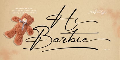 Hi Barbie, modern handmade script. It features dynamic and pretty swashes and can be used for many purpose, such as titles, signatures, logos, wedding invitations, letterhead, signage, labels, newsletters, posters, badges, and more. Files included: Hi Barbie Regular Numerals & Punctuation Stylistic Alternates & Ligatures PUA Encoded Characters Thanks so much for looking, I really hope you enjoy it and please don't hesitate to drop me a message if you have any issues or queries :)
 - Rumble Brave Vintage Fonts by Alit Design,
$14.00 Introducing Rumble Brave Vintage Fonts Packages. Lately I've been happy to see the design style with its vintage Victorian classic. Hence from that I launched fonts packages with vintage style. In this package, there are three types of letters: serif, script, and dingbat. The three font combinations are compatible with the Victorian classic design concept. You can also use each font by itself, without combining it with the others in the package.
 - Nightcrow by Putracetol,
$21.00 Introducing Night Crow . A display deathmetal font. This font is inspired by underground and metal music band logostyle. There are alternate directions of the thorns (right and left), alternate is in lowercase. I purposely made the spines a little so that the font can still be read. Night Crow is suitable for death metal music, underground, hardcore music, blackletter, death metal logo design, clothing, logos, music covers, posters or other designs with the theme deathmetal.
 - Midas Style by Sensatype Studio,
$15.00 Midas Vintage Retro Ligature Font is a well-balanced contemporary font with a fancy, unique, and versatile vintage serif, font that you can combine to get any variations and unique shapes easily just in seconds with choose alternates of them. I What's Included: Character set A-Z Uppercase & Lowercase Numerals & Punctuation Accented Characters (West Europe) Stylistic alternates Works on PC & Mac Recommended using Adobe Illustrator or Adobe Photoshop. Wish you enjoy our font. :)
 - Front Row JNL by Jeff Levine,
$29.00 Front Row JNL is an all-caps reinterpretation of Morris Fuller Benton's 1937 type design "Empire", and is available in both regular and oblique versions. As is often the case when a digital type font is based on a few letter examples found on a printed sample [in this case, the sheet music of the 1946 Guy Lombardo hit "What More Can I Ask For"], the missing characters were drawn from scratch.
 - Chicnatures by Abo Daniel,
$21.00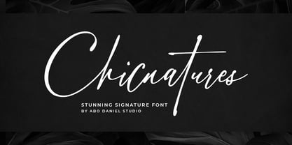 introducing CHICNATURES - stunning signature font - A classy and naturally beautiful typeface! CHICNATURES is perfect for branding, logotype, photography, invitations, quotes, watermarks, advertisements, cards, product designs, labels, social media, and much more! Chicnatures is completed with hundreds of ligatures to make it look so natural and easy to use. (you can see on presentation pictures) Features: - Uppercase - Lowercase - Number & Punctuations - Ligatures - Multilingual Support - Swash - PUA encoded I hope you love it. regards, Abo Daniel Studio
 - Headcorps by Almarkha Type,
$29.00 Headcorps is a Serif military style font, first conceptualize was inspired by the classic vintage military stencil design . I wanted a typeface that could be a solid base for any military inspired project Headcorps Fonts can be used for wallpaper, pattern fills, web page background, surface textures. Perfect for making army posters , scrapbooking,invitation cards, label stickers, stationary, gift wrap, packaging, clothes, buttons, pendants, holiday gifts, print on fabrics and so much more.

