10,000 search results
(0.051 seconds)
- LOVE-BOX - Personal use only

- Indulta SemiSerif - Personal use only

- Monserga FFP - Personal use only

- Lucemita - Personal use only

- Blusbow by Rvandtype,
$15.00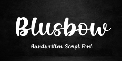 Blusbow is a handwritten Script font. It has an elegant and playful look that can be used for logos, branding, invitations, stationery, wedding designs, social media posts, and so much more. Its authentic look will add a personal and realistic feel to your designs. Thank You, i hope you enjoy it.
 - Heart Doodles by Outside the Line,
$19.00 Here are 29 hearts to say "I love you" through out the year. Some are stand-alone hearts and others have matching hearts for creating all-over heart patterns or a series of similar but slightly different hearts. Created in the same style as Outside the Line's other Doodle fonts.
 - WBP Helena by Studio Jasper Nijssen,
$15.00 Helena derived her curves from the old Chinese Tangram puzzle. She sure is playful, though sometimes she bites furiously. No worries! Helena may seem to be a tad crazy, but all in good moderation. Don’t go overboard, use her well and I can assure you … she’ll be worth all your effort.
 - Motzeda by Rvandtype,
$10.00 Motzeda display Serif is a cool, thick lettered and assertive display font. Featuring the perfect amount of trendiness, this font will make your designs come to life. Motzeda is PUA encoded which means you can access all of the glyphs. Thank you for checking and i hope you enjoy it
 - Mooono by Drawwwn,
$20.00 Mooono is retro futuristic monospaced font. The bright side (uppercase) is straight and to the point but the dark side (lowercase) is fat and funky. Mix up the upper and lower to create some serious spaced out vibes. I only saw the crescent, you'll see the whole of the mooono!
 - NailsNStaples by Ingrimayne Type,
$14.95 In NailsNStaples the letters are made up of nails and staples. (The staples are not the staples one uses to join paper, but the kind one hammers into wood.) It is not often that one needs a typeface made of nails and staples, but if one does, there is a font for that.
 - VLNL Wasabi Turbo by VetteLetters,
$35.00 Wasabi is one of the key ingredients in the Japanese kitchen. Also known as japanese horseradish, it is an extremely spicy condiment made out of the graded root of the Wasabi plant. Its spiciness is different than that of a chili pepper though, more like a hot mustard. The spicy taste shoots right through your nose, but does not last for long. Wasabi is traditionally used in sushi and sashimi dishes, soba noodles, and in a number of Japanese snack foods. Equally sharp and stingy, VLNL Wasabi Turbo was designed by Donald Roos. Despite its japanese outward appearance, the font has its origin in lettering found on a German book. It is hot, and edgy like a samurai sword. Wasabi Turbo will stand out as headline and logo!
 - Medieval Borders by Aah Yes,
$5.00 This is a large group of typefaces inspired by those borders and patterns you see going across documents from the Middle Ages and Medieval times, eventually becoming this collection of fonts where you can scroll various repeating patterns across a page, for example. You can get a repeating pattern that scrolls seamlessly by repeating the same letter. The default text displaying on the web-page is bbbbbbbb, for example. There's over 2 dozen basic styles, and each style has 52 designs within it, using the characters Upper Case A - Z and lower case a - z, with the lower case being the negative/reverse colour of the Upper Case version, it will be the corresponding design just reverse coloured and with an edging strip. There's also a space - but nothing else. The styles in these fonts usually have groups of six characters (A to F, G to L, M to R, S to X), and where the second group is a variation on the first - usually thicker lines - and the third grouping is another variation on that, usually thicker lines again, making the first 24 letters. (Sometimes there's three groups of eight characters). The pattern within a group normally starts off plain then gets busier as it progresses - such as there'd be a more complex pattern of circles and diamonds as you go through the letters. Then the letters Y & Z are somewhat different to the rest. There's four versions starting with Z, and they're a little bit different, and they're grouped in fives - getting bolder as you progress through the letters, but with similar patterns within each group of 5, and that makes the first 25 characters. The letter Z character is extra busy. Again, lower case is the reverse colour of the Upper Case. Mostly you can get patterns and borders that combine seamlessly by using letters within the same group of 6 or 8 (like maybe abdcedcb). There are a few occasions when that doesn't work out, because there may be circles or diamonds at the sides of the letters that don't match up with another letter that has a different pattern at the side. But you can create a pattern with the exact level of complexity you want perfectly easily. You can see examples of this in the poster images. Neighbouring letters without embellishments at the sides of the letters will usually fit together. Have fun with it, that's what it's there for. aah yes fonts
 - Zimbara by Slex Studio,
$12.00 Zimbara script is calligraphy font with a classic style and a touch of elegance, inspired by the handwriting of ancient manuscripts. Carefully designed to work together in harmony that makes it very suitable for wedding media, book covers, greeting cards, logos, branding, business cards and certificates, even for any design work that requires a classic, formal or luxurious. Try Zimbara scrpit, enjoy the richness of OpenType features and let her fun and elegant excitement make you happy and enhance your creativity! You can use this font very easily. multilingual support and ligatures Your download will include OTF & TTF format files. If you do not have programs that support OpenType features like Adobe Illustrator and CorelDraw X Versions, you can access all alternative flying machines using Font Book (Mac) or Character Map (Windows): Do not forget to see, buy, like and share my other great products. Thank you for purchases.!
 - Anamelia Script by Strong,
$20.00 Anamelia Srcipt is calligraphy font with a classic style and a touch of elegance, inspired by the handwriting of ancient manuscripts. Carefully designed to work together in harmony that makes it very suitable for wedding media, book covers, greeting cards, logos, branding, business cards and certificates, even for any design work that requires a classic, formal or luxurious. Try Anamelia Srcipt, enjoy the richness of OpenType features and let her fun and elegant excitement make you happy and enhance your creativity! You can use this font very easily. multilingual support and ligatures Your download will include format files. If you do not have programs that support OpenType features like Adobe Illustrator and CorelDraw X Versions, you can access all alternative flying machines using Font Book (Mac) or Character Map (Windows): Do not forget to see, buy, like and share my other great products:https://My Fonts.net/strong Thank you for purchases.!
 - An Electronic Display LED LCD LED7 Seg 3 by Fortune Fonts Ltd.,
$15.00 * For when you need the most realistic looking electronic display. * See User Manuals Main advantages: - Spacing between characters does not change when entering a decimal point or colon between them. - Custom characters can be produced by selecting any combination of segments to be displayed. Low cost electronic displays have a fixed number of segments that can be turned on or off to represent different symbols. A digital watch would be the most common example. Fonts typically available for depicting electronic displays are often in the artistic style of these common LED or LCD displays. They provide the look-and-feel, but fall short when technical accuracy is required. Failure to represent an accurate and consistent representation of the real thing can be a cringe-worthy experience for the product design and marketing team, or even the hobbyist for that matter. To solve this problem, Fortune Fonts has released a range of fonts that accurately depict the displays typically found on low cost electronic devices: watches, answering machines, car stereos, alarm clocks, microwaves and toys. These fonts come with numbers, letters and symbols predefined. However, they also allow you to create your own segment combinations for the custom symbols you need. When producing manuals, marketing material and user interfaces, accuracy is an all-or-nothing concept. Instructions in the user manual describe how to turn these fonts into realistic displays according to your own design, in the manner of the images above. If you cannot see a license option for your specific application, such a license may be purchased from here. By purchasing &/or using &/or distributing the fonts the buyer user and distributor (including Monotype Imaging Inc. & Monotype Imaging Hong Kong) agree to (1) indemnify & hold harmless the foundry, for any consequential, incidental, punitive or other damages of any kind resulting from the use of the deliverables including, but not limited to, loss of revenues, profits, goodwill, savings, due to; including, but not limited to, failure of the deliverables to perform it’s described function, or the deliverable’s infringement of patents, copyrights, trademarks, design rights, contract claims, trade secrets, or other proprietary rights of the foundry, distributor, buyer or other parties (2) not use the fonts to assist in design of, or be incorporated into, non-software displays
 - An Electronic Display LED LCD LED7 Seg 2 by Fortune Fonts Ltd.,
$15.00 * For when you need the most realistic looking electronic display. * See User Manuals Main advantages: - Spacing between characters does not change when entering a decimal point or colon between them. - Custom characters can be produced by selecting any combination of segments to be displayed. Low cost electronic displays have a fixed number of segments that can be turned on or off to represent different symbols. A digital watch would be the most common example. Fonts typically available for depicting electronic displays are often in the artistic style of these common LED or LCD displays. They provide the look-and-feel, but fall short when technical accuracy is required. Failure to represent an accurate and consistent representation of the real thing can be a cringe-worthy experience for the product design and marketing team, or even the hobbyist for that matter. To solve this problem, Fortune Fonts has released a range of fonts that accurately depict the displays typically found on low cost electronic devices: watches, answering machines, car stereos, alarm clocks, microwaves and toys. These fonts come with numbers, letters and symbols predefined. However, they also allow you to create your own segment combinations for the custom symbols you need. When producing manuals, marketing material and user interfaces, accuracy is an all-or-nothing concept. Instructions in the user manual describe how to turn these fonts into realistic displays according to your own design, in the manner of the images above. If you cannot see a license option for your specific application, such a license may be purchased from here. By purchasing &/or using &/or distributing the fonts the buyer user and distributor (including Monotype Imaging Inc. & Monotype Imaging Hong Kong) agree to (1) indemnify & hold harmless the foundry, for any consequential, incidental, punitive or other damages of any kind resulting from the use of the deliverables including, but not limited to, loss of revenues, profits, goodwill, savings, due to; including, but not limited to, failure of the deliverables to perform it’s described function, or the deliverable’s infringement of patents, copyrights, trademarks, design rights, contract claims, trade secrets, or other proprietary rights of the foundry, distributor, buyer or other parties (2) not use the fonts to assist in design of, or be incorporated into, non-software displays
 - An Electronic Display LED LCD LED7 Seg Platz by Fortune Fonts Ltd.,
$15.00 * For when you need the most realistic looking electronic display. * See User Manuals Main advantages: - Spacing between characters does not change when entering a decimal point or colon between them. - Custom characters can be produced by selecting any combination of segments to be displayed. Low cost electronic displays have a fixed number of segments that can be turned on or off to represent different symbols. A digital watch would be the most common example. Fonts typically available for depicting electronic displays are often in the artistic style of these common LED or LCD displays. They provide the look-and-feel, but fall short when technical accuracy is required. Failure to represent an accurate and consistent representation of the real thing can be a cringe-worthy experience for the product design and marketing team, or even the hobbyist for that matter. To solve this problem, Fortune Fonts has released a range of fonts that accurately depict the displays typically found on low cost electronic devices: watches, answering machines, car stereos, alarm clocks, microwaves and toys. These fonts come with numbers, letters and symbols predefined. However, they also allow you to create your own segment combinations for the custom symbols you need. When producing manuals, marketing material and user interfaces, accuracy is an all-or-nothing concept. Instructions in the user manual describe how to turn these fonts into realistic displays according to your own design, in the manner of the images above. If you cannot see a license option for your specific application, such a license may be purchased from here. By purchasing &/or using &/or distributing the fonts the buyer user and distributor (including Monotype Imaging Inc. & Monotype Imaging Hong Kong) agree to (1) indemnify & hold harmless the foundry, for any consequential, incidental, punitive or other damages of any kind resulting from the use of the deliverables including, but not limited to, loss of revenues, profits, goodwill, savings, due to; including, but not limited to, failure of the deliverables to perform it’s described function, or the deliverable’s infringement of patents, copyrights, trademarks, design rights, contract claims, trade secrets, or other proprietary rights of the foundry, distributor, buyer or other parties (2) not use the fonts to assist in design of, or be incorporated into, non-software displays
 - An Electronic Display LED LCD LED7 Seg dots1 by Fortune Fonts Ltd.,
$15.00 * For when you need the most realistic looking electronic display. * See User Manuals Main advantages: - Spacing between characters does not change when entering a decimal point or colon between them. - Custom characters can be produced by selecting any combination of segments to be displayed. Low cost electronic displays have a fixed number of segments that can be turned on or off to represent different symbols. A digital watch would be the most common example. Fonts typically available for depicting electronic displays are often in the artistic style of these common LED or LCD displays. They provide the look-and-feel, but fall short when technical accuracy is required. Failure to represent an accurate and consistent representation of the real thing can be a cringe-worthy experience for the product design and marketing team, or even the hobbyist for that matter. To solve this problem, Fortune Fonts has released a range of fonts that accurately depict the displays typically found on low cost electronic devices: watches, answering machines, car stereos, alarm clocks, microwaves and toys. These fonts come with numbers, letters and symbols predefined. However, they also allow you to create your own segment combinations for the custom symbols you need. When producing manuals, marketing material and user interfaces, accuracy is an all-or-nothing concept. Instructions in the user manual describe how to turn these fonts into realistic displays according to your own design, in the manner of the images above. If you cannot see a license option for your specific application, such a license may be purchased from here. By purchasing &/or using &/or distributing the fonts the buyer user and distributor (including Monotype Imaging Inc. & Monotype Imaging Hong Kong) agree to (1) indemnify & hold harmless the foundry, for any consequential, incidental, punitive or other damages of any kind resulting from the use of the deliverables including, but not limited to, loss of revenues, profits, goodwill, savings, due to; including, but not limited to, failure of the deliverables to perform it’s described function, or the deliverable’s infringement of patents, copyrights, trademarks, design rights, contract claims, trade secrets, or other proprietary rights of the foundry, distributor, buyer or other parties (2) not use the fonts to assist in design of, or be incorporated into, non-software displays.
 - An Electronic Display LED LCD LED14 Seg 1 by Fortune Fonts Ltd.,
$15.00 * For when you need the most realistic looking electronic display. * See User Manuals Main advantages: - Spacing between characters does not change when entering a decimal point or colon between them. - Custom characters can be produced by selecting any combination of segments to be displayed. Low cost electronic displays have a fixed number of segments that can be turned on or off to represent different symbols. A digital watch would be the most common example. Fonts typically available for depicting electronic displays are often in the artistic style of these common LED or LCD displays. They provide the look-and-feel, but fall short when technical accuracy is required. Failure to represent an accurate and consistent representation of the real thing can be a cringe-worthy experience for the product design and marketing team, or even the hobbyist for that matter. To solve this problem, Fortune Fonts has released a range of fonts that accurately depict the displays typically found on low cost electronic devices: watches, answering machines, car stereos, alarm clocks, microwaves and toys. These fonts come with numbers, letters and symbols predefined. However, they also allow you to create your own segment combinations for the custom symbols you need. When producing manuals, marketing material and user interfaces, accuracy is an all-or-nothing concept. Instructions in the user manual describe how to turn these fonts into realistic displays according to your own design, in the manner of the images above. If you cannot see a license option for your specific application, such a license may be purchased from here. By purchasing &/or using &/or distributing the fonts the buyer user and distributor (including Monotype Imaging Inc. & Monotype Imaging Hong Kong) agree to (1) indemnify & hold harmless the foundry, for any consequential, incidental, punitive or other damages of any kind resulting from the use of the deliverables including, but not limited to, loss of revenues, profits, goodwill, savings, due to; including, but not limited to, failure of the deliverables to perform it’s described function, or the deliverable’s infringement of patents, copyrights, trademarks, design rights, contract claims, trade secrets, or other proprietary rights of the foundry, distributor, buyer or other parties (2) not use the fonts to assist in design of, or be incorporated into, non-software displays
 - Azebra by Okaycat,
$29.95 Azebra is an elegant connected letter cursive script arriving with a family of detailed & artistic styles. Azebra features diagonal hatched texture, in extruded & shadow variations. Azebra is extended, containing West European diacritics & ligatures, making it suitable for multilingual environments & publications.
 - Hardley Brush by Negara Studio,
$17.00 Hardley x Rocky Sanz is Font Duo, modern brush style and modern sans. The best for labels, poster, project designs look modern, authentic and cool . It’s perfect for labels, quotes, posters, DIY projects, branding, packaging, greeting cards, websites, photos, photography overlays, signs, scrapbooking, tags and so much more! That is why Hardley has a textured, and authentic characteristic more natural look. You can activate Alternates glyphs OpenType panel. What’s Included : Standard glyphs Alternates glyphs Bonus extra font (52 swashes) Web Font Works on PC & Mac Simple installations Accessible in Adobe Illustrator, Adobe Photoshop, Adobe InDesign, even work on Microsoft Word. Image used: All photographs/pictures/vectors used in the preview are not included, they are intended for illustration purposes only. Hardley x Rocky Sanz supports the following languages; English, French, Italian, Spanish, Portuguese, German, Swedish, Norwegian, Danish, Dutch, Finnish, Indonesian, Malay, Hungarian, Polish, Croatian, Turkish, Romanian, Czech, Latvian, Lithuanian, Slovak, Slovenian ~Anugerah
 - Vemanem Pro by ffeeaarr,
$11.00 Vemanem is dynamic sans serif display fonts, you can use it for advertising, movie, titles & more.
 - Kurly by Bogusky 2,
$34.50I was working on an unrelated job with curls and wondered how I could apply them to a font. Well, here it is, all pair-kerned. A little silly but fun. - Pumpkinseed by Three Islands Press,
$19.00 The tale of Pumpkinseed began with a bit of hand-printing I noticed on the dinner menu at a local restaurant. I took a menu home for future reference. Several months later, some similar hand-lettering on another dinner menu caught my eye. I became a sort of connoisseur of hand-done menu lettering. After tweaking and adjusting a few of these menu-inspired (uppercase) characters, I placed them -- along with some other designs -- in an online Type in Progress survey. They won. So I finished the caps, drew out the lower case from scratch, created three weights and oblique styles. The result: Pumpkinseed, a full-featured casual hand-lettering face. Comes in Light, Medium, and Heavy.
 - Teacup by Hanoded,
$15.00 I remember a tea ceremony I attended in Fukuoka, Japan. The teahouse was set in a small, but beautiful garden and the whole idea of the ceremony was to appreciate the view from the porch. I thought the tea was quite bitter, but the view was unsurpassed. From time to time these memories pop up and I have to use them - that is why I named this font Teacup. Teacup is a slightly eroded all caps font, made entirely by hand with a Japanese marker pen and some high quality textured paper. It comes in a romantic open style and a more solid closed style. Teacup is filled to the brim with diacritics.
 - Understory by Hanoded,
$15.00 Lately I feel reluctant to watch the news: The Amazon Forest is burning, Australian forests are burning, palm oil controversy… It really brings tears to my eyes to see all this destruction around me. It is like people hate nature with a vengeance - I cannot explain it otherwise. I made this font to take my mind off things. It was loosely based on Futura, a font I really like. Understory was completely made by hand. It comes with some cute upper case swashes and a whole bunch of diacritics. The good thing is: no trees were cut down or burned to make this font; in fact, I donated a nice amount of $ to help save the rainforests!
 - Food Doodles Too by Outside the Line,
$19.00 Food Doodles Too is a 31-picture clipart font of food. Use them as dingbats or enlarge the small pictures and use them as clipart. Lots to choose from… from soup to nuts OK no nuts. But there is pizza, pasta, soup, eggs, sushi, sandwich, hot dog, hamburger, fish, kabobs, toast, breads, cheese, pickles, shrimp, soufflé, and desserts galore… cake, pie, cookie, cupcake, trifle, sundae, banana split, milk, tea and more. Food Doodles Too works nicely with Coffee & Tea Doodles. If you need some fancy cakes check out Party Doodles. All in the same line drawing style to mix and match.
 - Cline by Typomancer,
$20.00 Cline, a family of slab and sans typefaces that seamlessly harmonize with each other. All styles have the same width, so changing font weight will not affect your typesetting. Suitable for both text and headlines.
 - Acumin by Adobe,
$35.00Acumin is a versatile sans serif intended for a balanced and rational quality. Solidly neo-grotesque, it not only performs beautifully at display sizes, but also maintains an exceptional degree of sensitivity for text sizes. - Weeneez JNL by Jeff Levine,
$29.00 Weeneez JNL is an out-and-out novelty font made entirely of hot dogs. The font contains only the alphabet and numerals and a few other symbols including basic punctuation marks.
 - FE Blacking Out by Egor Stremousov,
$50.00 A bunch of OpenType features to blacking out of texts. The font does not contain glyphs. Only black blocks that replace your text with OpenType features. Watch demo: https://youtu.be/qUQgUV0PIT0
 - National Champion Line Series by Kyle Wayne Benson,
$4.00 National Champion is the overly confident geometric slab that comes in four weights and twelve line styles. He's got a 3/4 cap lowercase, lots of language options, and opentype fractions!
 - Lush Script by Positype,
$59.00 Lush was a formal script until it had a few too many drinks and, as a result, loosened up a little bit. Harkening back to the handlettering of the 40s and 50s, Lush has evolved into a casual, but well-dressed script that maintains a rather aggressive rhythm. Transitions often whip back quickly, forcing the letters to reel from the movement and resolve efficiently. It is not as warm as some scripts, intentionally so, so as to distinguish it from its predecessors. Type and lettering fans will revel in the options afforded to each character—in some cases there are up to 15 different variations with multiple glyph recipes available to produce the most unique and fluid lettering combinations possible. An often overlooked segment of contemporary script fonts, the uppercase letters have at least 3 options to work with that mesh well with the 36 ornamental flourishes to add even further embellishment. In total, there are over 1,650 glyphs in the typeface that includes these OpenType options: Stylistic Alternates, Contextual Alternates, Swashes, Titling, Historical Forms, Initial Forms, Oldstyle Numerals and 3 additional Stylistic Sets. With this release, I have tried to provide as much flexibility and 'forgiveness' within the typeface so the lettering enthusiast can have fun and explore thousands of iterations… and it's pretty easy math to figure this out: with over 970 alternates and 270 ligatures, I intended this typeface to be one that keeps on giving. One important fact to note… this marks the first release of a smooth, non-brushed, non-textured script from me—but it won't be the last. That said, I will have to admit that the brush has influenced many of the characters and their construction. Enjoy :)
 - Imperio by Juan I. Siwak,
$40.00 Imperio is a font inspired by old posters, especially those related to constructivism and futurism. It reflects both the rationalism of Bauhaus as a propagandist and revolutionary spirit of an era. On the other hand it is not nostalgic, but instead looks for its own way to get diagonals where there was rigidity. The poster itself is the language of graphic design, and geometry is its ally. This font aims for that goal. It has two variants that derive from its source. Imperio Giga Black attempts to be a negative typography, starting with the black and then searching for small windows in which they begin to uncover the morph. This is an extreme and modern font. Imperio West is a metamorphosis of the original one, with decorative details which transform it into a typeface of wood and saloon font. In all cases we recommend its use in large sizes (up to 20pt) and main titles. Imperio UltraBlack can work in smaller sizes than Imperio Regular.
 - Newgate by Factory738,
$15.00 Introducing NEWGATE, a trendy font that is both retro and contemporary, is now available. Its thick curves give it a 70s groovy vibe, while the serifs return it to tradition. NEWGATE fits right in with those vintage moodboards and logos. It has separate lower and uppercase letters, as well as numbers, punctuation, and multilingual letters. The Ligature fonts will come in handy for anything your imagination can dream up! 5 Weights (Light, Regular, Semibold, Bold, Black) Basic Latin A-Z and a-z Numerals & Punctuation Stylistic Ligatures Multilingual Support for ä ö ü Ä Ö Ü ... Free updates and feature additions Thanks for looking, and I hope you enjoy it. Check out Leonardo Sans which is a great pair for Newgate.
 - Beatrice Script by Aminmario Studio,
$20.00 Beatrice Script is a modern script, full of personality and curves. This font was designed to give natural handwritten look in a digital world. Perfect for any awesome project that need hand writing taste. And good for pairing with Sans or Serif This is suitable for quotes, invitations, stationery, wedding design, logos, watermarks on photography, signatures, branding, advertisement, album covers, business cards, clothing, magazines, posters, and more! Also support multilingual. As usual ,the font comes with many opentype features such as Alternates,Ligature and underline. Also support multilingual. You can access all those alternate characters by using Opentype or Glyph program such as Adobe Illustrator cs,Adobe Photosop cc, Adobe InDesign, etc. Thanks for checking out this font. I hope you enjoy it! AminMario
 - Cream Opera by Factory738,
$10.00 Cream Opera is a bold sans-serif font family. The combination of simple and geometric elements renders a bold design. It can be used to create almost all types of design projects like print materials and web design. Just use your imagination and your project will become more alive and vivid than ever with one of the Opera fonts. You want to make a greeting card or a package design, or even a brand identity? Feel free to play with all font styles, that will lead you to your next successful project. 10 styles (Thin, Light, Regular, Medium, Bold, Black, Outline, Inline, Stencil, and Western) Oblique font is available Numbers & Punctuation Extensive Language Support Thanks for looking, and I hope you enjoy it.
 - Halesbridge by Joanne Marie,
$12.00 Halesbridge is a soft sans serif font family consisting of 7 weights (from hairline to black), 4 widths (regular to super wide) and all styles are in italic. Many languages are supported (see the picture showing the international glyphs). It’s simple letterforms make it easy on the eyes for reading large amounts of body text and looks very modern, especially in the lighter weights. This family is perfect for editorial design, website design and general informative media. However, I can see endless possibilities for typographic logo designs because of the different widths and weights. Overall, this font family will be a great addition to your design assets, commanding the attention your creative projects deserve. For regular updates and freebies please follow me on Instagram at joannemarie_cm
 - Rock Road by Putracetol,
$22.00 Rock Road is a racing theme font with sharp and consistent angles combined with a hard and strong style. So it looks very fast and powerful. So I made it a display font. Rock Road has an uppercase and lowercase version that doesn’t have a recing feel, so you can be more creative. In addition, Rock Road has a sans ligature feature that makes the great look. Rock Road would be perfect for Logo, title, logotype, cover, headline, apparel, comic, cover books, cards, posters, or anything that requires a horror or scarylook! Rock Road is also support multi language. To access the alternate glyphs, you need a program that supports OpenType features such as Adobe Illustrator CS, Adobe Photoshop CC, Adobe Indesign and Corel Draw.
 - Sushi Bar by Hanoded,
$20.00 Since I am still in a Japanese mood, I decided to name this font after my favourite pastime in Japan: hunting for the smallest, nicest sushi bar in town. After all, there’s just nothing like eating freshly made sushi and washing it all down with a cup of green tea or a warm sake. Sushi Bar is a very detailed brush font - all caps, but upper and lower case differ and can be mixed. It is an ideal font for posters, albums, headlines and book covers. Comes with a bento box full of diacritics as well!


