10,000 search results
(0.048 seconds)
- BRICK 3d by WAP Type,
$15.00 More information about this Font Introducing “Brick 3D esport Font” This font can be used for any variety purpose, such as: Logo, Esport Logo, Band Logo, Championship Logo, Military Logo and Clothing FEATURES : uppercase lowercase symbol & number All images on the demo is just for preview purpose only, not included on the file! FILES INCLUDE : TTF OTF Hope you love it Thank you!
 - Les Folies JNL by Jeff Levine,
$29.00An early 20th-Century French lettering book displayed at an online image sharing site stood out with a hand-lettered version of a classic Victorian font. The lettering - a spur serif top and a split serif (or "Western-style") bottom is the basis for Jeff Levine's Les Folies JNL. All of the nuances and idiosyncracies of hand-lettering are left intact. - Matcha Orisha by Zeenesia Studio,
$15.00 Matcha Orisha is a beautiful and feminine serif font created by a romantic and lovely look. Matcha Latte was built with openType features, stylistic Alternate and Ligature makes your project will be awesome!! Perfect for Branding identity, editorial projects, Logo design, web font, clothing branding, product packaging, magazine headers, or simply as a stylish text overlay to any background image.
 - Parties by Monotype,
$29.99Parties Pi is a symbol font designed by Carolyn Gibbs. With a collection of 37 images, this is a versatile set of artistic elements great for instant illustrations, icons, or bullet points. Choose from opera masks, party hats, balloons, trumpets, candy, birthday cakes, martini glasses, and more! The icons in the Parties Pi are best used at larger point sizes. - Stay Golden by Rotterlab Studio,
$15.00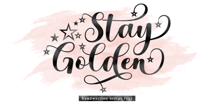 Introducing Stay Golden Script font in a smooth handwriting style and very pretty and classy. Stay Golden is perfect for branding projects, home appliance design, product packaging, use in business cards, invitation cards, etc. Simply as a stylish text overlay onto a background image or anything else that needs a touch of elegance. Thanks for checking! I really hope you enjoy it.
 - Rouben by Roman Melikhov,
$23.00 Rouben is a sans serif font family for creating minimalistic logos, wordmarks, titles, taglines. Use stylistic alternates to emphasize separate letters in your text. Features: - 10 weights + variable font - Multilanguage + Cyrillic - 2 stylistic alternates for each letter You can use alternates in most major image editors, just find menu item Glyphs (Alternates) there. For any questions about the font please contact: arbuzzu@gmail.com
 - Pelita by Lafontype,
$25.00 Pelita is a sans serif family which is divided into 2 sub-families, Regular and Grande. Pelita is designed with a terminal that forms a curved angle on one side so as to give the impression of representing firmness and softness. The grande version is a modified version of the main version, but is designed more streamlined with curves and more extreme angles.
 - Xbats by Holland Fonts,
$30.00Make your instant X-mas and Winter Holiday Greeting cards with the HF Xbats dingbats. 26 regular (capitals, A-Z) and 26 inverted (lowercase, a-z) images with the upcoming Winter Holiday Season as a theme. 7 instant Holiday Messages (numerals, 1-5 and inverted on 6-0 for English; ¡, !, ¿ and ? for Spanish) will make your Greeting complete in any combination. - Chevalier by URW Type Foundry,
$35.00 Chevalier is an engraved all-capital typeface with delicate shading. The Chevalier font is suitable for business letterheads and corporate stationery, headlines and packaging, where a clean, safe, established image is desired. Chevalier is a trademark of Heidelberger Druckmaschinen AG, which may be registered in certain jurisdictions, exclusively licensed through Linotype Library GmbH, a wholly owned subsidiary of Heidelberger Druckmaschinen AG.
 - Brushelva by Mevstory Studio,
$25.00 Introducing Brushelva Classic Sans Serif Font , created by Lettercorner Studio. Thelma is a traditional font for the classic sans serif type. A simple font, with a thin size, adds an elegant and classy impression. This typeface is perfect for an elegant logo, branding, travel promotion, layout magazine, beauty product, packaging product, quotes, or simply as a stylish text overlay to any background image.
 - Koara by Rosario Nocera,
$14.99 Koara is a handmade font family inspired by nature. It's composed of two versions, (rough and wild) and available in the weights, light, regular and bold, with an alternative capital K, linear lowercase and capital numbers. It's recommended for large titrations, small paragraphs, typographic compositions and logotype, Koara shines on several backgrounds like leafs, jungle, nature images and even organic food.
 - Silvermist by Letteralle,
$19.00 Silvermist is made to express things in a masculine and assertive way. With high letters, it makes it have a more dominant impression. Silvermist is perfect for display purposes such as editorial projects, Logo design, Music Album, Clothing Branding, product packaging, magazine headers, or simply as a stylish text overlay to any background image. I hope you enjoy! Letteralle Studios
 - Pictographs by Monotype,
$29.99The Pictographs MT font was contains over 700 emoji icons (emoticons). These symbols, pictures and images cover a range of expressions and uses. Emoji were very popularized in Japan and have become widely adopted and integrated into the Unicode specification. The Pictographs MT font was created to support messaging applications, and to give designers and developers a robust set of emoticons. - Monem by Wiescher Design,
$39.50 Monem is the word for the smallest significance-carrying part of a language. I thought that was a good name for a clean, straightforward Sans typeface. Monem is very sturdy and usable for lots of occasions. I am using this font myself for those of my clients that want to convey a clean unobtrusive image. Your very restrained Gert Wiescher
 - Toisy by Letrizmo,
$21.00When the right late seventies / early eighties message is needed, Toisy comes to the rescue. Founded on a mix of references from letterforms of the time, this new original nods to a style that defined an era. A sexy theme font that conveys a clear image of what was truly chic thirty years ago, this alphabet is deeply rooted in sultry memories of soft, endless nights. Exaggerate contrast between strokes and angular lines combine with rounded corners to provide a unique character and a look that sharply differs when set in all caps or lower case, thanks to an uncommon treatment of density and proportions. Set it real tight, as was typographically in fashion circa 1981. Toisy and Toisy Greek include a set of 13 matching images inspired in leisure stuff and the clothing of the last days of disco. They are different from the set included with Toisy Alt. - Double Nines JNL by Jeff Levine,
$29.00 Double Nines JNL is a dingbat font containing fifty-five glyphs for the tiles found in the second level of domino games. Sets of dominoes can be of either double six, double nine or double twelve. In this font, the double blank tile is located on the zero keystroke, while the one/blank and 1/1 tiles are on the 1 and 2 keystrokes. The rest of the tiles (in numerical order through 9/9) are located on the A-Z and a-z keystrokes respectively. To use any or all of the images contained in Double Nines JNL in any manufactured products or services, please refer to the software license agreement provided when purchasing this font. A separate royalty license must be secured from Jeffrey N. Levine for such purposes. The images are NOT licensed for use in proprietary logos or service marks.
 - PS Fournier Std by Typofonderie,
$59.00 Style and elegance in 14 styles PS Fournier, created by Stéphane Elbaz, is designed in tribute to Pierre Simon Fournier. Fournier was the prolific Parisian type designer whose work is best known for its iconic representation of French transitional style. PS Fournier elegantly represents the transition to the modern era of typography. Featuring three optical sizes, PS Fournier is designed to perform in any context. The Pierre Simon Fournier heritage Pierre Simon Fournier (1712—1768) was a leading innovative type designer of the mid-18th century. Early in his career, the young Pierre Simon developed a strong aesthetic that he cultivated throughout his life. His art is representative of the pre-revolutionary “Age of Enlightenment” (Siècle des Lumières). Precursor of the Modern style, Fournier’s body of work deeply influenced his times, and created the fertile ground from which the Didot family and Giambattista Bodoni developed their own styles. During the historical period of the 18th century, Fournier exemplified the intellectual pursuits of the times with his own research on type, documenting in detail the typefounding process. He also offered a unique vision: he is the first to clearly comprehend the concept of “type family,” sorting a set of similarly styled alphabets by sizes, width, and by x-heights. In addition, Fournier is one of the earliest advocates of the point system to organize the practice of typography, the point system that contemporary typographers continue to use to this day. The refined and discreet elegance of PS Fournier With a close look at the family, one finds you’ll find that the difference between the optical sizes (Petit, standard and Grand) is more than a contrast variation between the thin and the thick; the eye can also denote a palette of distinct tones: More streamlined and robust in the smaller sizes (Petit), more refined and detailed in the larger sizes (Grand). The PS Fournier standard family is designed to adapt to any situation with its intermediate optical size, from body copy to headlines. With a bit of tracking, PS Fournier Petit will make the smallest captions perfectly readable. However, Petit family is not limited to body and captions — its “slabby robustness” will make a relevant headline choice as well. PS Fournier Grand presents a higher contrast adapted to large text sizes, displays or banners. Its refined elegance makes it a perfect choice for Design, Fashion or Luxury publications. As a “modern” type PS Fournier Grand features a larger x-height than the preexistent old style typefaces such as Garamond or Jenson. These proportions provide any basic text set in PS Fournier Grand a strong typographic texture. As a result, the PS Fournier global family is a versatile alternative to the Modern typefaces commonly used in the publishing industry. The optical sizes, the large range of weights, and the design variations make this family adaptable to captions, paragraphs, and pages, as well as to large texts and displays. A leading-edge typography in the 18th century In the spirit of modernity, Pierre Simon Fournier did not find any use for the conventional swashes still produced by peers such as Caslon or Baskerville. Nevertheless the French designer created many inventive elements to decorate the page and set delightful variations in the text itself. To this regard PS Fournier includes a large set of glyphs variations, ligatures and more than one hundred glyphs for borders, rules and ornaments or — as called in French — “vignettes.” PS Fournier: A tribute to the French modern typography era by Stéphane Elbaz
 - Gotti by Resistenza,
$39.00 Introducing Gotti. Where Timeless Precision Meets Seventies Flair We are thrilled to unveil our latest creation, Gotti font family, born and meticulously crafted during an inspiring journey to Goteborg. This typeface seamlessly fuses the Bauhaus essence with the spirited vibes of the seventies, resulting in a font that's not just a visual treat but a design experience. Gotti draws its creative fuel from the geometric elegance of the Bauhaus movement, prioritising functional simplicity and razor-sharp lines. However, its design journey doesn't end there. Imbued with the unmistakable energy of the Seventies, Gotti emerges as a font family that encapsulates both nostalgic charm and contemporary boldness. At its core, Gotti boasts a geometric skeleton that has been intricately designed to redefine precision. Ranging from light to black, the weight variations offer a broad spectrum of expressive possibilities. Gotti is perfect for display use, advertising, and branding, it transforms your creative vision into a visual masterpiece. Stand out with confidence, whether it's a captivating logo, a compelling headline, or an unforgettable advertisement. Elevate your brand identity with Gotti. It brings strategic branding to life, communicating sophistication and modernity. Your advertising materials become memorable works of art, leaving a lasting impression on your audience. Curious about the magic Gotti can bring to your designs? Our showcase reveals real-world applications, demonstrating its adaptability and aesthetic appeal. See for yourself how this font family turns ordinary designs into extraordinary visual experiences. Follow us on social media for updates, inspiration, and a glimpse behind the scenes. Have questions or just want to share your thoughts? We're here for you!
 - Cornhusker by Section Type,
$22.00 Standing tall as an Illinois cornfield in September, Cornhusker Regular is a strapping condensed sans designed by a champion cornhusker. Inspired by 1940s Midwestern signage, it's warm & charming characters are perfectly at home in logos, beverage bottles and food packaging, restaurant menus, travel advertisements, websites, stationery, handmade product packaging and so much more. If you're looking for a hand-crafted typeface with punch (who can fit into tight spaces!) then Cornhusker Regular is the font for you. This inspired revival excels in both retro & modern designs. Cornhusker Regular includes capital letters, small caps, and alternate cuts (with diacritics) of A, E, F, J, X, Y, ᴀ, ᴇ, ғ, ᴊ, x, ʏ, 0, 1, 2, 3, 4, 5, 7 and a sharp German double s in both cap and smallcap. This font is not affiliated with or endorsed by the University of Nebraska. WHAT'S INCLUDED Cornhusker Regular includes an installable digital Opentype Font file in a single weight. This file contains a basic Latin character set with a full set of uppercase and small caps, multilingual diacritics, numbers, international currency figures, punctuation and pagination symbols. The font also includes alternate cuts for select uppercase and smallcap letters (located in stylistic sets). It is compatible with Adobe CS and CC, Microsoft Word and other type editing apps. SUPPORTED LANGUAGES Afrikaans, Alsatian, Basque, Bislama, Breton, Catalan, Chamorro, Danish, Dutch, English, Faroese, Finnish, Flemish, Franco-Provencal, French, Frisian, Friulian, Galician, German, Greenlandic, Icelandic, Indonesian, Irish, Italian, Ladin, Latin, Luxembourgish, Malay, Manx Gaelic, Northern Sotho, Norwegian (Bokmål), Norwegian (Nynorsk), Occitan, Portuguese, Rhaeto-Romance, Romansh, Sami (Inari), Sami (Lule), Sami (Northern), Sami (Skolt), Sami (Southern), Scottish Gaelic, Spanish, Swahili, Swedish, Tagalog, Walloon and Welsh.
 - Chiq by Ingo,
$36.00 The name suggests it: the Chiq is based on a well-known system font from Apple's classic Mac OS operating system. By revamping and expanding good old “Chicago“, I want to make that 90s tech charm available for the future. The model consisted of just a single style and inspired me to create “Chiq Bold,” which later became the starting point for the entire font family. The shapes of the Chiq are constructed according to a very simple principle. The contrast of stems and hairlines becomes more pronounced towards the bolder cuts. A few basic shapes form the framework for all characters. The shapes are very regular and sometimes form somewhat unusual figures, which has a negative effect on readability and makes the font rather unsuitable for long passages of text, but results in a very even typeface. This is particularly true for the extra-wide “UltraExpanded,” which is so wide that you can no longer recognize word images but literally have to spell them out. In this way, words are turned into letter bands with a great decorative effect. With variants from “Light” to “Black”, from “Normal” to “Ultra Expanded” and the italics, Chiq reaches beyond its archetype. This opens up a wide range of uses. It is even clearer, even more sober, and to a certain extent speaks an even more modern formal language. Chiq is also a variable font!
 - Aeonis by Linotype,
$29.99 After Generis™, Aeonis™ is the second large family of typefaces by Erik Faulhaber. The basic Aeonis sans-serif form references Ancient Greek lapidary inscriptions from the 9th century BC. Between the poles of antiquity and modernity, a deliberate contradiction of round and rectangular forms gave way to a new and energised font: Aeonis. Aeonis is available in three widths and seven weights, all of which have been carefully coordinated in terms of their proportions. The clear contrast in the bold stroke intensity emphasises the organic nature of the font and creates exciting aesthetics. In light of their open forms, the letters guarantee a good level of readability, even in small point sizes. Given that the dynamic individual forms of Aeonis also fit perfectly in a functional image, this typeface is ideal both for complex, text-heavy documents as well as for logos and display text settings. Particular attention was paid to ensuring carefully coordination proportions: all styles and weights have the same cap height, as well as identical ascender heights, x-heights, and descender lengths. The widths of all figures, currency symbols, mathematical operators, and special characters have been carefully aligned for tablular settings. Aeonis is an extremely systematic design. All of its widths and weights may be combined with one another, without restrictions. For users who do not like the open A, an alternate A with a crossbar is included in each font as well.
 - Yafferbuddle by Aah Yes,
$7.00 Yafferbuddle comes in the category of 'a funky fun font' with a pleasing rounded shape, but it still has the extensive range of features you'd expect in a modern OpenType font. It's especially useful for posters, headlines and comics. There's 5 weights and a Shadow version in Regular and Italic, making 12 fonts in all. To let you know what's in the font that you might otherwise not suspect . . . With Discretionary Ligatures on, you get special characters if you type Mc St. Rd. Bd. Ave. c/o No. (p) (P) - include the full-stop/period where given. With Stylistic Alternates switched on, you get plenty of extra characters - including a WiFi symbol (type Wifi or WiFi) / bullet numbers instead of ordinary numbers / that different U-dieresis / special characters for c/o No. Mc / an upside down ~ / a huge bullet, and different forms for cent, dollar, percent, per-thousand. As you'd expect, there's all the accented characters for all Western European scripts using Latin letters, and standard ligatures, plus other Open Type features including Class Kerning, Slashed-Zero, Historical Forms, Sub- and Superscript numbers, fractions for halves, thirds and quarters, Ornamental forms giving bullet numbers, etc. There's even some of the more obscure stuff like the main mathematical operators, symbols like card-suits and male/female signs and so on, schwa, U-horn O-horn, and there's more if you can Access All Alternates. Much will depend on what features your software recognises.
 - Parsi by Naghi Naghachian,
$105.00 Parsi Font family is designed by Naghi Naghashian. This Font is developed on the basis of specific research and analysis on Arabic characters and definition of their structure. This innovation is a contribution to modernization of Arabic typography, gives the font design of Arabic letters real typographic arrangement and provides more typographic flexibility. This step was necessary after more than two hundred years of relative stagnation in Arabic font design. Parsi supports Arabic, Persian, and Urdu. It also includes proportional and tabular numerals for the supported languages. Parsi Font is available in Light, Regular and Bold. Parsi design fulfills the following needs: A Explicitly crafted for use in electronic media fulfills the demands of electronic communication. Parsi is not based on any pre-digital typefaces. It is not a revival. Rather, its forms were created with today’s technology in mind. B Suitability for multiple applications. Gives the widest potential acceptability. C Extreme legibility not only in small sizes, but also when the type is filtered or skewed, e.g., in Photoshop or Illustrator. Parsi's simplified forms may be artificial obliqued in InDesign or Illustrator, without any loss in quality for the effected text. D An attractive typographic image. Parsi was developed for multiple languages and writing conventions. E The highest degree of geometric clarity and the necessary amount of calligraphic references. This typeface offers a fine balance between calligraphic tradition and the contemporary sans serif aesthetic now common in Latin typography.
 - Copenhagen Grotesk Nova by David Engelby Foundry,
$15.00 Copenhagen Grotesk Nova is based on its 2015 predecessor (Copenhagen Grotesk). The Nova edition is carefully designed with new details, a simpler set of glyphs and with moderate descenders and ascenders in relation to less accentuated capitals.
 - Meyola by Stripes Studio,
$20.00 Hi, Introducing the latest styles Meyola with the kind of modern hand scratches, I hope you are interested in this font, if you want to use for your work this font can be used easily and simply because there are a lot of features in it to contain a complete set of letters lower and uppercase letters, assorted punctuation, numbers, and multilingual support. font also contains several ligatures and alternate style Stylistic.
 - Luxca by Shakira Studio,
$17.00 Introducing Luxca, a font that epitomizes modern luxury within the serif category. This typeface seamlessly blends contemporary sophistication with timeless elegance, making it the perfect choice for designers seeking to infuse their projects with an air of opulence and refinement. With Luxca as your font of choice, you have at your fingertips a versatile tool that can elevate a wide range of design applications. Whether it's high-end branding, editorial layouts, invitations, or packaging.
 - Camelin by Gian Studio,
$15.00 Introducing Camelin sant display is a complete typeface that is modern, simple and clean. As a typographic display it is useful for posters, logotypes, titles and short text in general. This font is easy to read and bold, easy to play. the embellished serif of the hat is slightly different from the usual hat to create an alternative glyph. We also designed an attractive uppercase set inside, to enhance your design. Enjoy!
 - Ratherbe by Zane Studio,
$15.00 Ratherbe is a new modern brush font with an irregular baseline. A contemporary approach to design, natural handmade, suitable for use in designs for clothing, invitations, book titles, stationery designs, quotes, branding, logos, greeting cards, T-shirts, packaging designs, posters, and more. Complete with upper and lower case letters, and multi-language support, numbers, punctuation and several ligature. Thank you very much for searching and letting me know if you have questions.
 - Yolien by Reyrey Blue Std,
$16.00 Introducing, Yolien Font. A retro, cute, and modern inspired by the flowy freeform lettering of the '60s and '70s. This font has a unique shape where every corner is smoother and more rounded. Every curve is designed based on an authentic and natural style. Yolien is perfectly suitable for a layout design for quotes or body copy, best used as a display for headings, logos, branding, magazines, product packaging, invitations: logotypes, and much more.
 - Linotype Automat by Linotype,
$29.99Distinguishing characteristics of Frank Marciulano’s Linotype Automat™ are its strictly constructed basis and its uniquely placed stroke contrasts. The emphasized vertical strokes are reminiscent of bars and give text a static feel. The forms of the letters are distinctly modern, an interpretation of a typeface meant for machines. Automat is not recommended for text but is particularly good for headlines in large point sizes, which allow its unusual forms to really stand out. - Auline by Sensatype Studio,
$15.00 Auline is Modern Luxury Serif Font is a well-balanced contemporary font with a fancy, unique, and versatile Luxury serif, font that you can combine to get any variations and unique shapes easily just in seconds with choose alternates of them. What's Included: Character set A-Z Normal & Italic Style Numerals & Punctuation Accented Characters (West Europe) Stylistic alternates Works on PC & Mac Recommended using Adobe Illustrator or Adobe Photoshop. Wish you enjoy our font. :)
 - Fredy Youth by Mightyfire,
$14.00 Introducing Fredy Youth - Multilingual Handwritten Font. The characters of this handwritten font exude a subtle charm, maintaining a delicate balance between sophistication and simplicity. Each letter is carefully crafted with a light touch, capturing the essence of handwritten notes while maintaining a modern and refined aesthetic. The absence of unnecessary embellishments allows the font to convey a sense of clarity and purity, making it a versatile choice for a wide range of design projects.
 - Shardie Brush by Stripes Studio,
$20.00 Hi, Introducing the latest styles Shardie Brush with the kind of modern hand scratches, I hope you are interested in this font, if you want to use for your work this font can be used easily and simply because there are a lot of features in it to contain a complete set of letters lower and uppercase letters, assorted punctuation, numbers, and multilingual support. font also contains several ligatures and alternate style Stylistic.
 - Worst Hunter by Senekaligrafika,
$12.00 “Worst Hunter” has hard strokes and signature style that speak to instant unique sensation. Take your creative projects to the highest level with this font. “Worst Hunter” will help you to create special and touching typographical design for your characteristical and exclusively projects, for branding, food product, cafe product, restaurant product, labeling, clothing, movie title, album cover, logos and many more. It is really universal and modern font. The owner of endless possibilities!
 - Aspidistra by Studio K,
$45.00 Aspidistra is a modern vintage typeface; which is to say a Studio K original with a period feel: it has a strong Art Nouveau influence (a distant cousin of Arnold Bocklin). Why Aspidistra? In the first half of the last century an Aspidistra was a must have accessory of the aspiring middle classes (see George Orwell's Keep the Aspidistra Flying), and to my mind this font evokes the chintzy charm of that era.
 - Oval Monogram by MonogramBros,
$12.00 Oval Monogram is a perfect oval shaped monogram font consisting of 78 letters. With just a single font file you will be able to create beautiful monograms in just a matter of minutes after the purchase! Oval Monogram Font comes with font file in OTF format. It features all the modern advanced font features such as Contextual Alternates, effectively eliminating the need to use multiple separate font files for left, center and right letters.
 - Geometra by T4 Foundry,
$21.00 Geometra is a new font family from Swedish type designer Bo Berndal and the T4 font foundry. Somewhere between a slab serif and a sans it has a crisp, geometric feel and is both 20’s retro and modern. Its soft curves and openness makes it very readable in smaller print. The powerful serifs give the font lots of character in larger sizes. Geometra comes in three weights, regular, semibold and bold.
 - Joyeux Script by Elyas Beria,
$9.00 Is it modern, is it retro? Is it flowing, is it angular? It's all of these and more. Elegant and sophisticated, Joyeux© Script is a multilingual typeface in two weights that is perfect for any project that requires a touch of refinement, from invitations, labels, greeting and wedding cards, packaging, fashion, and logos to book covers and magazines. Includes: uppercase & lowercase regular and bold numbers and punctuation multilingual characters alternates ©2023
 - JH Fares by JH Fonts,
$45.00Jh Fares is a modern / simple Kufic style font. The user may notice plenty of white space around the text leading to a highly readable font. The Kufic script is one of the oldest Arabic Handwriting, first appeared in el Koufa - Iraq. The original calligraphy was derived from the Aramaic letters; later it went thru lots of enhancements. Its typical uses include decorative writings for Mosques / palaces, Magazines / Newspapers / Books titles and Greetings. - Humble Nostalgia by Arterfak Project,
$18.00 Experience the classic feel with Humble Nostalgia! A classy and elegant serif font that will bring you to the 80s era. Specially crafted with a modern touch, designed with tight kerning and spacing to achieve a more aesthetic appearance. An amazing combination of regular and italic styles that looks great in both large and small sizes, making it the perfect choice for your special designs. A perfectly versatile font pair suitable for lifestyle!