10,000 search results
(0.049 seconds)
- Heartline by Keristyper Studio,
$14.00 Introducing Heartline a magical script font carefully created with a touch of elegance. This font is good for logo design, Social media, Movie Titles, Books Titles, short text even long text letters, and good for your secondary text font with sans or serif. **Featured:** * Standard Uppercase & Lowercase * Numeral & Punctuation * Multilingual : ä ö ü Ä Ö Ü ß ¿ ¡ * Alternate & Ligature * PUA encoded We recommend programs that support the OpenType feature and the Glyphs panel such as Adobe applications or Corel Draw. so you can use all the variations of the glyphs. Hope you enjoy our fonts!
 - Zaire SF by Scholtz Fonts,
$19.00 Zaire SF is a distinctive, elegant, ethnic style font, inspired by the ancient masking traditions of the tribes indigenous to Zaire in Central Africa. The font captures the magic of the mask, representing the dance, the ceremony, the secret society. It evokes the very heart of Africa. Zaire is best used as a display font and is also effective for headings and posters. The tall, slim silhouette epitomizes the elegance of contemporary African design. It includes a full character set: characters for English, French, Italian, German, and Portuguese.
 - Consent by Sarid Ezra,
$15.00 Consent is an editorial serif font with unique lowercase. With special features, Consent will make your project more stand out and elegant. This font suitable for brand or title of the magazine. You also can use this font for logo, branding, and also versatile for any project! No need a complicated step for using the features. Just type in lowercase, uppercase, or both! You can also access the additional features from opentype ligatures. Just type equal + number (1-4) for the magic. Example =3. Try it in the type sample below!
 - Selomita by Thanoestd,
$15.00 Selomita is a magical handwritten font carefully created with a touch of elegance. This is a beautiful combination of timeless elegance and authentic calligraphy. It features an incredibly classic style, while still keeping a friendly feel. This font is the perfect font for making original and outstanding designs. To keep maximum real hand lettered effect, there were created 65 ligatures. Selomita also includes full set of uppercase and lowercase letters, full uppercase alternate and some lowercase alternate letters, swash, numerals, punctuation. I hope you like with this font. Thanks.
 - Chuck Noon Script by Fontdation,
$20.00 After long time no script, finally we released our new Chuck Noon Script. A clean and bold script fonts that offers you a natural hand-lettering experience. Handcrafted and digitally checked with high attention to the details, we're a sucker for clean lines and crispy edges too, just like you. Available in two styles; Script and Brush, their dynamic letterforms work like magic, whether you go all caps or using it normally as a script. Suits best for logotype, poster/t-shirt designs, food/beverage labels, hipster quotes, greeting cards, wedding invitations, and many more.
 - Mugi by Khoir,
$15.00 Not the usual bold serif, this is a bold serif that is unique, attractive and worth trying to apply to various backgrounds of your work, whether in branding, posters, logos, quotes, films, packaging and others. This serif has a magical curved shape that can be seen when you look at it, guaranteed to attract attention. Mugi Uppercase Lowercase 75+ Language So what are you waiting for? immediately purchase this font, feel free to comment, or send me my PM or email at khoirtypework@gmail.com Thank you for seeing
 - Hysterian by Gassstype,
$23.00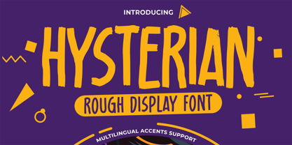 Hello Everyone, introduce our new product Hysterian is a Rough Display Font.This Playful Kids with a natural feel. This handmade font will make your design has a beautiful natural touch for each details. It is perfect for any design project as Invitation,logo, Kids,book cover, craft or any design purposes. This font is PUA encoded which means you can access all of the magical glyphs. That is Hysterian has charming unique,authentic and relaxed characteristic more natural look to your text. It also features a wealth of special features including Alternates glyphs.
 - Alice by Mirror Types,
$25.00 Alice is a formal fantasy font. It’s inspired in the fairy tales and magical lands that my mother used to tell me as a child when I went to sleep. The capitals are really nice and complex, while the minuscules are cleaner for easier reading. The style Curly uses some features of the normal uppercase letters in the lowercase ones. There are some minor, yet noticable, flaws in a number of characters that will need correction for signage/vinyl letter cuts (characters appx. 2-1/2" and larger).
 - Taxon by Hoftype,
$49.00 Taxon is a straightlined Sans with a clean, fresh and unsentimental look. Related to classical faces like Optima and Imago, it appears more contemporary and merges the austere linearity of the Grotesk with the elegance of the Antiqua. The Taxon family consists of 12 styles and is well suited for ambitious typography. It comes in OpenType format with extended language support. All weights contain ligatures, superior characters, proportional lining figures, tabular lining figures, proportional old style figures, lining old style figures, matching currency symbols, fraction- and scientific numerals, matching arrows and alternate characters.
 - Mybela by Scratch Design,
$9.00 Mybela is a beautiful brush script font with a super-sexy-casual vibe! This font is incredibly versatile in use cases ranging from street urban, to styled fashionista, to hearty food branding - whatever the weather, and also for invitation wedding or quote text! Mybela comes with a set of upper and lower case letters, and ligatures so you can write one word in a different ways - and keep things natural looking. Also this font has support for multiple languages. Do your magic with Mybela font, be creative and keep beautiful. Enjoy it!
 - Cochin by Linotype,
$29.99 Georges Peignot designed Cochin based on copper engravings of the 18th century and Charles Malin cut the typeface in 1912 for the Paris foundry Deberny & Peignot. The font is named after the French engraver Charles Nicolas Cochin (1715–1790) although its style had little to do with that of the copper artist’s. The font displays a curious mix of style elements and could be placed as a part of the typographical Neorenaissance movement. Cochin is especially large and wide and was very popular at the beginning of the 20th century.
 - Rathery by Scratch Design,
$15.00 Please welcome, Rathery Rathery is a textured handwritten script font made by Love. This font is detailed and has a beautiful shape. It will give you a summer vibe in your design. This font will be perfect for posters, invitations, branding, social media content, headlines, body text in magazines, logos and many more. What you'll get : Uppercase and lowercase Numbers & punctuation Multilingual support Alternates for lowercase Ligatures Please make sure you have your OpenType Ligatures turned on to see the magic of ligatures. Thank you for your purchase! Hope you enjoy our font!
 - Dark Blades Steel by Tadiar,
$19.00 !!! Please note that the font works in Photoshop CC2017 and higher and in Illustrator CC 2018 and higher only. !!! DarkBlades Steel is an unique vintage color gradient vector SVG font you may use in your projects just typing a text in Illustrator or Photoshop. DarkBlades Steel is derivative from DarkBlades Font Family: https://www.myfonts.com/collections/dark-blades-font-tadiar Designed for: - Vintage branding (Clothes, Alcohol, Bikes, Games) - Horror - Music branding - Myth: Vampires, Zombie, Halloween, Werevolves, Magic, Fantasy - Medieval style Well use in vintage labels, headers & titles, Posters, Street Signs and other Outdoor, Package Design.
 - Golestan by Naghi Naghachian,
$84.00 Golestan is designed by Naghi Naghashian. It is a Font family, in 2 weights, Regular and Bold. This font is a contribution to modernisation of Arabic typography, gives the font design of Arabic letters real typographic arrangement und provides more typographic flexibility. Golestan supports Arabic, Persian and Urdu. It also includes proportional and tabular numerals for the supported languages. Golestan design fulfills the following needs: A Explicitly crafted for use in electronic media fulfills the demands of electronic communication. B Suitability for multiple applications. Gives the widest potential acceptability. C Extreme legibility not only in small sizes, but also when the type is filtered or skewed, e.g., in Photoshop or Illustrator. Golestan’s simplified forms may be artificial obliqued in InDesign or Illustrator, without any loss in quality for the effected text. D An attractive typographic image. Golestan was developed for multiple languages and writing conventions. Golestan supports Arabic, Persian and Urdu. It also includes proportional and tabular numerals for the supported languages. E The highest degree of calligraphic grace and the clarity of geometric typography.
 - Afsane by Naghi Naghachian,
$94.00 Afsane is a sans-serif headline font family designed by Naghi Naghashian in 3 weights, Light, regular and Bold.This font is a contribution to modernisation of Arabic typography, gives the font design of Arabic letters real typographic arrangement und provides more typographic flexibility. Afsane supports Arabic, Persian and Urdu. It also includes proportional and tabular numerals for the supported languages. Afsane design fulfills the following needs: A. Explicitly crafted for use in electronic media fulfills the demands of electronic communication. B. Suitability for multiple applications. Gives the widest potential acceptability. C. Extreme legibility not only in small sizes, but also when the type is filtered or skewed, e.g., in Photoshop or Illustrator. Afsane’s simplified forms may be artificial obliqued in InDesign or Illustrator, without any loss in quality for the effected text. D. An attractive typographic image. Afsane was developed for multiple languages and writing conventions. Afsane supports Arabic, Persian and Urdu. It also includes proportional and tabular numerals for the supported languages. E. The highest degree of calligraphic grace and the clarity of geometric typography.
 - Jekta by Naghi Naghachian,
$104.00 Jekta is a sans-serif headline font designed by Naghi Naghashian. This is a single weights font, ExtraBold. This font is a contribution to modernisation of Arabic typography, gives the font design of Arabic letters real typographic arrangement und provides more typographic flexibility. Jekta supports Arabic, Persian and Urdu. It also includes proportional and tabular numerals for the supported languages. Jekta design fulfills the following needs: A Explicitly crafted for use in electronic media fulfills the demands of electronic communication. B Suitability for multiple applications. Gives the widest potential acceptability. C Extreme legibility not only in small sizes, but also when the type is filtered or skewed, e.g., in Photoshop or Illustrator. Nima’s simplified forms may be artificial oblilqued in InDesign or Illustrator, without any loss in quality for the effected text. D An attractive typographic image. Jekta was developed for multiple languages and writing conventions. Jekta supports Arabic, Persian and Urdu. It also includes proportional and tabular numerals for the supported languages. E The highest degree of calligraphic grace and the clarity of geometric typography.
 - Homa by Naghi Naghachian,
$108.00 Homa is a sans-serif sigle weight font designed by Naghi Naghashian. It is extremely legible even in very small size. This font is The contribution to modernisation of Arabic typography, gives the font design of Arabic letters real typographic arrangement und provides more typographic flexibility. Homa supports Arabic, Persian ( Farsi) and Urdu. It also includes proportional and tabular numerals for the supported languages. Homa design fulfills the following needs: A Explicitly crafted for use in electronic media fulfills the demands of electronic communication. B Suitability for multiple applications. Gives the widest potential acceptability. C Extreme legibility not only in small sizes, but also when the type is filtered or skewed, e.g., in Photoshop or Illustrator. Homa’s simplified forms may be artificial oblilqued in InDesign or Illustrator, without any loss in quality for the effected text. D An attractive typographic image. Homa was developed for multiple languages and writing conventions. Homa supports Arabic, Persian and Urdu. It also includes proportional and tabular numerals for the supported languages. E The highest degree of calligraphic grace and the clarity of geometric typography.
 - Pegah by Naghi Naghachian,
$98.00 Pegah is a sans-serif font family designed by Naghi Naghashian in three weights. Pegah Light, Pegah Regular and Pegah Bold. This font family is a contribution to modernisation of Arabic typography, gives the font design of Arabic letters real typographic arrangement und provides more typographic flexibility. Pegah supports Arabic, Persian and Urdu. It also includes proportional and tabular numerals for the supported languages. Pegah design fulfills the following needs: A Explicitly crafted for use in electronic media fulfills the demands of electronic communication. B Suitability for multiple applications. Gives the widest potential acceptability. C Extreme legibility not only in small sizes, but also when the type is filtered or skewed, e.g., in Photoshop or Illustrator. Nima’s simplified forms may be artificial oblilqued in InDesign or Illustrator, without any loss in quality for the effected text. D An attractive typographic image. BaBa was developed for multiple languages and writing conventions. BaBa supports Arabic, Persian and Urdu. It also includes proportional and tabular numerals for the supported languages. E The highest degree of calligraphic grace and the clarity of geometric typography.
 - BaBa by Naghi Naghachian,
$98.00 BaBa is a sans-serif font family designed by Naghi Naghashian in three weights. BaBa Light, Baba Regular and Baba Bold. This font family is a contribution to modernisation of Arabic typography, gives the font design of Arabic letters real typographic arrangement und provides more typographic flexibility. BaBa supports Arabic, Persian and Urdu. It also includes proportional and tabular numerals for the supported languages. BaBa design fulfills the following needs: A Explicitly crafted for use in electronic media fulfills the demands of electronic communication. B Suitability for multiple applications. Gives the widest potential acceptability. C Extreme legibility not only in small sizes, but also when the type is filtered or skewed, e.g., in Photoshop or Illustrator. Nima’s simplified forms may be artificial oblilqued in InDesign or Illustrator, without any loss in quality for the effected text. D An attractive typographic image. BaBa was developed for multiple languages and writing conventions. BaBa supports Arabic, Persian and Urdu. It also includes proportional and tabular numerals for the supported languages. E The highest degree of calligraphic grace and the clarity of geometric typography.
 - Babak by Naghi Naghachian,
$74.00 Babak is designed by Naghi Naghashian. It is a Font family, in 3 weights, Light, Regular and Bold. This font is a contribution to modernisation of Arabic typography, gives the font design of Arabic letters real typographic arrangement und provides more typographic flexibility. Babak supports Arabic, Persian and Urdu. It also includes proportional and tabular numerals for the supported languages. Babak design fulfills the following needs: A Explicitly crafted for use in electronic media fulfills the demands of electronic communication. B Suitability for multiple applications. Gives the widest potential acceptability. C Extreme legibility not only in small sizes, but also when the type is filtered or skewed, e.g., in Photoshop or Illustrator. Nima’s simplified forms may be artificial obliqued in InDesign or Illustrator, without any loss in quality for the effected text. D An attractive typographic image. Babak was developed for multiple languages and writing conventions. Babak supports Arabic, Persian and Urdu. It also includes proportional and tabular numerals for the supported languages. E The highest degree of calligraphic grace and the clarity of geometric typography.
 - Hafez by Naghi Naghachian,
$88.00 Hafez is a sans-serif font family designed by Naghi Naghashian in three weights. Hafez Light, Hafez Regular and Hafez Bold. This font family is a contribution to modernisation of Arabic typography, gives the font design of Arabic letters real typographic arrangement und provides more typographic flexibility. Hafez supports Arabic, Persian and Urdu. It also includes proportional and tabular numerals for the supported languages. Hafez design fulfills the following needs: A Explicitly crafted for use in electronic media fulfills the demands of electronic communication. B Suitability for multiple applications. Gives the widest potential acceptability. C Extreme legibility not only in small sizes, but also when the type is filtered or skewed, e.g., in Photoshop or Illustrator. Nima’s simplified forms may be artificial oblilqued in InDesign or Illustrator, without any loss in quality for the effected text. D An attractive typographic image. BaBa was developed for multiple languages and writing conventions. BaBa supports Arabic, Persian and Urdu. It also includes proportional and tabular numerals for the supported languages. E The highest degree of calligraphic grace and the clarity of geometric typography.
 - Naghashian by Naghi Naghachian,
$78.00 Naghashian is designed by Naghi Naghashian. It is a Font family, in 5 weights, Light, Regular, Bold, Extra Bold and Heavy This font is a contribution to modernisation of Arabic typography, gives the font design of Arabic letters real typographic arrangement und provides more typographic flexibility. Naghashian supports Arabic, Persian and Urdu. It also includes proportional and tabular numerals for the supported languages. Naghashian design fulfills the following needs: A Explicitly crafted for use in electronic media fulfills the demands of electronic communication. B Suitability for multiple applications. Gives the widest potential acceptability. C Extreme legibility not only in small sizes, but also when the type is filtered or skewed, e.g., in Photoshop or Illustrator. Nima’s simplified forms may be artificial obliqued in InDesign or Illustrator, without any loss in quality for the effected text. D An attractive typographic image. Naghashian was developed for multiple languages and writing conventions. Naghashian supports Arabic, Persian and Urdu. It also includes proportional and tabular numerals for the supported languages. E The highest degree of calligraphic grace and the clarity of geometric typography.
 - Damavand by Naghi Naghachian,
$114.00 Damavand is designed by Naghi Naghashian. It is a Font family, in 5 weights, Light, Regular, DemiBold, Bold and Heavy. This font is a contribution to modernisation of Arabic typography, gives the font design of Arabic letters real typographic arrangement und provides more typographic flexibility. Damavand supports Arabic, Persian and Urdu. It also includes proportional and tabular numerals for the supported languages. Damavand design fulfills the following needs: A. Explicitly crafted for use in electronic media fulfills the demands of electronic communication. B. Suitability for multiple applications. Gives the widest potential acceptability. C. Extreme legibility not only in small sizes, but also when the type is filtered or skewed, e.g., in Photoshop or Illustrator. Nima’s simplified forms may be artificial obliqued in InDesign or Illustrator, without any loss in quality for the effected text. D. An attractive typographic image. Damavand was developed for multiple languages and writing conventions. Damavand supports Arabic, Persian and Urdu. It also includes proportional and tabular numerals for the supported languages. E. The highest degree of calligraphic grace and the clarity of geometric typography.
 - Pasargad by Naghi Naghachian,
$108.00 Pasargad is a new font family, designed by Naghi Naghashian. It is a Font family in 3 weights, Light, Regular and Bold. This font is a contribution to modernisation of Arabic typography, gives the font design of Arabic letters real typographic arrangement und provides more typographic flexibility. Pasargad supports Arabic, Persian and Urdu. It also includes proportional and tabular numerals for the supported languages. Pasargad design fulfills the following needs: A Explicitly crafted for use in electronic media fulfills the demands of electronic communication. B Suitability for multiple applications. Gives the widest potential acceptability. C Extreme legibility not only in small sizes, but also when the type is filtered or skewed, e.g., in Photoshop or Illustrator. Pasargad’s simplified forms may be artificial obliqued in InDesign or Illustrator, without any loss in quality for the effected text. D An attractive typographic image. Pasargad was developed for multiple languages and writing conventions. Pasargad supports Arabic, Persian and Urdu. It also includes proportional and tabular numerals for the supported languages. E The highest degree of calligraphic grace and the clarity of geometric typography.
 - Homayoon by Naghi Naghachian,
$102.00 Homayoon is a sans-serif sigle weight font designed by Naghi Naghashian. It is extremely legible even in very small size. This font is The contribution to modernisation of Arabic typography, gives the font design of Arabic letters real typographic arrangement und provides more typographic flexibility. Homayoon supports Arabic, Persian (Farsi ) and Urdu. It also includes proportional and tabular numerals for the supported languages. Homayoon design fulfills the following needs: A Explicitly crafted for use in electronic media fulfills the demands of electronic communication. B Suitability for multiple applications. Gives the widest potential acceptability. C Extreme legibility not only in small sizes, but also when the type is filtered or skewed, e.g., in Photoshop or Illustrator. Homayoon’s simplified forms may be artificial oblilqued in InDesign or Illustrator, without any loss in quality for the effected text. D An attractive typographic image. Homayoon was developed for multiple languages and writing conventions. Homayoon supports Arabic, Persian and Urdu. It also includes proportional and tabular numerals for the supported languages. E The highest degree of calligraphic grace and the clarity of geometric typography.
 - Dara by Naghi Naghachian,
$88.00 Dara is a sans-serif sigle weight font designed by Naghi Naghashian. It is extremely legible even in very small size. This font is The contribution to modernisation of Arabic typography, gives the font design of Arabic letters real typographic arrangement und provides more typographic flexibility. Dara supports Arabic, Persian ( Farsi ) and Urdu. It also includes proportional and tabular numerals for the supported languages. Dara design fulfills the following needs: A Explicitly crafted for use in electronic media fulfills the demands of electronic communication. B Suitability for multiple applications. Gives the widest potential acceptability. C Extreme legibility not only in small sizes, but also when the type is filtered or skewed, e.g., in Photoshop or Illustrator. Dara’s simplified forms may be artificial oblilqued in InDesign or Illustrator, without any loss in quality for the effected text. D An attractive typographic image. Dara was developed for multiple languages and writing conventions. Dara supports Arabic, Persian and Urdu. It also includes proportional and tabular numerals for the supported languages. E The highest degree of calligraphic grace and the clarity of geometric typography.
 - Ostad Arabic by Naghi Naghachian,
$64.00 Oustad Arabic is designed by Naghi Naghashian. It is a Bold headline font, in 1 weight. This font is a contribution to modernisation of Arabic typography, gives the font design of Arabic letters real typographic arrangement und provides more typographic flexibility. Oustad Arabic supports Arabic, Persian and Urdu. It also includes proportional and tabular numerals for the supported languages. OstadArabic design fulfills the following needs: A Explicitly crafted for use in electronic media fulfills the demands of electronic communication. B Suitability for multiple applications. Gives the widest potential acceptability. C Extreme legibility not only in small sizes, but also when the type is filtered or skewed, e.g., in Photoshop or Illustrator. Nima’s simplified forms may be artificial obliqued in InDesign or Illustrator, without any loss in quality for the effected text. D An attractive typographic image. Kasha was developed for multiple languages and writing conventions. Nima supports Arabic, Persian and Urdu. It also includes proportional and tabular numerals for the supported languages. E The highest degree of calligraphic grace and the clarity of geometric typography.
 - MARIAMNE by Type Innovations,
$39.00 MARIAMNE is an original design by Alex Kaczun. It is an elegant, modern and traditional interpretation based on and modeled after his successful "Contax Pro" and "New Age Gothic" typeface series. As such, it has generous proportions with clean, crisp lines—ideally suited for easy reading and long lines of copy. Alex felt that the skeleton for "Contax" was perfectly suited to transform the design into a modern version of 'old-style', somewhat reminiscent of German Black Letter. Numerous modifications where made to the body proportions, stems and shapes. True 'old-style' serifs and unusual 'cross-strokes' where added for a touch of distinction. The 'cross-strokes' where added at exactly visual mid-point on the overall heights. This gives the typeface a romantic, female-like quality to the overall design. Strong, yet delicate. Visually stimulating in appearance and function. The result is a truly unique transitional and modern design. Unlike other typefaces, MARIAMNE incorporates uniform stems throughout the capitals, lower case and figures. This gives the design a uniform appearance in overall color and strength. There is a perfect visual balance between inter-letter spacing, stem weights and proportions. The accents are equally large, bold and command attention. This font includes a large 'Pro' character set, which supports most Central European and many Eastern European languages. As a result, the design is ideally suited for display copy as well as text composition. In the near future, Alex plans to expand the typeface series to include a light and heavy weight, along with true italics.
 - Faber Gotic by Ingo,
$21.00 A ”modern“ Gothic – designed according to principles of modern form in three variations Faber Gotik is a reminiscence of Gutenberg’s first script from around 1450. The heavily broken forms allow further development in the direction of a modern, strongly geometric and less formal type. It should be possible to push the principle of design so far to the limit that a type is created which, from the very start, extinguishes reminders of a dark past. The characters are composed of squares which are lined up straight or in a more or less slanted manner. The resulting corners similar to serifs were removed so that a sans serif type in the true sense without up and down strokes was created. The principle of ”breaking“ was applied according to the historical model. Even the form of the characters is based on the model from the Middle Ages. Only the characters which cannot be created with the principle described were modeled on today's forms. Faber Gotik includes three variations: - Faber Gotik Text — most similar to the historical model - Faber Gotik Gothic — pushes the applied principle of form the furthest - Faber Gotik Capitals —; a Gothic upper case font, contrary to tradition. 555 years after Gutenberg, interest in black-letter typefaces is nearly extinct. They are especially looked down upon in German-speaking countries because they are still associated with ”Nazi“ scripts. But yet, the very forms of blackletter, Gothic, Schwabacher and especially cursive have enormous potential with regard to the development of new advanced font forms.
 - The Beatrix by Shakira Studio,
$17.00 Say hello to new serif font, The Beatrix! The Beatrix is a serif font that offers the perfect combination of modern and retro feel to each letter. Bold and well-contoured in character, The Beatrix embodies a boldness and charm that cannot be overlooked. The design exudes classic serif elegance but with a touch of fresh, up-to-date style. The Beatrix accentuates uniqueness with a variety of stylish alternatives. Each character alternative provides an interesting creative dimension, presenting a fun combination of modern and retro styles. You as a designer have the freedom to explore and express your unique ideas through captivating typography. The Beatrix is an ideal choice for a variety of design projects. With a modern and retro feel, this font is suitable for use in headlines, logos, branding, marketing materials, posters, and many more. Whether it's a project that wants to convey a contemporary feel or explore the charm of the retro era, The Beatrix has the flexibility to adapt and deliver a strong message. Here's what you get: The Beatrix Regular All Multilingual symbol Opentype features ( ligature, alternate ) Accessible in the Adobe Illustrator, Adobe Photoshop, Adobe InDesign, even work on Microsoft Word. PUA Encoded Characters - Fully accessible without additional design software. Multilingual character supports : (Afrikaans, Albanian, Catalan, Croatian, Czech, Danish, Dutch, English, Estonian, Finnish, French, German, Hungarian, Icelandic, Italian, Lithuanian, Maltese, Norwegian, Polish, Portuguese, Slovenian, Spanish, Swedish, Turkish, Zulu) Follow my shop for upcoming updates, and for more of my work, Thank you!
 - Nortune by Ardyanatypes,
$10.00 Nortune is inspired by modern style combined with retro style so that it has a dynamic and elegant shape. This will be very suitable for use in any design that has a modern, retro, and classic feel. Nortune also has 10 thicknesses so it will be very easy to use on any design you have in mind. It also comes with multiple languages, making it easy to use for any country and language. Nortune also comes with alternative Ligatures and styles to make your designs more attractive. Alternate fonts will also create lots of options to combine. This modern letter shape will be very suitable to be combined with various types of fonts. Nortune is suitable for branding projects and various design purposes such as business cards, name tags, advertisements, posters, invitations, branding, logos, magazines, merchandise, presentations, etc. Supports languages: Afrikaans, Albanian, Asturian, Asu, Azerbaijani, Basque, Bemba, Bena, Bosnian, Breton, Catalan, Chiga, Colognian, Cornish, Croatian, Czech, Danish, Dutch, Embu, English, Esperanto, Estonian, Faroese, Filipino, Finnish, French, Friulian, Galician, German, Gusii, Hungarian, Icelandic, Igbo, Indonesian, Irish, Italian, Kabuverdianu, Kalaallisut, Kalenjin, Kamba, Kikuyu, Kinyarwanda, Latvian, Lithuanian, Low German, Lower Sorbian, Luo, Luxembourgish, Luyia, Machame, Makhuwa-Meetto, Makonde, Malagasy, Malay, Maltese, Manx, Meru, Morisyen, North Ndebele, Norwegian Bokmål, Norwegian Nynorsk, Nyankole, Oromo, Polish, Portuguese, Quechua, Romanian, Romansh, Rombo, Rundi, Rwa, Samburu, Sango, Sangu, Scottish Gaelic, Sena, Shambala, Shona, Slovak, Slovenian, Soga, Somali, Spanish, Swahili, Swedish, Swiss German, Taita, Teso, Turkish, Turkmen, Upper Sorbian, Vietnamese, Vunjo, Walser, Welsh, Western Frisian, Yoruba, Zulu
 - TT Livret by TypeType,
$39.00 If you still think that an antiqua is a typeface with a strong historical character that difficult to apply in modern realities, meet the new typeface from TypeType! TT Livret is an elegant, modern and functional antiqua featuring a calm text and an expressive display subfamily. TT Livret useful links: Specimen | Graphic presentation | Customization options This font looks harmonious in books and other periodicals, on posters or on magazine covers. The scope is not limited to the printing industry, because TT Livret looks aesthetically pleasing wherever text is used. The text subfamily has uniwidth proportions and a calm spirit, oval round characters, free spacing and more open apertures. The glossy display subfamily is proportional and has round signs that are as close to a circle as possible, the apertures are closed, and the spacing is dense. The font has an intermediate subfamily - Subhead, which can look more relaxed when used as text font, or be contrasting and used as a display font. In TT Livret, we have embodied the idea of an antiqua that will be comfortable to use in modern realities. This is a functional font, where the text face does not distract from reading, and the display face, on the contrary, attracts attention. The TT Livret font family consists of 32 faces: 15 upright, 15 oblique, and 2 variable fonts. Each face has 1031 glyphs. The font contains 26 OpenType features, as well as a large number of ligatures. There are many alternative characters in italics, which are especially diverse in Cyrillic.
 - Zambeza by Putracetol,
$28.00 Introducing Zambeza, a modern display font that draws inspiration from vintage posters and combines it with elegant typography styles. With Zambeza, you can create unique letter combinations for lettering with a wide range of options. The font comes with open type features, including alternate glyphs and end swashes, providing you with creative freedom for your lettering designs. Zambeza is perfect for various design applications, such as logotypes, headings, covers, posters, logos, quotes, product packaging, headers, merchandise, social media graphics, greeting cards, and more. Its versatile design makes it suitable for different creative projects, adding a touch of modernity and vintage charm. To access the alternate glyphs, you will need a software program that supports OpenType features, such as Adobe Illustrator CS, Adobe Photoshop CC, Adobe InDesign, or Corel Draw. This allows you to fully utilize the font's design possibilities and create unique compositions. Your zip package will include the Zambeza font files in otf, ttf, and woff formats, providing compatibility for different design projects. The font includes uppercase and lowercase letters, numerals, punctuation, and symbols, giving you all the essential elements for your designs. Zambeza also supports multilanguage characters, making it suitable for designing in various languages. Whether you're creating designs in English, Spanish, French, or any other language, Zambeza has you covered. In summary, Zambeza is a modern display font that combines vintage inspiration with elegant typography styles. With its open type features, multilanguage support, and versatile design applications, Zambeza is a great choice for your creative projects. Thank you for choosing Zambeza from our collection. Happy designing!
 - Faya by Clevus,
$16.00 Proudly present Faya stencil modern ligature. Faya is a font designed with a modern stencil style that blends classic elements with elegant contemporary touches. Featuring ligatures that offer design flexibility, Faya is suitable for various graphic design needs, including posters, banners, logos, and more. Don't forget to use all caps too in your mixing and matching - it adds contrast and impact to your type design. Design tips! : Tighten your letterspacing for larger titles to create a range of looks. Crafted with meticulous attention to detail, Faya's letterforms are bold, sharp, and geometrically-shaped, catching the eye with their visually appealing design. The font boasts high clarity and legibility, offering a range of different letter variations such as elegant uppercase and lowercase letters. With its clean yet stylish appearance, Faya is perfect for modern and minimalist design applications. Font Features : Lettres, numbers, symbols, and punctuation, alternates and ligatures No special software required they may be used even in canva, any basic program /website apps that allows standard fonts That's it folks! Multilingual Support Language Support: Danish, English, Estonian, Filipino, Finnish, French, Friulian, Galician, German, Gusii, Indonesian, Irish, Italian, Luxembourgish, Norwegian Bokmål, Norwegian Nynorsk, Nyankole, Oromo, Portuguese, Romansh, Rombo, Spanish, Swedish, Swiss-German, Uzbek (Latin) Follow My Shop For Upcoming Updates Including Additional Glyphs And Language Support. And Please Message Me If You Want Your Language Included or If There Are Any Features or Glyph Requests, Feel Free to Send me A Message. Kindly check over on Instagram! https://www.instagram.com/clevustudio/ Have a Good Day !
 - GEOspeed by deFharo,
$22.00 GEOspeed, a typeface that redefines design standards, this typeface goes beyond conventional, fusing robustness with elegance. Ideal for advertising use, posters or banners, GEOspeed is the very essence of modern visual expression. The typography includes 28 geometric icons accessible through the Open Type Functions: smcp and c2sc. Regular and Versalite: Two Styles, One Powerful Visual Identity: GEOspeed features two unique styles to meet all your creative needs. The Regular version provides solidity and clarity, while the Versalite adds a bold and distinctive touch. Together, these styles allow you to explore an unlimited range of visual expressions. 22 degree inclination: Movement and modernity in each letter: With a 22-degree incline, GEOspeed is not just about movement, it also has an avant-garde feel. Each letter is an expression of dynamism, capturing attention and carrying your message into the future. Each letter is a statement of progression and avant-garde. Sans serif geometry. GEOspeed's sans serif geometry sets a new standard for modernity. Each character is a geometric masterpiece, creating a contemporary look that highlights strength and elegance. Readability is guaranteed with meticulous metrics and kerning. Advanced OpenType features. GEOspeed's advanced Open Type features give you precise control over the appearance of your text. From sophisticated ligatures to typographic variations, your creativity is the limit. Explore an infinite range of possibilities with GEOspeed's numbers and letters set. From striking figures to expressive letter combinations, each design is unique. Includes dynamic fractions that maintain readability without sacrificing style. Every detail has been perfected to ensure a flawless typographic experience.
 - Austen Aesthetic by Ardyanatypes,
$15.00 Description Austen Aesthetic comes with an aesthetic style with a modern and elegant serif-type tagline appearance. This font comes with 8 thickness levels, from thin to black to suit your needs. Austen Aesthetic is also equipped with modern professional characteristics that can present an elegant and attractive identity for your company or project for business purposes. It pairs well with modern serifs and scripts pictured or stands firm as a title and brand representative for an elegant look. Austen Aesthetic also comes with multiple languages, making it easy to use for any country and language use. It also comes with alternative Ligatures and stylistics to make your designs more appealing. Austen Aesthetic is suitable for branding projects and various design purposes such as business cards, name tags, uniforms as a brand enhancement. Advertising, posters, invitations, branding, logos, magazines, merchandise, presentations, etc. Supports languages: Afrikaans, Albanian, Asturian, Asu, Azerbaijani, Basque, Bemba, Bena, Bosnian, Breton, Catalan, Chiga, Colognian, Cornish, Croatian, Czech, Danish, Dutch, Embu, English, Esperanto, Estonian, Faroese, Filipino, Finnish, French, Friulian, Galician, German, Gusii, Hungarian, Icelandic, Igbo, Indonesian, Irish, Italian, Kabuverdianu, Kalaallisut, Kalenjin, Kamba, Kikuyu, Kinyarwanda, Latvian, Lithuanian, Low German, Lower Sorbian, Luo, Luxembourgish, Luyia, Machame, Makhuwa-Meetto, Makonde, Malagasy, Malay, Maltese, Manx, Meru, Morisyen, North Ndebele, Norwegian Bokmål, Norwegian Nynorsk, Nyankole, Oromo, Polish, Portuguese, Quechua, Romanian, Romansh, Rombo, Rundi, Rwa, Samburu, Sango, Sangu, Scottish Gaelic, Sena, Shambala, Shona, Slovak, Slovenian, Soga, Somali, Spanish, Swahili, Swedish, Swiss German, Taita, Teso, Turkish, Turkmen, Upper Sorbian, Vietnamese, Vunjo, Walser, Welsh, Western Frisian, Yoruba, Zulu
 - Feel Script by Sudtipos,
$79.00 Feel Script is based on lettering that calligrapher and logo designer Rand Holub created for Intertype for his face Monterey. Fortunately, I didn’t have the technological limitations today that Intertype had back then. Holub’s lettering is presented in its entirety within Feel Script. Some letterforms were redrawn from vintage American magazine ads (some by Holub himself), along with many new alternates, ligatures, ending forms, and strangely beautiful character combinations. The experience I’ve accumulated from my previous calligraphy typefaces (Ministry Script, Affair, Buffet Script, Burgues Script, et al.) made it easier for me to apply Holub’s lettering in a new context using OpenType technology. The usual extended treatment was given to Feel Script, all the way into the implementation of three-letter ligatures and the dreamiest swashes I could imagine. I changed some of the connections between the lowercase letters in order to fit Holub’s calligraphy as opposed to the limited Intertype metal attempt. I hope you like Feel Script. I also hope what I contributed to this particular Holub design is somewhat of a happy ending to a calligraphy story that crosses many technologies. From the pen to computer Bézier. My part of this story stops here ... and yours begins. Feel Script has more than 1200 glyphs including: stylistic alternates, contextual alternates, titling alternates, swashes, and ligatures. Check out the PDF!
 - Stamen by Wordshape,
$20.00 Stamen is the answer to a big question: What would happen if one tried to create a typeface that was ‘out of time’? If a type designer was to turn off the internet and put away the type specimens and just try to explore limbic, phantom history, what might that look like? No slavish explorations of the past. No gropings toward the future. No exhaustive core sample of the contemporary. Instead, using what one remembers of history and our collective vision of the future (usually a future imagined from the past) and channeling that into something that is, hopefully, new… The Bentons meet Frutiger for a Manhattan on a space station while Matthew Carter sways to the sweet sounds of the chorale that occasionally played through the halls of Stephenson Blake. This smear of implicit history expressed without explicit reference—this is Stamen: a family of 12 typefaces with a ton of alternate characters. The bold weight was designed for the LP “I Thought the Future Would Be Cooler” ( http://ittfwbc.com/ ) by the band YACHT in response to their request for a typeface that was ‘lost in time’, and refers to neither strict historical models nor purely futuristic forms. I built a small family out from there. It works well in text, but just as well for display setting. I think you’ll enjoy using it.
 - Plausible by Create Big Supply,
$17.00 Introducing Plausible, a captivating stylized handwritten font that adds elegance and charm to your designs. With its beautiful style and versatile features, Plausible is perfect for creating exquisite wedding invitations, stunning stationery art, eye-catching social media posts, and more. Let your imagination soar as you explore the creative possibilities with this remarkable font. Plausible offers a comprehensive set of features, including both uppercase and lowercase letters, numbers, and punctuations. Its multilingual support ensures seamless integration of various languages, allowing you to connect with a diverse global audience and communicate your message effectively. Whether you're designing for personal projects or professional endeavors, Plausible provides the tools you need to create visually striking and impactful compositions. With PUA encoding, accessing the amazing glyphs and ligatures of Plausible is a breeze. These special characters add unique flourishes and connections, elevating the visual appeal of your text and giving it a personalized touch. The monoline style of Plausible enhances its sophistication, making it a versatile choice for a wide range of design applications. Unleash your creativity and make a lasting impression with Plausible. This font combines elegance and handcrafted beauty, allowing you to create designs that stand out from the crowd. Whether you're a graphic designer, a creative professional, or an enthusiast, Plausible is the perfect addition to your font collection, offering endless possibilities for captivating and memorable designs.
 - Sisters by Type-Ø-Tones,
$40.00 Sisters is a lively set of stencil display typefaces designed by Type-Ø-Tones’ co-founder Laura Meseguer. The family features four fresh fonts that share foundational principles of construction yet complement each other—as sisters do—by celebrating their differences. Variations in contrast, weight, and design characteristics result in four distinct styles dubbed One through Four. This cool quartet contains no lowercase, asserting the family’s rightful place in the titling typography space. Like many Type-Ø-Tones typefaces, Sisters was conceived as a custom lettering project—in this case, the design was crafted for the identity of an art exhibition. Laura initially drew only the limited character set the show required, but from the outset, she saw great potential for a fully developed type family based on her lettering concept. The first member of Laura’s new family was, naturally, Sisters One. She later added contrast to produce Sisters Two, then equalized the weight of Sisters Two to create Sisters Three. To round out the group, Laura added a deco touch to Sisters Two, resulting in the festive but retro-elegant Sisters Four. Each Sister shares DNA with the other members of the family, just as human siblings do :). Credit for the Sisters name goes to Eider Corral and we couldn’t imagine a more fitting moniker for this little family.