10,000 search results
(0.039 seconds)
- Malinsha by Arterfak Project,
$15.00 Introducing Malinsha, a vintage brush font created from manual hand-lettering. Inspired by retro signage and modern calligraphy, Malinsha has a bold letterform that perfect for displays. Available in Regular and Distressed that you can mix and match to be fit your theme. Malinsha equipped with hundreds of alternates characters that ease you to create an amazing typographic design! Malinsha is perfect for logo, logotype, apparel, merchandise, poster, website, label, signage & storefront, badge, packaging, greeting cards, and much more!
 - Smothy Bubble by HansCo,
$15.00 Smothy Bubble is a cute and fun display font with bubble style. You will get three types of fonts in this pack, Regular, Bubble and Shadow version. Use this display font to add that special bubble touch to any design idea you can think of! Very suitable for logotype, Stickers, Packaging design, Cricut Project, headlines, brand identity, t shirt or apparel industry, posters, magazines, books, YouTube, Instagram, websites, or any of your creative design projects. Enjoy!
 - Nishyad by Maulana Creative,
$14.00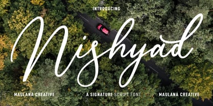 Nisyhad is an unique signature script font. With regular contrast stroke, fun character with a bit of ligatures and alternates. To give you an extra creative work. Nisyhad font support multilingual more than 100+ language. This font is good for logo design, Social media, Movie Titles, Books Titles, a short text even a long text letter and good for your secondary text font with sans or serif. Make a stunning work with Nisyhad font. Cheers, MaulanaCreative
 - Destinys by Maulana Creative,
$14.00 Destinys Script and Sans Font Duo is a modern script and display sans font. With regular marker stroke and bold sans stroke, fun character with some of ligatures. To give you an extra creative work. Destinys Script and Sans font support multilingual more than 100+ language. This font is good for logo design, Social media, Movie Titles, Books Titles, a short text even a long text. Make a stunning work with Destinys Script and Sans font. Cheers, MaulanaCreative
 - Crisp Cracks by Maulana Creative,
$11.00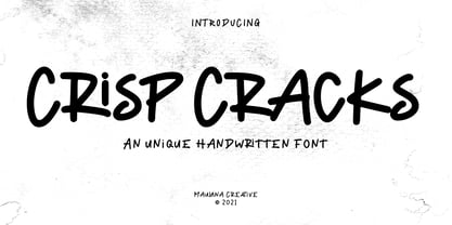 "Crisp Cracks" is a casual Handwritten font. With regular stroke, fun character with a bit of ligatures, lowercase alternates and swashes. To give you an extra creative work. "Crisp Cracks" font support multilingual more than 100+ language. This font is good for logo design, Social media, Movie Titles, Books Titles, a short text even a long text letter and good for your secondary text font with sans or serif. Make a stunning work with "Crisp Cracks" font. Cheers, MaulanaCreative
 - Oblonga by Eurotypo,
$28.00 Oblonga shows thin, elegant lines. The continuity of the trace is only suggested through the curves of the letters, a soft effect of bonding that maintains the identity of each character. Oblonga is an Art-Déco font proposed in a modern key, a revival performed without aggression. More than three hundred glyphs (regular and Italic) that ensure legibility in Central-European and Slavic languages, enriched by some appropriate discretionary ligatures that enhance the charme of a time gone away.
 - Argot by K-Type,
$20.00 Argot is inspired by condensed grotesque letterforms and would be a monolinear sans except for an unorthodox disparity between inner and outer shapes. Elegantly curved outlines contrast starkly with austere rectangular counters, suggesting a no-frills functionality, 20th century modernism, or an unsettling discordance. The squared off inner spaces also add clarity and crispness. Argot is available in three widths — Wide, Normal and Narrow. Each width is supplied in three weights — Regular, Bold and Black — with corresponding italics (obliques).
 - Hitshot Signature by Maulana Creative,
$12.00 Hitshot is an expressive signature brush script font. With regular brush stroke, slanted and fun character with some of ligatures and lowercase alternates. To give you an extra creative work. Hitshot font support multilingual more than 100+ language. This font is good for logo design, Social media, Movie Titles, Books Titles, a short text even a long text letter and good for your secondary text font with sans or serif. Make a stunning work with Hitshot font. Cheers, MaulanaCreative
 - MC Rasteira by Maulana Creative,
$16.00 Rasteira is an elegant classical display serif font. Regular contrast stroke, fun character with a bit of ligatures and alternates. To give you an extra creative work. Rasteira font support multilingual more than 100+ language. This font is good for logo design, Social media, Movie Titles, Books Titles, a short text even a long text letter and good for your secondary text font with script or serif. Make a stunning work with Rasteira font. Cheers, Maulana Creative
 - Drawlers by Letterhend,
$14.00 Drawlers is a organic sans with stencil versionthat effortlessly infuses your designs with a touch casual and a dash of classic. Its unique type- maekt it perfect choice for any projects especially in logo, and the other various formal forms such as invitations, labels, logos, magazines, books, greeting / wedding cards, packaging, fashion, make up, stationery, novels, labels or any type of advertising purpose. Features : Regular & Stencil Version Uppercase & lowercase Numbers and punctuation Alternates & Ligatures Multilingual PUA encoded
 - Humanism by Prominent and Affluent,
$30.00 Inspired by the urban typography, which later led to a grotesque style. It can be used for bold editorial statements graphic heavy prints or just as a simple logo. This new type will definitely make your designs stand out and unique. Its robust, strong and contemporary form makes it perfect for any project that needs the extra strength. Humanism is available from A to Z in the regular and italic style, developed in an urban style.
 - Maryam by Outras Fontes,
$24.00 Maryam is an Outras Fontes type family designed by Ricardo Esteves Gomes. With moderate contrast, these fonts have elegant and very legible forms even in small x-height sizes. There are more then 70 ligatures in each font, providing a lot of letterform variations that make this type family looks like a real handwriting on a page. It is currently available in two versions (Regular and Alternate) that you can combine with each other as you wish.
 - Apothecary by Pixel Colours,
$26.00 Apothecary is a modern stylish font duo that includes a sweet flowing script font and a typewriter font made from an authentic typewriting. Combine both fonts to create beautiful logos and branding. Design professional apothecary and botanical labels and packaging or make elegant wedding invitations. Includes: Apothecary regular: a script flowy monoline font Apothecary typewriter: an antique typewriter font perfect for small texts, taglines or info Lowercase and uppercase characters Numerals, alternates and ligatures. Language support
 - Lalalo by Cuda Wianki,
$25.00 Lalalo is a casual, modern sans-serif font family based on hand-lettering. It's oval letter shapes provide soft and friendly appearance. Lalalo font is very legible with a warm touch perfectly suited for children books. Lalalo family consists of 6 weights ( Extra Light, Light, Regular, Semibold, Bold, ExtraBold). You can use it with normal fill or outlined. You can mix various colors and stroke widths to gain interesting results. There is also a set of nice frames available.
 - Open Range by FontMesa,
$20.00 Open Range is a new font design based on an old classics sans serif font from the 1800s. Some may say that this font looks like a western version of the more modern Benguiat but samples of lettering from the 1800s show a similar design to Benguiat and may have been the inspiration for that font.
 - Kidela Sketch by insigne,
$21.99 Kidela Sketch is an energetic and eccentric serif typeface rendered in a sketchy style. The typeface includes 64 auto-replacing discretionary ligatures to extend the natural sketched look, oldstyle figures and small caps. Please see the sample brochure to see these features in action. Kidela Sketch is an excellent choice when you need a fun and interesting serif.
 - Meatball by Parkinson,
$25.00 Meatball is a fat and happy display font based on some lettering on a mid-20th century poster for the movie Bringing Up Baby. The lettering for the names of the stars, AudryHepburn, Cary Grant and Charles Ruggles, was the basis for Meatball. The sample was all caps and as it evolved, a lower case started to appear, etc.
 - Teeshirt by Typodermic,
$11.95 Hey there, so you want to look like a walking throwback to the 1980s? Well, lucky for you, Teeshirt is here to help you achieve that coveted slovenly appearance. If you’re looking for a typeface that screams, “I don’t care” then Teeshirt is your new best friend. It’s designed to mimic vintage t-shirt lettering, so you can rock that “I just rolled out of bed and put on the first thing I found on my floor” look. And if you’re worried about being too uniform with your letters, fear not! Teeshirt has got you covered with letter pair ligatures. Because who wants to look like they put any effort into their appearance, right? And if you’re feeling adventurous and want to shake things up a bit, you can always disable the “standard ligatures” feature in your application. Teeshirt comes in two styles: Regular and Pressed. The bouncy Regular style will make it look like your letters are ready to jump right off your shirt, while the orderly Pressed style will give you that crisp, just-ironed look (although let’s be real, who has time for ironing?). So what are you waiting for? Embrace your inner sloth and give Teeshirt a try. Because who needs effort and a polished appearance when you can look like a hot mess instead? Most Latin-based European writing systems are supported, including the following languages. Afaan Oromo, Afar, Afrikaans, Albanian, Alsatian, Aromanian, Aymara, Bashkir (Latin), Basque, Belarusian (Latin), Bemba, Bikol, Bosnian, Breton, Cape Verdean, Creole, Catalan, Cebuano, Chamorro, Chavacano, Chichewa, Crimean Tatar (Latin), Croatian, Czech, Danish, Dawan, Dholuo, Dutch, English, Estonian, Faroese, Fijian, Filipino, Finnish, French, Frisian, Friulian, Gagauz (Latin), Galician, Ganda, Genoese, German, Greenlandic, Guadeloupean Creole, Haitian Creole, Hawaiian, Hiligaynon, Hungarian, Icelandic, Ilocano, Indonesian, Irish, Italian, Jamaican, Kaqchikel, Karakalpak (Latin), Kashubian, Kikongo, Kinyarwanda, Kirundi, Kurdish (Latin), Latvian, Lithuanian, Lombard, Low Saxon, Luxembourgish, Maasai, Makhuwa, Malay, Maltese, Māori, Moldovan, Montenegrin, Ndebele, Neapolitan, Norwegian, Novial, Occitan, Ossetian (Latin), Papiamento, Piedmontese, Polish, Portuguese, Quechua, Rarotongan, Romanian, Romansh, Sami, Sango, Saramaccan, Sardinian, Scottish Gaelic, Serbian (Latin), Shona, Sicilian, Silesian, Slovak, Slovenian, Somali, Sorbian, Sotho, Spanish, Swahili, Swazi, Swedish, Tagalog, Tahitian, Tetum, Tongan, Tshiluba, Tsonga, Tswana, Tumbuka, Turkish, Turkmen (Latin), Tuvaluan, Uzbek (Latin), Venetian, Vepsian, Võro, Walloon, Waray-Waray, Wayuu, Welsh, Wolof, Xhosa, Yapese, Zapotec Zulu and Zuni.
 - Katarine by Suitcase Type Foundry,
$75.00From today's point of view Katarine has a rather unusual origin. Initially an all-caps display face, what was to become the Medium weight of the family was augmented with a lower case, then the character set was completed by adding all the missing glyphs. The next step was the creation of the Light and the Bold weights with matching Italics. This working method compromised the relationships between the characters across the different weights After some consideration the decision was made to start over and draw the complete family from scratch. This time the "conventional" process was followed — first the Light and Bold weights were designed. Those extremes were used to interpolate the Regular, Medium and Semibold weights. When compared to the original, the glyphs of the new fonts are slightly wider. The construction of the letters is sturdy, with an x-height that varies from the heaviest to the lightest weights. The relationship of the stem weight between the horizontal and vertical strokes is carefully balanced. Characters are open and firm; the italics have room to breathe. The original fonts included two sets of small caps — Small Caps and Petite Caps. However neither set were suited for emphasis, with the Small Caps being too tall and the Petite Caps too short. We decided to replace them both with one set of traditional small caps, slightly taller than the x-height, perfectly suited for emphasis in text usage. The original version of Katarine was partly incorporated into the new OpenType versions. Thus most of the original arrows, frames and boxes can be found in the new Katarine. Each individual weight now contains 830 glyphs, nine sets of numerals, small caps, numerous ligatures and fractions. An additional font named Numbers contains numerals in circles and squares, and is now augmented with accented caps and a number of terminal alternatives, which can easily be accessed through stylistic sets. We also added two extra variants, Experts Regular and Experts Black (in inverted form). Katarine Std preserves the solid construction and excellent legibility of the original family, but has now become a fully featured OpenType typeface. Katarine is suited for a broad range of applications, from simple layouts to intricate corporate systems. It is the typeface of choice where the cold, austere character of modern sans serifs are inappropriate, yet simple shapes and good legibility are required. - Bodoni Ornamental by FontMesa,
$30.00 New for 2020 Bodoni Ornamental now has two italics to choose from, one basic italic and a second which is more of a true italic with a few uppercase letters that have been stylized. Only one italic can be style linked to the regular upright version so in the second italic we've added Avanti to the name which means forward in Italian. When purchasing the regular upright and Avanti italic together they will install as two separate families. Bodoni Ornamental is a revival of a very old typeface based on the Poster Bodoni letter shape. Giambattista Bodoni passed away in 1813, this decorative version was created in the 1820’s or 1830’s which was the time period when many of these ultra bold decorated type faces began to appear, the original artist is currently unknown. The original version of this ornate classic was only available as a set of uppercase letters, today over one hundred eighty years later this font is now complete with a new lowercase, numbers and accented characters for Eastern, Central and Western European countries. Due to the ornate detail in Bodoni Ornamental when printing itís recommended to use a laser printer 600dpi or greater, a 1200dpi printer will give you the best results rendering the most detail at the smallest possible point size for this font. Small home user Ink Jet printers are not recommended for Bodoni Ornamental unless you set the font to a very large point size. With Ink Jet printers much of the detail in the letters will bleed together as the ink hits the page, commercial Ink Jet printers such as GiclÈe printers may give good results. When using Bodoni Ornamental for digital images including web site graphics it may help to add a one pixel stroke fill around the letters setting color to white or grey, this may help the web site images display better on some computer's. You will need a photo editing application such as Adobe Photoshop to create your image adding the stroke fill and save as a jpg , png or gif file. I hope you enjoy this old font as much as I did making it. Note: When previewing the Bodoni Ornamental font in the Windows font preview you may notice some letters appearing lighter and some darker, this is a problem with the preview window and some ornate fonts, Bodoni Ornamental will print normal and not with mixed light and dark letters.
 - Ghibli by Eyad Al-Samman,
$- The word ‘Ghibli’ per se refers to a Saharan hot and dry wind commonly known as the Sirocco. In Arabic language, ‘Ghibli’ is known as ‘Qibli or Kibli’, meaning ‘Southern’ for those Arabic nations who live in the North of Africa. The ‘Ghibli’ wind is most common during spring and autumn, and can blow at almost 60mph; it is this wind which is responsible for the dry, dusty conditions on the Mediterranean coast of North Africa. ‘Ghibli’ can last for days making life miserable and is therefore feared by the desert dwellers in that region. It can also have profound effect on the landscape by moving vast quantities of sand and dunes. Inspired by the Studio Ghibli’s unique and magical characters, the ‘Ghibli’ typeface is designed as a Latin free and literary serif typeface. It strongly expresses transition, imagination, sharpness, characterization, and modernization. It is a literary type that can capture the eyesight of readers and other observers with its acute and stylistic letterforms, dots, and numerals. It has transitional serifs and it is generally based upon the Latin printing style of the 18th and 19th centuries, with a pronounced vertical contrast in stroke emphasis (i.e., vertical strokes being heavier than the horizontal strokes). It has more regular forms in which serifs are bracketed and more symmetrical. The main characteristic of ‘Ghibli’ typeface is in its new designed serif letters. Special letters that can be described as having modern designs include small ‘g’, ‘p’ (with their open ends), ‘x’, and capital ‘B’, ‘P’, ‘Q’, and ‘R’ (with their open ends). ‘Ghibli’ typeface has also both of lining and old-style numerals which makes it more suitable for any literary and printing purposes. This gratuitous font comes in only two weights (i.e., Ghibli Regular and Ghibli Bold). It is absolutely preferable to be used in the wide fields related to literature and publication industry. This includes typing titles of diverse literary and academic books, readable texts of novels, novellas, short stories, prose, poetry, textbooks, newspapers, and magazines. It is also notable if chosen for designs that include movies’ titles, logos of academic institutions such as colleges and universities, organizations and associations’ names, medical packages such as those dedicated for tablets and syrups, and also other different educational and social materials. ‘Ghibli’ is simply a free literary typeface dedicated for all who want to write and read using a modern and stylish serif font. Enjoy it.
 - Greenhorn by Juraj Chrastina,
$29.00 Greenhorn is a hand-traced comic type for headlines. Funky, irregular and smiling. The first inspiration comes from the unique lettering of a classic czech cartoonist.
 - Agrafie by Linotype,
$29.99This typeface was developed by Roland John Goulsbra in 1995. Almost like the printing of a child, the irregular forms of Agrafie make a unique impression. - Roundel by K-Type,
$20.00 Roundel is a paradoxical, modern heraldic typeface. It is a display face of simple, angular and curved shapes, with each main glyph contained within a circle.
 - Cumbre by Antipixel,
$22.00 Cumbre is a slanted display type with unorthodox anatomy, a dynamic rhythmic structure, movement expression, and intense visual language. An eccentric rebel with ribbon-like moves, a balanced extrovert that makes meticulous use of ink traps. Both the name and design got inspiration from mountain peaks. "Cumbre" in Spanish means summit, and that's the motive for the spiked design and the angular serrated structure. Cumbre is built by balancing sharp angles and venturous curves. The stems are spiky, and they vary in width. Cumbre is slanted and unicase. It has condensed proportions, moderate weight contrast, spacious counters, pointy terminals, and square ink traps. Cumbre is meant for large display settings to make the most out of the precise outlines and the clean intersections. The font styles: 'Sharp' has straight paths and precise intersections. 'Round' has the same outlines but with round corners. 'Stamp' has irregular wavy contours and heavy swelling at intersections.
 - Foobar Pro - 100% free

- Turnkey by wearecolt,
$19.00 Turnkey is a modern grotesque typeface, it could be described as a neo-grotesque with hints of geometric shapes. A workhorse typeface designed to be versatile for both small and large sizes, ink traps have been used as a design feature above 26pt and a technical feature when printing small body text. The combination of 36 weights and styles allows you the freedom to create. Each weight includes extended support for over 90 languages (Including Cyrillic), fractions, tabular figures, arrows, ligatures, alternate glyphs, and more. Demo licenses are available from colttypeco.com In addition to a standard style set, the Turnkey family also has an italic set plus soft versions of both. Turnkey Soft is a slightly rounded version of the standard and italic, which looks more friendly, warm, and soft. It's corporate but with a personality. Current instances are: Turnkey Standard - Thin, Thin Italic, Extra Light, Extra Light Italic, Light, Light Italic, Regular, Regular Italic, Medium, Medium Italic, SemiBold, SemiBold Italic, Bold, Bold Italic, Extra Bold, Extra Bold Italic, Heavy, Heavy Italic. Turnkey Soft - Thin, Thin Italic, Extra Light, Extra Light Italic, Light, Light Italic, Regular, Regular Italic, Medium, Medium Italic, SemiBold, SemiBold Italic, Bold, Bold Italic, Extra Bold, Extra Bold Italic, Heavy, Heavy Italic When used as body type, Turnkey pairs well with: Take Note, Stroom and Markout. Turnkey is perfect for; headings, titles, body copy, logos, magazines, editorial design, corporate branding, brand identity, websites, blogs, apps, games, ebooks, publications, and signage. Turnkey can be found in the Typodarium 2024 OpenType features: Access All Alternates, Glyph Composition / Decomposition, Discretionary Ligatures, Denominators, Fractions, Kerning, Standard Ligatures, Localized Forms, Mark Positioning, Mark to Mark Positioning, Numerators, Proportional Figures, Scientific Inferiors, Stylistic Set 1, Stylistic Set 2, Stylistic Set 3, Subscript, Superscript, Tabular Figures. Support for 95 languages: Belarusian, Russian, Ukrainian, Afrikaans, Albanian, Asu, Basque, Bemba, Bena, Breton, Catalan, Chiga, Colognian, Cornish, Croatian, Czech, Danish, Dutch, Embu, English, Esperanto, Estonian, Faroese, Filipino, Finnish, French, Friulian, Galician, Ganda, German, Gusii, Hungarian, Inari Sami, Indonesian, Irish, Italian, Jola-Fonyi, Kabuverdianu, Kalenjin, Kamba, Kikuyu, Kinyarwanda, Latvian, Lithuanian, Lower Sorbian, Luo, Luxembourgish, Luyia, Machame, Makhuwa-Meetto, Makonde, Malagasy, Maltese, Manx, Meru, Morisyen, North Ndebele, Norwegian Bokmål, Norwegian Nynorsk, Nyankole, Oromo, Polish, Portuguese, Quechua, Romanian, Romansh, Rombo, Rundi, Rwa, Samburu, Sango, Sangu, Scottish Gaelic, Sena, Serbian, Shambala, Shona, Slovak, Soga, Somali, Spanish, Swahili, Swedish, Swiss German, Taita, Teso, Turkish, Upper Sorbian, Uzbek (Latin), Volapük, Vunjo, Walser, Welsh, Western Frisian, Zulu
 - Migae by Jolicia Type,
$25.00 Migae is a versatile and elegant display font designed to captivate and engage audiences across a wide range of design applications. With 14 distinct weight variants spanning from delicate Light to commanding Black, and complemented by a refined set of italics, Migae offers a harmonious balance of strength and elegance to fulfill your typographic needs. Key Features: 1. 14 Weight Variants: Migae's extensive weight range, including Light, Regular, Medium, Semi-Bold, Bold, Extra Bold, and Black variants, allows you to choose the perfect weight for your design, whether it's a subtle headline or a bold statement. 2. Italics: In addition to its standard upright styles, Migae boasts a comprehensive set of italics that adds versatility to your typography, conveying an air of sophistication and style. 3. Strong to Elegant Styles: Migae's design philosophy seamlessly combines strength and elegance. Its strong weights provide a bold and impactful presence, while the lighter weights exude an effortless elegance, making it suitable for a wide array of creative projects. 4. Modern Aesthetic: Migae's clean, contemporary lines and carefully crafted details make it an ideal choice for modern graphic and web design, editorial layouts, branding, and advertising. 5. Legibility: Migae prioritizes legibility across all weights and styles, ensuring that your messages are communicated effectively, regardless of the chosen variant. 6. Versatile Applications: From branding and packaging to posters, editorial design, and web headings, Migae adapts to various design contexts, making it a versatile choice for graphic designers, typographers, and creative professionals. Design Inspiration: Migae draws inspiration from the harmony of nature, where strength and elegance coexist. Its name, derived from the Korean word "미래" (miraee), meaning "future," reflects its forward-thinking design approach that is equally rooted in tradition and innovation. Ideal Usage: Migae is an ideal choice for those seeking a display font that can effortlessly transition between bold and delicate, exuding confidence and refinement in every style. It's perfect for branding, packaging, advertising, editorial layouts, and any design project where typography plays a pivotal role. Migae is more than just a font; it's a design companion that empowers creatives to achieve a perfect balance between strength and elegance in their visual communications. Explore the world of Migae and let your design projects shine with its captivating charm and versatility.
 - Hand Stamp Play Rough Serif by TypoGraphicDesign,
$25.00 “Hand Stamp Play Rough Serif” is a rough and dirty serif Font with authentic & real stamp look. Original Hand Stamped. A–Z, a–z, and 0–9 are each 3× different forms (every letter/glyph has two additional alternate characters) and is intended to show the hand-made nature and the vibrancy of the display font. The different pressure (velocity) of the stamp on paper creates a liveliness in the typeface. Ligatures like ae, oe, AE, OE, ff, fl, fi, fj, ffl, ffj, ffi, and additional logotypes like and, the, by, tel fax, web, www … and a Versal Eszett (Capital Letter Double S) give the Font more life and shows that despite their retro-looks works with modern OpenType technology (from ❤ love is, from luck will ✤ … ). Replacing the glyphs “E” instead of “3” to convey that typeface invites you to play. It is the desire to experiment and promote uninhibited experimentation. A variety of alternative letters and a few glyphs follow her own head @, &, ₤, £, “,”, * … The typeface has its quirks and downright human characteristics to “just love.” Have fun with this font – Just Stamp It. Application Area The serif font works best for headline size. Logo, Poster, Editorial Design (Magazine or Fanzine) or Webdesign (Headline Webfont for your website), Webbanner, party flyer, movie poster, music poster, music covers … How To Use – awesome magic OpenType-Features in your layout application ■ In Adobe Photoshop and Adobe InDesign, font feature controls are within the Character panel sub-menu → OpenType → Discretionary Ligatures … Checked features are applied/on. Unchecked features are off. ■ In Adobe Illustrator, font feature controls are within the OpenType panel. Icons at the bottom of the panel are button controls. Darker ‘pressed’ buttons are applied/on. ■ Additionally in Adobe InDesign and Adobe Illustrator, alternate glyphs can manually be inserted into a text frame by using the glyphs panel. The panel can be opened by selecting Window from the menu bar → Type → Glyphs. Or use sign-overview of your operating system. ■ For a overview of OpenType-Feature compatibility for common applications, follow the myfonts-help http://www.myfonts.com/help/#looks-different ■ It may process a little bit slowly in some applications, because the font has a lot of lovely rough details (anchor points). Technical Specifications ■ Font Name: Hand Stamp Play Rough Serif ■ Font Weights: Regular, Bold ■ Fonts Category: Display for Headline Size ■ Desktop-Font: OTF (OpenType Font for Mac + Win) + TTF (TrueType Font) ■ Web-Font: SVG + EOT + TTF + WOF ■ Font License: Desktop license, Web license, App license, eBook license, Server license ■ Glyph coverage: 617 ■ Language Support: Albanian, Alsatian, Aragonese, Arapaho, Aromanian, Arrernte, Asturian, Aymara, Basque, Bislama, Bosnian, Breton, Cebuano, Chamorro, Cheyenne, Chichewa (Nyanja), Cimbrian, Corsican, Croatian, Czech, Danish, Dutch, English, Estonian, Faroese, Fijian, Finnish, French, French Creole (Saint Lucia), Frisian, Friulian, Galician, Genoese, German, Gilbertese (Kiribati), Greenlandic, Guarani, Haitian Creole, Hawaiian, Hiligaynon, Hmong, Hopi, Hungarian, Ibanag, Iloko (Ilokano), Indonesian, Interglossa (Glosa), Interlingua, Irish (Gaelic), Islandic, Istro-Romanian, Italian, Jèrriais, Kashubian, Kurdish (Kurmanji), Ladin, Latvian, Lithuanian, Lojban, Lombard, Low Saxon, Luxembourgian, Malagasy, Maltese, Manx, Maori, Megleno-Romanian, Mohawk, Nahuatl, Norfolk/Pitcairnese, Northern Sotho (Pedi), Norwegian, Occitan, Oromo, Pangasinan, Papiamento, Piedmontese, Polish, Portuguese, Potawatomi, Rhaeto-Romance, Romanian, Romansh (Rumantsch), Rotokas, Sami (Inari), Sami (Lule), Samoan, Sardinian (Sardu), Scots (Gaelic), Seychellois Creole (Seselwa), Shona, Sicilian, Slovak, Slovenian (Slovene), Somali, Southern Ndebele, Southern Sotho (Sesotho), Spanish, Swahili, Swati/Swazi, Swedish, Tagalog (Filipino/Pilipino), Tahitian, Tausug, Tetum (Tetun), Tok Pisin, Tongan (Faka-Tonga), Tswana, Turkish, Turkmen, Turkmen (Latinized), Tuvaluan, Uyghur (Latinized), Veps, Volapük, Votic (Latinized), Walloon, Warlpiri, Welsh, Xhosa, Yapese, Zulu ■ Specials: Alternative letters, Versal Eszett (German Capital Sharp S), symbols, dingbats, digits, accents & €, incl. OpenType-Features like Access All Alternates (aalt), Contextual Alternates (calt), Glyph Composition/Decomposition (ccmp), Discretionary Ligatures (dlig) Denominators (dnom), Fractions (frac), Kerning (kern), Standard Ligatures (liga), Numerators (numr), Ordinals (ordn), Stylistic Alternates (salt), Stylistic Set 01 (ss01), Stylistic Set 02 (ss02), Stylistic Set 03 (ss03), Superscript (sups), Slashed Zero (zero) ■ Design Date: 2014 ■ Type Designer: Manuel Viergutz
 - Haunted House by HiH,
$8.00 Halloween lends itself to graphic images: witches, ghosts, bats, jack-o'lanterns and haunted houses. When we think of a haunted house, we generally think of a large, abandoned, derelict Victorian wood-frame house. The style is usually Second Empire or Queen Anne. There tends to be a lot of decoration. There is usually a porch or two with decorative spindle work. There is probably a tower, either square with a mansard roof such as one might see in Paris or round with a conical roof borrowed from a Loire Valley chateau. These houses were generally built in the United States between 1860 and 1900, products of the exuberance of a time before income tax. It took at least three servants to maintain such a house and was very expensive. Few can afford them today. That is why so many were converted to professional offices, multi-family dwellings or simply abandoned. HAUNTED HOUSE is our typographical contribution to Halloween. Based on our font PETRARKA ML, it features decorative capitol letters that utilize the silhouette of a Second Empire style house complete with a dead tree and a full moon. The font includes 8 ornaments suitable for flyers and party invitations. Revision 2.000 eliminates dual encoding, harmonizes metrics, adds new glyphs, and adds open type features. The zip package includes two versions of the font at no extra charge. There is an OTF version which is in Open PS (Post Script Type 1) format and a TTF version which is in Open TT (True Type)format. Use whichever works best for your applications.
 - Gallicide by MuSan,
$12.00 Gallicide is a Handmade Modern Vintage Textured Display Typefaces. This fonts is combining the style of modern handwritten style and classic vintage looks. It comes with 3 Styles (Rough, Reglar and Outline). This font will look good on any retro design like poster, t-shirt, label, logo etc.
 - Gutenberg B by Alter Littera,
$25.00 A clean, smooth rendition of the magnificent B42-type used by Johann Gutenberg in his famous 42-line Bible. In addition to the usual standard characters for typesetting modern texts, the font includes a comprehensive set of special characters, alternates and ligatures, plus Opentype features, that can be used for typesetting (almost) exactly as in Gutenberg’s Bible and later incunabula. Also available as The Oldtype “Gutenberg C” Font in a slightly roughened style simulating irregularities and ink spreads associated with old metal types, papers and parchments. The main historical sources used during the font design process were high-resolution scans from several printings of Gutenberg’s Bible. Other sources were as follows: Kapr, A. (1996), Johann Gutenberg - The Man and his Invention, Aldershot: Scolar Press (ch. 7); De Hamel, C. (2001), The Book - A History of The Bible, London: Phaidon Press (ch. 8); Füssel, S. (2005), Gutenberg and the impact of printing, Burlington: Ashgate (ch. 1); and Man, J. (2009), The Gutenberg Revolution, London: Bantam (ch. 7). Specimen, detailed character map, OpenType features, and font samples available at Alter Littera’s The Oldtype “Gutenberg B” Font Page.
 - Port by Onrepeat,
$25.00 Detailed guided tour available here. Port is an experimental Didone typeface with a modern twist, inspired in the well known forms of typography masters such as Bodoni and Didot and the exuberance and elegance of calligraphy typefaces. Port melds the straight lines and strong contrasts of the Didone typefaces with the elegant lines of calligraphy in a geometric way, resulting in exuberant characters with geometric swashes that can be combined in countless ways. The result of this experiment is Port, an unique and rich display typeface meant to be used on big sizes and it’s main perk is the amount of alternative characters it features. Port is Open-Type programmed and includes hundreds of alternates, from swashes to titling alternates, ligatures and stylistic sets with each character having a thin version of itself, giving complete freedom to all your creative needs. Port is available in several flavours: Port Regular, being the base version and featuring the whole base character set; Port Regular Decorated, featuring richer forms and containing more ornamentated and more extravagant characters; Port Medium and Port Medium Regular, designed for the occasions you need a bit more thickness and the decoration variants: Port Ornaments, containing a wide set of elements meant for the creation of fillets, vignettes and fleurons, resulting in an almost infinite number of possible combinations to embellish your designs and Port Words, a set of some of the most common words used in English, Spanish, French, German, Italian and Portuguese. It’s strongly recommended that you use it on big sizes, for better performance you can also set the Photoshop text anti aliasing settings to Strong when you type, for a better understanding of all the uses of Port and the full character list I recommend the reading of the manual.
 - Velour by SilkType,
$35.00 Velour is an elegant display typeface, with thin, bracketed serifs. The typeface’s main features are the curved crossbar on ‘A’ and ‘H’, the long, sophisticated legs of ‘K’ and ‘R’ including an alternative ‘k’ automatically substituted in appropriate places, providing a consistent flow of text and a romantic feel. The typeface comes with a beautiful set of both standard and old-style numerals, two different ampersands and alternates with less complicated letterforms. Velour is available in 6 weights, from Thin to Bold, and supports Western, Central and South Eastern European languages.
 - Carot Slab by Storm Type Foundry,
$39.00 Words in a blurry world want to be more firmly anchored in the line - this is the task of the Slab-serif, characterized by solid heels. They can be used in extreme sizes – under 6 points – as well as on huge tarpaulins covering trucks, boats and house facades. Carot serves its robust clarity. The eye takes a while to become accustomed to various character simplifications, but then comes a refreshing reading perception, familiar texts get actual sound. The whole Carot system of 64 members offers a modern alternative for all types of design work.
 - Chiripa by Huy!Fonts,
$25.00 Chiripa is a casual, handcrafted, display font that gets a semi-random effect rotating between three different sets of characters (with Contextual Alternates on). Chiripa means luck in Spanish, but if you do not trust in your Chiripa you can turn Contextual Alternates off and change the glyphs switching between sets in the OpenType menu of your application or in the Glyphs list. Chiripa is perfect for children's books, fresh advertising, food packaging and any use in large sizes.
 - Klang MT by Monotype,
$29.99Will Carter, well known in connection with his private press in Cambridge, has combined the skills of a calligrapher with a practical knowledge of printing. His mastery of pen-drawn letterforms was put to practical use in the design of Klang. Klang is a slightly inclined and calligraphically shaped sans serif with short ascenders and descenders. The Klang font is useful for informal applications, such as invitations, greetings cards and posters, but can also be used in advertising. - Rocking the Kasbah NF by Nick's Fonts,
$10.00This lively script is based on a handlettered offering from The Hunt Brothers, which they called simply "Ornamental Italic". Ornamental, yes, but there’s also a lot of action and attitude in this typeface. Please note that, due to the extreme slant of the characters, spacing in the font has been optimized for upper- and lowercase use. Both versions of this font contain complete Unicode 1252 (Latin) and Unicode 1250 (Central European) character sets, with localization for Romanian and Moldovan. - Ignazio by Figuree Studio,
$18.00 Ignazio is a powerfull sans serif font family with modern touches. A balance of hard lines and smooth curve makes them able to stand on their own dynamically Ignazio includes all-caps fonts Features - Support for MAC or PC - Simple installation for Adobe Illustrator, Corel Draw, Photoshop, or Procreate (New Updated) - Support Multi-language Ignazio works great in any branding, logos, magazines, films. The different styles give you a full range to explore a whole host of applications.
 - Loven Latte by IKIIKOWRK,
$17.00 Introducing Loven Latte - Handwriting Type created by ikiiko. Loven Latte is a handwriting font style with unique line and a natural feel. This typeface is perfect for an wedding invitiation, magazine layout, love letter, beauty product, packaging product, food & beverages, quotes, or simply as a stylish text overlay to any background image. What's included? Uppercase & Lowercase Number & Punctuation Stylistic Multilingual Support Enjoy our font and if you have any questions, you can contact us by email : ikiikowrk@gmail.com
