10,000 search results
(0.036 seconds)
- Medieval Leaves by Kaer,
$19.00 Once I found a pretty H letter initial on an ancient book. The letter was illuminated by beautiful engraved leaves. Based on it, I designed A-Z and 0-9 sets and assembled Medieval Leaves font. Medieval Leaves font family has Regular and Colored styles. It's all you need to precisely imitate medieval style text. Use this font as a decorative element at the beginning of a paragraph or section, other part of the paragraph should be in regular black letter font. You’ll get Drop Caps & Numbers set. --- *You can use color fonts in PS CC 2017+, AI CC 2018+, ID CC 2019+, macOS 10.14 Mojave+ * *Please note that the Canva & Corel doesn't support color fonts!* *Please download this test file with only A letter ( https://www.dropbox.com/s/03e7i78j4bz4mnm/MedievalLeaves-Test.otf?dl=0 ) to check your app & system.* --- Please feel free to request any help you need: kaer.pro@gmail.com Best, Roman.
 - Beloved Karins by Say Studio,
$15.00 About The Product Lemonade Fresh font is a Display Serif Typeface with a unique circular shape inspired by the alternate shapes in most serif fonts, but Lemonade Fresh makes it a regular shape, and Lemonade Fresh still has 50+ other alternate that you can combine to get curves and beautiful shapes easily just in seconds. It is a display font with moderate contrast that perfect for branding projects, logo, wedding designs, social media posts, advertisements, product packaging, product designs, label, photography, watermark, invitation, stationery, and any projects, it makes with a high level of legibility. What's Included: - Fresh Lemonade Regular - Fresh Lemonade Italic - Accented Characters (West Europe) - Ligature & Huge Stylistic alternate - Works on PC & Mac - Recommended using Adobe Illustrator or Adobe Photoshop. Wish you enjoy our font and if you have any questions, don't hesitate to drop message & I'm happy to help :) Thanks, Have a wonderful Day, Say Studio
 - HWT Geometric by Hamilton Wood Type Collection,
$24.94 This late 19th century design conjures up early 20th century Dutch DeStijl lettering with a mostly strict adherence to right angles and minimal stroke modulation. Geometric began its life as a metal typeface from the Central Type Foundry, circa 1884. Soon after, this design was officially licensed to Morgans & Wilcox and was shown in their 1890 catalog in Regular, Light and Condensed Light variations. After acquiring Morgans & Wilcox, Hamilton Manufacturing offered Geometric Light Face Condensed as their own No 3020 and the Geometric Light Face as No 3021. HWT Geometric has been expanded digitally to include a Regular Condensed version. A heavier wood type specimen was found from an unknown manufacturer and digitized as it was found, resulting in the HWT Geometric Shopworn and Shopworn Inked variations. These digital versions all include a full Western and Central European character set of over 380 glyphs.
 - Gadimon by Kotak Kuning Studio,
$12.00 Introducing Gadimon Layered Bold Script. This font is used with layers method, so it can generate interesting fonts to see, you no longer need to worry about how to make effects on the text. Use the Gadimon Basic style for purposes without shadow effect and when spacing is important for a project. Gadimon is suitable to use as a logotype, product designs, labels, watermark, social media posts, apparel, invitations, signboards, sports club, motor/car, special events or anything that need handwriting taste. What you get: - Gadimon includes capital and lowercase letters, Alternates, and Ligatures - Numbers + punctuation - Foreign language support I highly recommend using a program that supports OpenType features and Glyphs panels such as Adobe Illustrator, Adobe Photoshop CC, Adobe InDesign, or CorelDraw, so you can see and access all Glyph variations. This font is encoded with Unicode PUA, which allows full access to all additional characters without having special design software. Mac users can use Font Book, and Windows users can use Character Map to view and copy one of the extra characters to paste into your favorite text editor/application. We hope you enjoy the font, please feel free to comment if you have any thoughts or feedback. Or simply send me a PM or email me at kotakkuningstudio@gmail.com. Thanks for purchasing and have fun!
 - Apollon by Umka Type,
$15.00 Apollon is an angular display font. Made for social media posts and game design purposes.
 - Indoo BT by Bitstream,
$50.99Indoo is a modular geometric design that owes much to the typeface designs of Theo van Doesburg (1883-1931) and the De Stijl principles of abstraction, simplicity, clarity and harmony. That inspiration, combined with the lettering of signage often found in the Indian quarter of Paris, led to the connecting block letter motif of Indoo. The text fonts are joined by a common horizontal stroke positioned at the baseline. There is an accompanying Ornament font for building borders that includes various stylized fleurons and the like. Each font has a drop shadow companion that allows you to build three-dimensional and multi-colored lettering. - Garuspik by Dima Pole,
$27.00 Garuspik is an original ulra condensed, narrow, tall font with 3 styles: display, round and square. It is particularly well suited to create text blocks, advertising slogans, headlines, and other original and interesting text compositions. For convenience and variation the Uppercase are very tall, lowercase are moderately tall. Garuspik looks especially good when set in all uppercase. So, for convenience and simplicity, the smcp feature changes all characters to uppercase only. In addition, another OpenType feature changes the form of some uppercase, if they stand before to lowercase. And of course, there are all the necessary and popular features such as frac, ordn, locl and others.
 - Reservation Wide by TypeTrust,
$30.00Reservation Wide is intended for headlines with its relatively snug letterspacing and extended forms. Its simplicity will accommodate smaller sizes and lower resolution displays. OpenType Stylistic Alternates for characters 'a', 'g' and 't' lend an even simpler finish. The hand-drawn curves and angled stroke endings temper the otherwise rigid proportions of the family. This painterly tendency becomes more apparent in the heavier weights keeping them from looking too imposing. The design first took shape as a custom font named Majestos for the cable channel The Food Network . It can be found in their growing online and printed presence in addition to their broadcast identity for which it was developed. - Royale by Resistenza,
$39.00 With Royale, Resistenza reinvents the bifurcated Tuscan genre in a contemporary, warm and playful form. Royale Basic doesn't include ligatures or alternates. Rounded terminals, fabulous fancy fun spurs with elegant and extravagant flourishing - Royale comes in 8 weights and 4 widths which can also be layered to create polychromatic effects in another nod to the Victorian era these styles were popularised. While inspired by days gone past this Royale is far from a revival as unlike the classic Tuscans which inspired its structure Royale is monoline and sophisticated in its simplicity. Perfect for display and emphasis, Royale will command attention and leave a memorable impression wherever it is used.
 - Floure by Flawlessandco,
$9.00 Introducing "Floure" - a delightful handwritten sans serif font that combines the charm of handwriting with the simplicity of a modern sans serif typeface. With its organic and friendly letterforms, Floure adds a touch of warmth and approachability to your designs. There's some connected letters and some alternates that suitable for any graphic designs such as branding materials, t-shirt, print, business cards, logo, poster, t-shirt, photography, quotes .etc This font support for some multilingual. Also contains uppercase A-Z and lowercase a-z, alternate character, numbers 0-9, and some punctuation. If you need help, just write me! Thanks so much for checking out my shop!
 - Francker by Linotype,
$29.99 Francker is a sans-serif, based on clean and simple design principles that betray its Danish origin. Its curves are based on the “super ellipse”, a mathematical shape about half-way between an ellipse and a rectangle. Francker’s lowercase lettershapes a, b, n, and u, have no spurs, emphasizing the simplicity of their construction. The Francker family is available in two widths, normal and condensed, each in nine weights, from extra light to extra black. Use Francker for signage, posters, magazines, advertisements, or corporate identity projects—wherever an industrial, contemporary look is needed. The Francker type was developed and designed by Anders Francker, an engineer and designer living in Denmark.
 - Flyoika by Ingrimayne Type,
$9.00 Flyoika is a slab serif family with a fairly low x-height, long ascenders, and considerable contrast. The family has five weights, each with an italics and it can be used for either display or text. Flyoika was not designed to meet a particular need but rather out of curiosity. Years ago I had designed two slab serif families, FlyHigh and Euroika, that I recently noticed had a lot of similarities and I wondered what a blend of the two would look like. Several corresponding characters in the two families are considerably different and in cleaning up the results, I usually opted for simplicity. The name "Flyoika" reflects these origins.
 - Factor by John Moore Type Foundry,
$25.00 Factor is a letter that breaks with convention, providing an attractive geometric look. Fits perfectly sober rigor contemporary editorial design, and for the creation of logos, labels or advertising, just fits both vintage designs spirit as the simple graphic humor. Factor comes with a wide variety of alternative shapes for a more versatile use. As display font readability features that allow use as an innovative text font. Usage recommendations: Due to its linear simplicity of construction, handy for creating 3D characters. In terms of its form, is related to mechanization, the industrial and metallurgical. The black form may be combined with the inline to create colorful typographic uses.
 - Mobalys by Alit Design,
$19.00 Introducing Mobalys - Where Elegance Meets Nature Embrace the beauty of nature with Mobalys, a captivating font that seamlessly blends the grace of elegant script with the modern simplicity of sans serif. Immerse your designs in the lush greenery of a go-green theme, accompanied by stunning leaf illustrations that breathe life into your creations. Elegance in Every Curve: Mobalys boasts an exquisite script style that adds a touch of sophistication to your projects. Each curve and swirl is carefully crafted to exude elegance. Modern Simplicity: The sans serif elements bring a contemporary flair, ensuring versatility in usage. Whether it's a sleek logo or a clean headline, Mobalys adapts effortlessly. Nature's Embrace: Dive into a world of greenery with Mobalys. The font is adorned with enchanting leaf illustrations, adding a touch of organic charm to your designs. Let the beauty of nature seamlessly integrate into your projects. Extensive Character Set: With 730 characters at your fingertips, Mobalys provides a diverse range of options to express your creativity. Explore a plethora of possibilities with ligatures, alternates, swashes, and more. PUA Unicode: Unleash your design freedom with Mobalys' Private Use Area (PUA) Unicode support. Access additional characters and symbols for a truly customized touch to your work. Elevate your designs with Mobalys, where the synergy of elegance and nature creates a visual masterpiece. Immerse your audience in the refreshing green world and let your creativity flourish. Mobalys is not just a font; it's an experience.
 - Alverata PanEuropean by TypeTogether,
$119.00 Gerard Unger’s new typeface Alverata is a twenty-first-century type-face inspired by the shapes of Romanesque capitals in inscriptions of the eleventh and twelfth centuries, without being a close imitation of them. It is additionally based on the early twentieth-century model, but tweaked so as to prevent blandness and monotony. Alverata performs beautifully in both screen and on paper, delivering excellent legibility. Its letters are open and friendly in small sizes and lively and attractive in large sizes. They are robust, and show refinement in their detail. Unger’s Alverata is an extensive type family, with versions for both formal and informal applications, and with Greek and Cyrillic relatives. Alverata consists of three different fonts: Alverata, Alverata Irregular and Alverata Informal, that vary in form and width, but maintain the same spirit. The Irregular version is particularly inspired by the Insular letterforms, the uncials, and their constantly changing positioning. Alverata strikes a balance among Europe’s diversity of languages, combining contemporary typographical practices with features of medieval letterforms, from the time when Europe came into being. Visually, some written languages, such as Czech and Maltese, differ quite strongly from languages like English and German, notably because of their many accented characters. While other typefaces will show this difference, Alverata removes it. As a result, Alverata enables harmonious convergence of languages. For the development of the Greek letterforms, Unger collaborated with Gerry Leonidas (University of Reading) and Irene Vlachou (Athens), and with Tom Grace on the Cyrillic letterforms.
 - Mayence by Isaco Type,
$39.00 Mayence is the French name of Mainz, German city where Johannes Gutenberg was born. It's a manuscript font inspired in the author's calligraphy, with an angular structure, marked by a certain impulsiveness. Besides being a continuous-line font, Mayence explores some deviations and imperfections in the calligraphy practice, as accumulations of paint and anomalies in the thickness variation, characteristics which gives it more naturality. Its main difference is the set of over 430 ligatures (Premium version), based on the research and selection of important character sequences, rather frequent in several languages. For this, a study was done about the diphthongs, triphthongs and di-tri-tetra-pentagraphs more common in languages such as English, Spanish, French, German, Italian, Portuguese, Dutch, Hungarian, Croatian, among others. Ligatures with up to 2 characters are enabled by default and with more than 2 characters are enabled by the Discretionary Ligatures option. Mayence also contains several ligatures based on common words in English and Spanish, exclusive ligatures with numbers and another standard, discretionary, historic and Unicode ligatures. It has 9 different ampersands (&), which can be chosen by the user according to the application context. When you enable the Titling Alternates (in OpenType-savvy programs), these 9 ampersand styles are converted to their forms of seal, with different purposes of use. To enrich your graphic applications, Mayence brings the Ornaments Version, for construction of impressive lines, borders, textures and the geometric shapes that you want, according to your creativity! To see the features available in each version, open or download the User Guide pdf, in the Gallery section. All text fonts are available in OpenType PS format and have extended character set to support CE, Baltic, Turkish, as well as Western European languages and additional Celtic characters.
 - Inkarus by Scratch Design,
$10.00 Introducing Inkarus a playful font with a bold and all uppercase characters style. This font is perfect for posters designs, packaging, logotype, title, label, print ads, gift card, magazine title, movie title, sign, and the beautiful and curvy shape will give your designs that alternative look to your creative work looks innovative. Amazing curvy was hand-drawn and make the outlines look irregular and beautiful. This font has a lot of hand-lettered looks and the characters give a retro or urban feel. Inkarus has a serif style but can collaborate with sans-serif style together because the modern bold sans serif typeface has been the alternatives and ligatures of this font. Combine that bold shapes together will make your work a more unique, retro attitude. Ligatures Inkarus has 32 ligatures that you can turn on via the glyphs panel in Adobe applications. The ligatures make a innovative difference in the look of this font. It switches out between serif and sans serif styles that make your designs look still unity. Opentype The Alternatives and Ligatures use OpenType features. First, you will need a design app to access these options an application such as Adobe Photoshop, Illustrator, or InDesign. Alternatives All lowercase a,d,e,h, I, j,k,l,m,n, p,r, t, r you can switch out letters for other and makes your design look more like hand-lettering and innovative although you using in a repetitive way. Inkarus font includes; All uppercase characters 32 ligatures option Support for multi-languages characters Punctuation, Symbols, and Numbers Alternative lowercase characters ( a,d,e,h, I, j,k,l,m,n, p,r, t, r ) The font format is OTF So what you are waiting for? Grab it fast this font and make your innovative design. If you have any questions drop me a message.
 - LunchBox Slab by Kimmy Design,
$25.00 LunchBox Slab is the pair of LunchBox, a uniquely hand-drawn typeface that gives numerous customizable options and a fully authentic look. The serifs in LunchBox Slab are simple blocks, with bulbous terminals on curved letters, which creates a unique effect. Identical to its pair behind the scenes, LunchBox Slab’s OpenType features allow access to over 1,500 different characters. Contextual alternatives give each letter 4 different character styles, all cycling through each other to ensure that no two letters ever show up together. There is also a custom set of small caps, each with 4 style variations as well. Stylistic alternatives give an extra hand-drawn flourish, loop and slight variation, also with 4 different styles per letter. Discretionary ligatures pertain to both regular all caps LunchBox as well as stylistic alternatives. It gives special letter combinations a unique interaction, giving your design a unique and personalized look without spending hours creating it and outlining your text. Included are also a set of swashes that also have four style variations to both the regular and stylistic alternatives, as well as lowercase letters with ascenders and descenders. All of these options are available in Light, Regular and Bold. LunchBox Slab Ornaments includes nearly 200 different graphics, flourishes, frames, catchwords, text breaks and arrows. If you do not use OpenType but are using a program that includes a full glyph panel, you will be able to manually access each of the style variations you want. Enjoy!
 - Taca by Rúben R Dias,
$42.00 Taca is a typeface built around a shape that Portuguese designer Rúben R Dias calls a “squircle” — neither square nor circle. We usually associate the rounded, convex box with the television screens of the 1960s and Aldo Novarese’s classic typeface, Eurostile. But whereas Eurostile is cold and machined, Taca is warm and rugged, as if it was molded from clay or carved from stone. Taca’s organic nature is also derived from another unique feature: rounded crotches at the right angles where perpendicular strokes meet. This subtle finish, along with blunt stroke endings, softens the otherwise rigid skeleton. With such a strong conceptual vision, Taca could be relegated to the bin of experimental designs, severely limited in their application. But that fate is usually born of a less experienced maker. As a teacher, designer, and letterpress printer, Dias is a type user, keenly aware of the functional requirements of good type. Taca is therefore not a slave to its concept, but a working font family, effective in various sizes and environments. Its lettershapes break away from the base shape whenever it makes sense for legibility, while still maintaining the flavor of the design as a whole. That said, a set of squircle-shaped alternates give the user the flexibility to get more stylized if the situation calls for it. Fitting to its functional aims, Taca has many of the features one expects of a proper text font: upper and lowercase figures, case-sensitive punctuation, and Extended Latin language support. The simplicity, openness, and squareness of Taca’s forms also make it an ideal design for the pixel grid of screen displays.
 - Gotti by Resistenza,
$39.00 Introducing Gotti. Where Timeless Precision Meets Seventies Flair We are thrilled to unveil our latest creation, Gotti font family, born and meticulously crafted during an inspiring journey to Goteborg. This typeface seamlessly fuses the Bauhaus essence with the spirited vibes of the seventies, resulting in a font that's not just a visual treat but a design experience. Gotti draws its creative fuel from the geometric elegance of the Bauhaus movement, prioritising functional simplicity and razor-sharp lines. However, its design journey doesn't end there. Imbued with the unmistakable energy of the Seventies, Gotti emerges as a font family that encapsulates both nostalgic charm and contemporary boldness. At its core, Gotti boasts a geometric skeleton that has been intricately designed to redefine precision. Ranging from light to black, the weight variations offer a broad spectrum of expressive possibilities. Gotti is perfect for display use, advertising, and branding, it transforms your creative vision into a visual masterpiece. Stand out with confidence, whether it's a captivating logo, a compelling headline, or an unforgettable advertisement. Elevate your brand identity with Gotti. It brings strategic branding to life, communicating sophistication and modernity. Your advertising materials become memorable works of art, leaving a lasting impression on your audience. Curious about the magic Gotti can bring to your designs? Our showcase reveals real-world applications, demonstrating its adaptability and aesthetic appeal. See for yourself how this font family turns ordinary designs into extraordinary visual experiences. Follow us on social media for updates, inspiration, and a glimpse behind the scenes. Have questions or just want to share your thoughts? We're here for you!
 - Mashq by Arabetics,
$29.00 The Mashq script is the oldest documented Arabic Jazm calligraphy style. It was invented by the early Muslims in the Arabian cities of Mecca and Medina, exclusively for writing the Quran and other Islamic religious texts. The Mashq style employed complex ligature and multi-level baseline rules, and therefore it went through a continuous simplification process. Around the time period Mashq was developed, the early Arab Muslims experimented with another short-lived Mashq-like style with heavily slanted vertical stems, which closely resembled the common Ḥijazi style. This style is commonly referred to as the Ma’il (slanted) style. Eventually, the early complex Mashq style was replaced as the main Islamic Arabic script, by a more simplified Mashq-derived calligraphy style that was developed in the city of Kufa, modern day Iraq, which was commonly referred to as Kufi. The Kufic style became the official Arabic script style for centuries before it was replaced by the more developed Naskh, the modern Arabic script style used today. The Mashq font family by Arabetics includes three styles of Mashq. The first is Mashq regular, which closely follows the script style of Musḥaf ‘Uthman (currently displayed in the Topkapi Museum in Turkey) with only the initial and final Haa’ baselines shifting. The second is Mashq Maail, which emphasizes the features of the Ma’il style shared with Mashq. The third is Mashq Kufi, which closely follows the script style in an adequate sample from the Quran manuscripts of the Bergstraesser Archive. All three fonts include two styles, with and without Tashkeel (dots). The Mashq and Mashq Kufi fonts include two more styles, with and without Harakat (soft vowels), and Hamza. Only three soft vowels are implemented along with their Tanween (double) forms. The Sukoon vowel is the default shape before inserting a soft vowel. Hamza was treated as a vowel in the Mashq and early Kufi manuscripts. Kashida is a zero width character. In the Mashq fonts, inserting one Kashida before the final ‘Ayn glyph group will trigger alternative shapes. In the Mashq Kufi fonts, inserting one Kashida (or two) before the final Yaa’, ‘Ayn, and Ḥaa’ glyph groups will trigger alternative shapes. The Mashq font family by Arabetics was designed to be as compatible as possible with the Arabic keyboard and Unicode alphabet used in computers today. Calligraphic variations were implemented only when they marked significant and permanent script features.
 - Equator by Tour De Force,
$25.00 Equator is modern angular typeface available in two weights ready for traveling all over the world.
 - Stonehouse by Scriptorium,
$12.00Stonehouse is based on samples of Art Nouveau title lettering, adapted and expanded into a complete titling font. It has a nice intermediate weight ideal for titles on the web or in print, especially for section or topical headers within a body of text. - Cosmic Lager by Vozzy,
$5.00 A vintage look label font named "Cosmic Lager".Typeface includes four styles for clean version and four styles for rough version, for sample look at 4th preview. This font will good viewed on any retro design like poster, t-shirt, label, logo etc. Thank you!
 - SF Yazan by Sultan Fonts,
$19.99Yazan is a New Arabic display typeface for desktop applications, inspired by oriental kufi and Qairawani kufi . Designed and developed by Sultan M. Saeed, Yazan has updated proportions and details, and is distinguished by its traditional serenity, modern aesthetics, This makes it suitable for large display sizes, especially in the area of advertising, while still functioning well as a text face. - Anatolian by Artegra,
$29.00 Anatolian typeface was designed with inspiration from the traditional Anatolian kilim motifs and symbols that characterize Turkish culture. Motifs and design elements that has been used for centuries on carpets now found place in a typeface as serifs. It was exciting to see how these old design elements would turn into a modern font that would be applicable for modern designs.
 - Atomgeek by PizzaDude.dk,
$20.00Atomgeek is inspired by old arcade games. Use it for your comics - especially the ones with superheroes and their counterparts! The capital letters have lightning flaming out of the left side, and if you want them flaming out of the right side then just use the Open Type Stylish Alternates! You will need to use OpenType supporting applications to use the autoligatures. - Office Stamps JNL by Jeff Levine,
$29.00Office Stamps JNL is a collection of twenty-six images recreating the familiar 'stock' rubber stamps used in offices for decades before self-inking stamps and desktop printing made them relics of the past. Modeled from vintage sources, all of the images have been re-drawn by Jeff Levine to have a crisper look than simply utilizing scanned imprints of old marking devices. - Gresic by Yukita Creative,
$14.00 Gresic is a modern sans serif font, which is very bold, and contrasting, a font with this style is being sought after on the planet for modern design needs such as logo design, application design, website, social media, and others. Why not try Gresic Modern Font today? It comes in uppercase, lowercase, punctuation, and numbers; no more worrying about anything else.
 - Shibe by Linecreative,
$16.00 Shibe - Bold italic font, has a strong, sharp character, and is combined with the font graffiti styles, To make a beautiful combination, simply mix upper and lower case and mix with alternative glyphs Shibe offers you: Shibe- A clean Bold italic font including Upper & Lowercase characters(ALL CAPS), Stylistic alternates Character (2 Character) Supports Multi linguage (Latin Western Europe), Numbers and Punctuation
 - Yummy Foodies by Scratch Design,
$9.00Yummy Foodies is an authentic handwritten font, this font is complete with all punctuations and multi-languages support. This font will applicable to comic book text, poster, menu design, stationery design kit, presentation for education, youtube text and title, and many more with casual concept design. This font also supports for mac and windows. Enjoy this font, and make some cool stuff! - Quinceanera NF by Nick's Fonts,
$10.00Here's a new take on an old dry-transfer standard from the 70s named Barrio. This unicase version features several handy ligatures not found in the original typeface, which will substitute in OpenType-savvy applications when the lowercase combos are typed. This font contains the complete Latin language character set (Unicode 1252) plus support for Central European (Unicode 1250) languages as well. - Blue On Blue by Gerald Gallo,
$20.00 Blue On Blue is a display font not intended for text use. It was designed specifically for display, headline, logotype, branding, and similar applications. Blue On Blue has an uppercase alphabet, numbers, and punctuation. For convenience, the uppercase alphabet is repeated under the lowercase keys. Only the portions of the characters that are outlined by the 3D-simulated depth are visible.
 - Black Gold VP by VP Creative Shop,
$15.00 Black Gold is sophisticated typeface with tons of alternate glyphs, ornaments and multilingual support. It's a very versatile font that works great in large and small sizes. Black Gold is perfect for branding projects, home-ware designs, product packaging, magazine headers - or simply as a stylish text overlay to any background image. Feel free to contact me if you have any questions!
 - Hoakey by PizzaDude.dk,
$20.00 Hoakey is not really a grunge font, although it comes with rugged edges and a worn surface. This may sound like a grunge typeface, but Hoakey is a lot more than that! It oozes romance. Hoakey has curly alternate uppercase letters, and ligatures for both double lowercase and double numbers. You will need to use OpenType supporting applications to use the autoligatures.
 - Uniman by The Northern Block,
$19.30 A clear and simple sans serif typeface. Straight lines are combined with precision curves to form a functional and versatile font best suited for a wide range of applications. Developed to meet the needs of the professional user, details include 9 weights with italics, 540 characters, 5 variations of numerals, small caps, stylistic alternatives, manually edited kerning and Opentype features.
 - Midnight by Three Islands Press,
$29.00Midnight is a neon-sign-style font with two "gauges," Light and Bright. Works best when used in reverse against a dark background. The styles have a 2:3 ratio, as do the gauges of the neon "tubing," making both fonts equally useful across a range of applications. An elegant, stylish, wonderfully rendered display font. Comes with a complete character set. - Flogotop by Smartfont,
$29.00 FLOGOTOP works great in branding, logos, headlines, posters. The different weights and combinations give you full range to explore a whole host of applications, from tech startup, local events to concerts, festivals. FLOGOTOP LOGOMARK 52 logo marks inspired by geometry and clean, crisp, and universally symbolic design language. Make stunning logo designs with this eye-catching set of versatile shapes.
 - Sean's Other Hand by Sean Johnson,
$13.99 Sean’s Other Hand is a hand-drawn font and was created as an alternative to the popular Hand Of Sean font, by the same designer. It has a looser, more natural feel and is best suited to applications where a more organic, hand-written style is needed. Great for annotating sketches, notebooks and wireframes. Great for use on natural product packaging.
 - On Melody by Hatftype,
$15.00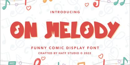 Is a comic display font with distinctive handwritten characters perfect for branding projects, logos, clothing designs, media posts, advertisements, product packaging, product designs, labels, photography, watermarks, invitations, stationery, and any project who need handwritten dishes. Feature : Symbol Number Punctuation Multilingual support Support in Mac and Windows OS Support in design application (photoshop, illustrator, and more) I really hope you enjoy it.