3,702 search results
(0.046 seconds)
- Abort Mission by PizzaDude.dk,
$12.00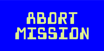 This is the kind of letters I drew in school back in the 1980ies. I would never have guessed that I would do the same thing like 40 years later! I remember making a simple space game for my VIC-20 computer, and I needed some "data letters" (as I called it) - as far as I can remember, this is close to what I made 40-like years ago. Also, I was inspired by the well known series "Stranger Things" - you know, all that 80ies theme stuff took me down memory lane! :) Anyway, all the letters are handdrawn, using a squared paper as guide - at it may look simple, but it took me quite some time to finish this font (hence the name!)
 - Mouser by Sharkshock,
$100.00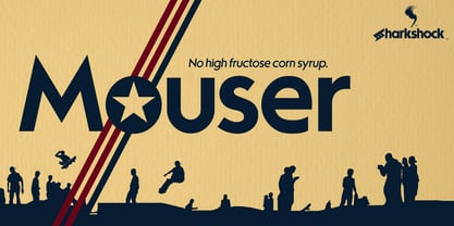 Mouser has been an ongoing project that originated as a geometric sans of the same name before morphing into a similar, but entirely different family called TypoGraphica. It retains much of its earlier character such as limited contrast, high legibility, and tight spacing. Major changes were made for a simplistic, more cohesive look. This was done to maximize its usefulness for body text while keeping characteristics used for display purposes. Slices to top strokes are much more subtle with styling dialed down to a minimum. This family comes in 6 different versions to meet a variety of needs. Mouser is equipped with Basic and Extended Latin/diacritics, Cyrillic, kerning, ligatures, and fractions. Try it for website text, applications, or headlines.
 - Herokid by W Type Foundry,
$29.00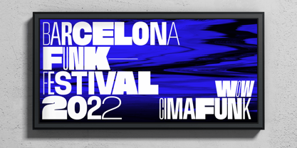 Herokid is a grotesque style font, inspired by classic fonts like Helvetica, Impact and Univers, with a dynamic, versatile and flexible personality. It ranges from Thin to Heavy, and from UltraCompressed to UltraExpanded. It’s a huge family, with 96 variants adaptable to kinds of design projects providing flexibility for their creation. Consider Herokid your new workhorse, you will be able to generate high-impact headlines, subtitles and/or text; all with the same font family. The mixture of wide and condensed sets allows for versatile combinations and can give great movement to a design, while the regular weights can be used for text bodies. The heavier weights also stand out, with its very full shapes with small counterforms, ideal for big headlines.
 - Circus Didot by ParaType,
$25.00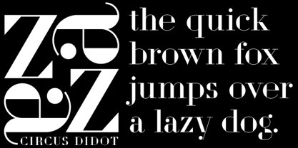 Circus Didot typeface presents a rework of a typical neoclassical serif type in a constructivist style. Analyzing the shapes of characters author placed basic geometric figures — triangles, rectangles, circles… above the contours of letters. Resulting constructions staying recognizable letters at the same time bore a resemblance to pictures of Russian avant-garde artists from 20th century. This discovery has brought an idea to design a typeface where the tendency of a modern serif type to rationalism and geometry is realized in maximum possible extent. The prototypes for the project were taken from the works of Didot, lettering experiments of Russian constructivists and art deco artworks. The technique of juggling with shapes and overall grotesque approach to the design explains the selection of the name for the font.
 - Artifex CF by Connary Fagen,
$35.00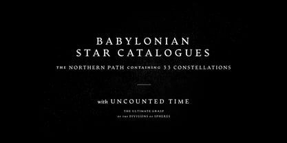 Designed for easy reading of long passages, Artifex CF's smoothed-off serifs help the flow of text without unnecessary visual noise. Artifex's even rhythm and mellow tone make it an excellent option for books, magazines, articles, blogs, captions, and longform texts. A near-upright italic adds emphasis and urgency with elegance. Artifex also doubles as a handsome display typeface, scaling gracefully with charming details revealing themselves at large sizes. Artifex CF pairs nicely with bold, clean sans-serifs, such as Greycliff CF and Visby CF. Artifex also has a sibling typeface, Artifex Hand CF, cut from the same cloth, but with subtle flares in place of the serifs. All typefaces from Connary Fagen include free updates, including new features, and free technical support.
 - Breve Text by DSType,
$50.00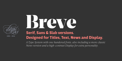 Breve was designed for use in editorial projects. Simple but with enough personality to stand by is own, in a quest for a more forceful and contemporary appearance. All the fonts in Breve superfamily, share the same exact structure, both in terms of anatomy and functionality. The Text versions provide a softer and warm feel to the typographic palette and is intended for use in much longer passages of text, while the Title versions are distinguished by non-descending letterforms, making the titles and headlines much more uniform and interesting. The News version is more classic, with ball terminals and classic proportions, while the Display is, somehow, the set of fonts we had to design: extra-black, ultra-contrasted, proud-display fonts.
 - Rumba by Type-Ø-Tones,
$60.00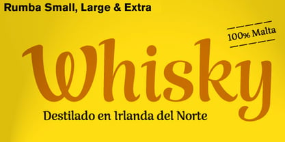 This family typeface consists of three fonts which have the same weight and style, but have been designed to work best at different sizes and in slightly different contexts. It is based on handwriting and calligraphy and consists of three typefaces: Rumba Small (for texts), Rumba Large (for headlines) and Rumba Extra (for words). The family is based on the idea of fonts that are interrelated depending on the differences in contrast, expressiveness and use, not on the classic range of weights. This type has been designed specifically but not exclusively for use in the languages spoken in Spain, hence special attention has been paid to the design of accents, special characters and ligatures. In a later development it was extended to CE Character Set.
 - Kalix by Linotype,
$29.99I have a notation that the summer of 1994, when I worked with Kalix, was a warm one. I had no special typeface in mind when drawing the characters of Kalix, but many typefaces contributed to it, e.g. my own Omnibus from which I borrowed the looks of the smal case g. I think it is a lovely typeface whose use is mainly for books and magazines. Kalix is the name of a northern Swedish town situated along a river called Kalixälven. Its name is of sami origin, *káles, meaning cold. There comes the connection to the warm summer of 1994! But even the Latin word for chalice, calix, has something to do with my choice of name. Kalix was released in 1994. - Breve Sans Text by DSType,
$50.00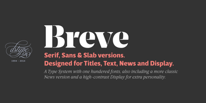 Breve was designed for use in editorial projects. Simple but with enough personality to stand by is own, in a quest for a more forceful and contemporary appearance. All the fonts in Breve superfamily, share the same exact structure, both in terms of anatomy and functionality. The Text versions provide a softer and warm feel to the typographic palette and is intended for use in much longer passages of text, while the Title versions are distinguished by non-descending letterforms, making the titles and headlines much more uniform and interesting. The News version is more classic, with ball terminals and classic proportions, while the Display is, somehow, the set of fonts we had to design: extra-black, ultra-contrasted, proud-display fonts.
 - Breve Slab Text by DSType,
$50.00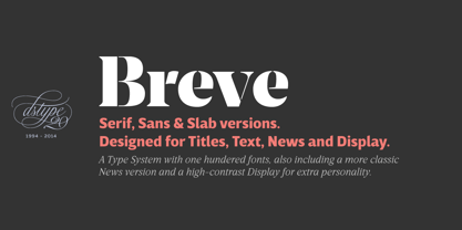 Breve was designed for use in editorial projects. Simple but with enough personality to stand by is own, in a quest for a more forceful and contemporary appearance. All the fonts in Breve superfamily, share the same exact structure, both in terms of anatomy and functionality. The Text versions provide a softer and warm feel to the typographic palette and is intended for use in much longer passages of text, while the Title versions are distinguished by non-descending letterforms, making the titles and headlines much more uniform and interesting. The News version is more classic, with ball terminals and classic proportions, while the Display is, somehow, the set of fonts we had to design: extra-black, ultra-contrasted, proud-display fonts.
 - P22 Nudgewink Pro by IHOF,
$39.95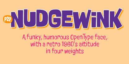 P22 Nudgewink is a funky font family with humorous retro 1960s attitude and crazy bouncy baseline now in four weights (That is one louder!) Each character in the Pro fonts has four different variations accessible with any OpenType friendly application. The "P22 Randomizer" feature makes sure that variations of each letter keep the look of hand lettering with slight variations of up to four versions of the same letter appearing automatically. Along with stylistic alternates, Pro versions include automatic fractions, ligatures, superiors, inferiors, ordinals and a whole bunch of groovy graphic dingbats. With all these options at your disposal, dynamic handcrafted effects can be achieved with just a little bit of goofing around. So check it out, load it up and turn it on!
 - Soul Drifter by Ana's Fonts,
$15.00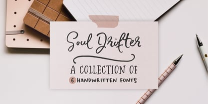 Soul Drifter is a handwritten font collection of 6 fonts that were designed to go together nicely. All six fonts were drawn using the same brush pen, so that their weight and design are consistent, and you can mix and match them easily. Soul Drifter includes: - a brush script font in regular and slant versions, with over 100 ligatures - a matching set of swashes to ornament your texts and designs - a cute sans font in two weights, regular and bold (true bold, drawn separately) - a tall serif font in all caps, with two sets of caps All you need for beautiful and easy designs with a hand-lettered feel, such as postcards and notes, creating logotypes, social media posts, branding and packaging, etc.
 - Alterhard by Popskraft,
$19.00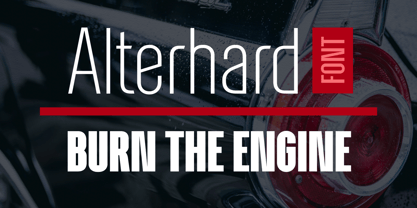 The Alterhard typeface combines the inimitable craftsmanship of the great condensed styles of the early twentieth century and at the same time looks organic and even unusual among modern ones. A distinctive feature of the Alterhard typeface is the smooth transition from the geometrically strict extremely compressed shapes of the bold typefaces to the classic sparse shape of the compressed typeface in light weights. Also unusual for vertical fonts are oblique elements in lowercase letters, which give uniqueness, liveliness and originality to the classic type of font. This allows the Alterhard typeface to be used in any design field such as corporate identity, typography, posters, web design, and other design areas. The set comes in 9 font sizes for rich typography.
 - Equipage by Kitchen Table Type Foundry,
$16.00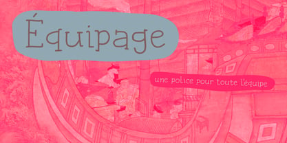 Équipage is a French word meaning ‘crew’. It is used for the crew on boats, airplanes, but it also applies to horse-drawn carriages and all that goes with it. Originally the word means ‘to fit out’ and it is probably derived from the Norse word ‘skipa’, which means ‘arrange, fit out a ship’. Then, if you’re really interested, the word ‘ship’ hails from this same word, just like the Danish ‘skib’, Middle Dutch ‘ship’, Dutch ‘schip’ and German ‘Schiff’. See? You learn something every day! Équipage is a really nice, handmade serif font. It is quite elegant and would look fantastic on labels, postcards and book covers. Comes with extensive language support and a set of alternates for the lower case glyphs.
 - Big Fish by Fenotype,
$30.00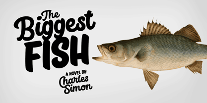 Big Fish is a low contrast Script and Slanted Casuals with bold characters. Big Fish has three weights of Script and a set of Extras that can be used as themselves or combined with script charters for custom swashes. Big Fish is packed with OpenType features: Keep on Contextual Alternates and Standard Ligatures for better flow and try Swashes to spice up your words. Big Fish Casuals is a sturdy casual lettering font with same stroke shapes as the script. Casuals works great with the script but is also a strong font by itself. All Big Fish fonts have wide language support and cover even Cyrillic alphabets. Big Fish is a tremendous pack for any display use from branding to packaging and online to print.
 - Nucliometer by Supremat,
$12.00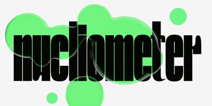 Nucleometer is a very contrasting and at the same time elegant display font. It is ideal for large headlines and impressionable typography. A feature of the Nucleometer is the rounding of the lowercase letters a, b and r, as well as a funny "tail" in the letters t, g, j, f, t, y. This gives it a more lively and unique character. Another interesting feature is the increased proportion of the ascender height of Ultra Condensed, which is larger than the usual Bold font. Together, this font is ideal for a designer who needs stylish and very contrasting typography in his work. Nucliometer is available in 5 styles, starting from Bold to Bold UltraCondensed and also has a variable format.
 - Elephantmen by Comicraft,
$19.00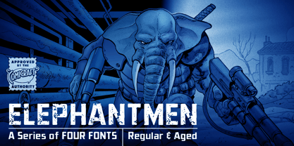 Worn and torn, dry and cracked, resistant to wind and rain... the skin of the elephant is a thing of dry beauty and ancient wisdom... During the gold rush, the phrase “Seeing the elephant” became synonymous with the high cost of each prospector’s dreams and hopes --- not only the prospect of wealth beyond the dreams of avarice in California but also the possibilities of encountering misfortune on the journey. Like the circus elephant, gold was an exotic sight, and seeking it was an unequalled experience, the adventure of a lifetime. Now we've created a font much like the skin of an Elephant and Adventure, Excitement and Really Wild Things are available in the pages of the comic book of the same name, Elephantmen.
 - Isle Body by Mans Greback,
$19.00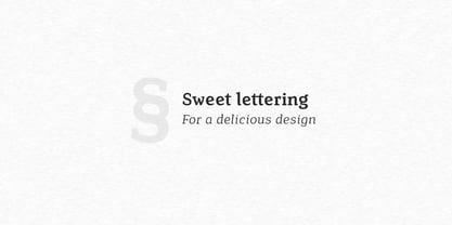 Isle Body is a high-quality serif typeface family, drawn by Måns Grebäck during 2018 and 2019. It is a sweet font with a casual and calm look, with generous spacing and an even weight, adapted for body texts and small sized type settings. It comes in four weights, each one as italic, totaling in eight styles: Light and Light Italic, Medium and Medium Italic, Bold and Bold Italic, Black and Black Italic. The font family can be used in a combination with a font of a different style, or together with its sister font Isle Headline, also a serif font, which has the same basic structure but more distinct weights and a sharper look. Each style contains ligatures and support for a wide range of languages.
 - Decora One by Naghi Naghachian,
$82.00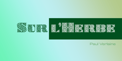 Decora one is a typographic innovation. It is the first of a series of typeface that gives the typographer and other graphic artists the possibility to use modern initials. It enables, moreover, the use of this typeface for decorative headlines and is suitable for manipulations in both vector-based and pixel-based graphic programs. Typographies in countries worldwide, whose alphabets derive from the Roman one, are dependent on such innovations in order to meet the increasing demands of modern communication. This typeface implies at the same time an enrichment of the possibilities for typographical design, which in turn increases the delight in such design. It gives me great pleasure to present this series of new typefaces to my creative colleagues worldwide.
 - Roumi Pro by Naghi Naghachian,
$58.00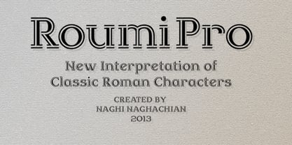 Roumi Pro is designed by Naghi Naghashian. It is a headline font, as modern interpretation of classic Roman characters in 1 weight: Regular. The naming is driven from the name of Rumi (the Roman), Persian philosopher and poet, 1207-1273. The character set of this Font family supports most western languages including: Afrikaans, Basque, Breton, Catalan, Danish, Dutch, English, Finnish, French, Gaelic, German, Icelandic, Indonesian, Irish, Italian, Norwegian, Portuguese, Sami, Spanish, Swahili and Swedish. There are 17 additional symbol characters: euro, litre, estimated, omega, pi, partialdiff, delta, product, summation, radical, infinity, integral, approxequal, notequal, lessequal, greaterequal, and lozenge. It also includes the characters necessary to support the following central European languages: Croatian, Czech, Estonian, Hungarian, Latvian, Lithuanian, Polish, Romanian, Serbian (Latin), Slovak, Slovenian and Turkish.
 - Ubuvila by Scholtz Fonts,
$19.00African fonts are characterised by design considerations that differ from those of Europe and the Americas. At one extreme we have a relaxed and casual approach to life that values the quality of each moment in life far more than people do in the west. In this approach each element of the font, while being part of a community, nevertheless stands on its own and has its own "character". An African font that characterises this approach is Ubuvila (the word means relaxedness or relaxation in Zulu). There is no strict adherence to a design format in Ubuvila nor are the characters constrained by resting on the same baseline. They wander up and down in the sentence and find a comfortable resting place. - Astrotype by Linotype,
$29.99Astrotype is an excellent choice for use in astronomical or astrological literature – books, journals, magazines, etc. It can be used effectively both within the text and in accompanying graphics. Using all weights also opens up a number of illustrative possibilities, for instance on posters or tarot cards. Clarity, homogeneity and pure simplicity give Astrotype its unique character. Based on the same elements and with consistant proportions, the characters display a natural elegance and harmony. The type really stands out through the ease with which it can be integrated into text and the many creative possibilities of combinations of different weights. For instance, try placing Astrotype N dot over Astrotype P dot and using different colors – perfect for onscreen buttons, icons or decorations. - HandMade by Misprinted Type,
$39.00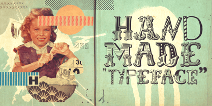 Handmade is based on my own handmade lettering, which is inspired by vernacular and ornamental type. It has the naive personality from street hand-painted signs from Brazil and that charm and elegance of vintage ornamental fonts. Each letter has its own style and the font comes with 2 uppercase variations, meaning you can mix them in order to write words without repeating the same character. The font has a handmade warmth feel to it, which is ideal for projects that demand the craftsmanship look or just that modern, grunge, fun type that goes well with tons of different styles. If that was not all, Handmade also comes with an EPS vector set with 16 vector and hand-drawn ornaments! Enjoy!
 - Courteous by Motokiwo,
$17.00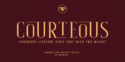 Courteous is absolute elegance. It's semi-condensed serif font with straight and consistent shape in every letter that will give a taste of professional feels to any design. Adding ligature will make it more stylish and modish, very suitable for fashion or beauty projects. Courteous also have the bold version that will looks more gentle. FEATURES: Regular and Bold Version Uppercase and Lowercase are the same 35 Ligature that only works with lowercase, so you can access regular letter by using only uppercase. Ligature: od ai ad ap ed eb ab ib ob ud id ub ou rt yl al le an lu ur gn ha ri ce ho ry ev in ro um ox ve as on Numbers, symbols, and punctuation Multi language support
 - Cleveden by Greater Albion Typefounders,
$9.50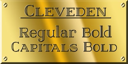 Cleveden was inspired by some lettering sighted on a neglected and somewhat tarnished brass plaque, affixed to an elderly office building. The elegance and character (somehow playful and formal at the same time) of the letterforms shone through the tarnished state of the plaque. As an aside the brass plaque in question was on the former business premises of a long established firm of accountants. We suspect the ethics of that profession would preclude us identifying which one. Our efforts to identify their engraver have proven unavailing. Cleveden is a family of four typefaces, Regular, Bold, Capitals and Capitals Bold. They are ideal for designs that call for distinctive formality and especially lend themselves to signage, certificates, and -dare it be said- engraved plaques!
 - Araldo by Hackberry Font Foundry,
$14.95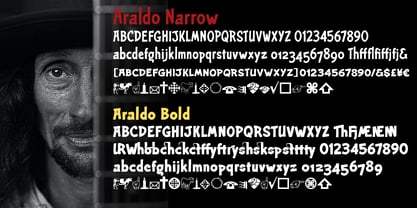 My latest book production group is quite conservative. I discovered my need for a pair of headline fonts with the same vertical metrics which are looser and more lively. Since the serif family is Biblia Serif, and the Sans family is Draetha [which is Welch for preach], Araldo [which is Italian for herald] makes sense to me. Narrow has my normal set of Opentype features with small caps, small cap figures, and the rest of the figure sets. Bold is too heavy for small caps, without messing with the metrics. So, it has the normal figure sets, plus a decent set of discretionary ligatures. They both work well, and are meeting my need for a headline family to add to the book production group.
 - Le Monde Livre Std by Typofonderie,
$59.00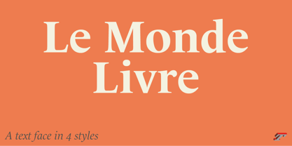 A text face in 4 styles Before the arrival of Phototypesetting, each font size had a specific design. Le Monde Livre, designed by Jean François Porchez, along with Le Monde Journal re-establishes this practice. When Le Monde Journal was developed specifically for use at small point sizes (below 10 points.) Le Monde Livre works beautifully for book typography, magazine settings. In comparison to the italics in Le Monde Journal, Le Monde Livre’s italics are of a totally different design, closer to the models of the Renaissance. The families match well together on the same page, Le Monde Journal for small sizes settings, Le Monde Livre for large settings. The verticals metrics and proportions of Le Monde Livre are calibrated to match perfectly others Typofonderie families.
 - The British Telegraph by Vintage Voyage Design Supply,
$14.00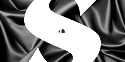 The British Telegraph font family was inspired by classic headers of Britain newspapers from the middle of XX century. Classic look with three width – Light, Regular and Bold. Great for headers, signs or logos. Also, working well for text blocks. - The British Telegraph Light: Use it for text blocks, or for gently light header typographic. Try to make more wide tracking with capitals, it looks good. - The British Telegraph Regular: Great for simple message, quotes, subheaders (If the header is Bold) or advert slogans. - The British Telegraph Bold: Is a killing title buddy. Massive, strong, bold and in the same time – very gentle. Perfectly for main words, headers, signs or logo's. The British Telegraph has full glyph set with standard and discretionary ligatures (Open Type Features).
 - Leco 1976 by CarnokyType,
$-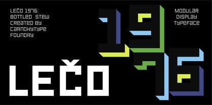 LECO 1976 is a headline display typeface in OpenType format. The title at the 1976 bottle of Lečo became an inspiration for creating this font. Besides the regular weight of the font, the font is drawn in light and bold font styles too, while each of these typefaces consists of a special alternative of an embedded diacritic. The font contains several specific styles as Stencil, Pixel, Tride, Shadow which combinations offer interesting possibilities for the typesetting. The metrics and kerning of every glyph of the font (except several glyphs in Bold) are identical. All the signs share the same character and size of the capital letters. This font is best used on strong posters or as a headline display typeface.
 - Rowan Oak NF by Nick's Fonts,
$10.00This “very elegant and British alphabet” was originally released in the 1920s as "Richmond Oldstyle" by the Blackfriars Type Foundry of London. Touted as highly artistic and graceful, it is exceptionally “at home” wherever style and charm are called for. Both versions of this font contain the complete Unicode Latin A character complement, with support for the Afrikaans, Albanian, Basque, Bosnian, Breton, Catalan, Croatian, Czech, Danish, Dutch, English, Esperanto, Estonian, Faroese, Fijian, Finnish, Flemish, French, Frisian, German, Greenlandic, Hawaiian, Hungarian, Icelandic, Indonesian, Irish, Italian, Latin, Latvian, Lithuanian, Malay, Maltese, Maori, Moldavan, Norwegian, Polish, Portuguese, Provençal, Rhaeto-Romanic, Romanian, Romany, Sámi, Samoan, Scottish Gaelic, Serbian, Slovak, Slovenian, Spanish, Swahili, Swedish, Tagalog, Turkish and Welsh languages, as well as discretionary ligatures and extended fractions. - Aloha Script by Borges Lettering,
$49.95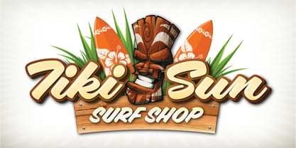 Aloha! Veteran Sign Painter Pierre Tardif and Lettering Artist Charles Borges de Oliveria have teamed up to bring you these fun to use brush fonts. Aloha Script comes in two flavors: Aloha Script and Aloha Script Casual. Both fonts contain the same lowercase, alternates, and ligatures – the difference is in the capitals. By mixing both fonts you can create a variety of unique logos. Aloha Scripts Casual can be set in all caps for greater emphasis on captions. Both fonts contains over 100 alternate characters, as well as an assortment of ligatures, swashes and underlines. With over a year and a half in development, Aloha is bound to please. Great for logo design, signs, posters, culinary food packaging and so much more. Aloha!
 - Transmogrifier by PintassilgoPrints,
$35.00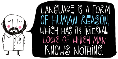 Inspired on Cuban posters by the talented and prolific graphic artist Eduardo Muñoz Bachs, Transmogrifier was hand painted with a thin brush, using loose, fast strokes. This font is packed with lots of contextual and stylistic alternates that automatically transmogrifies the letters as you write, when using opentype savvy programs. It's also possible to pick the alternates by hand and set the text the way you like better. The choice is yours, and there are really plenty of alternates to choose from and create original handlettered-looking designs. The font also brings a rough set of pictures based in charcoal sketches from Shniedewend & Lee Company, 1888. These were painted with the same thin brush as the letters, making it a natural complement. So let the transmogrification begin!
 - Areno by BoxTube Labs,
$24.00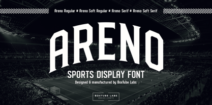 Areno was our first ever font family, released in 2017. We’ve learned a lot since then and made the decision to redraw it from scratch with improved letterforms, better readability and added language support. Most adjustments are very subtle, but some glyphs have gotten a complete makeover. We've also added lowercase letters to the family. Areno is a strong and bold sports block font. These fonts are perfect for sports logos, branding, posters, apparel design, magazine headlines, labels and so much more. Areno now features a full Adobe Latin 1 Character Set with support for most Western European languages including Afrikaants, Basque, Breton, Catalan, Danish, Dutch, English, Finnish, French, Gaelic, German, Icelandic, Indonesian, Irish, Italian, Norwegian, Portuguese, Sami, Spanish, Swahili and Swedish.
 - Breve Sans Title by DSType,
$50.00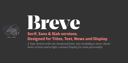 Breve was designed for use in editorial projects. Simple but with enough personality to stand by is own, in a quest for a more forceful and contemporary appearance. All the fonts in Breve superfamily, share the same exact structure, both in terms of anatomy and functionality. The Text versions provide a softer and warm feel to the typographic palette and is intended for use in much longer passages of text, while the Title versions are distinguished by non-descending letterforms, making the titles and headlines much more uniform and interesting. The News version is more classic, with ball terminals and classic proportions, while the Display is, somehow, the set of fonts we had to design: extra-black, ultra-contrasted, proud-display fonts.
 - Aurelux by Andfonts,
$16.00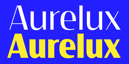 Just imagine, You are searching for the font that should be modern and elegant at the same time, which is not possible with typical sans or serif fonts. So, Aurelux is what You need. This font in your library can be with you for decades, because it is useful and It's open border to create graphic designs that require "modern but elegant touch". : cafe, bar, theatre, spa, hotels, overall entertainment industry, travel, vintage, retro signs. Font is gender neutral. But, when You see Bold and black styles You understand that this font can be in the design of some industrial companies, factories, construction companies that want to show that they have history and heritage. You can contact me if You need questions: andfontscontact@gmail.com
 - 1431 Humane Niccoli by GLC,
$38.00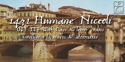 Niccolo Niccoli (1364-1437) was a wealthy bibliophile and an acclaimed scribe, in Florence (Italy). He was one of the most important Italian calligrapher in this early time of rediscovering Roman script. Of rare accomplishment was his adaptation of the so called Italian humanistic minuscule script. We were inspired from his late work to create this present Font. We have added a lot of accented and other characters (U/V, I/J...) who was not existing in the original and replacing "long s" by a small "s" for a modern use. The OTF encoding was used for intelligent alternates, permitting to use different forms of the same lower case or capital in a single word, reproducing easily the charming variety of a real manual scripture.
 - Examiner NF by Nick's Fonts,
$10.00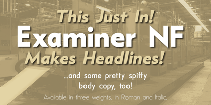 This workmanlike typeface is based on the Metro series, designed by William Addison Dwiggins in the 1930s for the Mergenthaler Linotype Company. Its clean lines and balanced color make it suitable for text and headline work alike. Available in three weights, plus italics. All versions of this font contain the complete Unicode Latin A character complement, with support for the Afrikaans, Albanian, Basque, Bosnian, Breton, Catalan, Croatian, Czech, Danish, Dutch, English, Esperanto, Estonian, Faroese, Fijian, Finnish, Flemish, French, Frisian, German, Greenlandic, Hawaiian, Hungarian, Icelandic, Indonesian, Irish, Italian, Latin, Latvian, Lithuanian, Malay, Maltese, Maori, Moldavan, Norwegian, Polish, Portuguese, Provençal, Rhaeto-Romanic, Romanian, Romany, Sámi, Samoan, Scottish Gaelic, Serbian, Slovak, Slovenian, Spanish, Swahili, Swedish, Tagalog, Turkish and Welsh languages, as well as discretionary ligatures and extended fractions.
 - Bygonest by Edignwn Type,
$15.00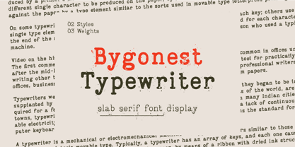 The font is called “Bygonest”, it is inspired by a realistic old typewriter. The font comes with 2 styles (clean and rustic) and 3 weights (thin, regular and bold). This font includes 1 sets alternates with different stamp texture, so you can combine the same 2 letters and not be boring. The font is unique because it has splash rustic in detail of glyph characters. Bygonest matches apply in some designs such as the newspaper, magazine, quotes, logotype, poster, label, packaging, branding, and more custom design. Bygonest includes : 2 style typefaces (clean and rustic) 3 weights (thin, regular and bold) Uppercase, lowercase, numeral, symbol and punctuation Alternate feature Standard ligature Multilingual PUA Encoded Thank you for your support and choosing us.
 - Blink Twice by Sarid Ezra,
$15.00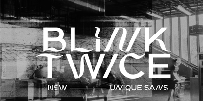 Introducing, Blink Twice, a unique sans with styled lowercase! Blink Twice is a modern and stylish font based sans that have unique looks. This font contains uppercase and lowercase that have different form. You can use the lowercase and uppercase in the same word that will make your text more stand out! And the best of this font is the italic version as the alternates which mean you can combine it all without worrying about the kerning! You can use this font for the magazine, poster, and suitable for headline. This font also support multi language. What you will get: All Caps Font with different uppercase and lowercase Italic version as the alternates (E H I N M e h i n m). Well Kerned.
 - Grungy Old Typewriter by FontFuel,
$14.00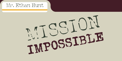 Grungy Old Typewriter is based on two typed letters, each on two pages and dated 1901. The results are eroded, rough, irregular and grungy. The final results are a vintage look. As a designer, I wanted as much flexibility as possible, so there are six versions that are designed to work together. Additionally, I decided to keep the grunge and irregularities within the shape and not include surrounding typewriter or paper marks. I leave it to the design to add those elements as desired. One note, the letter spacing is much tighter than an old typewriter. I felt that readability for modern readers suffered from the added space. Of course, you can get that same look by increasing the letter spacing in your favorite design program.