3,702 search results
(0.02 seconds)
- Diamond Ring by Dharma Type,
$24.99 Diamond Ring is an Art Deco font inspired by Japanese designs for cosmetic packaging and posters used from the end of the 19th century to the early 20th. The most distinguishing characteristic is the diagonal parts of the glyphs. All diagonals have the same degree of the angle. By this elements, whole design of this font and typography with this font look like the shining of diamond ring during total solar eclipse. When you prefer more humanly letter form, please try our Yasashii that used in La La Land.
 - Pigeon Wing by PizzaDude.dk,
$20.00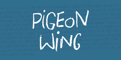 Crayon fonts are fantastic! I've always thought it looked so cool with fonts that simulate writing with crayons...but the fonts has always been limited in letters! But that’s where my Pigeon Wing font stands out! Using the smart techniques of the OpenType thing called “Stylistic alternates”, you get 8 different versions of each letter! Yes EIGHT different versions that cycle as you write! That means words with the same letter appearing several times, cycles through the different versions! Besides that, the font is loaded with multi language support! What’s not to like! :)
 - Olio by Little Fonts,
$15.00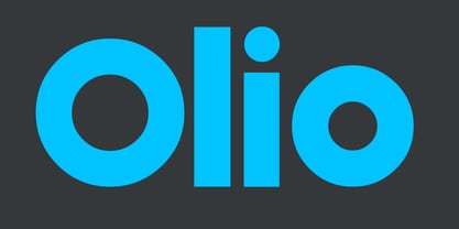 Olio is a chunky geometric sans serif typeface. The bold version takes inspiration from classic geometric fonts like Futura and works well when creating clean, balanced typography. The inline version is the same font with a stylish and decorative stripe effect to each character. Olio inline is a nod towards graphic design champion Lance Wyman and his typographic treatment for the iconic Mexico 68 Olympic identity. Although both versions are designed in reference to great (timeless) graphic design from the past, they have a contemporary finish making them suitable for any design purpose or application.
 - Salom by Schriftlabor,
$44.00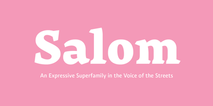 Salom was designed by Austrian type designer Igor Labudovic during his year at Reading University. Besides Latin, it originally included Arabic and Hebrew. The peaceful coexistence of both writing systems in his fonts led him to combine the words Salaam and Shalom to the font family name. Salom’s sibling, Salom Sans, features the same letter proportions and therefore allows a rich spectrum of diverse typography, yet keeping the harmony between all styles. The sans has an additional light weight, while the serif comes with an expressive stencil style.
 - Klip Klop by Samuelstype,
$24.00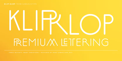 Designed by Hans Samuelson in 2023. With two weights and many variations Klip Klop offers a large set of characters for playful lettering. The flavouring is strong avant garde and the build is strict geometrical with even stroke thickness throughout. One unusual feature is that the bottom and top horizontal strokes are centered on the baseline and capital height. This renders the same optical size between the thin and the medium but different actual heights and baselines. Use it for Headlines or signage in any medium! Klip Klop!
 - Architype Van Doesburg by The Foundry,
$99.00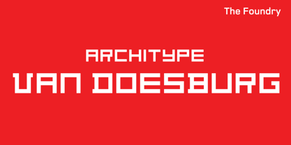 Architype Konstrukt is a collection of avant-garde typefaces deriving mainly from the work of artists/designers of the inter-war years, whose ideals have helped to shape the design philosophies of the modernist movement in Europe. Due to their experimental nature character sets may be limited. Architype Van Doesburg derives from the 1919 experimental geometric alphabet by Theo van Doesburg, whose work was heavily influenced by De Stijl theories, specifically rectangularity. The typeface has been constructed on the same 5 x 5 grid, and is limited by his ‘single alphabet’ theory.
 - Taler by Serebryakov,
$40.00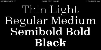 Taler is a serif typeface is represented by seven weights. It was conceived as a continuation of the sans-serif Nekst. In the process of design it became clear that it is a completely different typeface. The rectangular, slightly elongated serifs, the plastic stiffness, and the combination of different styles make Taler a true representative of contemporary. It's old-fashioned and modern, it's for a display titles and for plain text, it's rough and elegant — it's all present in design at the same time. The duality of it nature is it peculiarity.
 - Mr Brown by Hipopotam Studio,
$20.00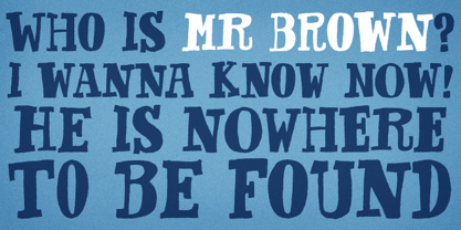 Mr Brown is a typeface based on hand drawn letters to our new book for children. It has up to four alternate glyphs for each character. You can switch them manually or use OpenType Contextual Alternates feature. It will automatically set alternate glyphs de-pending on frequency of appearance of the same character. The script doesn’t throw random glyphs. For example in the word “HIPPOPOTAMUS” you will automatically get three different “P” glyphs and two “O” glyphs. It really works great but of course you can always fine tune it by hand.
 - Bismuth by Setup,
$20.00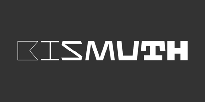 Bismuth is a simple versatile multi-purpose display typeface with nine weights. Both the upper and the lower case are capitals -- the paired letters (e.g. Aa, Bb) differ in construction but keep the same width. The width is also consistent across all weights, making the fonts easily interchangeable. The nine styles are accompanied with a free font Bismuth Symbols which contains more than one hundred various arrows, symbols and patterns for even more striking display typography. Learn more about the typeface and its OpenType features at http://www.urtd.net/fonts/bismuth.
 - Earth Encounters by Scrowleyfonts,
$24.00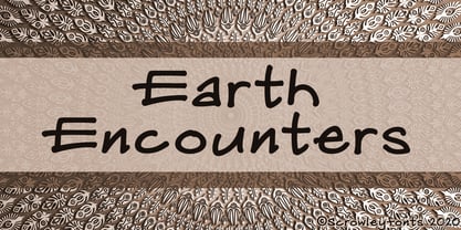 When my Taiji teacher gave all of his students a handwritten card with their name on I noticed that he had an unusual and beautiful handwriting. I persuaded him to write out each of the standard glyphs for me in return for me doing some repairs to his trousers! Earth Encounters Family is the result. The regular font and the light version include OpenType coding to offer the option of different versions of the same letter in words, giving the effect of real handwriting. Earth Encounters also comes with a Shadow style.
 - Lyonette NB by No Bodoni,
$39.00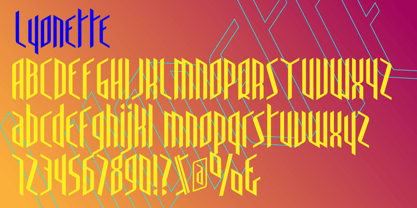 These four typefaces, Berlinette NB, Lyonette NB, Marseillette NB and Parisette NB, were designed from the same basic shape, a geometric form that avoids strict horizontals and uses more offbeat triangular shapes. Lyonette is a fanciful type, gentle and precocious. It seems aloof at times but isn�t really. The frivolity and quirkiness of the narrow width is offset by the fey, finger-like horizontals, vaguely reminiscent of strange encounters and dark closets. It�s great for fashion advertising with literary pretensions. Or maybe a kinder, gentler sci-fi movie.
 - Pinguino by Sudtipos,
$49.00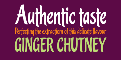 Angel Koziupa's familiar brush goes upright and narrow with Pinguino. Koziupa's approach to condensed brush fonts makes use of the same elements that have always distinguished his calligraphy from any other. With Pinguino, however, we see him softening his corners and adding a distinctly feminine touch to his exotic brush. Pinguino would feel at home on sobering coffee packaging just as it would on a bouncy mixed-fruit juice bottle. Try Pinguino for your next packaging project, and tell your client an Angel told you to use it.
 - Mrs Lollipop by Hipopotam Studio,
$20.00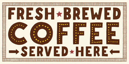 Mrs Lollipop is a hand drawn narrow typeface designed for one of our books. You can layer different styles over the background style to achieve lots of colorful effects. Check out the manual for details. Mrs Lollipop has upper and lowercase characters with up to three alternate glyphs. Build in OpenType Contextual Alternates feature will automatically set alternate glyphs depending on frequency of appearance of the same character (even in web font but only in HTML5 browsers). The script doesn’t throw random glyphs. It has lines, frames, hearts, stars, ladybird and two rabbits.
 - Paragraph Stretch by Paragraph,
$15.00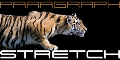 When merely “extended” just would not do, here is Paragraph Stretch™: a super extended or elongated geometric display typeface. It is a typeface with an unicase effect: the capitals and lower case fit the same height and a similar width, so they are interchangeable: fancy a round “W” in all caps? Use the lower case. Want a straight “x” in lower case? Use the cap. And so on. Designed for use at larger sizes for logotypes, short titles or headings. It supports Western plus Nordic, Eastern European and Turkish languages.
 - Diorite by Three Islands Press,
$24.00Diorite is modern face built on classical letterforms -- but left with a bit of residual roughness. Some might call Diorite forthright, others brutal. (It reminded the designer of the dark, hard igneous rock of the same name, treasured by the ancient Egyptians for statuary.) The typeface has a relatively chunky, four-style family; the italics are true cancellaresca corsiva, also writ heavy. "The cancellaresca is of course a Gothic design," notes the designer. "Just use a broader pen, and you'll see!" Has four styles: regular, bold, cursive, and cursive bold. - Vasarely by B2302,
$33.00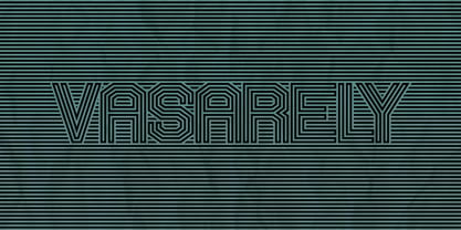 VASARELY has famous roots, its name is related to optical arts own Victor Vasarely. Dropping the field of Op-Art, you already know where we have been aiming at. The REGULAR and LIGHT cuts of VASARELY are quite ordinary, rectangular, but legible typefaces, but with the BOLD and EXTRABOLD versions you will be able to build diverse illusive type illustrations and layouts. Being build on a strict grid with same dimensions, the eye-affecting black-and-white contrast should trigger different optical effects. As an extra we build an EXTRUDED version as well. Have fun!
 - Shaq Attack NF by Nick's Fonts,
$10.00No: Jethro Bodine didn't design this typeface although, to look at it, you might be tempted to think so. Rather, the pattern was a product of the fertile imagination of famed lettering artist Alf Becker. The lowercase letters are the same as the uppercase, but angled differently so, if you want a randomized appearance, you can activate Contextual Alternates and the font will do the shift-key double-clutching needed. Both versions include the complete Unicode Latin 1252, Central European 1250 and Turkish 1254 character sets, with localization for Moldovan and Romanian. - Charmini by Luxfont,
$18.00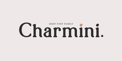 Charmini is an exquisite font with a soft and at the same time confident serifs, modern and with a touch of retro. Font lines are strict with smooth, perfect transitions. Charmini family includes 2 types of uppercase letters and has 9 font thickness options - from the lightest weights, suitable for large amounts of text to the heaviest weights, intended for headlines. Tech Specs: 36 fonts in family UPPERCASE and 2 versions of lowercase letters ligature fi ff fl Numbers & basic Punctuation Serif Typeface 9 variants of width + italic OTF font format ld.luxfont@gmail.com
 - Giulia by HVD Fonts,
$30.00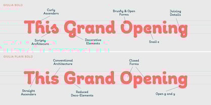 Giulia is a sweet type family consisting of 12 Fonts. It was created by Hannes von Döhren and published by HvD Fonts. Besides a fancy curly version there is a second version with a more straight architecture, still owning the same soft and friendly character. Informal and easy going at first sight and perfect for display settings, however the straight architecture of Giulia Plain also makes it nice for shorter to medium texts. This contemporary type family is ideal for use in retail, packaging, games, food, kids applications and advertising.
 - Twirrewyn by Hanoded,
$15.00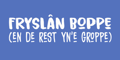 Twirrewyn is Frisian for ‘Whirlwind’. I have always liked the Frisian language; it’s like a crossover between English and Dutch. When I studied journalism in Zwolle (a city close to Fryslân) there were a lot of Frisian students and I did pick up a few words! Twirrewyn is a handmade font family: the fat version was made using a brush and ink; the light version was made using that same ink, but with a broken satay skewer instead of a brush. And yes, you have guessed right, we eat a lot of Satay! ;-)
 - 1545 Faucheur by GLC,
$42.00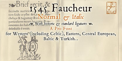 This family was inspired by the set of fonts used in Paris by Ponce Rosset, aka “Faucheur” to print the account of the second voyage to Canada by Jacques Cartier, first edition, in 1545. It is a Garalde set, the punchcutter is unknown, certainly it was not Garamond himself. In our two styles (normal and italic), fontfaces, kernings and spaces are scrupulously the same as in the original. This Pro font covers Western, Eastern and Central European languages (including Celtic) Baltic and Turkish, with standard and long-s ligatures in each of the two styles.
 - Ljubljana by Glyphobet,
$19.99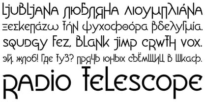 Ljubljana was inspired by art deco lettering seen in Slovenia, Croatia and Romania. It includes the Latin, Greek, and Cyrillic alphabets. It is named after the capital of Slovenia. Ljubljana is unicase, composed of as few basic glyphs as possible. The basic glyphs are shown in black, and the derived or duplicated glyphs in grey. Ljubljana attempts to encapsulate the essence of both upper and lower case designs in a single glyph. It also explores the common origins of the Greek, Latin, and Cyrillic alphabets, using the same glyph in more than one alphabet.
 - Urbane by Device,
$39.00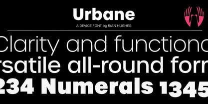 Urbane is a versatile all-purpose sans-serif family of six weights plus italics. It explores the same idea-space as early geometric modernist sans such as Futura, Erbar, Spartan and Elegant Sans, with a single-story a, a contemporary high x-height and very slightly condensed bowls. Perfect for headlines and running text, it is clear, classic and authoritative. Unusually for a geometric moderne sans, letter-widths are optically balanced, giving an even colour in setting. Includes a full international character set, lining, tabular and old-style numerals.
 - Arrow Callouts JNL by Jeff Levine,
$29.00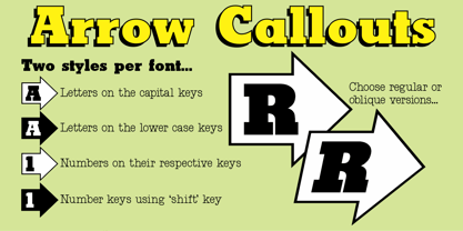 Here’s a set of arrow shaped callouts in two varieties within one font. The black-on-white letters are on the upper case keys, and the white-on-black characters are on the lower case keys. The numerals 1 thru 10 in black-on-white are in the standard key positions, while the white-on-black numbers are on the same keys when engaging the “shift” key. The 'zero' key houses the number '10'. For a more dynamic look, the font is also available in an oblique version.
 - Favela by Borutta Group,
$29.00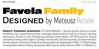 Favela is an experimental, geometric and sans serif type family. It is characterised by scalable construction of glyphs – hairline version is at the same time condensed, regular is normal, and black is super extended, with short ascenders. Favela was made mainly for branding and display purposes but middle weights are prefect for short texts. Thanks to characteristic features compilation of extreme styles will work on layouts, websites and prints. Favela type Family consist 18 styles with scalable x-height and width.. All styles include over 500 glyphs with set of small caps.
 - Three Neon Lines by Kaer,
$19.00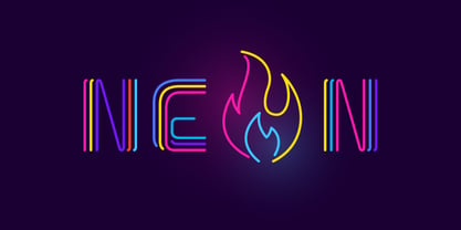 Hello! Do you need colorful neon-style lettering? Please use the ready-colored font I've made. What you will get: * Colored and regular B&W styles * Uppercase (lowercase glyphs are same) * Multilingual support * Numbers and symbols If you have any questions or issues, please contact me: kaer.pro@gmail.com Best, Roman. --- *You can use color fonts in PS since CC 2017, AI since CC 2018, ID since CC 2019, QuarkXPress since 2018, Pixelmator, Sketch, Affinity Designer Since macOS 10.14 Mojave, Paint.NET Windows only.* *Please note that the Canva does not support color fonts!*
 - NaNa Rounded Pro by Naghi Naghachian,
$85.00NaNa Rounded Pro Font family is designed by Naghi Naghashian. The character set of this Font family supports most western languages including: Afrikaans, Basque, Breton, Catalan, Danish, Dutch, English, Finnish, French, Gaelic, German, Icelandic, Indonesian, Irish, Italian, Norwegian, Portuguese, Sami, Spanish, Swahili and Swedish. There are 17 additional symbol characters: euro, litre, estimated, omega, pi, partialdiff, delta, product, summation, radical, infinity, integral, approxequal, notequal, lessequal, greaterequal, and lozenge. It also includes the characters necessary to support the following central European languages: Croatian, Czech, Estonian, Hungarian, Latvian, Lithuanian, Polish, Romanian, Serbian (Latin), Slovak, Slovenian and Turkish. - Radiant Extra Condensed CT by CastleType,
$59.00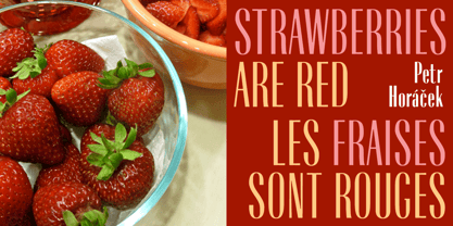 I was commissioned by the Emporium (now Macys) to digitize Radiant Bold Extra Condensed (originally designed by Robert Middleton in 1940) for use in their Sunday supplement to the San Francisco Examiner. For several years, I stubbornly refused to add the lowercase letters to the font, because I thought it looked best just used with caps, but finally relented, added the lowercase letters and at the same time created two more weights as well: Light and Medium. Used very large and carefully, these faces can be quite elegant.
 - Palmbell by Letterhend,
$13.00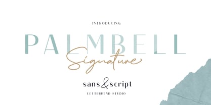 Palmbell is a pair of fonts that bring a classy yet casual feel at the same time. The classic sans combined with the natural hand-writing script are the perfect match for you who needs a typeface for headlines, logotype, apparel, invitations, branding, packaging, advertising, and more. This typeface is comes in uppercase, lowercase, punctuation, symbols, numerals, stylistic set alternate, ligatures, etc also support multilingual. We hope you enjoy the font, please feel free to comment if you have any thoughts or feedback. Or simply send me a PM or email me at letterhend@gmail.com
 - Allegra de Amour by Typetemp Studio,
$16.00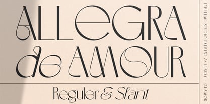 Allegra de Amour Font is Sans-Serif Font with upper and lowercase is complemented by some of the same alternatives made with love. Access your OpenType features to access the large selection of alternate letters and ligatures, select the letters you like from the large variety to get the display font you like. Perfect for editorial projects, Logo design, Clothing Branding, product packaging, magazine headers, or simply as a stylish text overlay to any background image. Features : Uppercase and Lowercase Stylistic Alternates & Ligatures Numerals & Punctuation Multilanguange PUA Encoded
 - 1809 Homer by GLC,
$42.00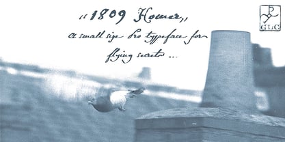 This family is inspired by the small hands used in the 1700’s 1800’s to write messages carried by carrier pigeons, also named “homers”, before the use of photography and microfilms in the same way. So, it is a “small eye” or "small x-height" font. It is enriched with numerous alternates and ligatures, as to look like a various real and written manual. The standard characters set is completed with accented or specific characters for Western (Including Celtic) and Central Europe, Baltic, Eastern Europe and Turkish.
 - Yummo by Dharma Type,
$24.99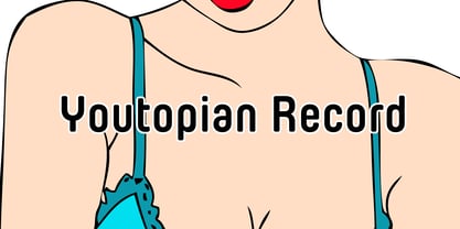 Yummo is a geometric and somewhat condensed sans serif type family that can be used in a wide range of applications. The minimal glyphs that have been shaped superbly will give modern and contemporary impressions. At the same time, the rounded shape makes your typography softer and cuter. Yummo is not only a ‘geometric rounded font’ but also conveys humanness and loveliness as though the forms were handwritten. To accommodate a wide range of usage, This family consists of 5 weights and includes diacritics for most European languages in each weight.
 - Plain Nouveau JNL by Jeff Levine,
$29.00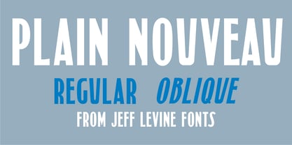 The Women's Suffrage Movement gained women the right to vote in 1920. Up until then there were many ways undertaken to rally sympathy for the cause. In 1916 Alice Paul formed the National Woman's Party. That same year a song with the [exhaustive] sixteen word title "She's Good Enough to be Your Baby's Mother (And She's Good Enough to Vote with You)" yielded a hand lettered Art Nouveau sans serif design in the main portion of the title. This became the basis for Plain Nouveau JNL, which is available in both regular and oblique versions.
 - Litera by ITC,
$29.99Litera was designed in 1983 by Michael Neugebauer, who used the same strict constructed design found in his typeface Circulus. In its figures are the clear geometric forms of the circle, triangle and rectangle, which were also the main forms of Bauhaus designs. The overall look of Litera is modern, clear and light. Distinguishing characteristics are the openness and the e and P and the particularly long cross stroke of the G. The cool Litera is best for middle length texts and headlines. Similar typefaces include Futura from Paul Renner and Avenir from Adrian Frutiger. - Sittl Pro by FaceType,
$18.00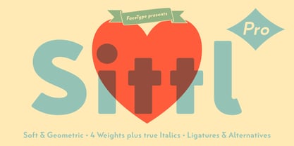 Sittl Pro is a professional version of the style of the same name in our Plaquette package, including 4 weights and true italics (most letters are not simply slanted but carefully crafted for that purpose). The smooth retro look achieved by softly rounded edges and a geometriec appeal is ideal for logos, company identities, menu cards, magazine headlines and the like. There are many choices regarding alternatives – choose the 20 stylistic sets, ligatures as well as initial and final forms to create unique typography for your next stylish project.
 - Syrup by Fenotype,
$35.00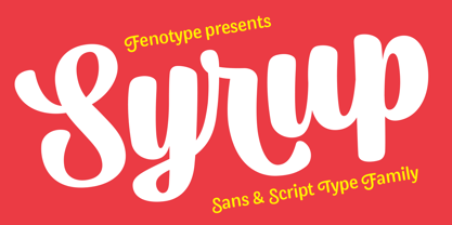 Syrup is a friendly, subtly rounded type family combining sans and script styles. It’s aesthetic roots are in the sign painting of the 1950’s but the execution is distinctly modern. The different styles are designed to work well together so you can have multiple levels of typography all with the same feeling and aesthetic. Try combining the styles in different ways for maximum impact. All styles are packed with Opentype features to enable flexible customisation of your design and the font is especially well suited for branding and packaging typography.
 - Debar by Prominent and Affluent,
$30.00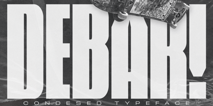 Inspired by newspaper headlines, this sleek and sophisticated font turns heads with its bold strokes and clean lines that exude professionalism. Debar is perfect for any project where you need a timeless design that's innovative at the same time. It comes in two styles: regular and oblique, making it highly flexible to use across various themes. With Debar at your fingertips, there are no limits to what you can achieve. Whether creating stunning logos or crafting captivating marketing materials, this versatile font will elevate every project to new heights of excellence.
 - VerticalFlipJJ by Ingrimayne Type,
$9.95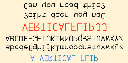 Many years ago I created two upside-down typefaces, UpsidedownJJ and UpsidedownTOC. They were based on monospaced or typewriter fonts, and were rotated 180 degrees, which is the same as a vertical flip followed by a horizontal flip. Recently I was reminded that this way of creating an upside-down typeface is not the only way to create an upside-down typeface--a simple vertical flip creates a different one. That is what this typeface is, a simple vertical flip. The original typeface on which this one is based is JetJaneMono.
 - Informational Gothic JNL by Jeff Levine,
$29.00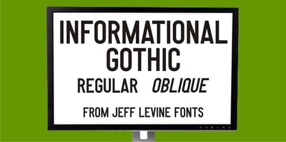 The Wood-Regan Instruments Company (Wrico) of New Jersey manufactured for decades a line of lettering kits called the Wrico Sign Maker. With only special ink pens, plastic templates and a template guide anyone could letter clean, clear signs, posters and notices. Based on the same principles of architectural templates, the lettering was [for the most part] utilitarian and functional. Few templates were of stylized or decorative lettering. Informational Gothic JNL and its oblique version are based on the four inch high lettering templates from one of those kits.
 - Foundry Flek by The Foundry,
$99.00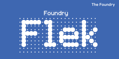 Foundry Flek and Foundry Plek are created on the same dot matrix grid system. Each family includes: light, regular, medium and bold weights – with a selection of dot patterns that can extend the grid vertically and horizontally. The underlying matrix common to each weight allows experimentation with overlays, and mixing weights produces varying effects. Foundry Plek used conventionally works well for serious correspondence, with a 'typewriter font' effect. Foundry Flek has an integral dot matrix grid as a background. With these two fonts a whole new graphic language can be explored.