3,702 search results
(0.019 seconds)
- Rubas by QubaType,
$12.00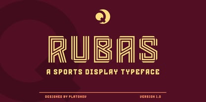 Rubas is an all-caps display typeface with octagonal design. Rubas consists of a solid basic font (Athletics) and its eleven inline variants. With its bold and confident appearance, it's perfect for sports logos, branding, posters, apparel design. Rubas supports many Latin-based languages including: Afrikaans, Basque, Breton, Catalan, Danish, Dutch, English, Finnish, French, Gaelic, German, Indonesian, Irish, Italian, Norwegian, Portuguese, Sami, Spanish, Swahili and Swedish. Also we add Cyrillic glyphs for supporting Russian, Ukrainian and Belarusian.
 - Virtuosa Classic by Linotype,
$29.99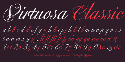 Virtuosa Classicis the 21st century OpenType re-release of a classic Hermann Zapf design, his very first script typeface, Virtuosa. Based on the same sketches that would inspire Zapfino 50 years later, Hermann Zapf developed Virtuosa in 1948-49. It was originally released in metal in 1952. Virtuosa nova is an English copperplate script with character. The font includes two form variants for each capital letter, and there are a number of lowercase alternates and ligatures, too.
 - Sanchez Slab by Latinotype,
$-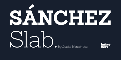 Sánchez, designed by Daniel Hernández, is a serif typeface belonging to the classification slab serif, or Egyptian, that bears a strong resemblance to the iconic Rockwell. Offering contrast and balance to the square structure, Sánchez Slab is a new version, more robust with straight edges, that give greater character and power. Sanchez Slab comprises 12 variants, ranging from extra light to black, each of the same x-height. Regular and Italic variants are available for free.
 - Donkeyman by Hanoded,
$15.00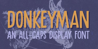 A Donkeyman is a person who is in charge of a ship’s engine room. I didn’t know this, but when I was looking for a nice name for this font, I sort of stumbled upon it. Donkeyman font is quite a useful font: it is a handmade, all-caps font that comes with two sets of alternate glyphs. The alternates cycle as you type, creating a ‘random’ effect. Comes with extensive language support, including Sami and Vietnamese.
 - Organic Tuesday by Bogstav,
$15.00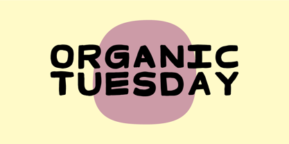 Sometimes you need things organised in a neat way. Organic Tuesday has that, but also a will to break free at the same time. Years ago I was at a restaurant where the menu was handwritten with a clumsy, but characteristic and charming, monospaced font. I must have focused so much on these letters that I can’t recall what I actually ate. But what I do remember is that it was a Tuesday, and the restaurant was organic!
 - JAF Herb by Just Another Foundry,
$59.00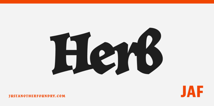 Herb is based on 16th century cursive broken scripts and printing types. Originally designed by Tim Ahrens in the MA Typeface Design course at the University of Reading, it was further refined and extended in 2010. The idea for Herb was to develop a typeface that has the positive properties of blackletter but does not evoke the same negative connotations – a type that has the complex, humane character of fraktur without looking conservative, aggressive or intolerant.
 - Juggling Squad by Bogstav,
$19.00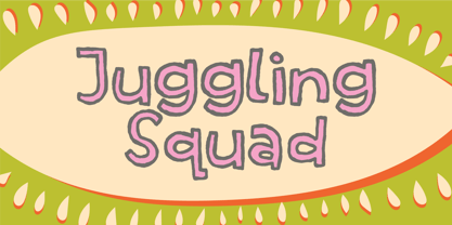 The name of the font is from the hilarious movie "21 Jump Street" - and that is where the similarity ends. While the movie is quite funny, it is also super goofy! I can't say the same about the font, because terms like organic and organic comes to my mind. Strange, yes! And I have really no good reason for this naming, other that its an odd way to tribute this one of my all time favourite comic movies! :)
 - Markisa by Showup! Typefoundry,
$34.00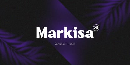 Markisa is a simple, cool, and dynamic Humanist-flavored Sans Serif type family. It consists of eighteen weights from Thin to Black in both Upright and Italic styles. The resilient yet robust typeface. A san-serif with a humanist touch, a steady combination of seriousness and merriment. Works well as texture in small sizes, while at the same time claiming its space on the display. With its distinctive characteristic, can catch anyone’s attention wherever and whenever.
 - Bronzier by Arterfak Project,
$13.00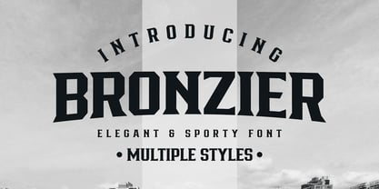 Bronzier is a strong serif display family with 8 different styles. Bronzier was designed with a strong and sharp serif which gives it a more manly look. Sporty, vintage and modern taste at the same time which mean you can use this font family for many design styles. Inspired by old-school typography and modern style. Create a perfect design with Bronzier! Because Bronzier is suitable for logos, logotypes, apparel, jersey, tags, labels, posters, stickers, branding and more.
 - Overbeat by PizzaDude.dk,
$20.00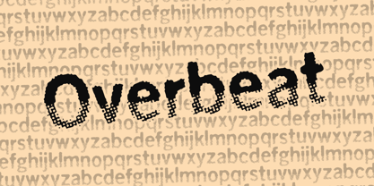 Grunge is not dead! Neither is punk! The proof is the Overbeat font! It has got both grunge and punk in the one and same. The letters are grungy, and punked up with a sort of halftone slime effect. It's hard, it's tough and perhaps even scary! Play around with the font and you'll quickly notice the variety of the font. Each lowercase letter has 4 different versions and there is ligature substitution for most common uppercase double letters!
 - Schism One by Alias,
$55.00 Schism is a modulated sans-serif, originally developed from our Alias Didot typeface, as a serif-less version of the same design. It was expanded to three sub-families, with the thin stroke getting progressively heavier from Schism One to Schism Three. The different versions explore how this change in contrast between thick and thin strokes changes the character of the letterforms. The shape is maintained, but the emphasis shifts from rounded to angular, elegant to incised. Schism One has high contrast, and the same weight of thin stroke from Light to Black. Letter endings are at horizontal or vertical, giving a pinched, constricted shape for characters such as a, c, e and s. The h, m, n and u have a sharp connection between curve and vertical, and are high shouldered, giving a slightly square shape. The r and y have a thick stress at their horizontal endings, which makes them impactful and striking at bolder weights. Though derived from an elegant, classic form, Schism feels austere rather than flowery. It doesn’t have the flourishes of other modulated sans typefaces, its aesthetic more a kind of graphic-tinged utility. While in Schism Two and Three the thin stroke gets progressively heavier, the connections between vertical and curves — in a, b, n etc — remain cut to an incised point throughout. The effect is that Schism looks chiselled and textural across all weights. Forms maintain a clear, defined shape even in Bold and Black, and don’t have the bloated, wide and heavy appearance heavy weights can have. The change in the thickness of the thin stroke in different versions of the same weight of a typeface is called grading. This is often used when the types are to used in problematic print surfaces such as newsprint, or at small sizes — where thin strokes might bleed, and counters fill in and lose clarity, or detail might be lost or be too thin to register. The different gradings are incremental and can be quite subtle. In Schism it is extreme, and used as a design device, giving three connected but separate styles, from Sans-Didot to almost-Grotesk. The name Schism suggests the differences in shape and style in Schism One, Two and Three. Three styles with distinct differences, from the same start point.
 - Schism Three by Alias,
$55.00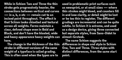 Schism is a modulated sans-serif, originally developed from our Alias Didot typeface, as a serif-less version of the same design. It was expanded to three sub-families, with the thin stroke getting progressively heavier from Schism One to Schism Three. The different versions explore how this change in contrast between thick and thin strokes changes the character of the letterforms. The shape is maintained, but the emphasis shifts from rounded to angular, elegant to incised. Schism One has high contrast, and the same weight of thin stroke from Light to Black. Letter endings are at horizontal or vertical, giving a pinched, constricted shape for characters such as a, c, e and s. The h, m, n and u have a sharp connection between curve and vertical, and are high shouldered, giving a slightly square shape. The r and y have a thick stress at their horizontal endings, which makes them impactful and striking at bolder weights. Though derived from an elegant, classic form, Schism feels austere rather than flowery. It doesn’t have the flourishes of other modulated sans typefaces, its aesthetic more a kind of graphic-tinged utility. While in Schism Two and Three the thin stroke gets progressively heavier, the connections between vertical and curves — in a, b, n etc — remain cut to an incised point throughout. The effect is that Schism looks chiselled and textural across all weights. Forms maintain a clear, defined shape even in Bold and Black, and don’t have the bloated, wide and heavy appearance heavy weights can have. The change in the thickness of the thin stroke in different versions of the same weight of a typeface is called grading. This is often used when the types are to used in problematic print surfaces such as newsprint, or at small sizes — where thin strokes might bleed, and counters fill in and lose clarity, or detail might be lost or be too thin to register. The different gradings are incremental and can be quite subtle. In Schism it is extreme, and used as a design device, giving three connected but separate styles, from Sans-Didot to almost-Grotesk. The name Schism suggests the differences in shape and style in Schism One, Two and Three. Three styles with distinct differences, from the same start point.
 - Schism Two by Alias,
$55.00 Schism is a modulated sans-serif, originally developed from our Alias Didot typeface, as a serif-less version of the same design. It was expanded to three sub-families, with the thin stroke getting progressively heavier from Schism One to Schism Three. The different versions explore how this change in contrast between thick and thin strokes changes the character of the letterforms. The shape is maintained, but the emphasis shifts from rounded to angular, elegant to incised. Schism One has high contrast, and the same weight of thin stroke from Light to Black. Letter endings are at horizontal or vertical, giving a pinched, constricted shape for characters such as a, c, e and s. The h, m, n and u have a sharp connection between curve and vertical, and are high shouldered, giving a slightly square shape. The r and y have a thick stress at their horizontal endings, which makes them impactful and striking at bolder weights. Though derived from an elegant, classic form, Schism feels austere rather than flowery. It doesn’t have the flourishes of other modulated sans typefaces, its aesthetic more a kind of graphic-tinged utility. While in Schism Two and Three the thin stroke gets progressively heavier, the connections between vertical and curves — in a, b, n etc — remain cut to an incised point throughout. The effect is that Schism looks chiselled and textural across all weights. Forms maintain a clear, defined shape even in Bold and Black, and don’t have the bloated, wide and heavy appearance heavy weights can have. The change in the thickness of the thin stroke in different versions of the same weight of a typeface is called grading. This is often used when the types are to used in problematic print surfaces such as newsprint, or at small sizes — where thin strokes might bleed, and counters fill in and lose clarity, or detail might be lost or be too thin to register. The different gradings are incremental and can be quite subtle. In Schism it is extreme, and used as a design device, giving three connected but separate styles, from Sans-Didot to almost-Grotesk. The name Schism suggests the differences in shape and style in Schism One, Two and Three. Three styles with distinct differences, from the same start point.
 - FE Planking 2020 by Egor Stremousov,
$50.00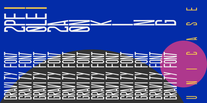 Experimental and accidental unicase grotesque. A font in which all the letters and numbers fell down and deformed under the force of gravity. Everything that was hanging fell down. Everything that was curved horizontally straightened. The form and principle of construction of each symbol in the font is dictated not by tradition, but by physics. This makes FE Planking 2020 an excellent tool for creating phrases and statements in advertising and art projects that attract attention and make your head spin. The first free version with a minimum set of Latin and Cyrillic alphabets was released in 2019, and in 2020 the font was updated and supplemented with an expanded set of characters. Dedicated to @Serge Rachok, who invented the Planking Game before it was invented by others.
 - Dynasty by Device,
$39.00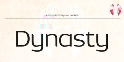 Dynasty is an extensive and versatile family that exploration and modernisation of the typographic quirks associated with the 'American Gothic' type school (in much the same way as English Grotesque was an exploration of Gill/Johnston idea-space) and adds chamfered elements to dots and tails to emphasise and extend the early machine-made aesthetic. Elegantly clean and readable at headline and small text settings, where (as with all fonts in small sizes) the introduction of tracking will improve legibility.
 - Emblema by Corradine Fonts,
$29.95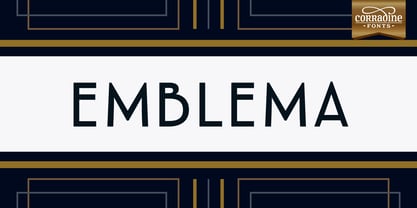 Emblema is an evocative font that exudes Art Deco style from early decades of the 20th Century. Its geometric shapes give a clean and modern look to any design where it is applied. Emblema was designed in 12 subtly different weights and is ideal for achieving the same weight in a single word when using different point sizes. Open Type users can access an extensive set of alternative and ornamental characters including 3 different size sets of caps, providing the utmost in versatility.
 - Smokers by Vozzy,
$5.00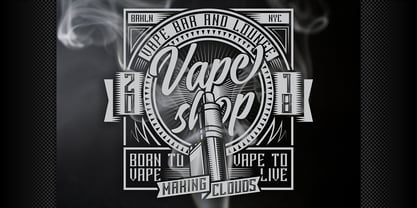 A vintage look layered label font named "Smokers".Typeface includes six styles (including effect styles), for sample look at 4th preview. This font will good viewed on any retro design like poster, t-shirt, label, logo etc. For using effects layers: - Type your text in Regular. - Copy that and paste at the same position. - Change the style to Shadow or Texture. - Alternates in first letters - just type letter in caps. For alternates in last letters - just use alternates for small letters. Thank you!
 - Overlapper by Aah Yes,
$4.49Winner of the "no prizes for guessing" category, Overlapper's main feature is that the letters overlap slightly. I thought it best to just come straight out with it. In case there's someone just recovering from a lobotomy. There's an extended character set with accented letters and extensive punctuation, in case you need to do anything more than basic displays and titles. The package contains both OTF and TTF versions - install either OTF or TTF, not both versions on the same machine. - Boetia by Scriptorium,
$24.00Boetia is an Art Nouveau period font which is designed to give some of the feel of ancient Greek lettering and design. It also echoes the lettering of the Psychedelic poster era and would be a great addition to any 60s font collection. The overall effect is both modern and classical at the same time, with readable, bold character forms perfect for posters or other titling uses. If you like our Hendrix or Pantagruel fonts you're going to love Boetia. - Fonton by PeGGO Fonts,
$24.00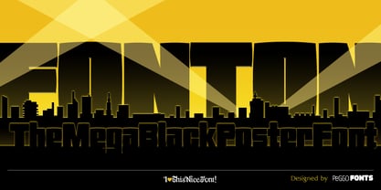 Fonton is a contemporary and modern bigger display font, inspired on bigger ton barrel shape, designed as posters font, with very soft curves drawing each stroke, The project regards 2 weight sizes, regular & small. Is useful in poster but also in covers and headings, letterhead, magazines, POP & Graphic culture, hip-hop topics, urban representations, and big sizes prints, Volumetric 3D shapes, etc. Now decorative ligatures, alternates and figures as the same graphic style as Fonton all powered by OTF technology.
 - Basika by NOS,
$15.00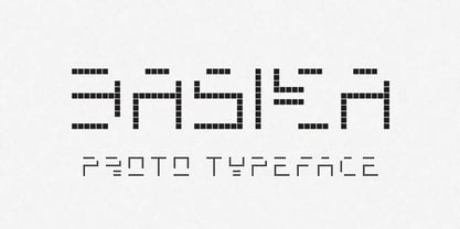 Basika is a Display proto-typeface, a bridge from the past into the future of experimental typeface design. It’s a powerful communication tool for designers who want to create unique projects. The concept of Basika has been developed over many years and became a typeface throughout 2019. Basika was released in December of the same year. Basika comes in three styles, includes discretionary ligatures and stylistic alternates. Don't hesitate to get in touch at nos.ink. Basika current version: 1.2 - released in April 2022.
 - Crassula by ParaType,
$30.00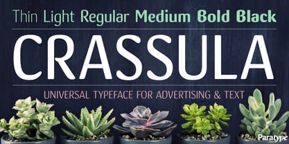 Crassula is a versatile display font. Like the plant of the same name (Crassula, jade tree, money plant), which has thick juicy leaves, the font is distinguished by rounded contours and smoothed out forms of elements. Stylistic Alternates offer more traditional letter shapes and make Crassula more readable in long texts. Six weights allow a broad range of applications - from informal book and magazine headlines to emotional marketing ads. The font was designed by Natalia Vasilyeva and released by ParaType in 2018.
 - Yotin by Stawix,
$40.00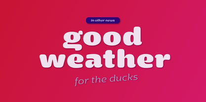 Yotin is a contemporary half-serif inspired by summer days vibe. Vibrant, round with a little bit of contrast makes the design of Yotin unique, friendly and flexible at the same time, suitable for text, headlines, display and other design needs such as layouts, branding and anything in between. Yotin is here to serve your creativities. Yotin comes in 9 weights from Thin to Black, each equipped with Italic plus many OpenType features; tabular numerals, inferiors & superiors, numerators & denominators, fractions, ligatures etc.
 - Coffinated by Ingrimayne Type,
$9.00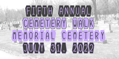 Coffinated features letters on coffin shapes. This caps-only family has two sets of characters, with one on coffins that are flipped from those in the other set. The OpenType feature contextual alternatives (calt) prevents two characters from the same set being adjacent. The two styles, bold and regular, can be used in layers to add color. There are not a lot of uses for macabre lettering (horror? Halloween?) but Coffinated is available for those who do find a use.
 - Tasty Chat by PizzaDude.dk,
$17.00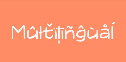 Something tasty for your design! Tasty Chat is designed to be super legible and with a natural and organic feeling to it. Besides multilingual support, the font has 4 different versions of each lowercase letter. These "contextual alternates" cycles as you type which makes the font more random and handmade looking. Add some of the doodles to your design to make it more spectacular - they were made with the same pen as the actual font, so they fit perfectly together!
 - Quadrat Grotesk New by ParaType,
$30.00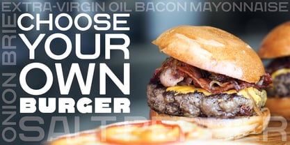 Designed for ParaType in 2004 by Vladimir Pavlikov. It is a new version of popular type Quadrat Grotesk by the same author. Letters of the new version in contradistinction to the old one are clean and have no traces of exploitation. Quardat Grotesk New due to its rectangular proportions is extremely readable in small sizes and can be successfully used in Web pages and in documents with long lists where critical aspect is a number of lines rather then length of a line.
 - Fidusmager by PizzaDude.dk,
$17.00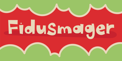 This is definitely a font suitable for kids toys. The letters are legible, and at the same time totally wacky! Kinda like what a kids toy should be! Fidusmager started out as a handdrawn, slightly rugged looking fon. However I ended up manually tracing each letter in order to have those smooth lines. By the way, Fidusmager is danish and actually means someone who’ll trick you - but as a kid I didn’t know that, and found that it most likely was something positive! :)
 - Vigorous by Gerald Gallo,
$20.00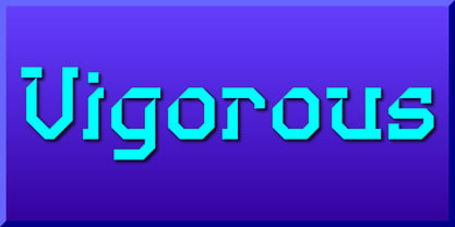 Vigorous is a clean and crisp, display font set. As their names imply, Vigorous Lower Case has a lowercase alphabet while Vigorous Small Caps has small caps in place of the lowercase alphabet. Both fonts have the same uppercase alphabet, numbers, accented characters, punctuation, symbols, and miscellaneous characters. The Vigorous fonts are ideal for headlines or titles - wherever a fresh, unique font is desirable. Vigorous Lower Case and Vigorous Small Caps are sold only as a set priced at $20.
 - Chalfont Roman by Alan Meeks,
$45.00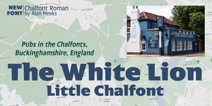 Some years ago I designed Chalfont as a sans face. All the characters have a top heavy look when viewed straight on, however, as most type is read at an angle with the top further away than the bottom, this top heavy look is diminished. Chalfont Roman, although re-drawn with some alterations, is still basically the same face but with a top left serif giving more emphasis to the top heavy characteristics. I have also added a set of non ranging numerals.
 - Apparel JNL by Jeff Levine,
$29.00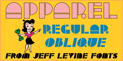 An image spotted online showed a rendering of a ladies’ fashions storefront that had appeared in the Libbey-Owens-Ford Glass Company’s 1939 brochure. The signage consisted of the hand lettered word ‘Apparel’, and was done in a variant of the Art Deco stencil style of lettering that’s most recognizable in Futura Black. From these few sign letters came the inspiration for a digital font of the same name, Apparel JNL – which is available in both regular and oblique versions.
 - Diva Doodles by Outside the Line,
$19.00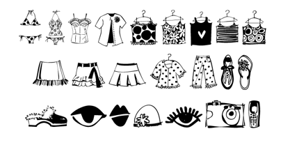 Diva Doodles is a picture font from Outside the Line. It has 40 little icons... of girl things such as lipstick, nail polish, perfume, shoes, hats, camera, phone, iPod, purses, shirts, skirts and a pair of PJs. If you liked the font Doodles, Doodles Too, Holiday Doodles or Holiday Doodles Too you should love Diva Doodles as it is more of the same style. It can be found in the book "Indie Fonts 3, a Compendium of Digital Type from Independent Foundries".
 - Tropen by Ahmet Altun,
$12.00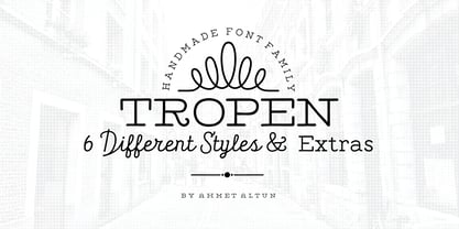 Tropen Font Family comes in one weight with six different types of styles but compatible at the same time with each other. All fonts are hand-made. It can be accessed to the extras with the standard keyboard codes which makes the use of font files very practical and easy. Tropen Font Family was designed carefully to create elegant works. It would be a perfect choice to design posters, affiches, logos, t-shirt and magazine prints, eye-pleasing typographic designs and more.
 - Kaapeli by Suomi,
$20.00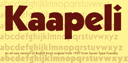 I've had mixed feelings about Kabel; It is a brilliant headline font with a lot of character, but it's the characters I have problems with. The versions of all big foundries have the same flaws (in my opinion), especially lowecase a and s. So I finally went ahead and made an all new version. It is not Kabel, but very much like it. It has unique x-height, weight and width, and many individual characters are also different from the original.
 - Fatz by Good Java Studio,
$20.00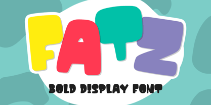 Fatz is the perfect font for all your fun designs. The main font file is equipped with ordinary characters. Everything is made with the bold and smooth brush, and everything is the same size as Hello Balls, so you can be sure they will work well together! It is suitable for you to use in making t-shirt design, quote, label, packaging, logo type, or long writing. Because we have compiled kerning and matrices that are tailored to your needs.
 - Seravee by Stawix,
$35.00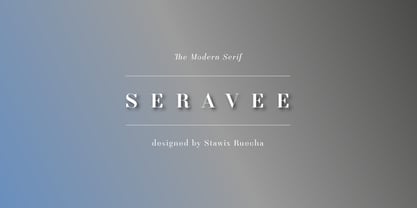 Seravee was inspired by the significant style of Modern (Didone) Typography. The bolder they become, the more exquisite and stylish along with excellent legible at the same time. Designed by Stawix Ruecha, Bangkok based type designer. Rather than programing process, geometric forms as they were, each weight was well-crafted manually by hand as a result of humanistic sense. Through various weight ranges (Black, Bold, Regular and Light), to ensure that Seravee will perfectly cover all aspects of usability in every layout.
 - 1491 Cancellaresca by GLC,
$38.00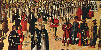 This font was inspired by the very well-known humanistic script called "Cancellaresca". This variant was used by a lot of calligraphers in the late 1400s, specially by the Venetian Giovannantonio Tagliente, whose patterns were mainly used for this font. You can compare this with 1610 Cancellaresca. Numerals were inspired by Da Vinci manuscripts, from the same period. We added accented characters and a few others not currently existing at the time. A lot of titling alternates and ligatures are also included.
 - QB One by BoxTube Labs,
$19.00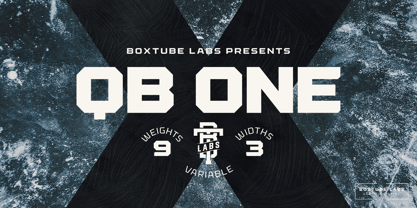 Introducing QB One - A variable block font with a unique style that stands out from the crowd. QB One was designed to be your favorite versatile and powerful communications tool. It's perfect for logotypes, sports branding, posters, apparel design, magazine headlines, labels and much more. The font family features support for most Western- and Central European languages including: Afrikaants, Basque, Breton, Catalan, Danish, Dutch, English, Finnish, French, Gaelic, German, Icelandic, Indonesian, Irish, Italian, Norwegian, Portuguese, Sami, Spanish, Swahili and Swedish.
 - Dress Quote by PizzaDude.dk,
$17.00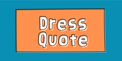 Dress Quote is obviously a wordplay - and I did my best to be funny, coming up with that name. I also did my best to do a funny font. I'll let you be the judge of my success - but personally I am satisfied with my performance in both cases! :) The Regular version is a set of steady, yet kind of rugged letters, while the Outline version is ... well, the same kind og rugged letters in an outlined version! :) Multilingual support is included!
 - Zubilo by ParaType,
$25.00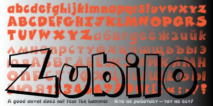 An informal decorative sans serif was designed by Gennady Fridman and released by ParaType in 2004. Based on informal lettering. In Russian 'Zubilo' means 'Cold cutter' or 'Chisel'. Colorful letterforms seems to be cut by an amateurish but strong hand used to operate with rough metal tools, not with pen or pencil. The face is good for use in advertisements, posters and headlines, especally for comic editions and youth press. Decorative styles were added in 2011 by the same author.
 - Art School by AVP,
$25.00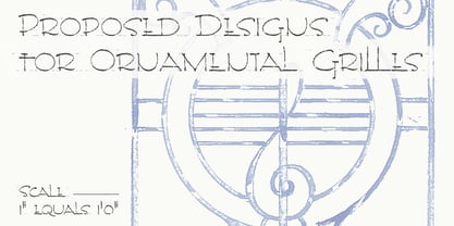 Faithfully reproduced from my father’s design drawings made at The Municipal School of Arts and Crafts, Wolverhampton in 1939. Strong nostalgic influences of Art Nouveau and Art Deco. What caught my eye was the consistency with which each particular character was formed: every ‘R’ like every other, every ‘S’ the same. Tight letter spacing and loose word spacing characterised his titling but he didn’t trust himself to print without first ruling guidelines, a hint of which remain in this font.