10,000 search results
(0.029 seconds)
- Silver Silk by dotHK Studio,
$15.00 Silver Silk is the latest Modern Serif Font from Dothk Studio, made with strong and assertive characters, giving it a beautiful and easy-to-read impression. Silver Silk has over 371 Glyphs that can support a wide range of Latinos. And also contains some features OpenType, Ligature, Numbers, Accents and others. To use a variety of flying machines, you need a program that supports OpenType features such as Adobe Photoshop Cs / Adobe Photoshop CC, Adobe Illustrator CS / Adobe Illustrator CC, Adobe Indesign, and Corel Draw and many more programs that support OpenType. If you do not have a program that supports OpenType, you can access all the alternate glyphs using Font Book (Mac) or Character Map Thanks and happy designing Thank You for your purchase! Arief.hk | Alivecreative
 - Glot by Wordshape,
$20.00 Glot is a ten-member flared terminal sans serif family of typefaces based on a mix of proportions of Roman square capitals and hyper-readable sans serifs. Glot comes in five weights with matching true italics: Light, Regular, Medium, Bold and Black. The Glot family has a wide range and is incredibly functional, working well for longer texts as well as display typography. After designing the house typefaces for a handful of the most predominant multi-player online games out there, we decided that it was time to bring the battlefield to the people. Glot comes armed with ample language support (Central, Eastern, and Western European) and OpenType ornamental spiked alternate characters for when one needs a hint of danger.
 - Allay by Twinletter,
$15.00 Allay is a display font with a distinctive and appealing shape that may be used in a wide range of creative design projects. Each letter shape is created using a variety of combinations that provide a one-of-a-kind, innovative, entertaining, and unmistakably aesthetic impression when used. This typeface also comes with typical ligatures and can be used in other languages. This font is perfect for games, sporting events, branding, banners, posters, movie titles, book titles, quotes, logotypes, and more. of course, your various design projects will be perfect and extraordinary if you use this font because this font is equipped with a complimentary font family, both for titles and subtitles and sentence text, start using our fonts for your amazing projects.
 - Luke by The Northern Block,
$49.50 Luke is a contemporary adaptation of historic English Blackletter, inspired by the creativity of leading English type-creator: Caslon Foundry. Their highly unique 19th century Blackletter typeface provided the core elements of Luke, with the name paying tribute to the Caslon family tomb in the churchyard of St Luke Old Street in London. This modern and versatile type family offers a wide range of styles — from thin to thick contours, and with half-filling to complete — allowing it to work best for headlines, short text and branding. Details include twelve styles and 641 glyphs. Opentype features include superscript, denominators, numerators, scientific inferiors, ordinals, stylistic alternatives, case-sensitive forms, fractions, contextual alternates and discretionary ligatures. Luke supports 37 languages, covering South, East and Western Europe.
 - Arboria by Type-Ø-Tones,
$60.00 Arboria has been a long-term project. Starting with the commission of a custom ‘architect’ font, this typeface has been changing over the years to its current form, which is its public debut. The source is named after the capital of planet Mongo, a futuristic city with art decó influences in their buildings. Arboria maintains that tension but is influenced by all elements of concern to his author. The result is a hybrid Grotesque with nods to the XXII century. Arboria family consists of six weights and matching italics, aside from many characters (it covers Latin and CE languages), the wide range OpenType features allows Arboria to perform great as a text and as a display typeface. Please check the ‘Read me’ file for more specifications.
 - Mestika Arabic by Boharat Cairo,
$20.00 Mestika is a resinous spice, in Arabic means gum, the name is Mestika cause the mestika has a mixture of sharp edges and cursive connections, that mixture gives the typeface an edge to stand out, a low contrast sharp design with 9 weights making it works well with text and headlines. The design is a collaboration with the Iranian designer Kamyab Jafari, The typeface is a modern design, and has a wide range of ligatures and features for better justifications. The typeface comes with 9 weights, and works in variable axes, the typeface now supports only Arabic-based languages, but in the near future, it would support Latin-based languages, the Typeface is based on Naskh calligraphy, something in between the Iranian and the Arabic styles.
 - Rukishy by Twinletter,
$17.00 Rukishy font is the most appropriate choice to enhance the visual appeal of your branding projects. With an attractive Script font style, this font presents an impressive design touch, creating an unforgettable charm. What makes Rukishy so unique is its wide range of features. With a complete family that includes regular, shadow, slant, and shadow slant, you have everything you need to express your creativity optimally. Not only that but some ligatures and alternates add a unique touch to each character, helping you create truly original designs. The ability to support multiple languages makes Rukishy a universal choice that allows you to reach a global audience. With its ease of use and flexibility, this font becomes a valuable asset in your design world.
 - Glot Round by Wordshape,
$20.00 Glot Round is a ten-member flared terminal sans serif family of typefaces based on a mix of proportions of Roman square capitals and hyper-readable sans serifs with slightly rounded corners. Glot Round comes in five weights with matching true italics: Light, Regular, Medium, Bold and Black. The Glot family has a wide range and is incredibly functional, working well for longer texts as well as display typography. After designing the house typefaces for a handful of the most predominant multi-player online games out there, we decided that it was time to bring the battlefield to the people. Glot Round comes armed with ample language support (Central, Eastern, and Western European) and OpenType ornamental spiked alternate characters for when one needs a hint of danger.
 - Basyirah Script by Joelmaker,
$16.00 **Basyirah Script** is a chic hand calligraphy, smooth, modern and clasik, calligraphy wavy, which was created to meet the needs of your next design project. **Basyirah Script**, Can used for various purposes. such as the title, signature, logo, correspondence, Name Card, Quotes, wedding invitations, letterhead, signage, labels, newsletters, posters, badges, etc. **Basyirah Script** It contains a full set of lowercase & uppercase, a large range of punctuation, numerals, and multilingual support. The font also contains several ligatures, stylistic alternates, and Stylistic Set, for you who have opentype, or through a panel of glyphs capable software e.g. **Adobe Photoshop; Adobe Illustrator, Corel Draw and Adobe InDesign.** **Let's switch from the reguler character into character alternative to get the text with the layout of your dreams.** **Thanks for your visit.**
 - The Ruby by Vintage Voyage Design Supply,
$15.00 The Ruby Duo - a retro inspired font duo with a wide range of sans and script styles. Rugged and simple sans with a cool pair of mono line script. The main thing is the possibility of various combinations of using - from Condensed to Extra Expanded and from Light to Black. You will definitely find the best way to use in your projects with more than 50 styles. The sans has underline small caps alternates to use it with conjunctions. The script also has some alternates to change the script mood. Also, you will find a five graphic fonts with 130 elements total! A lot of vintage badge shapes and more than 100 vector vintage mood icons to use it in your badges or logos. PDF graphic navigation
 - Rotulo Variable by Huy!Fonts,
$195.00 Rotulo Variable is a contrasted sans family which combines the Thick & Thin signpainter's style and some 70s feeling in a huge font family with three axis: Width, Weight and Slant. A visit to an exhibition of Spanish movie posters by Jano was the beginning of Rótulo (Spanish for Sign) project. Classic thick & thin signpainter style was featured in many letterings of those posters, as it was a very common style in 60s and 70s Spanish design. Unfortunately, today very few Contrasted Sans are seen, something that was quite common years ago has fallen into disuse in favor of Helvetic monotony. Rótulo recapture all that personality, with an extense range of weights and widths to be used in striking headlines and short texts.
 - Kunstler Grotesk by HiH,
$12.00 Künstler Grotesk ML is one of a number of typeface designs that attempts to reconcile Germany’s blackletter tradition with the international familiarity of roman letterforms in a simple, robust design suitable for meeting the demands of a modern industrial economy, while rejecting the extraneous ornamentation of the departing Victorian era. It is an all-cap design with a number of playful ligatures. It has an appealing boldness that reverses well. Künstler means ‘artist’ in German. I had always assumed it was a person’s name until I came across the translation. Lesson: conjecture is not fact. Grotesk refers to a sans serif letterform tradition. Kunstler Grotesk was originally released by Bauer'sche Giesserei of Frankfurt am Main circa 1900. Künstler Grotesk ML represents a major extension of the original release, with the following changes: 1. Added glyphs for the 1250 Central Europe, the 1252 Turkish and the 1257 Baltic Code Pages. Added glyphs to complete standard 1252 Western Europe Code Page. Special glyphs relocated and assigned Unicode codepoints, some in Private Use area. Total of 350 glyphs, 260 kerning pairs. 2. Added OpenType GSUB layout features: pnum, salt, dlig (19) and hist. 3. Revised vertical metrics for improved cross-platform line spacing. 4. Redesigned mathematical operators. 5. Included tabular (std) & proportional (opt) numbers. 6. Refined various glyph outlines. 7. Made CcNnOoSsZz-kreska available (salt). 8. Incorporated alternate glyphs in lower case.
 - Baline by Xelo,
$12.00 Baline is a modern and dynamic sans-serif typeface that is perfect for branding, marketing materials, and personal projects. With 20 font styles ranging from heavy to light, and variable weights, Baline is a versatile typeface that can adapt to any design project. Its sleek and clean design makes it easy to read, while its contemporary style gives your text a unique and sophisticated look. Baline is perfect for anyone looking to make a statement with their typography. Whether you're a designer, marketer, or just someone who appreciates beautiful typefaces, Baline is the perfect font for you. Try it out today and see how it can elevate your designs to the next level. Versatility: With 20 font styles ranging from heavy to light and variable weights, Baline is a versatile typeface that can adapt to any design project. This makes it a great investment for designers who need a font that can work across multiple mediums and projects. Modern and dynamic: Baline's sleek and clean design makes it easy to read, while its contemporary style gives your text a unique and sophisticated look. This makes it perfect for branding, marketing materials, and personal projects that need a modern and dynamic touch. Professional quality: Baline is a professionally designed font that has been created to the highest standards of typography. This means that you can be confident that your designs will look polished and professional, whether they are used for print or digital projects. Multilingual support: Baline supports multiple languages, making it a great choice for designers who need a font that can handle multilingual projects. Easy to use: Baline is easy to use and install, so you can start using it right away without any hassle. It also comes with a complete set of characters and symbols, so you can use it for a wide range of design projects. Great value: With its range of font styles and professional quality, Baline offers great value for money. It's a smart investment for any designer who wants to elevate their typography game without breaking the bank. Baline font is a great choice for anyone looking for a versatile, modern, and professional-quality typeface that can handle a wide range of design projects.
 - Tofes by Putracetol,
$28.00 Tofes - Modern Serif Font Tofes - Modern Serif Font is a versatile typeface that exudes elegance and sophistication. This font is perfect for any project that requires a touch of luxury and class, such as branding, packaging, logos, and more. The font's name is inspired by the Hebrew word for "apple," which symbolizes beauty and perfection. With its clean lines and modern look, Tofes is a must-have for any designer looking to create stunning and professional designs. If you're looking to create a romantic and elegant branding, Tofes is the perfect font for you. Its clean lines and modern look give it a timeless quality that works well for a variety of design projects. This font is particularly well-suited for use in packaging and logos, where it can help convey the quality and sophistication of your brand. Tofes comes with a range of features that make it a versatile and useful typeface. The font includes both uppercase and lowercase letters, as well as Opentype features such as alternates and ligatures. It also includes support for a wide range of languages, making it a great choice for designers working on international projects. Additionally, Tofes comes with number, punctuation, and symbol glyphs, allowing you to create a wide range of design elements with ease. In the font package, you will find Tofes in three different file formats: OTF, TTF, and WOFF. These formats ensure that the font is compatible with a wide range of software applications, including Adobe Creative Suite, Microsoft Office, and more. This means that you can use Tofes in virtually any design project, whether you're creating graphics for a website, designing a logo, or working on a print project. In summary, Tofes - Modern Serif Font is a versatile and elegant typeface that is perfect for a wide range of design projects. With its clean lines, modern look, and support for multiple languages, Tofes is an excellent choice for designers looking to create sophisticated and professional designs. Its features, including Opentype alternates and ligatures, make it a valuable addition to any designer's toolkit.
 - Solemnis by Berthold,
$67.99 Solemnis was designed by Günter Gerhard Lange in 1953 and is a uncials-based typeface.
 - Joe Hand by MatchaJoeJoe Fonts,
$10.00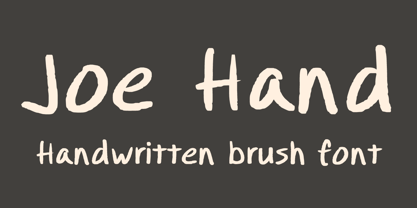 A handwritten brush font containing upper & lowercase characters, numerals and a large range of punctuation.
 - MHF Headbanger by MetalHead,
$14.95 A balance of ballad-meets-distortion that will make you want to Bang Your Head!
 - Disorder by TypeArt Foundry,
$45.00 Photocopied sans serif with some attitude.
 - Agio by Gaslight,
$15.00 Agio - a heavy contrast style font with cuts on the top of the some glyphs and spurs on top left corner of every glyphs. Also Agio has some decorative styles for glyphs and decorative elements.
 - Geometa Deco by Wiescher Design,
$39.50 Geometa Deco is based on Paul Renners Futura Classic. The design is timeless, but I always missed some decorative characters. So I sat down and did some. The type-designer for surprising solutions, Gert Wiescher
 - Franzi Variable by Wannatype,
$211.00 The new sans-serif Franzi typeface family – as neutral as can be, but at the same time individual and striking. Its unmistakable character lies in the detail, with no effect pushing itself to the fore. As a wide-running typeface with a relatively large x-height, the typeface family is perfectly suited to small text sizes but, with its elegant details, it leaves nothing to be desired in display applications either. Originally designed with constructed, often rectangular elements, Franzi has gradually been rounded during the development process and is now less hard in order to guarantee optimal legibility. Franzi Variable is designed alongside the italic and the weight axes. The italics are softly and elegantly drawn, while the upright characters appear much more severe. The design appeal reveals itself in the two-storey ‘a’ – a tribute to legibility in body copy; however, for those who prefer the geometric in applications, an alternative single-storey ‘a’ is also available. All styles have small caps, superscript and subscript lowercase letters, lining, non-lining and small caps figures, fractions as well as several ligatures, alternative fonts, symbols and arrows. The Latin uppercase letters are also available as discreet swash variants. In addition to the extended Latin alphabet, the typeface family also includes the complete Greek, Cyrillic and International Phonetic Alphabet IPA. Franzi was created as a further development of an order to produce a sign for a therapy practice in Vienna’s Franz-Hochedlinger-Gasse – hence the name, which is more common as an abbreviation for Franziska than as a diminutive for the male name Franz: Franzi is therefore a hybrid typeface name which has female tendencies.
 - Kaktis by Ingrimayne Type,
$5.00 The Kaktis collection features eleven typefaces that have spikes or spines. Some have short spikes, some long, some sparse spines and others abundant spikes. They are novelty fonts with limited uses, but there can be times when a typeface of this sort may be appropriate, perhaps for a sharp rebuke or a pointed reminder. These faces were constructed in the mid 1990s using a font distortion program.
 - Hardbop by W Type Foundry,
$29.00 Hardbop is a typographic system inspired by jazz, especially the style it's named after "Hardbop". It's also inspired by the prolific graphic work of Reid Miles for the covers of Blue Notes Records in the '50s, Japanese jazz album covers of the '70s and condensed and grotesque hand painted signs. Hardbop also references classic fonts such as Impact, Bebas, Din, Frontage and TT Trailers, the latter in the exaggeration of certain characteristics such as counterforms and endings. Hardbop design works for titles and wide spaces and was specially designed for covers and posters, where its intention is not to go unnoticed. Although it is a small family, it allows game possibilities with a wide set of characters. Enjoy!
 - F2F Mekkaso Tomanik by Linotype,
$29.99The techno sound of the 1990s, a personal computer, font creation software, and some inspiration all came together to inspire the F2F (Face2Face) font series. Alessio Leonardi and his friends had the demand to create new unusual typefaces, which would be used in the leading German techno magazine of the day, Frontpage. Even typeset as small as 6-points, in nearly undecipherable layouts, it was a pleasure for the kids to read and try to decrypt the messages. F2F Mekkaso Tomanik is a font whose letters have had diamond holes punched into them. In fact, so many holes have been punched into the letters that one could ask whether this font is more letterforms, or more holes! - Monotype Janson by Monotype,
$29.00 The Monotype Janson font family is based on types originally cut by the Hungarian punch-cutter, Nicolas Kis circa 1690. Named after Anton Janson, a Dutch printer. The original matrices came into the hands of the Stempel foundry in Germany in 1919. New type was cast and proofs made; these were used as the source for Monotype's version of Janson. The original hand cut Janson types have a number of small design irregularities which give the typeface its unique charm. These have been carefully incorporated into the new version. The overall effect is of even color and an easy readability that makes Monotype Janson most at home in book and publishing work.
 - Selestyna by Cooldesignlab,
$12.00 Meet the new slick calligraphy font - Selestyna. This gorgeous script is for those who need some elegance and style for their designs and is perfect for wedding invitations, saving date cards, feminine branding, and other necessities. This font is modern with a love style, but still authentic. Selestyna includes the complete set of Basic Uppercase and Lowercase Characters, Numbers, and Punctuation. It also contains binders and many stylistic alternatives to perfectly recreate natural calligraphy (check the preview to see all of them). If you have any questions regarding my products, feel free to write a message or contact me via email Cooldesignlab@gmail.com. Thank you very much for visiting my shop! ~ Cooldesignlab
 - Jorge by Galapagos,
$39.00(pronounced hor-hay) Some years ago my wife and I had our evening meal in a restaurant on what is called the northshore of Massachusetts. Of course, if you check a globe or map you'll see that the pilgrims needed a compass, it should have been called the eastshore as it's on the east end of the rectangle/hook we call the Commonwealth of Mass. In any event, the menu our waitress gave us was hand-lettered with shapes that I used to develop the 4 fonts called Jorge. When I brought the preliminary drawings into the office Steve Zafarana, a designer and cartoonist referred to them as Jorge's new design, the name stuck. - Founder by Serebryakov,
$19.00 Founder is a neutral sans-serif font family consisting of 6 weight categories. The font was created for use on his own website, but eventually the account went on public sale. The original purpose of the font was not intended to be a multi-tool. However, now everything necessary has been added to it so that it can be safely used in projects. Founder supports more than 50 Latin-based languages, as well as Belarusian, Russian and Ukrainian Cyrillic. Gothic sans aesthetics give Founder a natural and relaxed feel that business fonts lack today. The font is perfect for cases when you need to dilute the silence of modern digital environment or just to complement the author's illustrations.
 - Marsh Scroll by ArtyType,
$29.00 The concept for ‘Scroll’ came to me fully formed when setting out to design a bold display typeface. The premise for this was to base the letter-forms on a rolled strip of paper. A simple enough idea in principle but one I hadn't seen before. After working out the basic characters I set about completing the full effect I was after. This was achieved by applying a suitably incised line following the curve at each turning point to convey the important three-dimensional aspects of a scroll. Although the phonetic name personifying the font was there as a working title from the outset, I didn't commit to it fully until everything was completely resolved.
 - Epoque by Rafaeiro Typeiro,
$15.50 Époque initially came from composing a fashion catalogue with some materials from the Brazilian Amazon. The pieces of the collection used natural caoutchouc as raw material and the design of capital letters use forms that refer to the typography of the historical period 1890 - 1910 in which caoutchouc was the main driving force of the Amazonian economy. This typeface has a complete set of numerals, a set of standard ligatures, in addition to alternates in specific glyphs and a large set of discretionary ligatures composed mainly for UPPERCASE. Époque family is comprised of four weights without italics(with an alternate set in place). It’s a typeface recommended for titles, logos, and posters.
 - Mister Earl by Bitstream,
$29.99Mister Earl, released by Bitstream in 1991, was designed by Jennifer Maestre. Inspiration came from a page in a ‘how-to’ book published in the 1930s. Later versions of Extra Light, Light and Bold were added by Jim Lyles, with the help of Wally Petty. Mister Earl is named in honor of Earl Biscoe, a Bitstream designer who retired in the mid-1980s because of illness. In the winter of 1994–1995, Richard Stetler accidentally left a copy of Mister Earl outside his Alaska home... In the spring, amazed to discover the unfortunate font was still just about alive, he decided to release the result to a wider public as Snow Cap. - Teacup by Hanoded,
$15.00 I remember a tea ceremony I attended in Fukuoka, Japan. The teahouse was set in a small, but beautiful garden and the whole idea of the ceremony was to appreciate the view from the porch. I thought the tea was quite bitter, but the view was unsurpassed. From time to time these memories pop up and I have to use them - that is why I named this font Teacup. Teacup is a slightly eroded all caps font, made entirely by hand with a Japanese marker pen and some high quality textured paper. It comes in a romantic open style and a more solid closed style. Teacup is filled to the brim with diacritics.
 - Gasoline Alley NF by Nick's Fonts,
$10.00 A casual and fun-loving font based on the work of showcard artist Albanis Ashmun Kelly, from his 1911 book “Expert Sign Painter,” and named for a long-running comic strip. Both versions of this font contain the complete Unicode Latin A character complement, with support for the Afrikaans, Albanian, Basque, Bosnian, Breton, Catalan, Croatian, Czech, Danish, Dutch, English, Esperanto, Estonian, Faroese, Fijian, Finnish, Flemish, French, Frisian, German, Greenlandic, Hawaiian, Hungarian, Icelandic, Indonesian, Irish, Italian, Latin, Latvian, Lithuanian, Malay, Maltese, Maori, Moldavan, Norwegian, Polish, Portuguese, Provençal, Rhaeto-Romanic, Romanian, Romany, Sámi, Samoan, Scottish Gaelic, Serbian, Slovak, Slovenian, Spanish, Swahili, Swedish, Tagalog, Turkish and Welsh languages, as well as discretionary ligatures and extended fractions.
 - Mikan by Hanoded,
$15.00 A couple of years ago, I walked the Kumano Kodo pilgrimage trail in Japan. At the start of the walk, I stayed in a nice guesthouse in Tanabe city, which lies in Wakayama prefecture. I wouldn’t mention all of this, if it didn’t have something to do with the font name: Wakayama prefecture is THE mandarin orange (Mikan) growing area of Japan and the owner of the guesthouse had just picked a bagful of mikan, which he shared with me. So, I had to think of that when I made this font. Mikan is a nice, rounded family of fonts. Both styles come with alternative a’s (and accented a’s), which some people prefer for Children’s books.
 - Terra Ignota by Three Islands Press,
$39.00 The idea for Terra Ignota came to me years ago as I was admiring a reproduction of "Amerique Septentrionale," a 1650 map by French cartographer Nicolas Sanson, given to me by my parents. The handlettering has a sort of rakish character, evocative of pirates or adventurers at a time of unbridled world exploration. I ended up putting the project aside, but the idea to create this font tugged gently at my mind until I simply couldn't ignore it any longer. The resulting typeface has an italic slant and a deliberate feel, in keeping with its historical roots. Useful for simulating old hand-lettered documents. Has a full character set (and then some).
 - Crisis by SIAS,
$29.90 Crisis is a child of the dictatorship of economics. Since time is money the time budget of its production has been rigidly limited. Crisis was designed and generated completely on one single day. The target was to make a useful font while investing nothing more than absolutely indispensable. The component-based glyph construction scheme of another font has been utilized, further detailing work has been strictly limited. Due to those restrictions some letters have rather unusual shapes. This straightforward and contemporary sans (320 glyphs) is of compact proportions and very legible even when set in small sizes. In printing you get more text on one page and thus save up to 30% of paper.
 - Camplones by Miracledsign,
$8.00 Camplones is a handwritten font that accentuates the style and curve of the hand when inking the ink on the paper by perfecting the shape of each character so that Camplones looks very beautiful when applied in a sentence. Camplones is specially shaped and made so that users feel the touch of a hand that lives in the character of the letters so that it has tremendous value when used in your templates, game fonts, wedding invitations or sales products which will surely be very attractive to consumers when they see it and will definitely love it. make the product look more elegant and will increase the selling value of your product.
 - Pill Gothic by Betatype,
$40.00 Pill Gothic walks the tightrope between a heads down, hard working, utilitarian sans and something that stands out, saying, "Look at me!" Designers looking for a type that will work in blocks of text for callouts, captions and headlines will find that unique balance with Pill. Pill Gothic asks the question: what is the effect of a few truly unique characters on the meaning of a type? In particular, the 'a' and the 'g', while relating strongly to the forms of the other characters, stand out from the traditional milieu of sans serif types. The name Pill Gothic came from early studies of the condensed weight where the lower case characters had the shape of a pill capsule.
 - American Uncial by Linotype,
$40.99American Uncial™ was designed by Victor Hammer in 1943. Uncial typefaces consist of letter forms of the Capitalis Monumentalis and the majescule cursive. The origins of Uncial faces date back to the 5th century. In 1953, American Uncial was expanded to include some new figures, also designed by Hammer, and was rereleased by Klingspor with the name Neue Hammer Unziale. The forms are based on old scripts in books of antiquity and the early Middle Ages and the font is a new variation of a classic. Neue Hammer Unziale font has been a favorite for certificates and diplomas and is recommended for headlines and shorter texts in a point size of 12 or larger. - Understory by Hanoded,
$15.00 Lately I feel reluctant to watch the news: The Amazon Forest is burning, Australian forests are burning, palm oil controversy… It really brings tears to my eyes to see all this destruction around me. It is like people hate nature with a vengeance - I cannot explain it otherwise. I made this font to take my mind off things. It was loosely based on Futura, a font I really like. Understory was completely made by hand. It comes with some cute upper case swashes and a whole bunch of diacritics. The good thing is: no trees were cut down or burned to make this font; in fact, I donated a nice amount of $ to help save the rainforests!