10,000 search results
(0.024 seconds)
- Differentura by ABSTRKT,
$50.00This typeface was developed for the Different Ground exhibition identity (and that explains the name of the font). The aim was to make an absolutely geometric, constructed font. Sometimes even too geometric and too much into it's own rules. But at the same time to make it look very humane, sometimes imperfect and weird, but alive and not soulless. - Petre Devos NF by Nick's Fonts,
$10.00At first glance, this unusual display face might appear to be a product of the 1960s, with its highly unconventional letterforms and its plastic, fantastic highlight treatment. However, this font is in fact inspired by a ca. 1930 poster for a Belgian beer of the same name. The uncredited Flemish designer was clearly a head of his time (ouch!). - House Doodles by Outside the Line,
$19.00 Little houses, little houses and none are the same. Cute cottages, beautiful bungalows, homey homes and darling dwellings to use to make ads, flyers, invitations for moving, change of address, open house parties, address stamps... Some have a lot of detail so use them at larger sizes. The less detailed for can be used in a smaller size.
 - Top Forty by Jeff Levine,
$29.00 A 1963 issue of Billboard Magazine contained an ad for Jimmy Smith (along with some other artists on the same record label) that was hand-lettered in a free-form style similar to show-card ‘one-stroke’ typographic design. This was the inspiration for Top Forty JNL, which is available in both regular and oblique versions.
 - Naraba by Flawlessandco,
$9.00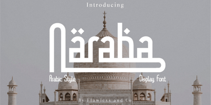 Introducing "Naraba," a stunning Arabic font inspired by the elegant Kufi style. This meticulously crafted typeface seamlessly merges tradition and modernity, making it perfect for a wide range of design applications. There's some connected letters and some alternates that suitable for any graphic designs such as branding materials, t-shirt, print, business cards, logo, poster, t-shirt, photography, quotes .etc This font support for some multilingual. Also contains uppercase A-Z and lowercase a-z, alternate character, numbers 0-9, and some punctuation. If you need help, just write me! Thanks so much for checking out my shop!
 - Loppemarked by PizzaDude.dk,
$17.00 Loppemarked is Flea market in danish, and that’s where I got the inspiration to do these fonts from! Headline - chunky serifs here and there, and some are missing! No attempt to get it right…anywhere! Text - The letters are scribbled quickly, leaving not much attention to accuracy. Sans - With this font, there has been some effort to hit the same width of strokes, but it is still off here and there. All in all, the sweet innocence in these letters…I love it! <3</p>
 - TypeKeys Pro by CheapProFonts,
$10.00 A range of retro initials mimicking the keys of an old style typewriter. Expanded from just a basic ASCII character set to our usual large CheapProFonts selection of glyphs. (I'm not sure all of them appears in the beginning of words, though. ALL fonts from CheapProFonts have very extensive language support: They contain some unusual diacritic letters (some of which are contained in the Latin Extended-B Unicode block) supporting: Cornish, Filipino (Tagalog), Guarani, Luxembourgian, Malagasy, Romanian, Ulithian and Welsh. They also contain all glyphs in the Latin Extended-A Unicode block (which among others cover the Central European and Baltic areas) supporting: Afrikaans, Belarusian (Lacinka), Bosnian, Catalan, Chichewa, Croatian, Czech, Dutch, Esperanto, Greenlandic, Hungarian, Kashubian, Kurdish (Kurmanji), Latvian, Lithuanian, Maltese, Maori, Polish, Saami (Inari), Saami (North), Serbian (latin), Slovak(ian), Slovene, Sorbian (Lower), Sorbian (Upper), Turkish and Turkmen. And they of course contain all the usual "western" glyphs supporting: Albanian, Basque, Breton, Chamorro, Danish, Estonian, Faroese, Finnish, French, Frisian, Galican, German, Icelandic, Indonesian, Irish (Gaelic), Italian, Northern Sotho, Norwegian, Occitan, Portuguese, Rhaeto-Romance, Sami (Lule), Sami (South), Scots (Gaelic), Spanish, Swedish, Tswana, Walloon and Yapese.
 - Adore by Canada Type,
$24.95 In 1939 the Stephenson Blake Company bought a very popular script called Undine Ronde and began marketing under the name Amanda Ronde. Although Undine/Amanda was quite popular and can be seen in many advertisements from the 1930s and 1940s, there seems to be no surviving record stating the original foundry or designer. We thought that six and half decades of dust layers over the once-popular typeface were enough, so here and now you have its complete and expanded digital incarnation, Adore. It is quite easy to see why this typeface was popular. A round script with graceful meaty curves is rarely found and can be used in plenty of applications. Wedding paraphernalia, chapter titles, posters, poetry, book covers, religious literature... you name it, Adore can fit it. Aside from its totality being unmatched by currently available designs, Adore also possesses some of the most unique and imaginative letter shapes. The narrow loops on the B, P and R, the minuscule-like Z, the looped b and d, the descending h... all these shapes contribute to a breathtaking and adorable calligraphic work unlike any other. The original design came in a basic alphabet, but we have updated it for current digital technologies, and expanded it to include plenty of alternates and ligatures, as well as some ornaments. The Postscript Type 1 and True Type versions come in two fonts, the second containing the alternates and extras, while the Open Type version is a single font containing all the alternates and extras in conveniently programmed features, easily accessible at the push of a button in OpenType-supporting software. We also encourage you to take a look at Typodermic's Mecheria font, which is further experimentation with the same letter forms, resulting in a quirky, friendly, curly, angular gothic-like creature.
 - Smart Sans by Monotype,
$29.99 Smart Sans is a personal tribute to Leslie (Sam) Smart, the first type director to be hired by a major typesetting house in Canada. Smart was a twentieth century design pioneer who raised the standards of Canadian typography. Together with three of his peers, he established the first Type Directors Club in Toronto. After Smart's death in 1998, type designer Rod McDonald decided that something should be done to commemorate Smart's life and achievements. I had first thought of establishing a scholarship in Sam's name, but a typeface design soon replaced this idea," says McDonald. "Once I decided to design a typeface, however, it became a foregone conclusion that it would be a sans serif - for no other reason than that I loved the name Smart Sans." Two typefaces served as inspiration for McDonald's work. "Like thousands of designers, I'm keen on Matthew Carter's Helvetica Compressed series. And, when I was younger, I also loved Fred Lambert's Compacta," says McDonald. "I thought there might be a place for a small range that could take over from these 'old workhorses' and, in the process, bring a fresher look to the genre." McDonald drew three weights for the Smart Sans family, all ideally suited for setting attention-getting headlines and powerful display copy. The two-storied 'g' contributes to the design's lively personality, and the short 'r' helps maintain tight, even spacing. Smart Sans is the perfect homage to a great typographer, because it raises the bar on what to expect from condensed sans serif typefaces. Sam Smart would be pleased."
 - Hubber by LomoHiber,
$16.00 Presenting my font called Hubber. This font has been inspirited by product retro posters from 60s-70s. I tried to make letters as much streamlined and gentle as possible. I hope you'll enjoy how sweet it came up. Hubber consists of such features as swashes, alternate glyphs, ligature, and additional shadow font. Hubber perfectly fits for retro designed logos, posters, prints. Hubber Features: Up to 19 alternates for each letter with swashes Contextual alternates feature will automatically match alternate letters depending on their position or pairing 21 ligatures Shadow effect font to save your time. Just place the layer with Shadow font behind Regular to make the shadow effect Carefully tuned kerning (preview above doesn't show it for some reason) If you have some issues, questions, please let me know: lhfonts@gmail.com Hope you'll enjoy using Hubber!
 - Broadway Poster by GroupType,
$15.00 Originally designed by Morris Fuller Benton in 1925, FontHaus's 1995 revival is based on a design named "Novelty Broadway". Characters were referenced from "Commercial Art of Show Card Lettering" by James Eisenberg, published by D. Van Nostrand Company in 1945. This Broadway is classic Broadway but with some charming differences such as a slanted lower case "f" a remarkable lower case "g" and a high-waisted upper case case "R", as only a few examples. It was named "Novelty" because the alphabet incorporated a concave design feature in the tops and bottoms of each letter. These differences allow this version to possess much more personality than that of all other Broadway designs on the market. It looks almost hand brushed, has soft edges and is no where near as sterile looking as all the other digital versions. It feels very 1925!
 - Colonna by Monotype,
$29.99Colonna is an inline roman typeface with some very elegant letterforms, based on artwork obtained by Stanley Morison during 1926 as part of a program to increase the range of display faces in the Monotype library. The letters of the Colonna font have an inscriptional feel about them, figures are non-ranging. Originally developed as an advertising face, Colonna is at its best when used in large sizes. - HUTagada by Heummdesign,
$15.00 "Disco Pang Pang" is the Korean name for Tagada rides. It is a characteristic typeface that is good to use when you want to make use of a unique and bouncy feeling. Light and Extrabold are made with the thickness of normal typefaces, but Left and Right have strange shapes with stroke thicknesses that are biased to one side. Its unique shape can make a strong impression on people.
 - Sandikza by Falling Angel,
$- Sandikza started out as an idea for a metal titles and some games. Or anything that was printed distorted. In other word something harsh. It makes a death or dirt feeling anywhere it is used.
 - Pismo Clambake NF by Nick's Fonts,
$10.00This stylish stout script was originally issued in the 1930s under the name “Fulgor” by the spanish foundry Fundición Gans. Cursory research suggests that Saks-Fifth Avenue found it suitably snooty to use extensively in its newspaper ads of that period. Perhaps somewhat ironically, this version takes its name from one of comedian W. C. Fields' many odd aliases. - Yasemin by Bülent Yüksel,
$24.00 My wife name is Yasemin. After building this typeface, I wanted to honor with my wife’s name. I think I fully reflects the character I created in my mind. I created ornaments and connected glyphs. Yasemin is an OpenType font that contains 1045 glyphs. Ligatures, alternates, starting, endings, a wide range of latin languages and a set of ornaments. And words specially designed to use in advertising slogan, stationery for weddings, birthdays, etc. TIPS: Try using Yasemin at a 20º angle so that the slanted strokes, ornament become perfectly vertical. Having the decorative ligatures feature (dlig) activated is a good option to see letters dance. TECHNICAL: It is absolutely recommended to use this font with the standard ligatures feature (liga) activated. It makes letters ligate perfectly and also improves the space between words. UPDATES: - 3 December 2015 Opentype Feature (fractions) update. - 20 March 2019 Opentype Feature (fractions) update. Some bug fixes.
 - Sanchez Condensed by Latinotype,
$- Sánchez, designed by Daniel Hernández, is a serif typeface belonging to the classification slab serif, or Egyptian, that bears a strong resemblance to the iconic Rockwell, but with rounded edges— offering contrast and balance to the square structure. Sánchez & Sánchez Condensed comprises 12 variants, ranging from extra light to black, each of the same x-height. Regular and Italic variants are available for free.
 - Havelock Titling by XO Type Co,
$40.00 Havelock Titling builds upon the essential geometry of Havelock , adding new weights for spacious, authoritative text. Made to combine with Havelock’s display capabilities for more traditional reading scenarios. Built on the same weight range as Rocinante Titling , which broadens your design options. Light matches Light, Bold matches Bold, and so on. Both Havelock and Havelock Titling collections are included in Havelock Complete for a lower price.
 - La Quinta by Jonahfonts,
$42.00La Quinta is a display font for some small text and logo applications as well as branding, invitations, stationery, packaging, fliers, gaming texts and book jackets. Plus many other applications at the discretion of the designer. - Pisang by Hanoded,
$15.00 Pisang means banana in Malay and Bahasa Indonesia. It is a tall, narrow and very clear font, ideal for books, recipes, food labeling and posters. It comes with a full range of diacritics and some interesting alternates for the closed glyphs as well.
 - Lenox Avenue by Hanoded,
$15.00 I came across an old book called ‘Studio Handbook Letter And Design For Artists And Advertisers’ by Samuel Welo. Samuel Welo was an American advertising calligrapher, typographer and lettering artist, who was most active during the roaring twenties. Lenox Avenue is my version of a set of letters in that book. It was handmade (just like Welo had done). I only had an ABC/abc to work with, so I designed all the remaining glyphs myself. I changed some of the original (and quite quirky) letters to a more contemporary form. The font is named Lenox Avenue, once home of the famous Savoy Ballroom. Comes with all the bells & whistles.
 - Arqua by DubbioGusto,
$15.00 I took Arquà’s curvy lines from some details in art nuveau posters from late 1800 / early ‘900, then I added to the mix a little bit of elegance with some weird contrast (look at the S). One hour in the hoven and a modern looking display font came out in 2 weights: Goodboy and the doppelganger Badboy perfect to mix up.
 - Helomade by Scratch Design,
$9.00 Helomade font named from Indonesia - Balinese language, this font is an authentic font with a suitable form like handwriting. This font was created to complement some designs such as quotes, invitations, texts, novels, story books and everything that requires some touch of handwriting. This font is also supported multi languages. Please try using this font, feel the sensation of Helomade's handwritten.
 - ChicaGogo NF by Nick's Fonts,
$10.00The compendium Alphabete: ein Schriftaltas von A bis Z listed the pattern for this family of faces under the name Chicago which, owing to the number of other faces using the same name, makes its origins difficult to ascertain. Nonetheless, its soft lines and round forms have a timeless appeal makes this family an excellent choice for both headlines and text use. Both versions of this font include the complete Latin 1252, Central European 1250 and Turkish 1254 character sets, along with localization for Lithuanian, Moldovan, Romanian and Turkish. - Jack Stanislav - Personal use only

- Idealista by Suitcase Type Foundry,
$39.00 Idealista directly responds to its other members, Nudista and Kulturista. It shares the same proportions and the same set of weights, yet it enriches the expression means of the two typefaces with new themes — the character set is smooth, even round, and it boasts a number of special details and perky moves. Most of all, Idealista relishes juicy magazine titles, typographic logotypes and propagandist posters. Unlike cold, technicist typefaces, it has great zest for life, so there's no wonder that in each of the letters, intuition wins over intellect. Owing to this, the text set in Idealista has a special voluptuous quality and unmistakable temperament — in a single typeface Idealista combines the best of sans-serif, slab-serif, as well as geometric and calligraphic construction principles, coming down to one impressive, expressive cocktail. Some letters have serifs, some do not, some are sharp, some are smooth, and all this results in the nice hip-hop beat of the line of text. The typeface has five weights and ten styles in total, so it can easily accommodate to the needs of complex texts, unlike many of its display counterparts. Idealista is valuable partner for the more text-suited Nudista and, if need for tiny sizes arises, to Kulturista as well.
 - Western Territory JNL by Jeff Levine,
$29.00 Browsing through images of old wood type for sale, a Western type design with some interesting character variations made the perfect subject for a digital revival. Western Territory JNL is available in both regular and oblique versions.
 - Joyful Juliana Pro by CheapProFonts,
$10.00 This is Kimberly Gesweins own handwriting, named for a sweet California friend of hers. Kimberly has spotted the original free version of this font in use in the far outskirts of China, and now - with the expanded language support - this Pro version can also be used in more remote parts of the western world. ALL fonts from CheapProFonts have very extensive language support: They contain some unusual diacritic letters (some of which are contained in the Latin Extended-B Unicode block) supporting: Cornish, Filipino (Tagalog), Guarani, Luxembourgian, Malagasy, Romanian, Ulithian and Welsh. They also contain all glyphs in the Latin Extended-A Unicode block (which among others cover the Central European and Baltic areas) supporting: Afrikaans, Belarusian (Lacinka), Bosnian, Catalan, Chichewa, Croatian, Czech, Dutch, Esperanto, Greenlandic, Hungarian, Kashubian, Kurdish (Kurmanji), Latvian, Lithuanian, Maltese, Maori, Polish, Saami (Inari), Saami (North), Serbian (latin), Slovak(ian), Slovene, Sorbian (Lower), Sorbian (Upper), Turkish and Turkmen. And they of course contain all the usual "western" glyphs supporting: Albanian, Basque, Breton, Chamorro, Danish, Estonian, Faroese, Finnish, French, Frisian, Galican, German, Icelandic, Indonesian, Irish (Gaelic), Italian, Northern Sotho, Norwegian, Occitan, Portuguese, Rhaeto-Romance, Sami (Lule), Sami (South), Scots (Gaelic), Spanish, Swedish, Tswana, Walloon and Yapese.
 - GodOfWar - Unknown license

- SF Intellivised - Unknown license

- Weekly Bazaar NF by Nick's Fonts,
$10.00Here’s another nostalgic beauty from the Central Type Foundry of St. Louis, originally titled Harpers, designed for the popular newsweekly of the same name. Its bouncy, quirky letterforms will add vitality and visual interest to your headlines and subheads. All versions of this font include the Unicode 1250 Central European character set in addition to the standard Unicode 1252 Latin set. - Amorphic by Ali Güzel,
$11.00 Chrome Balance is an experimental bitmap font created by photographing hand-modeled play dough and adding a chrome effect. It has a unique and dynamic look and is designed to accompany bold and simple designs such as album covers, posters etc.. The vector version of the same form has also been converted to the vector format, font named Amorphic. IG: algzl
 - Hennepin by Josh Grzybowski,
$24.99 Hennepin derives from a bridge, a street and a county that share the same name in Minneapolis, MN. It is a serif font comprised of three agile weights: regular, light, and extra light. The character set contains typical OpenType features in addition to small caps, and old style numbers, but most importantly, it embraces stylistic alternatives that unite and complete this font.
 - II Balfron by Increments,
$19.00 Inspired by Ernö Goldfinger's east London tower block of the same name, II Balfron is an imposing, all caps, one-weight typeface. Brutalist in form, the characters embody the principles of the distinctive 27-storey concrete profile with unexpected angles set within a rigid, structural grid. Much like Goldfinger's humanist, utopian housing ideals, the font is best viewed at large scale.
 - Pirate Bay by Vozzy,
$5.00 A vintage look label font named "Pirate Bay".Typeface includes five styles plus aged version, for sample look at 4th preview. This font will good viewed on any retro design like poster, t-shirt, label, logo etc. For using effects layers: - Type your text in Regular. - Copy that and paste at the same position. - Change the style to Effects, Shadow or Texture.
 - Tale by Suomi,
$25.00 Tale is an experiment to convert the script-style calligraphy into bitmap format. The two variants have the same dimensions, but (as the naming suggests), Forty has double amount of pixels in it when compared to Twenty. Both variants have hand made bitmaps to compliment these correlating point sizes, and you can always get the appropriate bitmaps by multiplying by two.
 - Virago by Khoir,
$15.00 Virago Font consists of two alternative fonts namely Regular Virago which has a modern and contemporary soft impression while Virago Alternate has an old-fashioned vintage impression, both of which have their own distinct impression but have the same advantage of having lots of alternative fonts that make it easier for you to use it, so what are you waiting for?
 - Faerie Queen NF by Nick's Fonts,
$10.00Based on a typeface named "Titania" from a 1930s specimen book from the Fundición Richard Gans in Madrid, this exquisite design will add a touch of elegance and nostalgic charm to any project it graces. - Honey Vineyard by PeachCreme,
$23.00 Hey guys! Meet our new font "Honey Vineyard"! It's time to pick up on the wedding trend of script-style fonts, and Honey Vineyard's sophisticated and stylish design is perfect for announcing your elegant wedding. A unique wedding font featuring flourishes of creativity and a graceful design won't leave anyone indifferent. This font includes stunning swashes and ligatures that will make your design even more attractive! Some commonly used letters have multiple swashes, while some rarely used letters have none at all. We also would like to note that when creating this font, a purely calligraphic approach was used. This means that all the letters are not the same: some letters are much thicker and some are thinner, as is the case in real calligraphy! The font also includes the Cyrillic version.
 - HU Discopangpang KR by Heummdesign,
$25.00 "Disco Pang Pang" is the Korean name for Tagada rides. It is a characteristic typeface that is good to use when you want to make use of a unique and bouncy feeling. Light and Extrabold are made with the thickness of normal typefaces, but Left and Right have strange shapes with stroke thicknesses that are biased to one side. Its unique shape can make a strong impression on people. This font contains Korean.


