10,000 search results
(0.021 seconds)
- Super Puff MX by Xuveki,
$12.00 Super Puff MX is a Y2K inspired variable display typeface that takes from early 2000's futurism, pop, and cartoon aesthetics. Due to its heavy weight and alternates it offers, it's perfect for a variety of logos, 3D, and motion graphics. SPMX was designed specifically for those use cases, and its wide range of styles and alternates gives you lots of freedom for creating unique graphics that still capture the same fun, futuristic, and playful early 2000's aesthetic. Features & What's Included: Variable font file that allows you to choose any slant degree from Regular to Full Tilt. OTF font files in 4 styles or slants, from Regular to Full Tilt. This is included because many young, talented designers around the world don't have access to programs that can take advantage of a variable font. I want them to have the option of using properly slanted and kerned oblique instances of Super Puff. Robust OpenType features including a vast pool of alternates and stylistic sets giving you lots of choices when choosing letters, numbers, and punctuation. Two stylistic sets for letters and numbers One stylistic set for punctuation and symbols One stylistic set that replaces punctuation with Y2K style icons Extensive Latin language support covering almost all of Europe and South America. All multilingual glyphs have access to alternates as well. Super Puff MX was designed and developed by Abe Zeinali/Xuveki.
 - PGF Americas by PeGGO Fonts,
$27.90 PGF-Americas is a font family, created by Pedro González for Peggo Fonts between 2015 and 2021. Inspired by Rudolf Koch’s Carved Letter design artwork. PGF-Americas delivers a readable, playful, and versatile experience through a font-weight range that goes from thin to ExtraDark plus two Inline weights, an Initials set, one set with ornaments and the other with weather theme dingbats that follow a coherent rhythm and proportions of the family core. An expressive tool that can consistently be applied as decorative complements to solve label, books & movie cover design, headlines, posters and friendly educational products. It adds generous OpenType features with the same spirit as the default versions. Access All Alternates Glyphs Composition/Decomposition Localized Forms Subscript Scientific Inferiors Superscript Numerators Denominators Fractions Ordinals Linig Figures Proportional Figures Tabular Figures Oldstyle Figures Case-Sensitive Forms Discretionary Ligatures Standard Ligatures Full Widths Swash Stylistic Alternates Stylistic Set 1, Stylistic Set 2, Stylistic Set 3, Stylistic Set 4 It supports over 300 Latin based languages: Abenaki, Afaan Oromo, Afar, Afrikaans, Albanian, Alsatian, Amis, Anuta, Aragonese, Aranese, Aromanian, Arrernte, Arvanitic (Latin), Asturian, Atayal, Aymara, Azerbaijani, Bashkir (Latin), Basque, Belarusian (Latin), Bemba, Bikol, Bislama, Bosnian, Breton, Cape Verdean Creole, Catalan, Cebuano, Chamorro, Chavacano, Chichewa, Chickasaw, Cimbrian, Cofán, Cornish, Corsican, Creek, Crimean Tatar (Latin), Croatian, Czech, Danish, Dawan, Delaware, Dholuo, Drehu, Dutch, English, Esperanto, Estonian, Faroese, Fijian, Filipino, Finnish, Folkspraak, French, Frisian, Friulian, Gagauz (Latin), Galician, Ganda, Genoese, German
 - Aeonian by Adorae Types,
$40.00 Aeonian, designed by Emilia Adorno, was mostly inspired by the iconic morphology adopted by the arts of the 1920s. One hundred years later we can still see the resemblance between the wants and the needs of now and then to reach for the sky, to look ahead and enter the future in style. Now as then, we seek the right tools to do so, then once again, we embrace the rational, yet elegant and stylish forms of simplicity, geometry and symmetry. At the same time, there is a strong and growing need for a warmer approach to creating lovemarks. For that, Aeonian’s alternates hold attractive, soft and inviting shapes to an emotional appeal. Aeonian is a combination of all of them. A rational side entwined with an emotional one. Born a geometric sans, Aeonian ended up being a 2 in 1 font with a sans serif set and alternates reaching over 1200 glyphs. The entire family contains 6 weights, from thin to black, with its matching italics. It features a variety of ligatures to be used as connectors, specially for display. It also offers multilingual support, even for certain display ligatures. Later, Aeonian kept growing, with stylistic alternate sets of initial, mid and final glyphs. These are its arms to reach for infinity with a warm heart. The wide range of possibilities that Aeonian offers, makes it the best font for creating vast design systems with a rich visual language.
 - Cherry Blossoms by Positype,
$15.00 It’s spring and the Cherry Blossoms are in bloom… and so is the new typeface by Neil Summerour and Positype. Cherry Blossoms is the new relaxed script family in the same vein as Good Karma. Produced from hand and sumi brush of Neil Summerour, Cherry Blossoms is a natural brush textured font family. Cherry Blossoms is blooming with personality, reliable and genuine movements, and a wide range of letter options to befit any project needing an honest hand-lettered look. Each typeface comes with an expansive set of stylistic alternates (upper AND lowercase), that harmonize wonderfully when you have the Opentype Ligature feature active. Additionally, special double-letter smart ligatures have been produced for specific combinations in need of more expressive flair, as well as a few swashes that work with the economical strokes originally produced from the sumi brush. To further expand the usefulnesss of this bright script, a separate Caps/Lowercase font has been added that provides the simple contrast needed to bring the script fonts forward. Rather than limit the personality of this script, various styles have been produced to compliment the original Regular… Wide and Tight as well as the afforementioned Simple’ fonts are included in hopes of helping you find the perfect variation needed for your composition. Cherry Blossoms is the second release of the Positype Relaxed Script Collection of typefaces—all focused on fluid, effortless script fonts for simple use.
 - Macklin Variable by Monotype,
$156.99Designed by Malou Verlomme of the Monotype Studio, Macklin is a superfamily, which brings together several attention-grabbing styles. Macklin is an elegant, high contrast typeface that demands its own attention and has been designed purposely to enable brands to appeal more emotionally to modern consumers. Macklin comprises four sub-families —Sans, Slab, Text and Display— as well as a variable. The full superfamily includes 54 fonts with 9 weights ranging from hairline to black. The concept for Macklin began with research on historical material from Britain and Europe in the beginning of the 19th century, specifically the work of Vincent Figgins. This was a period of intense social change--the beginning of the industrial revolution. A time when manufacturers and advertisers were suddenly replacing traditional handwriting or calligraphy models and demanding bold, attention-grabbing typography. Typographers experimented with innovative new styles, like fat faces and Italians, and developed many styles that brands and designers continue to use today, such as slabs, serifs, and sans serifs. Verlomme pays respect to Figgins’s work with Macklin, but pushes the family to a more contemporary place. Each sub family has been designed from the same skeleton, giving designers a broad palette for visual representation and the ability to create with contrast without worrying about awkward pairings. With Macklin, Verlomme shows us it’s possible to create a superfamily that allows for complete visual expression without compromising fluidity. - Morgan Sans by Feliciano,
$50.00The Morgan Project can be considered a big type family with ‘many styles’ or a set of different types that match with each other. For me it’s one typeface with different versions with deliberate and visible differences according to the propose to which each version was created. The design started in 2000 as a display type with the design of the Morgan Tower, to which more two display versions were added; Morgan Poster and Morgan Big — all together the make our: FTF Morgan Display Kit 1. All three versions consist only in uppercase with alternate letters in the lowercase and a set of special ligatures. Morgan Tower has four variants that differ in width/weight, Morgan Poster has six variants (often called styles), three weights in upright and oblique and Morgan Big has twelve, six weights in upright and oblique. Lately, the FTF Morgan Tex Kit 1 was added. Apropriate versions to use in text setting. Both versions, FTF Morgan Sans and FTF Morgan Sans Condensed share the same structure and character mapping. Four variants each; regular, bold, oblique and bold oblique with a large character set including: small caps, lining and old style figures (here called Office figures) — both tabular —, small caps lining figures, mathematical symbols and fraction figures, and, a set of foreign characters expanding the possibilities of use for a wider range of languages. Characters are distributed in six different font layouts: Lining, Office, Expert, Caps, Figures & Pi. - Hermann by W Type Foundry,
$29.00 Hermann is one of our most readable typefaces so far. Since last year, the W Design team had been examining closely the possibility of developing a text font. Thus, we dug into concepts within some of our favorite novels, such as The Steppenwolf and Brave New World, written by Hermann Hesse and Aldous Huxley respectively. Ideas like duality, surrealism, and wildness mainly appeared. With these concepts in mind, we analyzed carefully the typefaces used in both Hesse’s and Huxley’s creations; Sabon and Garamond showed up catching our attention and, of course, awakening our admiration. Consequently, the challenge was to combine the key features of these fonts with the concepts already identified. At first, we made a text font which was suitable to compose long texts. However, we realized that we needed to refine some characteristics to convey all the ideas. A full set of capital discretionary ligatures was designed, which convert Hermann in a display font when is required. We also designed swashes (from A-Z) and final forms (in letters h, k, m, n, r and x in romans, and in letters a, d, e, h, i, l, m, n, r, t, u, x and z in italics), conveying more dynamism and versatility when it comes to composing visually. Hermann was designed not only to be accurate in terms of legibility but also to be wild and bold. That is why we took a big leap and designed from the beginning a font that is inspired by the world of 20th-century novels, using the name of one of its greatest exponents, Hermann Hesse.
 - Biblia by Hackberry Font Foundry,
$24.95 This all started with a love for Minister. This is a font designed by Carl Albert Fahrenwaldt in 1929. In the specimen booklet there’s a scan from Linotype’s page many years ago. They no longer carry the font. I’ve gone quite a ways from the original. It was dark and a bit heavy. But I loved the look and the readability. This came to a head when I started my first book on all-digital printing written from 1994-1995, and published early in 1996. I needed fonts to show the typography I was talking about. At that point oldstyle figures, true small caps, and discretionary ligatures were rare. More than that text fonts for book design had lining OR oldstyle figures, lowercase OR small caps—never both. So, I designed the Diaconia family (using the Greek word for minister). It was fairly rough. I knew very little. I later redesigned and updated Diaconia into Bergsland Pro —released in 2004. It was still rough (though I impressed myself). In 2006, I found myself needing a readable sans serif. So I went to Bergsland Pro, and eliminated the serifs. I named the font Brinar. I kept a flare in place for the serifs and cupped the ends. I was stunned. People loved it. It’s remained my bestseller until very recently. So, at the end of 2016 I decided that Brinar really needed some help. The flares were basically random. The stem width and modulation variances all needed to be fixed. My old OpenType feature code was quite limited and clumsy. So, I created the 6-font Biblia family. I cleaned up or redesigned all the glyphs. I updated the fonts to the 2017 set of features: small caps, small cap figures, oldstyle figures, fractions, lining figures, ligatures and discretionary ligatures. These are fonts designed for book production and work well for text or heads.
 - Steinweiss Script by Alphabet Soup,
$59.00 Steinweiss Script began its journey towards daylight when Michael Doret was asked by Taschen Publishing to do cover lettering for the huge commemorative edition they were putting together on the work of Alex Steinweiss—“The Inventor of the Modern Album Cover”. The lettering was to be created to appear similar to the famous “Steinweiss Scrawl” the calligraphy that Steinweiss had used on countless album covers. While designing this piece of lettering, Michael realized that there was great potential for a font that was designed in the spirit of that famous “scrawl”. Through his contacts at Taschen Publishing, he was fortunate enough to be able to contact the Steinweiss family, and get the official Steinweiss approval to proceed with his “Steinweiss Script” project. Michael decided that in addition to giving the font his name as an homage, that he would donate a portion of the proceeds from the sale of this font to the man himself: Alex Steinweiss. Read more about the background of Steinweiss Script in Steven Heller’s article in Imprint. Steinweiss Script is a family of fonts in three weights: Light, Medium, and Bold. Additionally, within each weight there are three variations: Simple, Fancy, and Titling. These variations relate to the size/ratio of the caps to the lowercase, the complexity of those caps, and the size of the ascenders/descenders on the lowercase characters. These variations add usefulness to the font, making it accessible not just for headlines, but for longer passages of text as well. For a better understanding of its unique features please download The Steinweiss Script Users Guide from the Gallery section. PLEASE NOTE: the three Steinweiss Script fonts are cross-platform fonts which depend to some extent on certain advanced OpenType features, therefore they can be used to their full potential only with programs that support those features. When setting Steinweiss Script one should almost ALWAYS select the “Standard Ligatures" and “Contextual Alternates” buttons in your OpenType palette. See the “Read Me First!” file in the Gallery section.
 - Tank by Typodermic,
$11.95 Are you tired of flimsy typefaces that can’t stand up to the rigors of modern design warfare? Then it’s time to enlist in the Tank army! Tank is a typeface that means business. With its heavy letterforms and industrial appearance, it commands attention and demands respect. The tight spacing and lack of negative space give it a robust precision that other typefaces can only dream of. It’s the perfect weapon for delivering a knockout blow with bold color blocks or as a photo cut-out effect. And don’t let the name fool you—this typeface may be called Tank, but it’s far from slow or clunky. It comes in a large Regular style that will leave your competitors in the dust, an ironically titled Light version that still packs a punch, and a pair of oblique styles that add a dynamic twist to your designs. So what are you waiting for? Show the world that you mean business with the heavy headline artillery of Tank. Most Latin-based European, and some Cyrillic-based writing systems are supported, including the following languages. A Afaan Oromo, Afar, Afrikaans, Albanian, Alsatian, Aromanian, Aymara, Bashkir (Latin), Basque, Belarusian (Latin), Bemba, Bikol, Bosnian, Breton, Bulgarian, Cape Verdean, Creole, Catalan, Cebuano, Chamorro, Chavacano, Chichewa, Crimean Tatar (Latin), Croatian, Czech, Danish, Dawan, Dholuo, Dutch, English, Estonian, Faroese, Fijian, Filipino, Finnish, French, Frisian, Friulian, Gagauz (Latin), Galician, Ganda, Genoese, German, Greenlandic, Guadeloupean Creole, Haitian Creole, Hawaiian, Hiligaynon, Hungarian, Icelandic, Ilocano, Indonesian, Irish, Italian, Jamaican, Kaqchikel, Karakalpak (Latin), Kashubian, Kikongo, Kinyarwanda, Kirundi, Komi-Permyak, Kurdish (Latin), Latvian, Lithuanian, Lombard, Low Saxon, Luxembourgish, Maasai, Macedonian, Makhuwa, Malay, Maltese, Māori, Moldovan, Montenegrin, Ndebele, Neapolitan, Norwegian, Novial, Occitan, Ossetian, Ossetian (Latin), Papiamento, Piedmontese, Polish, Portuguese, Quechua, Rarotongan, Romanian, Romansh, Russian, Sami, Sango, Saramaccan, Sardinian, Scottish Gaelic, Serbian, Serbian (Latin), Shona, Sicilian, Silesian, Slovak, Slovenian, Somali, Sorbian, Sotho, Spanish, Swahili, Swazi, Swedish, Tagalog, Tahitian, Tetum, Tongan, Tshiluba, Tsonga, Tswana, Tumbuka, Turkish, Turkmen (Latin), Tuvaluan, Uzbek (Latin), Venetian, Vepsian, Võro, Walloon, Waray-Waray, Wayuu, Welsh, Wolof, Xhosa, Yapese, Zapotec Zulu and Zuni.
 - FS Alvar by Fontsmith,
$80.00 The classic modernist FS Alvar grew out of a library of pure modular shapes gathered by Fontsmith’s master of the abstract starting point, Mr Phil Garnham. “It was a collection that just had to be explored and brought to life in a typographic voice. “We debated long and hard about this. It was big decision to make a shift away from the typefaces that people knew us for. And we didn’t want to compromise our reputation of well crafted typographic quality”. Modular forms A headline font that’s both graphic and functional, in the modernist tradition, FS Alvar focused Fontsmith’s eyes on the bigger issue of what makes a font show its age. “Looking at those fonts from the 1980s that were supposed to represent the ‘future’,” says Phil, “they looked so dated now. With Alvar, we weren’t concerned with creating future-thinking typography but with exploring form for form’s sake, and how that can evolve to create letterforms. Modular forms with a typographic eye.” Stencilled The concept for Alvar first materialised back in 2001 with some sketches Phil made while still at Middlesex University. Eight years later, something made him dig them out again. “There was something really nice about the proportions of that first design. Working on it again, I thought about it properly, but it still needed something to give it that edge. “Jason stood up in the studio and supplied the missing link: ‘Why don’t we make it stencilled?’ He didn’t mean in an obvious way, but by building a kind of architectural stencil into the form. It worked and the idea of using an architect’s name (Alvar Aalto) to describe the font felt perfect.” Featured in... The three weights of FS Alvar are made for standout headlines in advertising campaigns and magazines. Alvar has had a starring role in campaigns for brands from Nike to Amnesty International, as well as on CD covers, record labels and packaging.
 - Marianas by Typodermic,
$11.95 Marianas is a typeface that demands attention. With its militaristic, industrial-looking Art Deco design, it’s a force to be reckoned with. It’s the typeface you choose when you want to convey strength and power. But it’s not just its aesthetics that make Marianas stand out. This font has a history, a purpose. It was first recruited for a video game about the Pacific Air War, where it proved to be the perfect choice for conveying the bold, fearless attitude of the game’s characters. Marianas is a hybrid of two distinct styles—the suave elegance of the 1920s and the serious, mechanical precision of the 1940s. So if you want to make a statement, if you want to stand out from the crowd, choose Marianas. It’s a typeface that’s not for the faint of heart, but for those who are bold enough to embrace the power of design. Most Latin-based European, and some Cyrillic-based writing systems are supported, including the following languages. A Afaan Oromo, Afar, Afrikaans, Albanian, Alsatian, Aromanian, Aymara, Bashkir (Latin), Basque, Belarusian (Latin), Bemba, Bikol, Bosnian, Breton, Bulgarian, Cape Verdean, Creole, Catalan, Cebuano, Chamorro, Chavacano, Chichewa, Crimean Tatar (Latin), Croatian, Czech, Danish, Dawan, Dholuo, Dutch, English, Estonian, Faroese, Fijian, Filipino, Finnish, French, Frisian, Friulian, Gagauz (Latin), Galician, Ganda, Genoese, German, Greenlandic, Guadeloupean Creole, Haitian Creole, Hawaiian, Hiligaynon, Hungarian, Icelandic, Ilocano, Indonesian, Irish, Italian, Jamaican, Kaqchikel, Karakalpak (Latin), Kashubian, Kikongo, Kinyarwanda, Kirundi, Komi-Permyak, Kurdish (Latin), Latvian, Lithuanian, Lombard, Low Saxon, Luxembourgish, Maasai, Macedonian, Makhuwa, Malay, Maltese, Māori, Moldovan, Montenegrin, Ndebele, Neapolitan, Norwegian, Novial, Occitan, Ossetian, Ossetian (Latin), Papiamento, Piedmontese, Polish, Portuguese, Quechua, Rarotongan, Romanian, Romansh, Russian, Sami, Sango, Saramaccan, Sardinian, Scottish Gaelic, Serbian, Serbian (Latin), Shona, Sicilian, Silesian, Slovak, Slovenian, Somali, Sorbian, Sotho, Spanish, Swahili, Swazi, Swedish, Tagalog, Tahitian, Tetum, Tongan, Tshiluba, Tsonga, Tswana, Tumbuka, Turkish, Turkmen (Latin), Tuvaluan, Uzbek (Latin), Venetian, Vepsian, Võro, Walloon, Waray-Waray, Wayuu, Welsh, Wolof, Xhosa, Yapese, Zapotec Zulu and Zuni.
 - Autoradiographic by Typodermic,
$11.95 Ahoy there, folks! Have we got a typeface for you! It’s called Autoradiographic, and it’s inspired by those trusty old warning signs from back in the day. You know the ones…“Inflammable! Stay away!” And boy oh boy, does it have personality! Back in the post-WWII era, low waistlines were all the rage—but let me tell you, strict waistline alignment was not. No, sir! That’s where Autoradiographic comes in. It’s informational, sure, but it’s also neat as a pin and chock full of personality. And listen to this—Autoradiographic has everything you need to crunch those numbers like a pro. Mathematical symbols? Check. Fractions? Check. Currency symbols? Check, check, and check. And for those times when you really want to make an impact, Autoradiographic’s italics are narrow and loosely spaced. Now that’s what I call a typeface with some serious sass! So what are you waiting for? Grab a copy of Autoradiographic today—it comes in five weights and italics, so you’re sure to find just the right fit for your project. Don’t miss out on the chance to add some mid-century flair to your work—you won’t regret it! Most Latin-based European, and some Cyrillic-based writing systems are supported, including the following languages. A Afaan Oromo, Afar, Afrikaans, Albanian, Alsatian, Aromanian, Aymara, Bashkir (Latin), Basque, Belarusian (Latin), Bemba, Bikol, Bosnian, Breton, Bulgarian, Cape Verdean, Creole, Catalan, Cebuano, Chamorro, Chavacano, Chichewa, Crimean Tatar (Latin), Croatian, Czech, Danish, Dawan, Dholuo, Dutch, English, Estonian, Faroese, Fijian, Filipino, Finnish, French, Frisian, Friulian, Gagauz (Latin), Galician, Ganda, Genoese, German, Greenlandic, Guadeloupean Creole, Haitian Creole, Hawaiian, Hiligaynon, Hungarian, Icelandic, Ilocano, Indonesian, Irish, Italian, Jamaican, Kaqchikel, Karakalpak (Latin), Kashubian, Kikongo, Kinyarwanda, Kirundi, Komi-Permyak, Kurdish (Latin), Latvian, Lithuanian, Lombard, Low Saxon, Luxembourgish, Maasai, Macedonian, Makhuwa, Malay, Maltese, Māori, Moldovan, Montenegrin, Ndebele, Neapolitan, Norwegian, Novial, Occitan, Ossetian, Ossetian (Latin), Papiamento, Piedmontese, Polish, Portuguese, Quechua, Rarotongan, Romanian, Romansh, Russian, Sami, Sango, Saramaccan, Sardinian, Scottish Gaelic, Serbian, Serbian (Latin), Shona, Sicilian, Silesian, Slovak, Slovenian, Somali, Sorbian, Sotho, Spanish, Swahili, Swazi, Swedish, Tagalog, Tahitian, Tetum, Tongan, Tshiluba, Tsonga, Tswana, Tumbuka, Turkish, Turkmen (Latin), Tuvaluan, Uzbek (Latin), Venetian, Vepsian, Võro, Walloon, Waray-Waray, Wayuu, Welsh, Wolof, Xhosa, Yapese, Zapotec Zulu and Zuni.
 - Digital Sans Now by Elsner+Flake,
$59.00 Digital Sans Now combines and completes the many diverse requests and requirements by users of the past years. By now, 36 versions for over 70 Latin and Cyrillic languages have become available, including Small Caps. Digital Sans Now is also available as a webfont and reflects, with its simplified and geometric construction and its consciously maintained poster-like forms as well as with its ornamental character, the spirit of the decorative serif-less headline typefaces of the 1970s. The basic severity of other grotesque typefaces is here repressed by means of targeted rounds. Exactly these formal breaks allow the impression that it could be used in a variety of visual applications. Short texts, headlines and logos of all descriptions are its domain. It is because of this versatility that the typeface has become a desirable stylistic element, especially in such design provinces as technology, games and sports, and that, for many years now, it appears to be timeless. Additional weights designed on the basis of the original, from Thin to Ultra, the Italics, Small Caps and alternative characters allow for differentiated “looks and feels”, and, with deliberate usage, give the “Digital Sans Now” expanded possibilities for expression. The basis for the design of Digital Sans Now is a headline typeface created in 1973 by Marty Goldstein and the Digital Sans family which has been available from Elsner+Flake since the mid-1990s under a license agreement. The four weights designed by Marty Goldstein, Thin, Plain, Heavy and Fat, were originally sold by the American company Visual Graphics Corporation (VGC) under the name of “Sol”. Similarly, the company Fotostar International offered film fonts for 2” phototypesetting machines, these however under the name “Sun”. The first digital adaptation had already been ordered in the mid 1970s in Germany by Walter Brendel for the phototypesetting system Unitype used by the TypeShop Group, in three widths and under the name “Digital Part of the Serial Collection.” Based on the versions by VGC, Thin, Plain, Heavy and Fat, new versions were then created with appropriate stroke and width adaptations for data sets for the fonts Light, Medium and Bold as well as for the corresponding italics
 - Courage by Positype,
$35.00 High-contrast? High impact? Have Courage? Eye-catching and (extra, extra) bold, Courage balances ultra-high stroke weight, delicate details, and unique letterforms with a self-indulgent passion that will make you feel a little guilty using it. Honestly, use it large and don’t try to force it into a small space, because these fearless letterforms need room to move. Flavored with both upright and italic styles, each font includes an indulgent level of alternates, swashes and titling options, visual elements and more. A backstory with a different name Years ago, I was commissioned to take my Lust typeface and produce something unique to use for large format graphics for an event…cool. It needed to be hyper-contrast with a lot of over-the-top details. With a tight turnaround, I looked for primers within my development catalogue to help me, and settled on some early work on a typeface I had drawn called Hedonist. I used those sketches and its conventions to retrofit and build out Lust Hedonist (only to see the project go bust on the client’s end). I intended to go back shortly after the Lust Hedonist release to finalize a retail version of the OG Hedonist, but I never could settle on the look of the 'g' or the numerals, got distracted with other projects, and never picked it back up… until last year. After randomly doodling a fat, flat ‘g’ with an extremely tilted counter axis, I knew immediately how it could be used and that (re)set things in motion. Only problem was, in the process of refining the letterforms I began truly dissecting the pieces, rediscovering all of the recklessness within Hedonist, and decided on fundamentally rewriting the approach to the typeface… literally flaying it to the bone. I’m much, much happier with this finished typeface now, but the name no longer fit the moniker given to the first, adolescent approach—there’s far more audacity and cleverness in these letterforms, tenacious in their resolution now. As a result, the name Courage fit the mettle of this typeface so much more, so I kept it.
 - Kobern by The Northern Block,
$19.30 A strong, horizontal sans serif typeface. The letterforms distinct lateral emphasis combined with condensed proportions helps improve readability and use of space across layouts. Ideally suited for a wide range of modern applications, details include 9 weights with italics, 540 characters, 5 variations of numerals, manually edited kerning and Opentype features.
 - Oliver Serif by Lebbad Design,
$29.95 Oliver Serif, clean, contemporary and sophisticated. It is available in 3 distinctive weights-Regular, Bold and Ultra with matching italics. Oliver Serif is a fine choice for a variety of uses ranging from body text to bold dynamic headlines and branding applications. A perfect choice for both digital and print.
 - Break Age Graffiti by Sipanji21,
$17.00 Break Age is an awesome display font with a graffiti style and break characters with bandages to make your design look awesome! It will elevate a wide range of design projects to the highest levels, be it branding, headings, wedding designs, invitations, signatures, logotypes, wall art illustrations, apparel, labels, and more!
 - Naville by Letterhend,
$16.00 Introducing, Naville Sans, the all caps font family. This family has 6 weights - extra light, light, reguler, medium, semibold and bold. The clean and simplicity look of the font suitable for wide range of graphic needs especially for headline, title, sign board, information board, billboard and for UI/UX design.
 - Slashmine by Din Studio,
$29.00 Slashmine is authentic and modern blackletter font. The font is suitable for any branding project like logo, t-shirt printing and many more. Outstanding in a wide range of contexts. Featured : Alternates Accents (Multilingual characters) PUA encoded Numerals and Punctuation (OpenType Standard) Thanks for downloading premium font from Din Studio
 - Finition by Mans Greback,
$59.00 Finition is a calligraphic brush script. Created by Måns Grebäck, this typeface is perfect to create a youthful logo. With its hundreds of glyphs it supports a wide range of languages. Use underscore to make an underline. Example: Fin_ition With ligatures activated, write multiple underscores for a longer line. Example: Aut___omatic
 - Barbaros by MoodyType,
$49.00 An Art Deco condensed display sans font with 8 styles, +800 glyphs, +100 ligatures, +30 languages and many opentype features. It is perfect for poster designs, magazines, book covers, logotypes, headlines, newspapers and press. It's bold, daring, modern, geometric and covers a good range of weights from light to block.
 - Moon Walk by Mchcrafter,
$15.00 Moon-Walk is an unique and very elegant font for brand and logo design. It is a bold, detailed and assertive sans serif font. This font is imposing and features uniquely shaped alternatives, and as a result, it will easily match a wide range of creations that require a distinct touch.
 - Presence by Présence Typo,
$36.00Présence is a modern sans serif with a light stroke contrast. The capitals are a bit narrow for a titling use which makes them space-economical without lack of legibility. The lower cases have a normal width for a fluid reading. Its wide range of weights allows it many uses. - BR Omny by Brink,
$30.00 BR Omny is a rounded geometric sans serif, it is based on a softened geometric framework with a confident and friendly persona. The family contains 7 weights ranging from Thin to Black with corresponding italics. It supports an ‘Extended Latin’ character set that provides support for 200+ latin based languages.
 - Singularity Type by Davide Mascioli,
$15.00 Singularity Type is a Modern sans-serif Geometric font with homogeneous thickness, based on essential geometric shapes. Built around 4 different widths, ranging from Extra Light up to Bold, the font contains 744 glyphs and supports more than 30 Latin alphabet languages. Singularity Type is Designed by Davide Mascioli ©2021
 - Signatural by Rochart,
$24.00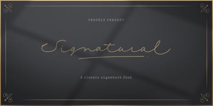 Give your designs an classy feel! Signatural is perfectly suited to signature, stationery, logo, typography quotes, magazine or book cover, website header, clothing, branding, packaging design and more. A handwritten script font containing uppercase and lowercase characters, numerals, a large range of punctuation, International language, ligatures, stylistic alternate and swashes.
 - Amsi Pro AKS by Stawix,
$79.00 Amsi has been designed to equipped with three different widths; Normal, Narrow and Condensed, addition to expanding weights to support various usabilities ranging from Thin, XLight, Light, Regular, SemiBold, Bold, Black and Heavy. Which makes Amsi along with a numerous features support the creativities of the designer from the Font Menu.
 - Christmas Neighborhood by Mvmet,
$15.00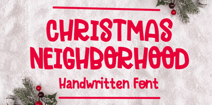 Christmas Neighborhood is your perfect stylish Christmas font. You can use it for anything ranging from t-shirts, kids’ book designs, and greeting cards to stickers and posters, or anything that needs a casual touch. Fall in love with its incredibly versatile style, and use it to create lovely designs!
 - Black Orchard by ErlosDesign,
$19.00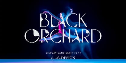 Black Orchard is a sans serif font with modern style. It includes uppercase letters, numeral, a large range of punctuation and also multilingual support. Perfects for poster, web design, magazine cover, album cover , branding and many more. The file you will get is: • Works on PC & Mac • Simple installation Enjoy!
 - Pedigree by Jonahfonts,
$29.00 Designed in six styles from Regular to Bold including Italics and Obliques, Pedigree covers a large range of editorial and advertising applications. Suggesting it’s usage is really up to the designers’ expertise whether it be used for web or print media. Try using the MyFonts “Preview Pedigree as a webfont”.
 - Amsi Pro by Stawix,
$40.00 Amsi has been designed to equipped with three different widths; Normal, Narrow and Condensed, addition to expanding weights to support various usabilities ranging from Thin, XLight, Light, Regular, SemiBold, Bold, Black and Heavy. Which makes Amsi along with a numerous features support the creativities of the designer from the Font Menu.
 - Winter Quarter by Mvmet,
$12.00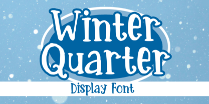 Winter Quarter is your perfect winter and season font. You can use it for anything ranging from t-shirts, kids’ book designs, and greeting cards to stickers and posters, or anything that needs a casual touch. Fall in love with its incredibly versatile style, and use it to create lovely designs!
 - Cornucurlia by Calligraplay,
$13.00 Cornucurlia is a carefully constructed typeface comprising curvaceously connected characters. Designed as a display font, use it for posters, signage, branding and any type-based artwork that needs stylish, standout lettering. Multi-lingual and with a range of symbols, the font includes 368 glyphs that link together with geometric curves.
 - Sweet Cane Comic by Mvmet,
$15.00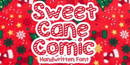 Sweet Cane Comic is a festive Christmas font. You can use it for anything ranging from t-shirts, kids’ book designs, and greeting cards to stickers and posters, or anything that needs a casual touch. Fall in love with its incredibly versatile style, and use it to create lovely designs!
 - Sillium by ATK Studio,
$15.00 Inspired by blackletter type styles. Sillium is built on modular basis. As a result, it excels in a wide range of display settings, logotypes, and short text. Determine the grid and create a complete set of cohesive characters (a-z) and multilanguage characters (latin based) in either lowercase or uppercase.
 - Joe Kubert by Comicraft,
$39.00 The official Joe Kubert font has been digitally mastered by John 'JG' Roshell based on Joe's own specifications for an upcoming SGT ROCK project for DC Comics. Pull up a chair at our Thanksgiving table and marvel at Joe's legendary work in comics ranging from TOR to FAX FROM SARAJEVO.
 - Criminal Trial JNL by Jeff Levine,
$29.00 An ad found within the pages of the Sept. 7, 1939 issue of Motion Picture Daily for "The Man They Could Not Hang" had the film's title hand lettered in a slightly stylized bold sans serif design. This is now available as Criminal Trial JNL, in both regular and oblique versions.
 - Alyson Signature by Subectype,
$14.00Alyson Signature is a Handwritten Signature Font, font with a touch of handwriting style. This font is perfect for creating signature logos and watermarks for photography studio or wedding invitation. Alyson Signature includes full set of beautiful hand lettered uppercase and lowercase letters, numerals and a large range of punctuation - Retro Candy by Mvmet,
$10.00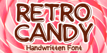 Retro Candy is a cool retro style candy display font. You can use it for anything ranging from t-shirts, kids’ book designs, greeting cards, stickers, and posters, or anything that needs a casual touch. Fall in love with its incredibly versatile style, and use it to create lovely designs!