10,000 search results
(0.032 seconds)
- Mr Dj Signature by Attractype,
$17.00 Mr. Dj Signature is a script typeface specially designed for signature fonts. With a balanced thickness, it is also suitable for various lettering purposes, such as greeting cards, invitations, branding, crafts, wedding decorations, even looks good for text. Mr. Dj Signature comes in two variants, regular appearing like calligraphy and monoline with the same line thickness. both are equipped with several ligatures, alternates and 3 signature swashes placed under the underline character (_) . Happy designing with Mr. Dj Signature.
 - MuskitosCaps by Ingrimayne Type,
$8.95 MuskitoCaps is a Tuscan (split-serif) font that is rather narrow and a bit awkward. It is caps only, though the lower case differs from the upper case(the lower case lacks the mid-stem spike). The family has three styles, plain, shadowed, and shadowinside. The last has the same shapes as the plain style but has the spacing of the shadowed style so it can be layered with the shadowed style to easily produce bi-colored lettering.
 - Mellnik by ParaType,
$25.00Mellnik is a sans serif of humanist style (in a way) that was developed by Oleg Karpinsky for ParaType in 2006. The type family contains nine styles with a number of alternate characters in each ones. For use as a text font in long text passages of advertising booklets, catalogues or magazines, as well as for accident setting. Mellnik may be also applied as a corporate typeface. Five condensed styles were added in 2007 by the same designer. - Nordic Folk by Kaer,
$19.00 Hey there! I'm happy to introduce to you my new ethnic-based font. Hurray! It was long and hard work because every glyph is unique. I sketched each letter of the font. Each letter is uniquely designed and has nordic folk art in the background. What you will get: Filled and Regular styles Icons and patterns font Uppercase (lowercase glyphs are same) Numbers and symbols Multilingual support Please feel free to request to add characters you need: kaer.pro@gmail.com
 - Virtuosa Classic by Linotype,
$29.99 Virtuosa Classicis the 21st century OpenType re-release of a classic Hermann Zapf design, his very first script typeface, Virtuosa. Based on the same sketches that would inspire Zapfino 50 years later, Hermann Zapf developed Virtuosa in 1948-49. It was originally released in metal in 1952. Virtuosa nova is an English copperplate script with character. The font includes two form variants for each capital letter, and there are a number of lowercase alternates and ligatures, too.
 - Organic Tuesday by Bogstav,
$15.00 Sometimes you need things organised in a neat way. Organic Tuesday has that, but also a will to break free at the same time. Years ago I was at a restaurant where the menu was handwritten with a clumsy, but characteristic and charming, monospaced font. I must have focused so much on these letters that I can’t recall what I actually ate. But what I do remember is that it was a Tuesday, and the restaurant was organic!
 - JAF Herb by Just Another Foundry,
$59.00 Herb is based on 16th century cursive broken scripts and printing types. Originally designed by Tim Ahrens in the MA Typeface Design course at the University of Reading, it was further refined and extended in 2010. The idea for Herb was to develop a typeface that has the positive properties of blackletter but does not evoke the same negative connotations – a type that has the complex, humane character of fraktur without looking conservative, aggressive or intolerant.
 - Markisa by Showup! Typefoundry,
$34.00 Markisa is a simple, cool, and dynamic Humanist-flavored Sans Serif type family. It consists of eighteen weights from Thin to Black in both Upright and Italic styles. The resilient yet robust typeface. A san-serif with a humanist touch, a steady combination of seriousness and merriment. Works well as texture in small sizes, while at the same time claiming its space on the display. With its distinctive characteristic, can catch anyone’s attention wherever and whenever.
 - Bronzier by Arterfak Project,
$13.00 Bronzier is a strong serif display family with 8 different styles. Bronzier was designed with a strong and sharp serif which gives it a more manly look. Sporty, vintage and modern taste at the same time which mean you can use this font family for many design styles. Inspired by old-school typography and modern style. Create a perfect design with Bronzier! Because Bronzier is suitable for logos, logotypes, apparel, jersey, tags, labels, posters, stickers, branding and more.
 - Overbeat by PizzaDude.dk,
$20.00 Grunge is not dead! Neither is punk! The proof is the Overbeat font! It has got both grunge and punk in the one and same. The letters are grungy, and punked up with a sort of halftone slime effect. It's hard, it's tough and perhaps even scary! Play around with the font and you'll quickly notice the variety of the font. Each lowercase letter has 4 different versions and there is ligature substitution for most common uppercase double letters!
 - Advertisers Gothic by HiH,
$12.00 Advertisers Gothic is bold and brash, like the city it comes from, Chicago. It was designed by the accomplished German-American matrix engraver, Robert Wiebking, for the Western Type Foundry in 1917. As its name suggests, it was designed for commercial headliner work, much as Publicity Gothic by Sidney Gaunt for BB&S the year before. See our Publicity Headline. Alternate letters ‘A’ & ‘S’ are provided. The most popular ad words “Free!”, “New!” and “Sale” (with both esses) are provided at an angle for dramatic tension. Advertisers Gothic became quite popular because it was effective. It can work equally well for a flyer advertising a non-profit event as for a magazine product ad. This font refuses to be a wimp. Use it boldly. Advertisers Gothic ML represents a major extension of the original release, with the following changes: 1. A total of 335 glyphs (compare) with added glyphs for the 1250 Central Europe, the 1252 Turkish and the 1257 Baltic Code Pages. 2. Added OpenType GSUB layout features: pnum, ornm, liga, hist & salt ˜ with total 13 lookups. 3. Added 209 kerning pairs. 4. Revised vertical metrics for improved cross-platform line spacing. 5. The most popular ad words “Free!”, “New!” and “Sale” (with both esses) are provided at an angle for dramatic tension The zip package includes two versions of the font at no extra charge. There is an OTF version which is in Open PS (Post Script Type 1) format and a TTF version which is in Open TT (True Type)format. Use whichever works best for your applications.
 - Bunday Clean by Buntype,
$22.50 Bunday Clean is a minimalist and friendly font family with different moods. It drops everything unnecessary like spurs and ears and appears crisp and contemporary with a slightly squarish touch. Like the other members of the superfamily (Bunday™ Sans and Bunday™ Slab), Bunday Clean provides uprights, a second set of styles with characters that reference handwritten cursive. These curvy styles give words a distinct look and are especially attractive for use in display applications and logotype design. Bunday™ Clean is space-saving and creates a homogenous text color with good legibility. The font was manually hinted and contains extensive handcrafted kerning tables to ensure perfect appearance in all media. It ships with 9 standard, 9 upright, and the corresponding italic styles from a considerably thin hairline to a quite thick heavy. It supports at least 99 languages and provides OpenType® features for ligatures, alternative glyphs, localized forms, and much more. Feature Summary*: -4 Moods: Normal, Upright, Italic and Upright Italic -9 weights: Hair, Light, Thin, SemiLight, Regular, SemiBold, Bold, ExtraBold and Heavy -Supports at least 99 Languages incl. eastern european -Overall width: Narrow or Space-Saving -Advanced f- ligature set including fb -Discretionary s- and c- ligatures -Alternative Characters: a, e, f, g, l, t, y, A, E, F, L, and more -Capital German Eszett -Extra characters with Polish Kreska -Catalan Punt Volat -More than 570 characters per font * Some features may only be available in OpenType®-savvy applications Please, take a look at the other Bunday superfamily members: Bunday™ Sans Bunday™ Slab
 - Transport New by K-Type,
$20.00 Transport New is a redrawing of the typeface designed for British road signs. In addition to the familiar Heavy and Medium weights, Transport New extrapolates and adds a previously unreleased Light weight font originally planned for back-lit signage but never actually applied. Version 3.0 of Transport New features significant improvements including numerous outline and spacing refinements, and a full complement of Latin Extended-A characters. Also, to align Transport New with the 2015 release of Motorway, the other typeface used for UK road signage, Italic fonts for all three weights have been added. Originally designed by Jock Kinneir and Margaret Calvert beginning in 1957 and first published on the Preston bypass in 1958, the original Transport font has subtle eccentricities which add to its distinctiveness, and drawing the New version involved walking a tightrope between impertinently eliminating awkwardness and maintaining idiosyncrasy. The Grotesk roots of the glyphs were investigated and cheekily fine-tuned – uncomfortably close terminals of characters such as 5, 6, C, G, and e were shortened, the S and s were given a more upright aspect and their protruding lower terminals tucked in, overly wide glyphs like the number 4 were narrowed, and some claustrophobic counters were slightly opened up. The question mark was redesigned and parentheses given some stroke contrast. The x height was edged fractionally even taller. The Heavy font is actually more of a Bold, and the Light is pretty much a regular weight, but the original nomenclature has been retained for old times’ sake.
 - Moliere by Eurotypo,
$44.00 The life of Molière is a story of struggle, hard work, domestic unhappiness, death and burial in obscurity and almost in shame. Molière left behind a body of work that not only changed the face of French classical comedy, but has also come to influence the work of other dramatists from around the world. Despite his own preference for tragedy, which he had tried to further with the Illustre Théâtre, Molière became famous for his farces, which were generally in one act and performed after the tragedy. Both the comic and the serious drama were powerfully affected by the work of Molière, not only in his own age and country but everywhere and up to the present time. Didot is a name given to a group of typefaces named after the famous French printing and type producing family. The classification is known as modern, or Didone. The typeface we know today was based on a collection of related types developed in the period 1784–1811. Firmin Didot cut the letters, and cast them as type in Paris. Along with Giambattista Bodoni of Italy, Firmin Didot is credited with establishing the use of the "Modern" classification of typefaces. The types that Didot used are characterized by extreme contrast in thick strokes and thin strokes, by the use of hairline serifs and by the vertical stress of the letters. As in the extreme contrasts of the literature of Molière, in Didione's typefaces, thick and thin strokes, straight and curved, are the most relevant characteristic for an era marked by the changes.
 - PMN Caecilia eText by Monotype,
$29.99PMN Caecilia™ is the premiere work of the Dutch designer Peter Matthias Noordzij. He made the first sketches for this slab serif design in 1983 during his third year of study in The Hague, and the full font family was released by Linotype in 1990. The PMN prefix represents the designer's initials, and Caecilia is his wife's name. This font has subtle variations of stroke thickness, a tall x-height, open counters, and vivacious true italics. Noordzij combined classical ductus with his own contemporary expression to create a friendly and versatile slab serif family. With numerous weights from light to heavy, and styles including small caps, Old style figures, and Central European characters, PMN Caecilia has all the elements necessary for rich typographic expression. eText fonts - the optimum of on-screen text quality With our new eText fonts that have been optimised for on-screen use, you can ensure that your texts remain readily legible when displayed on smartphones, tablets or e-readers. The poor resolution of many digital display systems represents a major challenge when it comes to presenting text. It is necessary to make considerable compromises, particularly in the case of text in smaller point sizes, in order to adapt characters designed in detail using vector graphics to the relatively crude pixel grid. So-called 'font hinting' can help with this process. This, for example, provides the system with information on which lines are to be displayed in a particular thickness, i.e. using a specific number of pixels. As font hinting is a largely manual and thus very complex technique, many typefaces come with only the most necessary information. What is unimportant for a text printed in high resolution can result in a poor quality image when the same text is displayed on a screen, so that reading it rapidly becomes a demanding activity. Specially optimised eText fonts can help overcome this problem. An extremely refined and elaborate font hinting system makes sure that these fonts are optimally displayed on screens. Monotype has not only adopted font hinting for this purpose but has also thoroughly reworked the fonts to hone them for display in low resolution environments. For example, the open counters present in the letters C, c, e, S, s, g etc. have been slightly expanded so that these retain their character even in small point sizes. Also with a view to enhancing appearance in smaller point sizes, line thickness has been discreetly increased and x-height carefully adjusted. Kerning has also been modified. Don't leave the on-screen appearance of your creations to chance. Play it safe and use eText fonts to achieve perfect results on modern display devices. Many typefaces, including many popular classics, are already available as eText fonts and new ones are continually being published. The eText font you can purchase here are available for use as Desktop Fonts or Web Fonts. Should they be used in Mobile Devices such as smartphones, tablets or eReaders, please contact our OEM specialists at sales-eu@monotype.com. - Coco Sharp by Zetafonts,
$39.00 Coco Sharp is the newest evolution of the Coco typographic project, developed since 2013 by Cosimo Lorenzo Pancini for the foundry Zetafonts, with the help of Francesco Canovaro and Andrea Tartarelli. Influenced by vernacular grotesques sign-painting and modernist ideals, and inspired by the classy aesthetic of fashion icon Coco Chanel, Coco is drawn on a classic geometric sans skeleton but applies humanist proportions and visual corrections to key letters with the aim to create a warmer, subtly vintage texture on the page and on the screen. Coco Sharp drops the rounded corners of previous incarnations (Coco Gothic and Cocogoose) to pair the typeface display and logo capability with a sharper definition for text use. As in the other Coco families, a wide range of alternate letterforms allows to express different historical moods, including elegant, quirky and unexpected designs able to transform a simple word in a memorable wordmark. The other peculiarity of Coco Sharp lies in the wide choice of x-heights given to the user, both by providing a variable version and five graded sub-families, that allows designers to fine-control text readability and space usage. Large and XLarge versions provide big and easily readable lowercase letters, perfect for small point size typesetting or bold copywriting; Small and XSmall provide smaller lowercase letters with the elegant proportions of Futura and its modernist eponyms, optimized for display use or for adding a classy flare to body text; the Regular x-height offers a "one size fits all" solution that works both for texts and for display use. Alle the 60 weights of Coco Sharp come with a full set of open type features allowing faultless typesetting thanks to small capitals, positional numbers & case sensitive forms. Use Coco Sharp out of the box as a solid workhorse family or enjoy discovering the limitless possibilities of its 2000+ latin, cyrillic and greek glyphs covering over 200 languages worldwide. • Suggested uses: perfect for modern branding and logo design, editorial design, web design, packaging and countless other projects; • 62 styles: 6 weights + 6 italics x 5 different x-heights + 2 variable fonts; • 2011 glyphs in each weight; • Useful OpenType features: Access All Alternates, Small Capitals From Capitals, Case-Sensitive Forms, Glyph Composition / Decomposition, Denominators, Fractions, Kerning, Lining Figures, Localized Forms, Mark Positioning, Mark to Mark Positioning, Alternate Annotation Forms, Numerators, Oldstyle Figures, Ordinals, Proportional Figures, Stylistic Alternates, Scientific Inferiors, Small Capitals, Stylistic Set 1, Stylistic Set 2, Stylistic Set 3, Stylistic Set 4, Stylistic Set 5, Stylistic Set 6, Stylistic Set 7, Stylistic Set 8, Stylistic Set 9, Subscript, Superscript, Tabular Figures, Slashed Zero • 220 languages supported (extended Latin, Cyrillic, Greek alphabets): English, Spanish, Portuguese, French, Russian, German, Javanese (Latin), Vietnamese, Turkish, Italian, Polish, Afaan Oromo, Azeri, Tagalog, Sundanese (Latin), Filipino, Moldovan, Romanian, Indonesian, Dutch, Cebuano, Igbo, Malay, Uzbek (Latin), Kurdish (Latin), Swahili, Greek, Hungarian, Czech, Haitian Creole, Hiligaynon, Afrikaans, Somali, Zulu, Serbian, Swedish, Bulgarian, Shona, Quechua, Albanian, Catalan, Chichewa, Ilocano, Kikongo, Kinyarwanda, Neapolitan, Xhosa, Tshiluba, Slovak, Danish, Gikuyu, Finnish, Norwegian, Sicilian, Sotho (Southern), Kirundi, Tswana, Sotho (Northern), Belarusian (Latin), Turkmen (Latin), Bemba, Lombard, Lithuanian, Tsonga, Wolof, Jamaican, Dholuo, Galician, Ganda, Low Saxon, Waray-Waray, Makhuwa, Bikol, Kapampangan (Latin), Aymara, Zarma, Ndebele, Slovenian, Tumbuka, Venetian, Genoese, Piedmontese, Swazi, Zazaki, Latvian, Nahuatl, Silesian, Bashkir (Latin), Sardinian, Estonian, Afar, Cape Verdean Creole, Maasai, Occitan, Tetum, Oshiwambo, Basque, Welsh, Chavacano, Dawan, Montenegrin, Walloon, Asturian, Kaqchikel, Ossetian (Latin), Zapotec, Frisian, Guadeloupean Creole, Q’eqchi’, Karakalpak (Latin), Crimean Tatar (Latin), Sango, Luxembourgish, Samoan, Irish, Maltese, Tzotzil, Fijian, Friulian, Icelandic, Sranan, Wayuu, Papiamento, Aromanian, Corsican, Breton, Amis, Gagauz (Latin), Māori, Tok Pisin, Tongan, Alsatian, Atayal, Kiribati, Seychellois Creole, Võro, Tahitian, Scottish Gaelic, Chamorro, Greenlandic (Kalaallisut), Kashubian, Faroese, Rarotongan, Sorbian (Upper Sorbian), Karelian (Latin), Romansh, Chickasaw, Arvanitic (Latin), Nagamese Creole, Saramaccan, Ladin, Kaingang, Palauan, Sami (Northern Sami), Sorbian (Lower Sorbian), Drehu, Wallisian, Aragonese, Mirandese, Tuvaluan, Xavante, Zuni, Montagnais, Hawaiian, Marquesan, Niuean, Yapese, Vepsian, Bislama, Hopi, Megleno-Romanian, Creek, Aranese, Rotokas, Tokelauan, Mohawk, Onĕipŏt, Warlpiri, Cimbrian, Sami (Lule Sami), Jèrriais, Arrernte, Murrinh-Patha, Kala Lagaw Ya, Cofán, Gwich’in, Seri, Sami (Southern Sami), Istro-Romanian, Wik-Mungkan, Anuta, Cornish, Sami (Inari Sami), Yindjibarndi, Noongar, Hotcąk (Latin), Meriam Mir, Manx, Shawnee, Gooniyandi, Ido, Wiradjuri, Hän, Ngiyambaa, Delaware, Potawatomi, Abenaki, Esperanto, Folkspraak, Interglossa, Interlingua, Latin, Latino sine Flexione, Lojban, Novial, Occidental, Old Icelandic, Old Norse, Slovio (Latin), Volapük;
 - Arsenica by Zetafonts,
$39.00 Arsenica is a serif typeface designed by Francesco Canovaro for Zetafonts, and developed by a design team including Mario De Libero, Andrea Tartarelli and Cosimo Lorenzo Pancini. The design of Arsenica takes its inspiration from Italian poster design at the beginning of the century, a time where typography, lettering and illustration where closely interwoven. Dawning nationalist movements, rather than using the modernist language, pushed on traditional Old Style letterforms often imbued with Art Nouveau and Deco sensibility. Artists like Giorgio Muggiani not only illustrated posters for Cinzano, Pirelli and Rinascente, but also provided logo design for newspapers, like "Il Popolo d'Italia". Starting from this mix of eclectic influences, Canovaro first developed the Arsenica Antiqua family, designed as display typeface that keeps the original Old Style low-contrast, wide proportions and quirky stylistic inventions. These where then distilled in a high contrast, Arsenica Display family, expanding the weight range to include both poster, ultra-bold weights and lighter weights that give the design a distinct calligraphic flavour. Bringing the letterforms into contemporary taste meant also developing alternate letterforms that were included in the Arsenica Alternate family, that drops the art nouveau details in favour of a more controlled modern serif aesthetic. Finally, Arsenica Text was developed by expanding the design space in the optical size axis, creating a low contrast, strongly readable old style typeface family, with a reduced weight set, oriented for long body copy typesetting. The final result is a superfamily of 41 weights, covering the design space with an expanded charset of over 900 glyphs, with full coverage of over 200 languages using latin and Cyrillic alphabets. All the weights of Arsenica come with a full set of open type features allowing to explore its vintage-inspired visual inventions thanks to stylistic sets, discretionary ligatures, contextual alternates and positional numbers. Two variable typefaces are included in the full family, allowing you to explore the design space and precisely control not only the weight but also the optical size design variations. • Suggested uses: perfect for elegant modern branding and logo design, fascinating editorial design, expressive packaging and countless other projects. • 43 styles: 7 weights + 7 italics, 4 different styles + 2 variable fonts. • 942 glyphs in each weight. • Useful OpenType features: Access All Alternates, Contextual Alternates, Case-Sensitive Forms, Glyph Composition / Decomposition, Discretionary Ligatures, Kerning, Lining Figures, Localized Forms, Mark Positioning, Mark to Mark Positioning, Oldstyle Figures, Ordinals, Stylistic Alternates, Stylistic Set 1, Stylistic Set 2, Stylistic Set 3, Stylistic Set 4, Stylistic Set 5, Stylistic Set 6, Stylistic Set 7, Stylistic Set 8, Stylistic Set 9, Slashed Zero. • 216 languages supported (extended Latin and Cyrillic alphabets): English, Spanish, Portuguese, French, Russian, German, Javanese (Latin), Turkish, Italian, Polish, Afaan Oromo, Azeri, Tagalog, Sundanese (Latin), Filipino, Moldovan, Romanian, Indonesian, Dutch, Cebuano, Igbo, Malay, Uzbek (Latin), Kurdish (Latin), Swahili, Hungarian, Czech, Haitian Creole, Hiligaynon, Afrikaans, Somali, Zulu, Serbian, Swedish, Bulgarian, Shona, Quechua, Albanian, Catalan, Chichewa, Ilocano, Kikongo, Kinyarwanda, Neapolitan, Xhosa, Tshiluba, Slovak, Danish, Gikuyu, Finnish, Norwegian, Sicilian, Sotho (Southern), Kirundi, Tswana, Sotho (Northern), Belarusian (Latin), Turkmen (Latin), Bemba, Lombard, Lithuanian, Tsonga, Wolof, Jamaican, Dholuo, Galician, Ganda, Low Saxon, Waray-Waray, Makhuwa, Bikol, Kapampangan (Latin), Aymara, Zarma, Ndebele, Slovenian, Tumbuka, Venetian, Genoese, Piedmontese, Swazi, Zazaki, Latvian, Nahuatl, Silesian, Bashkir (Latin), Sardinian, Estonian, Afar, Cape Verdean Creole, Maasai, Occitan, Tetum, Oshiwambo, Basque, Welsh, Chavacano, Dawan, Montenegrin, Walloon, Asturian, Kaqchikel, Ossetian (Latin), Zapotec, Frisian, Guadeloupean Creole, Q’eqchi’, Karakalpak (Latin), Crimean Tatar (Latin), Sango, Luxembourgish, Samoan, Maltese, Tzotzil, Fijian, Friulian, Icelandic, Sranan, Wayuu, Papiamento, Aromanian, Corsican, Breton, Amis, Gagauz (Latin), Māori, Tok Pisin, Tongan, Alsatian, Atayal, Kiribati, Seychellois Creole, Võro, Tahitian, Scottish Gaelic, Chamorro, Greenlandic (Kalaallisut), Kashubian, Faroese, Rarotongan, Sorbian (Upper Sorbian), Karelian (Latin), Romansh, Chickasaw, Arvanitic (Latin), Nagamese Creole, Saramaccan, Ladin, Palauan, Sami (Northern Sami), Sorbian (Lower Sorbian), Drehu, Wallisian, Aragonese, Mirandese, Tuvaluan, Xavante, Zuni, Montagnais, Hawaiian, Marquesan, Niuean, Yapese, Vepsian, Bislama, Hopi, Megleno-Romanian, Creek, Aranese, Rotokas, Tokelauan, Mohawk, Onĕipŏt, Warlpiri, Cimbrian, Sami (Lule Sami), Jèrriais, Arrernte, Murrinh-Patha, Kala Lagaw Ya, Cofán, Gwich’in, Seri, Sami (Southern Sami), Istro-Romanian, Wik-Mungkan, Anuta, Cornish, Sami (Inari Sami), Yindjibarndi, Noongar, Hotcąk (Latin), Meriam Mir, Manx, Shawnee, Gooniyandi, Ido, Wiradjuri, Hän, Ngiyambaa, Delaware, Potawatomi, Abenaki, Esperanto, Folkspraak, Interglossa, Interlingua, Latin, Latino sine Flexione, Lojban, Novial, Occidental, Old Icelandic, Old Norse, Slovio (Latin), Volapük.
 - Quire Sans by Monotype,
$155.99 My goal was to make a design that might fit in anywhere,” says Jim Ford about his Quire Sans™ typeface. “I wanted it to be highly functional and sexy at the same time.” With one foot comfortably in the realm of oldstyle design and traditional book typography, and the other in evolving electronic media, the Quire Sans family does, indeed, fit in just about anywhere. As for sexy, someone once quotably wrote, “A great figure or physique is nice, but it's self-confidence that makes someone really sexy.” Yes, Quire Sans is sexy, performing confidently in virtually any setting. 2014-06-26 00:00:00.000 57.9900 F43063-S193385 42831 Neue Frutiger World Monotype https://www.myfonts.com/collections/neue-frutiger-world-font-monotype-imaging https://cdn.myfonts.net/cdn-cgi/image/width=417,height=208,fit=contain,format=auto/images/pim/10000/279026_ed8c8093fe1ac59ebe9e3ee1d9262c8e.png Neue Frutiger World is designed for global use with an impressive range of 10 weights, from Ultra Light to Extra Black, with matching italics. It embodies the same warmth and clarity as Adrian Frutiger’s original design, but allows brands to maintain their visual identity, and communicate with a consistent tone of voice, regardless of the language. Neue Frutiger World supports more than 150 languages and scripts including Latin, Greek, Cyrillic, Georgian, Armenian, Hebrew, Arabic, Thai and Vietnamese. “Before Neue Frutiger World it was not an easy task for western brands to find families in Arabic, Hebrew, Thai and Vietnamese which match with their Latin,” says Monotype type director Akira Kobayashi, who led the Neue Frutiger World project. “They may find a type with closer expression, but there was no guarantee if the bold version in the non-Latin family matches the bold in their Latin. Neue Frutiger World offers a better solution.” In addition to Neue Frutiger World’s linguistic versatility, it works hard across environments – suited to branding and corporate identity, advertising, signage, wayfinding, print, and digital environments. The Neue Frutiger World fonts can be paired with Monotype’s CJK fonts: M XiangHe Hei (Chinese), Tazugane Gothic (Japanese), Tazugane Info (Japanese), and Seol Sans (Korean). These were all designed to address brands’ needs to expand into Asian cultures and solve for global typographic challenges.
 - Rolphie by Aah Yes,
$9.95 Rolphie can be your go-to sans-serif, with 16 easy-to-read weights and 10 versions for each weight, and the subtlety of choice that represents. The versions contained in each weight are: Regular; Condensed; Half-Condensed; Expanded; Small Capitals: and their italic counterparts. (At heavier weights particularly it seemed to be justified to have two Condensed versions). Plus there's 20 funky versions with the letters all shook up (that would make a good title for a song), or jumbled around, plus some Shadow, Doubled-Up, College, and other FX versions. In total there's 180 variations, giving a comprehensive selection of both standard and funky fonts, and that subtle degree of choice of weight. To make things easier, the weights are put in ascending numerical order from 01 to 16, and the FX versions have been stuck in the 80s and 90s, (like two musicians I know). There are grouped packages available for certain weights (which have 10 fonts in them) and the complete family package (180 fonts) which represent better value than the individual fonts, and there's a basic package containing the Normal and Italic versions of all 16 weights (32 fonts). A limit of 5 sub-family packages has been imposed, unfortunately, which precludes a more comprehensive selection. To let you know what's in the font that you might otherwise never know about . . . With Discretionary Ligatures on, you get special characters if you type Mc St. Rd. Bd. Ave. c/o No. (p) (P) - include the full-stop/period. With Stylistic Alternates switched on, you get plenty of extra characters - including a WiFi symbol (type Wifi or WiFi) / bullet numbers instead of ordinary numbers / that different U-dieresis / special characters for c/o No. Mc / an upside down ~ / a huge bullet, and different forms for cent, dollar, percent, per-thousand. As you'd expect, there's all the accented characters for all Western European scripts using Latin letters, and standard ligatures, plus other Open Type features including Class Kerning, Slashed-Zero, Historical Forms, Sub- and Superscript numbers, fractions for halves, thirds and quarters, Ornamental forms giving bullet numbers, etc. There's also the main mathematical operators, symbols like card-suits and male/female signs and so on, and some more obscure stuff like schwa and O-horn, U-horn - and there's lots more if you can Access All Alternates. Much will depend on what your software recognises. The Small Caps versions have (intentionally) lost the ligatures for lower case ff, fi, fj, fl, fr, fu, ffi, ffj, ffl, ffr, ffu. The names for the weights are not absolute - we had to make up some names to make them stretch out to sixteen - so rather - see them as relative to each other, being in ascending numerical order by weight.
 - ITC Tyfa by ITC,
$29.99 Some words from the designer, Frantisek Storm... Designed by Josef Tyfa in 1959, digitalized by F. Storm in 1996. This Roman and Italic are well-known perhaps to all Czech graphic artists and typographers ever since their release. Although this type face in some details is under the sway of the period of its rise, its importance is timeless, in contradistinction to other famous types dating from the turn of the sixties which were found, after some time, to be trite. The italics live their own life, only their upper-case letters have the same expression as the basic design. Thin and fragile, they work excellently, emphasizing certain parts in the text by their perfect contrast of expression. When seen from a distance they are a little bit darker than the Roman face. Tyfa Roman was released in 1960 by Grafotechna in Prague for hot setting. Later on, Berthold produced letter matrices - "rulers" for Staromat devices, used for manual photosetting of display alphabets. In the eighties it was available on dry transfers of Transotype and today it is offered also by ITC. The meticulously executed designs of the individual letters in the 288 point size are arranged into a set of signs on a cardboard of about B2 in size. The yellowed paper reveals retouches by white paint on the ink. Blue lines mark the baseline, the capital line, the ascender and descender lines and the central verticals of the letters. With regard to the format of the flat scanner, the designs had to be reduced, with the use of a camera, to the format A4, i.e. to the upper-case letter height of about 30 mm. These were then scanned in 600 dpi resolution and read as a bitmap template to the FontStudio programme. The newly created bold type faces derive from Tyfa's designs of the letters "a", "n", "p", the darkness of which was increased further, approximately by 3%, to enhance their emphasizing function. The text designs have hairstrokes thickened by one third; the contrast between thin and thick strokes has been modified, in order to improve legibility, in sizes under 12 points. We have used electronic interpolation to produce the semi-bold designs. Josef Tyfa himself recommends to choose a somewhat darker design than the basic one for printing of books.
 - Wilhelm Klingspor Schrift by Alter Littera,
$25.00 A comprehensive and faithful rendition of one of the finest metal typefaces of the 20th century. Rudolf Koch designed Wilhelm Klingspor Schrift (initially conceived as “Missal Schrift”, and later referred to also as “Wilhelm Klingspor Gotisch”) between 1919 and 1925 for the Gebr. Klingspor Type Foundry in Offenbach am Main. It is an impressive textura typeface, being sharp, elegant, spiky, sensitive and noble at the same time. Some of its most notable features have to do with the delicate decorations, the thin but subtly swelling lines that parallel or bridge strokes in the capitals, the hairline endings that terminate each stroke in both the capitals and the lowercase letters, the subtle joining of hairlines to thicker strokes, and the tension of some of the transitional curves. Koch’s original design included two sets of capitals (normal and condensed); alternates for a, d, e, r, s and z, plus long s; short and long flourished finial forms for f and t; thirty-five ligatures; and eighteen decorative pieces (Zierstücke). All of these features, plus several additional ones for modern use (including the usual standard characters for typesetting in modern Western languages, additional alternates and ligatures, plus carefully coded Opentype features), have been thoroughly implemented to the highest and most lively level of detail in the present font, in the hope that the past greatness of Wilhelm Klingspor Schrift will finally step into the modern OpenType realm. The main sources used during the font design process were several pages from a specimen book issued by the Gebr. Klingspor Type Foundry in 1927. Other sources were as follows: Bain, P., and Shaw, P. (Eds.) (1998), Blackletter: Type and National Identity, New York: Princeton Architectural Press (p. 43); Hendlmeier, W. (1994), Kunstwerke der Schrift, Hannover: Bund für Deutsche Schrift und Sprache (pp. 56-7); Kapr, A. (1983), Schriftkunst, Dresden: VEB Verlag der Kunst (p. 453); Kapr, A. (1993), Fraktur - Form und Geschichte der gebrochenen Schriften, Mainz: Verlag Hermann Schmidt (pp. 124-5); and Klingspor, K. (1949), Über Schönheit von Schrift und Druck, Frankfurt am Main: Georg Kurt Schauer (pp. 136-7). Some public and private comments by renowned designer and design historian Paul Shaw have also influenced both the design and the description of the present font. Specimen, detailed character map, OpenType features, and font samples available at Alter Littera’s The Oldtype “Wilhelm Klingspor Schrift” Font Page.
 - Cat Paw by Beary,
$14.00 Cat Paw embodies fun, quirkiness and authenticity. It features gorgeous and fun characters that will brighten up your crafting projects. It will elevate a wide range of design projects to the highest level, be it branding, headings, invitations, signatures, logos, labels, and much more!
 - Gear Four Graffiti by Sipanji21,
$13.00 Gear Four is a spectacular font with a graffiti style for your design look awesome. It will elevate a wide range of design projects to the highest level, be it branding, headings, wedding designs, invitations, signatures, logotype, wall art illustration, apparel, labels, and much more!
 - Porky Mother by Sipanji21,
$10.00 Porky Mother is a spectacular decorative font with a graffiti style and bubble looks. It will elevate a wide range of design projects to the highest level, be it branding, headings, wedding designs, invitations, signatures, logotype, wall art illustration, apparel, labels, and much more!
 - Locked Monster by Sipanji21,
$18.00 Locked Monster is a display font with a basic graffiti style. It will elevate a wide range of design projects to the highest level, be it branding, headings, wedding designs, tittle, signatures, logos, labels, movie, video, magazine, logotype, crafting, packaging, advertising and much more!
 - Winter Snowy by Sipanji21,
$10.00 Winter Snowy is a decorative font with a snow decoration on the top of characters. It will elevate a wide range of design projects to the highest level, be it branding, headings, wedding designs, invitations, signatures, logotype, wall art illustration, apparel, labels, and much more!
 - Freshtea Healthy by ahweproject,
$14.00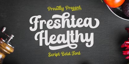 Freshtea Healthy feels equally charming and elegant. This stunning script font is a stylish homage to classic calligraphy. It will elevate a wide range of design projects to the highest level, be it branding, headings, wedding designs, invitations, signatures, logos, labels, and much more!
 - Christhine by Letterafandi Studio,
$14.00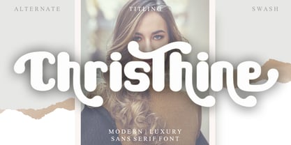 Christhine is a cool and interestingly designed display font. It will elevate a wide range of crafting ideas, from cards, to branding, labels and much more. This font is PUA encoded which means you can access all of the glyphs and swashes with ease!
 - Eggs Galore by Deniart Systems,
$20.00 EggsGalore consists of 52 decorative eggs along with 10 pedestals. These egg-shaped illustrations feature various decorative patterns ranging from geometric to frilly - great for greeting cards, posters, invitations. The EggsGalore font collection is a sure addition for your Easter or other decorative inspirations.
 - Jamstreet Graffiti by Sipanji21,
$15.00 Jamstreet Graffiti is a display font with one line graffiti style. It will elevate a wide range of design projects to the highest level, be it branding, headings, wedding designs, tittle, signatures, logos, labels, movie, video, magazine, logotype, crafting, packaging, advertising and much more!
 - Grota Rounded by Latinotype,
$26.00 Grota Rounded is a very expressive font, has a gestural character inspired by the hand lettering . Grota Rounded is grotesque, unicase and exceptional. It has six weights ranging from thin to black with their italics. It is ideal for logos, brands, magazines, headlines, books. etc.
 - Balaeno by Iwm Design,
$10.00 Balaeno seamlessly combines modern sophistication, technological innovation, sporting spirit, and timeless elegance into one captivating font. With its sleek design and sharp lines, the font not only reflects contemporary trends but also exudes cutting-edge technological vibes suitable for a range of design projects.
 - Storage JNL by Jeff Levine,
$29.00The range of subtle differences in the many different sized lettering stencils of the 1940s and 1950s allows for a wonderful library of authentic-looking stencil fonts. Storage JNL is another Roman (serif) type design by Jeff Levine and modeled from a 1950s stencil set. - Gentil by PintassilgoPrints,
$25.00 Gentil is a charming hand-drawn typeface. It comes in two weights along with two handy accessory fonts, one packed with darling doodles and the other loaded with lovely frames. Versatile, this very friendly family will certainly fit easily a wide range of design applications.
 - Jetblack by Tigade Std,
$35.00 Midnight is a cool, bold, and thick lettered sans serif font. It will elevate a wide range of crafting ideas, from cards, to branding, labels, and much more. Add it confidently to your favorite creations and let yourself be amazed by the outcome generated.
 - Korowai by ErlosDesign,
$19.00 KOROWAI - DISPLAY MODERN SERIF FONT by erlosDESIGN KOROWAI is a display serif font with modern style. It includes uppercase letters, numeral, ligatures, a large range of punctuation and also multilingual support. Perfects for poster, web design, magazine cover, album cover , branding and many more.
 - Fat Bubble by IbraCreative,
$23.00 Fat Bubble is a cute, cheerful and modern display font. Thick and friendly, this font will be an ideal choice for a wide range of casual, comic, kids book, and any informal designs. Use Fat Bubble for your creations and explore its endless possibilities.
 - Square Lemon by Awan Senja,
$14.00 Square Lemon feels equally charming and elegant. This stunning handwritten font is a stylish homage to classic calligraphy. It will elevate a wide range of design projects to the highest level, be it branding, headings, wedding designs, invitations, signatures, logos, labels, and much more!
 - Caskier by Hustle Supply Co,
$18.00 CASKIER Caskier is a whiskey inspired layered typeface. With 10 font files, you get access to a variety of potential aesthetics ranging from clean, layered or roughened. What's Included? Regular, Bold, Outlined, Shadow, Roughened + Oblique Versions Western European Character Set A variety of ligatures
 - Max Stitch by Aboutype,
$24.99Similar to Erasurehead. Redrawn as in line, outline font for embroidery application. Works well with layers, colors, gradients and filters. Max was designed for all media and can be used in a wide range of point sizes. Max requires subjective display kerning and compensation.