10,000 search results
(0.048 seconds)
- SK Brushwood by Shriftovik,
$10.00 SK Brushwood is an experimental geometric font based on chaotic lines. It is inspired by the Greek stone script, but nevertheless it is modern. The main component of the letter shape is straight and sloping lines ending in straight corners, which makes it look like brushwood. This is why the font gets its name. SK Brushwood is perfect for headlines, posters, print work, and the Internet.
 - Kepler by Adobe,
$29.00Named after the German Renaissance astronomer, Kepler is a contemporary type family designed by Robert Slimbach in the tradition of classic modern 18th century typefaces. Modern typefaces are known for their cool intellectual quality, but Slimbach's Kepler multiple master captures the modern style in a humanistic manner. It is elegant and refined with a hint of Oldstyle proportion and calligraphic detailing that lends it warmth and energy. - Aegiste by Flawlessandco,
$9.00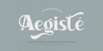 Aegiste is a Serif Retro Font with some font swashes that can add a touch of vintage to each letter. An Original typeface that suitable for any graphic designs such as branding materials, t-shirt, print, business cards, logo, poster, t-shirt, photography, quotes .etc This font support for some multilingual. Modern Serif Retro that contains uppercase A-Z and lowercase a-z, alternate character, numbers 0-9, and some punctuation. If you need help, just write me! Thanks so much for checking out my shop!
 - Javin by Flawlessandco,
$9.00 Javin is a Sweet Script Font with some font swashes that can add a touch of sweetness to each letter. An Original typeface that suitable for any graphic designs such as branding materials, t-shirt, print, business cards, logo, poster, t-shirt, photography, quotes .etc This font support for some multilingual. Modern Script that contains uppercase A-Z and lowercase a-z, alternate character, numbers 0-9, and some punctuation. If you need help, just write me! Thanks so much for checking out my shop!
 - Rossena by Flawlessandco,
$9.00 Rossena is a modern retro serif font that features unique alternate and ligature characters, so it's fitted for some retro project. An Original typeface that suitable for any graphic designs such as branding materials, t-shirt, print, business cards, logo, poster, t-shirt, photography, quotes .etc This font support for some multilingual. Modern Sweet Retro that contains uppercase A-Z and lowercase a-z, alternate character, numbers 0-9, and some punctuation. If you need help, just write me! Thanks so much for checking out my shop!
 - Chatarina by Flawlessandco,
$9.00 Chatarina is a Sweet Script Font with some font swashes that can add a touch of sweetness to each letter. An Original typeface that suitable for any graphic designs such as branding materials, t-shirt, print, business cards, logo, poster, t-shirt, photography, quotes .etc This font support for some multilingual. Modern Script that contains uppercase A-Z and lowercase a-z, alternate character, numbers 0-9, and some punctuation. If you need help, just write me! Thanks so much for checking out my shop!
 - Understory by Hanoded,
$15.00 Lately I feel reluctant to watch the news: The Amazon Forest is burning, Australian forests are burning, palm oil controversy… It really brings tears to my eyes to see all this destruction around me. It is like people hate nature with a vengeance - I cannot explain it otherwise. I made this font to take my mind off things. It was loosely based on Futura, a font I really like. Understory was completely made by hand. It comes with some cute upper case swashes and a whole bunch of diacritics. The good thing is: no trees were cut down or burned to make this font; in fact, I donated a nice amount of $ to help save the rainforests!
 - Austen Script by Tanya Cherkiz,
$20.00 Need beautiful letters for your love letter or wedding invitations? Look no more! Austen Script is an elegant and feminine typeface, named after Jane Austen, one of my favorite writers, who wrote so much about love. It includes uppercase and lowercase letters, numerals, punctuation, stylistic alternates, some ligatures and alternate uppercase letters, and multilingual support.
 - Bottle Brush by Hanoded,
$15.00 A Bottle Brush (a.k.a. Callistemon) is an Australian shrub. Its flowers resemble, well, bottle brushes, hence the name. Bottle Brush is also a very messy, yet quite lovely brush font. I made it with a Japanese brush pen. It comes with a bunch of alternate glyphs, some ligatures and a whole lot of diacritics!
 - Overton JNL by Jeff Levine,
$29.00 Overton JNL is based on some of the preliminary letter designs by Rudolf Wolf which evolved into his 1929 type design Memphis and is available in both regular and oblique versions. Memphis was the design model for the later typeface family Stymie and Overton JNL was named after Overton Park; located in Memphis, Tennessee.
 - Bear Anark by Ingrimayne Type,
$9.00 BearAnark is a decorative slab-serifed typeface that can be used for some text purposes. It has moderate contrast and comes in five weights, each with a true italic. The development of the family began with a blending of two other slab-serif faces, Anarckhie and BearButteT, and this origin is reflected in its name.
 - Reading And Writing Doodles by Outside the Line,
$19.00Reading & Writing Doodles is just that. 27 low-tech illustrations of books, pens, pencils and paper. Along with some hand lettered phrases, "My Book", "Ex Libris" and "From The Desk Of:" A fresh approach for Save a Date Cards and From The Desk Of notepads. An absolute must for bookplates and your book club graphics. - P22 Hoy Pro by IHOF,
$39.95 Hoy is a decorative font whose name derives from one of the Orkney Islands. Inspired by the wonderful encounter between the Celtic and Norse cultures in this specific geographic location, the font has adapted some of the features of the Insular half-uncial. It is playful and relaxed, and easily recognizable by its roundness.
 - Travel Plans JNL by Jeff Levine,
$29.00 A 1930s travel poster from American Airlines had the airline’s name in a classic thick-and-thin Art Deco design of hand lettering. With the addition of angular spurs, some of the characters become semi-serif in nature. This type style is now available as Travel Plans JNL, in both regular and oblique versions.
 - Polynesiac by Poole,
$22.50Polynesiac was discovered deep in the jungle on a cave wall on Gilligan's Island. "I was looking for ancient pictographs, and I find this crap instead!" says designer Wesley Poole. "But, the more I looked at it, the more I appreciated its charms." Sort of tropical, but not strictly Polynesian, this sans serif face never stoops to caricature, and achieves instead, a mysterious new flavor of the South Pacific Islands. Fun as it is, there's a certain dignity to it. "Living in Hawaii you just absorb this stuff. This is a fun loving culture. I hope I captured that, along with some Island Aloha." - QR by T-26,
$29.00QRc is based on a 2-D, space-saving optical code widely used in Japan. The code was originally intended for use in factories but quickly crossed into the consumer sector. With an enabled handset, a QR code -- which can appear on an ad, postcard, or almost anywhere else -- can be instantly interpreted to reveal its underlying message. QR contains 219 images. You can use the QRc font to accurately encode the letters you type, or just use it to create fields of lovely, semi-random pixel texture! The counterpart font, QR Type, is also a celebration of entropic pixelation, but the formations are alphabetic and human-readable. - Galifex by Andfonts,
$10.99 Galifex is a modern and futuristic sans-serif font that includes 4 weights and alternates. It can be used in many many projects. Standard CAPS letters are great in 90% scenarios, it can be masculine strong branding of construction company, but also it can be used in fashion design, interior, etc. you know....it works almost everywhere. But also you can use alternate CAPS and you can create logos of some sort of tech companies, future companies, metaverse, crypto you know...web 3.0. Create logos, labels, use in packaging, advertising, book covers, branding and magazines, headings, banners, posters and much more. Feel free to contact me: andfontscontact@gmail.com
 - Draughtwork by Scriptorium,
$18.00Draughtwork is a special decorative font designed to have the look of a work in progress, showing the process of constructing letters using a ruler and a compass on a grid. It's in the tradition of our very popular Roughwork font, but more detailed and with additional features. Unlike Roughwork, Draughtwork includes a full upper and lower case character set plus some special alternate character variants. Developing Draughtwork was a monstrous task. The complexity of the 9x9 grids with each character were a challenge to the rendering capacity of Fontographer and required an extraordinary amount of fine tuning - but the result was worth the effort. - DT Paper Type by Dragon Tongue Foundry,
$9.00 DT PaperType has evolved and morphed over time from quite distant origins. I previously created DT Paperside. It was neither Papyrus nor SSI Countryside, but was inspired in some ways by the Papyrus form, although untextured and smoother, and had the more open dimensions and proportions, similar to that of Countryside SSi, with its larger easily readable lowercase body, and more consistent, shorter stems. DT Paperside had an open scripted feel which was pleasing to the eye and easy to read. DT PaperType has since been crafted from of the original Paperside font. The Organic flow and comfortable form of Paperside has been retained, but it has been shifted very much from the feel of a script font, into a quality, extremely readable, organic and friendly, serif font, retaining its clarity, while adding a great deal of pose and class. This font is primarily suited to body text, and as such is extremely readable. It does however also make an excellent Display font, and comes with a full set of over sized Caps that drop below the line to stand out on a headline when required. Paperside can also automatically enhance the first letter of most sentences, and changes other letters to suit their position within words, and the letters they appear beside. Now comes with an italic that curves and softens various letters. For best results, use this ‘smart font’ with Contextual Ligatures turned on. Mulitiple Stylistic Alternatives are included. Inspiration for this fonts predecessor (Paperside) came from two other fonts. Papyrus: designed by Chris Costello and created in 1982, it is a hand-drawn textured typeface, emulating texts written in biblical times. One of the most used (and misused) fonts of all times. Owned by Letraset, and currently published by the Internation Typeface Corporating (ITC). Countryside SSi: The serif font of an unknown designer, currently licensed by Southern Software Inc. Feel free to preview some other Dragon Tongue fonts that are yet to be released, at https://www.dragon-tongue.com/fonts
 - Dynatype by Alphabet Soup,
$60.00 Suddenly...it’s the World of Tomorrow! With the push of a button Dynatype automates your typesetting experience. Dynatype is actually Two fonts in One–without switching fonts you can instantly change from Dynatype’s “regular” style to its alternate connecting version with the simple push of a button. For more details download “The Dynatype Manual” from the Gallery Section. What is Dynatype? Dynatype is the upright, slightly more formal cousin of Dynascript. It shares many of the characteristics of it’s slightly older relation, but is drawn entirely from scratch and has it’s own unique character. Dynatype may be reminiscent of various mid-century neon signage, and of sign writing, Speedball alphabets and even baseball scripts. Its design also takes some cues from a historical typographic curiosity that began in Germany in the ‘20s and which lasted into the ‘60s—when Photo-Lettering gave it the name "Zip-Top". Basically it was believed to be the wave of the future—that by weighting an alphabet heavier in its top half, one could increase legibility and reading speed. The jury’s still out on whether or not there’s any validity to this notion, but I think you’ll agree that in the context of this design, the heavier weighting at the top of the letters helps to create some uniquely pleasing forms, and a font unlike any other. Typesetters across the planet will also be able to set copy in their language of choice. Dynatype’s 677 glyphs can be used to set copy in: Albanian, Basque, Catalan, Cornish, Croatian, Czech, Danish, Dutch, Esperanto, Estonian, Faroese, Finnish, French, Galician, German, Hungarian, Icelandic, Indonesian, Irish, Italian, Kalaallisut, Latvian, Lithuanian, Malay, Maltese, Manx, Norwegian Bokmål, Norwegian Nynorsk, Oromo, Polish, Portuguese, Slovak, Slovenian, Somali, Spanish, Swahili, Swedish, Turkish, and Welsh—and of course English. Sorry! Off-world languages not yet supported. PLEASE NOTE: When setting Dynatype one should ALWAYS select the “Standard Ligatures” and “Contextual Alternates” buttons in your OpenType palette. See the “Read Me First!” file in the Gallery section.
 - FS Split Sans by Fontsmith,
$80.00 Quirky and irregular FS Split is no ordinary typeface. Its irregular proportions make it unique, with round letters appearing wide, and straight letters narrow. Other quirks include its eclectic crossbars – the uppercase ‘A’ has an unusually low bar, while the bar on ‘G’ is particularly long. The uppercase has many interesting features in fact, including large counters, closed terminals on certain letters like ‘J’, and a cap-height that lines up with ascenders. The lowercase also holds surprises – the dots on ‘i’ and ‘j’ are unusually large, and some characters, such as ‘g’, feature double-storey counters. An extreme but stylish italic The italic versions of FS Split Sans and Serif are particularly striking. While similar in style to their upright, Roman versions, they take on a larger-than-usual 18-degree angle, making the forward-slant more dramatic. Although the main purpose of any italic is to help words and phrases stand out, this unique execution helps to make the italic variants of FS Split stylish fonts in their own right – they would work brilliantly on magazine covers, in titles and headlines, pull quotes, and even used commercially in logos and corporate branding. Serif and sans: a split personality FS Split Sans and Serif have their differences but also their similarities, contrasting and complementing each other perfectly. This ‘love hate’ relationship inspired the name of the typeface family, and means the two variants provide a versatile, typographic palette for use in graphics and branding. While its proportions are similar to the sans, the serif has a bigger contrast between its weights of bold, regular and light, bracketed serifs, and different styles of terminals, some being straight and others ball-shaped. FS Split Sans has more subtlety and simplicity, with a smaller weight contrast, less flamboyant terminals, and more consistent counter sizes. The two variants are distinct yet alike, so can be used successfully either in isolation or together.
 - FS Split Serif by Fontsmith,
$80.00 Quirky and irregular FS Split is no ordinary typeface. Its irregular proportions make it unique, with round letters appearing wide, and straight letters narrow. Other quirks include its eclectic crossbars – the uppercase ‘A’ has an unusually low bar, while the bar on ‘G’ is particularly long. The uppercase has many interesting features in fact, including large counters, closed terminals on certain letters like ‘J’, and a cap-height that lines up with ascenders. The lowercase also holds surprises – the dots on ‘i’ and ‘j’ are unusually large, and some characters, such as ‘g’, feature double-storey counters. An extreme but stylish italic The italic versions of FS Split Sans and Serif are particularly striking. While similar in style to their upright, Roman versions, they take on a larger-than-usual 18-degree angle, making the forward-slant more dramatic. Although the main purpose of any italic is to help words and phrases stand out, this unique execution helps to make the italic variants of FS Split stylish fonts in their own right – they would work brilliantly on magazine covers, in titles and headlines, pull quotes, and even used commercially in logos and corporate branding. Serif and sans: a split personality FS Split Sans and Serif have their differences but also their similarities, contrasting and complementing each other perfectly. This ‘love hate’ relationship inspired the name of the typeface family, and means the two variants provide a versatile, typographic palette for use in graphics and branding. While its proportions are similar to the sans, the serif has a bigger contrast between its weights of bold, regular and light, bracketed serifs, and different styles of terminals, some being straight and others ball-shaped. FS Split Sans has more subtlety and simplicity, with a smaller weight contrast, less flamboyant terminals, and more consistent counter sizes. The two variants are distinct yet alike, so can be used successfully either in isolation or together.
 - Helvetica World by Linotype,
$149.00 Helvetica is one of the most famous and popular typefaces in the world. It lends an air of lucid efficiency to any typographic message with its clean, no-nonsense shapes. The original typeface was called Neue Haas Grotesk, and was designed in 1957 by Max Miedinger for the Haas’sche Schriftgiesserei (Haas Type Foundry) in Switzerland. In 1960 the name was changed to Helvetica (an adaptation of Helvetia, the Latin name for Switzerland). Over the years, the original Helvetica™ family was expanded to include many different weights, but these were not as well coordinated with each other as they might have been. At the beginning of the 21st Century, Linotype released an updated design of Helvetica, the Helvetica World typeface family. This family is much smaller in terms of its number of fonts, but each font makes up for this in terms of language support. Helvetica World supports a number of languages and writing systems from all over the globe.
 - Basic Commercial by Linotype,
$57.99 Basic Commercial is a family of fonts based on historical designs from the hot metal type era. First appearing around 1900, these designs were created by type designers whose names have not been recorded, but whose skills cannot be overlooked. These typefaces were popular among groups and movements as diverse as the Bauhaus, Dadaism, and the masters of Swiss/International-Style typography. They influenced a variety of later grotesque fonts, such as Helvetica and Univers. Basic Commercial was distributed for many years in the United States under the name Standard Series. The typeface worked its way into many aspects of daily life and culture; for instance, it became the face chosen for use in the New York City subway system’s signage. The Basic Commercial family members have a clear and objective design. Their forms exhibit almost nothing unusual, but remain both lively and legible nonetheless. Perhaps for this reason, Basic Commercial’s design has been popular with graphic designers for decades.
 - Blackhole PB by Pink Broccoli,
$14.00 A vintage look to the future of type, this funky typestyle with circular cut outs was stylish for its day, and a true novelty for today. Blackhole PB began as a digitization of a film typeface known as Circue Solid by LetterGraphics. This typestyle has such funkadelic appeal to it that it just makes me smile. Definitely not for broad uses, but full of novel flair. This font is the bees knees for anyone with a circle fetish. They are like hidden mickeys in this typestyle, building up curves and counters all over the place. Take it for a spin and have a flashback to wilder times.
 - Mayfair by Canada Type,
$24.95The long awaited and much requested revival of Robert Hunter Middleton's very popular classic is finally here. Mayfair Cursive was an instant hit for Middleton in 1932, and it went on being used widely until late into the 1970s, in spite of it never having crossed over to film type technology. Like a few of its contemporary designs, most notably the work of Lucien Bernhard, Mayfair is a formal script that is somewhat based on traditional italic forms with swash uppercase, but also employs subsidiary hairline strokes in some of its lowercase as an emphasis to the script's cursive traits. Why these gorgeous letters never made the leap into photo typesetting is a mystery to us. But here they are now in digital form, almost three quarters of a century since they first saw the light in metal. Mayfair was redrawn from original 48 pt specimen. It also underwent a major expansion of character set. Plenty of swash characters and ligatures were added. An alternate set of lowercase was also made, in order to give the user a choice between connected and disconnected variations of the same elegant script. Mayfair ships in all popular font formats. While the Postscript Type 1 and True Type versions come in two fonts (Mayfair and Mayfair Alt), the OpenType version is a single font containing all the extra characters in conveniently programmed features that are easily accessible by OpenType-supporting software applications. We are quite sure today's graphic designers will be appreciative of having access to the face that all but defined menus, romance covers, wine and liquor labels and chocolate boxes for almost two 20th century generations. - Oorrnnoott by sugargliderz,
$44.00 This is a series that takes unfinished typefaces that were either previously ideated but not realized or were close to completion but left incomplete due to dissatisfaction with certain aspects, and brings them to completion. "Oorrnnoott" was originally a project named "Petitgothiquemignon" or "Sangoth". In the process of refining "Kropotokin", several ideas were incorporated into the design. Well, I say "incorporated," but it was designed on a whim, as usual. After all, it was started around 2005, and I don't usually leave notes or anything (which isn't the best habit), so I don't remember the emotions or thoughts behind its creation. Please consider this typeface as a very typical sans-serif font, as that is what I was aiming for when I excavated it this time. Please use it for body text, headlines, eye-catching designs, or whatever you like.
 - Quinella by Eclectotype,
$40.00 Plumper than a misguided Z-lister's dodgy lip job, this is Quinella, named after the cheffy scoops of ice cream and the like, quinelles. It's a cute, fat script with a seventies vibe but a personality all of its own. It's non-connecting in the usual sense, but the letters overlap to make the white space as tiny as possible. Ligatures (standard and discretionary) make smoother solutions for quite a few pairs and trios, and every upper case letter has a more exuberant swash alternate. The contextual alternates feature substitutes in an alternate t for a better fit with certain letters. Fonts don't come much more voluptuous than this. The full-fat, creamy appearance makes it perfect for food packaging, but don't let it end there; it'll make memorable logos, unmissable headlines, and posters with more punch.
 - Smokers by Vozzy,
$5.00 A vintage look layered label font named "Smokers".Typeface includes six styles (including effect styles), for sample look at 4th preview. This font will good viewed on any retro design like poster, t-shirt, label, logo etc. For using effects layers: - Type your text in Regular. - Copy that and paste at the same position. - Change the style to Shadow or Texture. - Alternates in first letters - just type letter in caps. For alternates in last letters - just use alternates for small letters. Thank you!
 - Boetia by Scriptorium,
$24.00Boetia is an Art Nouveau period font which is designed to give some of the feel of ancient Greek lettering and design. It also echoes the lettering of the Psychedelic poster era and would be a great addition to any 60s font collection. The overall effect is both modern and classical at the same time, with readable, bold character forms perfect for posters or other titling uses. If you like our Hendrix or Pantagruel fonts you're going to love Boetia. - Tasty Chat by PizzaDude.dk,
$17.00 Something tasty for your design! Tasty Chat is designed to be super legible and with a natural and organic feeling to it. Besides multilingual support, the font has 4 different versions of each lowercase letter. These "contextual alternates" cycles as you type which makes the font more random and handmade looking. Add some of the doodles to your design to make it more spectacular - they were made with the same pen as the actual font, so they fit perfectly together!
 - Vigorous by Gerald Gallo,
$20.00 Vigorous is a clean and crisp, display font set. As their names imply, Vigorous Lower Case has a lowercase alphabet while Vigorous Small Caps has small caps in place of the lowercase alphabet. Both fonts have the same uppercase alphabet, numbers, accented characters, punctuation, symbols, and miscellaneous characters. The Vigorous fonts are ideal for headlines or titles - wherever a fresh, unique font is desirable. Vigorous Lower Case and Vigorous Small Caps are sold only as a set priced at $20.
 - Regular Joe by GroupType,
$21.00 Regular Joe was first delivered to the font world by Ron and Joe. Yes, the same Ron and Joe of the ArtParts fame. A few years of being so regular, Regular Joe became, well, just bored. Regular Joe needed company. He wished for a family. After all, most of his font friends had big families. His wishes were granted by FontHaus. So Skinny and Husky were created to be with Regular and all together, they became Family Joe. All is well.
 - Stacked Deck PB by Pink Broccoli,
$14.00 Stacked Deck is a retro typestyle inspired by an old private eye pulp paperback of the same name, and it expands on the title to dance on screen or in print. Let the cards fall in your favor with Stacked Deck in your playful typeface design collection. While this may look like an all capitals typeface, it contains a mix of capitals and alternate capitals meticulously kerned and cross kerned so you can mix them seamlessly. Just have fun with it.
 - Bonlivet by Greater Albion Typefounders,
$12.00 Bonlivet is an all capitals display face, which starts from Roman letter forms and pushes them into wild decorative extravagance. There is a somewhat early 20th century feel to this, but really it’s just a bit of good fun, with a hint of elegance thrown in.
 - Techno Retro JNL by Jeff Levine,
$29.00 Techno Retro JNL looks like a design straight out of the 1980s, but it actually appeared as hand lettering on a sheet music cover for the circa-1940s edition of the song "To You Sweetheart, Aloha", proving the old saying that "everything old is new again".
 - Fence Post JNL by Jeff Levine,
$29.00 The inspiration for Fence Post JNL comes out of an early 1900s manual for sign writing. A number of changes were made to make the design more aesthetically pleasing, but it retains its novelty effect of evoking the look of wooden fence posts or Western-themed typography.
 - Early Morning Coffee by Hanoded,
$15.00 Wake up and smell the….. Early Morning Coffee! It's a bit messy, I admit, but it has everything you need to make your designs look good. This caffeine fueled script comes with a whole bunch of alternates (CALT & SALT) and has all the diacritics you need.
 - HT Motel by Dharma Type,
$19.99 A handsome font, perhaps a little classical. Regularly-connected script, so it’s legible but also memorable font. Holiday Type Project offers retro hand drawing scripts. Inspired by retro script on shopfront lettering, wall paint advertisements in Italy around 1950s. Check out the script fonts from Holiday Type!
 - Herbaceous Border by Lauren Ashpole,
$15.00 Herbaceous Border features blocky letters made up of an intricate pattern of leaves and vines. It should definitely be used for headlines to get the most out of the details. All of the letters are capitals but the lowercase characters provide an alternative set of leafy designs.