10,000 search results
(0.086 seconds)
- Gunsmoke by FontMesa,
$25.00Gunsmoke is a revival of a James Conner's Sons font that's been listed under different names such as Extended Clarendon Shaded, Original Ornamented and Galena. Dating back to 1888 this font was available with an original lowercase, numbers and punctuation. Today we've expanded the set to include the original shaded version a regular black, open left, open right and a fill font for the two open faced versions. The single Gunsmoke fill font is in alignment with the Gunsmoke Open R version and will also work with Gunsmoke Open L by shifting your fill font layer to align with the Open L version. You will need an application that works in layers in order to use the fill font with the Gunsmoke Open L and R fonts. Make sure you check out the left and right pointing gun hands on the less than and greater than keys, the gun alone is on the left and right brace keys. Remember to check your gun in with the Marshal when entering Dodge City. - Conversation Hearts by Harald Geisler,
$- Conversation Hearts are inspired by the sweethearts and conversation hearts that can be found all over the US and Britain, but not in Germany. A source of endless fun and surprise. As a typographer to me they are also a surprising document of written communication. Most people complain that nowadays the inscriptions are not as sweet as they used to be. While they used to held romantic and promising inscriptions like “Be True” “Sweet Talk”, today they carry “Tweet me” “Ur Hot” and “Party Girl”. So i took this as a motivation to work with conversation sweetheart on a conceptial inspirational and typographical level. The obvious: every letter pressed on the keyboard brings out a conversation heart that starts with the letter - i.e. L = Loverboy, H = Heartless but what to write? Since i didn't want to reproduce the old “Fax me” and “Email me” I had to come up with something new. Something with a personal relation and of course something that I Love - what else could i write in the shape of the heart? So I tried to access my upper subconsciousness and looked for two words for every letter in the alphabet. One for the capital letter pressed and one word for the lowercase letter. Resulting in a Kurt Schwitters worthy assemblage of vocables "Post-office" “Internship” “Zebra” “Answers” etc. It is not easy to read a text set in Conversation Hearts but easier as a text set in Zapf-Dingbats. To sparkle the visual appearance uppercase letters are filled hearts with “carved” inscription, while lowercase letters are an outlined heart with written inscription. Conversations Hearts is a part of the Light Hearted Font Collection that is inspired by a recording of Jean Baudrillard with the title, "Die Macht der Verführung" (The Power of Seduction) from 2006. Further inspiration came from the article, "The shape of the heart: I'm all yours". The heart represents sacred and secular love: a bloodless sacrifice. by British writer Louisa Young printed in EYE magazine (#43) London, 2002.
 - Leaner by Kulturrrno,
$9.00 "Leaner" is uppercase sans-serif typeface. It’s clean and universal. Best for logos and heading. Extended latin glyphs Uppercase letters Thin / Regular / Bold weights + Same italics Numbers & punctuation That's it!
 - Bulmer by Monotype,
$29.00Cut as a private version for the Nonesuch Press in the early 1930s, Monotype Bulmer was first released for general use in 1939. Based on types, cut by William Martin circa 1790, used by the Printer, William Bulmer, in a number of prestigious works, including Boydell's Shakespeare. Martins types combined beauty with functionality. Narrower and with a taller appearance than Baskerville, it anticipated the modern face of Bodoni but retained vital qualities from the old face style. This new digital version of the Bulmer font family was drawn by Monotype following extensive research into the previous hot metal versions and a study of Bulmer's printed works. Additional weights have been designed together with a wide range of Expert and alternative characters. - Grande Sans by Type Innovations,
$39.00 Say hello to Grande Sans—a geometric typeface that features highly stylized capitals with sharp corners, circular forms and generous proportions. Specifically created for visual impact—use Grande Sans when you want your words to stand out from the rest of the crowd. The concept is modern, futuristic and non-traditional. Perfect for display text, logos and headlines. The development of Grande Sans started in 1997, inspired by Alex Kaczun’s best selling grotesque font family called Contax Pro. Grande Sans is specifically introduced here as a black weight, but Alex plans to expand the design to include many weights, styles and alternative design treatments. Stay tuned! If you like Grande Sans—check out Alex Kaczun’s Decrypt fonts as well as all of Type Innovations fonts here.
 - Sub Comp by Ech000,
$10.00 SubComp is a carefully constructed font made with over 160+ individual glyphs for English and some Latin based languages. This font is inspired by old fashioned computer and programming fonts with a unique twist to the lettering. Features characters or glyphs for Basic Latin, Some Extended Latin Characters, Some Greek, Some Coptic. Created for web, poster, graphic design, social media and branding.
 - Photo Developer JNL by Jeff Levine,
$29.00 An image found online of a vintage storefront sign for the Kraus Photo Shop was the inspiration for Photo Developer JNL, which is available in both regular and oblique versions. The sign featured a thick and thin Art Deco style lettering with an inline cutting through the thicker strokes. Before the advent of digital photography, and way before chain stores offered in-house processing, neighborhood photo labs were the only place for getting prints from your roll film (unless you wanted to send the film into Kodak for developing and printing). Customers of these stores could also purchase additional film, cameras and photographic accessories from the same location.
 - Sign and Display JNL by Jeff Levine,
$29.00 Sign and Display JNL is a long-overdue companion font to 2009’s Sign and Poster JNL. The original design models were Art Deco influenced die-cut cardboard letters and numbers manufactured by the Duro Decal Company of Chicago. Square in shape with rounded corners, the thick cardboard letters were used for making show-cards and other display signage. Subsequently, Duro used the same style of lettering to manufacture water-applied decals for boat identification and other uses. It was a set of these decals (with a black outline and yellow interior) that inspired the outline typeface Sign and Display JNL, which is available in both regular and oblique versions.
 - PM Doorbuster Script by Paper Moon Type & Graphic Supply,
$20.00 A new font inspired by vintage hand-painted paper grocery store signs. The Doorbuster Collection is based on retro hand-painted paper signs primarily seen in grocery stores from the 1920s through the 1970s. We meticulously hand-drew each font, modeling the spacing and uneven baseline found in vintage sign painting. The purposely organic ascenders and descenders, along with a huge set of ligatures/contextual alternates to avoid the same letters repeating when paired, give it a real hand-lettered look. Doorbuster Script is perfect for both vintage-inspired and contemporary marketing, branding, and packaging designs. Check out a few of the samples included in the thumbnails above.
 - Devoid by Dropper,
$35.00 Devoid is a sans serif typeface with a no frills stripped down design. The design has all the features of the neo grotesk typeface, horizontally cut endings, modern capitals, oval counters, with a bare bones appearance. The typeface comes in three subtle widths, Devoid Slim, which is spaced most narrowly, Devoid and Devoid Set, which have a wider letterspacing. There are regular, medium and bold weights with accompanying italics. The vertical metrics align across weights and widths, this allows for optical size adjustment as well as adjusting for same size text fit. Dutch designer Pier Taylor designed the typeface in 2020 for use in catalogs, lists and registers.
 - Wildrace by Din Studio,
$29.00 Get ready to be bold and elegant at the same time. It’s time to see Wildrace, a display font created in capital letters with the racing theme. The font’s character is the thick letters formed similar to rectangles to give strong impressions. Therefore, it will be more noticeable and match the large-sized texts. Wildrace also provides interesting features to enjoy. Features: Multilingual Supports PUA Encoded Numerals and Punctuation Use Wildrace for any design projects such as posters, banners, logos, book covers, headings, printed products, merchandise, social media, etc. Find out more ways to use this font by taking a look at the font preview. Purchase now. Happy designing.
 - Johnstemp by Linotype,
$29.99As a spinoff to his Tagesstempel™ design, Georg John created Johnstemp™ in 2008. The Johnstemp family has four weights, as well as a special Mix" variant. Each of the basic fonts (Light, Medium, Bold, and Heavy) contain many alternate glyphs, allowing users to set text that realistically simulates stamped impressions. For even faster design, Johnstemp Mix is the perfect choice; it contains letters with far more stylistic and weight variation out-of-the-box, and was developed to create even livelier impressions. Here as well, many alternates are included in the character set to prevent too much repetition of the same glyphs. " - 20th Century ExtraBold Extended by Wooden Type Fonts,
$20.00 A version of Futura, but very bold, ideal for modern advertising.
 - Bungalow by Elemeno,
$25.00Roughhewn, but oddly formal, Bungalow is a rock-solid casual font. - Jukebox Hero by Grype,
$19.00 As one of the most popular rock bands of the world, Foreigner has rocked the charts with 10 multi-platinum albums and sixteen top 30 hits in the last 40 years. But one might ask what a band this successful has been missing all these years? No head games here...a consistent typeface based on their logo is the answer. As fans of Foreigner, we've taken the essence of their iconic logotype and expanded it out into a full typeface in regular and bold weights to celebrate their 40th anniversary tour. The Jukebox Hero Family celebrates the typographic stylings of Foreigner, with the soft rounded terminals and an open geometric feel, including the unique stencil flavor of the original logo. It inherited the friendly stylings of the all Capitals logo that inspired it, and goes on to include a full standard character set with expansive international support of latin based languages, and two weights jumping from regular to a beefy bold. This family is ready to rock the charts for your designs towards that of a modern, comfortable appeal. Here's what's included with Jukebox Hero Family bundle: 413 glyphs - including Capitals, Lowercase, Numerals, Punctuation and an extensive character set that covers multilingual support of latin based languages. (see the 3rd graphic for a preview of the characters included) 2 weights: Regular & Bold. Fonts are provided in TTF & OTF formats. The TTF format is the standard go to for most users, although the OTF and TTF function exactly the same. Here's why Jukebox Hero Family bundle is for you: You're a die-hard Foreigner fan, and have a case of "Double Vision" and need both font weights. You're looking for a stylish and sophisticated soft sans-serif stencil typeface family. You've been waiting for fonts like these. You're looking for a Sci-fi vibe typeface that has a look that feels familiar. You just like to collect quality fonts to add to your design arsenal
 - Sui Generis by Typodermic,
$11.95 Looking for a typeface that’s as unique as your personality? Look no further than Sui Generis, the rounded square sans-serif that’s unlike any other. With its technical letterforms and boxy curves, Sui Generis has an industrial character that’s all its own. It’s the kind of typeface that demands attention, without ever feeling pushy or obnoxious. In fact, its understated charm is part of what makes it so special. But don’t let its quirky personality fool you—Sui Generis is as practical as it is unique. With four weights, two widths, italics, and an outline style, it’s incredibly versatile and perfect for any project that requires a touch of character. So if you’re tired of bland, run-of-the-mill typefaces that all look the same, give Sui Generis a try. Its square letterforms and distinctive voice will make your design stand out from the crowd, and leave a lasting impression on anyone who sees it. Most Latin-based European writing systems are supported, including the following languages. Afaan Oromo, Afar, Afrikaans, Albanian, Alsatian, Aromanian, Aymara, Bashkir (Latin), Basque, Belarusian (Latin), Bemba, Bikol, Bosnian, Breton, Cape Verdean, Creole, Catalan, Cebuano, Chamorro, Chavacano, Chichewa, Crimean Tatar (Latin), Croatian, Czech, Danish, Dawan, Dholuo, Dutch, English, Estonian, Faroese, Fijian, Filipino, Finnish, French, Frisian, Friulian, Gagauz (Latin), Galician, Ganda, Genoese, German, Greenlandic, Guadeloupean Creole, Haitian Creole, Hawaiian, Hiligaynon, Hungarian, Icelandic, Ilocano, Indonesian, Irish, Italian, Jamaican, Kaqchikel, Karakalpak (Latin), Kashubian, Kikongo, Kinyarwanda, Kirundi, Kurdish (Latin), Latvian, Lithuanian, Lombard, Low Saxon, Luxembourgish, Maasai, Makhuwa, Malay, Maltese, Māori, Moldovan, Montenegrin, Ndebele, Neapolitan, Norwegian, Novial, Occitan, Ossetian (Latin), Papiamento, Piedmontese, Polish, Portuguese, Quechua, Rarotongan, Romanian, Romansh, Sami, Sango, Saramaccan, Sardinian, Scottish Gaelic, Serbian (Latin), Shona, Sicilian, Silesian, Slovak, Slovenian, Somali, Sorbian, Sotho, Spanish, Swahili, Swazi, Swedish, Tagalog, Tahitian, Tetum, Tongan, Tshiluba, Tsonga, Tswana, Tumbuka, Turkish, Turkmen (Latin), Tuvaluan, Uzbek (Latin), Venetian, Vepsian, Võro, Walloon, Waray-Waray, Wayuu, Welsh, Wolof, Xhosa, Yapese, Zapotec Zulu and Zuni.
 - Ammer Handwriting by Schriftlabor,
$18.99 Austrian Cartoonist Wolfgang Ammer lent his handwriting to this font, which was produced by Miriam Surányi. Wolfgang already uses the font in his daily routine: It facilitates corrections and translations of his cartoons for international newspapers. Rich in contextual alternates, Ammer contains about 1800 glyphs. Each character has multiple alternates. And a complex OpenType substitution feature makes sure that the same variant does not appear twice in a line. As a special gimmick, the font contains a Tic Tac Toe game: To activate it, type a # and turn on stylistic set 20. Then use digits 1–9 for setting the naughts and crosses on their places. The enclosed TT variant has a reduced glyph set and therefore a smaller file size, hence it is better suited for use on the web.
 - Albiona Inked by Device,
$39.00 Albiona Inked is a vintage distressed version of Albiona that evokes the urgency of teletext printers, typewriter ribbons and authentic hot-metal type on rougher paper. A contemporary slab-serif, it revisits aspects of Robert Besley’s classic Clarendon, designed around 1842 for Thorowgood and Co. and named after the Clarendon Press in Oxford. Subsequently extended by Stephenson Blake in the 1950s, Albiona adds the inwardly-curved stroke terminals of the same foundry ’s Grotesque series, and includes italics and old-style and tabular numerals. The original Clarendon’s ball serifs and calligraphic eccentricities have been rationalised and streamlined for functional contemporary uses. The family consists of five weights plus italics and a stencil, and its clean readable style is perfect for both extended text as well as headline setting. A rounded “soft” version is also available.
 - Dingos by Antipixel,
$18.00 Dingos is a display typeface specially handcrafted for potent usage. It is compact, solid, and dense, with a heavy-built structure, tight internal space, and a versatile touch. Dingos is perfect for large settings due to its precise shapes. The 'Display' and 'Display Outline' styles have sharp and clean paths with angular ink traps, while 'Stamp' and 'Stamp Outline' have round ink traps and irregular, soft, curvy outlines optimized to ensure high-quality contours. Stamp textured styles have three sets of alphabets that slightly differ from one another. Thanks to the Contextual Alternates, these alphabets are automatically alternated to avoid repeating the same curvy textures. Some of Dingos' features are ligatures, discretionary ligatures, stylistic sets, numerators, fractions for any number combinations, arrows, special decorative characters, and a glyph coverage that ensures extended language support.
 - ZT Frimpong by Khaiuns,
$12.00 ZT Frimpong is a sans serif look made by hand, all the letters are drawn one by one, so that no one line is exactly the same. This is a closed, low contrast typeface with an emphasis on connecting strokes. Sensational style, potentially unique atmosphere, ZT Frimpong comes in three thicknesses, and each type has a different feel, namely each weight of the font texture is getting denser, so there are fewer cavities. It can be used to create almost any type of design project such as Poster materials, logos and web designs. Just use your imagination and your project will come alive and alive than ever with the ZT Frimpong Font. I hope you have fun using ZT Frimpong Thanks for using this font ~ Khaiuns X zelowtype
 - Hippie Freak JNL by Jeff Levine,
$29.00 What does a 1932 movie about a love affair between a circus' trapeze artist and a sideshow "little person" have to do with the 1960s counter-culture? They both share some commonalities. The title card for Tod Browning's "Freaks" inspired the lettering design for Hippie Freak JNL. It's in a retro style that was embraced by the youth movement that had its epicenter in the Haight-Ashbury district of San Francisco. Circus performers with birth defect abnormalities were displayed in what was referred to as "freak shows"; while young men with long hair and beards who sought peace, love and an end to the war in Vietnam were commonly referred to as "hippie freaks". As the saying goes "the more things change, the more they stay the same".
 - Telemark by Juri Zaech,
$20.00 Telemark is a monolinear slab serif influenced by the wide serif typefaces of the 19th century. The name refers to the vintage form of skiing which was introduced in Norway at the same period of time and allowed more fluid turns. After the Telemark style was replaced by newer techniques in the Alpine countries it has experienced a rise in popularity in recent years. The Telemark type family features the three weights in an additional label style which allows an uncomplicated creation of editable pointers, banners and cartouches. Different combinations of end pieces result in a great variety of designs. Telemark is suitable for headlines and logotypes and complements script typefaces as well as any neutral grotesque. Details include 207 characters in three weights, a total of six styles and manually edited kerning.
 - RM Scrapheap by Ray Meadows,
$19.00 Put together from a collection of old bits and pieces, RM Scrapheap is a distinctive display face with many uses. Due to the modular nature of this design there may be a slight lack of smoothness to the curves at very large point sizes (around 100 pt and above).
 - Ashley Crawford AT by Monotype,
$29.99Designed by Ashley Havinden, Ashley Inline is a monoweight all-capitals typeface with a hand-crafted look, suggesting European decorative wood-cut letters from the twenties and thirties. The term inline refers to the fine reversed-out line in the centre of the characters of the Ashley Inline font. - Victorian by ITC,
$39.00Freda Sack and Colin Brignall collaborated to produce the Victorian typeface. Their work was inspired by late 19th century display letterforms, and they sought to create a new ornate font in the same style. Victorian superbly reflects the refinement of the late 19th Century. Victorian Inline Shaded was designed by Nick Belshaw. He was inspired by late 19th century display letterforms, and sought to create a new ornate font in the same style. Victorian Inline Shaded superbly reflects the refinement of the late 19th Century. - Jesaya by Typodermic,
$11.95 Introducing Jesaya: the typeface that will elevate your design game. With its unique geometric design, Jesaya will bring a new level of sophistication and style to your creative projects. Its clean shapes and sharp angles give your message a distinctive voice, projecting a sense of precision and attention to detail. And with seven weights and italics, you have the flexibility to experiment with different styles and layouts, ensuring your design stands out from the crowd. But that’s not all—Jesaya is designed with your comfort in mind. Its shaved sharps prevent typographic injury, ensuring a smooth and seamless design process. So whether you’re crafting a bold logo, designing a sleek website, or creating eye-catching marketing materials, Jesaya’s contemporary style and unique geometry will help you express your vision with clarity and impact. Try it today and see the difference for yourself. Most Latin-based European writing systems are supported, including the following languages. Afaan Oromo, Afar, Afrikaans, Albanian, Alsatian, Aromanian, Aymara, Bashkir (Latin), Basque, Belarusian (Latin), Bemba, Bikol, Bosnian, Breton, Cape Verdean, Creole, Catalan, Cebuano, Chamorro, Chavacano, Chichewa, Crimean Tatar (Latin), Croatian, Czech, Danish, Dawan, Dholuo, Dutch, English, Estonian, Faroese, Fijian, Filipino, Finnish, French, Frisian, Friulian, Gagauz (Latin), Galician, Ganda, Genoese, German, Greenlandic, Guadeloupean Creole, Haitian Creole, Hawaiian, Hiligaynon, Hungarian, Icelandic, Ilocano, Indonesian, Irish, Italian, Jamaican, Kaqchikel, Karakalpak (Latin), Kashubian, Kikongo, Kinyarwanda, Kirundi, Kurdish (Latin), Latvian, Lithuanian, Lombard, Low Saxon, Luxembourgish, Maasai, Makhuwa, Malay, Maltese, Māori, Moldovan, Montenegrin, Ndebele, Neapolitan, Norwegian, Novial, Occitan, Ossetian (Latin), Papiamento, Piedmontese, Polish, Portuguese, Quechua, Rarotongan, Romanian, Romansh, Sami, Sango, Saramaccan, Sardinian, Scottish Gaelic, Serbian (Latin), Shona, Sicilian, Silesian, Slovak, Slovenian, Somali, Sorbian, Sotho, Spanish, Swahili, Swazi, Swedish, Tagalog, Tahitian, Tetum, Tongan, Tshiluba, Tsonga, Tswana, Tumbuka, Turkish, Turkmen (Latin), Tuvaluan, Uzbek (Latin), Venetian, Vepsian, Võro, Walloon, Waray-Waray, Wayuu, Welsh, Wolof, Xhosa, Yapese, Zapotec Zulu and Zuni.
 - ITC Aram by ITC,
$29.99Jana Nikolic was finishing her degree program at the Faculty of Applied Arts, in Belgrade, with a final project that would combine her two majors: type and book design. Three stories from William Saroyan's My Name Is Aram would provide the text for the book, to be set in a typeface that Nikolic would design. Nikolic knew something special was happening the moment she put pen to paper. The letters just emerged," she recalls. "I started to explore a few new pens and found one I loved. I was able to make its tip bend with pressure." Like the family Saroyan writes about, the design flowing from Nikolic's pen would be simple but a little quirky. "When there were a whole bunch of little black letters around me," continues Nikolic, "I saw that this was going to be a very interesting typeface family." Nikolic drew Latin and Cyrillic letters, lowercase and capital letters, wide letters and narrow letters. She was surprised at how quickly and easily the design came. "There were no badly written letters," she says. "I hardly had to rework them and they fit together remarkably well." ITC Aram's standard character complement consists of one set of lowercase letters and two sets of capitals: one narrow and the other wide. The wide caps can be used with the standard lowercase, or mixed with the narrow caps for a variation on "cap and small cap" copy. The ITC Aram create the opportunity to mix and combine the letters into playful typographic expressions. Words and sentences that twinkle; text that seems light and alive - one runs the risk of creating work that is both delightful and charming when setting copy in ITC Aram." - Intramural JL - 100% free

- Ornata E by Wiescher Design,
$39.50 Ornata E is the fifth of a series of old ornaments that I am trying to save from oblivion. I am completely redesigning the ornaments from scratch, trying in this one to keep the rough "letterpress" character. These ornaments were designed around 1910, I could not find out by whom. This set is perfect to design flowery frames since it has an enormous amount of flowery things. Your digitizing type-designing savior, Gert Wiescher
 - Jawbreak by BoxTube Labs,
$24.00 A modern sports font with classic roots. Jawbreak's three distinct styles and alternate cuts makes it incredibly versatile and perfect for logotypes, sports branding, posters, apparel design, magazine headlines, labels and so much more. Jawbreak features a full Adobe Latin 1 character set, with support for most western languages including: Afrikaants, Basque, Breton, Catalan, Danish, Dutch, English, Finnish, French, Gaelic, German, Icelandic, Indonesian, Irish, Italian, Norwegian, Portuguese, Sami, Spanish, Swahili and Swedish.
 - XXII HandTypeWriter by Doubletwo Studios,
$9.99 If you liked the XXII Marker you may like this small family too. The HandTypeWriter is, like the name might suggest, a playful handwritten typewriter font. And as already known from XXII Marker is this cool letter-replacing “Contextual Alternates” feature replacing every second glyph by an alternate character. This gives the HandTypeWriter a more natural and handwritten look. Just check it out. XXII HandTypeWriter – Your digital ink. For more detailed info: Behance.net
 - Bitumen by Hanoded,
$12.00 Bitumen is a sticky, black, and highly viscous liquid form of petroleum. When I created this font, it reminded me a bit of asphalt, hence the name. Bitumen is a handmade font based on Schmallfette Grotesk by Walter Haettenschweiler and Haettenschweiler font. The font was made with a Japanese brush pen, hence the bold lines. Bitumen comes in two styles: the regular, fat display font and a lighter version - both with italics.
 - Iso Metrix NF by Nick's Fonts,
$10.00This typeface takes most of its design cues from Isonorm, developed by the International Standards Organisation in Switzerland in 1980. In this version, the overall design has been homogenized to eliminate some of the anomalous forms in the original. Suitable for both text and headlines with a cutting edge vibe. All versions contain the complete Latin 1252, Central European 1250, Turkish 1254 and Baltic 1257 character sets, with several language-specific localizations. - Bradia by Locomotype,
$20.00 Going back in time, Locomotype presents Bradia, a classic style font that brings out a vintage and old-fashioned feel. Available in three weights: Light, Regular and Bold. Discrectionary Ligatures feature is also included to enhance some letter pairs when applied to typographic designs. Bradia is a stylish and versatile typeface perfectly suitable for a wide range of applications, especially headlines and short lines of text, posters, packaging, logotype, in both print and digital media.
 - Swing Era JNL by Jeff Levine,
$29.00 Hand lettered Art Deco lettering for the title on the cover of the 1930s-era song "And I Still Do" provided the inspiration for Swing Era JNL. A bold, casual and friendly typeface, it features an intersecting inline through some of the characters. One could almost picture the hottest big band of the day promoted on a lobby card with this alphabet, beckoning all to come on in and "cut a rug".
 - ITC Ziggy by ITC,
$29.99ITC Ziggy was designed by Bob Alonso, who says it started out as phone doodles in the early 1970s." Alonso rediscovered the sketches years later, thought they revived the feel of the 70s, and decided to digitize the typeface. He liked the form of the letter Z best, so named the font Ziggy. ITC Ziggy reminds its designer of "elephant bellbottoms" and its style as a display face instantly evokes a nostalgia for the 1970s. - Monotype News Gothic by Monotype,
$40.99 Similar in design to Franklin Gothic, News Gothic was one of a number of sans serif faces manufactured by American Type Founders in the early years of the twentieth century. Initially cut as a light sans, heavier versions were made in the 1940s and 50s along with some condensed weights. The News Gothic font family offers an uncomplicated design that is well suited for use in newspapers and magazines for headlines and in advertisements.
 - Janson Text by Linotype,
$29.99 The Janson font was based on the matrices made for the typeface in the 17th century. It originated from the Dutch typeface designer Anton Janson and was cut by Nicholas Kis. The strong main strokes and fine hair strokes were influenced by the art of copper engraving. In 1983, Prof. Horst Heiderhoff led the expansion of the Janson into a font family with various stroke contrasts and gave it the name Janson Text.
 - Youth Hidalea by Jinan Studio,
$10.00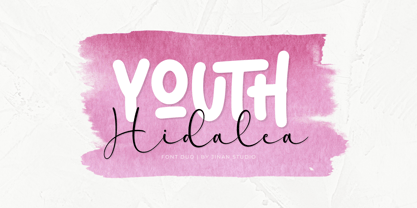 Youth Hidalea! is a fantastic font duo (sans serif & script), offering a modernity, playful, and artistic flair. Suitable for your design project needs, such as; logotype, wedding, packaging, social media posts, quotes, overlays on images, posters, and more. Features Uppercase and lowercase glyphs Number, symbol, punctuation, and multilingual support Some alternates and ligatures Thank you for buying and using this font for your projects. Enjoy this font and happy creating! Jinan Studio
 - Spaghetti Western by Comicraft,
$19.00 If you're a man with no name and you like your Westerns a little more continental, we've got a Fistful of Fonts for you! Load up your guns with our dynamite new offering, SpaghettiWestern. Lip synch the Good, the Bad AND the Ugly scripts you're presented with and we guarantee that Spaghetti Western will make Spanish lettering look a little bit more Mexican. Don't try to understand 'em, just rope and throw and grab 'em!
