10,000 search results
(0.039 seconds)
- Castrade by Din Studio,
$29.00 Castrade is modern display sans font. Made for any professional project branding. Every letter has a unique and beautiful touch. Includes: - Castrade (OTF) Features: - PUA Encoded - Multilingual Support - Numerals and Punctuation Thank you for downloading premium fonts from Din Studio
 - Coldera by Haniefart,
$12.00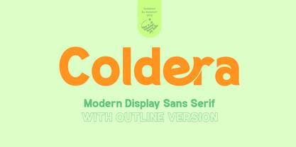 Coldera is a sans serif typeface deliberately modified to make it look beautiful, attractive and modern, available in uppercase, lowercase, ligature and alternative letters. Coldera is suitable for business brands, brochures, posters, magazines, comics, t-shirts, banners and many others.
 - Rockaway JNL by Jeff Levine,
$29.00The look of hand lettering often breaks up the monotony of the printed page. Rockaway JNL from Jeff Levine is a big, friendly sans serif that can give more of a human touch to your upcoming project without looking too informal. - Aircheck JNL by Jeff Levine,
$29.00 Inspired by building signage for the old CBS broadcasting facility in Los Angeles, Aircheck JNL is a bold, wide sans serif - reminiscent of Art Deco lettering of the 1940's, and perfectly suited for headlines and titles that get attention.
 - Casting Call JNL by Jeff Levine,
$29.00 Casting Call JNL is a simple condensed sans modeled from the hand-lettered title of a piece of vintage sheet music entitled "Somebody Else is Taking My Place"; a 1940s song co-authored and made famous by bandleader Russ Morgan.
 - Hanibal by Hazztype,
$20.00 Hanibal is a Bauhaus-inspired display sans serif, simple geometric letter shapes, and low contrast across all styles. Comes in three styles, hanibal is perfectly made to be applied especially in logos, headlines, signage, store front, and any other advertising purpose.
 - Reform School JNL by Jeff Levine,
$29.00 The extra bold sans serif stencil lettering on movie posters and lobby cards for “Reform School Girl” (a 1957 film by American International Pictures) was the basis of Reform School JNL, which is available in both regular and oblique versions.
 - Maghony by Sronstudio,
$18.00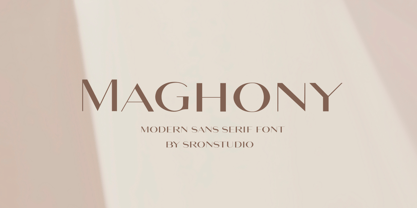 Maghony - Modern Sans Serif Font branding, invitation, stationery, wedding designs, social media posts, advertisements, product packaging, product designs, label, photography, watermark, special events, and more. Features: Uppercase and lowercase letters Multilingual symbols, numerals, and punctuation Follow Instagram: @sronstudio Thank You!
 - Shopping Basket JNL by Jeff Levine,
$29.00 The cover of the vintage sheet music for "This Little Piggie Went to Market" (from the 1934 film "Eight Girls in a Boat") features a hand-lettered sans serif with intermittent chamfered angles. This became the model for Shopping Basket JNL.
 - Bindweed by Solotype,
$19.95From an old wood type owned by a San Francisco printer. Wood types were customarily given somewhat generic names (Antique Tuscan) or, more frequently, numbers to identify them. Our clients liked colorful, easily-remembered names better, and so did we. - Office Work JNL by Jeff Levine,
$29.00 The 1965 film “Mirage” had its titles and credits hand lettered in a simple, thin sans serif with rounded corners and an overall square design. This is now available digitally as Office Work JNL, in both regular and oblique versions.
 - Pretzel Dough by Celebrity Fontz,
$19.99 The Pretzel Dough font was inspired by a challenge to make the letters of the alphabet and numbers from the same bowl of pretzel dough. The result is this whimsical and fun typeface. Comes with full set of accented characters.
 - Xahosch by Ingrimayne Type,
$9.95 Xahosch uses a calligraphic pen to form a set of letters in which circular elements are based on a bottom-heavy egg shape. A pen-drawn san-serif face, it is available in three weights, each with an italic style.
 - Coventry Garden NF Pro by CheapProFonts,
$10.00 I have improved and added diacritics to this elegant alphabet, and generally cleaned it up to a professional standard. It is well suited to logos, menus, invitations and other things wanting a touch of elegance. Nick Curtis says: "I came across this particular treatment for swash caps in an old book on letterhead design. The original had been handlettered, but I though it might be convenient to have a ready-made font to accomplish the same effect, and here it is. As an extra added feature, the “§” sign is an ampersand with a long tail." ALL fonts from CheapProFonts have very extensive language support: They contain some unusual diacritic letters (some of which are contained in the Latin Extended-B Unicode block) supporting: Cornish, Filipino (Tagalog), Guarani, Luxembourgian, Malagasy, Romanian, Ulithian and Welsh. They also contain all glyphs in the Latin Extended-A Unicode block (which among others cover the Central European and Baltic areas) supporting: Afrikaans, Belarusian (Lacinka), Bosnian, Catalan, Chichewa, Croatian, Czech, Dutch, Esperanto, Greenlandic, Hungarian, Kashubian, Kurdish (Kurmanji), Latvian, Lithuanian, Maltese, Maori, Polish, Saami (Inari), Saami (North), Serbian (latin), Slovak(ian), Slovene, Sorbian (Lower), Sorbian (Upper), Turkish and Turkmen. And they of course contain all the usual “western” glyphs supporting: Albanian, Basque, Breton, Chamorro, Danish, Estonian, Faroese, Finnish, French, Frisian, Galican, German, Icelandic, Indonesian, Irish (Gaelic), Italian, Northern Sotho, Norwegian, Occitan, Portuguese, Rhaeto-Romance, Sami (Lule), Sami (South), Scots (Gaelic), Spanish, Swedish, Tswana, Walloon and Yapese.
 - ITC Coventry by ITC,
$29.99ITC Coventry is the work of American designer Brian Sooy. ITC Coventry is what type would look like if you left a gothic font out in the rain. IF you look close, you'll see the roots of a handsome sans serif font buried under a layer of grime and rust, basically." The low-budget student flyers that Sooy saw in the Coventry section of Cleveland Heights, Ohio, inspired him to design this font and the result is a typeface which looks as though it has been faxed or photocopied many times. "While it looks very irregular in text, it's very carefully spaced to give that effect," says Sooy. ITC Coventry was designed to work just as well in text as in headlines or even on billboards." - ITC Freddo by ITC,
$29.99ITC Freddo is the work of New York designer James Montalbano and was inspired by a sign lettering manual from the 1930s. Montalbano liked the character shapes illustrated in this manual but found many of the proportions odd. So he reinterpreted them to produce capitals and lower case letters which, according to today's standards, better complement one another. - Maat by Wordshape,
$20.00 Maat is a modular geometric stencil display font that includes a number of modular pattern characters, and can be used to create designs that echo early Modernism by merely applying letters, patterns and color. Maat is a loose interpretation of a hand lettered alphabet by the late Dutch designer Jurrian Schrofer called Sans Serious which was included in Wim Crouwel's publication Letters of Maat. It is inflected with a bit of influence from British designer Ken Garland's similar lettering form the cover of his textbook, The Graphics Handbook. Maat derives its name from the title of Couwel's booklet.
 - Colmar JNL by Jeff Levine,
$29.00 French Art Deco lettering found within the pages of the 1934 publication L'Art du Tracé Rationnel de la Lettre (roughly translated to “The Rational Path Art of the Letter”) have provided a number of designs well-suited for digital revival. A hand lettered sans with varying character widths was the basis for Colmar JNL, which is available in both regular and oblique versions. As the source of the lettering design was a French publication, the typeface is named for the city of Colmar, which (according to Wikipedia) is the third-largest commune of the Alsace region in north-eastern France.
 - The overthinkers by Joanne Marie,
$26.00 The overthinkers is a semi script hand lettering font for all of your hand lettering designs! With two sets of uppercase glyphs, three sets of lowercase and over 230 ligatures no two words will be same! So your designs will truly look hand lettered. With so much choice be careful not to overthink your designs ;). This font is perfect on it’s own or you may like to use it with your existing hand lettering fonts. Go ahead and try it out - it’ll compliment any design! It’s perfect for merchandise and food packaging, book designs, logos and much more.
 - Raindrop by Great Lakes Lettering,
$30.00 Raindrop is a fun and flirty typeface that pulls inspiration from editorial illustration. Each letter was carefully crafted to feel hand made and give the appearance of custom lettering. Through a variety of stylistic alternates and pairings, Raindrop is the perfect typeface choice for projects that aim for a one-of-a-kind feel when hiring a lettering artist isn't an option. Raindrop is made up of three separate styles being serif, sans, and script. The ability to pair styles together will add texture and personality to your design, leaving the viewer wondering: lettering or type?
 - Advertiser JNL by Jeff Levine,
$29.00Advertiser JNL is a simple A-Z only font used to make retro-styled titles and names. Based on a popular style of retail signage from the 1950s and 1960s, alternating keystrokes will create a contrast of positive and negative letters. The capital letters have the alphabet in white on black boxes, the lower case have the black letters alone—with the white space conforming to the width of the black boxes. In a pinch, the boxed characters can also be used as initial caps. For a more complete character set with the same style of lettering, use DuBois Block JNL. - Reforma Grotesk by ParaType,
$30.00 PT Reforma Grotesk was designed for ParaType in 1999 by Albert Kapitonov based on the letterforms of Russian pre-revolutionary hand composition typefaces: Uzky Tonky Grotesk («Condensed Thin Sans»), Poluzhirny Knizhny Grotesk («Semibold Book Sans») and Reforma, of H. Berthold and O. Lehmann foundries (St.- Petersburg). This extra compressed sans serif with distinctive letter shapes is typical for display fonts of the late 19th and early 20th centuries. For use in advertising and display typography. The face got 'Galina' prize at Kirillitsa'99 International Type Design Competition in Moscow.
 - Fallbreeze by Maulana Creative,
$14.00 Fallbreeze is a complete collection of script and sans serif font duo. With bold script stroke, Compressed display sans serif character with a bit of ligatures and has a two files lowercase alternates extra swashes. To give you an extra creative work. Fallbreeze font support multilingual more than 100+ language. This font is good for logo design, Social media, Movie Titles, Books Titles, a short text even a long text letter and good for your secondary text font with sans or serif. Make a stunning work with Fallbreeze font. Cheers, MaulanaCreative
 - Summer South by Ergibi Studio,
$17.00 Summer South is a blend of 2 handwritten fonts with sans having a distinctive style and classy style, this font is suitable for your creative projects such as watermarks on photography, and perfect for logos & branding, photography, invitations, watermarks, advertisements, product designs, tools write, wedding designs, labels, product packaging, special events or anything that requires a handwritten flavor with a blend of sans. Summer South comes with 2 Signature and Sans Styles and has beautiful swash bonuses: uppercase, lowercase, lowercase, numbers, punctuation, binders, alternative letters and multilingual support
 - Axial cut by deFharo,
$21.00 Axial Cut is a sans serif typeface (Latin Extended-A), a contemporary and rounded evolution of geometric fonts for screen, but this time the letters are built on an axial axis that results in trapezoidal counter-shapes, joints with reduced antlers and rounded corners that correct optical effects in small sizes to make the typography more legible, and at the same time, in large sizes it shows its original shapes. The Axial Cut typeface family is made up of four weights: Light, Regular, Medium and Bold, each with 785 characters. I have taken particular care with the metrics and dimensions of each letter or sign, with a very careful and precise kerning configuration to achieve the For maximum readability, these are fonts with slightly higher ascenders than capitals and short descenders to make it more compact. The editing possibilities and unique designs with these complex typefaces are very wide, the fonts have a complete set of uppercase letters and a lowercase set with alternative characters as well as lowercase letters and numbers in different positions (lowercase, denominators, numerals, and uppercase) that They also work as automatic fractions, they also incorporate small capital letters and three sets of alternative numbers (Normal, Old style numbers, Square numbers), etc. Discover other alternative signs, characters and Open Type functions in the PDF: Specimen & The Cheat Sheet.
 - Actium by Type Mafia,
$45.00 Actium is a contemporary multilingual sans serif typeface developed to help perfect typography automatically. Type Mafia has focussed on words with odd combinations of capital letters and numbers, such as product names and postal codes such as WD40 and H1N5, jump out of the text. They sit awkwardly together as the numerals have been designed to work with the lowercase, not the uppercase letters – affecting readability.To fix this Type Mafia invented Smart Capo™. Smart Capo™ Smart Capo is a feature that automatically activates once you type an uppercase letter together with a number. When a capital letter is sat next to a numeral, Smart Capo converts the letter to a mid-cap — a contemporary alternative to small caps — and the default old-style numeral to a lining numeral. Actium’s mid-caps and lining numerals have been designed with the same height (between cap and x-height) so they sit comfortably next to each other and fit more harmoniously into text. Smart Capo applies equal attention to capitalised words without any numbers, such as NAVO and USA, and are also automatically set into mid-capitals. Working on its own, Smart Capo saves time and money for the typographer — taking the pain out of text formatting — and makes it a more pleasurable experience for the reader. This feature is made possible by the use of ‘contextual alternates’, an OpenType feature used in modern font software, working with a set of characters specially designed at mid-cap height. By default these changes automatically take place so it doesn't need to be switched on, it will just work. Actium Actium’s design has an unusual diagonal contrast — much more common in a serifed face than in a sans serif — giving it more bite. The typeface looks elegant when set in large sizes and remains very legible when shown in small sizes. The family consists of six weights in two styles, making a dozen fonts. Weights range from light to black in roman and true italic. All fonts are fully loaded with functional elements. Actium boasts an extended Latin character set and with Greek. This means a wide range of Western languages are supported: perfect for use in bilingual publications and packaging. For numerals, each font includes old-style and lining figures in both proportional and tabular widths, with superiors and inferiors. These allow you to select the right set of numbers for the right task.
 - Breakfast Pastry by Missy Meyer,
$12.00 I’d been thinking for a while about making a serif font with ball terminals: big fun round ends to the letters anywhere I can squeeze them in. So I made Breakfast Pastry! I started with a hand-drawn set of basic letters, then went hog-wild making alternates and ligatures galore with fun swirls, curls, and even more balls! I’ve cleaned the letters up significantly to make them smooth and easy for any cutting or printing you may want to do, but I’ve also left in some of the hand-drawn character so that the letters are warmer and not too formal. Then I took the first font, and made a second solid version without the cutouts. After that I thought: I tend to make plumper fonts ... why not make an even thinner version? So I did! All three versions have the same character set (over 700 glyphs total), which means they all have the same extras and alternates. All three fonts have over 300 extended Latin characters for language support, as well as over 200 bonus items: alternate letters, letters with swashes, two-letter ligatures, small caps, catchwords, and even some bonus ornaments and elements to make the fonts even more flexible. (After all, if one swash on a letter is good, two or three might be great!)
 - MVB Fantabular by MVB,
$39.00MVB Fantabular proves that monospaced faces needn’t be formal or bland. Inspired by the letterforms of older typewriters, Akemi Aoki designed a playful family of three weights with italics. With every character the same width MVB Fantabular works wherever a monospaced font is needed, but the face is so loose and carefree it hides its fixed pitch construction well, allowing it to be used in other settings too. A sans serif version—MVB Fantabular Sans—is also available. - Salda Soft by Hurufatfont,
$19.00 Salda Soft; It is a modern sans serif family that blends old and new generation sans serif fonts in the same body. It has a wide usage area with its light narrow structure, soft and clean lines, humanist touches. It provides clean and smooth visuals in vertical screens, mobile applications and block texts. It consists of a total of 20 styles. Ideal for all kinds of editorial design, packaging, corporate identity, brand, application, web and desktop.
 - Markisa by Showup! Typefoundry,
$34.00 Markisa is a simple, cool, and dynamic Humanist-flavored Sans Serif type family. It consists of eighteen weights from Thin to Black in both Upright and Italic styles. The resilient yet robust typeface. A san-serif with a humanist touch, a steady combination of seriousness and merriment. Works well as texture in small sizes, while at the same time claiming its space on the display. With its distinctive characteristic, can catch anyone’s attention wherever and whenever.
 - Reba Samuels by Samuelstype,
$24.00 Reba Samuels is based on the 2007 release Rebecca Samuels. While Rebecca was largely intended for text use Reba aims to be more versatile with an extended weight scope and added cut varieties. While Rebecca’s slab character is developed in the Reba serif, the ’seriffed’ italic of Rebecca is abandoned in favor of a simple italic sans, better matching the serif in plain text. The weight extremes are very useful for headlines while the middles do better in text. The robust and angular shapes of the serif matches the straightforward sans. The extreme contrast between the thin and the black cuts opens up great opportunities in any design project.
 - Hideko by Khaito Gengo,
$29.00 Hideko is a visually unique font that has the essence of both serif and san-serif fonts through integrating the body structure of san-serif while retaining the calligraphy from serif. Hideko was inspired by synthesizing Japanese calligraphy and western letters. During the process of creating Hideko, I attempted to make a font only for oriental use, but the result is a font with versatile uses. This multicultural font is most effectively used for oriental restaurants but is also ideal for western cafes, posters, books, etc. Along with the cultural synthesis of Japanese and western letters, Hideko features various ligatures, stylistic alternates, fractions, and languages as well.
 - Millbrae JNL by Jeff Levine,
$29.00 In the city of Millbrae (just South of San Francisco in San Mateo County, California) stands an office building which formerly housed the Millbrae Theater. California has the distinction of preserving artifacts of its past, unlike many other portions of the US, and the perpendicular "Millbrae" sign with its neon tubes and Art Deco lettering is still attached to the renovated structure. Gene Gable (a friend of type designer Jeff Levine) took a photo of the sign and sent it along as simply an image of great lettering of the past to enjoy, but it triggered the inspiration to create the namesake font Millbrae JNL.
 - Eurostile Unicase by Linotype,
$29.99 Akira Kobayashi modified his Eurostile Next design into a fun unicase version. Ascenders and descenders have been traded in for alternates of letters that all share the same height. The effect is similar to using all caps, although this is quite a bit more quirky. For example, letters like the lowercase a and e are now the same height as their capital versions and the lowercase y has been raised to fit between the baseline and top height. Odd relationships such as these give Eurostile Unicase a fresh and funky feeling. Try using it for headlines and titles, then use Eurostile Next for the body text!
 - Streeters by Fontsphere,
$16.00 Streeters is a hand brush typeface, created for a specific project, where one of the assumptions in creating it was to combine the appearance of a manual brush, liquid paint but also a spatial effect. Uppercase and lowercase letters create a slightly different effect with the same character height. They are created in such a way that, in addition to writing with one letter case, it is also possible to mix and create many different combinations of uppercase and lowercase characters, for example, a unique look for the same repetitive words. The font is best for works where a non-standard, strong and distinctive form of communication is needed.
 - Doric by Linotype,
$29.99Originally released by the Stephenson Blake foundry in England, Doric is modeled on one of the sans serifs of William Caslon IV, who was the first to interpret sans serif letterforms into a typeface (1816). Doric Bold has large, heavy capitals with uniform letter widths. It is often used for classified advertising in newspapers because these qualities coupled with a large x-height allow greater legibility at small point sizes. - Lituora by Maulana Creative,
$13.00 Lituora is a condensed classic sans serif font. With bold contrast stroke, fun character. To give you an extra creative work. Lituora font support multilingual more than 100+ language. This font is good for logo design, Social media, Movie Titles, Books Titles, a short text even a long text letter and good for your secondary text font with sans or serif. Make a stunning work with Lituora font. Cheers, Maulana Creative
 - Vitage by Fractal Font Factory,
$10.00 This sans-serif type family of two weights plus matching italics. Influenced by the geometric-style sans serif faces that were popular during the 1920s and 30s, the fonts are based on geometric forms that have been optically corrected for better legibility. Vitage has a functional look with a warm touch. It is manually hinted and optimized for screens, so it will be a good choice for Websites, eBooks or Apps.
 - Unicore by Halbfett,
$30.00 Unicore is a large family of geometric sans serif fonts. Design wise, it is inspired by classic 20th-century typefaces like Futura, Gill Sans, and Avenir. It fuses their aura with contemporary elements, like a unique harmonisation of width and height. You can see this in the lowercase letters especially and it helps support the fonts’ legibility. The regular weights in the family are optimised for body text.
 - Aristelle by My Creative Land,
$25.00 Aristelle Family is a beautiful, hand-lettered script that was created using Leonardt III EF nib. Aristelle Script is full of OpenType features such as initial and terminal swashes, ligatures, and ornaments and is best used in an OpenType-aware software. Aristelle Sans and Sans Condensed are well additions to the Aristelle Script and all three fonts shall help you create organic, stylish, and full-of-character designs.