10,000 search results
(0.051 seconds)
- Omni by ArtyType,
$29.00 Typefaces don't simply appear fully formed to a designer, even with a clear concept in mind, they evolve naturally during the design & development process. Out of the current 'Artytype' collection, Omni has evolved the most, being a stripped back off-spring from several exploratory exercises. At first glance and particularly at small scale, you'd be forgiven for thinking the basic characteristics have a conventional outlook; but on closer inspection, it's own distinctive, clean cut, subtle styling becomes apparent, revealing enough personality to stand alone or complement a wide variety of projects; subsequently, it's a font that won't go out of style quickly and may even become a modern classic in time. The Omni family has 2 distinct styles, sans and serif, each style being available in 4 weights; all 8 fonts have slanted options to match making a total of 16 fonts. Dictionary definition of OMNI: Combining form - Of all things, in all ways or places. Quite an apt name for a font with ubiquitous aspirations.
 - Sequel Sans by OGJ Type Design,
$35.00 Sequel Sans is a new chapter in the book of neogrotesque typefaces. Its core idea and its name were conceived in collaboration with the max bill georges vantongerloo foundation. The main inspiration for its design were the sans-serif typefaces used by Max Bill, the larger-than-life Swiss architect, artist, and designer. Honoring these roots, I designed Sequel Sans to be a clean and adaptable font family that is built upon a comprehensive system of styles. 8 weights, each with a corresponding italic, and a matching set of Variable Fonts are available in 4 optical sizes. These range from standard (for text sizes) to Subhead to Headline to Display—larger optical sizes come with tighter spacing and a number of gently adjusted glyph shapes. Like the great neogrotesques found in mid-century Swiss Style designs, Sequel Sans is a vessel that you can fill with any kind of content. It will amplify your message while retaining its own modernist character.
 - ITC Panache by ITC,
$29.99Typefaces, like most other works of art, provide a small window into the personalities and sensibilities of the artists who create them. ITC Panache not only provides this window, it is also aptly named. Mr. Edward Benguiat the dreator of ITC Panache, has all the dash, verve (and panache) hinted at in the design, Creative, capable and prolific, Ed Benguiat has drawn hundreds of exciting and popular typeface designs. Benguiat's design goal was to create a sans serif typestyle that is versatile, utilitarian - and distinctive. We think he has succeeded admirably. ITC Panache's three weights mix exceptionally well to complement each other or provide emphasis where necessary. Extensive testing at text sizes and design fine-tuning has produced a typeface family which is remarkably homogenous and consistent in color. Text set in ITC Panache is inviting without dissapointment. It is exceptionally easy to read, even in long text blocks of copy or small point sizes. When set in larger sizes or used for headlines, ITC Panache's character traits becomes more apparent and pronounced to the reader. They help to create graphics with distinction and style. Big or small. a little or a lot. it's hard not to use ITC Panache well. If you could pigeonhole ITC Panache, it would probably be classified as a stressed sans", but this would not completely describe, or do justiceto, the design. There is a slight contrast in stroke weight, which becomes more pronounced as the familiy weight increases; but there is a more to distinguish ITC Panache from ather sans serifs. Perhaps most obvious is its high waist and correspondingly slight condensation of the top half of the "round" capitals. Both of these traits link ITC Panache with the sensuous forms of art nouveau creations. In contrast are the typicall old style "e" found in designs like Cloister and ITC Berkeley Old Style, and the two storied "g" common to the early 20th century sans serif designs. The capital "A" even has the cupped top found in Caslon designs. Part of the beauty of ITC Panache is that all of these seemingly unrelated desig traits are melded into a design of exceptional continuity." - Hello Blushberry Script by Great Studio,
$14.00 Allow me to introduce Hello Blushberry - Font Duo is a playful script containing many choices of alternative characters to choose from as well as ligatures that look natural to add to the authenticity of letters. A collection of strange and initial swash tips is also included to add finishing touches or fill the design space in your type design. Hello Blushberry a modern handwriting fonts, loaded with awesome opentype features, and full alternative upper and lower case character sets. make custom letters a dream thanks to all the extra decorative choices you can enter for beautiful and unique customizations - swash, endings, alternative letters and ligatures all make it the prettiest little thing since tutus and tiara. Designed to work harmoniously, this duo font consists of super fine and casual signature scripts and a complete and clean set of all sans serif letters. Sans Serif fonts consist of two outline fonts of different weights, and a regular version. Layer them with different colors and turbidity to get a million different views. This font is perfect for branding, logos, web and editorial design, branding, prints, invitations, crafts, quotes, and more. Includes Files: • Hello Blushberry Script • Hello Blushberry Script Capitals Need help? If you need help or advice, please contact me by e-mail at Greatstudio92@gmail.com.
 - Century Gothic by Monotype,
$40.99 Century Gothic™ is based on Monotype 20th Century, which was drawn by Sol Hess between 1936 and 1947. Century Gothic maintains the basic design of 20th Century but has an enlarged x-height and has been modified to ensure satisfactory output from modern digital systems. The design is influenced by the geometric style sans serif faces which were popular during the 1920s and 30s. The Century Gothic font family is useful for headlines and general display work and for small quantities of text, particularly in advertising. The Century Gothic family has been extended to 14 weights in a Pan-European character set from Thin to Black and their Italics. The already existing 4 weights of Regular and Bold with their Italics are additionally still available in the STD character set. The W1G versions featuring a Pan-European character set for international communications supports almost all the popular languages/writing systems in western, eastern, and central Europe based on the Latin alphabet including several based on Cyrillic and Greek alphabets. Looking for the perfect way to complete your project? Check out Aptifer™ Slab, ITC Berkeley Old Style®, FF Franziska™, Frutiger®, ITC Legacy® Square Serif or Plantin®.
 - Gramers by Dora Typefoundry,
$15.00 Gramers is an elegant and modern minimalist font family, a new roman sans serif font carefully crafted, These font ideas come from various references, from vintage, classic, art deco, to the modern era. Carefully drawn with high contrast between the strokes bold and thin with the aim of making even the simplest sans serif letters look sensual, elegant, and warm. The feeling of versatility and luxury you get in Gramers. As you can see in the display of our creations such as Branding, Header, Logotype, Posters, Magazines, Packaging, Art deco wedding invitations, and others. This shows that Gramers can accommodate various design styles. The flat lines cover five styles (each light, regular, medium, semi thick, Thick), each of which includes nearly 293 glyphs. OpenType features include 103 standard ligatures and a small number of character variants, and multilingual support (including multiple currency symbols). Features: • 5 Font weight • uppercase • Alternative & Ligature Styles • Numbers & Punctuation • Characters with accents • Supports Multiple Languages This type of family has become the work of real love, making it as easy and enjoyable as possible. I really hope you enjoy it! I can't wait to see what you make with Gramers! Feel free to use the #Dora Typefoundry and #Gramersfont tags to show what you've done!
 - Retro Monkey by Shakira Studio,
$17.00 Say hello to new serif font, Retro Monkey! Retro Monkey is a display serif font that delivers a classic retro feel with strength and boldness. Characterized by striking bold letters, Retro Monkey exudes elegance and uniqueness in every detail. Its retro-inspired design evokes nostalgia and conveys a strong and charming style. Retro Monkey's lettering proportions are audacious in their clarity and legibility. With bold lines and strong contours, each letter looks tough while retaining the elegance of a retro aesthetic. Consistent letter thickness provides an appealing visual appeal and is easily recognizable. Retro Monkey is suitable for use in various design projects that want a strong retro classic impression. This font makes a perfect choice for headlines, titles, posters, merchandise designs, and more. In any context, Retro Monkey carries an impressive presence, inviting the audience to feel nostalgia for a different era. Here's what you get: Retro Monkey Regular, Italic All Multilingual symbol Opentype features ( ligature, alternate ) Accessible in the Adobe Illustrator, Adobe Photoshop, Adobe InDesign, even work on Microsoft Word. PUA Encoded Characters - Fully accessible without additional design software. Multilingual character supports : (Afrikaans, Albanian, Catalan, Croatian, Czech, Danish, Dutch, English, Estonian, Finnish, French, German, Hungarian, Icelandic, Italian, Lithuanian, Maltese, Norwegian, Polish, Portuguese, Slovenian, Spanish, Swedish, Turkish, Zulu) Thank you!
 - Enigmatic Pandora by Shakira Studio,
$17.00 Say hello to new serif font, Enigmatic Pandora! Enigmatic Pandora is a serif font that combines a psychedelic uniqueness with bold boldness in each letter. With its eye-catching psychedelic characteristics, Enigmatic Pandora exudes an aura of mystery and magic that is hard to describe. Enigmatic Pandora offers a great typography experience with bold bold characters. Its bold and striking design makes each letter a centerpiece in the design. Combining stunning psychedelic elements with strong, compelling contours, this font provides a unique and compelling visual dimension. Enigmatic Pandora is suitable for use in design projects that want to express visual uniqueness and tension. This font is ideal for titles, posters, illustrations, album designs, and other creative projects that need an extraordinary and bold look. Here's what you get: Enigmatic Pandora Regular All Multilingual symbol Opentype features ( ligature, alternate ) Accessible in the Adobe Illustrator, Adobe Photoshop, Adobe InDesign, even work on Microsoft Word. PUA Encoded Characters - Fully accessible without additional design software. Multilingual character supports : (Afrikaans, Albanian, Catalan, Croatian, Czech, Danish, Dutch, English, Estonian, Finnish, French, German, Hungarian, Icelandic, Italian, Lithuanian, Maltese, Norwegian, Polish, Portuguese, Slovenian, Spanish, Swedish, Turkish, Zulu) Follow my shop for upcoming updates, and for more of my work, Thank you!
 - Gothic Nesbitt by Wooden Type Fonts,
$20.00 An early gothic heavy sans serif font, largely for display.
 - Jamboks by PizzaDude.dk,
$20.00Jamboks is a grafitti and comic-inspired sans serif font. - Century PS Pro by SoftMaker,
$14.99 Century PS Pro is a serif typeface published by SoftMaker.
 - Maza by Gaslight,
$25.00 Clean, modern san-serif font for display and text application.
 - Pergamon by SoftMaker,
$9.99 Pergamon is a sans serif decorative typeface published by SoftMaker.
 - Meruba MF by Masterfont,
$59.00 Square and serif font - perfect for heavy headlines and signage.
 - Century Schoolbook Pro by SoftMaker,
$14.99 Century Schoolbook Pro is a serif typeface published by SoftMaker.
 - Taxi MF by Masterfont,
$59.00 A tender serif font with a round and soft look.
 - Openface No2 by SoftMaker,
$9.99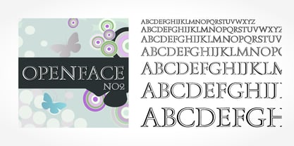 Openface No2 is a decorative serif typeface published by SoftMaker.
 - Broggitto by Letterara,
$16.00 Broggitto is a beautiful incredibly versatile serif font duo. It perfectly combines a beautiful serif with an elegant brush sans serif. This font was created with care and given a lot of features to make it look very attractive. These styles are ready to be used together and give your designs a modern and unique look! Broggitto font suitable for all design projects. This font is PUA encoded which means you can access all of the glyphs.
 - Rum Soft Sans by Trine Rask,
$30.00 Rum Soft Sans is a soft version of Rum Sans with softly rounded outer corners. Rum Soft Sans is a text & display family suitable for any purpose, any media, any size. A humanistic modular sans serif in five weights containing small caps, italic, swashes, alternative characters, old style, lining, tabular & proportional figures. Design date: 2001-2021 The complete family consists of Sans Serif & Serif in both sharp and soft version + the display fonts Rum Plakat & Rum Silhouette.
 - Beona Display by Josstype,
$12.00 Boena Serif. Boena Serif.is a Serif Display Font with a modern, classy, fun, unique and versatile style. It looks amazing at display size and is easy to read in text size. This font also has lots of unique alternatives and binders that will make for stunning design projects. Marselid Serif. works well for branding projects, logos, wedding designs, social media posts, advertisements, product packaging, product designs, labels, photography, watermarks, invitations, or any project you are working on.
 - Blue Bridge by Asenbayu,
$14.00 Blue Bridge is a creative decorative sharp serif display font. This font is an experimental font by combining the aesthetic characteristics of serifs and decorative flow shapes. The combination of sharp serif feet and beautifully curved lines presents a new experience in an elegant and attractive class. You can use this font in both modern and vintage designs. This font is suitable for attractive packaging label designs, unique desired logos, trendy poster designs, fashion and many more.
 - MC Filine Qiqah by Maulana Creative,
$13.00 Filine Qiqah heavy sans serif font. With bold stroke, fun character with a bit of ligatures. To give you an extra creative work. Filine Qiqah heavy sans serif font support multilingual more than 100+ language. This font is good for logo design, Social media, Movie Titles, Books Titles, a short text even a long text letter and good for your secondary text font with script. Make a stunning work with Filine Qiqah heavy sans serif font. Cheers, Maulana Creative
 - MC Quirtta by Maulana Creative,
$16.00 Quirtta is a semi serif or Flare Serif font. Round SemiBold stroke, fun character with a bit of ligatures and alternates. To give you an extra creative work. Quirtta font support multilingual more than 100+ language. This font is good for logo design, Social media, Movie Titles, Books Titles, a short text even a long text letter and good for your secondary text font with script or serif. Make a stunning work with Quirtta font. Cheers, Maulana Creative
 - Merova by Sarid Ezra,
$13.00 Introducing, brand new serif, Merova - a classic serif with alternates! Merova is a classic and elegant serif with many style. Merova contains a bunch of alternates for each characters that will make your presentation or logo even more stunning and stand out! Merova also support Multi Language. and already PUA Encoded! Features All Uppercase Number & Symbol Multi language Alternates for each characters PUA Encoded Don't hesitate to send me an email at saridezra@gmail.com Happy Creating!
 - Valveto by Maulana Creative,
$16.00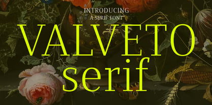 Valveto is a modern display serif. With light and consist serif stroke, fun character with a bit of ligatures and alternates. To give you an extra creative work. Valveto font support multilingual more than 100+ language. This font is good for logo design, Social media, Movie Titles, Books Titles, a short text even a long text letter and good for your secondary text font with sans or serif. Make a stunning work with Valveto font. Cheers, Maulana Creative
 - WT Volkolak by Wraith Types,
$50.00 Volkolak is the ultimate serif-sans-grotesque tribrid, its numerous cuts will give you many options represent a typesetter's dream! Designed as one, it offers a serif, a contrasted sans serif and a grotesque style. The numerous typesetting options offered this way gives it a ton of usability and functionality in many different mediums, editorial design, books, magazines, posters, visual identity, web design... You won't find a project in which you can't use this true workhorse superfamily!
 - Centima Pro by TipografiaRamis,
$39.00 Centima Pro is an enhance development of Centima – a geometric Sans Serif typeface, released back in 2011. Centima Pro family consists of two sub-families Sans and Serif fonts. Centima Sans – an upgraded version of Centima, with careful refinements to glyph shapes and extension of glyph amounts, which enabled support of Cyrillic languages. A new extended sub-family Centima Serif have been added to the Centima Pro family. This typeface is released in OpenType format with some OpenType features.
 - Lineare by Tipo,
$35.00 Lineare Serif is an attempt at solving the difficult problem of creating readable text type, seeking new ways to provide readers with some pleasure and rest as they walk along each line, creating a space where there is harmony between man and the printed form. Asymmetric serifs both in their height and width, medium contrast in the stroke, and balanced upward and downward movements make “Lineare Serif” a typeface featuring both attitude and aptitude for editorial purposes.
 - Golestan by Naghi Naghachian,
$84.00 Golestan is designed by Naghi Naghashian. It is a Font family, in 2 weights, Regular and Bold. This font is a contribution to modernisation of Arabic typography, gives the font design of Arabic letters real typographic arrangement und provides more typographic flexibility. Golestan supports Arabic, Persian and Urdu. It also includes proportional and tabular numerals for the supported languages. Golestan design fulfills the following needs: A Explicitly crafted for use in electronic media fulfills the demands of electronic communication. B Suitability for multiple applications. Gives the widest potential acceptability. C Extreme legibility not only in small sizes, but also when the type is filtered or skewed, e.g., in Photoshop or Illustrator. Golestan’s simplified forms may be artificial obliqued in InDesign or Illustrator, without any loss in quality for the effected text. D An attractive typographic image. Golestan was developed for multiple languages and writing conventions. Golestan supports Arabic, Persian and Urdu. It also includes proportional and tabular numerals for the supported languages. E The highest degree of calligraphic grace and the clarity of geometric typography.
 - Early Quake by Ahmad Jamaludin,
$19.00 Say hello to EARLY QUAKE! Inspire some retro fun with bubbly swash and alternates, 70's inspired font complete with groovy bellbottoms! Early Quake comes in three versions - Regular, Outline, and Extrude version. With three different style fonts, you can easily create eye-catching designs without any extra effort This font is perfect for a retro 80s theme, and can be used for cover magazine, brochure, logo, headline or quotes, stand alone display, and short paragraphs or content. Each font in the family is dynamic and authoritative on its own, making it perfect for any display project. What you get? Early Quake Early Quake Outline Early Quake Extrude Alternates and Ligatures Instructions ( Access special characters, even in circuit design ) Letters, numbers, symbols, and punctuation No special software is required to use this typeface even work in Canva Multilingual Support Multilingual character supports : (Afrikaans, Albanian, Catalan, Croatian, Czech, Danish, Dutch, English, Estonian, Finnish, French, German, Hungarian, Icelandic, Italian, Lithuanian, Maltese, Norwegian, Polish, Portuguese, Slovenian, Spanish, Swedish, Turkish, Zulu) Give your design projects that fun, playful edge with EARLY QUAKE! Enjoy your day! Dharmas Studio
 - Babak by Naghi Naghachian,
$74.00 Babak is designed by Naghi Naghashian. It is a Font family, in 3 weights, Light, Regular and Bold. This font is a contribution to modernisation of Arabic typography, gives the font design of Arabic letters real typographic arrangement und provides more typographic flexibility. Babak supports Arabic, Persian and Urdu. It also includes proportional and tabular numerals for the supported languages. Babak design fulfills the following needs: A Explicitly crafted for use in electronic media fulfills the demands of electronic communication. B Suitability for multiple applications. Gives the widest potential acceptability. C Extreme legibility not only in small sizes, but also when the type is filtered or skewed, e.g., in Photoshop or Illustrator. Nima’s simplified forms may be artificial obliqued in InDesign or Illustrator, without any loss in quality for the effected text. D An attractive typographic image. Babak was developed for multiple languages and writing conventions. Babak supports Arabic, Persian and Urdu. It also includes proportional and tabular numerals for the supported languages. E The highest degree of calligraphic grace and the clarity of geometric typography.
 - Naghashian by Naghi Naghachian,
$78.00 Naghashian is designed by Naghi Naghashian. It is a Font family, in 5 weights, Light, Regular, Bold, Extra Bold and Heavy This font is a contribution to modernisation of Arabic typography, gives the font design of Arabic letters real typographic arrangement und provides more typographic flexibility. Naghashian supports Arabic, Persian and Urdu. It also includes proportional and tabular numerals for the supported languages. Naghashian design fulfills the following needs: A Explicitly crafted for use in electronic media fulfills the demands of electronic communication. B Suitability for multiple applications. Gives the widest potential acceptability. C Extreme legibility not only in small sizes, but also when the type is filtered or skewed, e.g., in Photoshop or Illustrator. Nima’s simplified forms may be artificial obliqued in InDesign or Illustrator, without any loss in quality for the effected text. D An attractive typographic image. Naghashian was developed for multiple languages and writing conventions. Naghashian supports Arabic, Persian and Urdu. It also includes proportional and tabular numerals for the supported languages. E The highest degree of calligraphic grace and the clarity of geometric typography.
 - Damavand by Naghi Naghachian,
$114.00 Damavand is designed by Naghi Naghashian. It is a Font family, in 5 weights, Light, Regular, DemiBold, Bold and Heavy. This font is a contribution to modernisation of Arabic typography, gives the font design of Arabic letters real typographic arrangement und provides more typographic flexibility. Damavand supports Arabic, Persian and Urdu. It also includes proportional and tabular numerals for the supported languages. Damavand design fulfills the following needs: A. Explicitly crafted for use in electronic media fulfills the demands of electronic communication. B. Suitability for multiple applications. Gives the widest potential acceptability. C. Extreme legibility not only in small sizes, but also when the type is filtered or skewed, e.g., in Photoshop or Illustrator. Nima’s simplified forms may be artificial obliqued in InDesign or Illustrator, without any loss in quality for the effected text. D. An attractive typographic image. Damavand was developed for multiple languages and writing conventions. Damavand supports Arabic, Persian and Urdu. It also includes proportional and tabular numerals for the supported languages. E. The highest degree of calligraphic grace and the clarity of geometric typography.
 - Pasargad by Naghi Naghachian,
$108.00 Pasargad is a new font family, designed by Naghi Naghashian. It is a Font family in 3 weights, Light, Regular and Bold. This font is a contribution to modernisation of Arabic typography, gives the font design of Arabic letters real typographic arrangement und provides more typographic flexibility. Pasargad supports Arabic, Persian and Urdu. It also includes proportional and tabular numerals for the supported languages. Pasargad design fulfills the following needs: A Explicitly crafted for use in electronic media fulfills the demands of electronic communication. B Suitability for multiple applications. Gives the widest potential acceptability. C Extreme legibility not only in small sizes, but also when the type is filtered or skewed, e.g., in Photoshop or Illustrator. Pasargad’s simplified forms may be artificial obliqued in InDesign or Illustrator, without any loss in quality for the effected text. D An attractive typographic image. Pasargad was developed for multiple languages and writing conventions. Pasargad supports Arabic, Persian and Urdu. It also includes proportional and tabular numerals for the supported languages. E The highest degree of calligraphic grace and the clarity of geometric typography.
 - Benida by Craft Supply Co,
$20.00 Introduction to Benida Serif Font Benida, an elegant serif font, offers a high-contrast serif design. Its unique style is perfect for various applications. The font’s design is both bold and refined, making it versatile. Ideal for those seeking a mix of elegance and assertiveness, Benida is a great choice. Design Features Benida features high-contrast serifs, adding sophistication to its look. The wedges in the serif are carefully crafted. These elements combine to create a distinct, impactful appearance. The font’s structure balances strength with grace, making it stand out. This balance ensures that Benida is suitable for both formal and creative uses. Usability and Applications Benida’s design makes it highly readable. It’s perfect for headings, logos, and editorial work. The font’s elegant nature suits wedding invitations and upscale branding. Its assertive qualities make it ideal for professional presentations. Benida truly shines in both digital and print formats, demonstrating versatility.
 - Rhein by BeJota,
$21.00 Rhein is named after the German river that runs through the western border valley. Rhein is a sans-serif typeface family for titles, editorials and graphic design pieces with high impact needs. Rhein was not only conceived as a font design with rounded corners, but its intersection points have been also smoothed. In addition, the wide range of 8 weights that vary from Thin to Black allow relatively long continuous reading (Regular, Medium, Semibold), and short reading designs (Black, Bold, Thin). On the other hand, the "Inline" variant is extremely provocative to fit into any branding project. To add dynamism and to expand the typeface range of use, it was designed as a family of alternatives. Together, the 18 styles of "Rhein" provide a range of options that adjust to the needs and current design and advertising trends.
 - Brda by Linotype,
$29.99Brda originally designed by the Polish designer Franciszek Otto for the Powiat weekly newspaper. Powiat needed a new, dynamically drawn sans serif for its headlines, and Otto's Brda fit the bill. Combining traditional Grotesk letterforms with witty subtleties, like the notched-joint seen in the capital G, Brda displays a novel design that works best when set large. The typeface is named after the Brda river, which runs through Bydgoszcz, Poland, the city where Powiat is published. The Brda family includes three weights, each with a companion italic: Regular, Bold, and Extra Bold. The Brda family's Extra Bold weight was one of the winners selected in the 2003 International Type Design Contest, sponsored by Linotype GmbH. Franciszek Otto also teaches graphic design at the Secondary Art School in Bydgoszcz, where his typefaces rank among the students' favorites. - Danbury by Mans Greback,
$49.00 Danbury is a modern sans-serif typeface. Drawn and created by Mans Greback between 2020-2022, this slanted font has a distinct style and a strong personality. Danbury is a typeface with velocity and power: Use it in a sports campaign, a fresh headline or a cool logotype. The Danbury family is provided in the styles Regular and Bold, Caps and Caps Bold, Small and Small Bold: the perfect setup for a diverse design usage. The font is built with advanced OpenType functionality and has a guaranteed top-notch quality, containing stylistic and contextual alternates, ligatures and more features; all to give you full control and customizability. It has extensive lingual support, covering all Latin-based languages, from North Europe to South Africa, from America to South-East Asia. It contains all characters and symbols you'll ever need, including all punctuation and numbers.
 - Aromo by TipoType,
$19.00 Aromo was initially conceived for editorial purposes. This typeface mixes the versatility of a simple and modern sans-serif, with the sensibility of the humanist feeling: thus making it useful in a wide range of purposes when a balanced and friendly font, with elegant proportions and high readability is required. The functional nature of its design is complemented by a family of 14 variants (7 weights, plus their matching true italics) interpolated optically for application as a hierarchical resource, where the middle weights (Light, Regular) have been optimized for use in small bodies, while the extremes (Ultra Light, Black) where designed for display environments._ Aromo also offers a wide range of historical and discretionary ligatures, small caps, eleven different types of numerals and a set of more than 700 characters covering about two hundred languages of Latin script._
 - Gathes by thirtype,
$25.00 Gathes is vintage pop script with layered style, Since a few years I try to exploration of script with layered system. and this my third script layered from my collection font. Gathes is basic from 5 styles layered type. Base layer is regular, add an shine, extrude, extrude detail, and shadow to create a dimensional look. Several styles can be mix and matched together or can be used alone and/or in layered. The Script font have a opentype feature such a stylistic set, ligature, swash ornament. For additional we add a serif version in this family, so that it can be combined with script fonts. Gathes works great in any graphics app that allow to create a layered type and good to create the logo, badge, poster, heading, magazine, advertising design purpose and more. Features: - Opentype features - Ligatures - Alternates - PUA Encoded - Multilanguange