7,193 search results
(0.017 seconds)
- Logopedia Now by Bülent Yüksel,
$19.00 What makes "Logopedia Now" unique is that it has a strong body, upper and lower case letters are the same size and work in perfect harmony. All letters in the character have "alternatives" in various numbers. This feature provides you variety in your designs. It is possible to take your designs to the next level by using "Logopedia Now". "Logopedia Now" is ideal for especially logo design, advertising and packaging, branding and creative industries, banners and billboards and signage as well as web and screen design. "Logopedia Now" provides advanced typographical support for Latin-based languages. An extended character set, supporting Central, Western and Eastern European languages, rounds up the family. The designation “Logopedia Now 500 Regular” forms the central point. "Logopedia Now" comes 3 weights and italics total 6 types. The family contains a set of 543 glyphs. Classes and Features, Stilistic Style, Fractions and Old Style Numerator just one touch easy In all graphic programs. "Logopedia Now" is the perfect font for web use. Be sure to check out the other siblings of "Logopedia". - Logopedia Now - Logopedia Now Soft - Logopedia Next - Logopedia Next Soft You can enjoy using it.
 - How Lovely by Seemly Fonts,
$14.00 How Lovely is a brand new handwritten font perfectly suited for stationery, logos, t-shirt, paper, print design, website header, photo frame, flyer, music cover, poster, image slider, and more.
 - Growing Boy by Brenners Template,
$19.00 Growing Boy Display Font Family is designed with a rather high x-height and consists of cute and creative glyphs. Nine weights include regular and rounded styles, the rounded styles are designed for soft edge. The really uniquely drawn glyphs can work well with any composition to create the layout you want. In addition, rounded styles increase readability and simplicity, so they can be applied in a variety of ways, including editorial publishing, logo design, brand identity, and on-screen channels.
 - Helvetica Now by Monotype,
$42.99 Every single glyph of Helvetica has been redrawn and redesigned for this expansive new edition – which preserves the typeface's Swiss mantra of clarity, simplicity and neutrality, while updating it for the demands of contemporary design and branding. Helvetica Now comprises 96 fonts, consisting of three distinct optical sizes: Micro, Text and Display, all in two widths. Each one has been carefully tailored to the demands of its size. The larger Display versions are drawn to show off the subtlety of Helvetica and spaced with headlines in mind, while the Text sizes focus on legibility, using robust strokes and comfortably loose spaces. The Micro sizes address an issue Helvetica has long faced – that of being 'micro type challenged'. In the past, the typeface struggled to be legible at tiny sizes because of its compactness and closed apertures. Helvetica Now's Micro designs are simplified and exaggerated to maintain the impression of Helvetica in tiny type, and their spacing is loose, providing remarkable legibility at microscopic sizes and in low-res environments. There's also an extensive set of alternates, which allow designers the opportunity to experiment with and adapt Helvetica's tone of voice. This includes a hooked version of the lowercase l (addressing a common complaint that the capital I and lowercase l are indistinguishable) as well as a rounded G, and a straight-legged R, a single storey a and a lowercase u without a trailing serif. In the past, designers had to nudge, trim and contort the design to create stylish display-type lockups with Helvetica. Helvetica Now Display was designed and spaced with those modifications in mind—saving effort and providing more consistent (and more stylish) results. “Helvetica is the gold standard,' says Monotype Type Director Charles Nix. “To use it is to claim that you are the ultimate expression of whatever your brand aspires to be. Its blankness is its power.” Helvetica Now User Guide PDF. Featured in: Best Fonts for Resumes, Best Fonts for Websites, Best Fonts for PowerPoints
 - Futura Now by Monotype,
$53.99 For nearly 90 years, Paul Renner’s Futura has been as popular as it is versatile—from children’s books to fashion magazines to the plaque on the Moon. Futura is a typographic icon. Futura Now offers designers a chance to see Futura with fresh eyes. It’s more truly Futura-like than any digital version you’ve ever worked with. “It brings some much-needed humanity back to the world of geometric sans serifs,” says Steve Matteson, Monotype’s Creative Type Director who led the design team. “Despite its reputation as the ultimate modern typeface, Futura Now is surprisingly warm,” he explains. “It’s just as at home set next to a leafy tree as it is next to a stainless-steel table, because it skillfully navigates the border between super-clean geometry and humanist warmth.” Futura Now—the definitive Futura—contains 102 styles, including: new Headline and Text weights; new Script and Display weights and styles; and new decorative variants (outlines, inlines, shadows, and fill). Its contemporary alignment of names and weights makes the family easier to understand and use, and its comfortable Text and judicious Headline subfamilies provide instantly refined spacing. With a large Latin, Greek, and Cyrillic character-set, Futura Now serves a wider international creative community. Futura Now is available both as individual OpenType fonts and as a set of Variable fonts, delivering limitless styles in a tidy digital footprint.
 - Raw potato by Agnieszka Ewa Olszewska,
$25.00 Introducing "Raw Potato" - a font that beautifully balances the raw and the captivating. Its bold, middle, and very thin weights within each letter create an intriguing, almost unfinished aesthetic that's still undeniably cool and eye-catching. "Raw Potato" is the perfect choice for products aimed at kids, as it brings a sense of playfulness and curiosity to any design. Its unconventional charm adds a touch of whimsy while maintaining a modern and edgy appeal. So, if you're in the market for a font that's raw yet fascinating, "Raw Potato" is your ticket to making designs that resonate with creativity and youthful energy. Let your imagination run wild with "Raw Potato" and watch your projects come alive! it contains Europenian diarcritics.
 - SassyFrass ROB by TypeSETit,
$24.95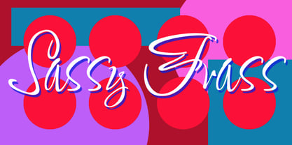 Fun, handlettered script.
 - Heart Grow by Olivetype,
$18.00 Love is in the air—or at least it should be! Get that perfect, happy feeling with Heart Grow. This font is great for adding some personality to all your occasions, making it perfect for logos, cards, labels, and more. So what’s included : Standard Latin Numbers, symbols, and punctuations Multilingual Support. Accented Characters : ÀÁÂÃÄÅÆÇÈÉÊËÌÍÎÏÑÒÓÔÕÖØŒŠÙÚÛÜŸÝŽàáâãäåæçèéêëìíîïñòóôõöøœšùúûüýÿžß PUA Encoded and fully accessible without additional design software Simple Installations Works on PC & Mac Thank You!
 - Roos ST by Canada Type,
$39.95 Roos ST is a special version of the Roos family, engineered specifically for science writing. It is equipped with SciType, a combination of additional characters and OpenType programming included in the fonts to help with typesetting science text. For more information about SciType, please consult the SciType FAQ available in the Gallery section of this page. The Roos design is the Dutch classic made by S. H. de Roos during the years of the second World War, and subsequently used for a special edition of the Dutch Constitution on which Juliana took the oath during her inauguration as the Queen of the Netherlands. This design is widely regarded as de Roos's finest, and has one of the most beautiful italics ever drawn. Aside from the SciType additions, all the Roos ST fonts contain OpenType features for ligatures, ordinals, automatic fractions, and seven kinds of figures. For details about the functionality of Roos ST, please consult its Access Chart PDF available in the Gallery section of this page.
 - Holy Cow by Fonthead Design,
$12.00 - Designer's page on Abstract Fonts.
- Painting With Chocolate - 100% free

- Paint Brush Script by Nirmana Visual,
$22.00 Paint Brush Script is a Natural Brush handwriting modern calligraphy font. Paint brush offers beautiful typographic harmony for a diversity of design projects, including logos & branding, social media posts, advertisements & product designs.
 - Linotype Paint It by Linotype,
$29.99Jochen Schuss designed Linotype Paint It in 1997 with exclusively capital letters and in two weights. The best way to describe the weight Paint It might be to compare it with a labyrinth in which the figures only become clear to the reader dedicated to finding them. The second weight, Paint It black, is almost the solution to this puzzle. The characters are black and stand out strikingly from the background. Linotype Paint It is particularly good for headlines in large point sizes or wherever a text should display a playful character. - Paint Store JNL by Jeff Levine,
$29.00Paint Store JNL is the third in Jeff Levine's series of display fonts modeled from actual water-applied decals that were manufactured by the Duro Decal Company of Chicago (now Duro Art Industries). Duro Decals were sold in paint, hardware, variety and art supply stores, and even [in some cases] print shops. - Painting Stencil JNL by Jeff Levine,
$29.00 Painting Stencil JNL was modeled in part from a vintage set of 8 inch Gothic stencils. Alphabets of this size were generally referred to as painting stencils because each letter could be painted individually in marking signs, streets or buildings, where the classic 'lettering guide' type of stencils were used for smaller projects and had alignment holes for accurate letter spacing as well as multiples letters per page.
 - Oil Painting JNL by Jeff Levine,
$29.00 Oil Painting JNL is a casual and condensed hand-lettered sans serif design based on a vintage WPA (Works Progress Administration) poster advertising an oil painting exhibition by renowned artists of the time.
 - MC Paint King by Maulana Creative,
$17.00 Paint King dripping graffiti display font. Heavy stroke, fun character with a bit of ligatures. To give you an extra creative work. Paint King dripping graffiti display font support multilingual more than 100+ language. This font is good for logo design, Social media, Movie Titles, Books Titles, a short text even a long text letter and good for your secondary text font with script or serif. Make a stunning work with Paint King dripping graffiti display font. Cheers, Maulana Creative
 - Linotype Not Painted by Linotype,
$29.99Linotype Not Painted is part of the Take Type Library, chosen from the contestants of Linotype’s International Digital Type Design Contests of 1994 and 1997. This fun font from German designer Robert Bucan grabs attention immediately. The forms are made up of multiple layers. The upper case’ alphabet forms, numerals and punctuation are two different styles of the same character, one over the other, and the lower case’ letters are composed of the lower case and upper case of the same letter superimposed. Linotype Not Painted is particularly good as a headline font in larger point sizes. - Aint Nothing Fancy - Personal use only

- Aint Nothing Fancy by Hanoded,
$15.00 A nice, ‘normal’ script font without the frills and thrills of my other work. It’s a handwritten typeface with a schoolboy kind of feel to it. Use it for your websites, your letters and product descriptions! Because of its unobtrusive nature, the font won't attract too much attention, so your work will stand out better.
 - Aint Baroque NF by Nick's Fonts,
$10.00Here’s a not-often-seen variation of Milton Glaser’s 1968 creation Baby Teeth, distributed by Photo-Lettering Inc. as Baby Teeth Baroque. Actually, the sinuous swirls suggest, rather, an Art Nouveau influence, which is why this version has its name. Well, that, and the original design didn’t need any fixing. This font contains the complete Latin language character set (Unicode 1252) plus support for Central European (Unicode 1250) languages as well. - She Paints Me Blue - Personal use only

- Growing Script free - Personal use only

- Rowling Stone XNarrow - Unknown license

- Z001-ROM™ - Unknown license

- KR Cow Juice - Unknown license

- Rowling Stone Narrow - Unknown license

- Markus the Cow - Unknown license

- Rowling Stone Wide - Unknown license

- Rowling Stone Bold - Unknown license

- Rowling Stone Chalked - Unknown license

- KR Firefighter Ron - Unknown license

- Urgency Of Now by PizzaDude.dk,
$20.00
- Raw Street Wall by TypoGraphicDesign,
$25.00 - Bazoo Tow NF by Nick's Fonts,
$10.00Here's a faithful rendering of the slightly quirky, but thoroughly yeomanlike headline face Basuto, designed by Stanley Baxter and released by the Stephenson Blake Type Foundry in 1927. Bold, brassy and a little sassy, this one will perk up your headlines fer sure. Both versions include the complete Latin 1252, Central European 1250 and Turkish 1254 character sets, as well as localization for Moldovan and Romanian. - Raw Street Wall by Volcano Type,
$25.00 The typeface Raw Street Wall is designed for the Typo Graphic Design font foundry from 2011–2017 by Manuel Viergutz. A playful display type for headlines with a street-art graffiti-style by hand. Rough-look plus state-of-the-art automatic generated OpenType-features (like contextual alternates (calt)). 567 glyphs with extras like emoticons/icons, arrows, dingbats, symbols, geomatric shapes, catchwords and many alternative letters. Multilingual support with 27 languages. Have fun with this font & try the DEMO-FONT (with reduced glyph-set) FOR FREE! Example of use It’s your turn … for example everywhere where it makes sense. Maybe for use in magazines, posters, headlines and advertisement, plus as webfont for decorative headlines. Technical Specifications ■ Font Name: Raw Street Wall ■ Font Weights: Regular + DEMO (with reduced glyph-set) ■ Font Category: Display for headline size ■ Font Format: .otf (OpenType Font for Mac + Win) + .ttf (TrueType Font) ■ Glyph Set: 567 glyphs ■ Language Support: 27: Afrikaans, Albanian, Catalan, Croatian, Czech, Danish, Dutch, English, Estonian, Finnish, French, German, Hungarian, Italian, Latvian, Lithuanian, Maltese, Norwegian, Polish, Portugese, Romanian, Slovak, Slovenian, Spanisch, Swedish, Turkish, Zulu ■ Specials: Extras like emoticons/icons, arrows, dingbats, symbols, geomatric shapes, catchwords and many alternative letters plus OpenType-Features. ■ Design Date: 2011–2017 ■ Type Designer: Manuel Viergutz ■ License: Desktop license, Web license, App license, eBook license, Server license
 - Today Sans Now by Elsner+Flake,
$59.00 With the publication of the “Today Sans Now” Elsner+Flake extends its offering of the “Today Sans Serif” type family, developed in 1988 by Volker Küster for Scangraphic, by another cut so that the gradation of the stroke width can now be more finely calibrated. The type complement is available for 72 Latin-based languages as well as Cyrillic. Where available, small caps were integrated, and mathematical symbols as well as fractions were included. In order to make the symbols for text applications in regard to headlines more flexible, the insertions which were formerly added, for technical reasons in order to sharpen the corners, were eliminated, and the optical size adjustments of the vertical and diagonal stem endings (I, v, H, V) to the horizontal bars (z, Z) were scaled back. Already since the end of 1984, Volker Küster experimented with broad sticks of chalk and a broad felt pen in order to develop a new sans serif typeface which, in the interest of easy legibility, would be built on the basic structures and proportions of the Renaissance-Antiqua. Using a normal angle of writing, his experiments lead to the form structure of the characters: a small contrast between bold and light weights, serif-like beginning and end strokes in some of the lower-case characters, and the typical, left-leaning slant of all round lower-case letters and the typical left-leaning axis of all round letter forms. In this way, a rhythmization of a line of type was achieved which created a lively image without being “noisy”. With this concept, Volker Küster has enlarged the Sans Serif by a distinctive, trend-setting form variation.
 - Now Showing JNL by Jeff Levine,
$29.00 Inside the pages of the April, 1937 issue of the fan magazine “Hollywood Now” is an unusual bit of hand lettering used for the titles in a number of featured articles. A narrow thick-and-thin Art Deco alphabet with many stylized characters, this type design is now available as Now Showing JNL in both regular and oblique versions.
 - Bluset Now Mono by Elsner+Flake,
$35.00 Bluset Monospaced enlarges the re-worked and expanded text- and headline typeface family Bluest Now with 6 new cuts. The concept for Bluest Now was based, in its original form, on a corporate design typeface by Elsner+Flake in 2004, ordered by the Landor Agency for a large German energy corporation. Regularly re-worked and brought up to modern standards, the typeface is still used to this day. Because of its large x-height and its well-balanced appearance, Bluset Now Mono is also excellent for use in small typesizes. The three Roman cuts, Regular, Medium and Bold, and the corresponding obliques, allow a clear differentiation of base- and display applications for every typesize. The character complement has been created for 72 Latin-based language areas and thus allows a neutral text exchange across language borders. Translation Inga Wennik


