10,000 search results
(0.071 seconds)
- Nickerbocker-Normal - Unknown license

- Slogan-Normal - Unknown license

- Present-Normal - Unknown license

- Viking-Normal - Unknown license

- Flemish-Normal - Unknown license

- Juniper-Normal - Unknown license

- Domino normal - Unknown license

- StrangePhenomena Normal - Unknown license

- Houters-Normal - Unknown license

- Ironick-Normal - Unknown license

- Chizzler Normal - Unknown license

- DearTeacher-Normal - Unknown license

- Coliseo-Normal - Unknown license

- StrangePhenomena [normal] - Unknown license

- Slam Normal by Wiescher Design,
$12.00 »SLAM« is my new, very sturdy but elegant slab-serif font family. I designed this font family with body copy in mind and gave it all the glyphs necessary for use with all latin writing languages. I also gave the fonts all kinds of different numerals as well as a complete set of small caps and overall extensive kerning. It comes in eight normal weights with corresponding oblique cuts and it comes in a rounded version and corresponding obliques as well. Enjoy this original font, it is a real work horse!
 - Sagata Normal by Lemonthe,
$10.00 Sagata Normal Font Duo, perfect for product packaging, branding project, magazine, social media, and much more. Explore the best your side. FEATURES Sans Serif & Script Ligatures Uppercase and Lowercase letters Numbering and Punctuations Also Multilingual Support
 - Fabrikat Normal by HVD Fonts,
$40.00 Fabrikat Normal is a geometric typeface which is based on 20th century German engineers’ typefaces. It is optimised for small sizes and long texts, but due to its constructed architecture it also works in headlines or display use. You can combine Fabrikat Normal with the more straight and space saving Fabrikat Kompakt or the reduced to the max Fabrikat Mono.
 - CA Normal by Cape Arcona Type Foundry,
$40.00 CA Normal is a typeface aiming for beauty without ostensible effects, merely relying on clarity and well balanced proportions. True beauty is not to be found in perfect geometry, so slight irregularities and inconsequences are spread throughout the typographic image. That’s perfection through imperfection. CA Normal merges influences from European grotesques and American gothics, breeding an experimental mongrel. The underlying concept stays in the background, giving the design a great self-evidence. Although it is doubtful if there can be such thing as neutrality, CA Normal comes pretty close to what people mean when speaking of a neutral font. Nevertheless it’s not faceless, anonymous or confound able. It’s just that the charm comes from subtle details rather than obvious design features. As good text typefaces must not be too smooth nor too agitated, CA Normal is smuggling little uneven details into the typographic image, that keep the readers eye awake. The well crafted oblique follows the grotesque tradition which knows no individually drawn italics. A rather unexpected addition is the reverse oblique, a style mainly used for maps. Under the classic surface lies a modern well equipped font, featuring small caps, a Central European character set and numerals in all kinds of flavors. Numerous ligatures round up the overall impression. By default CA Normal will set numbers as proportional lining figures. But if you prefer oldstyle figures, or tabular figures, just use the OpenType functions of your layout program. These allow access to the small caps as well, which feature a complete central European character set, brackets, punctuation and lining figures in small caps height.
 - Font - Unknown license

- Silom - Unknown license

- Salom by Schriftlabor,
$44.00 Salom was designed by Austrian type designer Igor Labudovic during his year at Reading University. Besides Latin, it originally included Arabic and Hebrew. The peaceful coexistence of both writing systems in his fonts led him to combine the words Salaam and Shalom to the font family name. Salom’s sibling, Salom Sans, features the same letter proportions and therefore allows a rich spectrum of diverse typography, yet keeping the harmony between all styles. The sans has an additional light weight, while the serif comes with an expressive stencil style.
 - Sator by Stone Type Foundry,
$49.00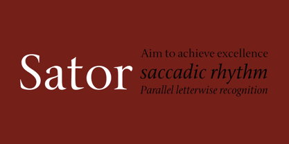
- Valor by Tim Rolands,
$29.00Valor is a display face inspired by uncial forms seen through a modern roman lens. The result is a type with strong contrast between thick and thin strokes and a highly geometrical construction that even so retains a hint of the charm of hand-written uncial letters. A number of alternate forms and ligatures add to the personality of the face and offer flexibility in usage. Best suited for large titling work such as in posters or book and magazine covers. - Sagor by Cihangir Öziş,
$15.00 Sagor, designed by Cihangir Öziş in 2019, is a modern font that adds a different flavour to your works with its cool look and unique details. Sagor is suitable for fashion, branding, packaging and editorial uses. It is an excellent choice for short sentences, big hero titles, unique logo fonts, in particular. It can also be used to add a new look to historic design structures. Sagor is particularly elegant and assertive, especially in lowercase letters. Features: Latin Basic Latin Western European South Eastern European Uppercase Lowercase Numbers - Decimal Digits Standart Punctuation Standart Ligatures Alternate for "a" Letter Symbols - Currency, Basic Math, Arrows
 - Sapore by Fonderia Serena,
$23.90 Sapore is a script font family, mostly monoline, inspired by the elegant handmade signs in the beautiful city of Venice, Italy, where I work and live. Many of these signs were made at the beginning of the 20th century by skillful craftsmen and artists, carrying that distinct vintage Italian flavour, and this is why I named the font Sapore, which means precisely flavour (also, one of the signs is from a pastry shop that makes the most delicious things). The design takes this retro vibe into the 21st century, making it up-to-date and fresh, while keeping it authentic. It is a script font, but I added some stand alone capitals that you can use in all caps words and texts effortlessly, as the open type code is taking care of using the right set of letters at the right time, I could have made two separate fonts, but I wanted to give you the best value I could and ease of use. Make sure contextual alternates are always on! There are also swashes, alternate styles, stylistic sets, small caps, 2 figure sets and decorative elements, all accessible through open type. I think the font is particularly suited for display use, as in logos, packaging design, branding, but it is readable enough for small text blocks. You can access the non-linking caps by clicking on the discretionary ligatures button. You can access the loopy caps by clicking on the titling alternates button. The main version has straight terminals but I included a round version and a calligraphic one, called “classico”. Hope you like it!
 - Salome by Canada Type,
$24.95 Salome is a revival, normalization and elaborate expansion of a 1972 film face called Cantini. The original film type, released by a tiny independent outfit called Letter Graphics, looked like it was hand drawn with little consideration for consistency in essential lettering flow measurements, like angles, stroke widths, and vertical metrics. All these issues have been resolved in this digital version, and the original character set, including the whole lot of alternates, was entirely redrawn and expanded to include even more alternates and many useful ligatures, as well as extended support for Latin-based languages. Combining elements of early 20th century art nouveau with common 1960s and 1970s signage and poster lettering flair, Salome uses curls and curves to wave its fantastic shapes in a most hypnotic dance. Salome simply cannot be unseen. Just like its namesake, the female seduction icon, it does not hesitate to put all of its natural beauty and energy on display in order to get what it wants. Salome comes in all popular font formats. The OpenType version, Salome Pro, combines the main font with the alternates one, and contains convenient features for push-button alternation and ligature substitution in supporting software programs.
 - Hilority by Maulana Creative,
$15.00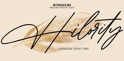 Hilority is an Expressive Signature script font. With light mono-line stroke, super slanted, Condensed and fun character with some of ligatures. To give you an extra creative work. Hilority font support multilingual more than 100+ language. This font is good for logo design, Social media, Movie Titles, Books Titles, a short text even a long text letter and good for your secondary text font with sans or serif. Make a stunning work with Hilority font. Cheers, MaulanaCreative
 - Sabor by Intellecta Design,
$59.90 Sabor is a voluptuous upright connected display font with mixed taste of script fonts. There were many inspirations for Sabor, but all started with a book from the 1950s about the battles of World War II. To that first sketches of a naive dense display typeface we, day by day, start to create a mixed style evolving some lettering concepts from 1950s, some calligraphy notions and the first display ideas. The feeling of this font is good to be used in many artworks, like logos, packaging, party invitations, layouts for t-shirts, magazine headings, and much more, since websites to and all kind of printed jobs. That font is not really a script, but, like the scripts we strongly recommends to use the caps only in the beginning of words and sentences, to contrast with the lower cases : it’s not designed for all-caps settings, so avoid that kind of use. This font has almost 700 glyphs and supports the most important Latin-based languages. We works hard in a tour-de-force kerning: over 12.000 kerning pairs soft adjusted handily. Its OpenType features include final forms, initial forms, special sets (upper and lowercase's), hundreds of contextual alternates ligatures providing letter-form variations and connections that make your designs really special, and ornaments (tails). Because of its high number of alternate letters and combination's, we suggest the use of the glyph palette to find ideal solutions to specific designs. The sample illustrations will give you an idea of the possibilities. You have full access to this amazing stuff using InDesign, Illustrator, QuarkXpress and similar software. However, we still recommend exploring what this font has to offer using the glyphs palette: principally to get all the power of the Contextual Alternates feature. You can get an idea of the power of this font looking at the “Sabor User Guide”, a pdf brochure in the Gallery section. Also available two sister fonts easy to use : SaborWords and SaborRasgosEscritura Sabor has original letters designed by Iza W and overall creative direction plus core programming by Paulo W.
 - Jester - Unknown license

- Fester by Fontfabric,
$150.00 Get inspired with Fester Behance presentation After several years of iterations, our brand new sans family of 16 styles is ready to take over with vector excellence! Fester is a semi-condensed Grotesque developed to beam big messages across the galaxy with a clear, bold voice. Emerging as if from the future, this low-contrast sans warps slick lines and sharp terminals into unexpected geometric shapes for extra flair. Ranging from Thin to Heavy, the typeface is loaded with 8 weights + italics, one variable style, over 760 glyphs, and Extended Latin + Cyrillic for flawless work at hyper-speed. Fester syncs with designs that feature big type, sharp layouts, interfaces, outlines, and raster images to help decipher any cutting-edge idea and make a memorable first contact. Family overview: 8 weights (from Thin to Heavy) + italics Extended Latin Cyrillic 760 glyphs Variable Font 1 free font - Fester-ExraLight 130+ languages OpenType Features: Localized Forms Subscript and scientific inferiors Superscript (Superiors) Numerators and Denominators Fractions Lining Figures Tabular Figures Oldstyle Figures Case-Sensitive Forms Standard and Discretionary Ligatures Stylistic Alternates Contextual Alternates Slashed Zero
 - Westey by sizimon,
$12.00 Westey is a script signature, beautiful for wedding card designs, logotype, website header, fashion design and any more. Westey come with 73 Glyph alternates and 63 Swash Characters. It contains a full set of lower & uppercase letters, a large range of punctuation, numerals, and multilingual support. - PUA encode - Bonus Swash - Multilingual support : (Danish,Finnish,English,,Spanish,Dutch,German,Icelandic,Italian,Norwegian,Portuguese,Indonesian, Swedish) If you have any question please do not hesitate to contact me.Thank You!
 - Wesker by SimpleType Studios,
$15.00 Introducing our Wesker - Sans Serif Display Font Collection—a stunning blend of style, versatility, and impact. With 15 fonts, 5 weights, and 3 widths to choose from, your designs will shine like never before. Each font is meticulously crafted to leave a lasting impression, offering unparalleled elegance and precision. Whether you're creating logos, packaging, or posters, our collection empowers you to make a bold statement. Don't settle for ordinary—unlock the power of extraordinary typography. Order our Sans Serif Display Font Collection today and elevate your designs to new heights.
 - Spaghetti Western NF by Nick's Fonts,
$10.00One in the series of fonts called Whiz-Bang Wood Type, intended to be set large and tight. Spaghetti Western is a based on an Italian interpretation of a classic ultrabold Western-style face; so, fittingly, the font is named for the genre of “cowboy” film pioneered by Sergio Leone. Both versions of this font contain the complete Unicode Latin A character complement, with support for the Afrikaans, Albanian, Basque, Bosnian, Breton, Catalan, Croatian, Czech, Danish, Dutch, English, Esperanto, Estonian, Faroese, Fijian, Finnish, Flemish, French, Frisian, German, Greenlandic, Hawaiian, Hungarian, Icelandic, Indonesian, Irish, Italian, Latin, Latvian, Lithuanian, Malay, Maltese, Maori, Moldavan, Norwegian, Polish, Portuguese, Provençal, Rhaeto-Romanic, Romanian, Romany, Sámi, Samoan, Scottish Gaelic, Serbian, Slovak, Slovenian, Spanish, Swahili, Swedish, Tagalog, Turkish and Welsh languages, as well as discretionary ligatures and extended fractions. - Western Sans JNL by Jeff Levine,
$29.00 Take a classic Western wood type where the horizontals are thicker than the verticals and remove the slab serifs… The result is Western Sans JNL, which is available in both regular and oblique versions.
 - TV Western JNL by Jeff Levine,
$29.00 In the 1889 Franklin Type Foundry specimen book is a type face called “Armenian”. With lighter weight horizontal slab serifs than more traditional Western fonts, it could be pictured as being used as copy on wanted posters or town notices. This is now available as TV Western JNL in both regular and oblique versions.
 - Country Western Swing by FontMesa,
$30.00Country Western is a revival of the classic William Page font known as Clarendon Ornamented originally designed in 1859 and again in 1877 by Vanderburgh & Wells. This version combines the best of both versions and adds something new. New to this font are the lowercase, italic, swash and script versions plus Greek and Cyrillic character sets. Keeping with the original theme from 1859 Fill fonts are available for the Ornamented and Open faced versions of this font. Greek, Cyrillic, Central and Eastern European characters sets are supported in the Windows TrueType and OpenType formats. The Windows and Mac PostScript Type1 versions of this font, however, do not support Greek, Cyrillic, Central and Eastern European characters sets. - Western Deco JNL by Jeff Levine,
$29.00 The cover of the 1938 sheet music for "Treasure Island March" had its title hand lettered in a rough-hewn Western style with overtones of Art Deco influence. All of the characters were "cleaned up" for the digital font, but still retain the basic designs with their irregular, eccentric look. The result is Western Deco JNL, which is available in both regular and oblique versions.
 - Western Stencil EF by Elsner+Flake,
$35.00 - Country Western Script by FontMesa,
$30.00 Country Western Script is a new font based on the classic William Page font known as Clarendon Ornamented originally designed in 1859 and again in 1877 by Vanderburgh & Wells. This version includes Greek, Cyrillic, Central and Eastern European characters sets. Keeping with the original theme from 1859, Fill fonts are available for the Ornamented and Open faced versions of this font. Greek, Cyrillic, Central and Eastern European characters sets are supported in the Windows TrueType and OpenType formats. The Windows and Mac Type1 versions of this font do not support Greek, Cryillic, Central and Eastern European characters sets.
 - Western Suburbs JNL by Jeff Levine,
$29.00 The cover of a 1932 edition of “Sunset magazine” (a publication for homeowners living in the west and southwest area of the United States) featured a lovely Art Deco serif alphabet that is now available as Western Suburbs JNL in both regular and oblique versions.


