10,000 search results
(0.058 seconds)
- Pouri by ejhaa,
$40.00 Pouri is a classic script with a modern style that is very suitable for wedding media, book covers, greeting cards, logos, branding, business cards and certificates, even for any design work that requires classics, formal or luxurious looks. Pouri includes a wealth of OpenType features. If you don't have a program that supports OpenType features like Adobe Illustrator and CorelDraw X Version, you can access all alternative glyphs using Font Book (Mac) or Character Map (Windows).
 - Stone Masher by Letterhend,
$19.00 Stone Masher is a bold hand drawn brush script which is purposely made for headline, display or logotype, and signature which need a standout appearing. This font is also suitable to be applied especially in logo, and the other various formal forms such as invitations, labels, logos, magazines, books, greeting / wedding cards, packaging, fashion, make up, stationery, novels, labels or any type of advertising purpose. Features : uppercase & lowercase numbers and punctuation multilingual alternates & ligatures PUA encoded
 - MVB Fantabular by MVB,
$39.00MVB Fantabular proves that monospaced faces needn’t be formal or bland. Inspired by the letterforms of older typewriters, Akemi Aoki designed a playful family of three weights with italics. With every character the same width MVB Fantabular works wherever a monospaced font is needed, but the face is so loose and carefree it hides its fixed pitch construction well, allowing it to be used in other settings too. A sans serif version—MVB Fantabular Sans—is also available. - MVB Fantabular Sans by MVB,
$39.00MVB Fantabular proves that monospaced faces needn’t be formal or bland. Inspired by the letterforms of older typewriters, Akemi Aoki designed a playful family of three weights with italics. With every character the same width MVB Fantabular works wherever a monospaced font is needed, but the face is so loose and carefree it hides its fixed pitch construction well, allowing it to be used in other settings too. MVB Fantabular Sans is the sans serif version of MVB Fantabular. - Qisharon by LetterMuzara,
$20.00 Qisharon is a contrast sans serif font, consisting of four styles (light, book, regular, bold) and including 5 writing systems such as Latin (supporting all European languages and Turkish), Cyrillic, Greek, Hebrew, and Arabic. It is based on classic calligraphic rules and respects the traditions of every script. There are plenty of ligatures, that will draw attention to your design. Qisharon with it's formal and elegant nature is a perfect fit for logos, visit cards and magazine headings.
 - Hirosin by Letterhend,
$14.00 Hirosin is a modern display font. This typeface has been made carefully to make sure its premium quality. This typeface has can be used for modern theme or vintage looks. Very suitable for logo, headline, tittle, and the other various formal forms such as invitations, labels, logos, magazines, books, greeting / wedding cards, packaging, fashion, make up, stationery, novels, labels or any type of advertising purpose. Features : Uppercase & lowercase Numbers and punctuation Alternates & Ligatures Multilingual PUA encoded
 - Havin Bride by Letterhend,
$17.00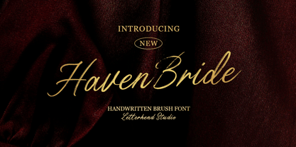 Haven Bride is the beautiful brush script font that perfectly captures the casual of a handwritten. With its natural feel and casual, chic style, it's the perfect choice for branding, logos, and the other various formal forms such as invitations, labels, logos, magazines, books, greeting / wedding cards, packaging, fashion, make up, stationery, novels, labels or any type of advertising purpose where a personal touch is needed. Features : Uppercase & lowercase Numbers and punctuation Alternates & Ligatures Multilingual PUA encoded
 - Shining Holiday by Zeenesia Studio,
$15.00 Shining Holiday is a calligraphic script font that comes with a lovely alternative character. mix of copper calligraphy in a handlettering style. Designed to convey an elegant style. Shocking Script is attractive because it is smooth, clean, feminine, sensual, glamorous, simple and very legible. Its classic style is very suitable to be applied to all types of formal items such as invitations, labels, menus, logos, fashion, make up, stationery, letterpresses, romantic novels, magazines, books, greeting / wedding cards, packaging, labels.
 - Fountencil by Letterhend,
$19.00 Introducing, Fountencil - A blackletter stencil typeface. This type of font perfectly made to be applied especially in logo, and the other various formal forms such as Logo, Clothing, Fashion, Headline, or any type of advertising purpose. Features : uppercase & lowercase numbers and punctuation stylistic alternate multilingual PUA encoded We highly recommend using a program that supports OpenType features and Glyphs panels like many of Adobe apps and Corel Draw, so you can see and access all Glyph variations.
 - Jackipur by HGB fonts,
$20.00 The motivation for Jackipur was: to achieve more openness and thus more clarity. That's why I created more clarity in the structure of the letters in order to avoid formal ambiguities that arise especially with small degrees. I found it important to open up the round letters so that they are straight and horizontal along the center and baselines so that the eye can connect the letters directly and quickly. A simple font, but neither plain nor without elegance.
 - Golden Way by Typehill Studio,
$12.00 Golden Way Family attracts such a subtle, clean, feminine, sensual, glamorous, simple and very readable typeface. The classic style is perfect to apply in various formal forms such as invitations, labels, menus, Logos, fashion, make up, stationery, letterpress, romantic novels, magazines, books, greeting / wedding cards, packaging, labels Golden Way Family also features a strong neoclassical serif typeface with high contrast, cool, stylish and unique look with alternative fonts, Ligatures, and multilingual support Thank you for your visit.
 - Killviners by Letterhend,
$19.00 Introducing, Killviners - A modern blackletter typeface. This type of font perfectly made to be applied especially in logo, and the other various formal forms such as Logo, Clothing, Fashion, Headline, or any type of advertising purpose. Features : uppercase & lowercase numbers and punctuation stylistic alternate multilingual PUA encoded We highly recommend using a program that supports OpenType features and Glyphs panels like many of Adobe apps and Corel Draw, so you can see and access all Glyph variations.
 - Golden Decades by Dharma Type,
$19.99 Back to the basics. In the last ten years, type design has been confronting chaotic scene. The font market is flooded with a mixture of wheat and chaff and typography becomes increasingly complex. But one golden straight path exists. The path began from the industrial revolution, passing through swiss style, now we walk along the path as a matter of course. It is sans-serif. The decades from the Swiss style, namely "less is more age" to the contemporary basic style "Less, but better age", we call it golden decades. In those decades, type design met modernism. Go back to a theory in the golden decades, we redesigned new geometric, minimal sans-serif. Less is more and better. We added cool and calm spices to the modernism in the golden decades. As a result, letterform has a contemporary, sharp, and neutral atmosphere, and geometric rounded bowls and counters create a nice rhythm. Golden Decades consists of 8 weights and their matching Italics for a wide range of usages. Farther, Golden Decades is supporting international Latin languages and basic Cyrillic languages including Basic Latin, Western Europe, Central and South-Eastern Europe. Also, Golden Decades covers Mac Roman, Windows1252, Adobe1 to 3. This wide range of international characters expands the capability of your works. Lowercase "a" has OpenType stylistic alternate for advanced typography.
 - Century Gothic Paneuropean Variable by Monotype,
$209.99 Century Gothic™ is based on Monotype 20th Century, which was drawn by Sol Hess between 1936 and 1947. Century Gothic maintains the basic design of 20th Century but has an enlarged x-height and has been modified to ensure satisfactory output from modern digital systems. The design is influenced by the geometric style sans serif faces which were popular during the 1920s and 30s. The Century Gothic font family is useful for headlines and general display work and for small quantities of text, particularly in advertising. Century Gothic family has been extended to 14 weights in a Pan-European character set from Thin to Black and their corresponding Italics. The already existing 4 weights of Regular and Bold with their Italics are additionally still available in the STD character set. For international communication, the W1G versions offer the appropriate character set. They contain Latin, Greek and Cyrillic characters and thus support all languages and writing systems that are in official use in Western, Eastern and Central Europe. Century Gothic Variable is features two axes: Weight and Italic. The Weight axis has preset instances from Light to Black. The Italic axis is a switch between upright and italic. Looking for the perfect way to complete your project? Check out Aptifer™ Slab, ITC Berkeley Old Style®, FF Franziska™, Frutiger®, ITC Legacy® Square Serif or Plantin®.
 - Century Gothic Paneuropean by Monotype,
$50.99Century Gothic™ is based on Monotype 20th Century, which was drawn by Sol Hess between 1936 and 1947. Century Gothic maintains the basic design of 20th Century but has an enlarged x-height and has been modified to ensure satisfactory output from modern digital systems. The design is influenced by the geometric style sans serif faces which were popular during the 1920s and 30s. The Century Gothic font family is useful for headlines and general display work and for small quantities of text, particularly in advertising. Century Gothic family has been extended to 14 weights in a Pan-European character set from Thin to Black and their corresponding Italics. The already existing 4 weights of Regular and Bold with their Italics are additionally still available in the STD character set. For international communication, the W1G versions offer the appropriate character set. They contain Latin, Greek and Cyrillic characters and thus support all languages and writing systems that are in official use in Western, Eastern and Central Europe. Century Gothic Variable is features two axes: Weight and Italic. The Weight axis has preset instances from Light to Black. The Italic axis is a switch between upright and italic. Looking for the perfect way to complete your project? Check out Aptifer™ Slab, ITC Berkeley Old Style®, FF Franziska™, Frutiger®, ITC Legacy® Square Serif or Plantin®. - Buckboard by Aerotype,
$49.00 The Buckboard family uses the OpenType ligature feature to substitute a unique pair of distressed characters when any upper or lower case letter is keyed twice in a row. The Buckboard Shadow font can be overlapped with Buckboard Regular to color the drop shadow separately. All fonts also support Eastern European Latin and Baltic languages.
 - Applewood by Aerotype,
$49.00 The Applewood family uses the OpenType ligature feature to substitute a unique pairing of characters when any upper or lower case letter is keyed twice in a row. The Applewood Shadow font can be overlapped with Applewood Alternate to color the drop shadow separately. All fonts also support Eastern European Latin, Baltic, Greek and Turkish.
 - Asia Impact by Gleb Guralnyk,
$14.00 Introducing a conceptual script font: Asia Impact. It's a brush handwritten typeface inspired by asian traditional calligraphy. Each letter has two shapes versions for uppercase and lowercase characters. It works both in horizontal and vertical orientation. Asia Impact is perfect for tattoo design and authentic eastern lettering.
 - TG Riota Gothic by Tegami Type,
$35.00 TG Riota Gothic is a brand new digital sans serif typeface in geometric style with many faces and possibilities with good proportions forms. TG Riota Gothic is outstanding for use in small text or even bigger sizes with seven weights, two axes & 14 styles, including the variable font. It comes with three alternative groups (single story alternates, no tail alternates & square dot alternates), which you can combine to maximize your needs—also supplied with a bunch of ligatures (standard & discretionary ligatures), lining figures (proportional, denominators, numerators, fractions, subscript & superscript), case-sensitive forms, symbol & Each typeface contains over 674 glyphs covered more than 90 languages Latin based. Language Supports: Afrikaans, Albanian, Asu, Azerbaijani, Basque, Bemba, Bena, Bosnian, Catalan, Chiga, Colognian, Cornish, Croatian, Czech, Danish, Dutch, Embu, English, Estonian, Faroese, Filipino, Finnish, French, Friulian, Galician, German, Gusii, Hungarian, Icelandic, Indonesian, Irish, Italian, Kabuverdianu, Kalaallisut, Kalenjin, Kamba, Kikuyu, Kinyarwanda, Latvian, Lithuanian, Low German, Lower Sorbian, Luo, Luxembourgish, Luyia, Machame, Makhuwa-Meetto, Makonde, Malagasy, Malay, Maltese, Manx, Meru, Morisyen, North Ndebele, Norwegian Bokmål, Norwegian Nynorsk, Nyankole, Oromo, Polish, Portuguese, Romanian, Romansh, Rombo, Rundi, Rwa, Samburu, Sango, Sangu, Scottish Gaelic, Sena, Shambala, Shona, Slovak, Slovenian, Soga, Somali, Spanish, Swahili, Swedish, Swiss-German, Taita, Teso, Thai, Turkish, Turkmen, Upper Sorbian, Vunjo, Walser, Welsh, Western Frisian, Zulu. Typeface Designed by Iqbal Firdaus Published by Tegamitype® Foundry Presentation Design by Eunike Agatha & Dennise Nathalie
 - Holitter Lines - 100% free

- Onick by Wordshape,
$- While researching the history of Onitsuka Tiger's branding and graphic design, I came across an odd, yet highly appealing piece of custom lettering on the company's ONICK ski boots from the 1970s. Reminiscent of aspects of the typeface Black-Out by Eli Carrico (released by my type foundry Wordshape), yet vertically compressed with razor-sliced counters and odd stencil element that makes up one of the legs of the "K", the ONICK lettering is a potential source for an intriguing modular font. I immediately thought of Ryoichi Tsunekawa as a potential collaborator to bring this piece of lettering to full-fledged life in the contemporary context. Based in Nagoya, Tsunekawa runs an independent type foundry called Dharma Type, including three specialized foundry sub-labels: Flat-It, devoted to display lettering; Prop-A-Ganda, a series of fonts inspired by and based on retro propaganda posters, movie posters, retail sign lettering & advertisements in the early 20th century; and Holiday Type, a series of decorative and retro scripts for holiday use. The past year has seen a flurry of notice of his work abroad, having been featured in both MyFonts' "Creative Characters" and YouWorkForThem's newsletter. As the work of most Japanese type designers is almost wholly unnoticed abroad, for Tsunekawa to be interviewed by two of the most popular type distribution companies in the world is definitely something beyond the norm. Perhaps it is because he works independently, or perhaps it is due to the charm and friendliness with which his typefaces are infused. Either way, this attention is both welcome and appreciated. Beyond mere charm, Tsunekawa's work is nuanced, detailed, and accessible due to its high level of finish. His fonts stand apart from his contemporaries in Latin typeface design in Japan due to his fascination with pop, vernacular and historical lettering from "non-pure" sources- whereas type designers like Kunihiko Okano and Akira Kobayashi have spent years analyzing the essence of Western letterform construction and unlocking the essence of Latin forms, Tsunekawa views surface and the awkward nature of his sources as being of value, as well. His irreverence for the formal doctrines of history imbue his typeface designs with a rugged inventiveness that would be missed by most- glyphs without source designs are guessed at and approximated, often in a manner wildly divergent from what Western eyes would assume. It is in these moments that I find sheer delight in Tsunekawa’s work and what make me most pleased to invite him aboard Neojaponisme and Onitsuka Tiger’s type development project. His assorted typefaces show an eclecticism in finish and as holistic systems- Tsunekawa's return email to me about the proposed type project showed a digital sketch of how a completed typeface family from the source lettering might look, rendered with an effortlessness and dedication to detail that belies a skilled craftsperson. Further development showed Tsunekawa’s rigor- the typeface in development rapidly featured glyphs ignored by many: a full set of fractions, Eastern European diacritics and accents, superior and inferior numerals, alternate characters, and custom ligatures - all designed with regulated, detailed spacing. ONICK is a typeface Tsunekawa should be proud of- an homage to a moment in history rendered in the absolute best fashion. We are proud to present it to the world! --Ian Lynam
 - Big Deal by Daily Studio,
$13.00 Big Deal is a display San serif font with a strong character. A beautifully handcrafted modern typeface that helps you to create remarkable logos, headings, advertisements, and more. With 235 glyphs and files in OTF format. If you want to make your project to a whole new level, you are going to love this font.
 - Lonesome by Gassstype,
$23.00 Here comes a New font, Lonesome is a All Caps Brush Font that is written casually and quickly. Letters are made with brushes on Procreate. Then crafted carefully drawn into vector format. That is why Lonesome has Stylish and strong characteristic more natural look to your text with a more modern look to your text.
 - MEME by Robert Petrick,
$19.95 “MEME” Regular is a work in progress designed in a square format. It is all Caps with small caps in the lower case. With over 80 design glyphs for you to use creatively. “MEME” is also a great font to add to your futuristic headline fonts, I am adding new characters all the time.
 - Mansel by Prominent and Affluent,
$30.00 Mansel – an exquisite sans serif font that takes inspiration from retro design. Boasting an impressive range of weights, widths, and italic angles in both classic and variable formats, Mansel offers unparalleled flexibility for creating stunning visual compositions. With support for most Latin-based languages, this versatile font is perfect for professional projects with global reach.
 - Hilde Sharp by Chank,
$59.00OMG it's got a smiley face underscoring the exclamation point! What a sweet, charming handwriting font from the wrist of an 18-year-old Norwegian girl. A sassy skip and a flowery flair lift this particular marker font up a notch above the rest. Now available in OpenType format for your Personal or Commercial Use. - Unranked by Gassstype,
$23.00 Here comes our new font Unranked this is a sans handwritten that is written casually and quickly. this font are made with brushes on Procreate. Then crafted carefully drawn into vector format. That is why Unranked has Rough and strong characteristic more natural look to your text with a more modern look to your text.
 - Wallnutt Corps by Here East Fonts,
$18.00 WALLNUTT CORPS is a cool, bold and powerful super modern unicase font, designed for maximum visual and emotional impact. It's great for social media, headlines, large-format print, editorial, branding, posters, fashion designs and websites — everything that strives for being confident and yolo. Definitely has a personality!
 - Fox Grotesque Pro by TipografiaRamis,
$39.00 Fox Grotesque Pro is follow-up version of Fox Grotesque family. Typeface consists of ten font styles with extended support for most Latin languages plus Cyrillic. Fox Grotesque Pro release in OTF format and includes some opentype features – proportional/tabular, lining/oldstyle figures, slashed zero, ligatures, fractions...
 - Cortada Dos Std by Type-Ø-Tones,
$60.00 Cortada is the name we gave to this display font that replaces Cortada Classic. After long discussions, Laura Meseguer gave birth to this brand new form. Cortada comes now in OpenType format in order to allow a wider range of characters, including Central European character set.
 - Hand Gothic by JCFonts,
$19.00 Hand Gothic is a condensed typeface with a hand-lettering feeling, available in two weights. The fonts, provided in OpenType format, include support for most European languages and some OpenType extras : ligatures, alternate “A” and “g”, case-sensitive forms and a handful of arrows and icons.
 - Voltexa by Ardyanatypes,
$10.00 Voltexa is a sans-serif font that offers 10 thickness levels, ranging from thin to extra black. Designed with a bold and firm style, it aims to provide a broad range of options for every designer. What sets Voltexa apart are its sharp curves in each letter, creating an elegant and modern yet strong impression. Tailored to meet diverse design needs, Voltexa can adapt to various contexts. With 10 available thickness levels, designers have the freedom to express their creativity limitlessly. This font also comes with OpenType features for ease of use and flexibility. Voltexa also supports multilingual use, allowing it to be utilized in various languages. Let's bring forth inspiring and powerful designs using the Voltexa font. With its 10 available thickness levels, this font offers designers the opportunity to create unique and standout works. The distinctiveness of each letter will enhance the aesthetic value of every design project. Use Voltexa to add an elegant, modern, and assertive touch to your creative works. With its comprehensive features and multilingual capabilities, this font will be a loyal partner in expressing your design ideas and visions into extraordinary works. Features: A – Z Character Set a – z Characters set Numerals & Punctuations Ligatures & Alternates Multilingual
 - MS Mincho by Microsoft,
$39.00MS Mincho™ Japanese font features serifs at the end of its strokes, and can be used for a variety of uses from screen display to publications. This font file is 5.3 MB in size. MS Mincho Japanese font is a trademark of Microsoft Corporation. MS Mincho font Character Set: Latin-1, Japanese (code page 932). MS Mincho is available in both TrueType and OpenType font formats. - Flamenca by Eurotypo,
$28.00 Flamenco is an Andalusian art. Who think in flamenco, think in Spain. Is the result of a cultural mix: Gypsies, Arabs, Jews and Christians mixed elements of their respective cultures with traditional Andalusian elements. It incorporate dance, song and guitar music. Known for its emotional intensity, flamenco is distinguished by the graceful arm movements, ferocious stomping’s flamenco dancer, deep groans and strumming guitar. Flamenco is an art of passion. Flamenca Regular and Flamenca Luz is a brush script inspired by the flamenco dance. Flamenca is an organic, modern and casual calligraphy family font that has preserved in its glyphs its original textured appearance for a more personalized effect even more authentic. As an exclusively Open Type release, with 747 glyphs, it has several special alternatives for all letters with lots of possibility an infinity of combinations. There are plenty of options to allow you to create something unique and special: standard and discretionary ligatures, several swashes, initial and terminal forms and stylistics alternates for each letter, catchwords, ornaments that can be added to the beginning or end of each letter, and much more. Ornaments has been created inspired in the bars of the Andalusian patios where flamenco is danced. These lovely fonts have already an extended character set to support Central and Eastern as well as Western European languages. As a whole, Flamenca was made to make your project more beautiful and attractive! Have fun with it! Flamenca is fancy, delicious & fresh!
 - Roos by Canada Type,
$24.95 The Roos family is a digitization and expansion of the last typeface designed by Sjoerd Hendrik De Roos, called De Roos Romein (and Cursief). It was designed and produced during the years of the second World War, and unveiled in the summer of 1947 to celebrate De Roos's 70th birthday. In 1948, the first fonts produced were used for a special edition of the Dutch Constitution on which Juliana took the oath during her inauguration as the Queen of the Netherlands. To this day this typeface is widely regarded as De Roos's best design, with one of the most beautiful italics ever drawn. In contrast with all his previous roman faces, which were based on the Jenson model, De Roos's last type recalls the letter forms of the Renaissance, specifically those of Claude Garamont from around 1530, but with a much refined and elegant treatment, with stems sloping towards the ascending, slightly cupped serifs, a tall and distinguished lowercase, and an economic width that really shines in the spectacular italic, which harmonizes extremely well with its roman partner. The Roos family contains romans, italics and small caps in regular, semibold and display weights, as well as a magnificent set of initial caps. All the fonts contain extended language support, surpassing the usual Western Latin codepages to include characters for Central and Eastern European languages, as well as Baltic, Celtic/Welsh, Esperanto, Maltese, and Turkish.
 - Tambau by Tipogra Fio,
$30.00 Tambau is a display typeface crafted by Matheus “Fio” Gonçalves, a Brazilian design student, still in college, inspired by Brazilian concert urban posters and wood type that I saw at the Oficina Tipográfica São Paulo. The font was first made for a magazine project in design school, making it beautiful on giant pages headlines, billboards, signs, etc. There’s no lowercase, the character set is dramatic and objective. The uppercase is actually expanded letterforms causing some eyes and breathing paths to the very condensed and very modular glyphs, which creates a quite interesting striped texture between form, counterform and spacing. The lots of ligatures come to give it more closure between the letters, when they try to form blank spaces. So do the diacritics, fitting in the space given to them by the dynamic letterforms, making dense rectangular blocks. You may use Tambau as big as you can or do a high tracking to it and still it will be pretty. The titles can be dynamic, just condensed or just large. It’s on your own. Don’t be afraid to play with Tambau, it’s an alive typography. Curiosity: For the magazine in design school, the pilot project of Tambau was cut in a MDF board, to print it with texture and paint. Later was added more characters, languages and special glyphs to it. Set: Tambau is a singular font typeface, with extended and condensed characters, numbers, ligatures, punctuation and symbols for Basic, Western, Central and South Eastern Latin languages.
 - LT Panneaux - 100% free

- Aron Grotesque - Personal use only

- Rockabye - Personal use only

- Philosopher - 100% free


