10,000 search results
(0.337 seconds)
- !The Black Bloc - Unknown license

- Axeo by Asritype,
$13.00 Axeo is a freeform serif typeface. With more than 500 glyphs for each cut, Axeo supporting wide Latin Base Languages. The font structures is sans-serif typeface. Then, the fonts is made into serif (serifed) using rhombus and adapted/modified rhombus (before remove overlaps) placed on its appropriate positions. This fonts is released first, while the sans-serif is being in process. There are 10 fonts; 5 weight in normal width: Light, Regular, Medium, Bold, and Black; and 4 in semi-condensed: Light, Regular, Medium, Bold and Black, too. The fonts has some minor character variations, all are sets in SS01.There are also standard and discretionary ligatures, arrow, some geometric shapes and ornaments. With its sansserif structure, the Medium, Bold and Black fonts is playful with text effect in various applications such MS Word, CorelDraw or others to enhance the appearance. Its serif form will make unique enhancements. Thus, the fonts is suitable for Branding, logos, cards, advertisements, banners, display and more; for the main texts or its companions. While the light, regular and medium fonts can also be used as description text, card text, note, caption and longer non-formal texts or other usages.
 - MFC Spindler Borders by Monogram Fonts Co.,
$19.95 The inspiration source for MFC Spindler Borders is a collection of border treatments revived from the “Catalog 25 TYPE FACES” by Barnhart Brothers & Spindler. The border designs were recreated from two different border sets, “Classic Art Borders” and “Classic Black & White Borders”. This collection of borders represents a structured repetition of elements in various ways to create elegant patterns and backgrounds. You can start with a new document or work on a new layer within an existing document. Select MFC Spindler Borders from the font menu. (Some users may have font previewing enabled in the font menu which will cause the font name to appear as border elements, disable this option in order to choose the name) Make certain that the point size of the font is the same as the leading being applied to the font so the borders will meet up properly. While we’ve adjusted this within the font, your program may override these settings. For instance a 12 point font should have 12 points of leading. Download and view the MFC Spindler Borders Guidebook if you would like to learn a little more.
 - Ver Army - Unknown license

- Wanderer by FontMesa,
$25.00This font was inspired by the title logo of the TV show The Wild Wild West (season two). The font was named after the train in the TV show. Wanderer is a combination of my Classic Tuscan Rodeo Clown font and a Robust Slab Serif font. Wanderer is available as a stand alone font or with the optional fill fonts. Caution: Use of this font may cause the Wild Wild West theme song to play over and over in your head. Solution: Try temporarily using another FontMesa font such as Rough Riders. - Delighted Atmosphere by Java Pep,
$15.00 Proudly present a pretty bouncy font called Delighted. As the name suggests, this font will make your project more enjoyable because it will make your project more beautiful and stand out. Delighted font comes with several alternates, so you can switch on for the alternate, stylistic alternate, and terminal form. This font is perfect for logo font, branding, greeting cards, cut files for quotes, silhouette font design, monogram font, etc. The packages and features Delighted font PUA encoded Multilingual support in more than 30 languages Thanks, and have a nice day
 - FS Clerkenwell by Fontsmith,
$80.00 A creative context 2003. Fontsmith was sharing a small, cold, whitewashed studio space in Northburgh Street, Clerkenwell. But things were on the up following prestigious custom type commissions for The Post Office and E4. “Slab serifs were on the brink of another revival, we could feel it,” says Jason Smith. “All we wanted to do was have a play with these slabs, go as far as we could within what was acceptable and readable.” “It wasn’t initially clear what was happening,” recalls Phil Garnham. “We were becoming very influenced by our surroundings, outside the studio space. We absorbed the essence and the designer grime of where we were.” Process Jason began by drawing stems on-screen. “The key aspect of the font is the upward bend of the leading shoulder serif, the way it kind of ramps up and then plummets back down the stem. “The regular and light characters are quite narrow – great for text but the bold is quite wide and chunky – better for headlines. I think ‘y’ is quite different for a slab design. We call it the Fontsmith ‘y’.” Promotion Fontsmith were determined to get FS Clerkenwell noticed. To launch the font, Ian Whalley, a designer friend of Fontsmith, captured words heard on the streets of Clerkenwell, set them in the new font and crafted a small book of typographic conversations. It was a first for Fontsmith. “I think that’s part of why this font has been so successful,” says Phil. “It really does embody the spirit of the area, as a special place for design, arts and crafts. And designers love that.” Contemporary twist FS Clerkenwell, based on influences in and around this part of London with a rich tradition of printing and design, mixes tradition with creation. Old-fashioned values meet new-school trends. Its quirky, contemporary character lends an edge to headlines, logotypes and any large-size text.
 - JT Collect by OGJ Type Design,
$35.00 JT Collect is a hybrid sans-serif typeface for the 21st century that takes a playful approach to the type design heritages of Germany and Switzerland. Confidently built on a geometric structure and infused with elements from traditional grotesque typefaces, it hits the sweet spot between geo and grot. I developed JT Collect purely digitally, drawing from years of experience with analog type design. The letters aren’t based on one particular source but seek to merge different type genres from the first half of the 20th century and lift them to a contemporary quality level. JT Collect is less reserved than strictly geometric designs and brings some industrial workmanship and honesty into the game. The six weights plus three optical sizes of JT Collect offer what you need to make an impact. While cool and elegant in the Light weight, the fonts show more presence on the page as they grow bolder. To this end, I drew the letterforms with a slightly unrefined, brawny air in the bolder weights. This sets them apart from the perceived purity of more geometric designs. The Book weight is ideal for short texts and medium-length copy, and the forceful Bold makes wordmarks look crisp and lets headlines radiate cosmopolitan self-confidence. JT Collect is suitable as a primary typeface for branding, advertising, packaging, stationery, posters, documents, and websites from trades and industries as diverse as food & fashion, media & makers, culture & creators, games & gems, sports & startups. Use JT Collect for film titles or watch faces, for leaflets or store signs, for business cards or billboards: this font family is as adaptable as a chameleon (and like a chameleon, it’s never boring). Try it in different contexts. You won’t be disappointed. Its adaptability also makes JT Collect a great starting point for poised and persuasive font combinations. Even a sans/sans pairing is possible due to hybrid nature of JT Collect—something that’d be hard to achieve with most other sans-serif typefaces on the market. You can add to it a heavy slab from the OGJ library, like Temper Wide. You might go for a geometric or a grotesque typeface as secondary (text) typeface. Or you could set your body copy in a classic serif typeface such as Caslon, Sabon, or Plantin. That’s right: JT Collect is a true team player. Whether you need a grotesque or a geometric sans: try JT Collect. You can get the best of both worlds.
 - Billowed by Ingrimayne Type,
$9.00 Billowed is a typeface family inspired by a simple shape that tessellates in three different ways: in a single orientation, in two orientations, and in four orientations. The shape resembles a billowing sail, with two concave edges that are adjacent and two convex edges, also adjacent. Forcing letters into this template shape results in some oddly shaped letters, but the result should not be judged by individual letters but by how the words and strings of words appear. Billowed was designed as an alternating-letter font in which two sets of characters alternate. The alternating is done automatically in applications that support the OpenType feature contextual alternatives (calt). To get the ripple pattern not just horizontally but also vertically, lines should alternate between the right and left styles and leading set to the same value as the font size. Billowed is monospaced with tight letter spacing to accentuate the ripple pattern. The family includes outline styles that can be used in a layer above the solid style to add color. Undulate was not designed for any particular use but as a challenge to fit letters into a particular geometric shape. The unusual patterns that result are eye-catching and may be useful for advertising or signage and in other places where one wants attention-grabbing lettering.
 - Atyp by Suitcase Type Foundry,
$80.99 The sources of inspiration for the Atyp typeface are spread out widely both stylistically and chronologically. The basic proportions of the uppercase refer to the elementary geometric constructions of the Bauhaus. The subtle details in the drawing of the characters and the microscopic adjustments, which evoke the illusion of uniformity and mechanical purity, pay homage to the rationalism of the typefaces popular in the International Style. The increased contrast of the joints of the bowls and shoulders in the Display weight, which in certain diagonal curves transition into almost deconstructive permutations. For a change these take delight in doing things on purpose, teasing readability and breaking the rules of the new millennium's typography. Atyp was created by adapting a typeface originally made for a commercial television station. The potential of the neutral grotesque, proven by its excellent readability on screens, gave the impetus for its preparation into an extremely wide character set with full support for three language scripts. Coherence across all eight key masters lays the groundwork ideally for using the variable font format. The key benefits of this technology are a significant reduction in data consumption in the case of web fonts, as well as an unlimited access to the full range of styles, which in turn is a significant benefit in the area of responsive design.
 - Octin Sports Free - 100% free

- Octin Prison Free - 100% free

- Octin College Free - 100% free

- Octin Vintage Free - 100% free

- JH Fares by JH Fonts,
$45.00Jh Fares is a modern / simple Kufic style font. The user may notice plenty of white space around the text leading to a highly readable font. The Kufic script is one of the oldest Arabic Handwriting, first appeared in el Koufa - Iraq. The original calligraphy was derived from the Aramaic letters; later it went thru lots of enhancements. Its typical uses include decorative writings for Mosques / palaces, Magazines / Newspapers / Books titles and Greetings. - RMU Czeschka by RMU,
$35.00 Thanks to the Quay Brothers, London, who provided me with original materials, I was able to revive Carl Otto Czeschka’s beautiful Czeschka Antiqua which was first released by Genzsch & Heyse in 1917. Since nowadays the word Antiqua rather refers to fonts with serifs, I dropped it, also because this fanciful font is a humanist sans. To get access to all ligatures, it is recommended to also activate the OT feature Discretionary Ligatures.
 - Thuner by Linecreative,
$16.00 Thuner is a chunky bold typeface perfect for any fun quirky design work! This font is equipped with ligatures and will be very good for your work such as posters, logos, t-shirt designs, branding, or even large scale artworks. What you get dear, you will get : 1. Thuner- A clean San serif font including Upper & Lowercase characters(ALL CAPS), 2. Ligatures Character (260 characters) 3. Supports Multi linguage (Latin Western Europe), Numbers and Punctuation
 - Bechtlers by Mevstory Studio,
$15.00 Bechtlers is a sharp geometric display sans font with roman proportion. Every character is in essence built from a rectangle (square), a circle and a triangle, and with just a little adjustment to make them appear optically equivalent. This font is equipped with some OpenType Layout Features such as fractions and ligatures, with the default layout for numbers being proportional lining. Tabular lining figures are also available to feature a more even spacing.
 - Thunder Heat by Letterhend,
$14.00 Thunder Heat is a monoline font duo with classic looks. You can play around to fit the form using sans serif and script mode. This font perfectly made to be applied especially in logo, and the other various formal forms such as invitations, labels, logos, magazines, books, greeting / wedding cards, packaging, fashion, make up, stationery, novels, labels or any type of advertising purpose. Features : Uppercase & lowercase Numbers and punctuation Alternates/Ligatures Multilingual PUA encoded
 - Tumbling Dice NF by Nick's Fonts,
$10.00An unnamed scroll typeface featured in the 1869 MacKellar Smiths and Jordan specimen book provided the pattern for this font. You may begin and end the scrolls with parentheses, braces or brackets, and employ the space bar as you normally would to construct headlines "in a pretty box". Both versions of this font contain the complete Unicode 1252 (Latin) and Unicode 1250 (Central European) character sets, with localization for Romanian and Moldovan. - SK Gothenburg by Salih Kizilkaya,
$9.99 SK Gothenburg is a double-weighted sans serif font designed with inspiration from the blending of the historical structure of the city of Gothenburg with its modern life. It contains all the typographic elements you will need. It offers full support for the Latin alphabet, and includes basic characters in Cyrillic and Greek alphabets. SK Gothenburg contains 48 different fonts and 34,176 glyphs. It includes a free version for you to experience.
 - Krok by ParaType,
$30.00 Krok is an experimental geometric sans serif designed by Zhanar Bereketova. It’s suitable for posters, packaging, brand elements and short memorable texts. Each character of this font adds a visual accent to the message. There are many alternative forms, designed in two stylistic sets and one contextual set that allow you to create a different mood of the text -- from electronic folk to science fiction. The font was released by ParaType in 2018.
 - Banner Year NF by Nick's Fonts,
$10.00An unnamed scroll typeface featured in the 1869 MacKellar Smiths and Jordan specimen book provided the pattern for this font. You may begin and end the scrolls with parentheses, braces or brackets, and employ the space bar as you normally would to construct headlines "in full-flowing draperies". Both versions of this font contain the complete Unicode 1252 (Latin) and Unicode 1250 (Central European) character sets, with localization for Romanian and Moldovan. - Breda by Eurotypo,
$18.00 Breda is a Geometric Sans-serif; it is constructed from simple geometric shapes such as the circle and rectangle. This family of fonts starts from a very thin single-line face to a strong heavyweight, called Black Face. The Breda font is austere style, functional and clear, emerged from straight lines, primary shapes, which is now jumping into the typographic and graphic design scene. They are presented in six wights with their corresponding italics.
 - Cosen by Larin Type Co,
$16.00 Cosen is an elegant, modern and contrast sans-serif font family, and a great fashionable solution for your project. It includes upright and Italic style, each of them has four weights from thin to bold. This is a multi-purpose font that is perfect for fashion project, it is contrasted, modern and easy to read. With it, you can create logos, banners, use in advertising, packaging, book covers and magazines, headings, descriptions and much more.
 - Sherika by Seniors Studio,
$15.00 Sherika is a cool and authentic sans serif font family. Seven weights plus matching italics. Simple geometry with nuance that adds warmth. t’s a perfect choice for branding, magazines, posters, advertising, packaging, headlines, logos, web, print etc. 14 styles: 7 uprights and matching italics. 232 glyphs. Latin based languages. OpenType features, including ligatures. Variable Font Includes. If you need help or advice, please contact me by e-mail "seniorsstudio@gmail.com" Thank you!
 - Collected Catchwords JNL by Jeff Levine,
$29.00 For those designers looking for nothing more than a library of familiar catchwords and phrases re-drawn from vintage source material, look no further. Collected Catchwords JNL gathers up ninety-three of them, picked from the dingbat typeface library of Jeff Levine Fonts and placed into one convenient font file. "Free", "Sale", "As Advertised", "Dollar Days", "Look", "New" and dozens of other icons of print advertising are no more than a keystroke away.
 - Violethe by Letterafandi Studio,
$16.00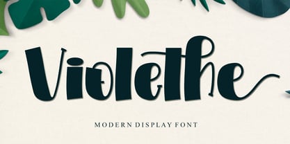 Violethe is a simple and unique-looking display font perfect for a wide variety of products. Use it on your Christmas decorations, Valentine’s Day cards, posters, wedding invitations, branding projects, social media posts, magazines, book covers, and whatever creative project you have in mind, and it will add a fun and friendly touch to your design! This font is PUA encoded, which means you can access all the glyphs and sweeps with ease!
 - Armetica by Hsan Fonts,
$18.00 Armetica is an ultra condensed sans serif typeface with a unique personality. It comes in normal and display versions, with 9 weights, as well as italics totaling 18 fonts. Armetica is a modern elegant typeface that would be perfect for branding, logos, headlines or captions. The font could also work as a stylish text overlay on any background image you like, minimalist and warm while still being versatile enough to use anywhere!
 - Gloomy Saturday by Almeera Studio,
$10.00 Introducing our new font Gloomy Saturday Font Duo. Gloomy Saturday is a luxurious paired typography, consisting of an elegant script & stylish Sans that is equipped with ligature.this is perfect for branding, logos, invitation, signature and more. Gloomy Saturday Features : Uppercase Lowercase Number Punctuation Multilingual PUA Encoded Opentype Ligatures Alternates PUA Encoded I really hope you enjoy it, and please don't hesitate to drop me a message if you have any issues or queries. Thank You
 - AT Bountys Rounded by Alandya TypeFoundry,
$18.00 AT Bountys Rounded is stylish and beautiful sans serif font with variable file. It will look perfect in photography designs, watermarks, social media posts, advertisements, logos, branding, and various other projects. The main strokes contain small breaks simulating modulated variations on the letterforms, these details are more present on large body sizes. All font versions contain Latin and Cyrillic encoding characters and also ligatures, case-sensitive forms, fractions, oldstyle and finally tabular figures.
 - Estricta by Graviton,
$24.00 Estricta font family has been designed for Graviton Font Foundry by Pablo Balcells in 2017. It is a sans serif typeface with a geometrical and mechanic appearence, its sharp, angular edges provide a strong and solid design. It has been conceived to be most suitable for short and middle length text blocks, as well as on all sized headlines. Estricta consists of 12 styles. Each containing small caps and glyph coverage for several languages.
 - Taruno Wide by Locomotype,
$18.00 Taruno Wide is an expanded display font that effortlessly evokes an aggressive yet elegant vibe with a modern twist. Choosing this font is a stellar solution for classy design projects that demand to leave a strong and professional impression. Consisting of 6 beautiful weights and an outline version plus matching italics, this minimalist sans serif will fit wherever you put it. Use this for headlines, apparel designs, posters, packaging, branding, movie titles and more!
 - Prince Of Darkness by Comicraft,
$19.00 The 52 characters assembled by this Gothic font, Prince of Darkness, were once interred in coffins onboard the Russian cargo ship Demeter, when it set sail for the sleepy shores of Whitby, Northern England ages ago. Hunted down by Vampire Hunters for century after century, this noble Transylvanian set has hidden for years in England and Eastern Europe. Now, Prince of Darkness is available as a font with more Layers than Dracula has Lairs.
 - Molard Two by Putracetol,
$20.00 Molard - Modern Various Font. This sans-serif typeface offers a diverse range of styles, featuring two distinct weights and versions – clean and textured. With a selection of three texture levels, Molard presents a total of eight fonts in its collection. Its contemporary and robust aesthetic adds an assertive touch to your projects. Perfectly suited for logo creation, branding, labels, quotes, printing, magazines, posters, film titles, and more, Molard empowers your creativity to flourish.
 - AT Bountys by Alandya TypeFoundry,
$18.00 AT Bountys is stylish and beautiful sans serif font with variable file. It will look perfect in photography designs, watermarks, social media posts, advertisements, logos, branding, and various other projects. The main strokes contain small breaks simulating modulated variations on the letterforms, these details are more present on large body sizes. All font versions contain Latin and Cyrillic encoding characters and also ligatures, case-sensitive forms, fractions, oldstyle and finally tabular figures.
 - Osande by XdCreative,
$20.00 Osande is a modern sans serif font with neo-Grotesque touch, more homogenous forms with minimal stroke contrast. Osande the font family contains 3 basic forms: italics, obliques, and upright. Each of which has 7 different weights ( Thin, Extra Light, Light, Regular, Medium, Semibold, and Bold ). Osande can easily be matched to an incredibly large set of projects, so add it to your creative ideas and notice how it makes them stand out! Thank you.
 - Tuerca by Graviton,
$24.00 Tuerca font family has been designed for Graviton Font Foundry by Pablo Balcells in 2021. It is a slightly extended sans serif typeface with a strong technical appearence. Its squared, angular shapes provide a futuristic and robust aesthetics. It has been conceived to be most suitable for logos, headlines and display design pieces as well as short length text blocks. Tuerca consists of 8 styles, each containing small caps and glyph coverage for several languages.
 - Almond Buttery by Nurrontype,
$17.00 Introducing "Almond Buttery" - A Playful and Retro Bold Font with Curvy Elegance and Stylistic Flair Get ready to infuse your designs with a touch of whimsy and nostalgia with "Almond Buttery," a dynamic and bold font that pays homage to the retro aesthetic while adding a modern twist. With its curvaceous letterforms and an array of stylistic alternates, "Almond Buttery" is a versatile typeface that's ready to add character and charm to your projects.
 - Slipstream by ITC,
$40.99Slipstream font was developed by Letraset Type Studio in response to the growing need to convey competence and speed through typography. It is based on an italic sans serif letterform and its horizontal lines look like streaks left behind letters speeding to the right. Characters can be slightly overlapped for small spaces without losing this feeling of movement. Slipstream font is ideal for service-oriented advertisements, especially where efficiency and quick service should be emphasized.


