10,000 search results
(0.032 seconds)
- Yusyad by Eyad Al-Samman,
$20.00 The typeface Yusyad is designed mainly for a very sentimental and emotional reason. Metaphorically, it is a modest artistic gift offered virtually from the designer to one of his beloved and cherished persons in this life, namely, his loyal and devoting wife. She represents one of the most essential motives for many artistic and non-artistic works that the designer achieved during his life. This was done through her tranquil personality, infinite patience, sincere support, and endless encouragement. The designer's partner (i.e., the significant other) lives with him along with their three children looking both always for a life full of peace, achievements, philanthropy, and of course love. The typeface's name Yusyad is a portmanteau word consists of two morphemes. It is a simple name-meshing for two different names. Those names represent the name of the designer's wife (Yusra) and the name of the designer (Eyad). Yusyad is like an epithet that ties the two partners' honest and eternal relationship until the last day of their lives. Technically, Yusyad is a sans-serif condensed and display typeface. It comprises seven fonts with dual styles and multiple weights. Specifically, it has two main styles, namely, the normal and the inline design. The normal style comes in five weights (i.e., thin, light, regular, bold, and black) whereas the inline style has two weights (i.e., regular and bold). The typeface is designed with more than 700 glyphs or characters. Its character set supports nearly most of the Central, Eastern, and Western European languages using Latin scripts including the Irish and the Vietnamese languages. The typeface is appropriate for any type of typographic and graphic designs in the web, print, and other media. It is also absolutely preferable to be used in the wide fields related to publication, press, services, and production industries. It can create a very impressive impact when used in movies' or TV-series titles, posters, products’ surfaces, logos, signage, novels, books, and magazines covers, medical packages, as well as the product and corporate branding. It has also both of lining and old-style numerals which makes it more suitable for any printing or designing purposes. To end, Yusyad's condensed appearance—especially the inline style—makes it very memorable, eye-catching, and striking for advertising, marketing, and promotional purposes.
 - Azbuka by Monotype,
$29.99 The Azbuka™ typeface family has its roots in a fairly pedestrian source. “The idea came in part from an old sign in London that read ‘SPRINKLER STOP VALVE’,” says Dave Farey, designer of the typeface. Like all good sign spotters, Farey took a photograph of the sign and filed it away for possible use in a lettering or typeface design project. In Prague a number of years later, the street signs reminded Farey of the London signage - and his camera came out again. Comparing the two back in his studio, he realized that the signs from London and Prague were not as similar as he initially thought. However, they were enough alike to serve as the foundation for a no-frills, 21st century sans serif typeface family. “I wanted to draw a wide range of weights, italic and condensed designs all in one go,” recalls Farey, “rather than add on to the family later.” His goal was to create a family that could be used for text and display copy, with sufficient weights to provide a broad typographic palette. Indeed, the completed design, created in collaboration with fellow type designer Richard Dawson, consists of twenty typefaces in eight weights ranging from extra light to extra black. The five mid-range designs have complementary italics. Seven condensed designs round out the family. Azbuka’s lighter weights perform remarkably well in blocks of text composition. “They’re clean and legible - and perhaps a little boring,” says Farey, “but they are perfect for copy with a down-to-earth, yet contemporary flavor.” The heavier weights are equally well suited for a variety of display uses. The designs are authoritative but not overbearing and will readily make a strong statement without calling attention to themselves. The condensed weights of Azbuka are ideal for those instances where you have a lot to say - and not much room to say it. The name Azbuka? It’s Russian for “alphabet.” And what more appropriate name could there be for this utilitarian, industrial-strength type family than alphabet? The Azbuka family is available as a suite of OpenType Pro fonts. Graphic communicators can now work with this versatile design while taking advantage of OpenType’s capabilities. The Azbuka Pro fonts also offer an extended character set that supports most Central European and many Eastern European languages
 - Albireo by Cory Maylett Design,
$25.00 Albireo is a typeface for those times when you have more to say than space to say it. It also looks fantastic spread out across the page as though space doesn’t matter. Expertly crafted with a high level of attention to detail, Albireo is an immensely practical and flexible typeface that’s neutral enough to be used almost anywhere a highly condensed, sans-serif face is needed. Despite its down-to-earth functionality, this is a typeface that definitely isn’t lacking in style. It really shines when used for headlines or subheadings in magazines, brochures, posters, newspapers, flyers or on the web. With 42 weights, widths and italics, there’s enough flexibility to make every word fit perfectly. You may buy one font at a time or save money by purchasing packages consisting of the 14 fonts in each width (Extra Condensed, Condensed or Semi Condensed). Save even more by purchasing the entire collection and, in addition to the 42 separate fonts, you'll receive two variable fonts (upright and italic) that cover all the weights, widths and everything in between. So where does the name come from? Well, look upwards at night. Albireo is a binary star in the constellation Cygnus. Through a backyard telescope, Albireo (the star) resolves into two brilliant component stars — one orange and one blue. The beginnings of the typeface were the result of me needing a newspaper feature headline about space exploration. I couldn’t find the right typeface, so I drew my own letters and eventually expanded it out into an entire mega-family. Given its origins, naming it after my favorite star seemed totally appropriate. Check it out. I think you’ll love it. Albireo deserves its place as a shining star in everyone’s font collection. It’s that good — really.
 - ITC Aram by ITC,
$29.99Jana Nikolic was finishing her degree program at the Faculty of Applied Arts, in Belgrade, with a final project that would combine her two majors: type and book design. Three stories from William Saroyan's My Name Is Aram would provide the text for the book, to be set in a typeface that Nikolic would design. Nikolic knew something special was happening the moment she put pen to paper. The letters just emerged," she recalls. "I started to explore a few new pens and found one I loved. I was able to make its tip bend with pressure." Like the family Saroyan writes about, the design flowing from Nikolic's pen would be simple but a little quirky. "When there were a whole bunch of little black letters around me," continues Nikolic, "I saw that this was going to be a very interesting typeface family." Nikolic drew Latin and Cyrillic letters, lowercase and capital letters, wide letters and narrow letters. She was surprised at how quickly and easily the design came. "There were no badly written letters," she says. "I hardly had to rework them and they fit together remarkably well." ITC Aram's standard character complement consists of one set of lowercase letters and two sets of capitals: one narrow and the other wide. The wide caps can be used with the standard lowercase, or mixed with the narrow caps for a variation on "cap and small cap" copy. The ITC Aram create the opportunity to mix and combine the letters into playful typographic expressions. Words and sentences that twinkle; text that seems light and alive - one runs the risk of creating work that is both delightful and charming when setting copy in ITC Aram." - Zapfino Extra Paneuropean by Linotype,
$103.99ZapfinoExtra is an OpenType format typeface available in two versions. The Contextual version contains a treasure-trove of extra contextual features. When created in 2004, this was the most advanced OpenType font released to date. By purchasing the Contextual version, users of OpenType-supporting applications, such as Adobe InDesign, may access all of the features available in the entire Zapfino family through just two fonts, Zapfino Extra LT Pro (Contextual), and Zapfino Forte LT Pro! Unfortunately, most non-Adobe applications currently do not support the contextual features made possible by recent OpenType developments. Users of Quark XPress and Microsoft Office should instead purchase all of the non-contextual fonts of Zapfino Extra Pro family, in order to access all of the Zapfino family's 1676 glyphs. The Zapfino family's character set supports 48 western and central European languages. More Zapfino History: Today's digital font technology allowed the world-renowned typeface designer/calligrapher Hermann Zapf to finally realize a vision he first had more than fifty years ago: creating a typeface that could capture the freedom and liveliness of beautiful handwriting. The basic Zapfino™ font family, released in 1998, consists of four alphabets with many additional stylistic alternates that can be freely mixed together to emulate the variations in handwritten text. In 2003, Herman Zapf completely reworked the Zapfino design, creating Zapfino™ Extra. This large expansion of the Zapfino family was designed in close collaboration with Akira Kobayashi. Zapfino™ Extra includes a cornucopia of new characters. It features exuberant hyper-flourishes, elegant small caps, dozens of ornaments, more alternates and ligatures, index characters, and a very useful bold version-named Zapfino™ Forte. Use Zapfino to produce unusual and graceful advertisements, packaging, and invitations. Zapfino Extra is so joyously abundant that it's tempting to over-indulge, so be sure to check out the tips for working well with the possibilities!" - Drop Cap One by Outside the Line,
$19.00 Drop Cap One is a drop cap or an initial cap font. Even though it has all the letters of the alphabet it is not an alphabet font to be used for headlines or body copy. It has no kerning or punctuation except a period. It does not have accent marks. There are basically 2 alphabets in this font. The lighter letters are lower case and the darker letters are upper case. The light and dark letters are interchangeable. While a fun desktop font the real inspiration for this font was my need for a webfont for initial caps for blogging. It could also make a great scrapbooking font too. Lots of uses for this quirky little font.
 - Woolworth by The Northern Block,
$32.95 Woolworth is a modern sans serif font inspired by the grotesque designs of the late 19th century. Each letter has been developed with careful attention towards balance and purity of form, creating a clean, functional and optically correct typeface. These handcrafted details make a warm personality throughout the design without any single character being too overwhelming. It's a contemporary grot typeface fully equipped to tackle a wide variety of text setting scenarios. Woolworth is now available as version 2.0 (2022). Details include six weights and italics, over 600 characters with alternative lowercase a, e, g, and basic punctuation. Open type features include seven variations of numerals, small caps, ligatures, and language support covering Western, South and Central Europe.
 - Puggu by Aah Yes,
$9.95Puggu is ideal for headlines or posters where slightly unusual or unrefined type is required, though paragraphs of text are quite readable. The font includes 57 ligatures of fairly common letter combinations (such as at, ee, ss, tt, Ar, RD,) with alternative letter-shapes used, to give some random variations and avoid having too many repeat letters looking identical. (The full list is included with the zip-file.) And there's a wide range of accented characters giving compatability with many European languages. The zip contains OTF and TTF versions - only install one version of a font on the same machine, either the OTF or TTF, but not both as that could cause various conflicts and erratic behaviour. - Machin by Hanoded,
$15.00 Machin is a French word meaning 'thing'. Apparently, it is also a species of macaque from the Philippines, but I named this font after the French word! Machin is based on a really old font I made back in the day. It was called Whynot and (because I didn't know a thing about making fonts at the time) I could not get it to work properly, so it had its 15 minutes of fame before it was pulled off of the internet. Machin was made using the recycled glyphs from Whynot and it does work. It comes with extensive language support (yes, Vietnamese and Sami too), some handy ligatures and a lot of scribbly panache.
 - Birly by Orenari,
$18.00 A few nights ago, I was dreaming about making a cute font that the children in the city would love. I only remember some characters of the font but I thought that it was a sign to make a new font. So, here it is, Birly. A new font and I think its cute yet playful for your fun projects. Birly was made with all my heart, I love it, and I hope you like it too. Birly has 2 styles, the regular and solid. You can choose, these all in the package! Please take a look and enjoy the preview pictures of Birly. I made it seriously, so you can see how is Birly looks on some projects.
 - Spellcaster by Comicraft,
$19.00 Raven hair and ruby lips, it may have been a trick of the light but I'm sure sparks flew from her fingertips. I definitely heard echoed voices in the night, of a restless spirit on an endless flight. If I remember correctly she held me spellbound in the night, with dancing shadows and firelight. Yes, I think I did see a crystal ball on the table, showing the future, the past and I did drink the potion she offered me, when I really should have gotten out of there fast. And that's my story and I'm sticking to it, your honor. It was that girl with the white hair, I'm telling you. She has my wallet too.
 - Festabe by PizzaDude.dk,
$20.00 It's time for a party! A party with monkeys, or a party AS monkeys! :) The danish term "Festabe" is a partyanimal, and definitely in a positive way! And that's the spirit of this font! It has that happy attitude, that could boost your designs in a happy and positive way. Besides legibility, the font is superlegible, even at very small sizes. But try looking at the letters at a LARGE size, and you will notice the smoothness of each letter! To ensure the letters don't get too alike, I've added several (slightly) different versions of each letter. In fact, every letter has 5 different versions, and these automatically cycles as you type!
 - Conserta by Konstantine Studio,
$15.00 Inspired by the vintage label and packaging design, we do a very fun research about the typeworks in the old era. We drown too deep in every single reference that we found. Super mesmerized with how each letters flow so uniquely in every brand's packaging display. We sum up every idea, build the characters one by one, carefully crafting in every single click, till the day that we've been waiting for finally come. Proudly present, CONSERTA. A beautiful vintage display serif typeface. Packed up with a bunch of features like Stylistic Alternates, Ligatures, and Oldstyle Numbering, To expand the flow and characteristic in every single letters. Perfectly fit for any of your vintage touch of branding and visual content.
 - Rainier by Kimmy Design,
$10.00 I was inspired to create the Rainier type family during my summer back home in the Pacific Northwest. The concept behind it may be simple - a hand crafted font family - but what it delivers is quite complex! Here is a breakdown of everything you get: FONT FAMILIES: Two sub-families with unique styles - Rainier North and Rainier West WEIGHTS: 4 weights per family, broken down numerically - 100 (light), 300 (regular), 500 (bold), 700 (black) OPENTYPE: In each family, there are tons of OpenType options, offering lots of customizable opportunities (in order to access all these goodies, you must be using Illustrator, Photoshop, Indesign or Publisher). Because Rainier is 100% handmade, contextual alternatives allow each letter has three subtle variations, this way it keeps that authentic hand-drawn look. Additionally, a full alphabet with special descending swashes, as well as start and end swashes for capitals and small caps. Titling alternatives offer a full character set just to help with readability! Meant for captions or smaller text, these letterforms are easy on the eye and a great complement to the regular alphabet. Stylistic Alternatives add a little fun, providing a unified cap height, no matter what case you are using (all caps, small caps or lowercase.) Discretionary Ligatures are created only for capitals, and takes specific letter pairs and creates a unique ligature between them To get a better understanding of everything, please check out the quicker user guide (http://bit.ly/1W0Bfma) and print if you so desire (http://bit.ly/23W9ZV6) that helps you navigate your way around and get the most out of Rainier! Unfortunately those links aren't working right now and soon I will have them fixed. So sorry! ORNAMENTS: In addition to the font, you get a set of awesomely rustic ornaments designed and drawn to go specifically with Rainier! - Rustic Northwest Illustrations - Banners & Flags - Frames - Flourishes - Lines & Line Breaks - Arrows There are a lot of extras packed in this set, so make sure you check out the Ornaments User Guide to get the most out of it! Check it out here: http://bit.ly/1rRVJRx And that’s all folks! Hope you enjoy Rainier!
 - Bachelorette by Mans Greback,
$69.00 Bachelorette is a charming handwriting script font with a delicate and feminine touch. Its smooth curves and gentle strokes give it a natural and authentic look, as if it were written with a brush or pen. Perfect for adding a personal touch to your designs, Bachelorette is versatile and can be used for anything from greeting cards and invitations to social media posts and logos. This cute and beautiful font is designed with a focus on elegance and simplicity, making it ideal for projects that require a touch of sophistication and grace. Let Bachelorette bring a romantic and whimsical feel to your work with its soft, flowing letters and elegant swashes. Bachelorette is available in four styles: Regular, Italic, Bold, and Bold Italic, allowing you to easily switch between different weights and styles to create dynamic and eye-catching designs. Use underscore _ anywhere in a word to make swashes. Example: Bach_elor Use multiple underscores to make different swashes. Example: Love__letter The font is built with advanced OpenType functionality and has a guaranteed top-notch quality, containing stylistic and contextual alternates, ligatures and more features; all to give you full control and customizability. It has extensive lingual support, covering all Latin-based languages, from Northern Europe to South Africa, from America to South-East Asia. It contains all characters and symbols you'll ever need, including all punctuation and numbers.
 - Factually Handwriting by Mans Greback,
$69.00 Factually Handwriting is a stunning signature-style font that conveys a sense of expressive hand-lettering with a genuine touch. Its effortless strokes and wild curves make it perfect for adding a personal touch to your projects. Designed with a focus on authenticity, Factually Handwriting captures the beauty of natural handwriting, and consists of eight styles, including Regular, Italic, Bold, Alternate, Alternate Italic. Each style of Factually Handwriting offers a unique aesthetic, giving you the freedom to experiment with different looks and create truly personalized designs. This font is perfect for everything from logos and branding to social media posts and invitations. With its natural charm and expressive strokes, Factually Handwriting adds a touch of warmth and personality to any project. Use undercore _ anywhere in a to make a swash. Example: Hand_Signature Use multiple underscores to make different swashes. Example: Candy___Bars Use * to make flowers! Beautiful*Spring Blue***Roses The font is built with advanced OpenType functionality and has a guaranteed top-notch quality, containing stylistic and contextual alternates, ligatures and more features; all to give you full control and customizability. It has extensive lingual support, covering all Latin-based languages, from Northern Europe to South Africa, from America to South-East Asia. It contains all characters and symbols you'll ever need, including all punctuation and numbers.
 - Othello by Monotype,
$29.99 Othello's dense graphic demeanor delivers a straightforward, no-nonsense message. This versatile revival has a direct, experiential quality that suggests action and the outdoors. Originally released by Monotype in 1928, Othello was offered as competition to Rudolf Koch's Neuland typeface. This new digital version includes a wide variety of previously unavailable characters. Small caps, alternate letters, ligatures, and special joined logotype" characters add to the versatility of this powerful communications tool. These many letter variants create new possibilities for headlines and short text blocks in advertisements, signage, and packaging, suggesting the immediacy of woodcuts or hand-drawn lettering."
 - Bohemian by URW Type Foundry,
$39.99 Mixed designs of Futura and Bodoni (Fudonis) are quite popular. Apart from being contemporary, such fonts provide excellent readability. However, most of the existing 'mixtures' were not good enough in terms of balance for P. Kraft. He was finally inspired by a noticeable 'mixture' in a Japanese fashion magazine. His intention was not to combine two existing fonts but to design a completely new typeface: Bohemian - named after the well-known Japanese fashion style in Shibuya/Tokyo - the Bohemian Style.Bohemian and Parametra can be mixed perfectly since their proportions and dimensions are the same.Bohemian was designed for the URW++ FontForum.
 - Ryo Display PlusN by Adobe,
$79.00Ryo is a Japanese kana typeface design composed of hiragana, katakana and some punctuation marks. Available in five weights--medium, semibold, bold, extra bold and heavy, Ryo Display has been specifically designed for use when setting copy in larger sizes, such as in headlines or posters. Supplied in the cross-platform OpenType format, this special kana font can be used to supplement or replace the existing kana designs in existing Japanese fonts that contain full character sets. Creative professionals using the Japanese version of Adobe InDesign may use that program's Composite Font tool to easily combine Ryo Display with other typefaces. - Artographie by Mans Greback,
$49.00 Artographie is a Art Deco sans-serif family. The lettering was designed by Måns Grebäck during 2019 and 2020. It gives any project a moderist appearance, as a reinvention of the hundred-year-old style of design, adapted and adjusted to fit in present-time purposes and technology. The typeface is a family containing five styles: Thin, Light, Medium, Bold and Black. The weights are top quality and created to balance perfectly against each other. It has a very extensive lingual support, covering all European Latin scripts. The font contains all characters you'll ever need, including all punctuation and numbers.
 - HiTone by Scholtz Fonts,
$19.00 HiTone emulates a natural hand-lettered typeface that provides exceptional legibility with a quirky style. It comes in three widths, the narrowest of which enables text to be placed compactly within a limited space. The widest, on the other hand, increases readability while maintaining the same stroke weight. In addition, each width comes in two weights, regular and black, enabling the user to provide emphasis or headline display without changing the essential style of writing. The font is most useful as a stylish text font. The font has all the features of a fully professional typeface. Language support includes all European character sets.
 - Kaleidos Rough by Melvastype,
$32.00 Kaleidos Rough lining is a brush script. It has two versions; Kaleidos Rough and Kaleidos Textured. The rough version has rough edges to mimic authentic brush strokes. The textured version also has those rough edges and in addition it has a brush stroke texture to mimic dry ink. Both versions are sketched and drawn with a pointed brush pen. Kaleidos Rough has plenty of alternates, ligatures and swashes so you can build interesting-looking words and headlines. Although Kaleidos Rough is condensed and quite tightly spaced it is clear and legible. Also check out Kaleidos Smooth, a clean and smooth version of Kaleidos.
 - Slenderz by CozyFonts,
$25.00 Slenderz is a handwritten font designed by Tom Nikosey, an American Graphic Designer specializing in Typographic Design and Illustration. Slenderz is available in Light, Medium & Bold weights. CozyFonts Foundry is Tom's intro into the world of font design. Slenderz is a casual, handwritten font that gives a reserved yet firm and legible personality to any headline or copy. Each of the 3 weights has it’s own personality yet like 3 brothers they represent the and belong to the same family. Intermixing Light & Bold or Medium & Bold won’t ruin the flow but will enhance it. Slenderz is the 9th font family from CozyFonts Foundry.
 - Mollen by Eko Bimantara,
$19.00 Mollen is sans serif font family that designed to be functional. Each glyphs are shaped by geometrical form with specific visual structure: Simple and clean form with low contrast stroke, rounded 'o' in the normal width, mix diagonal and straight cuts on terminals and finials. Low capitals, with flat top and low descenders. With this personality, Mollen meant be fit for modern, contemporary and technological nuance. Mollen consist of 48 font with 8 weight: From Thin to ExtraBold and 3 width: Condensed, Narrow and Normal. With each matching Italics. It also contain 425 glyphs and several opentype features.
 - Graphemic by Picatype,
$18.00 Inspired by the medieval print design, the look of the sans serif typeface is strong and beautiful. It brings charming curves and satisfying patterns to traditional thick fonts. I like to use this font for printed material and titles - the height attracts attention and creates a visually attractive modern medieval feel. Graphemic fonts include two fonts - Regular and Light. Graphemic offers broad language support, upper and lower case letters, extended numbers and punctuation. Specifically suitable for: Posters, Blockbusters, films, trailers, headlines, titles, logos, branding, scripts, display & bold 'goods'. Thank you for viewing! (and more thanks for the purchase)
 - Kathak by Ekahermawan,
$14.00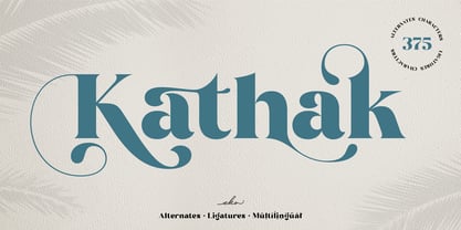 Please welcome Kathak. Kathak is a display serif font. Kathak is specially designed to make your typography design result looks more beautiful with tons of alternates and ligatures characters. Kathak is versatile font for many different projects such as logo, branding, poster, magazines, labels, merchandise, invitation, presentation, advertising, quotes and so much more! FEATURES: OpenType support Playfull to use (with ligatures and alternates options) Multilingual support PUA Encoded If you need support or more information about this item, please kindly contact me : ekahermawanputu@gmail.com Thank you so much.. I really hope you enjoy when using it!
 - Frequent by PizzaDude.dk,
$19.00 This font was originally meant to be my last creation of 2022, but as it turned out, it was the first font of 2023 instead! Why? Well, because it took me a lot of time to complete the 150 different swahes letter combinations, the 182 different letters (not counting numbers, accented characters etc) the small caps, the subscript and the multilingual support! Anyway, it was worth the work - the Frequent font works great as a display font, or whatever you have in mind. Play around with the different versions (Regular, Solid and Inside) for great results.
 - Flanders Script by Letterhend,
$15.00 Flanders is a bold and modern script that will fulfil your design needs for sporty themes, logotype, quotes, watermarks and more. This has many OpenType features like ligatures, stylistic alternates, contextual alternates, swashes, as well as multi-language support. Flanders Shadow is a complementary font that allows you to create extrude/shadow effect in a snap without needing any graphic software tool! We hope you enjoy the font, please feel free to comment if you have any thoughts or feedback. Or simply send me a PM or email me at letterhend@gmail.com or visit letterhend.com for freebies. Thanks for purchasing and have fun!
 - Tabarnak by Canada Type,
$24.95 Tabarnak started out as an assessment and correction of an old concept by George Wilkens. The original idea was for a bold upright alphabet reminiscent of Oz Cooper’s work, but ornamented with some shocard/signage traits. That idea was radically redrawn and reinvented to become a simple 21st century font made to turn heads and induce a friendly rush. Tabarnouche is Tabarnak’s “jittery” incarnation. Just as great for packaging as they are for ads, posters, book and magazine covers, both Tabarnak and Tabarnouche come with about 600 characters, including tons of alternates, and support for the majority of Latin-based languages.
 - High Fidelity by District 62 Studio,
$59.00 High Fidelity is our funky new variable font that was inspired by an incredible vintage poster we saw at the NYPL (sadly, the designer wasn't credited.) First we developed the ultra wide top-heavy style. Then, unable to resist the dynamics of variable type, we added the narrow width and violà our first variable font was born. We then added "drip" and "stretch" axes so you can play around and customize it to your heart's content. We think it works for anything from album covers, posters, social media, apparel - really anywhere you need a fun, expressive look.
 - Nolde by Brownfox,
$21.99 Nolde is a new titling typeface named after the German-Danish painter and printmaker Emil Nolde, one of the first artists to work in the Expressionist style. Not unlike the work of Nolde the artist, the seemingly rhythmical characters of Nolde the typeface conceal expressive tension of form and nervous line quality. While its letterforms hearken to the early-20th c. foundry types, this font makes a fresh and decidedly current impression, making it suitable for cutting-edge display use. Nolde capitals are available in two weights: regular and outline, and support over 60 languages that employ Latin and Cyrillic scripts.
 - Art Maria by Letterara,
$14.00 Art Maria is a playful and strikingly beautiful handwritten font with a bold twist in the style of Modern Calligraphy. Art Maria is fully-featured with tons of alternate characters and OpenType features. It will add a sophisticated charm to any design project! Art Maria handletter is particularly well suited to invitations, branding, editorial design, elegant logos, upscale packaging, wedding stationery, posters, quotes, short text, branding, web, graphic design, and any other projects requiring a handwritten and luxurious touch. The OpenType features can be very easily accessed by using OpenType-savvy programs such as Adobe Illustrator and Adobe InDesign.
 - Le Jardin by Anmark,
$13.00 Le Jardin comes in two styles: Floral and Regular. This font includes ligatures and a full set of lowercase alternates to make your text as close to a natural handwritten script as possible. Le Jardin Floral is an elegant, decorative, feminine font. Floral uppercase letters are ideal for your wedding monograms and logos. Use this font for wedding invitations, branding, packaging, magazines, florist shops, social media, restaurant menus, greeting cards, headers and many more. Le Jardin Regular is a modern calligraphy font. It's perfect for wedding design projects, instagram, invitations, signatures, watermarks, logos, letterpress address, titles, birthday invitations, handwriting and more.
 - Youngblood Antique by insigne,
$21.99 Youngblood Antique is a distressed non-connected formal script with tall, sweeping ascenders. Three variants are available, including an inked regular font, a font drawn with a dry brush and a distressed, grungy version. Sixty-four OpenType ligatures add a realistic, natural effect and ensure that no two letters in a word repeat. Youngblood Antique also includes OpenType ending swashes, and old style figures and 30 alternate characters that allow designers to customize the ascender and descender swashes. Be sure to check out the non-distressed original Youngblood. Youngblood Antique works great in conjunction with insigne Splats!.
 - Tide Sans by Kyle Wayne Benson,
$6.00 Tide Sans’ fresh, carefree, look makes you almost forget that you’re staring at a monitor and not on the beach. When Tide Sans is not surfing, you’ll find it at community college parties, giving free henna tattoos, or tossing a Frisbee to the dachshund next door. The Tide Sans family includes beautiful italics and an equally affable condensed set. Tide Sans does the work for you by providing a ridiculously large stylistic alternates set, fine tuned small caps, and a whole beach of alternate (amper)sands to feel between your toes. Also check out its kid brother, Tide Sans Condensed.
 - Neiva Flowers by Niznaztype,
$15.00 Thanks for checking my font’s work, Neiva Flowers typeface. It’s postmodern script font. Neiva Flowers have a feminism styles and ethnic curves. Very perfect for adding unique and slegant character to your branding project. Also, Neiva Flowers font is suitable for wedding lettering, beautiful touch in your all graphic design. This font have two styles, regular and italic. It contains a full set of lowercase, uppercase, punctuation, numeral and multilingual support. Neiva Flowers typeface also can support your design to be more better. You can use it in lettering, wall painting, cover, advertising, invitation, card, feminism design, script lettering design and more.
 - Arboretum by Joe Hewitt Design,
$12.00 Inspired by a number of Green and forward thinking ventures, Arboretum is designed to be an Eco-friendly typeface. Perfect for use with recycled products, environmental advertising and anything nature themed. However, its clean and modern appearance works beautifully for a large range of projects. The typeface contains lower and uppercases, the latter having two complete sets of alternatives, each with differing levels of flourish! You will also find a selection of leafy glyphs to help personalise and decorate your Arboretum lettering. The glyph set includes all languages covered in Basic Latin, Latin-1 Supplement and Latin Extended-A scripts.
 - Risque Pro by Stiggy & Sands,
$29.00 Our Risque Pro draws inspiration from the title screen of the 1962 Looney Toons cartoon, "Martian through Georgia". Originally an all Capitals reference, Risque includes Capitals, lowercase, and SmallCaps sets as festive and irregular in its bounce as the cartoon reference. This frolicking fun typeface has retro roots, but also an all around offbeat personality that opens it up to a wide gamut of uses. Opentype features include: - SmallCaps. - Full set of Inferiors and Superiors for limitless fractions. - Tabular, Proportional, and Oldstyle figure sets (along with SmallCaps versions of the figures). - Stylistic Alternates for Caps to SmallCaps conversion.
 - Aparo by DSType,
$40.00 Typography or Calligraphy. Unconnected or Connected. For us, at DSType Foundry, that was the main question. With Aparo, we tried to bring the best of the two worlds into a single, yet complex, typeface. Aparo appears to be a very simple bold italic roman typeface, but it has plenty of calligraphic flair, including swashes that make your words stand out, collision detectors so that you don't get weird combinations, alternate characters activated by default for improved calligraphic effect and a very extended character set in a total of 897 glyphs. Download our detailed type specimen for complete information on Aparo.
 - Ant Serif by LNP Fonts,
$9.99 Ant Serif is a font that can be used for advertising, logo creation, webfonts and more. The font comes in two styles, Regular and Italic and has all the characters in the Latin Basic, Additional and Extended scripts. The font's design came from my love of Marvel's Ant-Man and the Wasp logo. The typeface used, which was custom, was of interest for me, so I decided to create it as a font. It's not a perfect font, but I have put work to make sure it looked as decent as possible. Hope you'll enjoy it!