10,000 search results
(0.037 seconds)
- Dry Brush Serif by Kaer,
$28.00 I'm happy to present you my new classic style font. It's a vintage serif font with my brush touches. I used dry strokes with rough edges decoration elements. Perfect if you want to add slight retro style to your project. I designed it for fashion labels, classic headlines, glamour posters, luxury identity, wedding invitations. You will get: * Uppercase glyphs * Numbers and symbols * Multilingual support * Free future updates Please feel free to request to add characters you need: kaer.pro@gmail.com Thank you!
 - Arkusi by Gatype,
$10.00 Arkusi is a neatly crafted and highly detailed script font. Whatever the topic, this font will be a wonderful asset to your font library, as it has the potential to enhance any creation. Arkusi is coded with PUA Unicode, which allows full access to all additional characters without having to design any special software. Mac users can use Font Book, and Windows users can use Character Map to view and copy any additional characters for pasting into your favorite text editor / application.
 - HMS Gilbert by Fenotype,
$35.00 HMS Gilbert is a hand drawn collection of fonts designed to play perfectly together. HMS Gilbert contains seven different fonts, five of which also have texturised versions of them. In addition to fonts there is also Catchwords and Ornaments -sets of nice extras that help you to complete your designs with a coherent look. Most of the fonts are equipped with OpenType features such as Swash, Stylistic Alternates and Automatic Ligatures to help you to achieve more custom and “hand made” look.
 - Super Vibes by HansCo,
$15.00 Super Vibes font is a retro groovy display font. Use this display font to add that special retro touch to any design idea you can think of!. Masterfully designed to become a true favorite, this font has the potential to bring each of your creative ideas to the highest level! Very suitable for logotype, Stickers, Packaging design, Cricut Project, headlines, brand identity, t shirt or apparel industry, posters, magazines, books, YouTube, Instagram, websites, or any of your creative design projects. Enjoy!
 - Dassie by Prioritype,
$35.00 Introducing. Dassie - Expanded Display Fonts Cool display fonts are ready to create new ideas for your design projects. It is good to be applied to various types of designs for young people today and goes back to the past. Now you can team up with this font to create t-shirt designs, book covers, posters, logos, landing pages, promotional designs, social media posts etc. See some of the previews above for reference. Features: • All Caps • Numeral • Punctuation • Multilingual • PUA Encoded Thanks.
 - Lyzero by RagamKata,
$16.00 Lyzero is a font with a groovy retro theme that brings a classic feel and a style that is making a comeback. With its unique, '70s-inspired design, Lyzero combines funky and vintage elements to create an eye-catching typography look. With sparkling characters and a vibrant style, this font is perfect for projects that want to bring a touch of nostalgia and retro fun to their designs. Lyzero is the perfect choice to bring a vibrant era feel to your visual communications.
 - Fashion Signature by Letterara,
$14.00 Fashion Signature is an enchanting handwritten font. This versatile Monoline font has a wide spectrum of applications ranging from greeting cards, fashion, weddings, posters, beauty cosmetics, and logos to headlines and is guaranteed to add a romantic or casual feel to your next project. Add it confidently to your projects, and you will love the results. This font is PUA encoded which means you can access all the beautiful glyphs and swashes with ease! Add to your collection for future Design and projects!
 - Soul Wave by HansCo,
$15.00 Soul Wave font is a wavy retro groovy display font. Use this display font to add that special retro wavy touch to any design idea you can think of.. Masterfully designed to become a true favorite, this font has the potential to bring each of your creative ideas to the highest level! Very suitable for logotype, Stickers, Packaging design, Cricut Project, headlines, brand identity, t shirt or apparel industry, posters, magazines, books, YouTube, Instagram, websites, or any of your creative design projects. Enjoy!
 - BORCHA by Top Type,
$9.00 Hello there.. I introduce to you a new work by the name of BORCHA. This font has an attractive style as well as elegant. In addition, this font is also equipped with several ligature features, stylistic alternate and stylistic set so that it can be the best work in each of your work. This font can be used to create letters, advertisements, logos, banners, web, and everything else. Thank you, glad to be able to contribute to your best work.
 - Semer by Illushvara,
$14.00 Hello, Introducing Semer is a display typeface started from classic back in 80's or 90's but make it going to elegants. The line very clean but smooth upright. All in standart character very easy to use and add this font to your most creative ideas for Fashion, Poster, Handmade Product, Beauty Skincare, Logotype and more you want to used! Support the Multilingual Language! If you have any question, don’t hesitate to contact me. Happy Designing !!! Thank You, Illushvara Design
 - Schadenfreude by Comicraft,
$19.00 We don't mean to gloat, but we have to say that it gives us immense, malicious pleasure and joy to supplant other popular germanesque letterforms with this, remarkably superior font. This successful addition to our DEAD cool POOL of ACHTUNG BABY alphabets will, no doubt, make you feel that your own library of teutonic fonts is now severely lacking. We're that mercenary, we're Mercs with Mouths, you might say. Wait, did we say that we DON'T mean to gloat? Actually, we do.
 - Carino Sans by Kaligra.co,
$29.00 Carino is a stunning classy modern bold all-caps sans serif that comes in three beautiful weights to complement every project you're working on. Use to create beautiful headings, gorgeous invitations, stunning logos, and so much more!! Perfect for displays, headers, invitations, save the dates, weddings, and so much more, Carino will become a playful staple in your font library! HOW TO ACCESS ALTERNATE CHARACTERS Open glyphs panel: In Adobe Photoshop go to Window - glyphs In Adobe Illustrator go to Type - glyphs
 - Mitogen Display by Areatype,
$20.00 Mitogen Display is a very versatile font. Also available Mitogen Signature to help you mix and match it to fit your creative work in harmony. perfect for magazine images, to wedding invitations, to branding, poster design, and more. Files included: Mitogen Display Regular Mitogen Italic Mitogen Signature Numerals & Punctuation Stylistic Alternates & Ligatures PUA Encoded Characters Thanks so much for looking, I really hope you enjoy it and please don't hesitate to drop me a message if you have any issues or queries :)
 - Poem Harmony by Fromletterel,
$12.00 Introducing to a usable handwritten font family : Poem Harmony. Just like the name Poem Harmony, this fonts will beautify your design with its lovely look, you can also harmonize the font and create phenomenal works. This is a very easy usable family font, it is perfect to your signature, business card, branding, also will be very gorgeous to your quote for social media post and obviously will be very great to be applied to mug, tote bag or any kind of crafts.
 - Jokerwild AOE by Astigmatic,
$19.95JokerWild is a thematic typestyle reminiscent of Christmas Stories, sixties Cocktail Parties, and playing jacks when you were younger. A retro inspired typeface of nostalgic memories, the good old days. A fun and funky typestyle full of life, sure to add spark to your designs. Add a little festive mayhem to your designs, and remember, the Joker is WILD! Suitable for anything from the Jester, to the Grinch, Holidays to MardiGras mayhem, JokerWild can introduce play back into your designs today! - Afons Infant by Andy Peat,
$9.00 About this font family Afons Infant has been designed for children’s storybooks; using round, single-decker letter forms to create simple, clear and readable stories that children are familiar. Features 5 weights (from thin to bold) Multi language Lowercase Numerals to blend with text Ligatures To be able to access alternative fonts, make sure the software you use can support opentype features such as Microsoft Word, Paint, Adobe, Corel draw and other applications. Designed and published by Andy Peat. Released April 2022
 - Iwan Stencil by Linotype,
$40.99 Iwan Stencil is a new revival of an old display typeface. Based on type originally designed by Jan Tschichold in 1929, the style was revived by Klaus Sutter in 2008. The letterforms in this peculiar design are very high contrast; all of the thin bits are much thinner than the thick parts. They have a modern, upright axis. All in all, the creation has a bit of a Bodoni-gone-crazy touch. The thin elements are the unique part of the design that binds this face together. They almost naturally fade away in the stencil gaps (or pylons), making you wonder if you are really looking at a stencil face at all. These thins contribute greatly to the typeface's overall serif-style, making the design at least a semi serif typeface, if not a full serif one. The lowercase n, for instance, has no serifs of its own, but many of the other letters have clear ones, or serif-like terminals. A serif stencil face is a peculiar variety, especially in this day and age, but in the past they were much more common, if not the norm, The Iwan Stencil typeface has only one weight. Naturally, this is just for display. Use Iwan Stencil to cut real stencils, or only to create the effect of stenciled type in your design work. Ivan Stencil includes all of the characters that you have come to expect in a font. Just because this design was originally made in 1929 does not mean that is has a 1929 character set. Instead, it includes a 21st century, with extended European language support Jan Tschichold, who we have to thank for today's Iwan Stencil inspiration, was a man of many faces. A trained calligrapher who went on to codify the New Typography, would go on to become a teacher, a classical book designer, and the creator of the Sabon typeface. Like all young designers, he was occasionally in need of money. Before his emigration from Germany in 1933, he took on many kinds of commissions. In the late 1920s, a time full of waves of economic turmoil within Germany and across the world, he began designing a typefaces for different European companies, mostly display things like this. For a time during the mid-1920s, Jan Tschichold went by the name Iwan" "
 - Joystix by Typodermic,
$11.95 Step back in time and relive the glory days of arcade gaming with Joystix, the authentic retro game design typeface that brings the spirit of the 1980s straight to your fingertips. Inspired by the iconic pixelated fonts of the era, Joystix captures the timeless charm of classic video games with stunning accuracy. Created with a meticulous attention to detail, Joystix is the perfect choice for any designer looking to infuse their work with a touch of vintage flair. Whether you’re working on a retro-inspired project or simply want to add a touch of nostalgia to your designs, Joystix delivers a stunning visual impact that’s sure to delight. Available in two distinct styles, Joystix Monospaced and Joystix Proportional, this versatile typeface gives you the flexibility to choose the aesthetic that best suits your needs. If you’re after an accurate retro game feel, opt for Joystix Monospaced. Alternatively, if you prefer elegant, proportionately spaced headlines that take up less space, Joystix Proportional is the perfect fit. So why wait? Give your designs a touch of retro charm and explore the limitless possibilities of Joystix today! Most Latin-based European, Vietnamese, Greek, and most Cyrillic-based writing systems are supported, including the following languages. Afaan Oromo, Afar, Afrikaans, Albanian, Alsatian, Aromanian, Aymara, Azerbaijani, Bashkir, Bashkir (Latin), Basque, Belarusian, Belarusian (Latin), Bemba, Bikol, Bosnian, Breton, Bulgarian, Buryat, Cape Verdean, Creole, Catalan, Cebuano, Chamorro, Chavacano, Chichewa, Crimean Tatar (Latin), Croatian, Czech, Danish, Dawan, Dholuo, Dungan, Dutch, English, Estonian, Faroese, Fijian, Filipino, Finnish, French, Frisian, Friulian, Gagauz (Latin), Galician, Ganda, Genoese, German, Gikuyu, Greenlandic, Guadeloupean Creole, Haitian Creole, Hawaiian, Hiligaynon, Hungarian, Icelandic, Igbo, Ilocano, Indonesian, Irish, Italian, Jamaican, Kaingang, Khalkha, Kalmyk, Kanuri, Kaqchikel, Karakalpak (Latin), Kashubian, Kazakh, Kikongo, Kinyarwanda, Kirundi, Komi-Permyak, Kurdish, Kurdish (Latin), Kyrgyz, Latvian, Lithuanian, Lombard, Low Saxon, Luxembourgish, Maasai, Macedonian, Makhuwa, Malay, Maltese, Māori, Moldovan, Montenegrin, Nahuatl, Ndebele, Neapolitan, Norwegian, Novial, Occitan, Ossetian, Ossetian (Latin), Papiamento, Piedmontese, Polish, Portuguese, Quechua, Rarotongan, Romanian, Romansh, Russian, Rusyn, Sami, Sango, Saramaccan, Sardinian, Scottish Gaelic, Serbian, Serbian (Latin), Shona, Sicilian, Silesian, Slovak, Slovenian, Somali, Sorbian, Sotho, Spanish, Swahili, Swazi, Swedish, Tagalog, Tahitian, Tajik, Tatar, Tetum, Tongan, Tshiluba, Tsonga, Tswana, Tumbuka, Turkish, Turkmen (Latin), Tuvaluan, Ukrainian, Uzbek, Uzbek (Latin), Venda, Venetian, Vepsian, Vietnamese, Võro, Walloon, Waray-Waray, Wayuu, Welsh, Wolof, Xavante, Xhosa, Yapese, Zapotec, Zarma, Zazaki, Zulu and Zuni.
 - Kernig Braille by Echopraxium,
$5.00 This font is the younger sister of HexBraille with which it may be combined to create new patterns. This also explains why their introductory text are similar. Introduction The purpose of this monospace font is to display braille in an original and "steganographic" way. The Kernig prefix means "Robust" in German, this is because of the crank shapes . The core of the glyph design is a flat hexagon which can be read as 3 rows of 2 dots (i.e. regular braille glyph grid). Even if within a glyph, braille dots ("square dots" indeed) are placed on the vertices of a flat hexagon, the difference with HexBraille is that edges connecting vertices are not straight lines but "crank shapes" instead. This can be summarized by saying that the whole glyph is a Hexcrank (a flat hexagon where vertice pairs are connected by a crank shape) NB: The initial design is illustrated by glyphs 'ç' (no dot) and 'û' (6 dots) as shown by poster 6. A. "Kernig Lattice" In KernigBraille, glyphs are connected to each other, thus for each Hexcrank glyph there are 6 connections: 2 on left/right and 4 on top/bottom. In the final design some cranks were removed for esthetical reason (i.e. leave empty space for allowing patterns diversity). In summary, a text using this font won't display a honeycomb but a lattice instead. NB: Please notice that in order to obtain the lattice without vertical gaps, you must set the interline to 0. The lattice is made from 3 kind of shapes: a.1. Hexcrank a.2. Square a.3. Irregular cross (mostly unclosed) The design favored squares over crosses. The whole slightly resembling a PCB. B. Text Frames It's possible to frame the text with 4 sets of frame glyphs (as illustrated by poster 2) b.1. Kernig { € ° £ µ § ¥ ~ ¢ } b.2. Rectangular-High { è é ê ï î à â ä } b.3. Rectangular-Low { Â ù Ä Ê Ë Ô õ ö } b.4. Mixed Kernig+High: a mix of Kernig and Rectangular-High frame glyphs When using frame glyphs, it is advised to show Pilcrow (¶) and Non Breaking Space, which are replaced by empty shapes in this font (e.g. in Microsoft Word, use CTRL+8 or use [¶] button in the ribbon).
 - Greatest Richmond by Azetype,
$19.00 Presenting Greatest Richmond! An Authentic Brush Font with 3 alternates and 36 swashes. This font made with the perfect combining of each character. You can type by Mix & Match with alternate version to get a unique combining. It looks original and can be used for all your project needs. Each glyph has its own uniqueness and when meeting with others will provide dynamic and pleasing proximity. This font can be used at any time and any project. You can see in the presentation picture above, Greatest Richmond looks stylish and wildly on design projects. So, Greatest Richmond can't wait to give its touch to all your design projects such as quotes, poster design, personal branding, promotional materials, website, logotype, product packaging, etc. Besides that, Greatest Richmond also has some ligature that gives a surprise when you type certain characters combining. The ligatures are ee, ff, ii, nn, oo, rr, ss, st, St, tt, lt, rt, and th. WHAT'S INCLUDED? 1. Greatest Richmond Basic • The first version comes with uppercase, lowercase, ligatures, numeral, punctuation, symbols, and Standard Latin Multilingual Support (Afrikaans, Albanian, Catalan, Danish, Dutch, English, French, German, Icelandic, Indonesian, Italian, Malay, Norwegian, Portuguese, Spanisch, Swedish, Zulu, and More). 2. Greatest Richmond Alternate One • The first version comes with uppercase, lowercase, ligatures, numeral, punctuation, symbols, and Standard Latin Multilingual Support (Afrikaans, Albanian, Catalan, Danish, Dutch, English, French, German, Icelandic, Indonesian, Italian, Malay, Norwegian, Portuguese, Spanisch, Swedish, Zulu, and More). 3. Greatest Richmond Alternate Two • The first version comes with uppercase, lowercase, ligatures, numeral, punctuation, symbols, and Standard Latin Multilingual Support (Afrikaans, Albanian, Catalan, Danish, Dutch, English, French, German, Icelandic, Indonesian, Italian, Malay, Norwegian, Portuguese, Spanisch, Swedish, Zulu, and More). 3. Greatest Richmond Alternate Three • The first version comes with uppercase, lowercase, numeral, punctuation, symbols, and Standard Latin Multilingual Support (Afrikaans, Albanian, Catalan, Danish, Dutch, English, French, German, Icelandic, Indonesian, Italian, Malay, Norwegian, Portuguese, Spanisch, Swedish, Zulu, and More). 3. Greatest Richmond Swash • The first version comes with 36 Swashes. You can feature all with typing A-Z, a-z, and 0-9 Thank You Azetype Studio xx
 - TT Autonomous by TypeType,
$39.00 TT Autonomous useful links: Specimen PDF | History of creation | Graphic presentation | Customization options Please note! If you need OTF versions of the fonts, just email us at commercial@typetype.org About TT Autonomous: The idea was born in Amsterdam when one of our colleagues took the official electric taxi at the Schiphol airport. At the moment we were thinking about creating a new wide sans-serif, and an interesting question emerged during the trip: what font would be associated with autonomous electric transport. Then we thought it would also be nice to expand this theme visually. This is how the font family TT Autonomous came about. It is a modern brutal technological sans-serif. The basic visual characteristic of the typeface is the noticeable squareness of the characters and angular internal space. In addition, the typeface proportions tend to appear monospaced, but they are not really monospaced. The width of the characters is inspired by automobile logotype proportions, which are mostly rather wide. We could not disregard the fact that code lines in software for autonomous cars are traditionally typed using monospaced fonts and added a special monospaced subfamily to the TT Autonomous typeface. Thanks to the squareness of the characters inherited from the main family and the real monospace properties, the character forms in the subfamily turned out very specific and interesting. This is especially true for oblique monospaced fonts, which are true italics. In addition, we created a couple of outline styles which are great for use in titles and large inscriptions and perfectly match the basic family and the monospaced family. As opposed to outlines that can be created in graphic editors, in TT Autonomous Outline we worked through the narrow and questionable spots, thanks to which the font looks professionally complete and harmonious. As from the very beginning, the font was developed with tomorrow's technologies in mind, we could not miss addressing variability and creating a variable font. TT Autonomous has variable versions for both the basic and the monospaced subfamilies. TT Autonomous is a complex font family that consists of 32 fonts intended to solve a broad range of design tasks. Overall, the font family features 14 regular styles, 6 monospaced styles, 7 reversed styles, 2 outline styles and 3 variable fonts. The number of glyphs varies from 630+ in the monospaced font to 790+ in the basic styles. The basic subfamily has alternates, ligatures, old-style figures, slashed zeroes, and many other useful features. FOLLOW US: Instagram | Facebook | Website TT Autonomous language support: Acehnese, Afar, Albanian, Aleut (lat), Alsatian, Aragonese, Arumanian, Asu, Aymara, Azerbaijani, Banjar, Basque, Belarusian (cyr), Belarusian (lat), Bemba, Bena, Betawi, Bislama, Boholano, Bosnian (cyr), Bosnian (lat), Breton, Bulgarian (cyr), Catalan, Cebuano, Chamorro, Chichewa, Chiga, Colognian, Cornish, Corsican, Cree, Croatian, Czech, Danish, Dutch, Embu, English, Erzya, Esperanto, Estonian, Faroese, Fijian, Filipino, Finnish, French, Frisian, Friulian, Gaelic, Gagauz (lat), Galician, Ganda, German, Gusii, Haitian Creole, Hawaiian, Hiri Motu, Hungarian, Icelandic, Ilocano, Indonesian, Innu-aimun, Interlingua, Irish, Italian, Javanese, Jola-Fonyi, Judaeo-Spanish, Kabuverdianu, Kalenjin, Karachay-Balkar (cyr), Karachay-Balkar (lat), Karaim (lat), Karakalpak (lat), Karelian, Kashubian, Kazakh (lat), Khasi, Khvarshi, Kinyarwanda, Kirundi, Kongo, Kumyk, Kurdish (lat), Ladin, Latvian, Leonese, Lithuanian, Livvi-Karelian, Luba-Kasai, Ludic, Luganda, Luo, Luxembourgish, Luyia, Macedonian, Machame, Makhuwa-Meetto, Makonde, Malagasy, Malay, Maltese, Manx, Maori, Marshallese, Mauritian Creole, Minangkabau, Moldavian (lat), Montenegrin (cyr), Montenegrin (lat), Mordvin-moksha, Morisyen, Nahuatl, Nauruan, Ndebele, Nias, Nogai, Norwegian, Number, Nyankole, Occitan, Oromo, Palauan, Polish, Portuguese, Quechua, Rheto-Romance, Rohingya, Romanian, Romansh, Rombo, Rundi, Russian, Rusyn, Rwa, Salar, Samburu, Samoan, Sango, Sangu, Sasak, Scots, Sena, Serbian (cyr), Serbian (lat), Seychellois Creole, Shambala, Shona, Silesian, Slovak, Slovenian, Soga, Somali, Sorbian, Sotho, Spanish, Sundanese, Superscripts and Subscripts, Swahili, Swazi, Swedish, Swiss German, Tagalog, Tahitian, Taita, Talysh (lat), Tatar, Teso, Tetum, Tok Pisin, Tongan, Tsakhur (Azerbaijan), Tsonga, Tswana, Turkish, Turkmen (lat), Ukrainian, Uyghur, Valencian, Vastese, Vepsian, Volapük, Võro, Vunjo, Walloon, Welsh, Wolof, Xhosa, Zaza, Zulu.
 - Amazing Slab by Zetafonts,
$39.00 Amazing Slab is a typeface family designed by Francesco Canovaro and Andrea Tartarelli as a development of the Amazing Grotesk family designed by Cosimo Lorenzo Pancini. Mixing an egyptian serif, low contrast approach with the curved endings and open shapes of humanist sans grotesques, it was developed to embody the energetic and friendly nature of the startup scene: a feeling of innovation, information and energy, with a desire for simplicity and straightforward communication. The basic design shapes for the font come from the strong personality of the extrabold letterforms drawn by Francesco Canovaro for his StartupItalia logo, that informed the display design of the four darkest weights (from medium to black). Each of these weights, has been paired with an inline version, designed by Mario De Libero, to extend the range of uses for the typefaces, from bold signage to logo design, to editorial titling. The lighter range of the family features two weights (regular and light) that are designed for text use, complemented by the thin and extralight weights that are better suited to big point size, for editorial and signage use. All the weights of Amazing Slab, as well the matching true italics forms, feature an extended charset of over 900 glyphs, covering 211 languages using latin, cyrillic and greek alphabets, and sporting a complete set of Open type features including positional numbers, annotation and case-sensitive forms, standard ligatures and a wide array of stylistic sets to customize glyph shapes for logo and display usage. With its friendly, energetic mood and its versatile range of application use, Amazing Slab is born to make every design project look simply... amazing! Suggested uses: old signage, logo design, editorial titling, display 21 styles: 8 weights, 8 italics, 4 inline styles, 1 variable font 965 glyphs in each weight Useful OpenType features: Small Capitals; Standard Ligatures; Discretionary Ligatures; Stylistic Alternates; Stylistic sets 01, 02, 03, 04, 05, 06; Ordinals; Fractions; Tabular Figures; Old-style Figures; Slashed Zero; Circled Numbers; Case Sensitive Forms; Numerators; Denominators; Subscript; Superscript; Scientific Inferiors; 211 languages supported: extended Latin, Cyrillic, Greek English, Spanish, Portuguese, French, Russian, German, Javanese (Latin), Turkish, Italian, Polish, Afaan Oromo, Azeri, Tagalog, Sundanese (Latin), Filipino, Moldovan, Romanian, Indonesian, Dutch, Cebuano, Malay, Uzbek (Latin), Kurdish (Latin), Swahili, Greek, Hungarian, Czech, Haitian Creole, Hiligaynon, Afrikaans, Somali, Zulu, Serbian, Swedish, Bulgarian, Shona, Quechua, Albanian, Catalan, Chichewa, Ilocano, Kikongo, Kinyarwanda, Neapolitan, Xhosa, Tshiluba, Slovak, Danish, Finnish, Norwegian, Sicilian, Sotho (Southern), Kirundi, Tswana, Sotho (Northern), Belarusian (Latin), Turkmen (Latin), Bemba, Lombard, Lithuanian, Tsonga, Wolof, Jamaican, Dholuo, Galician, Ganda, Low Saxon, Waray-Waray, Makhuwa, Bikol, Kapampangan (Latin), Aymara, Zarma, Ndebele, Slovenian, Tumbuka, Venetian, Genoese, Piedmontese, Swazi, Zazaki, Latvian, Nahuatl, Silesian, Bashkir (Latin), Sardinian, Estonian, Afar, Cape Verdean Creole, Maasai, Occitan, Tetum, Oshiwambo, Basque, Welsh, Chavacano, Dawan, Montenegrin, Walloon, Asturian, Kaqchikel, Ossetian (Latin), Zapotec, Frisian, Guadeloupean Creole, Q’eqchi’, Karakalpak (Latin), Crimean Tatar (Latin), Sango, Luxembourgish, Samoan, Maltese, Tzotzil, Fijian, Friulian, Icelandic, Sranan, Wayuu, Papiamento, Aromanian, Corsican, Breton, Amis, Gagauz (Latin), Māori, Tok Pisin, Tongan, Alsatian, Atayal, Kiribati, Seychellois Creole, Võro, Tahitian, Scottish Gaelic, Chamorro, Kashubian, Faroese, Rarotongan, Sorbian (Upper Sorbian), Karelian (Latin), Romansh, Chickasaw, Arvanitic (Latin), Nagamese Creole, Saramaccan, Ladin, Palauan, Sami (Northern Sami), Sorbian (Lower Sorbian), Drehu, Wallisian, Aragonese, Tuvaluan, Zuni, Montagnais, Hawaiian, Marquesan, Niuean, Yapese, Vepsian, Bislama, Hopi, Megleno-Romanian, Creek, Aranese, Rotokas, Tokelauan, Mohawk, Warlpiri, Cimbrian, Sami (Lule Sami), Jèrriais, Arrernte, Murrinh-Patha, Kala Lagaw Ya, Cofán, Gwich’in, Seri, Sami (Southern Sami), Istro-Romanian, Wik-Mungkan, Anuta, Cornish, Sami (Inari Sami), Yindjibarndi, Noongar, Hotcąk (Latin), Meriam Mir, Manx, Shawnee, Gooniyandi, Ido, Wiradjuri, Hän, Ngiyambaa, Delaware, Potawatomi, Abenaki, Esperanto, Folkspraak, Interglossa, Interlingua, Latin, Latino sine Flexione, Lojban, Novial, Occidental, Old Icelandic, Old Norse, Slovio (Latin), Volapük
 - spanky 20 second version - Unknown license

- Courtside by Epiclinez,
$18.00 Courtside is a casual all caps handwritten font. It's easy to read and it has a playful feel to it at the same time. Get inspired by its simplistic charm and use it to brighten up any creative projects
 - Medieval Dragons by Deniart Systems,
$15.00 The beasts of mythological and medieval times. From semi-dragons like lindorms and wyverns to classical and serpent-like dragons, this package features 52 unique medieval beasts that are sure to add a little fire to all your presentations.
 - Linear Tektu by TeGeType,
$19.00 The basic idea of this type family was to keep the "ductus" of the fraktur calligraphy only. And to adapt it to draw a sans serif typography which still keep the magic rhythm and colour of the original letters.
 - Negentherophy by Fromletterel,
$12.00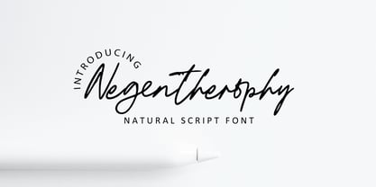 Negentherophy is a natural signature font to beautify your designs with its natural charm, suitable to create gorgeous wedding invitation, beautiful social media post, business card and other beautiful projects. It also contains ligature to add more natural charm.
 - Linear Fraktu by TeGeType,
$19.00 The basic idea of this type family was to keep the "ductus" of the fraktur calligraphy only. And to adapt it to draw a sans serif typography which still keep the magic rhythm and colour of the original letters.
 - Long Tall Palito by Pedro Teixeira,
$15.00 This font can make a great art element to emphasize, to provide impact, can stand out as a banner, or with a few words in headers and headlines and allow you to optimize space and keep neat and organized.
 - ITC Franklin by ITC,
$40.99 The ITC Franklin™ typeface design marks the next phase in the evolution of one of the most important American gothic typefaces. Morris Fuller Benton drew the original design in 1902 for American Type Founders (ATF); it was the first significant modernization of a nineteenth-century grotesque. Named in honor of Benjamin Franklin, the design not only became a best seller, it also served as a model for several other sans serif typefaces that followed it. Originally issued in just one weight, the ATF Franklin Gothic family was expanded over several years to include an italic, a condensed, a condensed shaded, an extra condensed and, finally, a wide. No light or intermediate weights were ever created for the metal type family. In 1980, under license from American Type Founders, ITC commissioned Victor Caruso to create four new weights in roman and italic - book, medium, demi and heavy - while preserving the characteristics of the original ATF design. This series was followed in 1991 by a suite of twelve condensed and compressed designs drawn by David Berlow. ITC Franklin Gothic was originally released as two designs: one for display type and one for text. However, in early digital interpretations, a combined text and display solution meant the same fonts were used to set type in any size, from tiny six-point text to billboard-size letters. The problem was that the typeface design was almost always compromised and this hampered its performance at any size. David Berlow, president of Font Bureau, approached ITC with a proposal to solve this problem that would be mutually beneficial. Font Bureau would rework the ITC Franklin Gothic family, enlarge and separate it into distinct text and display designs, then offer it as part of its library as well. ITC saw the obvious value in the collaboration, and work began in early 2004. The project was supposed to end with the release of new text and display designs the following year. But, like so many design projects, the ITC Franklin venture became more extensive, more complicated and more time consuming than originally intended. The 22-font ITC Franklin Gothic family has now grown to 48 designs and is called simply ITC Franklin. The new designs range from the very willowy Thin to the robust Ultra -- with Light, Medium, Bold and Black weights in between. Each weight is also available in Narrow, Condensed and Compressed variants, and each design has a complementary Italic. In addition to a suite of new biform characters (lowercase characters drawn with the height and weight of capitals), the new ITC Franklin Pro fonts also offer an extended character set that supports most Central European and many Eastern European languages. ITC Franklin Text is currently under development.
 - Mundo Sans by Monotype,
$50.99 Mundo Sans, by Carl Crossgrove for the Monotype Studio, is distinctive, approachable – and ready to tackle jobs both big and small. Its open counters and large x-height, which give the design a straight-forward no-nonsense mien, are softened by inviting calligraphic undertones. With 10 weights and a complementary suite of cursive italics, there is little outside the range of the Mundo Sans family. The light weights are elegant in packaging and brochure design, the medium are easy readers in digital blogs and print periodicals and the bold command attention in banners and headlines. Mundo Sans is at home in a wide range of sizes, and comfortable in everything from wayfinding to mobile apps. Mundo Sans takes on complicated branding projects with efficient grace. The family enables companies and products to express their brand seamlessly in websites, advertising, corporate messaging, packaging – virtually everywhere visible engagement is possible. A large international character set, that includes support for most Central European and many Eastern European languages, ensures ease of localization. Mundo Sans was originally released with seven weights. The family was updated with three new roman weights and their italics in 2019 that extend and diversify its range of use: a fine hairline weight, a book weight, slightly lighter than regular, and a demi that is subtly lighter than the medium. The design is also is a good mixer. It easily pairs with everything from refined Didones to stalwart slab serif designs. And if you need a more harmonious palette, look no further than Mundo Sans’ relative, Mundo Serif. The two designs harmonize with each other perfectly in weight, typographic color and proportion. Mundo Sans’ italics are true cursive designs, with fluid strokes and obvious calligraphic overtones. The flick of the down-stroke in the ‘a,’ the descending stroke of the ‘f’ and baseline curve of the ‘z’ add grace to the design and distinguish it from more mechanistic styles. Mundo Sans is a design with deep roots. It was originally drawn to pair with classic Renaissance book typefaces like Bembo® and ITC Galliard®. With a hint of diagonal stroke contrast and gentle flaring of strokes, Mundo Sans complements these designs with warmth and grace. Crossgrove says that Mundo isn’t meant to be showy or distinctive. It is intended to follow the tradition of sans serif designs that have a wide range of uses, enabling comfortable reading and clear expression. Crossgrove has designed a variety of typefaces ranging from the futuristic and organic Biome™ to the text designs of Monotype’s elegant Walbaum™ revival. His work for Monotype also often takes Crossgrove into the realm of custom fronts for branding and non-Latin scripts.
 - Evita by ITC,
$29.99Gérard Mariscalchi is a self-made designer. Born in Southern France of a Spanish mother and an Italian father, he has worked as a mechanic, salesman, pilot, college teacher – even a poet (with poetry being the worst-paying of these professions, he reports.) “Throughout all this, the backbone of my career has always been design,” Mariscalchi says. “I’ve been drawing since I was five, but it wasn’t until I was twenty-four that I learned that my hobby could also help me earn a living.” It was about this same time that Mariscalchi fell in love with type. He studied the designs of masters like Excoffon, Usherwood and Frutiger, as well as the work of calligraphers and type designers such as Plantin, Cochin and Dürer. With such an eclectic background, it’s no surprise that Mariscalchi’s typeface designs are inspired by many sources. Baylac and Evita reflect the style of the art nouveau and art deco periods, while Marnie was created as an homage to the great Lithuanian calligrapher Villu Toots. However, the touch of French elegance and distinction Mariscalchi brings to his work is all his own. Baylac Who says thirteen is an unlucky number? Three capitals and ten lowercase letters from a poster by L. Baylac, a relatively obscure Art Nouveau designer, served as the foundation for this typeface. The finished design has lush curves that give the face drama without diminishing its versatility. On the practical side, Baylac’s condensed proportions make it perfect for those situations where there’s a lot to say and not much room in which to say it Evita Mariscalchi based the design of Evita on hand lettering he found in a restaurant menu, and considers this typeface one of his most difficult design challenges. “The main problem was to render the big weight difference between the thin and the thick strokes without creating printing problems at small point sizes,” he says. Unlike most scripts, Evita is upright, with the design characteristics of a serif typeface. Mariscalchi named the face for a close friend. The end result is a charming design that is light, airy, and slightly sassy. Marnie Based on Art Nouveau calligraphic lettering, Marnie is elegant, inviting, and absolutely charming. Mariscalchi paid special attention to letter shapes and proportions to guarantee high levels of character legibility. He also kept weight transition in character strokes to modest levels, enabling the face to be used at relatively small sizes – an unusual asset for a formal script. Marnie’s capital letters are expansive designs with flowing swash strokes that wrap affectionately around adjoining lowercase letters. The design easily captures the spontaneous qualities of hand-rendered brush lettering. - Baylac by ITC,
$29.99Gérard Mariscalchi is a self-made designer. Born in Southern France of a Spanish mother and an Italian father, he has worked as a mechanic, salesman, pilot, college teacher – even a poet (with poetry being the worst-paying of these professions, he reports.) “Throughout all this, the backbone of my career has always been design,” Mariscalchi says. “I’ve been drawing since I was five, but it wasn’t until I was twenty-four that I learned that my hobby could also help me earn a living.” It was about this same time that Mariscalchi fell in love with type. He studied the designs of masters like Excoffon, Usherwood and Frutiger, as well as the work of calligraphers and type designers such as Plantin, Cochin and Dürer. With such an eclectic background, it’s no surprise that Mariscalchi’s typeface designs are inspired by many sources. Baylac and Evita reflect the style of the art nouveau and art deco periods, while Marnie was created as an homage to the great Lithuanian calligrapher Villu Toots. However, the touch of French elegance and distinction Mariscalchi brings to his work is all his own. Baylac Who says thirteen is an unlucky number? Three capitals and ten lowercase letters from a poster by L. Baylac, a relatively obscure Art Nouveau designer, served as the foundation for this typeface. The finished design has lush curves that give the face drama without diminishing its versatility. On the practical side, Baylac’s condensed proportions make it perfect for those situations where there’s a lot to say and not much room in which to say it Evita Mariscalchi based the design of Evita on hand lettering he found in a restaurant menu, and considers this typeface one of his most difficult design challenges. “The main problem was to render the big weight difference between the thin and the thick strokes without creating printing problems at small point sizes,” he says. Unlike most scripts, Evita is upright, with the design characteristics of a serif typeface. Mariscalchi named the face for a close friend. The end result is a charming design that is light, airy, and slightly sassy. Marnie Based on Art Nouveau calligraphic lettering, Marnie is elegant, inviting, and absolutely charming. Mariscalchi paid special attention to letter shapes and proportions to guarantee high levels of character legibility. He also kept weight transition in character strokes to modest levels, enabling the face to be used at relatively small sizes – an unusual asset for a formal script. Marnie’s capital letters are expansive designs with flowing swash strokes that wrap affectionately around adjoining lowercase letters. The design easily captures the spontaneous qualities of hand-rendered brush lettering. - Kis Antiqua Now TH Pro by Elsner+Flake,
$99.00 In the course of the re-vitalization of its Typoart typeface inventory, Elsner+Flake decided in 2006 to offer the “Kis Antiqua” by Hildegard Korger, in a re-worked form and with an extended sortiment, as an OpenType Pro-version. After consultation with Hildegard Korger, Elsner+Flake tasked the Leipzig type designer Erhard Kaiser with the execution of the re-design and expansion of the sortiment. Detlef Schäfer writes in “Fotosatzschriften Type-Design+Schrifthersteller”, VEB Fachbuchverlag Leipzig, 1989: No other printing type has ever generated as far-reaching a controversy as this typeface which Jan Tschichold called the most beautiful of all the old Antiqua types. For a long time, it was thought to have been designed by Anton Janson. In 1720 a large number of the original types were displayed in the catalog of the „Ehrhardische Gycery“ (Ehrhardt Typefoundry) in Leipzig. Recently, thanks to the research performed by Beatrice Warde and especially György Haimann, it has been proven unambiguously that the originator of this typeface was Miklós (Nicholas) Tótfalusi Kis (pronounced Kisch) who was born in 1650 in the Hungarian town of Tótfal. His calvinistic church had sent him to the Netherlands to oversee the printing of a Hungarian language bible. He studied printing and punch cutting and earned special recognition for his Armenian and Hebrew types. Upon his return to Hungary, an emergency situation forced him to sell several of his matrice sets to the Ehrhardt Typefoundry in Leipzig. In Hungary he printed from his own typefaces, but religious tensions arose between him and one of his church elders. He died at an early age in 1702. The significant characteristics of the “Dutch Antiqua” by Kis are the larger body size, relatively small lower case letters and strong upper case letters, which show clearly defined contrasts in the stroke widths. The “Kis Antiqua” is less elegant than the Garamond, rather somewhat austere in a calvinistic way, but its expression is unique and full of tension. The upper and lower case serifs are only slightly concave, and the upper case O as well as the lower case o have, for the first time, a vertical axis. In the replica, sensitively and respectfully (responsibly) drawn by Hildegard Korger, these characteristics of this pleasantly readable and beautiful face have been well met. For Typoart it was clear that this typeface has to appear under its only true name “Kis Antiqua.” It will be used primarily in book design. Elsner+Flake added these two headline weights, which are available besides a separate font family Kis Antiqua Now TB Pro. Designer: Miklós (Nicholas) Tótfalusi Kis, 1686 Hildegard Korger, 1986-1988 Erhard Kaiser, 2008
 - Marnie by ITC,
$29.99Gérard Mariscalchi is a self-made designer. Born in Southern France of a Spanish mother and an Italian father, he has worked as a mechanic, salesman, pilot, college teacher – even a poet (with poetry being the worst-paying of these professions, he reports.) “Throughout all this, the backbone of my career has always been design,” Mariscalchi says. “I’ve been drawing since I was five, but it wasn’t until I was twenty-four that I learned that my hobby could also help me earn a living.” It was about this same time that Mariscalchi fell in love with type. He studied the designs of masters like Excoffon, Usherwood and Frutiger, as well as the work of calligraphers and type designers such as Plantin, Cochin and Dürer. With such an eclectic background, it’s no surprise that Mariscalchi’s typeface designs are inspired by many sources. Baylac and Evita reflect the style of the art nouveau and art deco periods, while Marnie was created as an homage to the great Lithuanian calligrapher Villu Toots. However, the touch of French elegance and distinction Mariscalchi brings to his work is all his own. Baylac Who says thirteen is an unlucky number? Three capitals and ten lowercase letters from a poster by L. Baylac, a relatively obscure Art Nouveau designer, served as the foundation for this typeface. The finished design has lush curves that give the face drama without diminishing its versatility. On the practical side, Baylac’s condensed proportions make it perfect for those situations where there’s a lot to say and not much room in which to say it Evita Mariscalchi based the design of Evita on hand lettering he found in a restaurant menu, and considers this typeface one of his most difficult design challenges. “The main problem was to render the big weight difference between the thin and the thick strokes without creating printing problems at small point sizes,” he says. Unlike most scripts, Evita is upright, with the design characteristics of a serif typeface. Mariscalchi named the face for a close friend. The end result is a charming design that is light, airy, and slightly sassy. Marnie Based on Art Nouveau calligraphic lettering, Marnie is elegant, inviting, and absolutely charming. Mariscalchi paid special attention to letter shapes and proportions to guarantee high levels of character legibility. He also kept weight transition in character strokes to modest levels, enabling the face to be used at relatively small sizes – an unusual asset for a formal script. Marnie’s capital letters are expansive designs with flowing swash strokes that wrap affectionately around adjoining lowercase letters. The design easily captures the spontaneous qualities of hand-rendered brush lettering. - Goldstone by Fran Studio,
$20.00 Goldstone is a hand-brushed modern calligraphy script, created with both pen and brush. It includes a dancing baseline with separate swashes that can be applied to the beginning and ends of all lowercase. Goldstone includes several ligatures, alternates, and international support for most western languages. Perfect for branding, logos, greeting cards, wedding stationery and so much more. To activate OpenType Stylistic alternative, you need a program that supports OpenType features such as Adobe Illustrator CS, Adobe Indesign and CorelDraw X6-X7, Microsoft Word 2010 or later. How to access all of the alternate characters, using the Windows Character Map to Photoshop: https://www.youtube.com/watch?v=Go9vacoYmBw How to access all of the alternate character using Adobe Illustrator: http://youtu.be/iptSFA7feQ0nn How to use stylistic sets font in Microsoft Word 2010 or later versions: https://youtu.be/x1A_ilsBsGs Goldstone is PUA encoded with Unicode, which allows full access to all the extra characters without having to design special software. Mac users can use Font Book, and Windows users can use the Character Map to view and copy one additional character to paste into your text editor or favorite applications.
 - Strong table by Fran Studio,
$15.00 Strong table is a hand-brushed modern calligraphy script font, created with both pen & brush. It includes a dancing baseline with separate swashes that can be applied to the beginning and ends of all lowercase. Strong table includes several ligatures, alternates and international support for most western languages. Perfect for Branding, Logos, Greeting Cards, Wedding Stationery and so much more! To activate OpenType Stylistic alternative, you need a program that supports OpenType features such as Adobe Illustrator CS, Adobe Indesign and CorelDraw X6-X7, Microsoft Word 2010 or later. How to access all of the alternate characters, using the Windows Character Map to Photoshop: https://www.youtube.com/watch?v=Go9vacoYmBw How to access all of the alternate character using Adobe Illustrator: http://youtu.be/iptSFA7feQ0nn How to use stylistic sets font in Microsoft Word 2010 or later versions: https://youtu.be/x1A_ilsBsGs Strong table is PUA encoded with Unicode, which allows full access to all the extra characters without having to design special software. Mac users can use Font Book, and Windows users can use the Character Map to view and copy one additional character to paste into your text editor / favorite applications.
 - Bentonite Script by Fran Studio,
$15.00 Bentonite Script is a hand-brushed modern calligraphy script font, created with both pen & brush. It includes a dancing baseline with separate swashes that can be applied to the beginning and ends of all lowercase. Bentonite Script includes several ligatures, alternates and international support for most western languages. Perfect for Branding, Logos, Greeting Cards, Wedding Stationery and so much more! To activate OpenType Stylistic alternative, you need a program that supports OpenType features such as Adobe Illustrator CS, Adobe Indesign and CorelDraw X6-X7, Microsoft Word 2010 or later. How to access all of the alternate characters, using the Windows Character Map to Photoshop: https://www.youtube.com/watch?v=Go9vacoYmBw How to access all of the alternate character using Adobe Illustrator: http://youtu.be/iptSFA7feQ0nn How to use stylistic sets font in Microsoft Word 2010 or later versions: https://youtu.be/x1A_ilsBsGs Bentonite Script PUA encoded with Unicode, which allows full access to all the extra characters without having to design special software. Mac users can use Font Book, and Windows users can use the Character Map to view and copy one additional character to paste into your text editor / favorite applications.
 - Yohey by Fran Studio,
$16.00 Yohey is a hand-brushed modern calligraphy script, created with both pen and brush. It includes a dancing baseline with separate swashes that can be applied to the beginning and ends of all lowercase. Yohey includes several ligatures, alternates, and international support for most western languages. Perfect for branding, logos, greeting cards, wedding stationery and so much more. To activate OpenType Stylistic alternative, you need a program that supports OpenType features such as Adobe Illustrator CS, Adobe Indesign and CorelDraw X6-X7, Microsoft Word 2010 or later. How to access all of the alternate characters, using the Windows Character Map to Photoshop: https://www.youtube.com/watch?v=Go9vacoYmBw How to access all of the alternate character using Adobe Illustrator: http://youtu.be/iptSFA7feQ0nn How to use stylistic sets font in Microsoft Word 2010 or later versions: https://youtu.be/x1A_ilsBsGs Yohey is PUA encoded with Unicode, which allows full access to all the extra characters without having to design special software. Mac users can use Font Book, and Windows users can use the Character Map to view and copy one additional character to paste into your text editor or favorite applications.
 - Malicute Script by Fran Studio,
$20.00 Malicute is a hand-brushed modern calligraphy script font, created with both pen & brush. It has a dancing baseline with separate swashes that can be applied to the beginning and ends of all lowercase characters. Malicute includes several ligatures, alternates and international support for most western languages. Perfect for Branding, Logos, Greeting Cards, Wedding Stationery and so much more! To activate OpenType Stylistic alternative, you need a program that supports OpenType features such as Adobe Illustrator CS, Adobe Indesign and CorelDraw X6-X7, Microsoft Word 2010 or later. How to access all of the alternate characters, using the Windows Character Map to Photoshop: https://www.youtube.com/watch?v=Go9vacoYmBw How to access all of the alternate character using Adobe Illustrator: http://youtu.be/iptSFA7feQ0nn How to use stylistic sets font in Microsoft Word 2010 or later versions: https://youtu.be/x1A_ilsBsGs Malicute is PUA encoded with Unicode, which allows full access to all the extra characters without having to design special software. Mac users can use Font Book, and Windows users can use the Character Map to view and copy one additional character to paste into your text editor / favorite applications.
