10,000 search results
(0.043 seconds)
- Nuuk by Hanoded,
$15.00 Nuuk is the capital of Greenland. It is the Kalaallisut word for "cape". I really like the sound of it, so I just had to name this font Nuuk. Nuuk is a whimsical, handmade serif font. It comes in four weights, each weight with its own Italic style.
 - Maisha by MrLetters,
$19.00 Introducing Maisha Script is a handwriting font that is modern and cool daat used in greeting cards, wedding invitations, business cards and also suitable for the purpose in the world of photography and more. Maisha Script comes with 339 glyphs alternate characters that can be accessed easily using programs such as Adobe Illustrator, Adobe InDesign, Adobe Photoshop Corel Draw version X, and Microsoft Word. Fonts have supported unicode PUA. so that all the alternative characters can be easily accessed in full by designers and other users. If you don't have a program that supports OpenType features such as Adobe Illustrator and CorelDraw X Versions, you can access all the alternate glyphs using Font Book (Mac) or Character Map (Windows). If you have some questions about Maisha Script please send an inquiry email to hello.mrletters@gmail.com, Thank you for a layover.
 - Avineo by Valentino Vergan,
$16.00 Avineo is a unique modern display typeface, which comes with a set of creative lowercase characters. The Avineo typeface has an ultra-fat look, which makes it perfect for logo and poster design. The Avineo typeface also comes in three styles, Regular, Outline and Extended, each style has an oblique version. The Avineo typeface comes with multilingual support for languages such as: Danish, English, Finnish, French, German, German (Switzerland), Norwegian Bokmål, Norwegian Nynorsk, Portuguese, Spanish, Swedish, Swiss German. The Avineo typeface has a unique design, which will make your next project standout. The Avineo typeface can cover a wide range of projects such as: brand packaging, brochures, magazines, logos, posters, flyers, book covers, quotes, branding, billboards, social media, pictograms and much more. If you are looking for something unique, bold and creative for you next project, the Avineo typeface is the font for you. WHAT YOU GET: Avineo Regular.otf Avineo Oblique.otf Avineo Outline.otf Avineo Outline oblique.otf Avineo Extended.otf Avineo Extended oblique.otf AVINEO INCLUDES A FULL SET OF: Uppercase and lowercase letters. Numbers. Punctuation. Ligatures. Alternates. Multilingual Symbols. We hope you enjoy using the Avineo typeface.
 - Symposium Pro by Canada Type,
$49.95 Philip Bouwsma's Symposium Pro is a wide Carolingian script that can be set simply or with a wide range of flourishes. It takes its inspiration from the scriptoria of the twelfth century, particularly in Spain, where Christians, Muslims and Jews lived harmoniously in a brilliant culture for two centuries. As manuscripts were translated and copied to meet the Western demand for classical texts, calligraphic elements from Arabic and Hebrew spread throughout Europe, sparking a proliferation of new styles that brought the simple book hand to a higher level. Symposium Pro spans a broad range of time and space, from the court of Charlemagne to the Arabian nights and Renaissance Florence. Symposium Pro comes in four weights, ranging from Light to Bold, with each font containing over 1200 glyphs. Variations on every letter form, from swashes to subtle alterations, are plenty, with some even having up to 40 alternates. Also plenty are the embedded ornaments and flourishes, over a hundred of them. Keep that glyph palette handy for many pleasant surprises and easy setting solutions.
 - Taglio by Wilton Foundry,
$29.00 Taglio’s name is derived from intaglio, which means “incised carving” or “an impression from an engraving”. Indeed, Taglio looks like an incised engraving with a contemporary calligraphic interpretation. The down strokes start with a single horizontal line that curves into a dual vertical line and ends with the same single line at the base. The dual elongated strokes create a bold overall impression but is literally twice as sophisticated than if the two lines were solid. That was exactly the goal in creating this font. We managed to create a font that is distinctive, elegant, and crisp that is also intentionally stencilled for more flexibility. For instance, it is ideal for laser cutting signage. One of the unique features in using the capital glyphs is that they stack perfectly without losing legibility, primarily because of the slanted ends of the dual vertical lines - see the example “Miami Fashion Week” display ad. Taglio’s unusual style was carefully crafted to come to life at display sizes. It is therefore ideal for use in branding fashion, restaurants, buildings, packaging, museums, signage, etc. An ideal pairing font is our WERK family which can be seen on some of the display ads below. Taglio has a sparkling and sophisticated personality that will absolutely delight!
 - Billy Serif by SparkyType,
$19.00The serifed companion to the popular Billy family comes in 3 very different but complimentary weights that when combined create a very strong, playful and persuasive style. - Red Dog Saloon by FontMesa,
$25.00Red Dog Saloon is an old classic western looking type font and one that never goes out of style. A fill font is included with this font, you will need an application that works in layers in order to use the fill fonts that come with FontMesa fonts. - Fatty Fatty Boombalatty PW by Patty Whack Fonts,
$24.00Fatty Fatty Boombalatty PW is suitable for display use for titles, as well as short paragraphs of text. This font contains some alternates and ligatures for your creative pleasure. Fatty Fatty Boombalatty PW is available in OpenType and TrueType format which are both included in the same package. - Castile by Eyad Al-Samman,
$3.00 Castile is a central region of Spain that formed the core of the Kingdom of Castile, under which Spain was united in the 15th and 16th centuries. "Castile" is a Kufic modern Arabic typeface. It is suitable for books' covers, advertisement light boards, and titles in magazines and newspapers. It is very distinctive when used in black and white printout. It decorates colored pages and makes artworks more attractive. This font comes in three different weights. I adore Spain and the historical achievements of the Islamic civilization existed there in the past. By designing "Castile" Typeface, I wanted to refer to the Islamic civilization that Muslims had in Spain and especially in Andalusia. Today the name of Castile survives in two autonomous regions of Spain: Castile-La Mancha (capital city is Toledo) and Castile-Leon (capital city is Valladolid). The main characteristic of "Castile" Typeface is in its modern open-end style for some of its Arabic characters such as "Sad", "Dad", "Seen", "Sheen", "Qaf", "Faa", "Yaa" and others. The shape of the characters' "dot", "dots", and "point" is innovative; a triangle with a semi-circle shape. "Castile" Typeface is suitable for books' covers, advertisement light boards, and titles in magazines and newspapers. Its charactersí modern Kufic styles give the typeface more distinction when it is used also in posters, greeting cards, covers, exhibitionsí signboards and external or internal walls of malls or metroís exits and entrances. It can also be used in titles for Arabic news and advertisements appeared in different Arabic and foreign satellite channels.
 - Aphrodite Slim by Typesenses,
$57.00 Aphrodite Slim Pro is not just a lighter version of its sister Aphrodite Pro. Aphrodite Slim Pro has duplicated the quantity of characters of its partner, and that means more than 500 new glyphs, reaching a total of more than 1000. More delicate and meticulous, Aphrodite Slim Pro is once more a new typography with deep calligraphic ideals: We immersed ourselves into the world of each calligraphy ductus and each calligraphy masters by studying from decoration to lettering books. This was the key for the logic of Aphrodite Slim’s behavior. The new concept of Aphrodite Slim Pro was to join diverse styles of calligraphy in one in order to achieve an autonomous expressiveness, in fact, this is what calligraphy aims to, and we agreed to bring those ideals to the world of typography: It is justifiable to be inspired in hundred-year-old calligraphies, but it is even better if the results you obtain have a plus. A personal plus. During the creation process we were wondering whether it was possible to mix certain strokes of such rigid styles as uncial, (Li·n’s favourite style), with strokes of the copperplate, (Sav’s favourite style), and also to take and mix cualities of cancelleresca cursiva, formata and moderna; finally giving our creation a roman-transition italic look. So Aphrodite Slim takes ideals and aspects from those formal styles, following its own logic though, and emphasizing the fact of being a decorative typography. Calligraphy masters of our past are who we are in debt with. They are the cause we have lovely letters now. They have been spontaneous at the moment of creation, what differs from the type-designers of nowadays, whose spontaneity is more limited. Digital faces that we are used to see these days are a result of long hours of optical adjustments, grids, macros and inspirations of other existing typography, but without personal contributions. Aphrodite Slim wants to refute this. Its mission is to rescue de spontaneity of the artesanal lettering in order to obtain unique words; those which only calligraphy masters of our past or lettering artists of our present could give us. We have worked hard to achieve this, making Aphrodite the most universal font we could: It was necessary to study the most common words, focalizing more in the ones referring to “sensitivity”, of four of the most spoken languages in the world. Aphrodite Slim has an enormous quantity of decorative characters and special ligatures for phrases and words in English, French, Spanish and German. (See English, Français, Español, Deutsch PDF in the gallery section). We promise there is no existing type that decorates/ligates glyphs and words like Aphrodite Slim does: It is the first time a font like this really considers its purpose. -The way glyphs are ligated is insane- : Aphrodite Slim rescues some ideals of persons like Jan van den Velde (Italian cancilleresca writing of XVI Century) who understands ascenders and descenders as possibilities to beautify the lines of writing with curved strokes that seem to be dancing above and below of the words. This master also creates ascenders and descenders even where they are not necessary, on letters that do not actually need them: Aphrodite Slim takes this ideal. The font counts with a wide range of glyphs that seem not to be satisfied with its more primitive form and prefer to extreme their parts to be decorative. It also existed masters of calligraphy like José de Casanova of XVII Century, who, with a magnificant skill and a really personal mark, had the particularity of ligating words that were actually separated with spaces. This is another innovative feature in Aphrodite Slim. An investigation of the most common beginnings and endings words of the English language was done. Having that feature activated (discretionary ligatures), common words will start to ligate or to be decorated even when they are separated by spaces. Impossible to forget Francesco Periccioli of XVII Century and our experience us designers to face with works of him: His letters, that today are included in the group of cancellerescas modernas, have been a direct inspiration to the oldstyle figures and historical forms variables in Aphrodite Slim. Giovanni Antonio Tagliente (XVI Century) and his particular way of making tails and diagonals longer than usual, qualities that our creation reflects too. Finally, our adventures in Biblioteca Nacional and Barrio San Telmo, Buenos Aires, were essential for us to make Aphrodite Slim more complete and interesting: Sav did an excellent work when studying how the decorative miscellanea and swirls of early XX century were. She also investigated what particularities made those roman titling characters look antique so she could rescue some ideals for the oldstyle figures and historical forms variables. This also leaded her to create the ornaments variable in Aphrodite Slim. We are really proud of presenting Aphrodite Slim Pro, a typography that was the result of days and nights of working hard, because we do love what we do; and we are glad we are living in a present that gives us the possibility to spread this kind of art, because that is the way we consider our job: Aphrodite Slim Pro is Art. Hope you can appreciate the enormous work this type has. Features. Aphrodite Slim Pro is the most complete variable. It includes more than 1000 glyphs. Thanks to the Open-Type programming, it counts with a easy way to change/alternate glyphs if the application in which the font is used supports this. The variables contained in Aphrodite Slim Pro are also offered separately. Aphrodite Slim Text: It is the variable for lines and paragraphs. Thus it is the least ornamental and the most accurate to achieve a satisfying legibility. It has the Standard Ligatures feature in order to improve the possible conflicts some glyphs could have by others. Aphrodite Slim Contextual: It is the one that makes emphasis in decorating. It has the particularity of ligating/decorating words of common use in English, French, Spanish and German. It also has the quality of ligating common beginnings and endings of the common words in English. Aphrodite Slim Stylistic: With similar features of Slim Contextual. It includes a set of decorative numbers for a display use. Aphrodite Slim Swash: This one has special beginnings and endings to decorate words. Aphrodite Slim Endings: It makes words look as a signature. Aphrodite Slim Historical: It adds an antique look to the written word. It also has the special historical ligature function. Aphrodite Slim Titling: This one is the most decorative. Its copperplate inspired ornaments give words a special color, in order to handle the quantity of decoration, it comes with the standard ligature feature, which has the most common ligatures plus others that make decorative swirls not to be conflictive. Aphrodite Slim Ornaments: A set of 52 ornaments. Aphrodite Slim Pro includes all this features plus the Stylistic Set 1; Stylistic Set 2 and the possibility of Slashed Zero. We recommend you to check out the gallery in order to see all these features in action.
 - Nouveau Rose by Jeff Levine,
$29.00 In the July 24, 1915 issue of “Dry Goods Reporter” is a demonstration of hand lettering rendered with the use of a “speed pen”. Two suggested examples cited in the accompanying article were the Payzant pen and the then-new Speedball pen. An ornate Art Nouveau serif alphabet is displayed, with some examples having delicate floral elements entwining the letters. The initial alphabet was auto-traced, then cleaned-up and modified to recreate the core design of the basic (unadorned) letters. The numerals, punctuation and all additional characters were then made from scratch. Nouveau Rose JNL is the finished result, and is available in both regular and oblique versions.
 - FF Assuri by FontFont,
$30.99 German type designer Fabian Rottke created this display FontFont in 1994. The font is ideally suited for poster and billboards. FF Assuri provides advanced typographical support with features such as ligatures. It comes with proportional lining figures.
 - FF Littles by FontFont,
$30.99 German type designer Simone May created this display FontFont in 1995. The font is ideally suited for poster and billboards. FF Littles provides advanced typographical support with features such as ligatures. It comes with proportional lining figures.
 - Battle Scarred by Comicraft,
$19.00 We know what you're thinking... This is not a new font, just an old one with a few bullet holes in its helmet, dirt on its shins and some carbon scoring on its breastplate. You're thinking this is like a variant cover by Joe Madureira or J. Scott Campbell -- handsome and rugged on the outside but weak and effete on the inside. Well, my fine, font-finagling friend, you'd be Dead Wrong! This really is an All-New, All-Different, All Star, Ultimate Collectable, from the Comicraft House of Ideas! Our Dynamic Duo -- Johnny Comicraft and Ferran 'Nuff Said have brought you another winner from the Silver Age of comic book lettering. It’s a little worse for wear, we admit it, but wouldn't you be after three rounds with the Justice League of Avengers Assembled?!? See the families related to Battle Scarred: Battle Cry & Battle Damaged .
 - Deco Triline JNL by Jeff Levine,
$29.00 From the title on the sheet music for the 1935 composition "Along Tobacco Road" comes Deco Triline JNL in both regular and oblique versions. Reminiscent of Broadway if done as a neon sign, this typeface virtually shouts about the Manhattan nightlife of the 1930s. For maximum readability, space the letters a bit wider than normal.
 - P22 Hoy Pro by IHOF,
$39.95 Hoy is a decorative font whose name derives from one of the Orkney Islands. Inspired by the wonderful encounter between the Celtic and Norse cultures in this specific geographic location, the font has adapted some of the features of the Insular half-uncial. It is playful and relaxed, and easily recognizable by its roundness.
 - Alan Hand by K-Type,
$20.00 Based on some beautifully blobby lettering, handwritten by printer and mailartist, Alan Brignull. Alan creates amazingly credible artistamps for the virtual countries of Adanaland and the Perfect State of Flatby, lands frozen in boyhood Englishness forever. He writes nicely too.
 - Barcore by Barkar Designs,
$12.00 This font was designed to create unique typography in graphic design. It consists of one style and only capital letters. It is deliberately complicated by the addition of styles and lines that are not traditional for the latin or cyrillic alphabet, which adds zest, makes you look closely. The uniqueness of this font also lies in the fact that it is made in a geometric style using only square angles or perfect rounding in glyphs. This font will add futurism to your project, the unusual font always looks stylish and memorable. I am sure that the font will come in handy for those who want to add something new, modern and unique to their work.
 - Dersima by Cankat Saribas,
$10.99 Home. Dersima is a stencil display typeface that is a homage to past relatives and ancestors of genocide and oppression. The philosophy of the typefaces missing parts symbolizes the dark and confusing history and the struggle for equality of the Alevi Kurds. The objective of this typeface is to live on and make sure they are not forgotten.
 - Calle 26 by Christian Gamba Pardo,
$9.90 This group of icons has graffiti as central theme, based on the most representative images and styles of the artists; Guache, Toxicomano and DjLu. In addition, the 26th Street corridor (also known as El Dorado Avenue) was taken as the main reference because it brings together the work of many important exponents in this type of art; at least locally and nationally. Some icons are characterized by have a similar appearance with the Stencil technique or by have a loose stroke with high contrast. This font can be used in projects and works related to street art.
 - Madani by NamelaType,
$49.00 Madani is a geometric sans serif consisting of 9 weights ranging from Thin to Black and matching Oblique. With a touch of character choice, adding tails to some glyphs on the stylistic set 1 and pointing joined at some of the tapered characters in the stylistic set 2, suitable for display and body text font.
 - Swim by Designpiraten,
$15.00 A typeface family inspired by water. The family comes with a text version of two weights and matching italics —Regular, Regular Italic, Bold and Bold Italic. In addition, both weights come with a characteristic “glitch” version wich makes the family outstanding and suitable for branding and visual communication projects. The fonts support 207 different languages.
 - Kubrickle by Discourse Type,
$29.00Kubrickle is an unique typeface release by the Discourse Type foundry. It comes in three styles a block, stencil and swash. The swash types comes with an large set of special ligatures that can give you titles an edge. Combine the three different styles to create dynamic typography suitable for album covers, magazines and flyers. - Stencil Company JNL by Jeff Levine,
$29.00 A mid-1950s hand lettered ad for Stenso Lettering Guides provided the inspiration for Stencil Company JNL, now available in both regular and oblique versions. The Stenso Lettering Company of Baltimore, Maryland pioneered easy-to-use and inexpensive lettering devices with guide holes for accurate spacing. Originally designed by a school teacher (Ruth Libauer Hormats) around 1940, the company was family run until it was sold in 1962 to Ottenheimer Publishers. They in turn sold the line to the Dennison Manufacturing Company, and it was discontinued in the 1980s after Dennison merged with Avery.
 - Biscayne by JVB Fonts,
$39.00 Biscayne is inspired by the old and classic Art Deco art and architecture found in some building ads from the 1930's in the Art Deco District of Miami. The name of the font family is one of the most emblematic and representative places in Miami City. Biscayne can be used mainly in titles, display and short texts. This typeface family supports East Europe languages. It also includes standard and discretionary ligatures, alternative style of uppercase, fractions, numerators and denominators, end and/or terminal forms and other OpenType features.
 - Antapani by Monoco Type,
$15.00 Antapani is a grotesk sans style with some stylistic style to some letter. Designed for readability but can also function as a display text. Come with 9 style from Thin to Black so you can choose which style you want. Designed with opentype features in mind. Each weight includes extended language support (+ Cyrillic), fractions, tabular figures, arrows, ligatures and more. Perfectly suited for graphic design and any display use. It could easily work for web, signage, corporate as well as for editorial design. Designed by Abdurrahman Hanif, a young Jakartans Graphic Designer who fell in love into type design after his graduation. Published by Monoco Type
 - Harri by Blancoletters,
$39.00 Harri –“stone” in Basque language– is a display font based on the peculiar letter forms used in signs and fascias all over the Basque Country. This idiosyncratic lettering style, very often used as an identity signifier, evolved from ancient inscriptions carved on gravestones which can still be found in the French part of the Basque Country (Behe Nafarroa, Lapurdi and Zuberoa).Harri takes some of its more significant features from those engraved letter forms, but also from the current overemphasized shapes derived from them, while keeping in sight their antecessors: the Romanesque inscriptions and ultimately the Roman Capitals. Gerard Unger once said “the black version of a font is a caricature of the regular”. This may explain how the odd heavy shapes in use in the Basque Country today might have evolved from their engraved roots, which are already an interpretation of Romanesque and Roman letter forms. This evolution is echoed in Harri through its weights, from the clean formal Roman-inspired light to the extreme expressive Basque-style extra bold.
 - Strawberry Swirl by Krafted,
$10.00 Imagine a world filled with swirls of strawberry, pops of pink, and pure joy to go around for everyone... Are you trying to make an elegant, sweet, and stylish statement with your invitations, social media, website, or printed materials? Then grab some cotton candy, crack a smile, and get ready for a swirly day of wonders! Introducing Strawberry Swirl - A Modern Script Font. This gorgeous & stylish font can be used for a host of different content needs and projects. Use it for your headings, logos, business cards, printed quotes, invitations (wedding, birthday, engagement, etc.), packaging, resumes, and even your website or social media branding. Enchant & delight your audience, clients, or guests with this versatile, stylish, and elegant font. What you’ll get: - Multilingual & Ligature Support - Full sets of Punctuation and Numerals Compatible with: - Adobe Suite - Microsoft Office - KeyNote - Pages Software Requirements: The fonts that you’ll receive in the pack are widely supported by most software. In order to get the full functionality of the selection of standard ligatures (custom created letters) in the script font, any software that can read OpenType fonts will work. We hope you enjoy this font and that it makes your branding sparkle! Feel free to reach out to us if you’d like more information or if you have any concerns.
 - Chewy Geewy by Agny Hasya Studio,
$12.00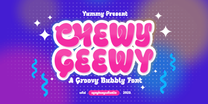 Chewy Geewy is a Playful, Groovy Bubbly, and Fun typeface. Come in 2 (two) styles (regular & slant) and is created with some alternate and ligature. Featured with Uppercase & Lowercase, Numeral & Punctuation, Multilingual Support, Opentype Features Perfect for your design projects like logos, branding, advertising, product designs, magazine designs, book/cover title designs, art quotes, special events, labels, product packaging, and more.
 - Whortle by Katsia Jazwinska,
$19.00 Bold, free-flowing and confident, Whortle is guaranteed to add an eye-catching appeal to your designs. Irregular shapes and dancing baseline make it feel much more personal. It looks great in both all-caps as well as lowercase. Whortle comes with upper and lowercase characters, large set of punctuation glyphs, numerals, and supports international languages. Hope you like it!
 - Closer Text by Mint Type,
$35.00 Closer Text is a narrower, more compact version of previously released Closer. Closer Text is a highly customizable Swiss grotesque with overclosed aperture. Featuring some humanistic shapes, Closer Text feels less bland though still relatively neutral. Closer Text comes in 9 weights (18 styles altogether), features extensive language support including Cyrillic and is highly customizable with 7 stylistic sets to mix and match.
 - Ongunkan Danish Futhark by Runic World Tamgacı,
$40.00 THE DANISH RUNES Prior to 500 AD the 24-rune Elder Futhark was used in Denmark. From 500 AD to 800 AD there were many transitional futharks, reflecting a change from the 24-rune Futhark to the 16-rune Futharks. By the end of this period, the 24-rune Futhark went completely out of use and the 16-rune Futharks had prevailed. From 900 AD some of the runes changed, visually and phonetically. This occurred again about 950 AD and 1100 AD due to language changes. Runes dated to 1300 AD show evidence of being influenced by the Latin alphabet. Runes found in Skåne, Halland and Blekinge in Sweden, and runes found in Schleswig-Holstein in Germany, is counted among Danish runes, because in the Runic period, this was Danish land.
 - Nautica Sottile by Resistenza,
$49.00 The Copperplate penmanship style has a distinctive flow and character. Many years of steady and patient practice allow calligraphers to achieve the flow, direction, sequencing, and speed required from the copperplate ductus, to achieve its distinctive, elegant, fluid aesthetic. Nautica is a monumental new script from Resistenza, which builds on the creator’s accomplished penmanship skills. The delicate strokes have high contrast and an extravagant personality. These letterforms invoke 18th-century sailors logbooks and the nostalgic correspondence those at sea sent home to their loved ones, with letters looping and rolling into one another like the waves these intrepid adventurers voyaged on. Nautica’s ornate feel is perfectly suited to romantic applications, and with three weights, one set of useful navigational icons and some nautical knots Nautica will allow you to create rich and cohesive graphics for those 'tying-the-knot' or in any display context which requires some sophistication. Nautica allows you to achieve the complexity and flow of copperplate calligraphy with OpenType features. Supreme swashes inspired by brush pen stroke, and exhaustive alternates, with over 900 glyphs and extensive language support, Nautica offers full professional typographic features, for a natural ‘written’ look. Check out also “Voguing” & “Nautica”
 - Compagnon by Hanoded,
$15.00 Compagnon is a friend, a partner. This handmade display font will come in super handy when you are working on that book cover, or the packaging of a product. It will shine on posters and websites and it will keep you warm at night. I guess that last bit is an exaggeration… Compagnon comes in three distinct styles: a ‘regular’ version, which is a bit rough around the edges, a ‘dirty’ version, with a juicy eroded look and a polka dot version. All three have their accompanying italics.
 - Antique by Storm Type Foundry,
$26.00The concept of the Baroque Roman type face is something which is remote from us. Ungrateful theorists gave Baroque type faces the ill-sounding attribute "Transitional", as if the Baroque Roman type face wilfully diverted from the tradition and at the same time did not manage to mature. This "transition" was originally meant as an intermediate stage between the Aldine/Garamond Roman face of the Renaissance, and its modern counterpart, as represented by Bodoni or Didot. Otherwise there was also a "transition" from a slanted axis of the shadow to a perpendicular one. What a petty detail led to the pejorative designation of Baroque type faces! If a bookseller were to tell his customers that they are about to choose a book which is set in some sort of transitional type face, he would probably go bust. After all, a reader, for his money, would not put up with some typographical experimentation. He wants to read a book without losing his eyesight while doing so. Nevertheless, it was Baroque typography which gave the world the most legible type faces. In those days the craft of punch-cutting was gradually separating itself from that of book-printing, but also from publishing and bookselling. Previously all these activities could be performed by a single person. The punch-cutter, who at that time was already fully occupied with the production of letters, achieved better results than he would have achieved if his creative talents were to be diffused in a printing office or a bookseller's shop. Thus it was possible that for example the printer John Baskerville did not cut a single letter in his entire lifetime, for he used the services of the accomplished punch-cutter John Handy. It became the custom that one type founder supplied type to multiple printing offices, so that the same type faces appeared in various parts of the world. The type face was losing its national character. In the Renaissance period it is still quite easy to distinguish for example a French Roman type face from a Venetian one; in the Baroque period this could be achieved only with great difficulties. Imagination and variety of shapes, which so far have been reserved only to the fine arts, now come into play. Thanks to technological progress, book printers are now able to reproduce hairstrokes and imitate calligraphic type faces. Scripts and elaborate ornaments are no longer the privilege of copper-engravers. Also the appearance of the basic, body design is slowly undergoing a change. The Renaissance canonical stiffness is now replaced with colour and contrast. The page of the book is suddenly darker, its lay-out more varied and its lines more compact. For Baroque type designers made a simple, yet ingenious discovery - they enlarged the x-height and reduced the ascenders to the cap-height. The type face thus became seemingly larger, and hence more legible, but at the same time more economical in composition; the type area was increasing to the detriment of the margins. Paper was expensive, and the aim of all the publishers was, therefore, to sell as many ideas in as small a book block as possible. A narrowed, bold majuscule, designed for use on the title page, appeared for the first time in the Late Baroque period. Also the title page was laid out with the highest possible economy. It comprised as a rule the brief contents of the book and the address of the bookseller, i.e. roughly that which is now placed on the flaps and in the imprint lines. Bold upper-case letters in the first line dramatically give way to the more subtle italics, the third line is highlighted with vermilion; a few words set in lower-case letters are scattered in-between, and then vermilion appears again. Somewhere in the middle there is an ornament, a monogram or an engraving as a kind of climax of the drama, while at the foot of the title-page all this din is quietened by a line with the name of the printer and the year expressed in Roman numerals, set in 8-point body size. Every Baroque title-page could well pass muster as a striking poster. The pride of every book printer was the publication of a type specimen book - a typographical manual. Among these manuals the one published by Fournier stands out - also as regards the selection of the texts for the specimen type matter. It reveals the scope of knowledge and education of the master typographers of that period. The same Fournier established a system of typographical measurement which, revised by Didot, is still used today. Baskerville introduced the smoothing of paper by a hot steel roller, in order that he could print astonishingly sharp letters, etc. ... In other words - Baroque typography deserves anything else but the attribute "transitional". In the first half of the 18th century, besides persons whose names are prominent and well-known up to the present, as was Caslon, there were many type founders who did not manage to publish their manuals or forgot to become famous in some other way. They often imitated the type faces of their more experienced contemporaries, but many of them arrived at a quite strange, even weird originality, which ran completely outside the mainstream of typographical art. The prints from which we have drawn inspiration for these six digital designs come from Paris, Vienna and Prague, from the period around 1750. The transcription of letters in their intact form is our firm principle. Does it mean, therefore, that the task of the digital restorer is to copy meticulously the outline of the letter with all inadequacies of the particular imprint? No. The type face should not to evoke the rustic atmosphere of letterpress after printing, but to analyze the appearance of the punches before they are imprinted. It is also necessary to take account of the size of the type face and to avoid excessive enlargement or reduction. Let us keep in mind that every size requires its own design. The longer we work on the computer where a change in size is child's play, the more we are convinced that the appearance of a letter is tied to its proportions, and therefore, to a fixed size. We are also aware of the fact that the computer is a straightjacket of the type face and that the dictate of mathematical vectors effectively kills any hint of naturalness. That is why we strive to preserve in these six alphabets the numerous anomalies to which later no type designer ever returned due to their obvious eccentricity. Please accept this PostScript study as an attempt (possibly futile, possibly inspirational) to brush up the warm magic of Baroque prints. Hopefully it will give pleasure in today's modern type designer's nihilism. - Just Be by Roland Hüse Design,
$12.00 JUST BE is a playful brush script. Perfect for titles, headings and logotypes for blogs, ads, quote prints, home decor, book title, invitation, birthday, custom product, lifestyle imagery (like quotes and stuff). Character set contains Eastern and Western European Latin accented letters. For additional customisations (for logotypes for example) please email me at contact@rolandhuse.com You MAY NOT sell this font or claim them as your own. You MAY NOT edit or rename this font. You MAY NOT redistribute this font. Thank you I hope you like this font & good luck with your project! Roland Instagram: @rolandhusedesign Background images of "Just Be" main poster by Annie Spratt from unsplash https://unsplash.com/@anniespratt "Your best moments in life are ahead" by Helena Hertz https://unsplash.com/@imperiumnordique paper bag mock up by Graphic Burger https://graphicburger.com"
 - Lunatique by The Flying Type,
$20.00 Lunatique is a highly decorative font, available in three widths, with extended language coverage as well as alternates for some glyphs. This font is inspired by Lucky typeface, designed in 1972 by André Pless for the Mecanorma permanent type contest. The style was later released as Letter-Press transfer sheets. Transfer sheets... Sounds quite nice, definitely. But hey, these digital ones will be way smoother to use, you bet. Give them a go and make your text shine!
 - Trump Mediaeval Office by Linotype,
$50.99The Trump Mediaeval Office family is designed after the model of the original serif family produced by Georg Trump in 1954. Trump released this typeface through the C.E. Weber type foundry in Stuttgart, and Linotype quickly cut the face for mechanical composition. Thereafter it became popular around the world. One of the most prolific German type designers of the 20th century, Trump created numerous typefaces in several different styles, but Trump Mediaeval is often regarded as his best work. Trump Mediaeval is an old style serif typeface, with new inherent quality that could only have come about after centuries of variation on this theme. It bears some resemblance to the classic Garamond typefaces, yet its characteristic letters set it apart in a positive way. Akira Kobayashi, Linotype’s Type Director, released his own revived design, Trump Mediaeval Office, in 2006. Trump Mediaeval Office has two weights, each with an italic companion. Unlike the original design, Kobayashi has harmonized the varying letterforms across the two weights, allowing Regular and Bold text to stand side by side harmoniously. Trump Mediaeval’s numbers now match across weights as well, optimizing their legibility in sizes large and small. Decades ago, Trump Mediaeval was a popular choice for setting book texts, because of its robust serifs. These are exactly what make the face a good choice for office application today; on lower-resolution printers, these serifs will still remain a strong feature on the letterform, increasing legibility along the line of text. - Dream Goods by Create Big Supply,
$15.00 Introducing DreamGood, a captivating natural handwriting font that adds a touch of artistic charm to your creative projects. With its authentic style and versatile nature, this font is perfect for various craft endeavors. DreamGood's natural handwriting style brings a unique and personalized feel to your designs. Whether you're working on shirt designs, websites, SVG creations, home decor, branding materials, blogs, logos, or invitations, this font will elevate your projects with its organic appeal. With both uppercase and lowercase letters, DreamGood offers flexibility in crafting engaging compositions. It also includes numbers and punctuation, ensuring seamless integration within your text. The font's multilingual support enables you to communicate your message effectively across different languages, expanding your reach to a wider audience. DreamGood features ligatures that enhance the flow and aesthetics of your typography, allowing for captivating and cohesive designs. The font's PUA Encoding provides easy access to special characters and glyphs, opening up endless creative possibilities. Embrace the natural beauty of DreamGood in your craft projects and watch your creations come to life with an artistic flair. From handmade goods to digital designs, this font adds a touch of elegance and authenticity.
 - Hanna by Wilton Foundry,
$29.00Hanna has its roots in the Plato and Cilantro fonts published earlier by Wilton Foundry. It is an informal roman and very legible at any size - a rare combination for many applications. Hanna was specifically designed to generate additional income for an orphanage in Ethiopia. Hanna Teshome runs an orphanage of roughly 140 children in Addis Ababa, Ethiopia. She is an amazing lady with a deep passion for orphan kids as well as innocent kids that find themselves in jail because their mothers have been imprisoned - they are treated as prisoners and are typically sexually abused - it is not uncommon for them to commit suicide when they are released from jail at age 18. Most of the orphans end up with Hanna because one or both of their parents have died from AIDS. Hanna relies entirely on donations to keep her orphanage running and this font is a small but tangible way for you to help make a difference in the lives of the orphan kids. I am committed to helping Hanna after visiting the orphanage several times and seeing the jails from where the kids have been rescued. Hanna is my hero because she stepped out of her comfort zone, with no financial support, to take care of the kids. My hope is that you will use this font as a messenger of good. All of Wilton Foundry royalties for this font will go to the support of Hanna’s orphanage in Ethiopia. Thank you in advance for your support on behalf of Hanna and the kids!