10,000 search results
(0.051 seconds)
- Horst by PintassilgoPrints,
$29.00 Inspired by Laatzen’s Bilderbogen etchings by the extraordinary artist and printmaker Horst Janssen, this font is packed with Open Type features that allow the creation of unique typographic pieces. Besides the set of automatic discretionary ligatures, this all-caps font also comes with two extra stylistic sets, so there are 4 versions for each letter (plus the variations contained in the ligatures). When working with ligatures turned on, the carefully handcrafted kerning table takes advantage of overlapping some ligatures with its neighbor letters, multiplying ligatures performance. An unmistakable original font to create outstanding design works!
 - Abi Nouveau JNL by Jeff Levine,
$29.00Inspired by the images on some EBay auctions, Jeff Levine sketched out and revived this early 1900s serif design used on some French sign letters. Named for a friend in the graphics industry, this font captures the charm of the Art Nouveau period. - Twenty Night by Aminmario Studio,
$20.00 Twenty Night is a modern handwriting font. Its charm makes it appear wonderfully, readable, and, ultimately, incredibly versatile. This font will look outstanding in any context, whether it’s being used on busy backgrounds or as a standalone headline! Comes in Regular and Italic styles. Thank you for your purchase! Hope you enjoy with our font
 - Illuminations Woodcut by Just My Type,
$10.00 Illuminations Woodcut is inspired by the decorated initial capitals of Medieval manuscripts… and an old book of clip art in which they were found. Try decomposing them in Adobe Illustrator and coloring the pieces or dropping color into them in Photoshop: you can get some stunning results. Caps and TrueType only.
 - Lonely Heart by Black Studio,
$19.00 Lonely Heart Font Duo is a fancy font. which comes with a combination of modern and elegant fonts, namely Script and Sans style. You can combine them to create beautiful typography. This handmade style makes it perfect to use in all your design projects be it logos, labels, packaging designs, blog titles, posters, wedding designs, social media posts, Instagram designs, invitation cards, art quotes, home decor, book covers/titles , etc. Here's what's included: Lonely Heart Regular / Bold Script • Elegant and realistic Script font contains 108+ ligatures and substitutes, lowercase, uppercase, all punctuation & numbers. Regular / Thick Lonely Heart • Sans font with upper and lower case, all punctuation marks, numbers and Language support Language support • Lonely Heart supports the following languages; English, French, Italian, Spanish, Portuguese, German, Swedish, Norwegian, Danish, Dutch, Finnish, Indonesian, Malay, Hungarian, Polish, Croatian, Turkish, Romanian, Czech, Latvian, Lithuanian, Slovak, Slovenian. I hope you enjoy this font. If you have any questions, feel free to message me :)
 - Hello Girlfriend by Black Studio,
$19.00 Hello Girlfriend Font Duo is a fancy font. which comes with a combination of modern and elegant fonts, namely Script and Sans style. You can combine them to create beautiful typography. This handmade style makes it perfect to use in all your design projects be it logos, labels, packaging designs, blog titles, posters, wedding designs, social media posts, Instagram designs, invitation cards, quote art, home decor, book covers/titles , etc. Here's what's included: Hello Regular Girlfriend / Bold Script • Elegant and realistic Script font contains 108+ ligatures and substitutes, lowercase, uppercase, all punctuation & numbers. Regular / Bold Hello Boyfriend • Sans font with upper and lower case, all punctuation marks, numbers and Language support Language support • Hello Girlfriend supports the following languages; English, French, Italian, Spanish, Portuguese, German, Swedish, Norwegian, Danish, Dutch, Finnish, Indonesian, Malay, Hungarian, Polish, Croatian, Turkish, Romanian, Czech, Latvian, Lithuanian, Slovak, Slovenian. I hope you enjoy this font. If you have any questions, feel free to message me :)
 - Skaremoosh by Studio 85 Design,
$19.99 Skaremoosh is display typeface that is wild and weird. It plays by its own rules, and so will you when you use this font. Included in Skaremoosh are standard ligatures, currencies, ampersands and footnotes consistent with the design. Skaremoosh is complete with alternates for each letter, and alternate ligatures for variation and stylistic choices. Skaremoosh is well suited for an informal look and feel for apps, games, fashion, posters, menus, graphic novels, and anything eye catching. This font was created after months of working on some very rule driven font projects. The need to just let loose was intoxicating - and the exact opposite of what I was doing. I really hope this font inspires some spirited designs!
 - Schreibmeister by RMU,
$30.00 Schreibmeister is my interpretation of Arno Drescher’s design for Ludwig Wagner, Leipzig, completed in 1958. The letters X and x were improved as well as some ligatures. The letter E has an alternative, and the small d comes with two alternatives, of which one form can be reached by typing the partial different key. Generally it is recommended to activate both Standard and Discretionary ligatures.
 - Instyles Collective by Tropical Sunlight Co.,
$16.00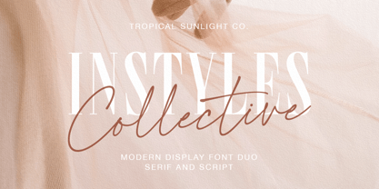 The font is called "Instyles Collective", it is font duo with fashionable themes. The font comes with two pairing typefaces (script and serif). The Instyles Collective matches apply in some designs such as the logotype, quotes, wedding invitation, business card, packaging, branding, and more custom design. Instyles Collective includes : Uppercase, lowercase, numeral, symbol and punctuation Ligature Multilingual PUA Encoded If you have any questions, please contact :
 - PF Libera Pro by Parachute,
$79.00 PF Libera was designed at a time of leisure with no particular intention for commercial use. In fact it was offered in the beginning as a freeware. In 2001, designer Charis Tsevis was convinced that it may have some commercial value, so Parachute obtained the rights to sell this typeface. At that time, we did not even imagine what would follow. Since then, PF Libera is one of our most successful typefaces. We have seen it being used in very diverse applications. From publishing to advertising to banking, to transportation, to retail applications. Food, beverages, fashion, automobiles, tourism, the list goes on and on. In any way, this typeface is very personal, modern and provocative. It stays with you and definitely it brings along the message. PF Libera comes in 3 styles. One of them, 'Liberissima', was added later and is more loose than the other two. The new 'Pro' version is powered with 7 OpenType features and is carefully designed to include all languages that are based on Latin, Greek and Cyrillic.
 - Reluctant Aviator by Hanoded,
$15.00 I read something interesting the other day: in 1910 a cat called Kiddo snuck on board an airship and was found by aeronaut Walter Wellman - after he had already taken off in an attempt to cross the Atlantic Ocean. Wellman and Kiddo spent 71 hours aboard the airship, but never completed the journey, due to engine problems and foul weather. Luckily, they were both rescued. It was a funny story, so I decided to name a font after it. Reluctant Aviator is a handmade font (pen and paper). It has a rough edge, some shaky glyphs and a lot of bravado. Comes with diacritics and swashes.
 - Chippewa Falls by Chank,
$49.00 In the spirit of the old days, before water sparkled and before typefaces were known as fonts, Chank is proud to introduce Chippewa Falls the font. This font comes with fancy swirly uppercase letters and stout small caps for lowercase, as well as a heart-warming story. Chank rescued this former custom font from an abandoned design proposal. He gave it some TLC and before long a retro typeface emerged, with lettering worthy of good old fashioned sleigh rides and candy canes. Enjoy this font as you would a cup of hot cocoa next to a potbelly stove on a snowy day.
 - Boister Black Pro by CheapProFonts,
$10.00 I loved the look of this font so much that I couldn't resist reworking it - although it probably had the most basic character set I've ever used as a starting point. But here it is in its complete, professional, multilingual state. I hope this wonderful swashbuckling font now finds many new users and uses. Celebrate! ALL fonts from CheapProFonts have very extensive language support: They contain some unusual diacritic letters (some of which are contained in the Latin Extended-B Unicode block) supporting: Cornish, Filipino (Tagalog), Guarani, Luxembourgian, Malagasy, Romanian, Ulithian and Welsh. They also contain all glyphs in the Latin Extended-A Unicode block (which among others cover the Central European and Baltic areas) supporting: Afrikaans, Belarusian (Lacinka), Bosnian, Catalan, Chichewa, Croatian, Czech, Dutch, Esperanto, Greenlandic, Hungarian, Kashubian, Kurdish (Kurmanji), Latvian, Lithuanian, Maltese, Maori, Polish, Saami (Inari), Saami (North), Serbian (latin), Slovak(ian), Slovene, Sorbian (Lower), Sorbian (Upper), Turkish and Turkmen. And they of course contain all the usual "western" glyphs supporting: Albanian, Basque, Breton, Chamorro, Danish, Estonian, Faroese, Finnish, French, Frisian, Galican, German, Icelandic, Indonesian, Irish (Gaelic), Italian, Northern Sotho, Norwegian, Occitan, Portuguese, Rhaeto-Romance, Sami (Lule), Sami (South), Scots (Gaelic), Spanish, Swedish, Tswana, Walloon and Yapese.
 - Soda Syrup by Kitchen Table Type Foundry,
$10.00 At home, we don’t drink soft drinks at all. Maybe sometimes, when one of the kids has a birthday party, but we normally don’t have a stash of the stuff. We have cordial, or, as wel call it in Holland: limonadesiroop (‘Lemonade Syrup’). There you go, another font name xplained! Today Syrup was made with a marker pen and a lot of paper! It comes with a frizzy, sticky goodness to give your designs that extra kick.
 - MattsDinosaurStencils by Ingrimayne Type,
$11.95 This typeface is mostly composed of images of dinosaur skeletons drawn by Matthew Schenk and used as stencils for decoration. I thought they would also make a nice typeface. Check the key map—some of the very large critters are cut into pieces and put on several keys—this may help printing in some situations.
 - Marxis by Juru Rancang Studio,
$15.00 Introducing a retro condensed font called "Marxis". Best font to use as a headline to bring back the propaganda era inspired by Soviet posters, movie titles and book covers. The letterforms are straight and condensed and come in 2 styles: uppercase and small caps with the ligatures. This font will suited well for titles, poster design, web design, branding and packaging works, illustrations, badges and other typography works. Thank you, I hope you like it as I do!
 - Ambrosine by Hanoded,
$15.00 Ambrosine is a female name, which comes from the Greek. It means ‘immortal’. This handmade didone-ish font may not be immortal, but it is quite divine in appearance. Comes in regular and italic styles.
 - Ring Slab by Ochakov,
$9.00 Hope I made the world a little better. It's a great honor for me to be here. I'm super excited to present the next set of the Ring font family - Ring Slab. Ring Slab is a geometric slab serif typeface based on the original Ring font and inspired by classical writers. Ring Slab comes in 16 styles, ranging from Thin to Black. Fonts of the Ring Family is the perfect choice for headlines, logos, branding, packaging, publications, and websites. Ring Slab is still ready to take any decisions. The future of the big font family has come closer!
 - Vasetters by Ingrimayne Type,
$9.00 In Vasetters the letters are cut from the shape of a tessellating vase. To get the tessellating effect, the two sets of letters (and numbers and some symbols) must alternate, and this is done automatically in applications that support the OpenType feature of Contextual Alternatives (calt). Vasetters is monospaced and comes in two weights. The regular weight is tightly spaced, which should not be a problem at large point sizes. At small point sizes adjacent letters can be colored differently or the character spacing can be increased. The lighter weight can be used alone or layered above the regular weight to create the effect of hollow lettering. Vasetters is is fun, bizarre, weird, and obviously a decorative display font.
 - Duhline by Edignwn Type,
$18.00 The font collection is called "Duhline", it is a display font for logotype. These collections contain serif and sans serif font. Every font comes with 4 style typefaces (regular, smooth, rough and texture). This texture style includes some different stamp for uppercase and lowercase. Extras 9 hand-drawn illustrations about beer. The Duhline matches apply in some designs such as the logo, poster, label, badge, packaging, t-shirt, branding, quotes and more custom design. Duhline features : 4 style typefaces (regular, smooth, rough and texture) All-caps, numeral, symbol and punctuation and ligature in serif font All-caps, numeral, symbol and punctuation in sans serif font Multilingual PUA Encoded Duhline includes : 2 fonts (serif and sans serif) 9 hand-drawn illustrations in dingbat If you have any questions, please contact : edignwn11@gmail.com Check out Derpache which is a great pair for Duhline.
 - Fontazia Stiletto by Deniart Systems,
$20.00 The Fontazia Stiletto font was inspired by my personal obsession with shoes. This is a stylized version of some of the lovely footwear found in my personal closet as well as some of my equally obsessed friends. You'll find 52 assorted shoe illustrations ranging from sandals to boots, some a little strange, but all in good fun.
 - Hop Serif Hand Lettering by Joanne Marie,
$10.00 Here’s another font family for your hand lettering projects. Hop Serif Hand Lettering is a font family consisting of 3 styles: 1.) Hop Serif Hand Lettering Regular 2.) Hop Serif Hand Lettering Lines 3.) Hop Serif Hand Lettering Shadow This font family is all authentically hand drawn from pencil and paper to the digital screen and is perfect to include on designs for apparel such as mugs, t-shirts, bags, notebooks, inspirational quotes for the home and office, and more. Each font is multi-lingual too! I love using this font in my hand lettering designs and I hope you will too!
 - Loraine by Homelessfonts,
$49.00 Homelessfonts is an initiative by the Arrels foundation to support, raise awareness and bring some dignity to the life of homeless people in Barcelona Spain. Each of the fonts was carefully digitized from the handwriting of different homeless people who agreed to participate in this initiative. MyFonts is pleased to donate all revenue from the sales of Homelessfonts to the Arrels foundation in support of their mission to provide the homeless people in Barcelona with a path to independence with accommodations, food, social and health care. Loraine was born in London. She was an ordinary, hardworking family person, with nothing to worry about beyond paying the rent at the end of the month or keeping the fridge full. Until in 2009 she came to Barcelona on holiday. Soon after she arrived her passport was stolen from her and she had a series of problems with the British embassy. Somebody had made illegal use of her passport. So Loraine found herself in a strange place, unable to get home. She didn’t know anyone there and her circumstances meant she couldn’t ask for help from England, either. She had to sell all her possessions and, in time, learn to speak Spanish. “Living in the street is a wonderful adventure,” she says. In the street she discovered a new city, a new country and a new culture. “There are lots of people who prefer to sleep under the stars.” She also made lots of friends who helped her in a completely unfamiliar world.
 - Lubaline by Lián Types,
$39.00 Who haven't heard the phrase that ‘any past time was better’?. Although I sometimes find this phrase a little too pessimistic (because I try to think that the best is yet to come), it may be true regarding my passion, typography. I'm too young (29) unfortunately, and this means I did not have the pleasure of being contemporary with maybe the man who has influenced my work the most (1). The man that showed that letters are more than just letters to be read. Herb Lubalin (1918-1981), also called sometimes as ‘the rule basher’ (2), smashed the taboos and sacred rules of type design and gave it personality. He rejected the functionalist philosophy of europeans in favor of an eclectic and exuberant style. To him, letters were not merely vessels of form, they were objects of meaning. (3). Nowadays, when looking at his portfolio, who dares to deny that the term ‘typography’ and ‘beauty’ may go hand-in-hand without any problem? Ed Benguiat, one of Herb’s partners, still likes making jokes with the phrase “screw legibility, type should be beautiful” and what I understand of this is not to forget the rules, but to know and break them carefully. In an era of pure eclecticism, we, the lovers of flourishes and swashes, can't do nothing but admire all the legacy that Lubalin, this wonderful type-guru, left. My font Lubaline read as “the line of Lubalin” is my humble tribute to him. Those who know his work, may see the influences easily like in his ‘Beards’ (1976) and ‘The Sound of Music’ (1965) posters; the art-deco forms in many of his amazing logos and practically in all his creations where letters seem to be alive just like you and me. I really hope that the future finds me still learning more and more about type-design and letterforms, and like him, always willing to make innovations in my field: Because letters are not just letters to be read. NOTES (1) These are some of my fonts in which some of Lubalin’s influences can be seen (in order of creation): Reina, Aire, Erotica, String, Beatle, Heroe, Selfie, Model, Seventies, and many others that are still in progress. (2) (3) Steven Heller. Herb Lubalin: Rule Basher. U&lc (1998) http://www.printmag.com/imprint/my-favorite-lubalin/
 - Technique BRK Pro by CheapProFonts,
$10.00 I noticed this font for its versatile techno look - it makes wonderful logotype word images. Every letter combination is perfectly kerned so that the letters fit together nicely... Also includes some alternate letterforms, but only in their basic forms (not made in combinations with diacritics). These alternates are available via your programs' glyph palette or using the OpenType functions "Stylistic Alternates"/"ss02" and "Swash"/"ss01". Technique BRK Pro is the perfect companion for Technique Outline BRK Pro (it exactly fills the "holes") but also a nice techno font in its own right. ALL fonts from CheapProFonts have very extensive language support: They contain some unusual diacritic letters (some of which are contained in the Latin Extended-B Unicode block) supporting: Cornish, Filipino (Tagalog), Guarani, Luxembourgian, Malagasy, Romanian, Ulithian and Welsh. They also contain all glyphs in the Latin Extended-A Unicode block (which among others cover the Central European and Baltic areas) supporting: Afrikaans, Belarusian (Lacinka), Bosnian, Catalan, Chichewa, Croatian, Czech, Dutch, Esperanto, Greenlandic, Hungarian, Kashubian, Kurdish (Kurmanji), Latvian, Lithuanian, Maltese, Maori, Polish, Saami (Inari), Saami (North), Serbian (latin), Slovak(ian), Slovene, Sorbian (Lower), Sorbian (Upper), Turkish and Turkmen. And they of course contain all the usual "western" glyphs supporting: Albanian, Basque, Breton, Chamorro, Danish, Estonian, Faroese, Finnish, French, Frisian, Galican, German, Icelandic, Indonesian, Irish (Gaelic), Italian, Northern Sotho, Norwegian, Occitan, Portuguese, Rhaeto-Romance, Sami (Lule), Sami (South), Scots (Gaelic), Spanish, Swedish, Tswana, Walloon and Yapese.
 - Egyptian Hieroglyphics – Deities by Deniart Systems,
$30.00 Give your documents a sense of history. The study of the ancient Egyptian Hieroglyphics has been an ongoing fascination by scholars and Egyptology buffs for literally centuries. The discovery of the Rosetta stone in 1799 provided an incredible breakthrough in deciphering the hieroglyphs, however there continues to be conflicting opinions on the literal translation of both the phonetic and ideographic symbols. As such, the interpretation provided in this manual represents an assembly of the most popular transcriptions. This series contains 62 assorted gods and deities as well as a few well known kings or pharaoh's from the New Dynasty. It is important to note that most of the gods and deities were represented in many different forms throughout the centuries and regions of Ancient Egypt, and these are but some of these representations. NOTE: this font comes with an interpretation guide in pdf format.
 - Aztec Day Signs by Deniart Systems,
$15.00 Contains the 20 Days of the Mexican Calendar Stone in outline and silhouette mode NOTE: this font comes with an interpretation guide in pdf format.
 - Calligraphic Griffo by Alice Tebaldi,
$25.90 Calligraphic Griffo comes from my personal interpretation of Francesco Griffo works. He was one Italian's type founder, punch cutter and type designer and the first who drawn and realize the typographical's punch of the italics around the 1500. His dedication to works and incredible perfection make me fall in love with his typefaces. Here my font: a readable and classical Serif with well-proportioned letterforms, a lot of ligatures combination and initial Swash Letters. Hope you like it, enjoy!
 - Simpel by Letterhead Studio-IG,
$30.00 This font was made during testing of a neat little application, that traced hand-written letters on the fly. That application was later abandoned, and the font, named Simpel for it's obvious casual simplicity, was finished separately. This story goes up to the year 1998, and recently the font was returned from the archives. SImpel was completly remastered and some useful ligatures were added. It is nice, clean and really, quite simple. Which often comes very handy. It will work well in comic books, magazines and party flyers, for instance.
 - Modulus Pro by Arkitype,
$16.00 Modulus Pro, the extensive update to Modulus. This update was built around the original Modulus Font. This rounded sans-serif has a larger glyph set which covers many languages. Modulus Pro now comes in 8 weights from Extra-Light to Black. This updated version was designed with the designer in mind, you have many stylistic alternates to get creative with and make some really cool customised typography. A large range of examples have been designed to show just how versatile and creative you can get with this font family. It's fun but has a cool, edginess to it at the same time. Modulus Pro is not just another rounded sans-serif, you are going to want this in your font list.
 - Kowane by Valentino Vergan,
$18.00 Kowane is a very eye-catching and creative bubble font. Kowane is designed with fun and playful letters, making it great for retro designs and graffiti projects. Kowane comes in regular and oblique styles, included is a set of solid uppercase and lowercase letters. I hope you enjoy using the Kowane typeface.
 - Birly by Orenari,
$18.00 A few nights ago, I was dreaming about making a cute font that the children in the city would love. I only remember some characters of the font but I thought that it was a sign to make a new font. So, here it is, Birly. A new font and I think its cute yet playful for your fun projects. Birly was made with all my heart, I love it, and I hope you like it too. Birly has 2 styles, the regular and solid. You can choose, these all in the package! Please take a look and enjoy the preview pictures of Birly. I made it seriously, so you can see how is Birly looks on some projects.
 - Ice Creamery by FontMesa,
$29.00Ice Creamery is a new variation of our Saloon Girl font family complete with italics and fill fonts which may be used to layer different colors into the open parts of each glyph. We don’t recommend using the fill fonts for Ice Creamery as stand alone solid fonts, Ice Creamery Chocolate was designed as a the stand alone solid font for this font family. Fill fonts go back to the 1850's where they would design matched sets of printing blocks and the layering of colors took place on the printing press, they would print a page in black then on a second printing they would print a solid letter in red or blue over the letters with open spaces to fill them in. Most of the time the second printing didn't line up exactly to the open faced font and it created a misprinted look. With the fill fonts in Ice Creamery and other FontMesa fonts you have the option to perfectly align the fill fonts with the open faced fonts or shift it a little to create a misprinted look which looks pretty cool in some projects such as t-shirt designs. I have some ice cream making history in my family, my Grandfather Fred Hagemann was the manager of the ice cream plant for thirty years at Cock Robin Ice Cream and Burgers in Naperville IL. In the images above I've included an old 1960's photo of the Cock Robin Naperville location, the ice cream plant was behind the restaurant as seen by the chimney stack which was part of the plant. If you were to travel 2000 feet directly behind the Cock Robin sign in the photo, that's where I started the FontMesa type foundry at my home in Naperville. My favorite ice cream flavor was their green pistachio ice cream with black cherries, they called it Spumoni even though it wasn't a true Spumoni recipe. Their butter pecan ice cream was also incredibly good, the pecans were super fresh, their Tin Roof Sundae ice cream was chocolate fudge, caramel and peanuts swirled into vanilla ice cream. One unique thing about Cock Robin and Prince Castle was they used a square ice cream scoop for their sundaes. - Rustic Printed by Edignwn Type,
$12.00 The font is called "Rustic Printed", it is sans serif display with vintage themes. The font comes with 2 style typefaces (regular and stamp). This font include different width of alternates glyphs. The Rustic Printed matches applies in some designs such as the logotype, poster, label, badge, packaging, branding, and more custom design. Rustic Printed includes : 2 style typefaces (regular and stamp) Uppercase, lowercase, numeral, symbol and punctuation Alternates Multilingual PUA Encoded Thank you for your support and choosing us.
 - ALS FinlandiaScript by Art. Lebedev Studio,
$63.00 Some 40 km north of Helsinki, surrounded by meadows and a serene Finnish lake, lies Ainola, the former home and now museum of composer Jean Sibelius (1865–1957). I know the place quite well, since it is only a stone’s throw away from the art school where I began my graphic design studies. We sometimes went there after classes—a beautiful walk, especially in spring, when the days were getting longer, the snow melting in the sun and the ice cracking on the lake. The composer often professed his love for this landscape and found constant inspiration in its moods, sounds and scents during different seasons. For many people, Sibelius and his music, most notably his famous symphonic poem Finlandia, are a symbol of Finland. I decided to name the typeface family I’m presenting here FinlandiaScript, because it owes its influence to both Sibelius’ manuscripts and the Finnish landscape around Ainola. The shape of letters, their poise and the rhythm they create resemble Sibelius’ handwriting without copying it. The letters form gently flowing lines of text which is legible without giving up individuality. The font family comes in three styles: FinlandiaScript, FinlandiaScript Bold and FinlandiaScript Frost. Together they are perfect for magazines, websites and brands aiming to create a personal and sincere image. While the fine details of FinlandiaScript Frost are best suitable for display sizes, FinlandiaScript and FinlandiaScript Bold work well in both headlines and texts of smaller sizes. Hundreds of ligatures give them an especially flexible appearance. The FinlandiaScript family contains Western, Central European and Extended Cyrillic character sets and supports almost 100 languages. It is best suited for Opentype savvy programs with the “standard ligatures” and “contextual alternates” features turned on.
 - Erotica by Lián Types,
$49.00 “A picture is worth a thousand words” and here, that’s more than true. Take a look at Erotica’s Booklet; Erotica’s Poster Design and Erotica’s User’s Guide before reading below. THE STYLES The difference between Pro and Std styles is the quantity of glyphs. Therefore, Pro styles include all the decorative alternates and ligatures while Std styles are a reduced version of Pro ones. Big and Small styles were thought for better printing results. While Big is recommended to be printed in big sizes, Small may be printed in tiny sizes and will still show its hairlines well. INTRODUCTION I have always wondered if the circle could ever be considered as an imperfect shape. Thousands of years have passed and we still consider circles as synonyms of infinite beauty. Some believe that there is something intrinsically “divine” that could be found in them. Sensuality is many times related to perfectly shaped strong curves, exuberant forms and a big contrasts. Erotica is a font created with this in mind. THE PROCESS This story begins one fine day of March in 2012. I was looking for something new. Something which would express the deep love I feel regarding calligraphy in a new way. At that time, I was practicing a lot of roundhand, testing and feeling different kinds of nibs; hearing the sometimes sharp, sometimes soft, sound of them sliding on the paper. This kind of calligraphy has some really strict rules: An even pattern of repetition is required, so you have to be absolutely aware of the pressure of the flexible pen; and of the distance between characters. Also, learning copperplate can be really useful to understand about proportion in letters and how a minimum change of it can drastically affect the look of the word and text. Many times I would forget about type-design and I would let myself go(1): Nothing like making the pen dance when adding some accolades above and below the written word. Once something is mastered, you are able to break some rules. At least, that’s my philosophy. (2) After some research, I found that the world was in need of a really sexy yet formal copperplate. (3) I started Erotica with the idea of taking some rules of this style to the extreme. Some characters were drawn with a pencil first because what I had in mind was impossible to be made with a pen. (4) Finding a graceful way to combine really thick thicks with really thin hairlines with satisfactory results demanded months of tough work: The embryo of Erotica was a lot more bolder than now and had a shorter x-height. Changing proportions of Erotica was crucial for its final look. The taller it became the sexier it looked. Like women again? The result is a font filled with tons of alternates which can make the user think he/she is the actual designer of the word/phrase due to the huge amount of possibilities when choosing glyphs. To make Erotica work well in small sizes too, I designed Erotica Small which can be printed in tiny sizes without any problems. For a more elegant purpose, I designed Erotica Inline, with exactly the same features you can find in the other styles. After finishing these styles, I needed a partner for Erotica. Inspired again in some old calligraphic books I found that Bickham used to accompany his wonderful scripts with some ornated roman caps. Erotica Capitals follows the essentials of those capitals and can be used with or without its alternates to accompany Erotica. In 2013, Erotica received a Certificate of Excellence in Type Design in the 59th TDC Type Directors Club Typeface Design Competition. Meet Erotica, beauty and elegance guaranteed. Notes (1) It is supossed that I'm a typographer rather than a calligrapher, but the truth is that I'm in the middle. Being a graphic designer makes me a little stubborn sometimes. But, I found that the more you don't think of type rules, the more graceful and lively pieces of calligraphy can be done. (2) “Know the forms well before you attempt to make them” used to say E. A. Lupfer, a master of this kind of script a century ago. And I would add “And once you know them, it’s time to fly...” (3) Some script fonts by my compatriots Sabrina Lopez, Ramiro Espinoza and Alejandro Paul deserve a mention here because of their undeniable beauty. The fact that many great copperplate fonts come from Argentina makes me feel really proud. Take a look at: Parfumerie, Medusa, Burgues, Poem and Bellisima. (4) Some calligraphers, graphic and type designer experimented in this field in the mid-to-late 20th century and made a really playful style out of it: Letters show a lot of personality and sometimes they seem drawn rather than written. I want to express my sincere admiration to the fantastic Herb Lubalin, and his friends Tony DiSpigna, Tom Carnase, and of course my fellow countryman Ricardo Rousselot. All of them, amazing.
 - Magical Brush by Hanoded,
$15.00 Personally I think a brush font should have the word ‘Brush’ in its name. It’s not that easy finding a name - you need some magic to come up with a good one! Magical Brush is a completely handmade font. I used a small brush (a number 3 to be precise) and Chinese Ink. I wanted just a little ‘erosion’, so I used copier paper rather than my expensive French water color paper (which is quite rough). Magical Brush comes in the normal variant and a chickenpox one. Use it for your posters, your book covers and your Christmas invitations!
 - Stay Golden by Rotterlab Studio,
$15.00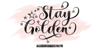 Introducing Stay Golden Script font in a smooth handwriting style and very pretty and classy. Stay Golden is perfect for branding projects, home appliance design, product packaging, use in business cards, invitation cards, etc. Simply as a stylish text overlay onto a background image or anything else that needs a touch of elegance. Thanks for checking! I really hope you enjoy it.
 - Anywhere - Unknown license

- Filigree by Scholtz Fonts,
$19.00 Filigree, reminiscent of the delicate lace and jewelry produced in Europe in the 16th to 18th centuries, was inspired by the font Always, and by the way in which the threads (or filia) of the characters in Always intertwined. It has a soft, wafty character. It is best used as a display font at a relatively large size. At too small a size the delicacy of the individual filaments will be lost. Best results also from a combination of upper and lower case characters. Using upper case characters alone will not look as good. Alternate characters and ligatures are also included. If your application program supports "kerning" then I suggest that you turn it on. Although not essential, this will enhance the spacing of the letters. The font contains over 272 characters - (upper and lower case characters, punctuation, numerals, symbols and accented characters are present). It also includes a number of "open-type" characters - these enhance the flexibility of the font by providing alternatives that are used either at the discretion of the designer or are determined by the circumstances in which the font is used. It has all the accented characters used in the major European languages.
