10,000 search results
(0.092 seconds)
- Karope by Nian Keun Studio,
$12.00 Karepo is a remarkably cool and dynamic serif font designed to elevate the visual appeal of your display. This font brings a sense of modernity and vitality to your designs, making them more captivating and engaging. Ideal for graphic design, social media, and branding projects, Karepo seamlessly integrates into the contemporary design landscape, adding a touch of sophistication and charm. Elevate your visual communication with this versatile serif font, perfect for creating a lasting impact across various platforms. Thank you for coming to my shop and enjoying other fonts.
 - Kinger by Twinletter,
$15.00 We designed Kinger as a display font with the notion of excellent graffiti writing in mind. We have polished Kinger into a typeface that is ideal for use in a variety of projects since when you use this font, your complete project will appear more beautiful and pleasant in the eyes of many people. This graffiti font is great for product logos, poster titles, headlines, packaging, film titles, logotypes, gorgeous writing, and trendy graffiti designs, among other things. Of course, if you utilize this font in your numerous creative projects, they will be perfect and outstanding. Use this typeface right away for your one-of-a-kind and remarkable projects.
 - American Spirit STF by Altered Ego,
$30.00American Spirit STF is a glorious collection of contemporary patriotic symbols: US Flags (traditional and contemporary), a variety of stars, eagles, torches, and combinations of them all. Designed for print and web, this collection is useful for embellishing your designs with a subtle (or not-so-subtle) patriotic touch. The flags have been designed for easy ungrouping in a drawing program, in order to colorize the union and stripes. And as a special feature, American Spirit™ splits the flags into two characters (the union and the stripes) that can be separately colored and will kern together based on the character chosen. Suggestions for doing this are included in every package. This versatile collection also contains a special contemporary version of the US Flag, with rounded corners on the union and stripes, and a five-pointed asterisk-like shape as the stars. (This allows the stars to appear as stars at smaller sizes.) Show your American Spirit! Sign up today for this contemporary collection of patriotic symbols! - Carlton by ITC,
$29.99Carlton is based on a typeface designed by Prof. F. H. Ehmcke. In 1908, Ehmcke released his Ehmcke-Antiqua design through the Flinsch typefoundry in Germany. Ehmcke-Antiqua was later distributed by the Bauer typefoundry in Frankfurt am Main. The Caslon Letter Foundry in England discovered the design and released their own typeface based upon the model, which they named Carlton. Carlton entered the Stephenson Blake program after they acquired the Caslon Letter Foundry in the late 1930s. As hot and cold metal typesetting became outdated technologies, Carlton and Ehmcke-Antiqua fell out of general use. In the 1990s, Letraset revived this classic design, distributing it under its English name, Carlton. Carlton's clean and generous capitals, as well as its understated yet detailed lower case, have found popularity again in recent years. The elegance of Carlton is best used for displays with large letter and word spacing. Carlton shows all of the hallmarks of a delicate serif typeface design; its forms capture a distinct moment that was common within Central European type design during the first third of the 20th Century. Carlton is similar to several other expressive typefaces from the early 1900s, including Bernhard Modern, Koch Antiqua, Locarno, and Nicolas Cochin." - Tsubame by Thirdin,
$30.00 "TSUBAME" means swallow in Japanese. These fonts are based on the shape of Tsubame. The relationship between humans and swallows is as deep-rooted. Japanese swallows have adapted to nesting in and around human habitation from ancient time. So in Japan, they prohibited people from catching or killing swallows because of their beneficial role as insect eaters. Since the relationship between humans and swallows is close, this font's letter spacing is designed to be very tight.
 - Sihmittree by Ingrimayne Type,
$9.00 Sihmitree is a gimmick typeface in which all glyphs have reflective (mirror) or rotational symmetry (or both). Sihmitree has two weights and is caps only, with most of the lower-case letters identical to the upper-case letters. It includes only those accented characters that are symmetrical. The letters of the alphabet are often used to explain symmetry. BCDEK are given as examples of shapes that can easily be formed with symmetry over a horizontal line. AMQTUVWY can easily be formed so that they mirror over a vertical line. Letters HIOX can be formed so they mirror over both horizontal and vertical lines, and as a result they will also have rotational symmetry. Letters NSZ can be formed so that they reproduce themselves with a rotation of 180º. That leaves letters FGJLPR, which are usually considered examples of asymmetry. However, there are script versions of J, L, and R that can be formed with symmetry, and variants of lower-case f and g can be made that are symmetrical. P looks a lot like the thorn character. Some of the numbers also present challenges when trying to form them symmetrically. The symmetrical alphabet is not stylistically harmonious and has limited use other than as an exploration of symmetry.
 - FS Albert Arabic by Fontsmith,
$150.00 Brother To create a truly global font family, FS Albert needed an Arabic script sibling. Emanuela Conidi set about the delicate task of creating an alphabet to harmonise visually with its Latin sans serif counterpart so that the two could be used side-by-side in bilingual publications. Working with the Kufic style of script, with its simpler, geometric forms, Emanuela sculpted letters with the a similar optical size, weight and rhythm as FS Albert, with open counters and monolinear strokes. It never hurts to Naskh But there’s more to FS Albert than a simple, geometric structure. To match Albert’s cheery, charming character, FS Albert Arabic needed an injection of warmth and informality. Emanuela incorporated some of the more expressive, calligraphic shapes of the Naskh script style, which lent the letterforms a looser, softer, more handwritten quality, while remaining functional and structured. The Naskh influence is most noticeable in the bowl of characters such as Jim, Qaf and Nun, in the curved tail of Waw and Reh, and the deep joining of Tah. Follow the script The end result is an Arabic script that’s the perfect partner to FS Albert: open counters, monolinear strokes and a friendly, rounded appearance. FS Albert Arabic is available in Opentype format, in five weights from Thin to ExtraBold. It supports Persian and Urdu, with proportional and tabular numerals for both, plus full vocalisation and the Hijra feature.
 - Mondrake by Flawlessandco,
$9.00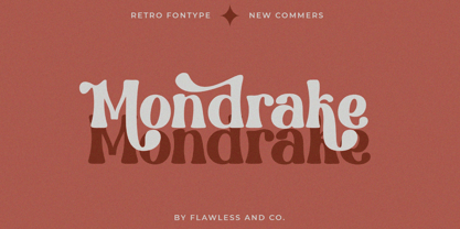 Mondrake is a modern retro with a fun and bold style that perfect for your retro-themed projects. Try out some alternate characters for another visual result! There's some connected letters and some alternates that suitable for any graphic designs such as branding materials, t-shirt, print, business cards, logo, poster, t-shirt, photography, quotes .etc This font support for some multilingual. Also contains uppercase A-Z and lowercase a-z, alternate character, numbers 0-9, and some punctuation. If you need help, just write me! Thanks so much for checking out my shop!
 - Croist by Flawlessandco,
$9.00 Croist is a modern retro with a fun and bold style that perfect for your retro-themed projects. Try out some alternate characters for another visual result! There's some connected letters and some alternates that suitable for any graphic designs such as branding materials, t-shirt, print, business cards, logo, poster, t-shirt, photography, quotes .etc This font support for some multilingual. Also contains uppercase A-Z and lowercase a-z, alternate character, numbers 0-9, and some punctuation. If you need help, just write me! Thanks so much for checking out my shop!
 - Helios Retro by Flawlessandco,
$9.00 Helios Retro is a modern retro with a fun and bold style that perfect for your boho-themed projects. Try out some alternate characters for another visual result! There's some connected letters and some alternates that suitable for any graphic designs such as branding materials, t-shirt, print, business cards, logo, poster, t-shirt, photography, quotes .etc This font support for some multilingual. Also contains uppercase A-Z and lowercase a-z, alternate character, numbers 0-9, and some punctuation. If you need help, just write me! Thanks so much for checking out my shop!
 - Brahmasta by Flawlessandco,
$9.00 Brahmasta is a modern serif with a classic retro style that perfect for your retro-themed projects. Try out some alternate characters for another visual result! There's some connected letters and some alternates that suitable for any graphic designs such as branding materials, t-shirt, print, business cards, logo, poster, t-shirt, photography, quotes .etc This font support for some multilingual. Also contains uppercase A-Z and lowercase a-z, alternate character, numbers 0-9, and some punctuation. If you need help, just write me! Thanks so much for checking out my shop!
 - Bfrika by Holland Fonts,
$30.00Bfrika is an 'Africa inspired' typeface and a contribution for the typographic issue 'National Typographica' of I-Juici Magazine, in South Africa. This geometrical decorative design represents bold simplicity, directness and rythm. The name evolved from text for the spread in the magazine. The B replaces the A. Africa be free. Bfrika. The concept behind Bfrika is to generate an unpredictable visual rhythm in an attractive decorative presentation. Filling up the white space around the letters accentuates form over function, thus creating an interference of visual impressions with its legibility. This visual rhythm is amplified by its redundancy in a text, only pausing at a break or a word space. Based on the concept of separate printing forms in letterpress, Bfrika Two Tone and Bfribat Two Tone separate the letter from the outside form in two fonts. Placing two text frames exactly on top of each other and assigning each part of these font to a frame in a different color, offers a quick way to add color. Originally Bfrika was designed for I-Jusi magazine #17, National Typografika, South Afrika 2001. Bfribat and both two tone fonts were created for Building Letters, a fund raiser for orphanages in Kenya and Uganda (www.buildingletters.org) and are also available for Mac and PC at www.hollandfonts.com and will be distributed in 2004 through associated foundries. - FS Irwin by Fontsmith,
$80.00 New York vibes FS Irwin was born in New York while Senior Designer, Fernando Mello, was studying an intensive 5 week typeface design course at the Cooper Union. His brief was to design a perfectly clear typeface that could communicate well, without loud or overtly mannered design features. Fernando was influenced by the subway font in New York: ‘It is very in your face and clear, always in bold. It doesn’t shout much but at the same time is very present and unique. The design is completely different but it was this spirit I wanted to capture for FS Irwin.’ And the vibe of the city: ‘In a similar way to London, New York is so mixed and so cosmopolitan. I was amazed by the different styles and identities I saw there, and tried to encapsulate this essence to create something new, relevant and very now.’ Incisive quality Rather than focusing on quirks or distinctive characteristics, the key to FS Irwin is the quality of its design and spirit of simplicity. The design, proportions and details are usable and authentic and it is suitable for countless situations, without running the risk of being instantaneously noticeable. Families like this can be used on nearly anything, from more playful designs to serious corporate IDs. ‘Extensively tested and precisely drawn text-oriented typefaces are what I enjoy designing the most. There is a beauty and a different approach, a different way of making them interesting, sellable and usable rather than adding flicks or unexpected details.’ Inscriptions and calligraphy FS Irwin’s origin lies in Fernando’s studies in inscriptional lettering and writing-calligraphic exercises at the Cooper Union. Mello started the process by digitising his explorations and adapting them into a more workable sans serif structure. The traditional forms of writing which gave the basis to Latin type as we know it today were the perfect place to start. This influence can be seen in the proportion of the capitals and in slight writing-calligraphic details in the lowercase, such as the slightly angled, chiselled spurs and their open terminals.
 - Werksatz by Identity Letters,
$39.00 Inspired by early grotesque typefaces such as Akzidenz Grotesk and Venus, Werksatz is our contemporary interpretation of this beloved genre. Some things are timeless. These are the things that only get better with use. The aforementioned typefaces certainly belong into this category. Rediscovered by designers from every generation again and again, they are here to stay. However, as tools evolve and technology moves on, even a well-tried design has to adapt to this evolution continuously in order to stand the test of time. Werksatz is such an adaptation, taking the best from the invincible classics and infusing them with the warm blood of today’s tech. With 10 weights from Thin to Black, each with painstakingly fine-tuned obliques, and more than 940 characters per style, this font family is ready for the future. Its Extended Latin support ensures you won’t miss a letter in any of hundreds of languages. Special glyphs like three variations of arrows and additional shapes will make your design work so much easier—for well-structured forms as well as radical editorial layouts. Among a treasure trove of OpenType features, you’ll find essentials such as Capital Spacing, Case-Sensitive Forms, and Ligatures, but also advanced functions like Small Caps, Subscript and Inferior figures and letters, plenty figure sets (Lining Figures, Tabular Figures, Old-Style Figures, circled and squared figures, figures for small caps … you get the idea), Slashed Zero, and more. You’ll discover that Werksatz is less formalistic and rigid than your average neogrotesk typeface. Sure, you can use it for serious business—whether in corporate design, branding, editorial design, publication design, or web design for industries and topics ranging from politics, government, management, or law to technology, entrepreneurship, commerce, or finance. However, Werksatz is much more versatile than that. Its more human appearance also allows for effective use in culture, fashion, art, entertainment, sports, exhibitions, leisure, and luxury. It’s an excellent choice for wayfinding applications, apps, packaging, and all kinds of nonfiction books. Other Grotesks with big names are left behind outdated by their proprietors, but Werksatz is here to stay. The classic industrial warmth of these letterforms will age like fine wine.
 - Linotype Devanagari by Monotype,
$103.99 The new Linotype® Devanagari typeface is a traditional text face now available in five weights (from Light to Black) and suitable for a wide variety of print and digital uses. A compact design, Linotype Devanagari also provides economy of space where textual real estate is at a premium. In addition, its large character set enables the setting of Hindi, Marathi, Nepali and is suitable for Sanskrit passages. The design’s open counters ensure high levels of legibility at small sizes and at modest resolution. The history of Linotype Devanagari is quite extensive. Inspired by the late 19th and early 20th century Nirnaya Sagar designs, it was originally designed in 1977 by Mathew Carter for phototypesetting systems. It was then revised and expanded for digital typesetting by the Linotype letter-drawing studio headed by Georgie Surman under the art direction of Fiona Ross. This new, enhanced revival was designed by Lisa Timpi and Gunnar Vilhjálmsson with Fiona Ross as a consultant. This new Linotype Devanagari is part of a project to refresh the pivotal Linotype Bengali and Linotype Gujarati typefaces and make them available for the first time in the popular OpenType font format.
 - Romance Roman JNL by Jeff Levine,
$29.00 The antique sheet music for the 1915 song "A Girl in Your Arms is Worth Two in Your Dreams" had its title hand lettered in a Roman typeface that reflected ever so slightly the Art Nouveau influences of the time. This design is now available as Romance Roman JNL, in both regular and oblique versions.
 - Entog by Twinletter,
$12.00 This font offers beautiful abstract typographic harmony for a wide variety of design projects, including natural handwriting in digital form for designs, quote designs, for social media business designs, advertisements, trademarks, promotional banners, posts, posters, signatures, and all. the design requires handwriting or whatever design you want. This font is equipped with uppercase, lowercase, numbers, punctuation marks, swhases and several variations on each character including multi-language. This font is best suited for open type friendly applications. How to get alternative glyphs from open type fonts: http://adobe.ly/1m1fn4Y PUA Character Code - Fully accessible without additional design software. We hope you enjoy this font. Feel free to send whatever message you want to convey. Thank you Regards Twinletter
 - Daitengu by Hanoded,
$15.00 I have always been fascinated by Tengu - a mythical creature from Japan. Tengu are usually depicted with a red face, a very long nose, white moustaches and a funny hat. They used to be regarded as harbingers of war, but over the centuries, their image softened and they became the protective spirits of mountains and forests. Daitengu means ‘greater tengu’ and stems from the Genpei Jōsuiki - an extended version of the ‘The Tale of the Heike’ - an epic account of the struggle between the Taira and Minamoto clans for control of Japan. So, now you know about tengu, end of the history lesson! Daitengu is an epic brush font. I made it with a soft brush and China ink (like most of my brush fonts), but instead of forming the glyphs I saw in my head, I let the brush do the work. A more ‘zen’ approach to brushwork if you will! The result is a messy, organic brush font with a lot of spirit. Comes with diacritics and double letter ligatures.
 - Open-Dyslexic - Personal use only

- Blackstripe by Mirror Types,
$15.00This font was inspired by the bricks of my wall, I stared at them all the time thinking, wouldnt be great if fonts live in cooperation with bricks, and then, it came to my mind…A font family that shows naked bricks, like it is RIGHT on the middle of design process. The main features are the informal and wired look that make it worthwhile for bands and informal invitations, flyers, for concerts or infantile designs. - Bona Nova by Borutta Group,
$- ☞ Bona Nova is a collective revival project of Bona typeface designed in 1971 by the author of polish banknotes Andrzej Heidrich. Besides giving the project a digital font form the aim was to expand the base character set: preparation of small caps, designing the alternative glyphs and multiple opentype features. Working together with the author we designed two new text versions: regular and bold – to give the family a form of a classic script triad. ☞ It is accompanied by three title versions and three contour styles under the name of Bona Sforza. All styles contains over 1200 glyphs. ☞ Bona Nova is an unprecedented typographic adventure for our team. We hope that our work will allow the cultural heritage of Bona and the work of Andrzeja Heidricha to gain new followers and fans. This project connected three generations of graphic designers who graduated the same school – the Academy of Fine Arts in Warsaw. ☞ Bona Nova isn’t only a typeface. We have also prepared a book about the project (including an interview with Andrzej Heidrich, my text about the digitalisation and a font specimen). The Bona Nova release party was a big exhibition (over 1000 guests). I’ve invited 26 graphic designers to prepare their own initials of Bona Nova – they were presented as posters on exhibition too. LINKS Bona Nova WEB Bona Nova FP Bona-Nova-(FREE-FONT) Bona Nova Book BONA NOVA IN THE MEDIA Typeroom Typography Guru Slanted Designalley Stgu Typografie Info Wikipedia Bona Nova is a non-profit project, all founds that we raise we reinvest to develop the Bona Nova project (new styles, Cyrillic & Greek, extend character set).
 - Minotaur by CastleType,
$59.00 Minotaur is an original monoline design based on an Oscan (http://en.wikipedia.org/wiki/Oscan_language ) votive inscription from the second century B.C.E. The letterforms immediately caught my eye in the wonderful book, Lettering by Hermann Degering, and I decided to create a typeface based on them with only enough compromises to make it usable as a modern alphabet. Not quite as straightforward as I had hoped. For example, the Oscan language (the predominant language in the Italian peninsula before the ascendance of Latin), has no letter "O", so the distinctive curve of the "D" was used as the model for the rounded letters "C" and "G" and more subtly for "O" and "Q"; this shape is also echoed in the original design of "B", "P" and "R". Also, the Oscan letterforms for A, K, L, M, N, S, and U are rather quaint, so I've included modern forms as alternates. Minotaur offers the best of both worlds: Just as the mythical Minotaur is half man and half bull, the font Minotaur is half modern and half ancient. Thanks to OpenType features (stylistic sets), you can easily switch from ancient letterforms to modern (if you have an OpenType-savvy application such as Adobe InDesign) for Latin, Greek, and Cyrillic alphabets. Minotaur supports all modern European languages, including Modern (monotonic) Greek and those that use the Cyrillic alphabet. And, yes, it supports Oscan, both right-facing and left-facing. Minotaur includes 3 OpenType Stylistic Sets: 1 - converts ancient (default) letterforms (A, K, L, M, N, S, and U) to modern alternates; 2 - converts Latin letterforms to equivalent left-facing (standard) Oscan letterforms; 3 - converts Latin letterforms to equivalent right-facing Oscan letterforms.
 - Cupcake Mystery by Bogstav,
$17.00 Who took the last cupcake? It's a mystery! This lovely cookie Is made out of crunchy handmade lines, and comes with 7 different versions of each letter - these automatically cycles as you type. Pretty lovely, if you ask me! On top of all this, Cupcake Mystery has multilingual support! Enjoy!
 - Spy Stencil JNL by Jeff Levine,
$29.00 Dean Martin starred in four movies as Matt Helm, the titular character in a series of spy novels by Donald Hamilton. Martin’s version of the government counter-agent followed his TV persona – a fun-loving ladies man who (in this case) just happened to be a spy. The movie poster for 1966’s “The Silencers” has its title hand lettered in an extra bold sans serif stencil style. This is now available as Spy Stencil JNL in both regular and oblique versions.
 - Baystar Script by Mans Greback,
$59.00 Baystar Script is a high-quality script typeface. Drawn and created by Mans Greback in 2021, this calligraphic font has power, style and stamina. The type’s organic, handwritten lettering is well suited for a variety of applications: from happy, playful designs, to super sleek web graphics and vivid logotypes. It has velocity like a mustang, a brilliant look and–with its hundreds of alternates–is truly dynamic. It flows with quick turns, marking out brush strokes and connecting tails, like a genuine, hand-painted writing should. Write multiple underscores to make swashes of different lengths. Example: Corvette_______ Baystar Script is legible and professional while retaining the personality that is valued in handwriting. Drawn in accordance with the latest trends in design, but is inspired by retro logotype lettering such as Chevrolet Chevelle and Camaro. A modern calligraphy, fast as a sport race car or sharp as a stingray, the letters are characterized by thorny edges and tall ascenders. It comes in three weights; Light, Medium and Bold, making it useful in any size and context. The font is built with advanced OpenType auto-functionality and guaranteed top-notch quality, containing stylistic and contextual alternates, ligatures and more automatic and manual features; all to give you full control and customizability. It has extensive lingual support, covering all Latin-based languages, from North Europa to South Africa, from America to South-East Asia, as well as Cyrillic (Russian, Serbian, Bulgarian) and the Greek alphabet. It contains all characters and symbols you'll ever need, including all punctuation and numbers. Let this font help you to transform your professional work into an energetic piece of handmade art!
 - ZT Ravigsfen by Zelow Type,
$13.00 In a design landscape dominated by modern advancements, ZT Ravigsfen emerges as a stunning turning point. A work of sans-serif grotesque font that celebrates the style and audacity of classic sci-fi, this font takes users on a journey through time. With Nine Weights spanning from delicate thin to commanding black, ZT Ravigsfen offers boundless flexibility to embrace any design project. Its unique alternative style, featuring a central split, creates characters shrouded in mystery and wonder. This is more than just a font; ZT Ravigsfen is a narrative. Each letter is a blank canvas waiting to be filled with stories and adventures. Both uppercase and lowercase letters, while sharing similar forms, exude distinct auras, framing each word with a signature touch. ZT Ravigsfen Key Features: 9 Remarkable Weights 3 Styles (Grotesque, Oblique, & Alternate) Captivating Alternative Style Distinct Aura in Every Thickness Rich with 525 Glyph Free Updates Download now, discover unforgettable retro aesthetics, and embrace boundless creativity with ZT Ravigsfen. This font is the gateway to a new dimension of design waiting to be explored. I hope you have fun using ZT Ravigsfen. Thanks for using this font ~ Zelowtype
 - Deck by Turtle Arts,
$20.00Deck is a font inspired by old decks of playing cards and even some old tarot decks. Deck is an all caps font; the lower case letters and the punctuation are actually different playing card and tarot symbols like: hearts, diamonds, spaces, clubs. This font is great for designing your own deck of cards. - Baby Story by Sulthan Studio,
$12.00 Baby Story The script font with a handwritten style inspired by a very cute baby story fits well with this beautiful handwriting with a heart that can be connected or a heart on each end of the letter or also a middle letter that rises up or down. Baby Story comes with 567 glyphs.
 - Six Hands by ParaType,
$10.00 Six Hands is a set of handwritten fonts based on various writing tools, such as pencil, felt-tip pen, ball-point pen, and brush. The character set of each of these fonts supports the Cyrillic alphabet, as well as the extended Latin script for all European languages. Most of the styles also contain additional alternatives that have the capability of automatically interchanging in the setting, which significantly variegates and humanizes the text. Six Hands is quite a rare combination of diverse display fonts that work well together. It is made for talented designers who can use it creatively in packaging, advertising, displays, posters, menus, invitations and so on. The design of Six Hands was a result of collaboration between Alexandra Korolkova, Alexander Lubovenko and all those who assist them in this work. This set of fonts was released by Paratype in 2018.
 - Crique Grotesk by Stawix,
$25.00 This contemporary typeface is inspired by the neo-humanist and geometric industrial tones presented in late 2000s typefaces. The font family is also composed of the normal width and display width in order to support different applications in delicate designs.
 - Cinnamon Peach by Abbasy Studio,
$8.50 Let me introduce my first ever product on my shop. Cinnamon Peach - Layered Font After 2 years of learning how to create a fonts, learn about the anatomy of typography, features of the OpenType fonts, and all of the experience on my collaborations with many friends, Finally I just launched my first personal product with the name Cinnamon Peach. Cinnamon Peach is beauty combinations of layered font. It has a Serif and Script style inside. Both of them are layered font, which is you can express the style on both of it. You can add shadow, inline or hatch on Serif style. Changing the color of the other layer as just easy as change standard color of the fonts but it’s more deep in detail. On the Script style, I give you more freedom of choosing which style do you want, if you want a deep style of layer, you can choose regular and inside with different color. but if you want the outline style, it also available as a single fonts. Looks like on the display that I Created, You can see the most of combinations font in there are perfectly matched even on script version doesn’t include the Uppercase character. Because of the strong characteristic of this fonts you can see the combinations are great with or without layer, monochrome or multi color, pastel or watercolour. It’s great for posters, display, logos, header website, magazine, animation text, etc. Thank You very much, hope you enjoy this fonts !
 - Technical SCRIPTURE by MMC-TypEngine,
$19.00 ‘Technical Scripture’ 2015-2021 A manuscript look, Pixel labyrinthine Display Type System… Plus, an Optical “Layered Game”, Retro Futuristic Sci-Fi Digital interface evolving placeholder… Now with 3D Styles! It was designed as a pair to its brother font ‘Technical Signature’ a Small Caps Font, both inspired by antique Greek, mosaics zig-zag ornaments “ancient times computer” intentionally as a Romanic variation with same metrics... Searching for Technical Solutions, it resulted in many combined styles by matching the primary ones so there’s plenty variations for multi-purpose texting like layered typesetting or simply monochromatic designs… Plus got accurate streaming resolution, therefore some sub-families like Stamp and Texture implicates greater points for minimum size as Regular and Light is appropriated to Small Optical Text reductions. *The New 3’s Upgraded Edition Improvements consisted of Correct ‘Font Info’ (verified data-debugging) rescaled glyphs, quick design review, better style linking with correspondent renamed fonts, addition of automatic OT features encoding, 3D Styles and Italics. Ps. This actual Typeface was quickly re-edited for technical reasons and hasn’t yet reached the intended design, it will soon receive a more tangible redesign upgrade, mainly in lowercases to enhance cursive style. Due to other priorities. Tip: Give preference to THE LYSERGIC UPPERCASES! Multilanguage Support: Western & Eastern European, Baltic, Turkish, Greek, and Cyrillic. This Type is pleasant to Technician Compositions, Such as Briefs layouts manuscript, Old Engineering & Crafts Logos or Support Text, Op-Art Posters, Stamps, Labels, movies and Cartoons Ludic Scripts, sites and of course Video Games! Try ‘Technical Scripture’ & Have some Power to the Pixel! Padang!
 - Alphabet Of Death by Celebrity Fontz,
$24.99The Alphabet of Death font is inspired by the work of Hans Holbein the Younger. This series of Northern-Renaissance-style woodcut letters shows the figure of Death in many disguises, confronting individuals from all walks of life and intervening directly in scenes of everyday life. As depicted in this detailed alphabet, Death is sometimes the dispenser of justice, denouncing greed and the abuse of power. At other times, Death plays the role of a friend or a servant. This unique font includes one set of A-Z ornamental initials conveniently assigned to both the upper- and lower-case alphabet characters and is perfect for starting off the beginning of paragraphs in artistic publications, storybooks, fairy tales, biblical texts, and any written work conveying the expressive style of typography in the 1500s. - Daito by insigne,
$29.99 It’s alive! Insigne’s new creation, Daito, is now functional, built to process your logos, business cards, magazine layouts, packaging and more without the slightest glitch. But this new slab serif is no heartless churn of the same factory nuts and bolts. Daito is designed to greet your reader with a friendly face. Inspired by types from the era of the Space Race, this new take on some old faces brings a contemporized, unique set of serif forms to the font race. Daito comes complete with a variety of weights to help you find the best settings for your current needs or moods. Need soft and playful? Daito light communicates its message gently with softened serif. Need a different feel with more authority? With the touch of a few buttons, engage the powerful Black or striking Bold. Additional features with Daito include stylistic alternates, ligatures, titling capitals and small caps among other typographic features. Please note: use magical OpenType-savvy applications such as Adobe Creative Suite, QuarkXPress, etc to keep your font from malfunctioning, shorting, attacking people, or attempting a world takeover. Daito also speaks Western, Eastern, and Central European languages. However, Japanese is not available for this edition. It’s not every day you find a top-of-the-line font like Daito. This machine can handle most anything on your list, short of folding your laundry (though it may make your laundry look nicer). Don’t wait. Order yours today while supplies last.
 - Bejo by Twinletter,
$15.00 BEJO is a display font in the Japanese style, with each letter having its own individual personality. This font is appropriate for a wide range of project demands, particularly those involving Asian features. By utilizing this typeface, you will create a project with a gorgeous, original, and elegant appearance that will be remembered by many people. Logotypes, food banners, branding, brochure, posters, movie titles, book titles, quotes, and more may all benefit from this font. Of course, using this font in your various design projects will make them excellent and outstanding; many viewers are drawn to the striking and unusual graphic display. Start utilizing this typeface in your projects to make them stand out.
 - Tasty Chat by PizzaDude.dk,
$17.00 Something tasty for your design! Tasty Chat is designed to be super legible and with a natural and organic feeling to it. Besides multilingual support, the font has 4 different versions of each lowercase letter. These "contextual alternates" cycles as you type which makes the font more random and handmade looking. Add some of the doodles to your design to make it more spectacular - they were made with the same pen as the actual font, so they fit perfectly together!
 - CTM Sans by Gspr one,
$- CTM Sans is a typeface of the grotesk category, it is designed based on a previous Herokid typeface, but with greater freedom to creative tastes and at the same time with more rebellion and errors (quite a few, but well-intentioned) than its predecessor. This makes Bellavista a somewhat messy clone, for the grotesk style. This font does not seek to be a correct typography, but rather fun and useful for the designer. I hope you like it
 - Panton by Fontfabric,
$47.00 NEW! Update 3.0 What’s New: • New Narrow version of 18 weights • Bulgarian Localization Support • Tabular Figures • Case-Sensitive Punctuation • Extended Glyph Case • Icon Sets PDF Specimen available: http://myfonts.us/suAc3K Panton has been expanded with Panton Narrow! It has 9 uprights and 9 matching italics ranging from Thin to Heavy. The Panton font family includes 54 fonts - 19 uprights with 19 matching italics and 16 icon sets as a bonus! It is characterized by excellent legibility in both web & print design areas, well-finished geometric designs, optimized kerning, excellent web-font performance and legibility etc. Inspired by the classic grotesque typefaces - Panton has his own unique style, expressed in perfectly softened geometric forms. The font family is most suitable for headlines of all sizes, as well as for text blocks that come in both maximum and minimum variations. Panton font styles are applicable for any type of graphic design in web, print, motion graphics etc and perfect for t-shirts and other items like posters and logos.
 - Artful Dodger by Hanoded,
$15.00 The Artful Dodger is a character in Charles Dickens' Oliver Twist. Dickens wrote his books in the Victorian Era, which also gave birth to a beautiful and extensively used typeface called Clarendon. The typeface was developed by Robert Besley and first published in 1845. Artful Dodger was modeled on the glyphs found in a 1865 book, which was typeset in Clarendon. Artful Dodger has not been 'cleaned', so the glyphs look rough and worn, just like the book I found them in.
 - Cozee by Parker Creative,
$18.00 Introducing Cozee, a quirky tall and narrow handwritten font with stylistic alternates! This modern condensed sans serif is fun and skinny - ideal for creating minimalist illustrations, cricut projects, kids books, branding projects, custom home decor, and so much more.
