10,000 search results
(0.178 seconds)
- Rotten by Pen Culture,
$15.00 Rotten is modern and elegant serif font. This font bring modern minimalist and elegant concept, this font will be very suitable for branding needs, logo design, posters and much more. This font is equipped with ligatures and beautiful alternates, you can mix and match them very easily in your projects. I really hope you enjoy it – please do let me know what you think, comments & likes are always hugely welcomed and appreciated. More importantly, please don’t hesitate to drop me a message if you have any issues or queries. Thank you
 - New Year Deco by Wing's Art Studio,
$9.00 New Year Deco: An Art Deco Font for Festive Celebrations! Raise a glass to the New Year with this elegant, vintage inspired Art Deco header font. This first edition of New Year Deco is the introduction to an experimental design that I hope will evolve into the ultimate in Art Deco fonts. Starting with 4 alternative styles with varying degrees of decorative flourish, this all-caps design is tailor-made for invitations, award ceremonies, elegant title designs and logos. It includes unique uppercase and lowercase characters, along with numerals, punctuation and language support. And also includes a variety of illustrated symbols, underlines and icons for an extra graphic touch. See the visuals for more. For the future development of this font I encourage my customers to contact me with suggestions and requests. If you would like to see a bolder, thinner, fatter, taller or wider version, contact me and I’ll add it to the next update!
 - Ballet Mechanique by Characters Font Foundry,
$25.00 Ballet Mechanique is a custom designed font for musician Jeroen Borrenbergs, aka Ballet Mechanique. For his upcoming record releases Jeroen asked me to create a special font for him. As co-founder and graphic designer at Stoere Binken Design he creates his own artwork and therefor had very specific wishes. The font should be warm, soft and have soul. He gave me some sketches for his logo that I should use as a starting point. The result is a very narrow, kind of techno, monocased font called "Ballet Mechanique" (what else). After having served his purpose, Jeroen Borrenbergs allowed his font to be sold publicly. Jeroen Borrenberg’s debut work, in 1996, received hugely praising reviews. Muzik Magazine made Evolutionary Entities techno single of the month, Laurent Garnier and Mister C constantly played it in their sets and Morgan Geist just said “I won’t do a review here - let me just encourage all of y’all to listen to and/or pick up the new Eevolute 12″. Beautiful stuff - complex, melodic, soaked in just enough reverb to take it to another room. Check or regret.”
 - VLNL Bint by VetteLetters,
$35.00 Kornelis de Vries, a headmaster from the Dutch province of Friesland, cultivated new potato breeds that he named after pupils in his school. In the early 1900s he came up with the tasty Bintje (a Frisian girl’s name) and it became a big success – in Belgium and France it has remained the most popular potato for french fries to this day, more than a century since its introduction. Donald Roos took 10 kilos of fresh Bintje potatoes and cut the Bint typeface by hand with a short, sharp knife. He then inked each character once and printed it twice; the second, lighter printing is accommodated in the lower case alphabet. The Bint family offers a script to make the letters bounce up and down the baseline; with OpenType functionality the font randomly chooses each character from the upper- or lowercase alphabet. ‘Tabular lining figures’ will activate a series of negative numerals in boxes; ‘Discretionary ligatures’ activates specially designed letter combinations like ‘www’ as well as arrows and stars. Bint has a distinct, slightly rough handmade appearance, making it useful for a wide range of designs.
 - P22 CoDependent by IHOF,
$24.95 P22 CoDependent is a revival of the Independant typeface from 1930 created by Dutch designer Johannes Nicolaas Coenraad Collette along with Jos Dufour from Belgium. Independant was released in metal by the Belgian division of the Amsterdam Type Foundry in commemoration of the 100th anniversary of the independence of Belgium from the Netherlands. Despite the name, the two fonts contained in the set, Regular and Shadow, are not codependent upon each other. They can be used alone, but together they can create a dynamic two-color option. There have been other fonts inspired by and revived directly from Independant, but this version adheres the original design with the added consideration of how the shadow version will overlap.
 - Chilly Medium - Personal use only

- Bullets by Wiescher Design,
$6.00 BulletNumbers come in very handy for all kinds of lists that don't exceed 100 categories. I have long since been using my own Bullets in positive and negative and four styles, serif, sans, engravers and script, a fitting one for every occasion. Now I added six more designs and perfected the Bullets for all of you. The following is a »must read«! Here is how to use them: (Important! Set letterspacing to '0', otherwise the two digit numbers will have gaps!!!) The numbers 1-0 reside on the standard keys. Two digit numbers 01-99 can be composed out of left and right half circles by using (lowercase) 'abcdefghij' for the first digit (left half circle) and 'lmnopqrstu' for the second digit (right half circle). The critical pairs (all combinations with 1) can be found in various places. Type '!' for 10, '#' for 11, '$' 12, '%' for 13, '&' for 14, '(' for 15, ')' for 16, '*' for 17, '+' for 18, ',' for 19, '-' for 21, '.' for 31, '/' for 41, ':' for 51, ';' for 61, '?' for 81, '_' for 91. The two arrows are on the < and > keys. '100' can be found with shift+option+1. Last but not least, the capital letter bullets A-Z can be found on the shift+letter A-Z. Your very practical Gert Wiescher
 - Juggling Squad by Bogstav,
$19.00 The name of the font is from the hilarious movie "21 Jump Street" - and that is where the similarity ends. While the movie is quite funny, it is also super goofy! I can't say the same about the font, because terms like organic and organic comes to my mind. Strange, yes! And I have really no good reason for this naming, other that its an odd way to tribute this one of my all time favourite comic movies! :)
 - Trevor by TypeTogether,
$36.80 Teo Tuominen’s Trevor took its first breath as a revival of an 18th century antiqua, but culminated in an entirely new and good-natured family. Trevor is an affable slab serif in nature: both heavy and kind. Known for their familiarity and their dark colour, the terminals of slab serifs put additional weight along the line to maintain an inky presence. Their clunky forms reveal slight immaturity and arouse the reader’s sympathy for the subject at hand. Trevor connects with others by consciously riding the line between being personal and commanding. One goal with Trevor was to pair the robust nature of a low contrast slab serif with more sophisticated elements, such as the ball terminals. So wherever one looks in Trevor, rounded corners rule the day, softening the overall appearance by mimicking ink spread made by old metal type. The easygoing look is tempered by very few inktraps and sharp corners, mostly to the inside of characters and in acute angles. Whatever Trevor is paired with, it has an altruistic outlook in that it sees the best in others. It’s the neighbourly type family — the neighbour you actually want. Trevor’s almost monolinear weight and high x-height give it a typewriter look in the extralight and light weights, but the whole family was made to work with many other font styles, design work, and information structures. It certainly finds its home in packaging and advertising, its sturdy verticality and narrowness fit the needs of headlines and intro text, and its seven weights are primed for plays and involved text needing many layers of distinction. The black weight is treated like a separate display style with altered ball terminals and serifs to capitalise on the added heft. Trevor’s seven roman weights cover the Latin A Extended glyph set to bring its kindly and commanding outlook to your projects. Along with alternate version of the ‘R’ in the black weight, its OpenType features include both tabular and proportional lining and oldstyle figures, ligatures, and fractions. The complete Trevor family, along with our entire catalogue, has been optimised for today’s varied screen uses.
 - Forbes by Linotype,
$29.99 Forbes consists of one bold weight and is an alphabet in the style of the bold English slab serifs, as made evident by its flexed serifs. This style first made its appearance in the 19th century. It was used at first only on posters but later became available in smaller point sizes and was then be used for titling and headlines. With its robust figures, Forbes should be used exclusively for these applications in middle and large point sizes.
 - Stuph by Tail Spin Studio,
$25.00Stuph Light is a collection of drawings pulled from one of the many sketch books Steve Zafarana is always doodling in. Because they are in a font, the drawings can be used in font format or opened and manipulated in vector programs like Freehand or Illustrator. Stuph Light continues to inflict upon an unsuspecting public Steves’ cockeyed outlook on the world that was started with ITC Fontoonies, ITC Gargoonies and ITC Backyard Beasties. Will this lunacy ever end? - HardTimes Roman by Wiescher Design,
$39.50 HardTimes has been hard work, designing a handmade typeface must always have the right balance between rough and smooth, specially with this Times-like face. It has the big European glyph-set, so that it can be used all over the continent I come from. I gave this font extensive kerning. Times are too hard for boring typefaces, so try this one for a change. -Your hardworking type designer, Gert Wiescher
 - 1925 My Toy Print Deluxe Pro by GLC,
$42.00 This family was created inspired from two French (one so common and a very rare large one) "toy print" boxes, named Le petit imprimeur, with rubber stamp characters from the 1920's. The big difference from our 1920 My Toy print is that this font is complete, with upper and lower cases, accented, complete punctuation and some symbols. The doubly of each usual character in each style (A-Z/a-z and numerals) allow to give a rich and variously uneven appearance, looking like the results of the real use of those old rubber stamps, with bad kernings and alignement. The font is containing West (including Celtic), Central, East European, Turkish and Cyrillic characters. The bold style may be used as a reinforcement, mixed with normal style without disadvantage, allowing finally four choices for each usual letter... The original size is 6mm (about 17 pts).
 - Cardillac Text by Hoftype,
$49.00 Cardillac Text is the down to earth version of the subtle and high contrasted Cardillac family. More suitable for longer text and for strong headline applications. The Cardillac Text Family consists of 16 styles, provides many features which allow its application for ambitious typography. It comes in OpenType format with extended language support. All weights contain small caps, ligatures, superior characters, proportional lining figures, tabular lining figures, proportional old style figures, lining old style figures, matching currency symbols, fraction- and scientific numerals, matching arrows and alternate characters.
 - Cattyfox by Popskraft,
$19.00 Everyone loves black, strict stylish and elegant shapes. We strive to be perfect. Right? But ... don't you think we have lost something? Maybe childish spontaneity? The Cattyfox font will take you back to those wonderful times when there was no need to be serious, when the whole world was not so serious. If you want to have some uncompromising fun, hover above the crowd to show everyone how free you are, just create something in Cattyfox font and you will understand what true freedom is.
 - Al Glamour Bouquet by Aluyeah Studio,
$125.00 Hello Aluyeaholics! Glamour Bouquet, a magnificent wadding handwritten font. It's was inspired by a royal wedding that just took place in our town. Uniting the two empires of the two major cities of our country. Coming with 140+ stunning and super easy to use alternates and ligatures. Super Easy to Use alternates - You can easily call alternates using special combination like a.2 k.3 b.4 t.h c.c etc. To get results like the preview just type g.7l.8amour.3 b.6ouquet.2
 - Boggle Royale by Abbasy Studio,
$15.00 Introducing Boggle Royale, is layered display typeface. It was inspired by the vintage design on the circus and festival signage. Boggle Royale also comes with 3 font, Regular, Shadow, and Hatch. it will make a perfect combination for you to create more detailed designs. Boggle Royale is perfectly suitable for made to be applied especially in logo, and the other various formal forms such as invitations, labels, logos, magazines, books, greeting / wedding cards, packaging, fashion, make up, stationery, novels, labels or any type of advertising purpose.
 - Brass Rail JNL by Jeff Levine,
$29.00 Brass Rail JNL is a novelty font, with its name derived from two key components of the source material. It was modeled from examples of vintage small letters stamped out of brass with "rails" above and below each character to fit within a slot. The most likely use of these letters would have been for either decorative initials or small merchandising signs (similar examples of both have been seen in the past). From these few examples comes a typeface with numerals, punctuation and an extended character set.
 - Realtime Text Rounded by Juri Zaech,
$30.00 Realtime Text Rounded is the proportional alternative to the monospaced Realtime type family. Nevertheless Realtime Text Rounded includes a monospaced design already built into the font. It is employable through OpenType by activating alternate characters. Realtime Text Rounded is a technical yet friendly design with details that serve function and visual impact alike and lends itself to tabular designs, sturdy columns and tidy layouts. It comes in five weights, from light to black, and with a character set that covers over 200 latin languages.
 - Eclipse by Type Innovations,
$39.00 I often experiment with different shadow techniques. One day I accidentally scaled, instead of repositioning, some black text behind the white copy on top and noticed something very different and interesting happen. It was an intriguing effect. It took some clever handiwork to make it work properly across the entire alphabet. And behold, Eclipse was born.
 - Sweet Patterson by Just Font You,
$16.00 Sweet Patterson, a beautiful and lovely modern calligraphy script font with perfectly imperfect written by the hand. Perfectly fit for branding, logo, wedding things, greeting cards, fashion, anytime you need to pour some love. Included Uppercase, Lowercase, Numbers & Punctuations, Multilanguage Support, Stylistic Alternates for every lowercase letters, and some nice ligatures to aim the handwriting feels.
 - Wakefield by Galapagos,
$39.00A gentle breeze caressed his face as his body took on the easy posture of a dancer on break. Flickering sparklets of light sprinkled the glass-smooth surface of the aqua liquid on which he floated. His mind wandered; he was only days away from his scheduled departure date. This day was no different from a hundred other days he had spent melded to his windsurfer, skittering along the breadth of the modest lake, soaking up the sun's rays and forgetting about the entire rest of the world. Lake Quannapowitt, and the town of Wakefield, Massachusetts, were familiar to Steve, a long-time resident of the picturesque New England town. This is where he grew up; this is where he married and lived for many years; and this is the place he was preparing to leave, not one week hence. Not generally prone to nostalgia, it was in just such a state he nonetheless found himself once Zephyrus retreated, as was his custom, periodically, while patrolling the resplendent lake. Steve was going to miss the lake, and he was going to miss the town. How many hours of how many days had he spent exactly like this, standing on his motionless board, waiting for his sail to fill, and staring at the lake's shores, its tiny beach, the town Common with its carefully maintained greenery, and equally well-tended gazebo, the Center church - its spire shadow piercing the water's edge, like a scissor-cut the better to begin a full-fabric tear? Yes, he was going to miss this place - this town which all of a sudden had become a place out of time, just as he was about to become a person out of place. Once this idea struck him, he couldn't shake it. He was transported back in time four score years, now watching his ancestors walk along the shore. Nothing in view belied this belief - not the church's century old architecture, not the gazebo frozen in time, nor the timeless sands of the beach, nor the unchanging Common. Everything belonged exactly where it was, and where it always would be. This, he decided, was how he would remember his hometown. And this is when it occurred to Steve to design a typeface that would evoke these images and musings - a typeface with an old-fashioned look, reflected in high crossbars, an x-height small in size relative to its uppercase, and an intangible quality reminiscent of small-town quaintness. Wakefield, the typeface, was born on Lake Quannapowitt in the town for which it was named, shortly before Steve moved away. It is at once a tribute to his birthplace and a keepsake. - Night Train by FontMesa,
$19.95 Night Train is a new font built from the ground up; while Night Train may resemble an old classic wood type there are a few lines that make this font a little more modern setting it apart from other wood type revivals. If you're a railroad enthusiast you're sure to enjoy the steam locomotive graphic located on the less than and greater than keys on all versions of this font, due to the fine detail of this train illustration the best printing results will be at 600dpi or higher on a laser printer. An alternate K and R are within the Night Train fonts, for Win Type1 these alternates are on the left and right bracket keys, for Truetype and OpenType you may access the alternates by using the Character Map in Windows or Adobe Illustrator, for OpenType you may also find them on the stylistic alternates page of the glyph map in Illustrator. There's something new with Night Train that the sign making people will love, for the first time FontMesa is pleased to offer a block shadowed version in four directions. One fill font is all that is needed for all four open faced fonts, you'll need an application that works in layers in order to use the fill font with the open faced fonts, simply place the fill font in its own layer then move it behind one of the open faced fonts of Night Train. The Night Train name has been on my list to use as a font name for a few years, a friend from years ago used to sail his boat in the Mackinac race from Chicago to Mackinac Island, the name of that boat was the Night Train. Watching the 2010 Olympic four man U.S. bobsled team win gold with their sled also called Night Train has inspired me to complete this font.
 - Samira by CastleType,
$29.00 I must admit that I am not a big fan of the Art Nouveau style. However, I found this particularly beautiful alphabet and decided to use it as the basis for this new font. Very graceful, elegant, and dare I say, organic. Includes some intertwined ligatures. Complete uppercase, numerals, basic punctuation. Supports most Western European languages.
 - Rapazola by César Modesto,
$29.95 Rapazola is a new geometrical typeface, it was inspired by the moments of childhood and it's play. This typeface contains five different weights, Extra Light, Light, Regular, Bold and Extra Bold, all with the completed alphabet A to Z, upper and lower case, all numbers and some symbols.
 - Soulmate by Haksen,
$18.00 Introducing Soulmate - an elegant, luxurious and classy script. Soulmate comes with many alternates so you can create a luxury design. I recommend using Adobe to design with this font. The Glyphs menu contains all the alternates. If you have any questions, please contact me for support at : edhi.sarwo@gmail.com
 - Beuys by Jan Eloy Gabriel,
$9.99 Beuys is a sans serif typeface based on geometrical shapes. The horizontal sroke contrast gives Beuys its distinct look. This unique appearance makes it an interesting display typeface. The six weights of Beuys come with OpenType-Features and a character set of 323 glyphs including symbols, ligatures and alternates.
 - Lost City by Tigade Std,
$15.00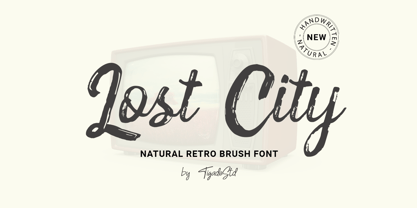 Lost City is a Natural Retro Brush Font. It is a handwritten which can beautifully enhance your design and product with the feel of retro. It's perfect for creating quotes, greeting cards, branding, promotion, advertisements (hello creative people!). This is a complete set comes with the International Characters. Enjoy!
 - Penta Rounded by Wiescher Design,
$29.00 This is the rounded version of Penta! »Penta« is a new Sans typeface, designed in the American tradition with contrast between the up- and downstrokes. The contrast is hardly visible on the »thin« cut, but the heavier the weights get, the more contrast becomes visible. That makes this font very useful, almost linear in the lighter weights and very distinct rhythm in the heavier ones. »Penta« is extremly versatile, it can be used for bodycopy in the lighter weights and for heavy headlines.
 - ITC Stepp by ITC,
$29.99When Hal Taylor saw the 1930 logo for the Stetson Shoe Company of Weymouth, Massachusetts, he didn't run out and buy a pair of loafers. Instead, he seized on this striking example of an Art Deco logotype as the basis for a new typeface design. “I was impressed with the delicate and sophisticated letter forms,” Taylor recalls, “particularly the enlarged cap S -- in any other case it would have seemed unbalanced, but in the context of this logo, it worked perfectly.” All the letters in the original all-caps Stetson Shoe logo were rendered with condensed proportions except the O, which was a perfect circle. While the prominent O added visual interest to the logo, Taylor knew that such a character would limit his typeface to display applications. For versatility's sake, he drew his O for ITC Stepp with the same proportions as the rest of the alphabet. Taylor also gave the logotype's inverted S a more traditional design, but kept the original as an alternate character in the OpenType font. Taylor's toughest challenge during the design process was creating a lowercase. “A good type design tells you what it wants to be,” he says, “and after a little while the Stepp caps began to tell me what the lowercase should look like.” Taylor's lowercase is slightly more conventional than the caps. The jaunty g" and almost upside-down "s" add subtle charm, while the capital letters provide the broader gestures of Stepp's personality. Together, they create a versatile and distinctive typeface design. One of Hal Taylor's first jobs was as a photo-lettering typographer in Philadelphia, setting headlines and creating custom lettering. This was followed by a stint doing finished lettering for John Langdon, whose ambigrams appear in Dan Brown's best-selling novel, Angels & Demons. Today, Taylor works as a graphic designer in the publishing industry, but he still finds time to create an occasional hand-lettered book jacket, and draw handsome typeface designs. ITC Stepp is available in four weights, ranging from Light to Ultra Bold. All four weights have companion italics, and the lightest three weights also offer a suite of small caps." - Aarde by Scholtz Fonts,
$19.00This is the definitive standard African font. It combines wonderful readability with tremendous panache. The fact that it has a full character set (UPPER and lower case), all punctuation and all special characters, means that it can be used in just about any African design context. If you had only one African font in your arsenal, it would have to be Aarde Black. The name "Aarde" means "earth" and refers to the gutsy, earthy character of the letterforms. It includes a full character set: characters for English, French, Italian, German, and Portuguese. The numerals are mono-spaced, and are very readable so that they will line up correctly in columns of figures. The letters of the alphabet are correctly kerned so that they appear correctly in text. - Marble by URW Type Foundry,
$59.99 Marble is part of Asterisk Type Collection by URW Type Foundry. Marble is a modern sans serif with a distinct character and comes in 108 styles plus Variable Fonts. It grew from the desire to create full bodied letters in contrast to the economy of most sans serif faces. Designed for corporate and publishing use it is rounded and approachable, its three styles (Condensed, Normal and Wide) range from slender elegance to warmth and playfulness without ever being informal. Designed by Alessia Mazzarella and Vaibhav Singh, Marble derives its character from the generous roundness of the x-heights which is balanced by the striking horizontal or vertical cuts to the terminals. The result is a readable font that encourages the eye to move from one shape to the next and that offers a range of possibilities for digital and print. The Marble family has nine weights in Latin for each variant. Eminently versatile, it’s ideal for establishing hierarchies of information with a wealth of choices for headlines, subheadings, captions and body copy styles that are all in harmony with each other. The Wide style allows headlines to be set with width and presence.
 - Ex Libris by Fenotype,
$25.00 Ex Libris is a high contrasted Flared Serif font family in two weights. Ex Libris is a display type and it’s at its best in headlines, branding, packaging or as a logotype. Try adding some extra flair with Swash, Stylistic or Titling Alternates or wield any of Ex Libris’s 33 Discretionary Ligatures when typing in caps.
 - Regio Mono by Degarism Studio,
$30.00 Regio Mono is a monospaced typeface designed with industrial-strength, sturdy columns and tidy layouts. contrasting geometric shapes and sharp terminals. Whether used in design or in a code editor, Design proposal, Ads, Packaging and more. Regio Mono comes in six weights, from Ultra Light to Bold, and with a character set that covers over 200 Latin languages.
 - Ki by Mint Type,
$29.00 Ki is a monospaced display typeface inspired by older VCR / camcorder OSD (on-screen display) fonts. It is peculiar for its diagonal angles being restricted to 45°, which results in a specific textural effect perfectly legible in small type sizes. Ki comes in 7 weights with corresponding italics, and features extensive language support with over 500 glyphs, including Cyrillic.
 - Dietal by Tour De Force,
$25.00 Dietal is condensed slab serif family that comes in 5 weights. Dietal coquettes with different type categories from sans and slab to calligraphy, western and display elements. It is available in two versions: with curved and sharp joining. Contains Stylistic Alternates, Ordinals and Tabular Figures as Open Type Features in Extended Latin and Cyrillic character set.
 - 1863 Gettysburg by GLC,
$38.00 This script font was inspired by a lot of autographs, notes and drafts, written by President Abraham Lincoln, mainly the Gettysburg address, first draft and copies, but also the emancipation proclamation. It is an attempt to offer a typical manual script from this American period, not to propose the exact writing from A. Lincoln himself. This font is a little fat and monotone, maybe Abraham Lincoln used a smooth or rounded pen, but some letters I have consulted were written obviously with a sharp one, so, in the future, I will certainly produce a slim version of this font. It is used as variously as web-site titles, posters and fliers design or greeting cards, all various sorts of presentations, menus, certificates, letters. This font supports enlargement as well as small size, though the original size was about 18 to 24 pts. When printed, it remain perfectly legible from 10 to 12 pts.
 - TT Ricordi Marmo by TypeType,
$29.00 TT Ricordi Marmo useful links: Specimen | Graphic presentation | Customization options TT Ricordi Marmo extends the series of experimental projects within the TT Ricordi fonts collection. The main goal of the TT Ricordi project is to look for gems in old signs and on stone and bringing those inscriptions back to life in the form of contemporary fonts with the umbrella name TT Ricordi. TT Ricordi Marmo is an original experimental project by Eugene Tantsurin inspired by inscriptions at Basilica di Santa Croce in Florence. Working on it, we wanted to create a contemporary typeface that would unite the elements of a Florentine sans-serif mixed with more traditional visual solutions typical for the period's serifs. As a result, we got a bright and somewhat provocative typeface with irregular serif distribution, some unusual contours and a free spirit. In small body size TT Ricordi Marmo makes a neutral impression, but as the size gets bigger, the user is taken on a playful quest to search for interesting moves, graphic peculiarities and unusual solutions. TT Ricordi Marmo is great for poster design, packaging, and setting large and medium-sized inscriptions. Thanks to its idiosyncrasy, the typeface may look nice both at a poster in a grand academic theater and at an acid rave party. You can find a set of icon patterns that can be used in several ways. First, you can substitute letters with these patterns, thus getting an inscription with a visible graphic element. Then you can also construct borders and interval marks, or just use them as icons. All patterns are perfectly adapted to the design of letters in the font. TT Ricordi Marmo consists of 2 styles and one variable font. Each of the styles contains over 630 glyphs and 18 OpenType features. As we have conceived TT Ricordi Marmo as a poster typeface from the very beginning, it features small capitals instead of lowercase characters. In addition, the typeface has a set of interesting ligatures, stylistic alternates, pointers, hands, and pattern icons. TT Ricordi Marmo OpenType features list: AALT, CCMP, LOCL, NUMR, ORDN, TNUM, PNUM, CASE, SS01 (Alternative latin E), SS02 (Alternative Eszett), SS03 (Alternative Cyrillic I), SS04 ( Alternative Amper- sand), SS05 (Romanian Comma Accent), SS06 (Dutch IJ), SS07 (Catalan Ldot), DLIG, CALT, SALT.
 - Holiday by alphArt,
$13.00 Introducing our UPDATE "Holiday - Script Handwritten Font" Two years ago we created a script handwritten font that we named Holiday, we didn't expect, hundreds of designers have use the Holiday font, this is really cool font. And today, we've been working hard to make this Holiday font even better, it's the best script handwritten font we've ever made, we've named it Holiday2. Holiday2 - Script Handwritten Font is a handwritten script font with a simple and classy style, this font is great for your next creative projects such as branding, watermark on photography, signature or signature logo design, quotes, album cover, business card, and many other design project. From business cards to photo watermarks, Holiday2 is here to elevate your work to the highest level. However, we still included our old Holiday font, we created Holiday2 to be easier to read and of course with a better design and clean. Holiday comes with uppercase letters, lowercase letters, lowercase alternative letters, numbers, punctuation, ligature and multi lingual support To use alternative end text is just block end letters and select alternative letters on glyphs option. it may be used in almost any program by using your Operating System’s utilities (CharacterMap for Windows and Font Book for Mac.), as well as Illustrator, Photoshop CC 2017 and several other applications. we hope you enjoy this font. If you have any questions please don't hesitate to drop me a message :) Thank you, Best regards alphArt
 - Seabright Monument by Device,
$39.00 During a ‘type walk’ at the 2007 AtypI conference in Brighton, typographer Phil Baines pointed out what he considered to be a particularly egregious example of over-decorative art nouveau lettering on a war memorial. This made me determined to use it as the basis for a font. Released in Opentype, it now features ligatures, swashes and alternates. It’s not certain if the curved top bars on the E and F are a feature of the original design or due to climbers using them as footholds, but I incorporated them anyway. It has recently been used for invitations and supporting print material for formal charity dinners at the House of Lords.
