10,000 search results
(0.054 seconds)
- Rhythm by Positype,
$42.00 I hate the idea of revivals. I have publicly said I choose not to do revivals because they make me uncomfortable. This is as close as I have been to crossing my own line. To be direct, Rhythm is based on the ATF typeface, Ratio (I just recently learned the foundry of origin). I came across this typeface from a printed specimen years ago when I was in school and held onto it. It was unique and I loved how well integrated the inline worked within both the flourish and serif of the glyphs—it was old, but not, reminiscent, but fresh. My specimen was limited in the glyph offering (it was c. 1930ish) and I realized a lot would need to be done to ‘finish’ it and bring it to contemporary expectations. I didn't want to do ‘retro’ and tried to avoid the visual trappings associated with it. What I did want to do is interpret what I had in the specimen and reinterpret it digitally, refining its construction and extending its typographic equity along the way. The ‘One’ and ‘Two’ (and their matching ‘Solids’) styles diverge providing various elaborations that coordinate well between rigid bracketed serifs and compact tails. I further expanded the glyph offering to include a full diacritic set, old style numerals, fractions, stylistic alternates, swashes, titling alternates and controlled flourishes that adhere to the efficient framework of the script. And yes, I refer to it as a ‘script’ because calling it a ‘cutesy serif’ seems wrong :) I hope this is seen less as a slavish revival and more as a championing of a really unique typeface. The Original Typeface was Adastra, designed by Herbert Thannhaeuser for the Foundry D. Stempel AG in Frankfurt, Germany.
 - Risans Basic by Richard Ham Lettertype Ontwikkeling,
$24.99Font with more than 400 glyphs. This font can be used for the most comman languages and can als used for the basic calculus. Some glyphs for the fractions (and special rootfunction) there are used special characters (which be can used with the key code f0000 till f00014 (and Alt + X)) - Erratic JNL by Jeff Levine,
$29.00 Erratic JNL earns its name from the varying widths and shapes of the hand lettering found on some old Art-Deco era sheet music. Following this unusual pattern throughout the complete typeface, the user finds a mix of traditional Deco type design and an overly wide M, N, W and 8.
 - Berling by Linotype,
$29.99The productivity of the Berlingska Stilgjuteriet was made possible by the development of modern typeface art in Sweden in the 1950s. The typeface Berling was designed by Karl-Erik Forsberg for the Berlingska Stilgjuteriet in Lund. It belongs to the modern text typefaces and like most of these markedly shows the influece of the Neorenaissance. Berling Antiqua appeared in 1951 with a matching italic and by 1959, it was expanded to include five weights. Linotype offers Berling in four of them, roman and bold with their respective italics. In 2004 the Swedish publisher Verbum commissioned a complete redesign of Berling for the 21st century. Linotype assisted the designers of this new typeface, which came to be called Berling Nova. - Alchemila by Heyfonts,
$18.00 Alchemila "UNIQUE serif modern font" likely refers to a typeface that combines elements of traditional serif design with contemporary and distinctive features. Serif fonts have small lines or strokes attached to the ends of characters, which can contribute to a more formal or traditional appearance. The term "modern" in this context typically implies a contemporary or updated style. Here's an explanation of the characteristics and significance of a UNIQUE serif modern font: -Serif Elements: Serifs are the small lines or strokes at the ends of characters, and they are a hallmark of traditional typography. In a UNIQUE serif modern font, these serif elements are likely to be present but may have a distinctive shape or style that sets them apart from more conventional serif fonts. -Contemporary Design: The "modern" aspect of the font suggests a contemporary or updated design. This may involve a departure from the more classical serif styles seen in traditional typefaces, incorporating modern design principles, cleaner lines, and a more minimalist aesthetic. -Distinctive Characters: A UNIQUE serif modern font is likely to feature characters with unique and individual design elements. This could include unconventional serifs, letter shapes, or other stylistic details that make the font stand out and contribute to its uniqueness. -Versatility: While serif fonts are often associated with formality and readability, a UNIQUE serif modern font may offer versatility suitable for a range of design applications. It could be used in both traditional and modern contexts, providing flexibility for various design projects. -Applicability to Branding: Fonts play a crucial role in branding, and a UNIQUE serif modern font could be an excellent choice for businesses or projects that want to convey a sense of tradition and reliability while maintaining a contemporary and innovative image. -Digital and Print Design: Modern serif fonts are often designed with both digital and print applications in mind. The clarity of the typeface, even at smaller sizes, and its aesthetic appeal make it suitable for a variety of design projects, from websites and apps to print materials like brochures and posters. -Attention to Detail: The uniqueness of the font may be reflected in the careful attention to detail in each character. This could include refined curves, balanced proportions, and other design elements that contribute to the overall visual appeal and readability of the font. -Available Features: Unique serif modern fonts may come with additional features, such as alternative characters, ligatures, or stylistic sets, allowing designers to customize the appearance of the text for specific design needs. When selecting or working with a UNIQUE serif modern font, designers should consider the overall design goals, the intended audience, and the context in which the font will be used
 - Earline by Cooldesignlab,
$15.00 Meet the new slick calligraphy font - Earline. This gorgeous script is for those who need some elegance and style for their designs and is perfect for wedding invitations, save date cards, feminine branding, and other necessities. This font is modern, simple, but still authentic. Earline includes the complete set of Basic Uppercase and Lowercase Characters, Numbers, and Punctuation Marks. It also contains binders and many stylistic alternatives to perfectly recreate natural calligraphy (check the preview to see all of them).
 - Cheliya by Cooldesignlab,
$15.00 Meet the new slick calligraphy font - Chelya. This gorgeous script is for those who need some elegance and style for their designs and is perfect for wedding invitations, save date cards, feminine branding, and other necessities. This font is modern, simple, but still authentic. Chelya includes the complete set of Basic Uppercase and Lowercase Characters, Numbers, and Punctuation Marks. It also contains binders and many stylistic alternatives to perfectly recreate natural calligraphy (check the preview to see all of them).
 - Lovetina by Cooldesignlab,
$12.00 Meet the new slick calligraphy font - Lovetina. This gorgeous script is for those who need some elegance and style for their designs and is perfect for wedding invitations, saving date cards, feminine branding, and other necessities. This font is modern with a love style, but still authentic. Lovetina includes the complete set of Basic Uppercase and Lowercase Characters, Numbers, and Punctuation. It also contains binders and many stylistic alternatives to perfectly recreate natural calligraphy (check the preview to see all of them).
 - Albus by Gustav & Brun,
$20.00 Albus is bold and friendly. It is your wizard when you're lost in communication. Perfect for the not so serious statements, or maybe for the very serious ones? Maybe it fits on your next children’s book, or maybe on your webshop? The Albus Friends (ornaments) includes speech bubbles, clouds and other fluffy stuff. You can also buy the whole family for an extra friendly price. Let Albus be your wand and let it help you create the kind of message you want. Let’s create some magic!
 - Bong God by Loaded Fonts,
$7.50Following rules, perhaps too closely. The first full font created by Ray Mullin who strongly believes a font need not be pretty to be valid. Each capital shares similar angles, as does each lowercase, making for a typeface only a mother could love. The rounded style was the true inspiration for the original, but logically it had to come second. Based entirely around Bong God but losing the harsh edges to become a usable futuristic type. Legible, but not readable, recommended in small doses. - paintbrushdd by Matthias Luh,
$49.00 paintbrushdd was created using a real paintbrush. It is available in 4 styles including almost 3000 characters (Latin, Greek, Cyrillic, Coptic, symbols, shapes, mathematical expressions and so on). The main focus is on authenticity: The font literally looks like someone just painted it onto your artwork with a paintbrush! Just to name some examples, it is recommended for headlines, posters, t-shirts, computer graphics, and for any other purpose that need less than about 1000 words (due to the complexity of the font and the brush details).
 - Auberge Script by Sudtipos,
$79.00 It took me a long time, but I think I now understand why people of my generation and older feel the need to frame current events in an historical context or precedents, while most of the young couldn't care less about what happened ten years ago, let alone centuries back. After living for a few decades, you get to a point when time seems to be moving quite fast, and it’s humbling to see that your entire existence so far can be summed up in a paragraph or two which may or may not be useful to whoever ends up reading the stuff anyhow. I suppose one way to cope with the serenity of aging is trying to convince yourself that your life and work are really an extension of millenia of a species striving to accept, adapt to, and improve the human condition through advancing the many facets of civilization -- basically making things more understandable and comfortable for ourselves and each other while we go about doing whatever it is we are trying to do. And when you do finally convince yourself of that, history becomes a source of much solace and even a little premonition, so you end up spending more time there. Going far back into the history of what I do, one can easily see that for the most part it was ruled by the quill. Western civilization’s writing was done with quill pens for more than thirteen centuries and with newer instruments for about two. By the mid-18th century, the height of the quill experience, various calligraphy techniques could be discerned and writing styles were arranged in distinct categories. There are many old books that showcase the history of it all. I recommend looking at some whenever the urge comes calling and you have to get away from backlit worlds. Multiple sources usually help me get a better perspective on the range of a specific script genre, so many books served as reference to this quill font of mine. Late 17th century French and Spanish professional calligraphy guides were great aides in understanding the ornamental scope of what the scribes were doing back then. The French books, with their showings of the Ronde, Bâtarde and Coulée alphabets, were the ones I referenced the most. So I decided to name the font Auberge, a French word for hotel or inn, because I really felt like a guest in different French locales (and times) when I going through all that stuff. Because it is multi-sourced, Auberge does not strictly fit in a distinct quill pen category. Instead, it shows strong hints of both Bâtarde and Coulée alphabets. And like most of my fonts, it is an exercise in going overboard with alternates, swashes, and ornamental devices. Having worked with it for a while, I find it most suitable for display calligraphic setting in general, but it works especially well for things like wine labels and event invitations. It also shines in the original quill pen application purpose, which of course was stationery. Also, as it just occurred to me, if you find yourself in a situation where you have to describe your entire life in 50 words or less, you may as well make it look good and swashy, so Auberge would probably be a good fit there as well. This is one quill script that no large bird had to die for. A few technical notes The Auberge Script Pro version includes 1800 glyphs, everything is included there. Also latin language support. We recommend you to use the latest design application to have full access to alternates, swashes, small caps, ornaments, etc. The images from the gallery uses this version. For better results use the fonts with “liga” feature on. Awards During 2014 the early develop of Auberge Script was chosen to be part of Tipos Latinos, the most important type exhibition in South America.
 - Delaguerra by Scriptorium,
$18.00Delaguerra is based on a lettering style originating in the California Arts & Crafts period commonly associated with 'Mission Style'. It is still in common usage in signage at historical sites in California. This version is a sort of idealized hybrid of several different variations on the style from samples we were sent by a customer who wanted to use the font in a set of invitations. It features a basic character set on the lower case and then relief initial versions of the same characters for the upper case. - HWT Etta by Hamilton Wood Type Collection,
$24.95 HWT Etta is a fun display typeface that has two styles: East and West! Its two variations ensure you have maximum wood type swagger in every display size that you might want. This fresh design takes a cue from the wild design experimentation that was happening in the heyday of mid 19th Century wood type—but filtered through 1960s photo-type sensibilities and served up for today’s design needs. Etta West is a decorative inline style and the Etta East is a whimsical reverse contrast style. They live together harmoniously, with their own specific flavors. Practically speaking, both styles are intended for display use, so use them big and use them proudly! Set your XXL size titles in West and your L to XL size types in East. As different as they might look at first, both fonts share a common DNA—Don’t be shy about using them together. The HWT Etta font is part of the Hamilton Wood Type and Printing Museum’s Type Legacy Project. In keeping with the project, Etta is named after Etta Shove Hamilton, who was J.E. Hamilton’s wife and the company’s first bookkeeper.
 - Sunbursting by RVM Creative,
$9.00 Sunbursting is the perfect, bright retro font for all of your summery needs. Great for use on book and album covers, websites, branding, clothing, and social media. It has playful, bubbly serifs on letters and alternates to give your projects all the personality they need. Glyph Count: 449 This font also has multilingual support, and supports most western languages! Comes with two styles, regular and outline.
 - Babycakes by Balpirick,
$15.00 BABYCAKES is a Fun Handbrushed Font. Babycakes is a cute and fun display font. It embodies playfulness and authenticity and is the perfect choice for any children activity or school project. Add this chunky lettered font to your designs and notice how it makes them come alive!. BABYCAKES also multilingual support. Enjoy the font, feel free to comment or feedback, send me PM or email. Thank you!
 - Artistic Venture by Storictype,
$19.00 Artistic Venture Typeface, Inspirated those bold wide letters you see on. computer screen, movie futureistic with combine classic , Well, some of them have these strong or hooks on the ends of the letters. But, there's also this new style of font that's super cool and futuristic. It's called a Artistic Venture Typeface. There Include : All Caps Opentype Feature Alternate Character Ligature Multilanguage Thank You
 - Quida by LetterMaker,
$25.00 Quida is a display family with three styles; Regular, Italic and script. The personality of the design comes from concave vertical shapes, which are consistent through all styles. This makes them work together seamlessly. Quida Script is packed with opentype goodness such as swash caps, stylistic alternates, ligatures and ending forms for lowercase letters. All styles have an extended language support for most European languages.
 - Isidora by Latinotype,
$26.00 Designed by Enrique Hernández V. Isidora is a modern geometric design based on the classic typefaces of the early 20th Century with a contemporary and functional touch. In spite of its strong and rational structure, the font also looks friendly and expressive, thanks to its rounded terminals. In addition, its diagonal terminal cuts give it a softer and more rounded appearance. Isidora consists of two 7-weight subfamilies: one (more classic) Regular and one Alternative (more contemporary and for display use). Both subfamilies come in italic version, giving a total of 28 fonts. Isidora is the perfect font for headlines, logotypes, branding, packaging, publishing and web use. The family contains a set of 438 characters—supporting 207 different languages—and also includes an alternative character set, which allows for more versatility when composing text.
 - Ador by Fontador,
$24.99 Ador is a humanist sans serif especially designed for contemporary typography and comes up with 8 weights from ultralight to black plus true italics and 343 ligatures. A large x-height not only creates space in the letters for extra-bold styles, but also lends Ador an open and generous character in the more narrow and semi-bold versions. The nice balance between sharp ink trapped and soft, dynamic shapes helps to work in small sizes. Diagonal stress, angled finials and the 4 degree true italic styles give Ador a dynamic look. The font contains 981 glyphs including small caps, tabular, old style, fractions … and a wide range of flexibility for Latin language support for every typographical needs. Ador is a contemporary sans serif typeface, special for logotypes, brands, magazines and editorial.
 - Kulture Grotesk by SilverStag,
$19.00 I am thrilled to present you the KULTURE GROTESK, a brand new sans serif font meticulously crafted to elevate your design projects to new heights. This contemporary typeface seamlessly blends modernity, chic aesthetics, and boundless creativity to offer a truly unique and captivating visual experience. With its clean lines and refined forms, this grotesk font embodies a perfect balance of simplicity and sophistication. Designed with the utmost attention to detail, it brings a breath of fresh air to the world of typography. Its versatility knows no bounds, making it the ideal choice for a wide range of applications, from editorial design and branding to web design and advertising. Whether you are looking to create a sleek corporate identity or add a touch of elegance to your personal projects, this font will undoubtedly leave a lasting impression. One of the most exciting features of the new font is the inclusion of over 300 alternate letters and ligatures.These unique characters offer a world of possibilities, allowing you to create stunning and original typography. From distinctive logo designs to captivating headlines, this grotesk font enables you to break free from the ordinary and infuse your creations with a touch of individuality. KULTURE GROTESK - Modern Sans Serif Font Includes: Over 300 ligatures and alternate letters Numerals & Punctuation Language Support Web Font Kit is included as well Detailed instructions on how to use alternates in most of the apps on your computer as well for Canva Would you like to get 5 completely free fonts worth over $75? No tricks, no hidden words, terms or anything. Just subscribe to my newsletter, make sure to check your email to approve the subscription, add me to your contacts so that the emails don't end up in spam folder and you will get 5 fonts for free. The fonts are packed with alternates, ligatures and some even come with extra goodies. Happy creating everyone!
 - Big Ballpen by Simonkoba,
$18.00 Big Ballpen is a modern, slightly naive handwriting typeface, which has the feel of graffiti with its rough lines. The font lines are basically fat and the thickness is not regular from letter to letter. Some numbers are inspired from Tony Buzan concept of picture-number. For example, the number 2 resembles a swan. Some special characters like €$*#@&{Ç~• are available.
 - Allotrope by Kostic,
$40.00 Allotropes are different structural forms of the same element and can exhibit quite different physical properties and chemical behaviors. The change between allotropic forms is triggered by the same forces that affect other structures – pressure, light, and temperature. From Wikipedia the Free Encyclopedia With ten weights in five widths plus Italics, this family comes to a total of 100 fonts. The large number of styles was made with the intent to cover most cases UI designers have to tackle, with one type family. Stylistic alternates were made to follow the same logic, so there is an optional single-story g, serifed capital I, and dotted zero – all available through the OpenType feature. The character set supports Western and Central European languages, as well as Turkish.
 - Kowalski2 by GRIN3 (Nowak),
$28.00 Kowalski2 is a decorative, serif, hand-drawn font. It can be used for invitations, greeting cards, posters, advertising, weddings, books, menus etc. The inspiration came from the beautiful font Desire designed by Charles Borges de Oliveira. Kowalski2 Pro is the most complete style, it contains all the alternates and ligatures. To get the alternate glyph just add "+“, ”=" or "*" before the letter in any OpenType savvy application or manually select the characters from Glyph Palette. Kowalski2 Basic has the basic character set with 345 glyphs and no alternates. Kowalski2 A, Kowalski2 B and Kowalski2 C have less glyphs than the Pro one, they only contain some selected alternates and ligatures. Language support includes Western, Central and Eastern European character sets, as well as Baltic and Turkish languages.
 - La Taqueria by Sudtipos,
$39.00 Mexico’s storied culture is one of the most recognizable today. Its amazing vibrant art and delicious foods have made the leap to influence many parts of the world in recent years. This proud, intense and diverse identity was the inspiration behind La Taqueria, a set of four fonts that express different characteristics of Mexican pop culture. The heavy and spicy, the light and gentle, the constant dynamism, all come together with one rhythm to produce an explosion of personality. Just like its predecessors Distillery and Scrapbooker, the La Taqueria set contains down-to-earth alphabets perfect for chalkboard art and handmade design. All the fonts include alternates and ligatures, providing plenty of variation for that spontaneous appearance everyone is looking for these days.
 - Sambo Briliant by Gian Studio,
$10.00 Brilliant Sambo Featuring Slab Serif totality and elegance. One of my most recent first releases, naturally drawn with pinpoint accuracy. Sambo Brilliant has the perfect amount of simplicity and subtlety for your next project. It perfectly represents the retro and vintage aesthetic. I recommend this font for your next logo, invitation, and home decor project that needs a succinct alternative combination touch! Sambo Brilliant appears with strong characters available: Get inspired by the image above and feel free to share with me what you get by using this font.
 - Vianova Serif Pro by Elsner+Flake,
$59.00 The font superfamily Vianova contains each 12 weights of Sans and Slab and 8 weights of the Serif style. The design from Jürgen Adolph dates back into the 1990s, when he studied Communication Design with Werner Schneider as a professor at the Fachhochschule Stuttgart. Adolph started his carrier 1995 at Michael Conrad & Leo Burnett. He was responsible for trade marks as Adidas, BMW, Germanwings and Merz. He has been honored as a member of the Art Directors Club (ADC) with more than 100 awards. On February 26, 2014, Jürgen Adolph wrote the following: “I was already interested in typography, even when I could not yet read. Letterforms, for instance, above storefronts downtown, had an irresistible appeal for me. Therefore, it is probably not a coincidence that, after finishing high school, I began an apprenticeship with a provider of signage and neon-advertising in Saarbrücken, and – in the late 1980s – I placed highest in my field in my state. When I continued my studies in communications design in Wiesbaden, I was introduced to the highest standards in calligraphy and type design. “Typography begins with writing” my revered teacher, Professor Werner Schneider, taught me. Indefatigably, he supported me during the development of my typeface “Vianova” – which began as part of a studies program – and accompanied me on my journey even when its more austere letterforms did not necessarily conform to his own aesthetic ideals. The completely analogue development of the types – designed entirely with ink and opaque white on cardboard – covered several academic semesters. In order to find its appropriate form, writing with a flat nib was used. Once, when I showed some intermediate designs to Günter Gerhard Lange, who occasionally honored our school with a visit, he commented in his own inimitable manner: “Not bad what you are doing there. But if you want to make a living with this, you might as well order your coffin now.” At that time, I was concentrating mainly on the serif version. But things reached a different level of complexity when, during a meeting with Günther Flake which had been arranged by Professor Schneider, he suggested that I enlarge the offering with a sans and slab version of the typeface. So – a few more months went by, but at the same time, Elsner+Flake already began with the digitilization process. In order to avoid the fate predicted by Günter Gerhard Lange, I went into “servitude” in the advertising industry (Michael Conrad & Leo Burnett) and design field (Rempen& Partner, SchömanCorporate, Claus Koch) and worked for several years as the Creative Director at KW43 in Düsseldorf concerned with corporate design development and expansion (among others for A. Lange & Söhne, Deichmann, Germanwings, Langenscheidt, Montblanc.”
 - Vianova Slab Pro by Elsner+Flake,
$59.00 The font superfamily Vianova contains each 12 weights of Sans and Slab and 8 weights of the Serif style. The design from Jürgen Adolph dates back into the 1990s, when he studied Communication Design with Werner Schneider as a professor at the Fachhochschule Stuttgart. Adolph started his carrier 1995 at Michael Conrad & Leo Burnett. He was responsible for trade marks as Adidas, BMW, Germanwings and Merz. He has been honored as a member of the Art Directors Club (ADC) with more than 100 awards. On February 26, 2014, Jürgen Adolph wrote the following: “I was already interested in typography, even when I could not yet read. Letterforms, for instance, above storefronts downtown, had an irresistible appeal for me. Therefore, it is probably not a coincidence that, after finishing high school, I began an apprenticeship with a provider of signage and neon-advertising in Saarbrücken, and – in the late 1980s – I placed highest in my field in my state. When I continued my studies in communications design in Wiesbaden, I was introduced to the highest standards in calligraphy and type design. “Typography begins with writing” my revered teacher, Professor Werner Schneider, taught me. Indefatigably, he supported me during the development of my typeface “Vianova” – which began as part of a studies program – and accompanied me on my journey even when its more austere letterforms did not necessarily conform to his own aesthetic ideals. The completely analogue development of the types – designed entirely with ink and opaque white on cardboard – covered several academic semesters. In order to find its appropriate form, writing with a flat nib was used. Once, when I showed some intermediate designs to Günter Gerhard Lange, who occasionally honored our school with a visit, he commented in his own inimitable manner: “Not bad what you are doing there. But if you want to make a living with this, you might as well order your coffin now.” At that time, I was concentrating mainly on the serif version. But things reached a different level of complexity when, during a meeting with Günther Flake which had been arranged by Professor Schneider, he suggested that I enlarge the offering with a sans and slab version of the typeface. So – a few more months went by, but at the same time, Elsner+Flake already began with the digitilization process. In order to avoid the fate predicted by Günter Gerhard Lange, I went into “servitude” in the advertising industry (Michael Conrad & Leo Burnett) and design field (Rempen& Partner, SchömanCorporate, Claus Koch) and worked for several years as the Creative Director at KW43 in Düsseldorf concerned with corporate design development and expansion (among others for A. Lange & Söhne, Deichmann, Germanwings, Langenscheidt, Montblanc.”
 - Vianova Sans Pro by Elsner+Flake,
$59.00 The font superfamily Vianova contains each 12 weights of Sans and Slab and 8 weights of the Serif style. The design from Jürgen Adolph dates back into the 90th, when he studied Communication Design with Werner Schneider as a professor at the Fachhochschule Stuttgart. Adolph started his carrier 1995 at Michael Conrad & Leo Burnett. He was responsible for trade marks as Adidas, BMW, Germanwings and Merz. He has been honoured as a member of the Art Director Club (ADC) with more than 100 awards. On February 26, 2014, Jürgen Adolph wrote the following: “I was already interested in typography, even when I could not yet read. Letterforms, for instance, above storefronts downtown, had an irresistible appeal for me. Therefore, it is probably not a coincidence that, after finishing high school, I began an apprenticeship with a provider of signage and neon-advertising in Saarbrücken, and – in the late 1980s – I placed highest in my field in my state. When I continued my studies in communications design in Wiesbaden, I was introduced to the highest standards in calligraphy and type design. “Typography begins with writing” my revered teacher, Professor Werner Schneider, taught me. Indefatigably, he supported me during the development of my typeface “Vianova” – which began as part of a studies program – and accompanied me on my journey even when its more austere letterforms did not necessarily conform to his own aesthetic ideals. The completely analogue development of the types – designed entirely with ink and opaque white on cardboard – covered several academic semesters. In order to find its appropriate form, writing with a flat nib was used. Once, when I showed some intermediate designs to Günter Gerhard Lange, who occasionally honored our school with a visit, he commented in his own inimitable manner: “Not bad what you are doing there. But if you want to make a living with this, you might as well order your coffin now.” At that time, I was concentrating mainly on the serif version. But things reached a different level of complexity when, during a meeting with Günther Flake which had been arranged by Professor Schneider, he suggested that I enlarge the offering with a sans and slab version of the typeface. So – a few more months went by, but at the same time, Elsner+Flake already began with the digitilization process. In order to avoid the fate predicted by Günter Gerhard Lange, I went into “servitude” in the advertising industry (Michael Conrad & Leo Burnett) and design field (Rempen& Partner, SchömanCorporate, Claus Koch) and worked for several years as the Creative Director at KW43 in Düsseldorf concerned with corporate design development and expansion (among others for A. Lange & Söhne, Deichmann, Germanwings, Langenscheidt, Montblanc.”
 - Remora Sans by G-Type,
$39.00 Remora is an extensive new humanist sans serif which comes in 2 style variations, the effervescent Remora Sans and its corporate business partner Remora Corp . Both styles include 5 individual width sets ranging from the condensed W1 to the extra-wide W5. Furthermore, with an impressive 7 weights (Thin to Ultra) and true matching italics in each pack Remora is an ultra versatile super family comprising 140 individual fonts, perfect for any typographic assignment or design brief. Remora was designed by G-Type founder Nick Cooke. Both the Sans and Corp families share the same proportions, with the exception of certain key characters that change the overall appearance. Remora Sans is an exuberant and characterful typeface while Remora Corp, as its name suggests, is a businesslike typeface more suited to corporate typography. Quite early on in the design process Nick decided to give Remora Corp equal billing instead of incorporating these glyphs as alternates or a stylistic set that may get overlooked. “I created two separate families after learning a valuable lesson with one of my earlier typefaces, Houschka”, says Nick. “Houschka contained distinctive rounded A’s W’s and w’s, with ‘straight’ styles as character alternates. Even though style sets and alternates are easy to activate they are rarely used, so after many requests for customised versions of the fonts with the straight characters as defaults it was decided to create the separate ‘Alt’ family. So I cut straight to the chase with the two Remora variants and created two complementary families.” Both sets contain many shared letterforms, but it is the alternate characters that significantly alter the appearance of each font. Remora has been carefully designed for optimum legibility at large and very small sizes. Although fairly monolinear in appearance, especially in the lighter weights, particular attention has been paid to optical correction like the overshoots of the curved characters. Open counters and painstaking attention to detail (e.g. weight contrast between horizontal and vertical strokes, junctions of shoulders and stems etc) all boost readability and make Remora a great choice across all media. Remora Sans and Corp are ‘humanist’ rather than ‘geometric’ in style, meaning they’re not strictly based on rectangles and circles, resulting in a warm and friendlier feel. The slightly ’super-elliptical’ rounded forms create generously attractive curves. Remora has very distinctive italics in that they are only inclined by 8 degrees, but are not just based on slanted uprights. The italic styles are very alluring when used for display at large sizes and the good news is they come bundled free with their respective uprights. Each family also contains many OpenType features including proportional and tabular numbers, small caps, discretionary ligatures, plus five stylistic sets for ultra versatile typography.
 - Remora Corp by G-Type,
$39.00 Remora is an extensive new humanist sans serif which comes in 2 style variations, the effervescent Remora Sans and its corporate business partner Remora Corp. Both styles include 5 individual width sets ranging from the condensed W1 to the extra-wide W5. Furthermore, with an impressive 7 weights (Thin to Ultra) and true matching italics in each pack Remora is an ultra versatile super family comprising 140 individual fonts, perfect for any typographic assignment or design brief. Remora was designed by G-Type founder Nick Cooke. Both the Sans and Corp families share the same proportions, with the exception of certain key characters that change the overall appearance. Remora Sans is an exuberant and characterful typeface while Remora Corp, as its name suggests, is a businesslike typeface more suited to corporate typography. Quite early on in the design process Nick decided to give Remora Corp equal billing instead of incorporating these glyphs as alternates or a stylistic set that may get overlooked. “I created two separate families after learning a valuable lesson with one of my earlier typefaces, Houschka”, says Nick. “Houschka contained distinctive rounded A’s W’s and w’s, with ‘straight’ styles as character alternates. Even though style sets and alternates are easy to activate they are rarely used, so after many requests for customised versions of the fonts with the straight characters as defaults it was decided to create the separate ‘Alt’ family. So I cut straight to the chase with the two Remora variants and created two complementary families.” Both sets contain many shared letterforms, but it is the alternate characters that significantly alter the appearance of each font. Remora has been carefully designed for optimum legibility at large and very small sizes. Although fairly monolinear in appearance, especially in the lighter weights, particular attention has been paid to optical correction like the overshoots of the curved characters. Open counters and painstaking attention to detail (e.g. weight contrast between horizontal and vertical strokes, junctions of shoulders and stems etc) all boost readability and make Remora a great choice across all media. Remora Sans and Corp are ‘humanist’ rather than ‘geometric’ in style, meaning they’re not strictly based on rectangles and circles, resulting in a warm and friendlier feel. The slightly ’super-elliptical’ rounded forms create generously attractive curves. Remora has very distinctive italics in that they are only inclined by 8 degrees, but are not just based on slanted uprights. The italic styles are very alluring when used for display at large sizes and the good news is they come bundled free with their respective uprights. Each family also contains many OpenType features including proportional and tabular numbers, small caps, discretionary ligatures, plus five stylistic sets for ultra versatile typography.
 - Soutkind by Sitintahitam,
$19.00 SOUTKIND is a display typeface with heavy bold style, inspired by pop culture in 80s century. Soutkind have a unique and fat forms. This font suitable for your design suh as packaging, poster, apparel, etc. SOUTKINDalso includes a set of some pop illustration. Extras allows you to develop awesome design with this font. Cheers! 🍻
 - Sketching by Graphicfresh,
$16.00 This time we designed a font of ink streaks on paper and named it Sketching. We loved creating it because this is a work of art in itself, making it through a long process. Every letter we made has always maintained its distinctive style. We hope you are all happy with our latest font.
 - Nucleo by HansCo,
$17.00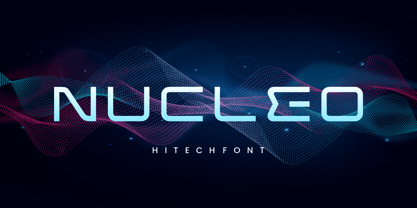 INTRODUCING NUCLEO – Modern Display typeface! NUCLEO is a modern monoline font with unique style that will make your design looks modern and futuristic. You can use this font for any purpose, especially to make logotype like a technology logo brand. This typeface is comes in uppercase, lowercase, punctuation, symbols, numerals, etc also support multilingual. Enjoy!
 - Dark Angel by Alphabet Soup,
$60.00 Selected as one of “Our Favorite Typefaces of 2013” by Typographica.org, Dark Angel is the first completely new take in decades on the traditional “blackletter” font style. It began its journey towards the light years ago when this style was born as a sketch for a new logo for the California Angels baseball team (renamed shortly thereafter the Anaheim Angels). The Angels logo never happened, but that sketch has risen from the dead and become the basis for this brand new font design—and was also the source for the name. It’s kind of blackletter in feel, but as a display font it’s so much more. It is far more legible than most “Old English” or “Gothic Script” styles, and incorporates many features never before seen in them, such as swashes, tails and a plethora of ligatures. Dark Angel can be purchased in its regular solid form, or as Dark Angel Underlight—a handtooled font. If these two fonts are purchased together, the Family package will contain a third font—Dark Angel Highlight. With this font layered over the basic font, you can achieve two–color typesetting when the highlight and the base font are assigned two different colors. Dark Angel has enough language support to make the builders of Babel envious—its 1,163 glyphs can be used to set copy in 59 different languages. From A to Z: Afrikaans, Albanian, Basque, Bemba, Bosnian, Catalan, Cornish, Croatian, Czech, Danish, Dutch, English, Esperanto, Estonian, Faroese, Filipino, Finnish, French, Galician, Ganda, German, Hungarian, Icelandic, Indonesian, Irish, Italian, Kalaallisut, Kamba, Kikuyu, Kinyarwanda, Lithuanian, Luo, Malagasy, Malay, Maltese, Manx, Morisyen, North Ndebele, Norwegian Bokmål, Norwegian Nynorsk, Nyankole, Oromo, Polish, Portuguese, Romansh, Sango, Shona, Slovak, Slovenian, Somali, Spanish, Swahili, Swedish, Swiss German, Turkish, Welsh, and last (but not least) Zulu. PLEASE NOTE: Dark Angel is a cross-platform font which depends to some extent on certain advanced OpenType features, therefore it can be used to its full potential only with programs that support those features. ADDITIONALLY: When setting Dark Angel one should ALWAYS select the “Standard Ligatures" and “Contextual Alternates” buttons in your OpenType palette. Please see the “Read–Me–First!” file in the Gallery section.
 - Kalix by Linotype,
$29.99I have a notation that the summer of 1994, when I worked with Kalix, was a warm one. I had no special typeface in mind when drawing the characters of Kalix, but many typefaces contributed to it, e.g. my own Omnibus from which I borrowed the looks of the smal case g. I think it is a lovely typeface whose use is mainly for books and magazines. Kalix is the name of a northern Swedish town situated along a river called Kalixälven. Its name is of sami origin, *káles, meaning cold. There comes the connection to the warm summer of 1994! But even the Latin word for chalice, calix, has something to do with my choice of name. Kalix was released in 1994. - Hella Instegra by Skypia,
$17.00 Start good day for new font! present to you, Hella Instegra! Hella Instegra is a stylish font It has both modern and retro look - clear, modern and fun. Helps to create layout design in 60s or 70s design projects. This font have more than 150 unique alternate and 59 ligature that to give your logo,business card and another project to a unique vintage look. It has Italic and Outline version too so what a perfect vintage font! Hella Instegra is also included full set of: uppercase and lowercase letters multilingual symbols numerals punctuation Alternates PUA Encoded Unique letterforms I really hope you'll get pleasure using Hella Instegra font and it will be perfect addition to your font collection! If you have some questions, please write me a letter! Thank You Skypia.
 - Hilsfiger by Gatype,
$10.00 Hilsfiger is a unique, fun and versatile serif font that comes with Regular and Italic Fonts, OpenType and includes ligatures, alternatives, numbers, punctuation, and also supports other languages. So you can spice up any design you like. Hilsfiger I is a versatile serif font that works in both large and small sizes. This font is suitable for a wide variety of projects such as: headlines, logos, labels, branding projects, magazines, homeware designs, product packaging, mugs, quotes, posters, and more. Hilsfigeris is encoded with PUA Unicode, which allows full access to all additional characters without having to design any special software. Mac users can use Font Book, and Windows users can use Character Map to view and copy any additional characters to paste into your favorite text editor/app. I really hope you enjoy it!
 - Voltury by Angin Studio,
$10.00 Voltury is a vintage script created carefully to create a great flow and great character. It is inspired by American vintage signage and packaging. Voltury comes with 2 styles: clean and rough. It also comes with OpenType features such as ligatures and stylistic alternates, so you have more flexibility to mix and match the letters and make your design stand out from the crowd. It also contains characters for multi-lingual support. Check this link to see all glyph inside this product : https://bit.ly/2Oa3DVo Email : ahmadaswin99@gmail.com Thank you happy creating
 - Piambis by Aga Silva,
$24.99 Piambis Family has been featured in "Slanted #28 Contemporary Typefaces 2016/17" This handwritten font family that boasts great variety of glyphs - many of which are fancy alternates for standard letters (click on text written in Piambis below, then click on “Glyphs”). This font is designed so the letters are available via standard programs ie. Word. It is recommended however that you use professional software such as Photoshop or Illustrator to make your work easier as there are over 1600 glyphs in each of the fonts included in Piambis family. About the family: The chief difference between the files in the family are finishes to the capital letters (in all languages) and appearance of the lowercase “f”. The fonts support all languages that use latin script - yes - Vietnamese (Tiếng Việt) and Pinyin is also available.